Gray’s Anatomy – How Ironic – By Richard Gray
Another week has come and gone but just before the weekend starts we have the pleasure in publishing the wonderful words and wisdom of none other, than our great columnist, Richard Gray. This week Richard discusses the ‘history’ of photography in his own very special humorous way, don’t miss this. (Foreword by Joanne Carter). Over to you Richard…
“I love Hipstamatic’s recent Tintype SnapPak, which includes the C-type (or cyanotype) film. In the words of the Hipsta blurb, this “film” adds a hand-painted quality to your portraiture” (not sure why they mention portraiture in particular – it does allow you take photos of non-portrait things).
Some interesting things about cyanotype I found on Wiki (I read it so you don’t have to): 1) The process was discovered in 1842. Wow! That’s a long time ago. We think of photography as fairly recent, but, hell, we’re coming up for the double century; 2) The term “blueprint” comes from cyanotype (cyan is also the name for a type of blue) because the first prints had a blueish hue; 3) Cyanotype prints don’t like being put next to things that have chemicals in them and they can fade as a result. But here’s a lovely thing. If they’ve faded a bit, if you put them in a dark room for a while, they recover. So they’re almost alive in an organic sort of way. A bit like humans.
But enough of the historical stuff. Hipstamatic’s new C-type film produces pictures with beautifully cool colors with a rough texture that you can almost feel, even though of course all you’re looking at is a million or so pixels on a screen. But it has one slightly annoying thing. It delivers your “prints” with these little black triangles in the corners. I just don’t like them, so I usually take them out using Touch Retouch. I mentioned this to someone on Instagram recently and they came back to me and pointed out that without the corners the print wouldn’t be authentic. Of course. But then I thought, isn’t that a little bit ironic? The Hipstamatic process is a completely artificial reproduction of an old process and its lenses, films and prints are all pure figments of our pixel-imaginations. Compared to the real thing, they’re about as authentic as Justin Bieber is to Bob Dylan.
But they’re brilliant. Who cares if Hipstamatic’s game is the backward-looking reproduction of old processes and equipment. It produces beautiful images. Now, if you’ll excuse me, I’m off to lie down in a dark room”.
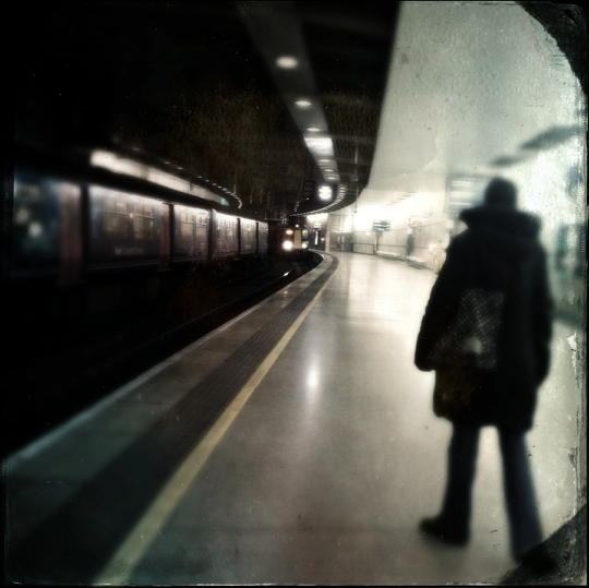
© Richard Gray – ‘Those triangles need to go’
Joanne Carter
Joanne Carter, creator of the world’s most popular mobile photography and art website— TheAppWhisperer.com— TheAppWhisperer platform has been a pivotal cyberspace for mobile artists of all abilities to learn about, to explore, to celebrate and to share mobile artworks. Joanne’s compassion, inclusivity, and humility are hallmarks in all that she does, and is particularly evident in the platform she has built. In her words, “We all have the potential to remove ourselves from the centre of any circle and to expand a sphere of compassion outward; to include everyone interested in mobile art, ensuring every artist is within reach”, she has said. Promotion of mobile artists and the art form as a primary medium in today’s art world, has become her life’s focus. She has presented lectures bolstering mobile artists and their art from as far away as the Museum of Art in Seoul, South Korea to closer to her home in the UK at Focus on Imaging. Her experience as a jurist for mobile art competitions includes: Portugal, Canada, US, S Korea, UK and Italy. And her travels pioneering the breadth of mobile art includes key events in: Frankfurt, Naples, Amalfi Coast, Paris, Brazil, London. Pioneering the world’s first mobile art online gallery - TheAppWhispererPrintSales.com has extended her reach even further, shipping from London, UK to clients in the US, Europe and The Far East to a global group of collectors looking for exclusive art to hang in their homes and offices. The online gallery specialises in prints for discerning collectors of unique, previously unseen signed limited edition art. Her journey towards becoming The App Whisperer, includes (but is not limited to) working for a paparazzi photo agency for several years and as a deputy editor for a photo print magazine. Her own freelance photographic journalistic work is also widely acclaimed. She has been published extensively both within the UK and the US in national and international titles. These include The Times, The Sunday Times, The Guardian, Popular Photography & Imaging, dpreview, NikonPro, Which? and more recently with the BBC as a Contributor, Columnist at Vogue Italia and Contributing Editor at LensCulture. Her professional photography has also been widely exhibited throughout Europe, including Italy, Portugal and the UK. She is currently writing several books, all related to mobile art and is always open to requests for new commissions for either writing or photography projects or a combination of both. Please contact her at: [email protected]
2 Comments
Robert Lancaster
My and those pesky black triangles are embroiled in a serious love hate relationship.
On occasion I have found that they add that special something to an image
And in other images (such as your station scene) they are a bit of an annoyance.
Catherine
Great article Richard! Didn’t know the history of cyanotype prints and found that quite interesting. Also agree with you about the triangles…sometimes they’re okay, but in many compositions I don’t want them. Touch Retouch is a miracle app, IMO. 🙂