Technical iPhone Photography Tutorial – Diptic – Part 2
We’re delighted to publish the second part of two Diptic Technical Tutorials by our newest staff member, Jerry Jobe. Jerry joined us earlier this month to work alongside our Head of Technical Tutorials David Hayes, allowing us to increase our quantity of stunning photo app tutorials that we know you all value so much. We think you’re going to enjoy this tutorial a lot – over to you Jerry…
Diptic retails for $0.99/£0.69 and you can download it here.
‘Last week we began work with this framing app by placing images within the frame, then arranging and filtering them. Today we’ll manipulate the borders or frames.
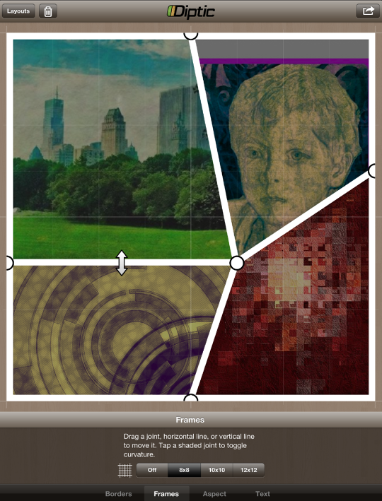
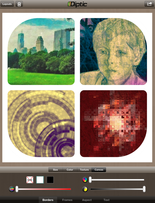
There are two ways to manipulate the edges of the photos. Frames allows you to move the edges around. Borders changes the characteristics of the edges. Our first image shows the Frames command. The pictures themselves darken; you cannot move them or manipulate them in the Frames module. You can either move entire interior lines, by dragging the arrows, or you can move control points, by moving the dots. You cannot move any portion of the exterior lines.
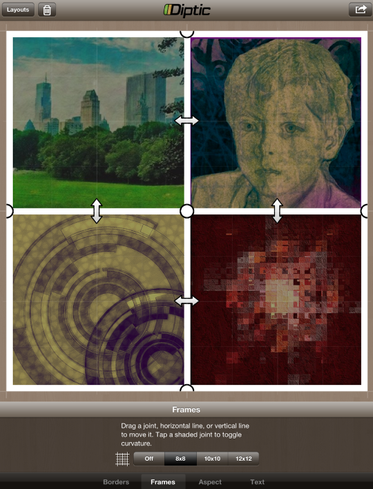
The grid controls allow you to constrain your movement. Movement of the lines or points “snaps” to the grid. The gridlines are faint, but visible. You have the option for an 8×8, 10×10 or 12×12 grid. Here I’ve dragged the vertical line one grid square to the right.
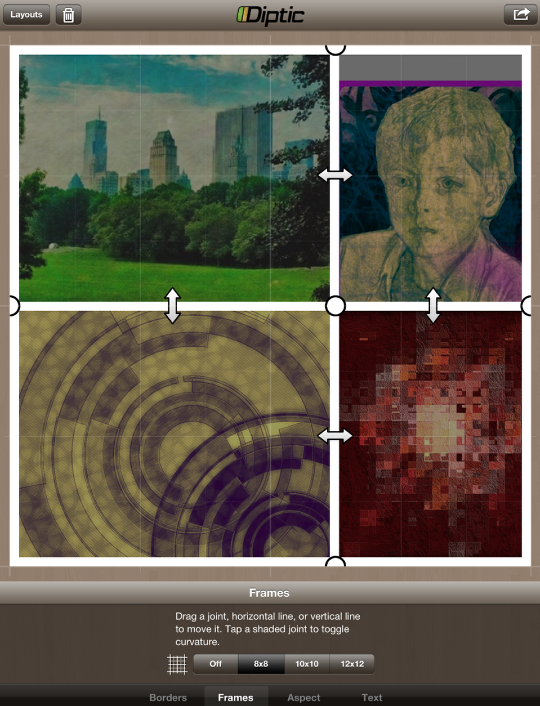
If you turn the grid off you will have the ability to smoothly move the line or point to positions in between grid markings. The drawback is that with the gridlines off, you will find it nearly impossible to restore the lines or points to their original position. Below I’ve turned the grid off and moved the horizontal line slightly downward.
Moving a control point moves all the lines touching that point. When you move a control point, and the associated lines become “out of true” (not straight, like the vertical line in the example below), then the arrows will disappear and you can no longer move the line. I have moved the center control point one square to the right, and the right control point one square up. That leaves only the horizontal line left of center as a moveable line.
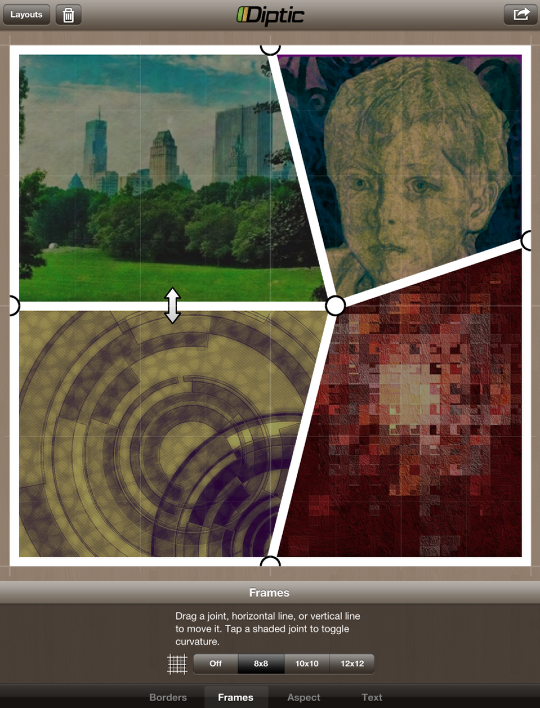
I can move that line one square downward.
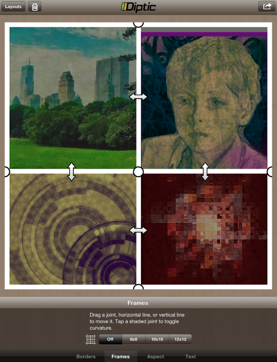
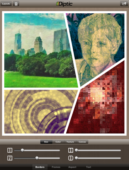
Leaving the Frames module, and going to the Borders module, will allow you to recenter the images within the new cells.
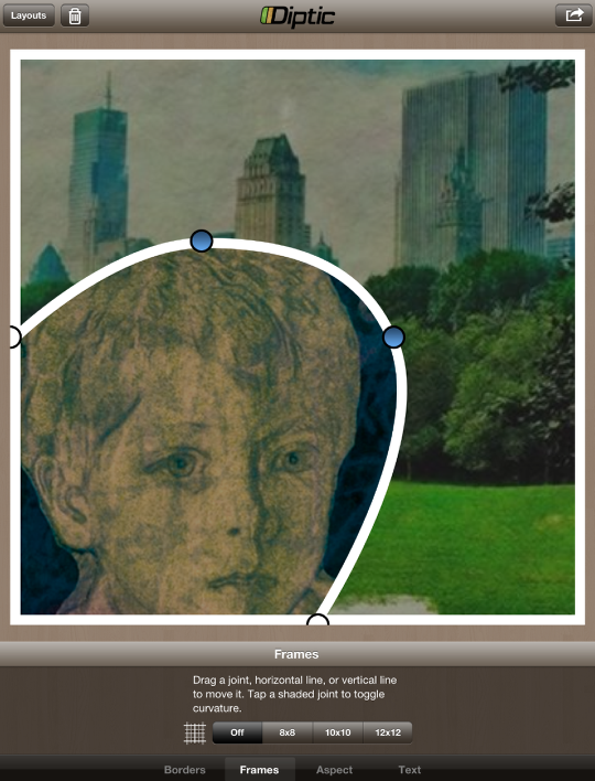
Some frames allow for curved lines. Here we are in the Frames module with a frame that looks like a “house” within the larger square. There are the regular white control points, but there are also blue control points that can become points on a curve. The top blue point is currently toggled for curvature, while the blue point to the right is toggled for an angle. See the difference? Tapping the point toggles it back and forth.

Once a control point is toggled to curvature, the arrows disappear and you can no longer move the line.
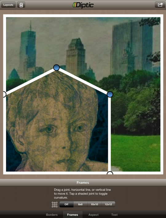
Why isn’t the border now curved, given that we’ve toggled the control points to curvature? That’s because there’s another control that changes the degree of curvature, and that is in the Border module: the lower-left control. If that slider is all the way to the left, that means zero curvature is applied.
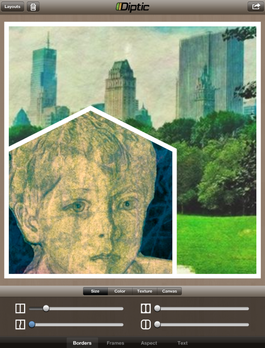
As I move the slider to the right, the edge begins to bend.
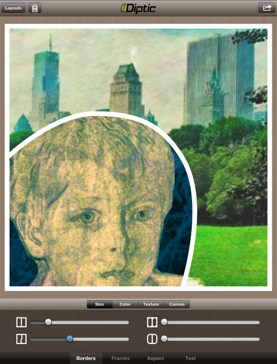
At this point I can go back into frames and manipulate it further. I could move the bottom control point to more closely conform to the boy’s face, for instance.
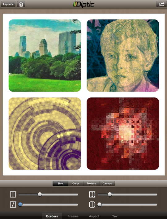
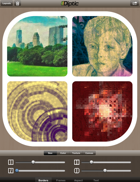
The lower left slider under the Borders>Size control – as we’ve seen – controls curvature of certain interior lines. The three remaining sliders control the width of all lines (upper left), interior corner rounding (upper right), and exterior corner rounding (lower right). In the example below I’ve thickened the lines and applied some interior corner rounding.
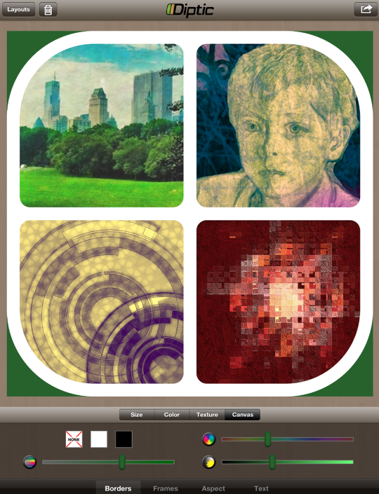
When you round the exterior corners, you expose area in the corners. That area is called the Canvas, and by default that Canvas area is set to none, or transparent. Diptic output is in PNG format, which retains that transparency. That means you can see through the corners to the app background; or, if you post it on a web page, then the web page’s background.
That Canvas can also be made opaque by the Canvas controls. You would first toggle the canvas to opaque by tapping either White or Black instead of None.
If desired, you can change the color of the canvas by using the Hue (upper right), Saturation (lower left), or Luminance (lower right) sliders. Here I’ve adjusted all three sliders to get a mid-level green canvas.
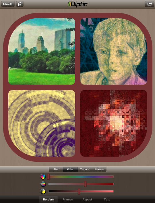
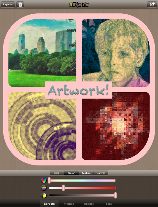
The remaining two ways to manipulate the Border are Color and Texture. You can change one or the other, or both. Below I’ve changed the color of the border using the same three sliders we saw in the Canvas control: Hue, Saturation and Luminance.
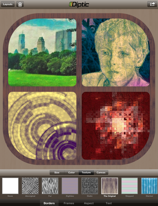
The twelve Textures included with Diptic are affected by the color you choose with the Color control. Here I’ve chosen The Original texture, which resembles woodgrain. (When you choose a two-colored texture, such as Eighties, then the Color sliders will only change one of the colors.)
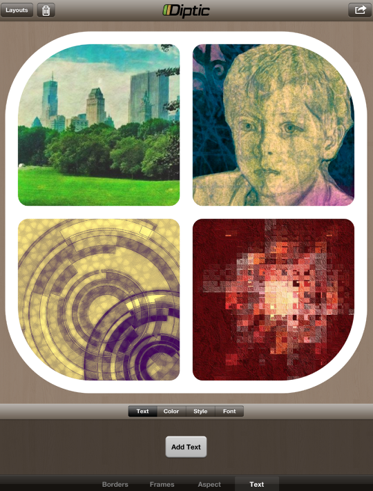
You can also add text to your framed image. After choosing text, the first task is to enter the text by pressing the “Add Text” button.
A text editor appears and I typed in “Central Park!”, tapped Done and repositioned the text over the first image.
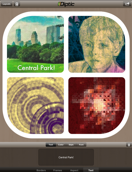
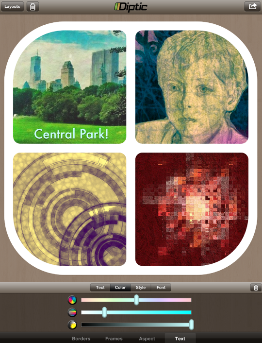
You can change the color of the text using the same Hue, Saturation and Luminance sliders.
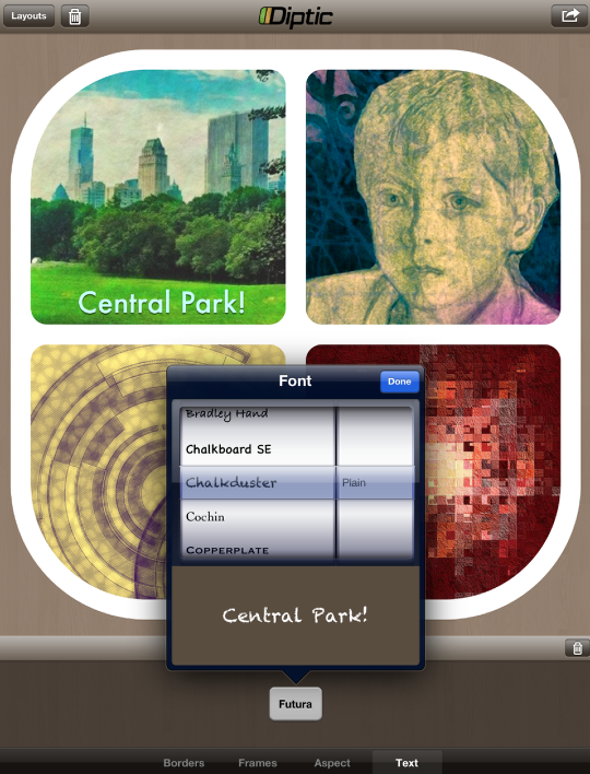
When you choose Font, you’ll see a button with the current font identified. Tapping that button will bring up a list of fonts.
Style has three settings: Stroke, Shadow and Background. The stroke slider controls the size of the stroke; color of the stroke is a light or dark tint of the font color, depending on if you tap “Dark” or Light”. The Shadow slider controls the opacity of the shadow (Dark or Light). The background controls the size of the background behind the text. The color of the background will always match the frame, but the Texture of the frame will not apply to the background.
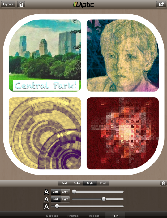
Diptic only allows one text element to be added. So I changed the text and the frame/text background color and repositioned the text in the middle.
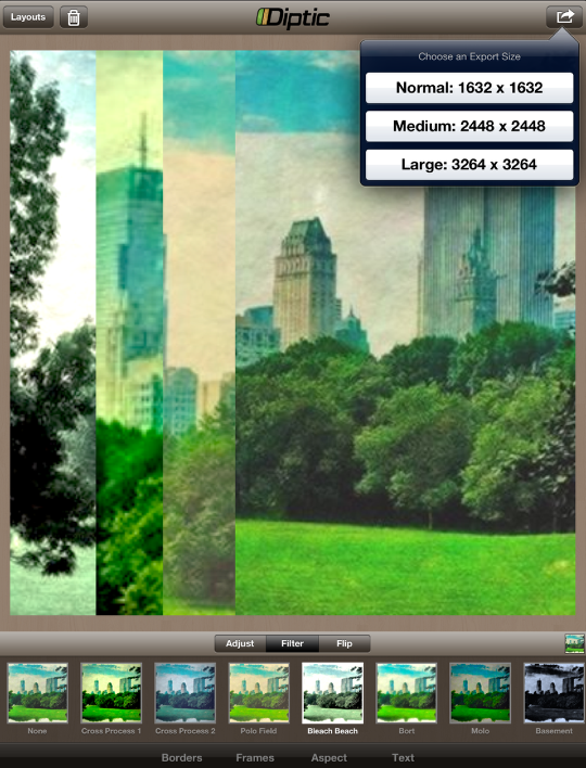
Since the finished framed image can be comprised of photos of different resolution, the save function does not depend on the resolution of the images to determine the resolution of the output. Tapping the Save button will show you several stock sizes for your output. As always, I recommend the highest resolution possible.
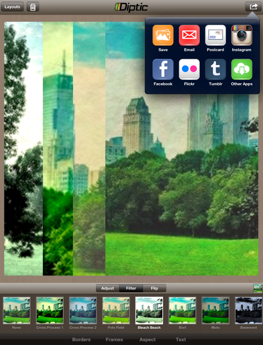
Save options include the usual suspects, except that it includes Tumblr and will export to Twitter, providing there is an account installed on your device, otherwise it will not show up.
Conclusion and Examples
I recommend Diptic. The crash when using the landscape user interface is troubling, but you can work around that. Other than that, the first changes I would make are minor – the ability to add more than one text element and the ability to enter aspect ratios directly (such as 8:3 for Facebook cover photos). Diptic does what it’s designed to do quickly and easily, if you avoid the crash and overlook the minor quibbles.
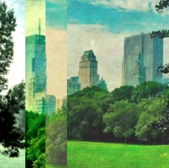
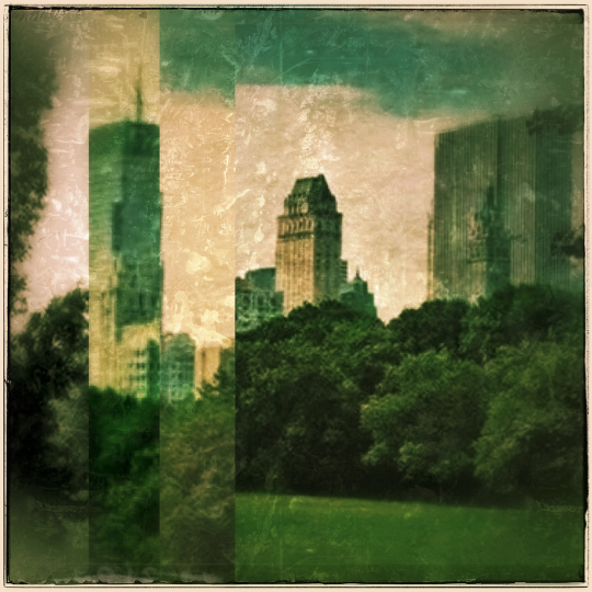
This week’s example shows you that it’s not necessary to have any frame at all to get value from Diptic. I took the Central Park illustration and placed it in all four frames, resizing and repositioning each. Then I took the Frame Size slider (under Borders) all the way to the left, meaning no frame at all.
I then took the result through Snapseed, adding my own outside frame as well as Grunge and a little Retrolux. Enjoy!
Jerry Jobe
Never content with just scratching the surface of what an app can do, Jerry Jobe decided to pass on what he learned about imaging apps to others. He’s constantly trying to figure out just what tools other artists have used, and trying to incorporate them into his own work, in an attempt to find his style. He’s written tutorials on over 145 apps so far, which you can find (along with his Song of the Day entries) at http://enthusiasmnoted.wordpress.com/ He lives near Atlanta, Georgia, where he also finds a creative outlet in acting and directing in community theater.
One Comment
Pingback: