iOS Photography Technical Tutorial – Dramatic Black & White by Jerry Jobe
We’re delighted to publish Jerry Jobe’s latest iOS Photography App tutorial today. This time Jerry has put the very popular app ‘Dramatic Black & White’ by JixiPix through it’s paces. Dramatic Black and White is a hugely popular iOS photography app, we’re sure you will all enjoy this very much. Over to you Jerry, (foreword by Joanne Carter).
“Last February I covered an app called Noir, which is a fast, and not very customizable, monochrome app. JixiPix’s Dramatic Black and White, available in separate iPhone and iPad versions, is much more customizable, with a wealth of presets that make good starting places for your conversion to black and white (or tinted black and white).

Dramatic Black & White looks similar to other JixiPix products; the left side of the screen is the workspace and the right houses the presets and adjustments. As usual, the app allows you to select from your albums or take a photo with the iOS camera. As usual, I suggest you take your photos with other apps.
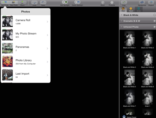
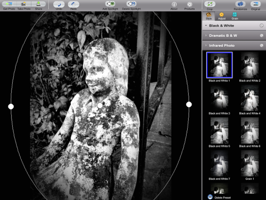
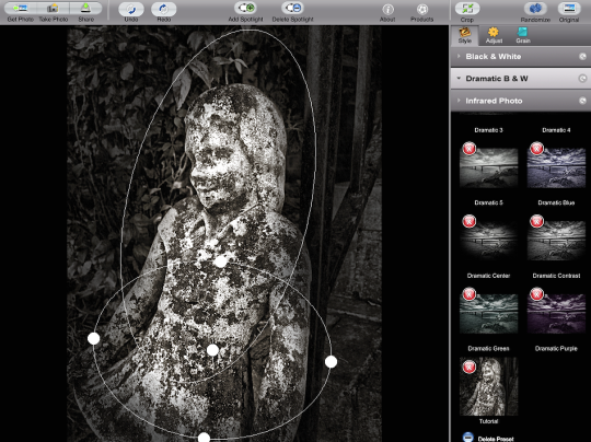
I’m starting with an image that I took of a small, weathered concrete statue we’ve had in our front yard for over ten years. Across the top of the workspace you’ll see buttons for Get Photo, Take Photo and Share; Undo and Redo; Add and Delete Spotlight; Info and Products (which takes you to the App Store for other JixiPix products).
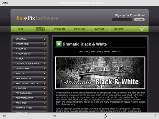
Below you’ll see that tapping the Info button will take you to a web page with help for this particular product, along with ads for other apps. I love JixiPix, but their cross-marketing is rather relentless!
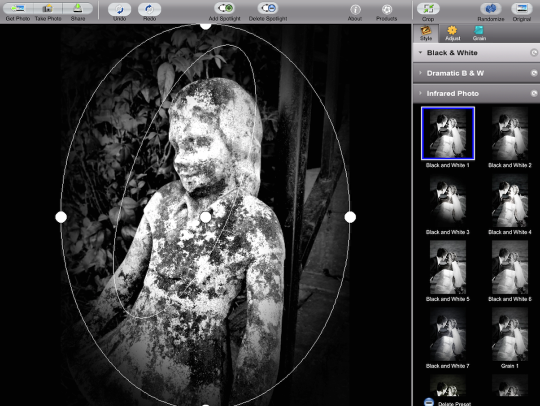
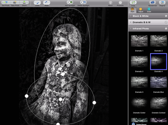
The ellipse you see overlaying the photo is a spotlight. The ellipse is customizable through the use of the handles. Below I’ve grabbed a side handle and moved it towards the center, producing a thin ellipse.

Tapping in the workspace outside the image hides the ellipse, so you can see your image without the clutter. Tapping back inside the ellipse will reveal it again, allowing you to once again change the size or shape.
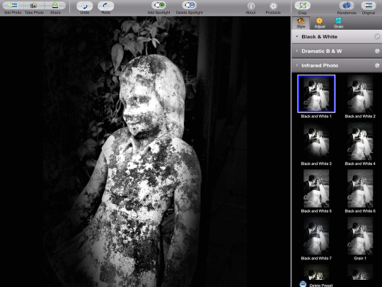
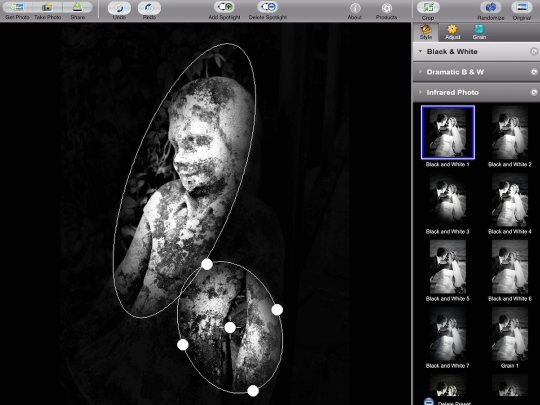
Noir allows for a single ellipse, as does the iPhone version of Dramatic Black & White, but the iPad version allows for multiple. Below I’ve tapped the Add Spotlight button at top center, and a second ellipse has been added. Notice that the added ellipse is currently selected and has handles, while the one underneath has no handles.
I used a two-finger pinch to make the ellipse smaller, and dragged a side handle to make it narrower. A single-finger drag to the center of the ellipse moved it into place.
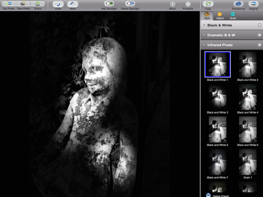
Once again, a tap on the workspace hides the ellipses. A tap on Delete Spotlight will delete the currently selected spotlight (the one with the handles).
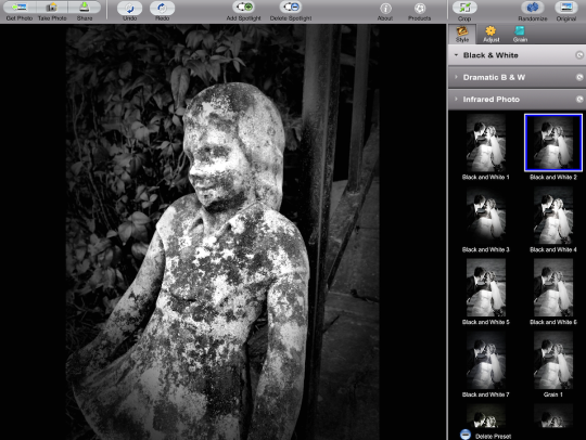
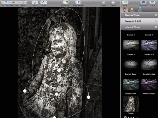
Spotlights are one of the parts of a preset, so changing the preset being used will reset the spotlights you may have added/moved/resized. Below I’ve changed from Black and White 1 to Black and White 2. There are 12 presets in the Black and White category.
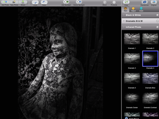
Tapping the Dramatic B & W bar will show the Dramatic presets – there are 10 of them included.
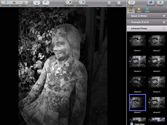
The Infrared category has 14 presets.
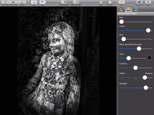
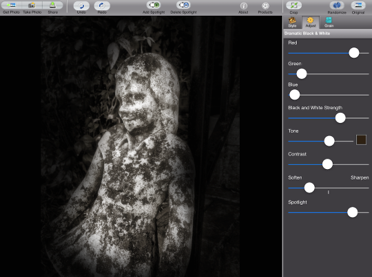
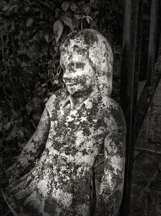
Below you’ll see that I’ve gone back to a Dramatic Preset (#4) as the basis for my monochrome conversion. I’ve added another spotlight and formed them into a kind of inverted T.
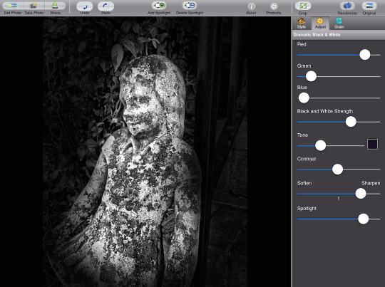
Next I tap the Adjust button above the presets to further modify the image. The top three sliders, Red, Green, and Blue, work as though you had placed a color filter over the lens when taking the picture. In the image below, the Blue is emphasized. That means that blues would become brighter in the photo, while reds and greens would be darker. That makes for a darker, more contrasty photo in this case, since there isn’t much blue in the original photo.
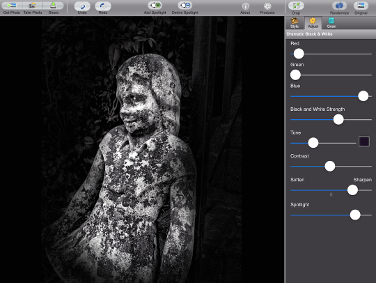
If I want to make the foliage lighter, I would emphasize the Green. Notice that when I move the Green slider to the right, the Blue slider automatically moves to the left. If I have all Green in my filter, then I can have no Red or Blue.
The same thing happens if I increase the Red; the Green and Blue must make way.
The Black and White Strength slider produces very subtle changes. Even if you slide it all the way to the left, only a very slight amount of the original colors in the image are allowed through. I’ll show an example of that at the end.
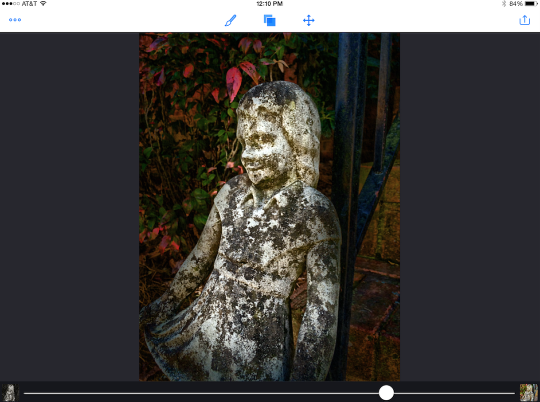
The Tone slider and color picker allow you to tint the photo. I want to add a bit of brown to the image, warming it slightly, so I use the color picker to choose a dark brown. You can see the color I’ve chose in the Current area. I hit Apply to confirm the color choice.
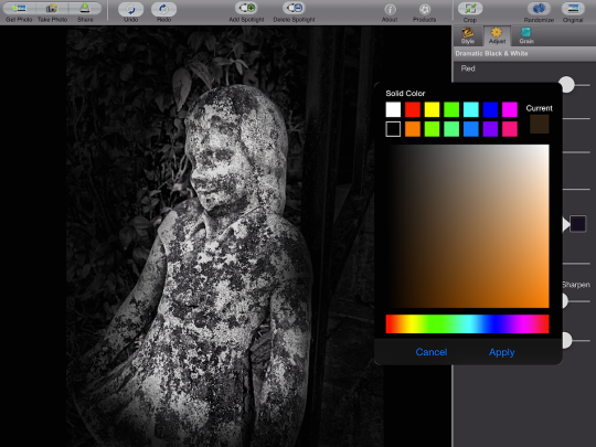
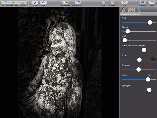
Not the Tone slider is used to adjust the amount of color I add. Notice that, since I’ve chosen a dark color, that increases the contrast along with adding the color.
Contrast is self-explanatory; you can use that slider to increase or decrease the contrast.
The Soften/Sharpen slider works on the entire photo, not just on the spotlit or background areas. Below I’ve moved the slider to the Soften side to give the photo a nice glow. Nice, but not what I’m looking for.
Finally, the Spotlight slider adjusts the darkness of the background. Below, I’ve lightened it until there is almost no difference between the area under the spotlights and the background. By the way, Dramatic Black & White does not allow you to lighten the background more than the original photo, so no white vignettes are allowed.
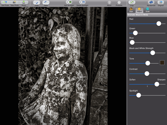
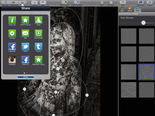
The final tab is Grain, which adds film grain to your photo. This will not make a huge difference in this case, with such a busy subject, but can make a huge difference if you have large areas of the same tone, such as skies.
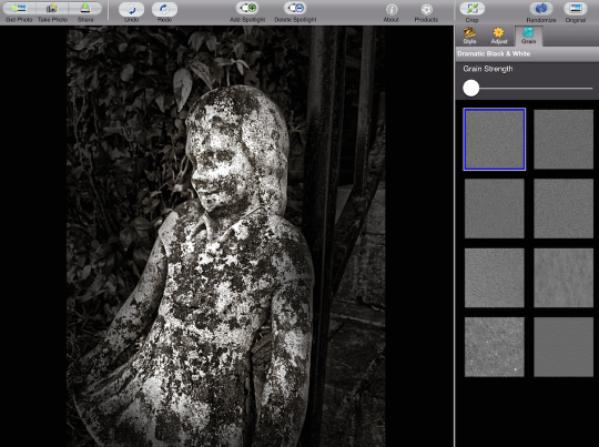
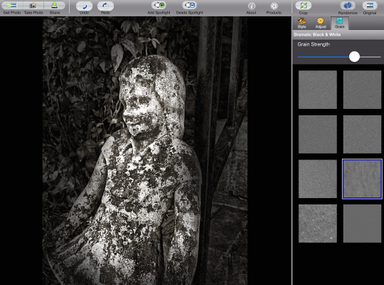
Below I’ve added a fairly large amount of grain, but you can’t see it that much.
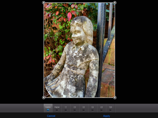
The Crop button at the top of the preset area takes you to the screen below, which allows you to crop the image to the standard range of sizes. Warning: applying the crop will reset the changes you’ve made, so you may want to save your changes as a preset before cropping.
So how do you save a preset? Through the Save Preset button (second row, right) under the Share button.
Tapping Save Preset will open up a text window for you to name the preset.
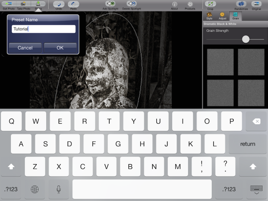
The preset will be saved in the current category (Dramatic in this case) with the current image as a thumbnail.
Tapping the Delete Preset at the bottom will show a red X on each preset. Clicking the red X will delete the preset. Be careful you only delete your own presets!
Here’s my finished image.
Monochrome photography, as I mentioned in my article on Noir, is all about tone – the emphasis of the level of light across the grayscale. Apps like Dramatic Black & White allow you to separate the tone from the color and work on it directly. But there’s no reason that you can’t add the color back afterwards. Below I’ve taken my finished photo into Image Blender, then blended the original back in Color mode at 75%. Color mode means that the grayscale values come entirely from the “bottom” image” while color comes from the “top”. If you have a green pixel, then the top image tells you it’s green, while the bottom tells you how light or dark it is. Now, I can adjust contrast, brightness and vignetting without affecting the saturation or hue, and then deal with that separately.
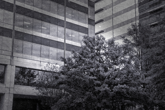
I’ll finish by showing you three different versions of the same image, all done in DBW. The first is an untouched preset, Dramatic 1.
Next I moved the Green slider to the right to brighten the green foliage on the tree. I also moved the Black and White Strength slider all the way to the left. You can actually see just a hint of the original green in the leaves. The Soften/Sharpen slider was used to give a touch of glow. I finished by moving the Spotlight slider to the left to tone down the vignette.
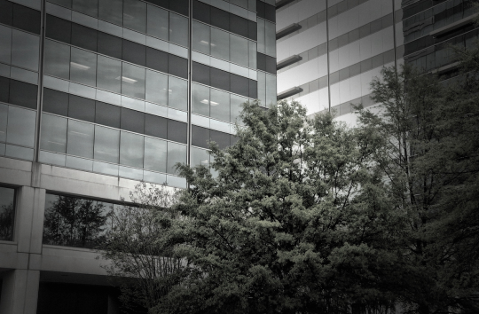
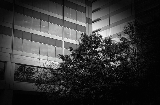
The third example uses a blue tone, a double spotlight in an inverted V, Sharpen and a large dose of Grain that is readily apparent over the building.
Dramatic Black & White isn’t as flashy as most JixiPix apps, but it’s a solid addition to your arsenal. It’s not as easy to use as Noir, but it gives you a lot more control over the tone of your image. So get out there and enjoy seeing the world in shades of gray!
Jerry Jobe
Never content with just scratching the surface of what an app can do, Jerry Jobe decided to pass on what he learned about imaging apps to others. He’s constantly trying to figure out just what tools other artists have used, and trying to incorporate them into his own work, in an attempt to find his style. He’s written tutorials on over 145 apps so far, which you can find (along with his Song of the Day entries) at http://enthusiasmnoted.wordpress.com/ He lives near Atlanta, Georgia, where he also finds a creative outlet in acting and directing in community theater.
3 Comments
rsmithing
Thanks for this review, from us fans and practitioners of monochrome iOS photography. I use Noir all the time, and while it’s indeed not very customizable, I still love it for being so effective in such a direct manner. It’s one of my go-to apps for many of my creations. I must admit, having another oval/spotlight looks intriguing!
Jeffrey Simpson
Stellar tutorial. I love this app. Very powerful and easy to use
Thank you Jerry.
Pingback: