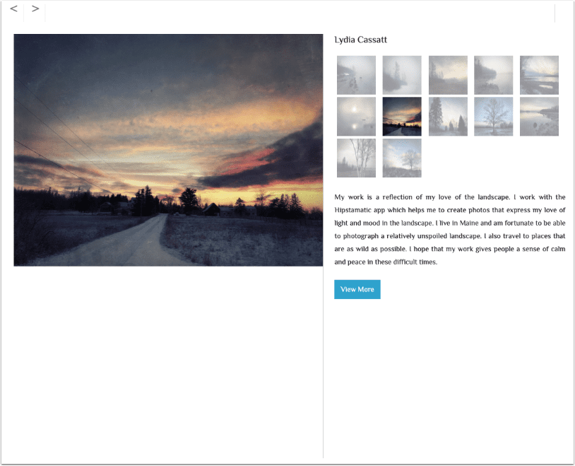
iOS Photography Tutorial – Through a Glass Darkly: Taking a Look at Blurs by Jerry Jobe
We’re delighted to publish Jerry Jobe’s latest technical iOS photography tutorial. This week Jerry tackles blurs and demonstrates how they can be used creatively in your art. Over to you Jerry (foreword by Joanne Carter).
I was inspired to write this tutorial when I encountered a free offer for an app. It seemed that all this app would do is blur your image severely. You might think “Why would I want to do that? I struggle to make my images as sharp as possible!” But blurs have their uses, and I thought I’d show you a few.
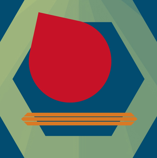
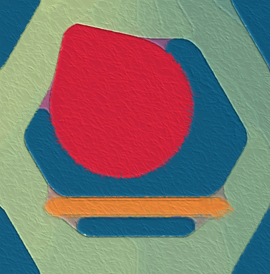
We’re going to be working with this image, which I created in Tangent (reviewed in December). The strong lines and shapes will make the blurs more readily apparent.
Gaussian Blur
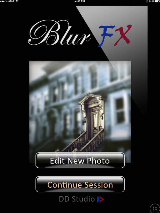
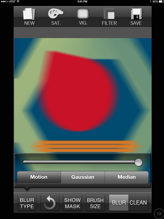
The first type of blur we’ll discuss is Gaussian blur. This is the most widely used blur in graphics programs. It creates a smooth blur that extends the “fuzziness” equally in all directions. We will look at Gaussian Blur using an app called Blur. (This app is remarkably similar to the new app I mentioned above in that it performs exactly the same function; since I already have Blur I felt no need to get another app – even if it is free.)
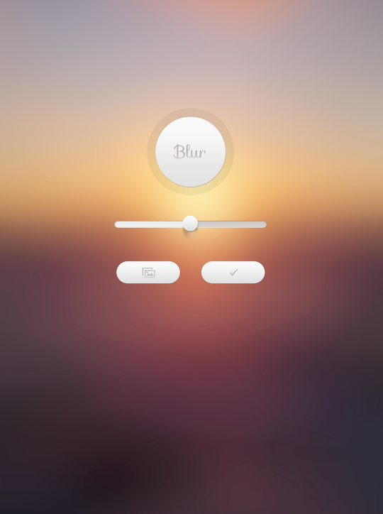
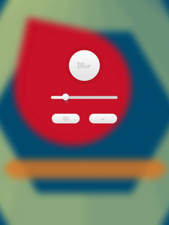
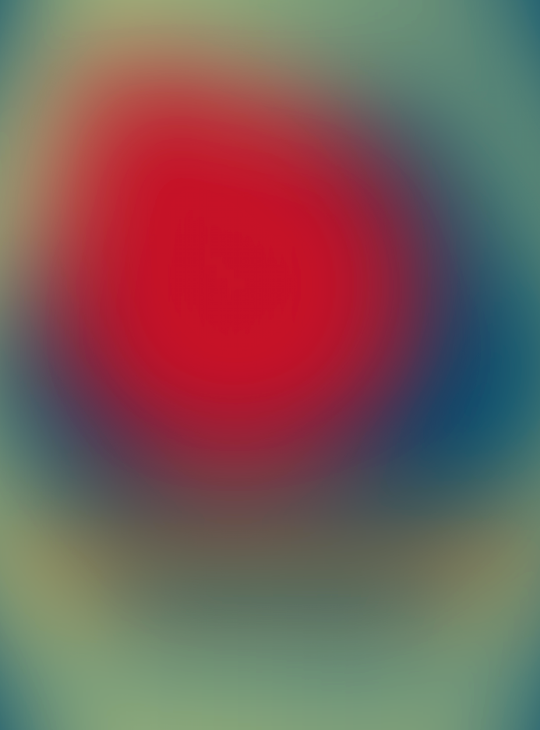
Blur is dead simple. You have a button to import photos, a check button to save the result, and a slider to adjust the amount of Gaussian blur. It advertises its main function as creating wallpaper for your iOS device; as such, you are limited in aspect ratio to screen size. When I import my square image, it gets cropped to fit the screen. Below you’ll see I pulled the slider down from the middle to get a moderate amount of blur.
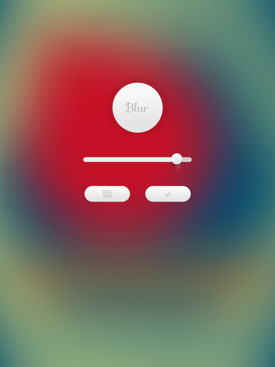
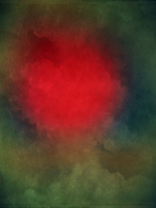
By pulling the slider up, you get an enormous amount of blur. I’ve done that below, and I’m left with only a hint of the orange lines near the bottom of the hexagon.
I tap the check mark, and that saves the result to my camera roll.
But what use is that? I suppose you could use that as your wallpaper on your device as is. But passing it through some other apps might create a nicer result. Below I’ve used Stackables to change the feeling entirely.
Motion and Median Blur
The default blur in Blur FX is Gaussian. Notice how Blur FX, even with the strength slider all the way to the right, does not blur as intensely as the app Blur.
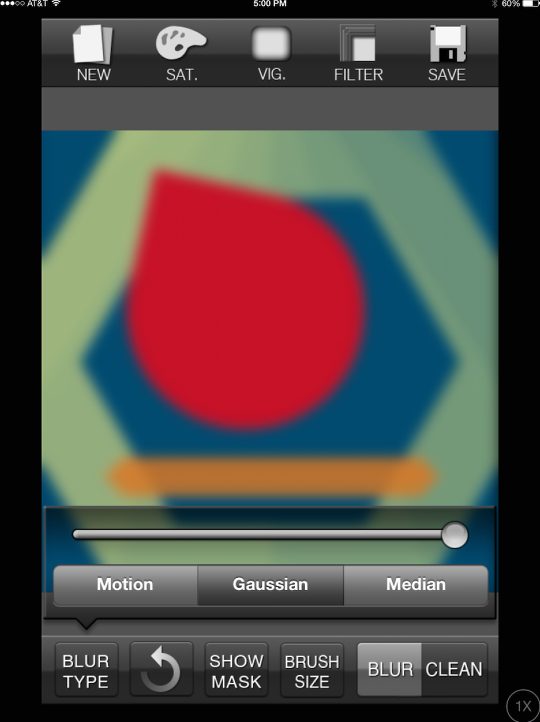
If you want to make it look as though either your camera or the subject was moving at the time the picture was snapped, you apply Motion blur. This imparts direction to the blur – the blur in more intense along a line than perpendicular to the line. Blur FX is limited to horizontal motion blur. It is impossible to change the direction. For that reason, I rarely use Blur FX for motion blur.
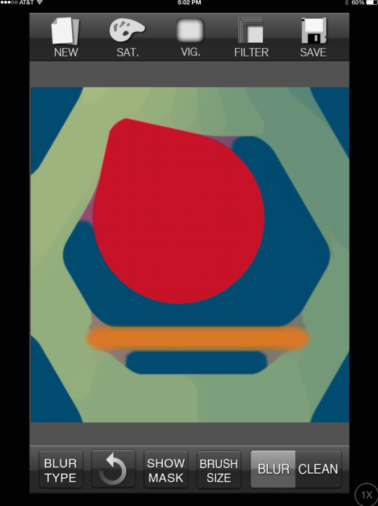
Another type of blur, Median blur, is primarily used for noise reduction. It tries to keep edges intact, while blurring the interior of an object. When you turn the strength up, however, it can give some interesting effects. When the strength, or radius of the blur is increased, then the averaging that is done between the colors results in colors and shapes appearing that weren’t within the original image.
In the first example below the strength is turned all the way to 11. (Gratuitous Spinal Tap reference.) Because the radius is now large enough to encompass parts of several of the shapes at once, the calculations performed average the red and blue to a purple, and the orange, yellow and blue to a tan.
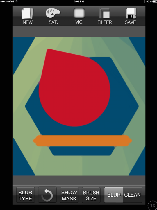
When you’re working with noiseless blocks of color as we are here, then you may find it hard to notice when median blur is applied. Below, with the median radius turned down, the only change that’s obvious is the orange stripes running together and some “webbing” where the stripes meet the hexagon.
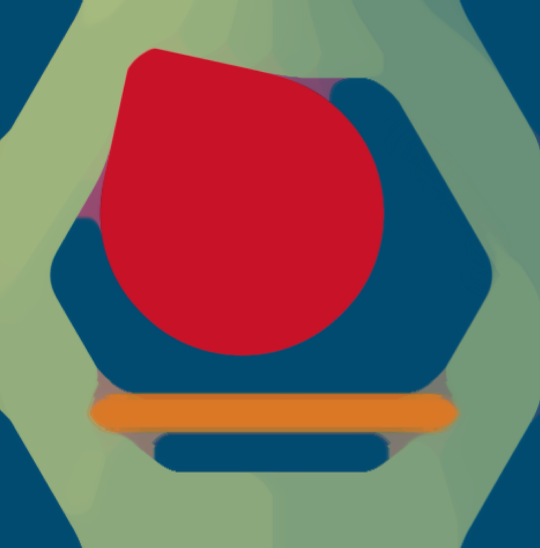
When I want to have large blocks of color, with relatively sharp edges, I’ll use Median blur. It’s useful for passing to a paint app or for combining with a sketch to get an illustration look. Here’s our image with maximum Median blur applied.
And here it is when passed through Glaze. The sharp edges made possible with Median blur translates to sharp painted edges.
Other uses of blur, and a final subset of blur
Let’s turn to other ways to use blur, and let’s use iColorama for that. If you apply a Gaussian blur to an image, then blend the blurred version with the original in screen or lighten mode, then you get a nice glow that’s useful for portraits and some landscapes. Below you’ll see that I’ve applied a mask so that you see the original on the right, and the change on the left. You can almost hear the left side saying “I’m ready for my closeup. Mr. DeMille!”
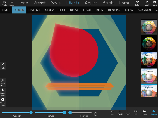
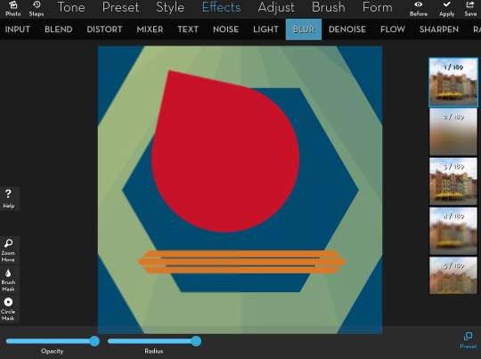
As I keep the mask in place, let’s go to the Effects>Blur feature in iColorama. The first, shown in the first thumbnail on the right and applied to the left side of the image, is a slight Gaussian blur. If you look at the second thumbnail, you’ll see it’s a very intense Gaussian blur, much like what is produced in the Blur app.
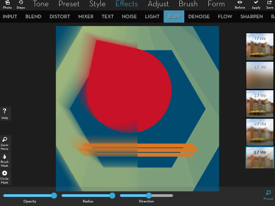
Blur #5 is a motion blur, and you will see that iColorama gives you a direction slider to change the line of motion.
Blur #9 is a motion blur in two directions, horizontally and vertically.
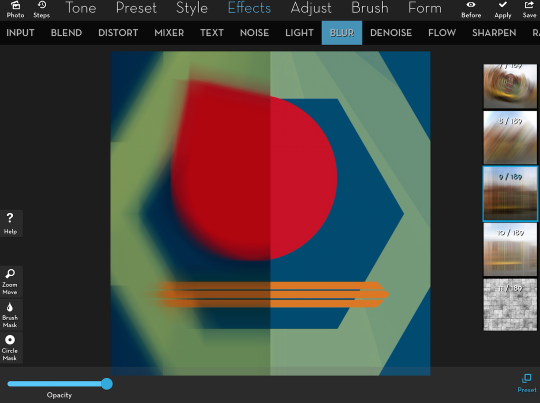
If you look at the thumbnails above, you’ll see that, up through #10, the thumbnails show various methods of blur, both Gaussian and motion. But what’s with the pattern in thumbnail #11?
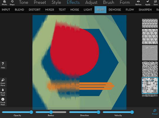
iColorama gives you 179 patterns that affect how a Motion blur is applied. I refer to them as patterned blurs. The white parts of the pattern make the radius largest, and the black the smallest. In the example below, you can see that the white lines in between the shapes on the pattern accomplish the most blur. You can also say they do the most smearing.
Patterned blurs are a subset of Motion blurs since in addition to a direction, they have a velocity or speed. The higher the velocity, the more blurring occurs. In the example below I’m using the same pattern, but have reduced the velocity.
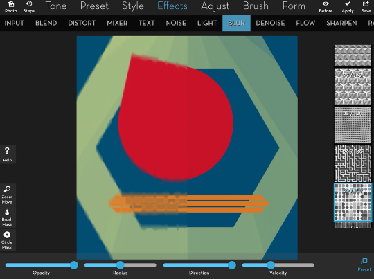
Of course, the Radius slider also controls the amount of blurring. Manipulation of Velocity and Radius results in different looks. Below I’ve returned Velocity to the maximum, but reduced the Radius. This gives a blockiness to the blur that is more reminiscent of a Median blur.

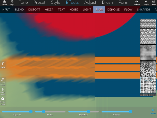
But Patterned blurs are primarily Motion blurs, as you can see when you move the Direction slider. Below I’ve zoomed in on the orange stripes so that you can see more closely the patterned blur with the reduced Radius and the change in Direction.
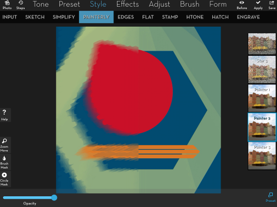
I took one look at Patterned blurs and thought they would be useful for combining with line drawings or sketches of the same image – it would look as though you were “painting outside the lines” in an organic way. But in order to make the blur look even more like a painting, I applied the Style>Painterly>Painter 2 preset below. That makes it look more like actual strokes have been applied, not like a blur.
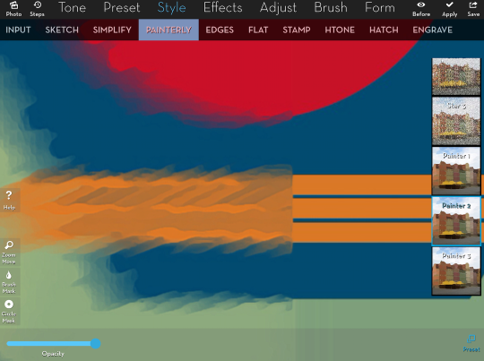
I’ve zoomed out below so you can see the left side changes, as compared to the right side original.
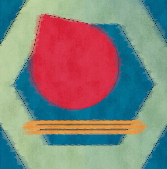
And finally, the resulting image, once I’ve blended in the sketch from Pencil FX and some added Textures.
I hope you’ve enjoyed our discussion of Gaussian, Motion, Median and Patterned blurs. I also hope that it gives you some ideas on how your images can be improved – even if they are obscured! Enjoy!
Jerry Jobe
Never content with just scratching the surface of what an app can do, Jerry Jobe decided to pass on what he learned about imaging apps to others. He’s constantly trying to figure out just what tools other artists have used, and trying to incorporate them into his own work, in an attempt to find his style. He’s written tutorials on over 145 apps so far, which you can find (along with his Song of the Day entries) at http://enthusiasmnoted.wordpress.com/ He lives near Atlanta, Georgia, where he also finds a creative outlet in acting and directing in community theater.
2 Comments
Jürgen Schmitt
Thank you, inspiring as always!
Pingback: