iOS Photography Tutorial – ‘iColorama Procedural – Music of the Spheres’ by Jerry Jobe
We are delighted to publish our latest iOS Photography Tutorial by Jerry Jobe. This week Jerry writes a ‘procedural’ taking you through various necessary steps to create a specific image. Don’t miss this. (Foreword by Joanne Carter).
iColorama for iPad retails for $2.99/£1.99 and you can download it here
This is the link for the mDAC Summit is http://www.mdacsummit.org/
“Occasionally, while messing around, I’ll produce an image that makes people ask, “how did you do that”? That gives me an opportunity to go from something I’m not very skilled at – producing wonderful images – to a task I am better suited for – explaining the ins and outs of apps. On those occasions, I will deviate slightly from my review/tutorial format to write what I call a procedural. My procedurals take you through the steps to create a particular image, with some side topics brought in to relate the image to iPhoneography topics in general.
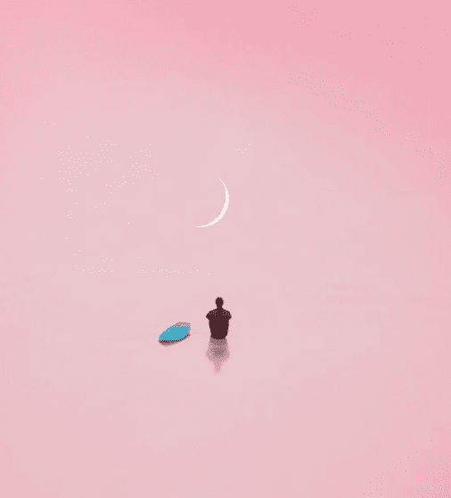
Here’s the piece I will recreate today: “Music of the Spheres”
I started this piece because I am gathering images to use in a talk I am giving at the Mobile Digital Arts and Creativity Summit (mDAC) in Palo Alto, California in a few weeks. The session is entitled “iColorama – Alternative Art Tool”, and will be discussing brushes and masking within iColorama. I would love to meet any readers of this column that are attending! Just follow the link above to sign up.
I have many images I’ve captured myself that might be appropriate for such a talk: buildings, flowers, animals, portraits. However, some of the backgrounds are too busy, or the subject is too far away. There are a number of problems with photos that make them unacceptable for creating quick artwork on the fly as you’re speaking. So it occurred to me that I might be able to use images captured by someone else.
This has its own pitfalls. People are rightly protective of their own work. They don’t want others to profit from their efforts, or ruin (in their eyes) the images they worked hard on. So I’m very sensitive to their wishes, and never want to simply grab images for use, even if they are not for commercial purposes.
There are a number of sites that offer free images under Creative Commons licenses. I realize that like any system, Creative Commons can be abused, with copyrighted work being taken and re-uploaded with CC licenses appended. Nevertheless, for my non-commercial purposes, these free images can be a wonderful resource. For my own peace of mind, I will try to give appropriate credit to the person whose images I use.
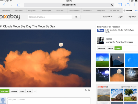
When I went to the free image site Pixabay, the first image that caught my eye is the one below by user jrperes. The image is not cluttered; there’s the sky, the moon, and some lovely clouds – a simple image that might be nice for masking or brushwork.
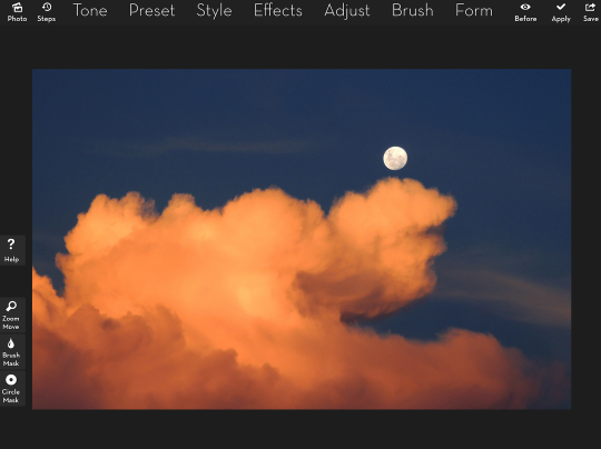
When I brought it into iColorama, I noticed the edges of the clouds, and how they were almost painterly already. I got distracted from actual brushwork and decided to see how the various painterly presets would treat the image.
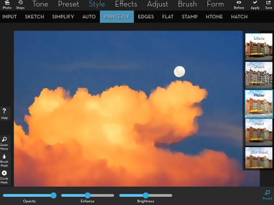
The first I tried was Watercolor. Nice, but not exactly the feeling I was trying to get at this point.
Below you will see detail of the Oilify preset. Nice layered look to the color.
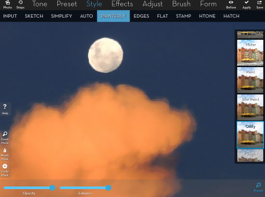
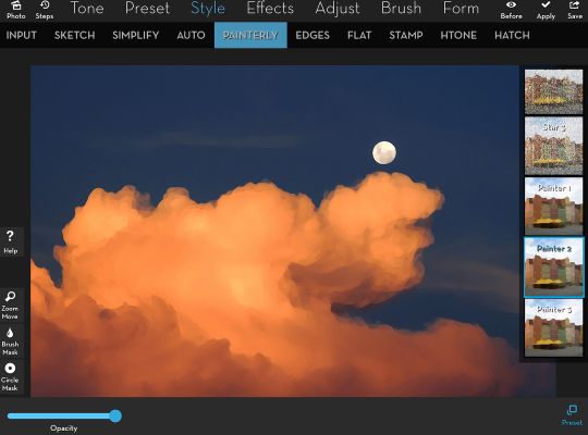
But I decided on my favorite Painterly setting: Painter 2. It’s much like Oilify, if just a little bit chunkier, as though painted with a larger brush.
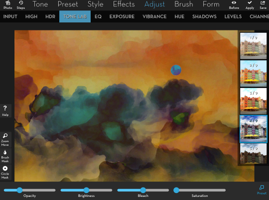
Well, as long as I was headed down another path, I thought I might see how I might modify that “painted’ image. I find the orange clouds beautiful in the photo, but a little too monochrome for a “painting”. Time to move on to another of my favorite settings: Adjust>Tone Lab>4. It raises the contrast and adds blues and greens to the image.
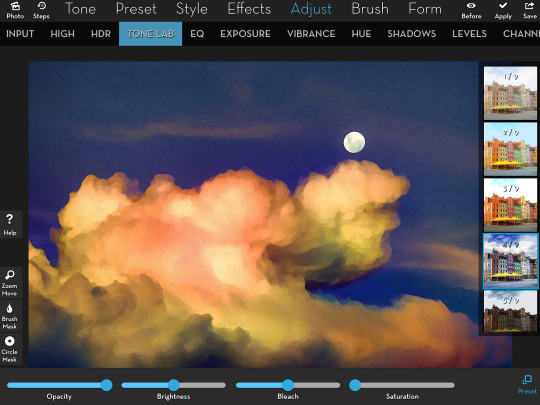
Tone Lab 4 can certainly be overdone, but the Opacity slider at the lower left will help me lessen the effect, as seen below.
That looks very nice, and it got me to thinking, how would I finish it off? Texture is usually towards the end of my workflow, so I thought, if I want to add a painterly texture, why not use one that exists right in the photo? So I saved the image, then brought it back in using Effects>Blend. I zoomed in on the texture to make the cloud cover the entire image, then flipped the new texture horizontally using the “Flip X” toggle at the bottom.
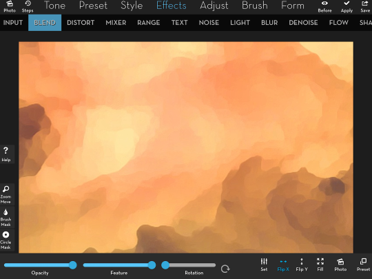
Now I needed to change the Blend mode from normal to something that was more appropriate for a texture. The first mode I tried, Overlay, saturated some of the colors. Unfortunately, it looked more like a stain to me, as seen below.
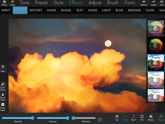
Would Lighten work? Not really.
How about Hard Light? That’s kind of interesting, but it still loses the clouds from the original image.
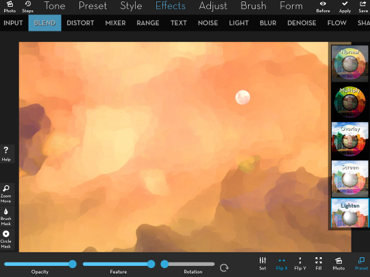
Sometimes you encounter a setting that takes you in a completely different direction. It was such an occasion when I tried Difference mode.
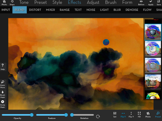
In order to make sure the interior of the clouds still had some definition and were not quite so black, I backed off on the Opacity of the Difference Blend to about 80%. You’ll see below that change in the Opacity slider allows more detail to be seen.
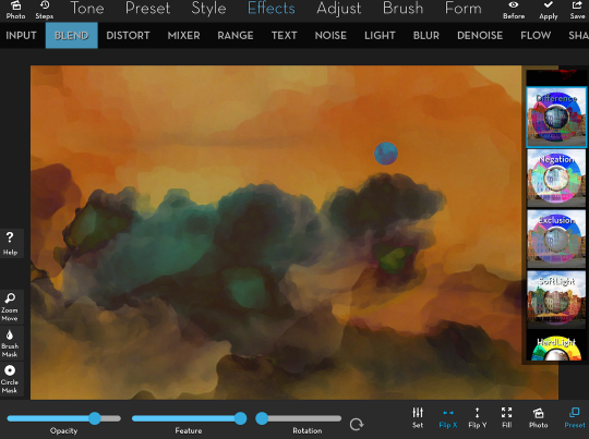
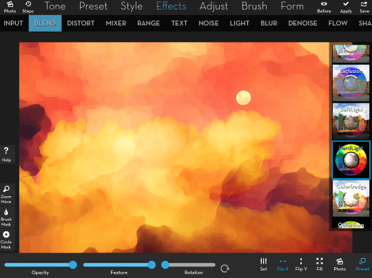
But it did lower the contrast, so another application of Tone Lab 4 at about 25% makes it pop.
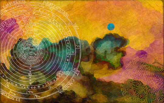
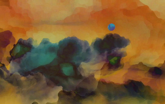
Below you’ll see the results to this point. When I saw it, the phrase “music of the spheres” popped into my head. What could I do to the image to really illustrate that title that I’d given it? Perhaps some sphere line art.
I Googled “spheres line art” and saw an image from Wikipedia for “celestial spheres” about 20 images down. I saved it and brought it into iColorama. My image is relatively dark, so I don’t want to have dark lines, as in this image – I would rather work with light lines.
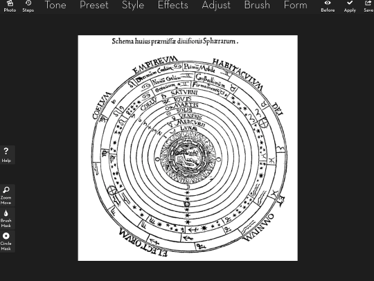
There is an Invert preset, although it’s not called that. You’ll find it in Adjust>Channels as preset 5. That inverts the image, swapping white for black and vice versa.
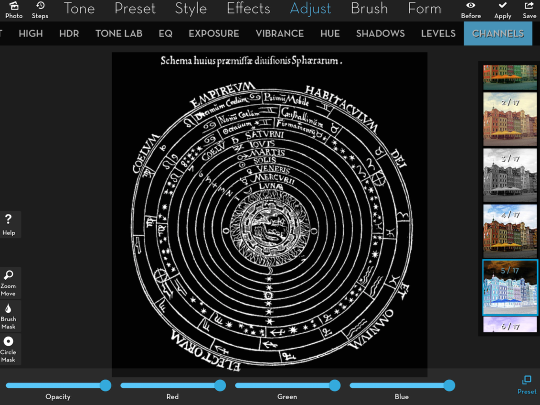
I saved the image and then reloaded my “music” image. I used Effects>Blend to load the celestial sphere image above the painted image.
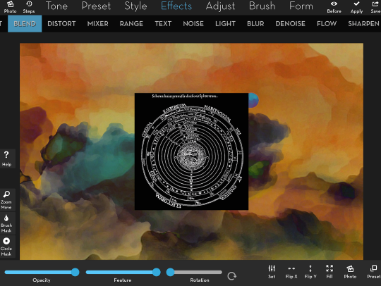
I wanted to drop out the black, leaving just the white lines. This is done with the Screen blend mode. I repositioned and resized the celestial sphere with a two-fingered pinch and drag, and lowered the opacity to about 75%.
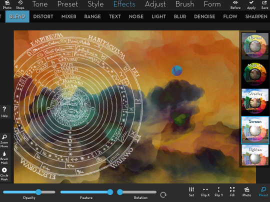
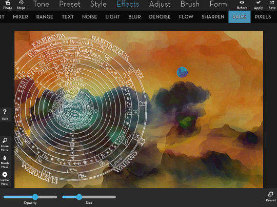
Now we’re getting somewhere – but the image doesn’t look painted. It looks a little flat. There is a preset, Effects>Raise>1, which gives a three-dimensional look to your image by “raising” the light parts and “lowering” the dark.

That effect is too intense for my taste, so I lower both the Size of the Raise and the Opacity of the effect using the sliders at the bottom of the screen.
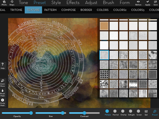
Some of the “painted” areas are too smooth for my taste. Time to break them up with some texture. The Preset>Texture menu selection defaults to Multiply mode. This mode, which drops out the lighter portion of the texture and keeps the dark, has a tendency to make the image too dark and too gray for me. Look at the image below, where the dark texture is added in Multiply mode, to see what I mean.
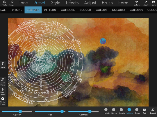
I prefer to add the texture in Soft Light mode. That darkens the areas where the texture is darkest, but lightens where the texture is light. So the overall image is not made darker – instead the contrast is raised. At the same time, the original colors are retained instead of being made gray. The same texture, added in Soft Light with the contrast setting raised, can be seen below.
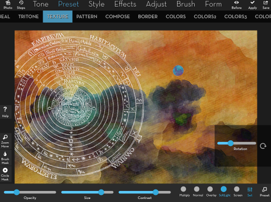
I decided to add another texture, and chose one with lines that would look as though the paper underlying the painting had some texture. (Quite frankly, I don’t recall which of the nearly 500 textures I used on the original “Music of the Spheres”, and so this is where the re-creation deviates from the original.)
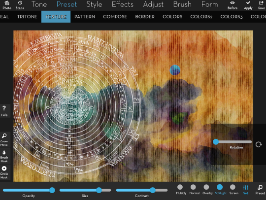
I didn’t want the lines to be straight vertical, so I moved the Rotation slider under the Settings for Texture (see the Set icon at the lower right is blue and therefore active). I also lowered the Opacity to below 20% so just a hint of the lines is added.
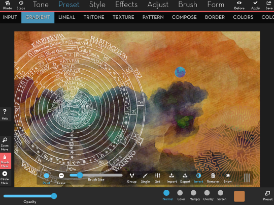
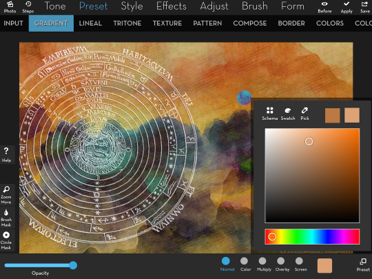
At this point I decided that the image was a little overbalanced, and needed something at the lower right. I could look for another piece of line art, but I know that there are some brushes within iColorama that can perform the same function. As I’ve shown you in earlier tutorials on iColorama, I can use a single dab of a brush to add a detailed brush shape, using Preset>Gradient to determine the color used. Below I’ve tapped Preset>Gradient, and the default white color is seen. I also tapped the Color thumbnail at the bottom, and tapped the Swatch icon at the top of the color picker. This will allow me to choose a color that already exists in the underlying image.
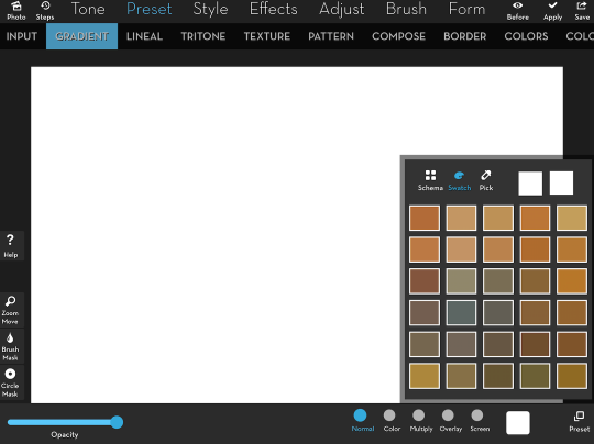
I choose the orange that is the first color of the second row in the swatch, and the entire image is covered with that color.

Brush masking defaults to brushing out an effect (in this instance, the color gradient). I want to brush the color in, so I tap the Brush Mask icon at the left and tap the Invert icon in the Mask toolbar that appears. I can now see the underlying image and will be able to brush in the color.
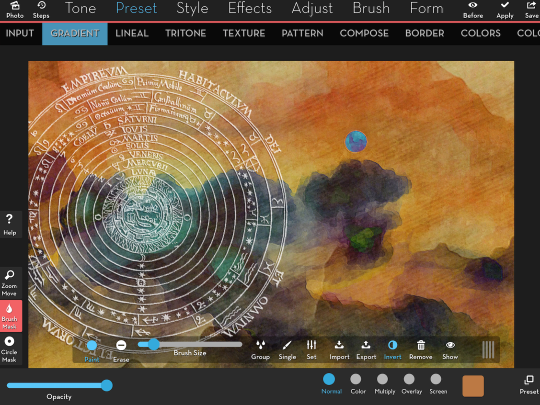
Now I’m going to choose my brush tip. In keeping with the theme, I look under the Brush Group and find the Maze group. I then tap the Single icon and choose Maze brush 9, a circular maze to imply a sphere.
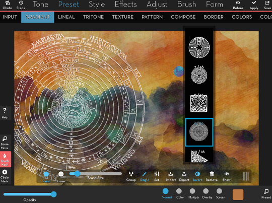
I raise the Size slider slightly and tap once in the lower right of the image, showing a maze-shaped piece of the orange color. If the size or placement is wrong, I can tap the Remove icon followed by the Invert icon to start over. But in this case, I’m happy with the size and placement – but not the color. There’s not enough contrast between the orange maze and the “painting”. It doesn’t stand out enough
That’s OK. I haven’t applied the masked Gradient yet, so I can go back and change the color. I tap the Color thumbnail, and tap the Swatch icon at the top to go back to the regular color picker. I drag the dot to a lighter, less saturated color in the large box. You can see the difference at the top right corner of the dialog box, where you can see both the old and the new color.
I happen to like a border – a way to draw the viewer’s eye into the image. Most of the time, I want just a hint of one. A vignette performs that function nicely. But in this case, I thought I’d use Preset>Border>19, since it offers a cracked texture as well. Borders 8-32 default to white, with a switch at the bottom that will change them to black.
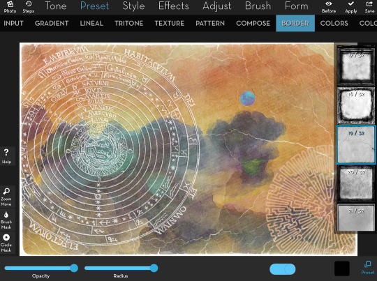
I flip the switch at the bottom to change it to black, and lower the Opacity to about 50%.
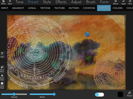
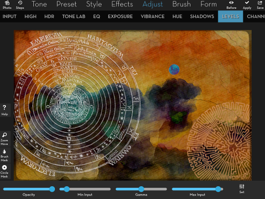
In order to up the contrast and intensify the colors, I do a final Adjust>Levels setting, moving both the Min Input and Max Input sliders.
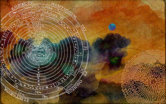
And here’s the final image. It’s darker than the original, and used different textures, but it’s a close approximation. When you’re in the midst of creating digital art, it can be difficult to recreate an image exactly, just as it can be difficult to recreate a pencil or brush stroke in analog art.
I hope that my procedurals help you in creating more beautiful art than this on your phone or tablet. I also hope that you take away from this article the concept that there are image resources that are available to you online to help you create, but you should be VERY CAREFUL to make sure you are not using images you have no right to use. Enjoy!
Jerry Jobe
Never content with just scratching the surface of what an app can do, Jerry Jobe decided to pass on what he learned about imaging apps to others. He’s constantly trying to figure out just what tools other artists have used, and trying to incorporate them into his own work, in an attempt to find his style. He’s written tutorials on over 145 apps so far, which you can find (along with his Song of the Day entries) at http://enthusiasmnoted.wordpress.com/ He lives near Atlanta, Georgia, where he also finds a creative outlet in acting and directing in community theater.
2 Comments
AlanH
Thank you so much, Jerry, for this procedural…I love this sort of thing. IMO iColorama is a very powerful app that I use, maybe, 20% of its capability. It’s nice to see the thinking and how someone else works within this app. I’ve enjoyed your other iColorama tutorials and training, too! Keep ’em coming…
Pingback: