iOS Mobile Photography App Tutorial – Artista Impresso by Jerry Jobe
We are delighted to publish this very interesting tutorial of the new app by JixiPix Software called Artista Impresso. Over to you Jerry. (Foreword by Joanne Carter).
Artista Impresso retails for $2.99/£1.99 and you can pick it up here
“JixiPix Software is always coming up with new art-based photo manipulation apps. They’ve worked with oils with their Artista Oil; water with Artista Haiku and Aquarella; Japanese woodblock with Moku Hanga; pencils with Artista Sketch; even half-tone printing with PopDot.
Their new product, Artista Impresso, is less about the medium than the method. Impressionism is more about the feeling of movement and changing light than it is about the tools used. So it’s made with many short, rough strokes that literally give an impression of the subject.
As with most JixiPix products, there are separate apps for the iPhone and iPad, and should be bought separately. Many times I will buy the iPhone version and install it on both. In this case, I bought the iPad “HD” version alone, as I cannot see the detail on the iPhone”.
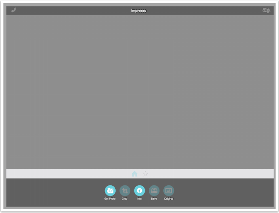
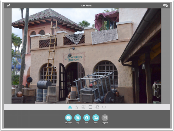
Impresso uses the “new” JixiPix user interface, which is a combination of blues and grays. If you want to compare it to apps I’ve covered, it’s like the interface for Hallow’s Eve, not the one for Grungetastic. At the top are an arrow (Undo) and a pair of dice (Random). At the bottom are buttons for Get Photo, Crop, Info, Save and Original.
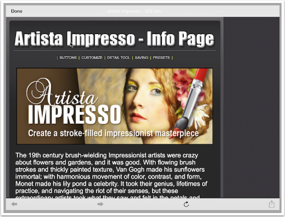
The Info button, as with all JixiPix apps, takes you to a browser window pointed to their help file for the current product. I understand that this allows them to update their help files on the fly, which is a timely and efficient method, but I don’t want to need an internet connection to access help.
Once you load an image (or take one, as I’ve often recommended you NOT do), you are directly taken to the Preset workspace, with an effect loaded. This will be the first time you encounter what I consider a slight problem with the app: the image renders every time a slider is moved, a preset is chosen, a palette, a paper – every time you touch the screen the image is rendered. It’s not an instantaneous render, either.
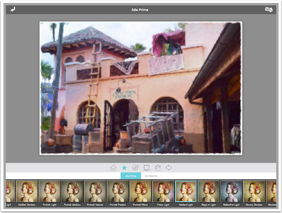
The presets are divided into two sets of twenty each. Alla Prima (“at first attempt”) emulates a method of painting wet-on-wet. In other words, it is as if the lower strokes have not dried when more stokes are painted on top. This will allow for more blending of strokes.
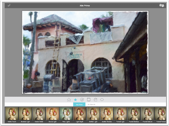
The presets are scrollable horizontally. In the screenshot below I’ve selected the Prism Light preset.
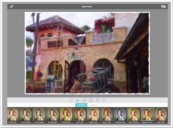
The Strokes of Color preset gives a slight color variation to each stroke.
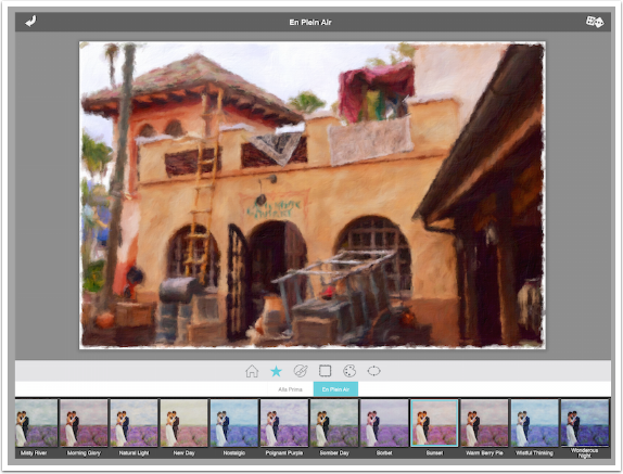
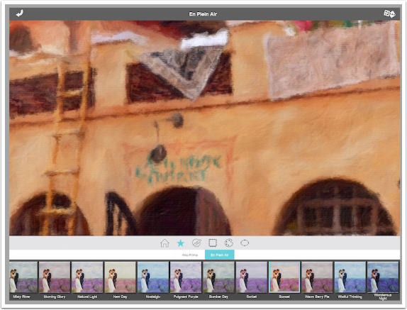
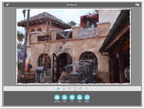
The other group of presets is En Plein Air (“in the open air”). It also describes a rapid method of capture, capturing the moment rather than setting the light precisely within a studio. In other words, it’s a “snapshot” method of painting. Below is the Sunset preset.
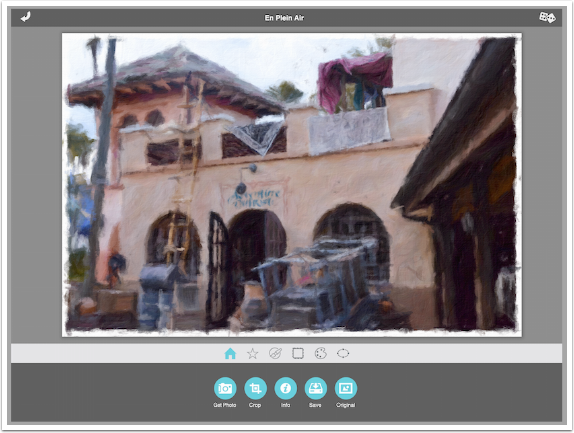
At any time you can use a two-fingered pinch to zoom into the image to see the detail of the strokes.
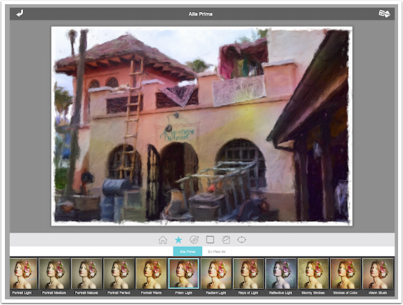
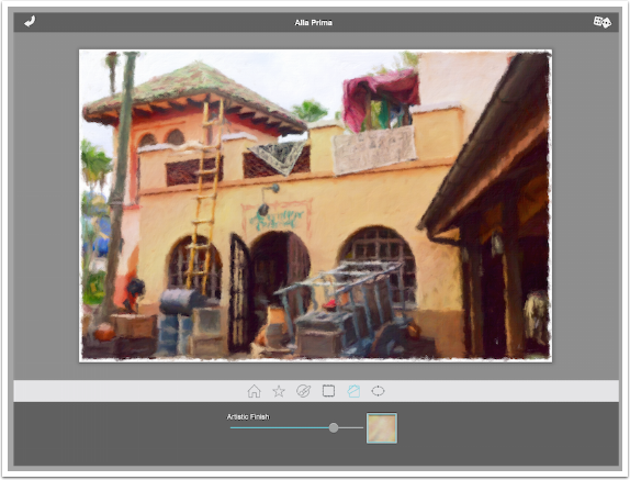
I return to the Radiant Light preset under Alla Prima to continue. Each preset (the preset workspace is indicated by the star in the menu bar below the image) can be tweaked using the other options in the menu bar.
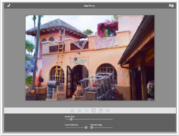
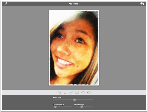
The next set of options, indicated by a brush in a circle, gives you overall brush control. The first slider is the Brush Size, which currently is at its largest.

Moving the Brush Size slider all the way to the left reduces the brush size, which allows more detail to be shown. Notice how the barrels and boxes at the bottom of the ladder can now be seen to be barrels and boxes.
The Color Enhance slider is a saturation slider. In this preset it’s already set at its highest value.
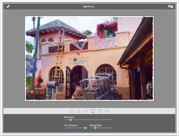
The Painted Edge slider, moved to the right, leaves a hefty amount of white space around your image. The edge cuts into the image, so elements near the edge will be lost.
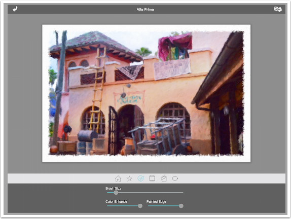
Moving the Painted Edge slider to the left will get rid of the white edge entirely.
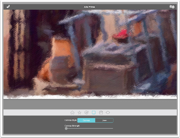
The next set of options, indicated by the frayed square, are the Canvas options. You can choose between Canvas and Linen, and adjust the “depth” of the canvas with the Canvas Strength slider.
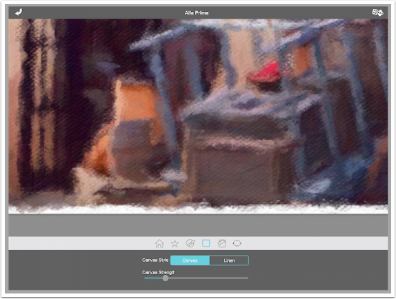
Below is the Linen setting. Even at a low Strength, the texture change between Canvas and Linen is obvious.

Moving the Canvas Strength to the right adds a significant amount of texture.

But moving it all the way to the left will not remove the canvas texture entirely, since the canvas texture is an integral part of how the strokes are applied.
The next set of options changes, depending on whether you are using the Alla Prima or En Plein Air presets. Alla Prima has a set of washes, called Artistic Finishes, along with a slider that controls the strength of the finish.
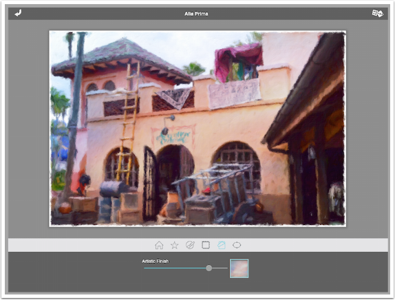
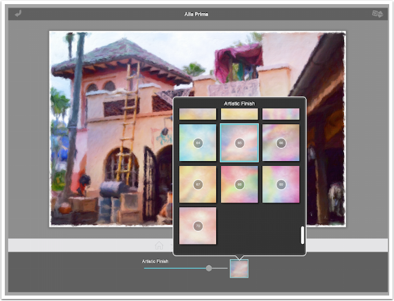
Tapping the thumbnail brings up a scrollable window of thumbnails of the various finishes. These washes cannot be rotated. Finish #2, shown below, will always have the darker blue at the bottom of the image. Washes will be stretched for landscape and portrait orientations.
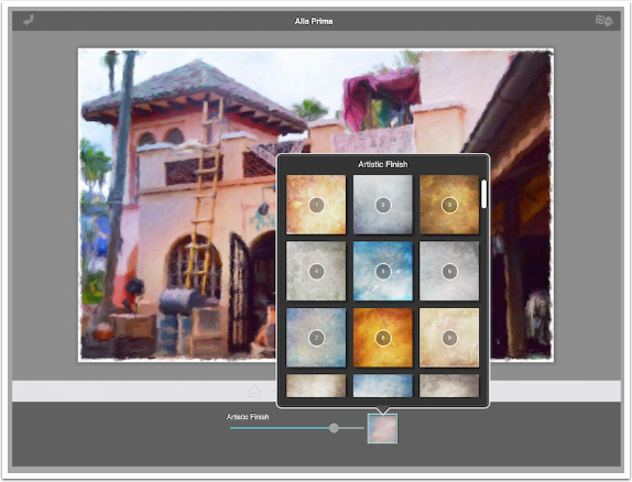
There are seventy different washes, so there is a lot of flexibility built into Impresso.
Choosing a dark Finish with definitely darken your painting, so take care!
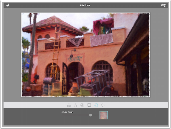
Below I’ve chosen a neutral finish to slightly warm my painting.
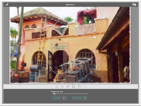
The last option is Detail, which allows you to apply greater detail (smaller brush size) to oval-shaped areas of your image. One oval is automatically added to your image. You can place the oval by dragging the center dot, and shape the oval using the dots on the sides of the oval. Remember, every time you move or shape an oval, the entire image is rendered again!
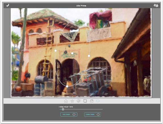
Tapping Add Detail will provide another oval to place and shape (thereby causing multiple renderings). You can really tell the difference the detail ovals made by comparing the roughness of the cart outside the ovals to the portion within.
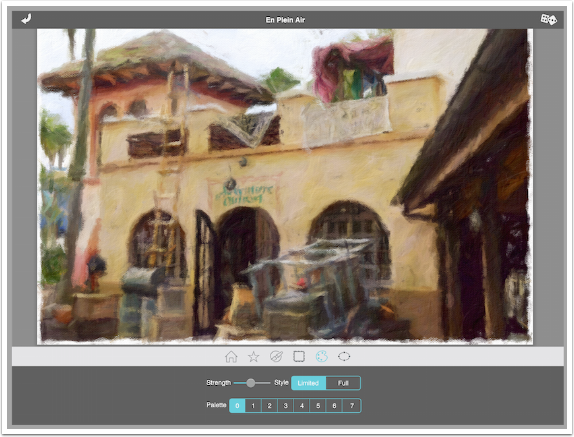
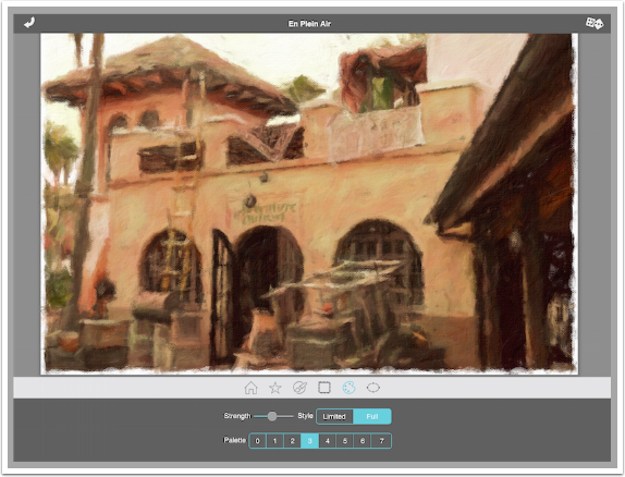
As I said above, En Plein Air presets do not use washes/finishes. Instead they include modification to the color palette. You’ll see below that there are eight palette modifications numbered zero to seven, with no indications on how the palette is modified. There’s a strength slider, and there’s a switch to indicate Limited or Full use of the palette change.
Palette 3 makes the image very yellow, as seen below.
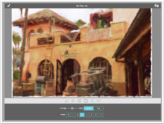
Palette 3 did not make the blue at the left center edge of the image yellow. That is due to the Limited function. Below I’ve switched it to Full and everything is turned yellow.
Changing the palette will make drastic changes, as seen below. Unfortunately, they are unpredictable changes, and the image is re-rendered each time the palette is changed.

At any time you can return to the Home workspace and hold sown the Original button to compare your changes from the original photo.
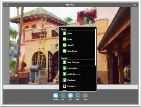
The Save button in the Home workspace offers many options to save you image and send it to social media. It also allows you to save the tweaks you made as a new preset. Saved presets will not include Detail ovals.
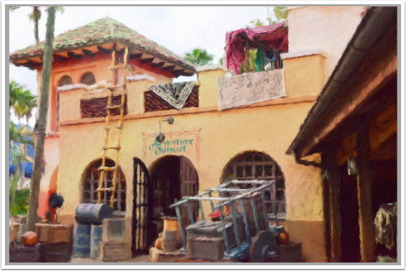
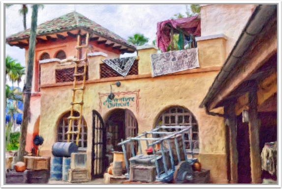
And here is my painting.
The randomizer chooses a preset at random and does further tweaks. It can give you some great ideas, if you’re willing to wait the 8-10 seconds for the image to render!
And a second hit of the Randomizer got me the image below.
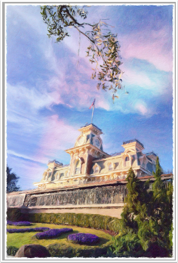
I find that I get the most pleasing results in my eyes when I blend the Impresso version back with the original. That’s what I did with the image below, and I like it.
I also blended the following image back with the original in Lighten mode. That allowed me to see much more detail in the railing across the front.
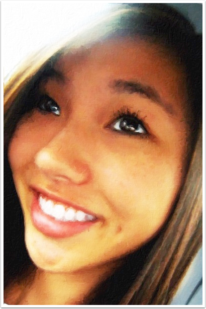
Impresso works well with portraits also. Below is one straight out of Impresso with no blending.

When working with portraits, sometimes the rough strokes of impressionism will leave dark blotches in unfortunate places. Notice the grayish blotch on my daughter’s chin.

It’s a quick fix: just change the Brush size slightly and the blemish disappears, as shown below.
To finish that image, I combined it with two other images. The left eye was taken from an Artista Oil version, and the hair from a Portrait Painter version. Both are JixiPix apps.
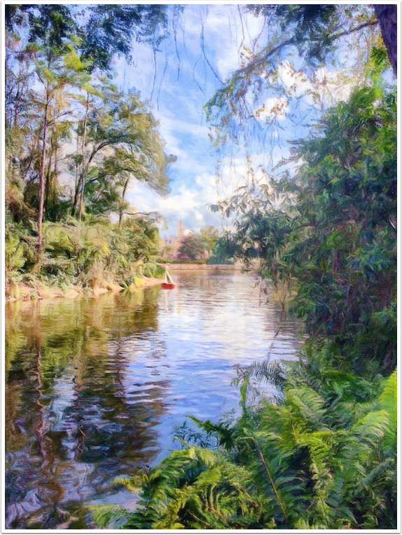
I’ll leave you with another blended-with-the-original landscape. After blending I took it into iColorama for Raise and sharpening.
I think I get some really lovely results from Impresso, especially when using the results in blending. The drawbacks are pretty significant: two apps, at $2.99 each, if you want it to run as intended on both your iPhone and iPad; palettes identified by number so you have no prior knowledge of what the change will do; and, worst of all, an 8-10 second rendering every time any control is changed.
These drawbacks keep Impresso from being a great app that I can use on a daily basis, but doesn’t pull it back to the level of the AutoPainter series, which combines the long rendering times with less control. Give either the iPad or iPhone version a try, and let me know what you think! Until next time, enjoy!
Jerry Jobe
Never content with just scratching the surface of what an app can do, Jerry Jobe decided to pass on what he learned about imaging apps to others. He’s constantly trying to figure out just what tools other artists have used, and trying to incorporate them into his own work, in an attempt to find his style. He’s written tutorials on over 145 apps so far, which you can find (along with his Song of the Day entries) at http://enthusiasmnoted.wordpress.com/ He lives near Atlanta, Georgia, where he also finds a creative outlet in acting and directing in community theater.
4 Comments
Jennifer
Great tutorial (as usual!) and especially love the last landscape image. Just wondering what app you’re using for blending your images?
Carol
I loved the sailboat picture too. I also wondered which blending program you used.
I love your tutorials and appreciate that you share your creativity.
Nadia
Great tutorial as always from Jerry. Thx
Steve
The app is now 99 cents and it appears at least for me that the app is universal for both Iphone and Ipad.