iOS Photography App Tutorial – Union – by Jerry Jobe
We are delighted to publish our latest iOS photography app tutorial, this time with the very successful app Union by Pixite. Jerry Jobe has written Part 1 of this wonderful blending app to help you gain greater control via the user interface. Over to you Jerry (forward by Joanne Carter).
“I’m a huge fan of the apps by Pixite. Last year around this time, I published articles on Tangent (see here), LoryStripes (see here) and Fragment (see here), followed later in the year by the brand-new Matter (see here). I even covered the app developed by Ben Guerrette pre-Pixite: DecoSketch (see here). So, naturally, I was excited when Pixite introduced two other apps in 2014: Union and Shift. I’ll be covering both of them in the weeks to come.
Union is Pixite’s blending app, working the same ground as Image Blender and Superimpose. I’ve covered both of those apps, along with the Blend feature in iColorama. I’ve given basic information on blending several times, including the use of blend modes like Multiply and Overlay. I won’t be repeating that information here. Instead, we’ll see if the user interface is more conducive to your workflow, and if the controls available are flexible enough for the work you want Union to do”.

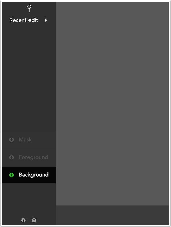
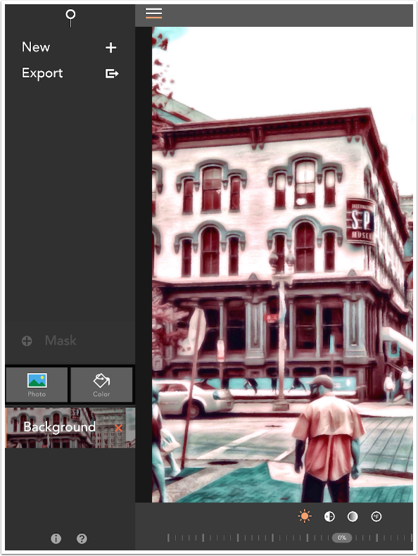
The interface shown when the app is entered is very clean. As you can see below, you are given the option of restoring the most recent edit session by tapping Recent edit at the top left. This will restore the Background, Foreground and Mask of that session. Alternatively, you can start a new session by establishing the background. At the bottom left are two buttons, Information and Help.
The “Information” is very basic. It swoops in from the right, so you return to the main menu by swiping it back to the right.
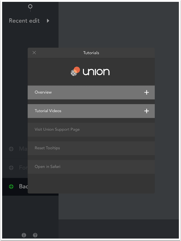
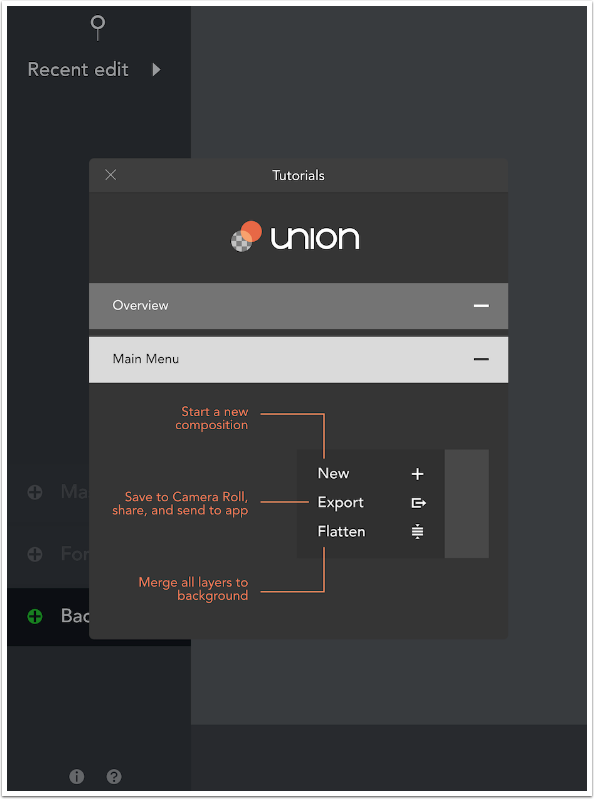
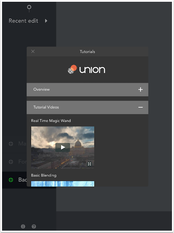
The help is a tad more robust than that in other Pixite apps. The first two options, Overview and Tutorial Videos, are drop-downs that show more information.
The Overview is divided into four sections: Main Menu, Background, Foreground and Mask.
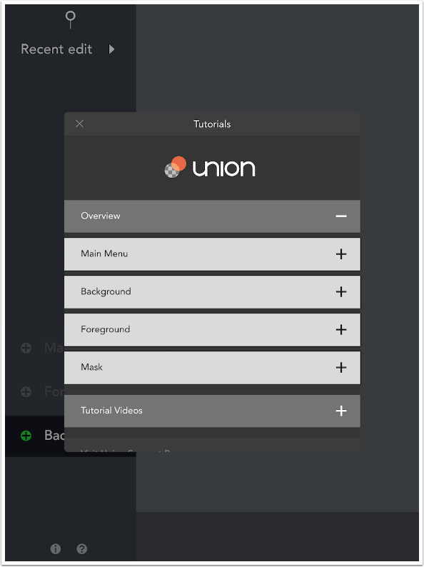
Each of these sections are a scrollable basic description of the controls in that portion of the app. Below you’ll see the first part of the instructions for the Main Menu.
There are five video tutorials available. Each run under 90 seconds, and have no explanatory spoken soundtrack. While these are an improvement over the lack of videos in other Pixite apps, they are of the type that can be hard to follow: you need to know what they’re up to before you can make sense of the steps they take to get there.
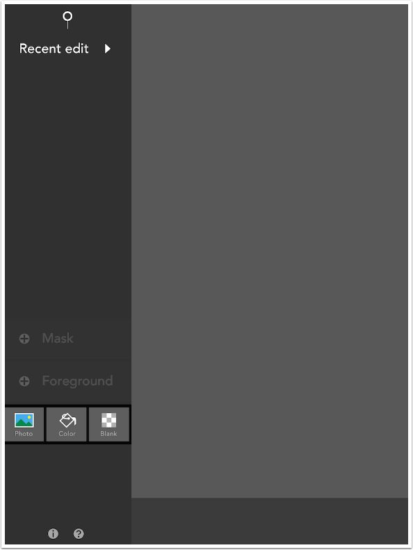
As described above, you start a project by choosing the background. Tapping Background on the Main Menu gives you three choices: Photo, Color and Blank. Discussion of the Color and Blank options will be in Part 2 of the tutorial. Today I am loading a photo.
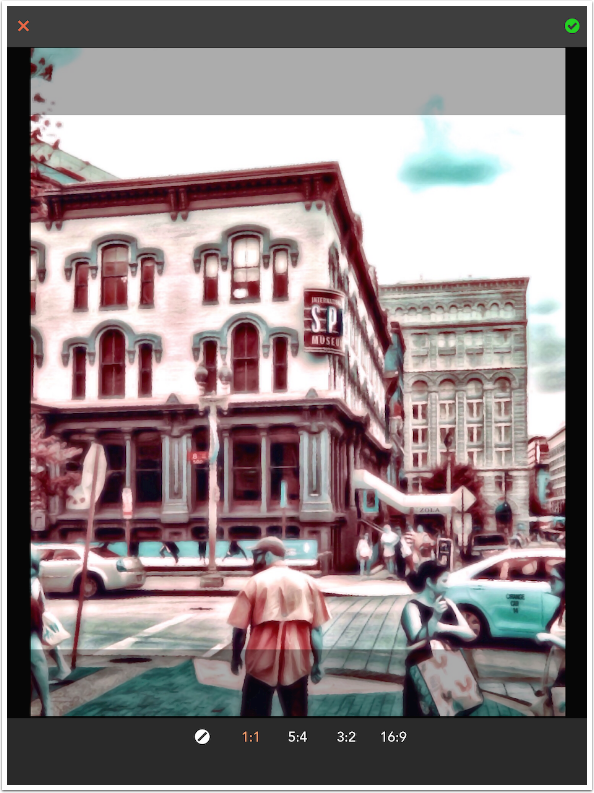
When loading the background you are given the opportunity to crop the image. You must choose either the original ratio or one of the standard ratios listed. You do not have the capability for a custom crop ratio (such as the 8:3 ratio of a Facebook cover photo). Tapping the green check mark at the upper right confirms your choice of crop.
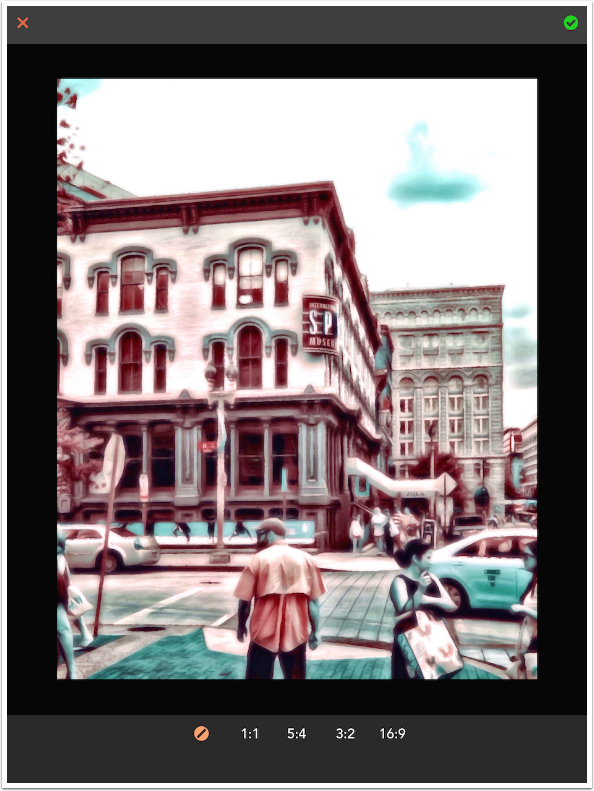
If you do choose to crop the image, transparent bands appear and you can use a two-fingered pinch to fit your image within the crop box. Below is a square crop. If you use a rectangular crop (for instance 5:4), a button will appear at the top center to allow you to change the crop from landscape to portrait (4:5).
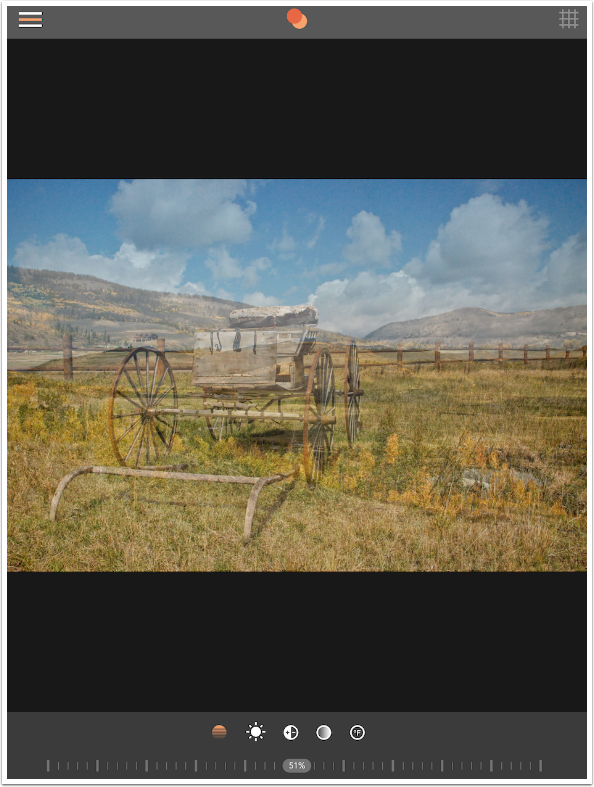
Once the background is loaded, four controls and a slider appear at the bottom of the screen. From left to right they are Brightness, Contrast, Saturation and Temperature. The slider works for whichever control is active. In the screenshot below, Brightness is active. If I made it a negative value, the background image would become darker; if positive, brighter. I do not change any of the values at the present time. If I wish, I can always come back to the background and adjust it later.
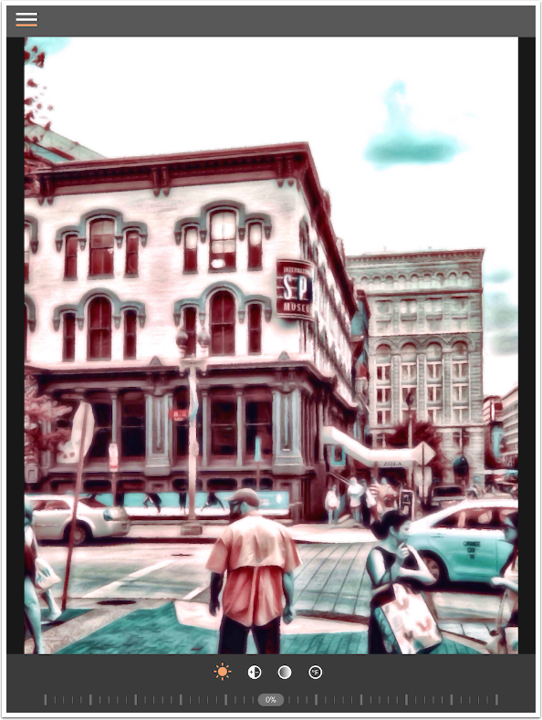
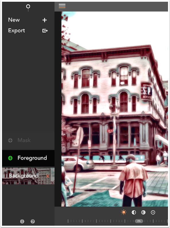
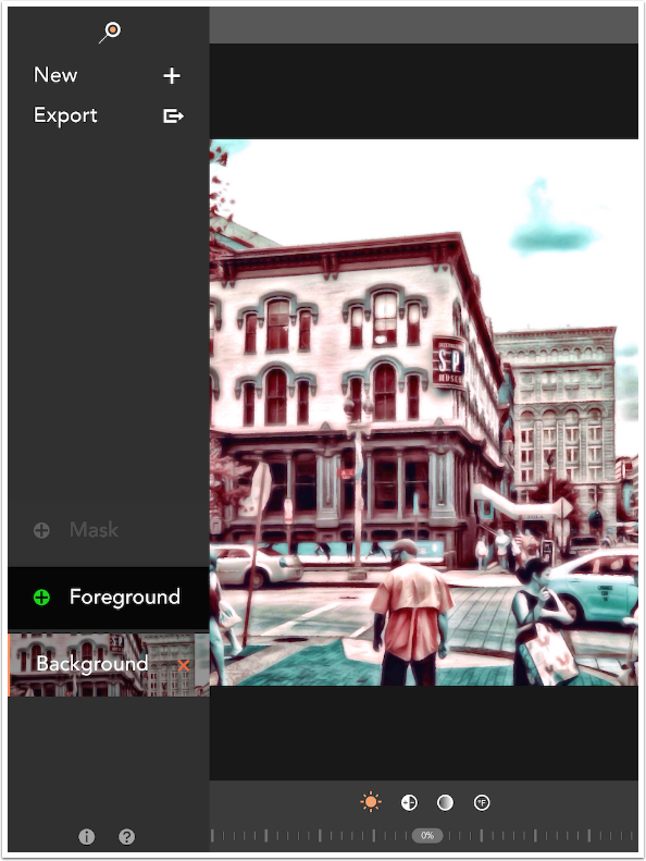
The three lines at the upper left of the workspaces perform two functions. As a button, they take you back to the main menu. As an indicator, they tell you which portion of the project you are working on. From the top to bottom, the lines are Mask, Foreground and Background. When the bottom line is orange, as it is in the example, the background is active.
Tapping the three lines brings the main menu in from the left, shoving the image to the right. If you prefer to always work with the main menu showing, you can do that. Just flip the switch at the top left that looks like a magnifying glass.
When the switch is active, the workspace is squeezed into the right side of the page. Choosing another menu option, like Foreground or Mask, does not make the menu disappear.
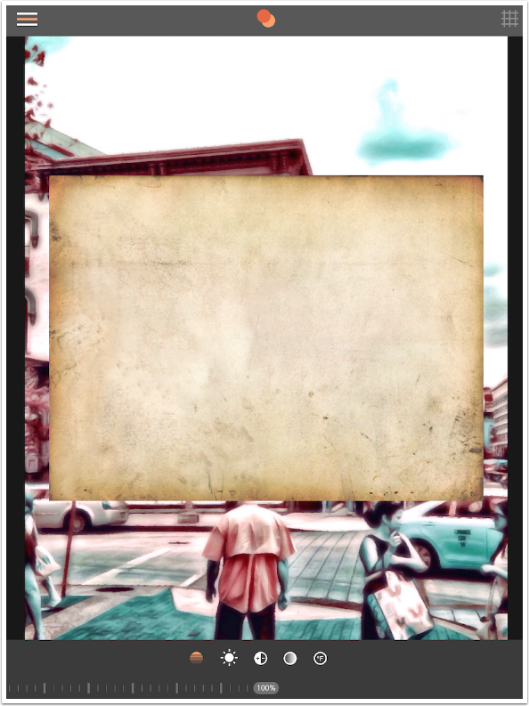
I prefer to have the workspace take as much of the screen as possible, and do mot mind the extra tap to bring up the main menu each time, so I leave that switch off. Below you’ll see that tapping Foreground on the main menu gives two options for the source of the foreground: Photo and Color. (Obviously, a blank foreground does nothing.) Once again, I am choosing a photo.
I chose a texture, since blending textures is a common task for a blending app. As you can see below, the texture is in landscape mode while the background is in portrait mode. There is no control that allows you to flip or rotate the foreground in exact increments. Fitting the foreground to the background is a manual process, accomplished with a two-finger pinch. This can be assisted by tapping the crosshatch at the upper right, which will snap the foreground to a grid.
In addition to the four controls that are the same as the background controls, there is an opacity control. In the screenshot below, I have rotated the texture and kept the opacity at 100%.
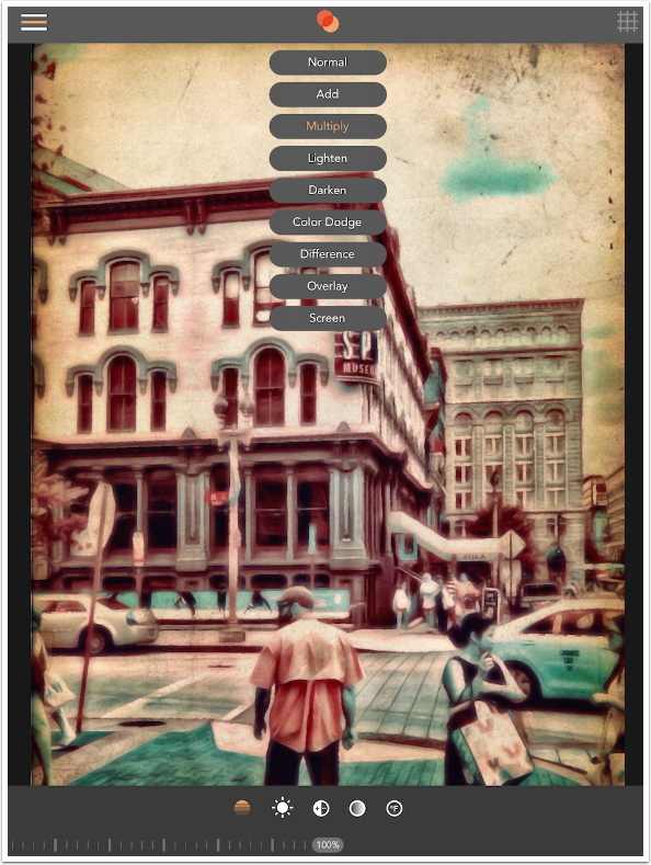
Tapping the double circle at the top center brings up the blending modes list. It’s rather an odd choice of modes – very limiting. Add, but not Subtract. Color Dodge, but not Color Burn. No Luminosity or Color. However, I find that most of my blending is done with Multiply, Screen, Overlay or Difference, so it’s not a tremendous issue. I chose Multiply here.
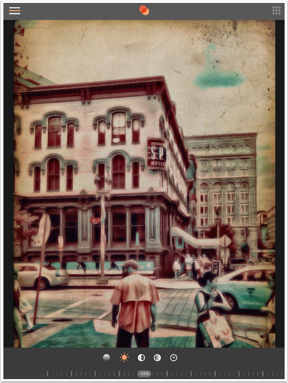
I wanted to make the texture a tad darker, so I chose the Brightness button and moved the slider to -19%.
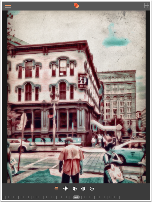
Using the Contrast control, I upped the contrast to bring out the grungy elements of the texture. It was too yellow, so I also chose Saturation and moved it to a negative value to desaturate it. Below, you’ll see I lowered the opacity to 66% to make it more subtle.
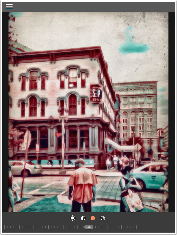
As I said above, you can always go back to the background and change values. The texture took some of the saturation out of the background, so I upped it to 34%.
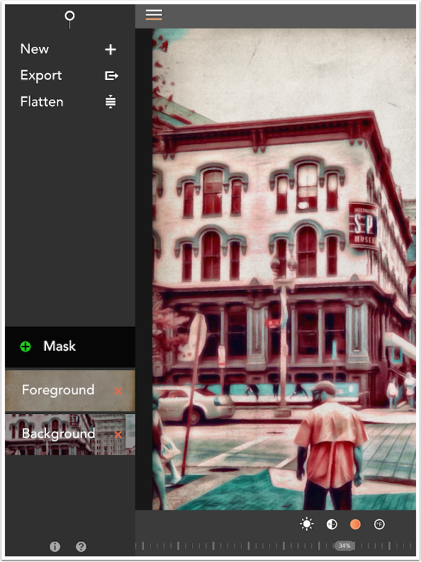
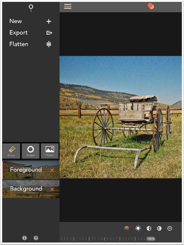
That’s all I wanted to do with this image, so I returned to the main menu to save the image using Export. You will see that there is also a Flatten button. This commits a change, adding the Foreground to the Background layer, and making it impossible to adjust that change. A new Foreground can then be added – a texture, an image, or a color.
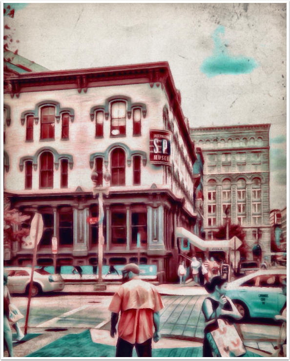
Below you’ll see the Export menu and the various options available. I save the image to the Camera Roll.
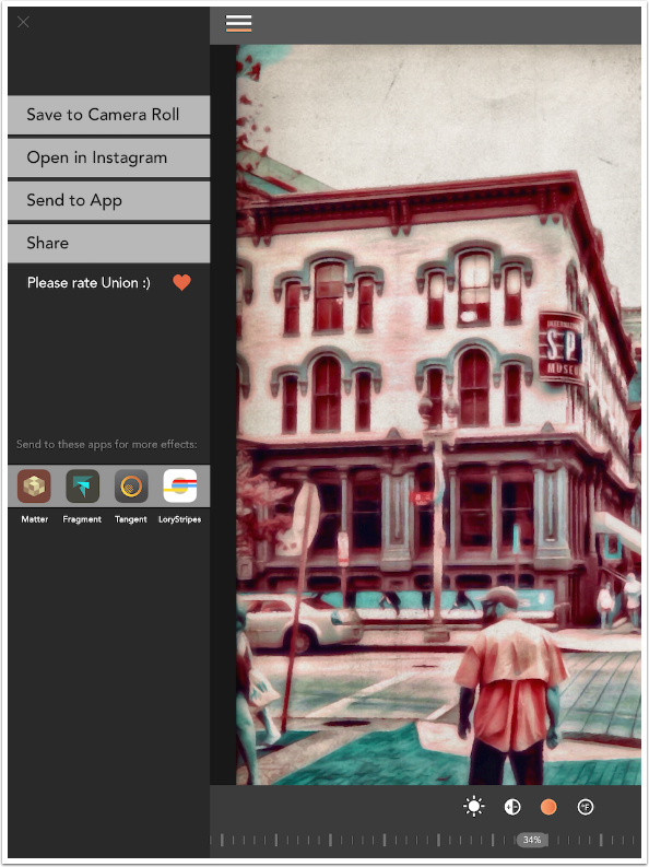
And here it is!
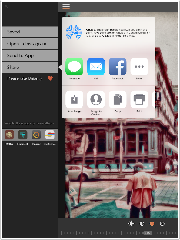
The other export options use standard iOS dialog boxes. Below you’ll see the one for Share.
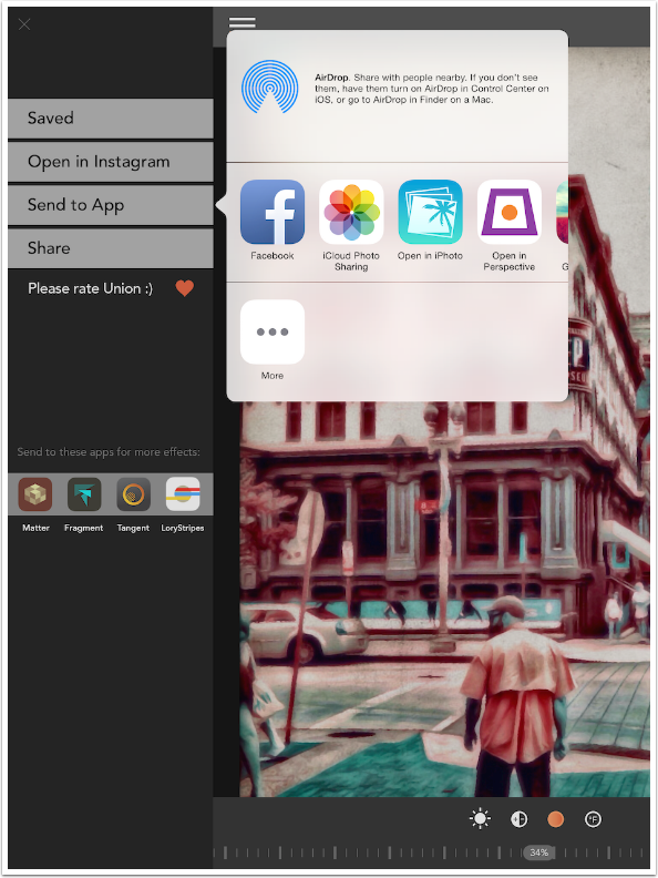
Next is the dialog box for Send to App.
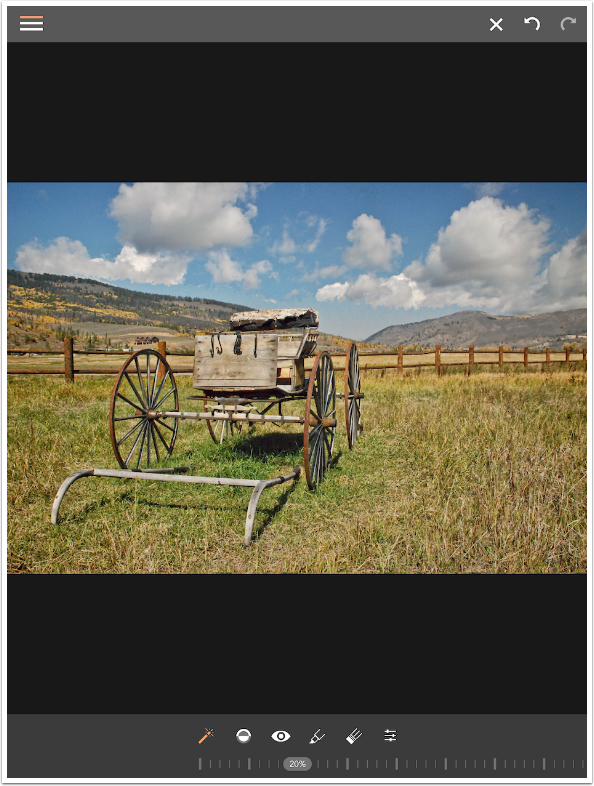
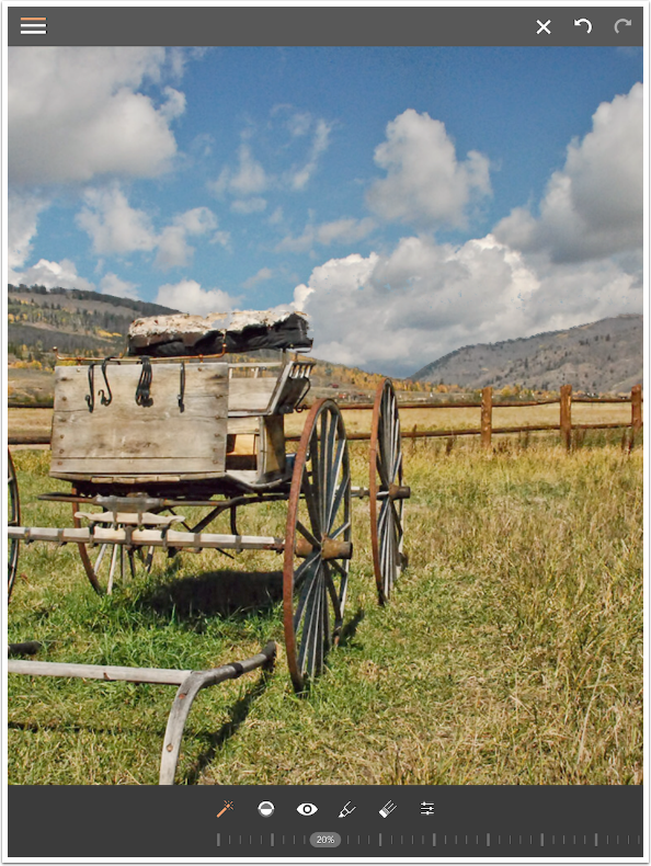
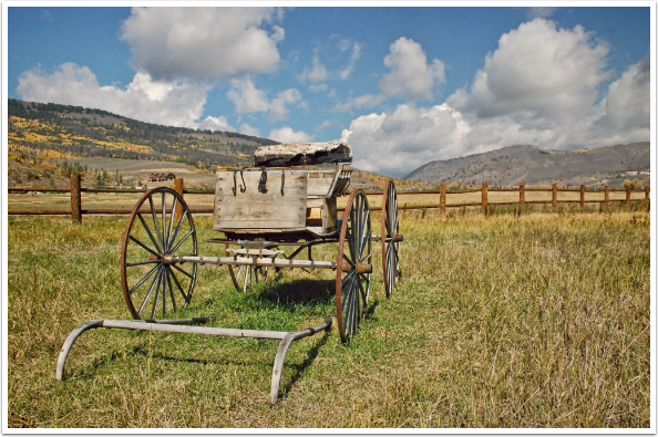
Another often-used function for a blending app is to replace a boring sky. Below I’ve used a mountain view with nice puffy clouds as my background. The image with the buckboard and the cloudless sky is my foreground. I’ve reduced the opacity of the foreground while placing it to make sure the boring sky will be completely replaced by clouds – I don’t want to have any stray mountains peeking through. After placing, I increased the opacity back to 100%.
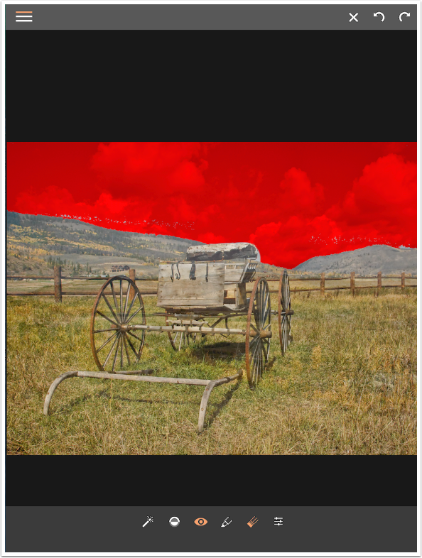
In order to hide the boring sky, I need to mask it out. I tap the three lines to return to the main menu to select Mask, and choose the Erase option.
While in masking mode, the position of the foreground is locked. You don’t need to worry that an accidental touch of the screen will move your carefully-placed foreground.
The tools available for masking are, in order from the left, Magic Wand, Invert, Show, Restore, Erase, and Brush Settings. Since the boring sky is pretty much one color, I’m going to start with the Magic Wand. I tap on the sky and it is masked out. Voila!
Upon closer inspection, however, part of the old sky remains. The slider at the bottom controls the threshold of the Magic Wand. A larger value means a wider range of colors will be masked. When I raise the Threshold from 20% to 23%, the mountain starts to be masked out as well.
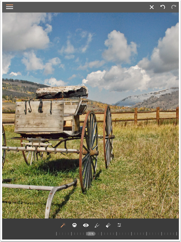
I return the Threshold to 20% and tap on the remaining sky instead. This is a better result, but now there are gaps in the back of the buckboard seat. At this point, it’s time to do some brushwork.
Using Show at this point (the eye icon) makes it obvious where the masking is imperfect. There are blue dots in the field of red along the top of the mountains, and there’s a large piece at the end of the buckboard seat. A two-fingered pinch zooms into the areas and moves the image around within the workspace.
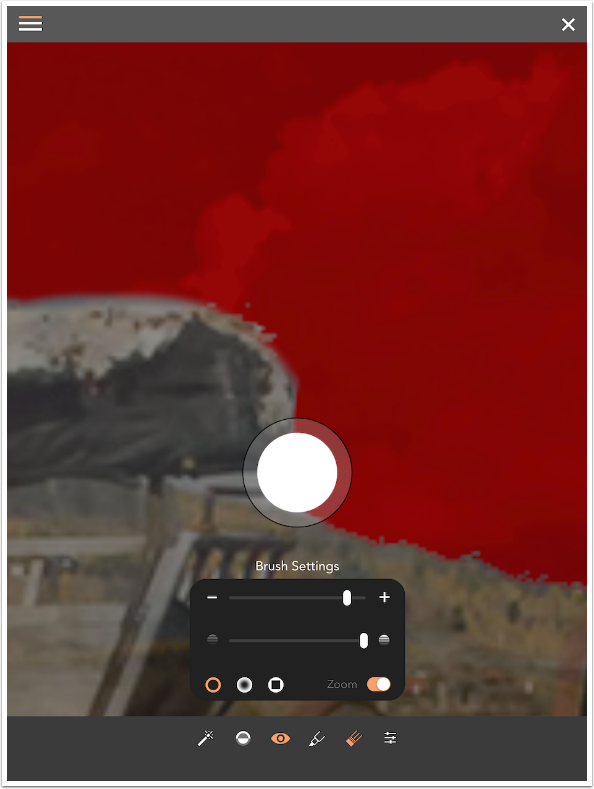
Below I’ve brought up the Brush settings while using the Eraser tool to add to the masked area (the red). The top slider is brush size. The next slider is brush opacity. Along the bottom are brush tips: normal, soft-edged, and square. The Zoom button comes into play when the brush size is smaller than about 50%.
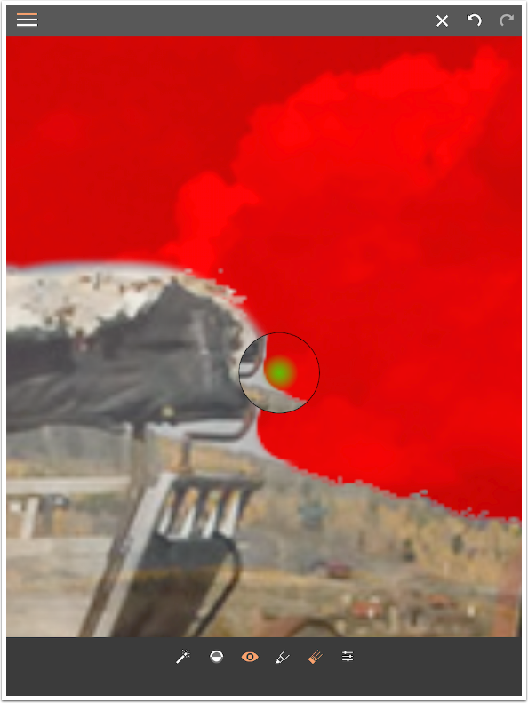
When the brush size is smaller than 50%, it can be difficult to see what you are masking under your finger or stylus. With the Zoom button on, a loupe appears above where you are brushing, as shown below. This can get confusing, as some other apps have the loupe appear where the brush is active, while your finger is displaced from the area. In this case, what appears in the loupe is what is under your finger. It can take some adjustment, but it’s a perfectly fine way of implementing this necessary function.
When I finish the mask, I save the result. Looks good!
Next time, we’ll look at some of the more esoteric features of Union: color layers, blank backgrounds, and masks made from shapes and photos. Until then, enjoy!
Please Support Us…
TheAppWhisperer has always had a dual mission: to promote the most talented mobile artists of the day and to support ambitious, inquisitive viewers the world over.
As the years passTheAppWhisperer has gained readers and viewers and found new venues for that exchange. All this work thrives with the support of our community.
Please consider making a donation to TheAppWhisperer as this New Year commences because your support helps protect our independence and it means we can keep delivering the promotion of mobile artists that’s open for everyone around the world.
Every contribution, however big or small, is so valuable for our future.
Jerry Jobe
Never content with just scratching the surface of what an app can do, Jerry Jobe decided to pass on what he learned about imaging apps to others. He’s constantly trying to figure out just what tools other artists have used, and trying to incorporate them into his own work, in an attempt to find his style. He’s written tutorials on over 145 apps so far, which you can find (along with his Song of the Day entries) at http://enthusiasmnoted.wordpress.com/ He lives near Atlanta, Georgia, where he also finds a creative outlet in acting and directing in community theater.

5 Comments
Pingback:
Alfredo Martez
Hi! Question: On Foregrounds I was zooming out on the image to get a better look at it, but then some how the image disappeared while doing that. How do you retrieve the image the back into frame?
Thanks
Jerry Jobe
Sounds like you may have pinched it until it disappeared. If you immediately hit the undo button, it should be restored. If you want to zoom in or out, you have to change to the Background first.
Pingback:
Wes Boyce
I see this is an old document and I believe the app has changed quite a bit since then including a big increase in price. I’m on the free trial and need basic info on bringing photos into the app when I need them. I have one in the gallery and can’t bring a second one in. You have interesting instruction and will explore your website for more info! Thanks.