Mobile Photography App Tutorial – Chalkspiration and Fold Defy: Decent Solutions for Obscure Needs
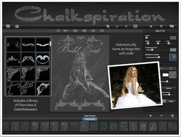
If I had a nickel for every time I thought, “Boy, this image would look great if I could put it on folded paper” or “Look at the neat art on that restaurant chalkboard! Wonder if I could do that on my iPad?”, then I probably would still be penniless. I certainly wouldn’t have enough to pay for these two apps from Jixipix, Chalkspiration and Fold Defy. (Both are available in normal iPhone and HD iPad versions. They are not universal and require separate purchase.)
Let’s face it – they’re not horribly done (although Chalkspiration did crash on me). Jixipix does not release horrible apps. For someone like me, who looks forward to their apps and owns all of them, these two are particularly…well, useless.
Perhaps you have a need for creases or chalky flourishes. So let’s take a look at the apps and how you manoeuvre in them, starting with Chalkspiration.
Chalkspiration
This app turns the edges of your image into chalk lines, and also allows you to add flourishes and text. That’s pretty much it. The conversion to a chalk drawing is fairly static, and you can’t erase parts of your image.
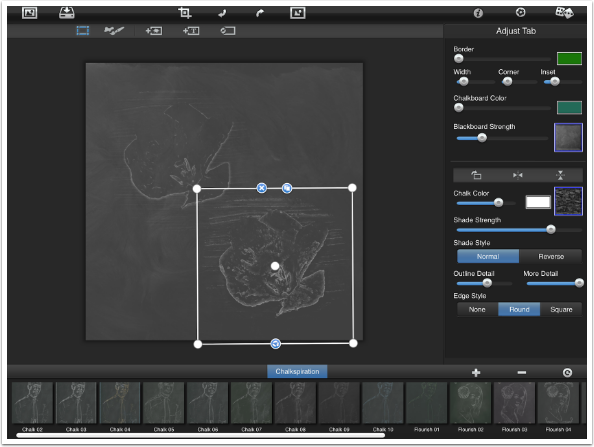
The user interface is similar to the interface on other Jixipix apps. There’s a control bar at the top, presets at the bottom, and adjustment sliders on the right side. The buttons on the tap bar, from the left, are Load, Save, Crop, Undo, Redo, Original, Info, Settings and Randomize.
Notice that there is a box around the image. This allows you to move, resize and rotate the imported image.
Pressing the “landscape” button in the top row allows you to see the original image.
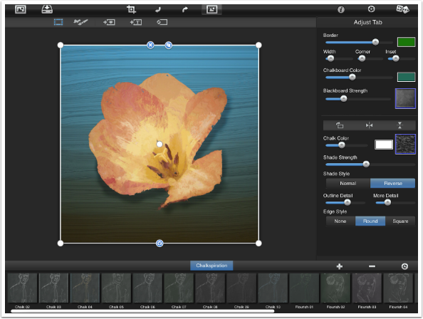
The handles in the corners of the box can be dragged to resize and rotate the image. The center dot can be dragged to move the image. The X deletes the image, the circle of arrows resizes the image to regular size, and the double box copies the image. Below I used the handles to resize the flower and place it at the upper left. I then tapped the Copy button and dragged the copy to the lower right.
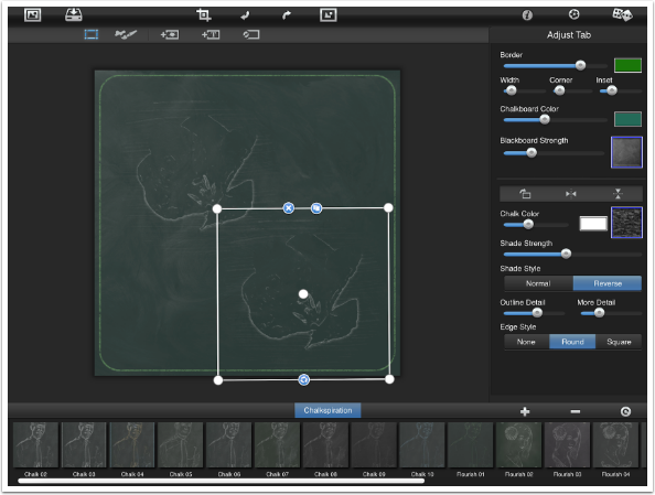
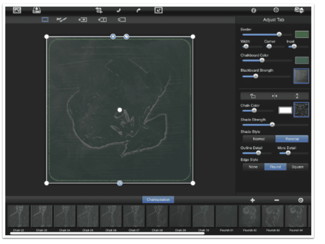
At the top of the Adjust tab are controls for the entire chalkboard. Below, I turned off the Border by dragging the slider all the way to the left. If a border is desired, there are separate sliders for Width of the border, amount of Corner rounding, and Inset (distance the border comes in from the edge).
I also moved the Chalkboard Color slider all the way to the left, making it a true “blackboard”. The Blackboard Strength slider controls the amount of “dust” left on the board. There are different presets (accessible by tapping the thumbnail) for what was “erased” from the board, leaving the chalk residue.
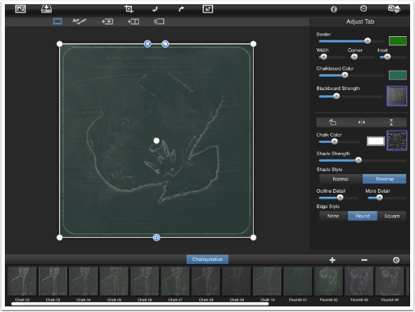
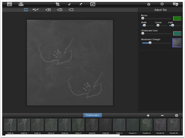
The remaining controls on the Adjust tab deal with the selected piece, whether that is image, flourish or text. In the image below, nothing is selected, so all the controls disappear.
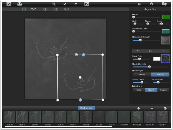
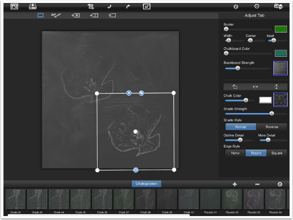
The controls for the selected clip include Chalk Color and Style, Shade Strength and Style, Detail controls and Edge Style. These can be manipulated separately for each clip. So below, I’ve changed the Shade Style and the Chalk Color and Strength for the flower copy in the lower right, but it doesn’t affect the original in the upper left.
Below I’ve upped the More Detail slider to get even more “chalk onto the board”.
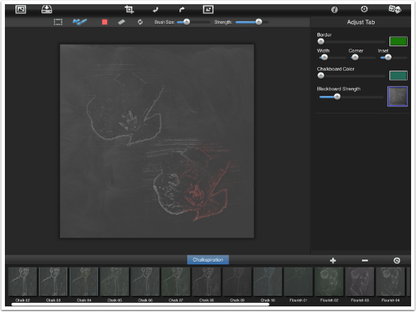
The bar below the top bar controls the task that is being accomplished. The box, which is the only option we’ve seen so far, allows us to adjust the selected clip. The Brush, next in line, allows the color of the chalk to be changed. The Color in the Adjust tab changes the color for the entire clip, while the brush allows you to change the color of areas within the clip. For example, you could import a portrait and add brown to the hair and blue to the eyes.
When the brush is tapped, further controls appear next to the brush in the bar: Color, Eraser (which erases the color, not the chalk), Undo, Brush Size and Strength. Below I’ve colored part of the lower flower.
Coloring in this manner can be difficult. There is no indicator that shows how large the brush is, and there is no way to zoom in on the image to color small details. This is a surprisingly clumsy control for a Jixipix product.
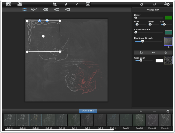
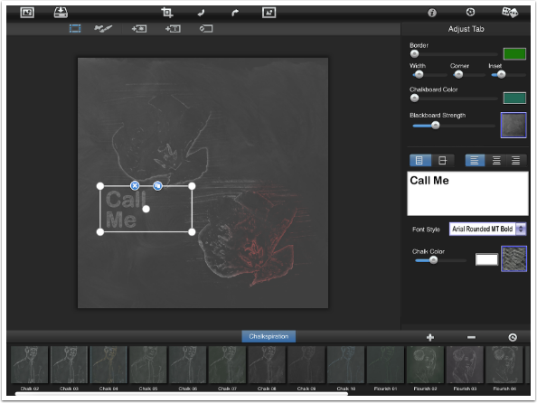
The next control adds flourishes to the image. These can be separately sized, moved and controlled through the adjust tab.
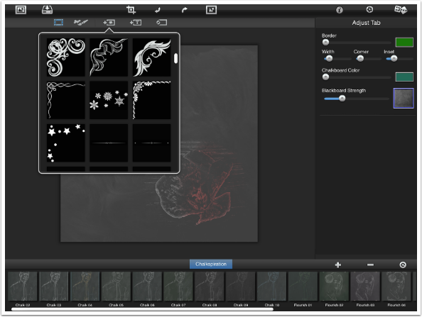
I’ve added a flourish below and moved it to the upper left corner. Over in the Adjust tab you will see that I can change the chalk Color and Style for this flourish.
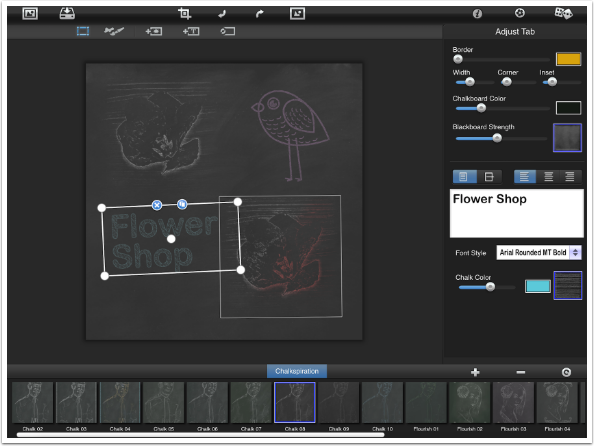
The next button in the option bar adds text. In the Adjust tab you’ll see that the Text, Font, Chalk Color and Style can be adjusted.
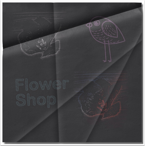
The last button in the option bar should be avoided. It resets everything to the beginning, with no warning. I tapped it to find out what it did, then tried to use Undo to get all my changes back – and that is when Chalkspiration crashed. Below I rebuilt everything I’d done so far, with an added bird flourish.
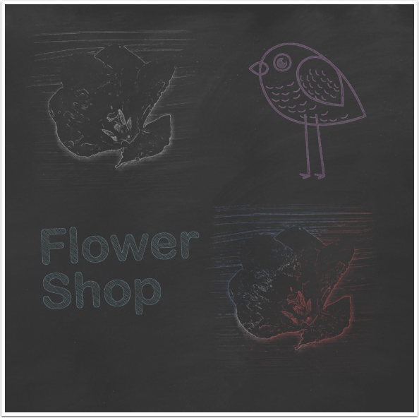
So, below is my “finished” chalkboard. Many of you may find Chalkspiration to be of value, but I find it to be a subpar product for Jixipix. The results are so “specialized” I don’t find much use for it, and having an unlabelled “Reset All” button so close to the normal controls is very bad app design.
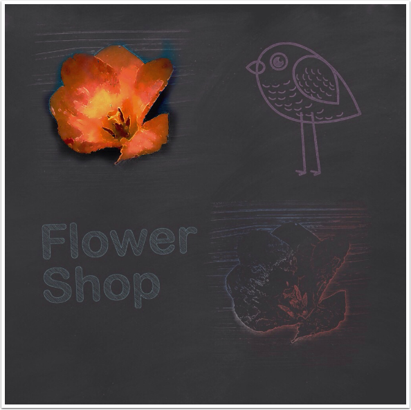
Of course, nothing keeps you from using Chalkspiration as part of your workflow. By blending the original back in Vivid Light mode, I got a somewhat interesting result.
Fold Defy
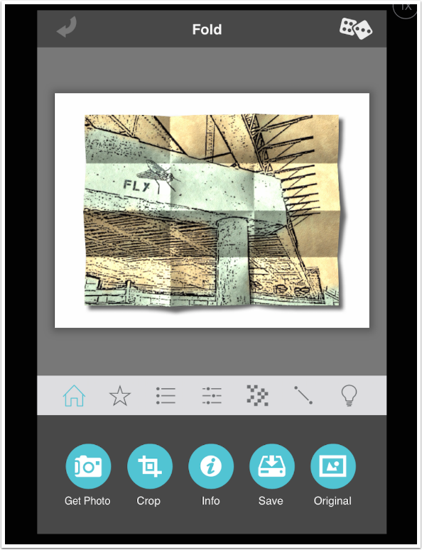
Fold Defy does as advertised. It folds or crumples your image. I did not pay for the separate HD version, so the screenshots are from the iPhone version running on the iPad. (The opposite was true for Chalkspiration; I own the HD version but not the regular version.)
Fold Defy has the “blue-white-gray” Jixipix interface. Controls are grouped under buttons on the white bar. Shown below are the controls under the Home button: Get Photo, Crop, Info, Save and Original.
I’ve loaded an illustration, as that type of image seems to suit the folding more than a standard photograph. A default fold is done on the image, and the image is squeezed in over a white background so that a shadow can be added.
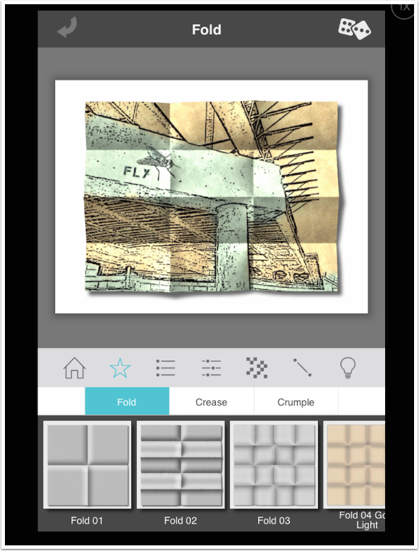
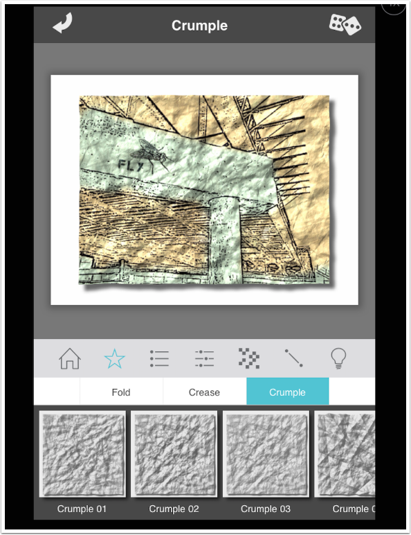
The Star button is for Presets. Presets are divided into three categories: Fold, Crease and Crumple. There are 25 Fold presets.
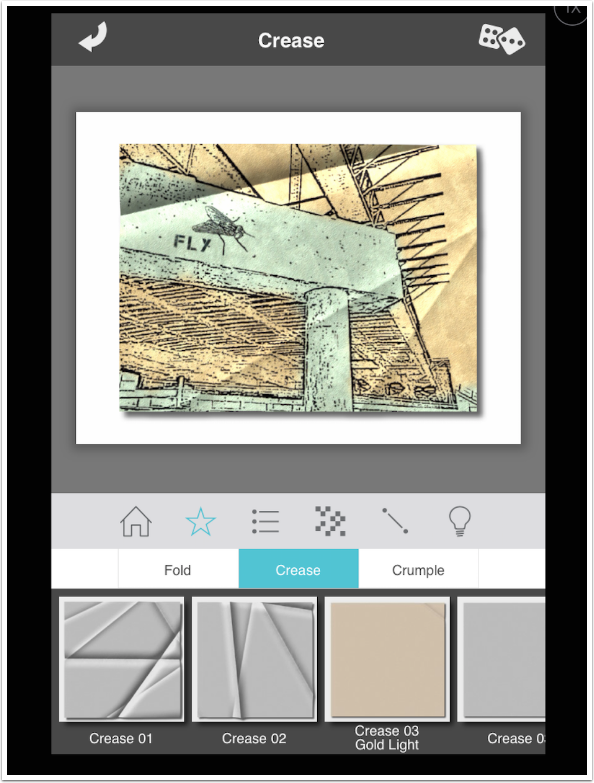
Crease presets range from a single corner fold to multiple crisscrossing folds. There are 25 Crease presets.
Crumple is an extreme mangling of your image. There are 20 Crumple presets.
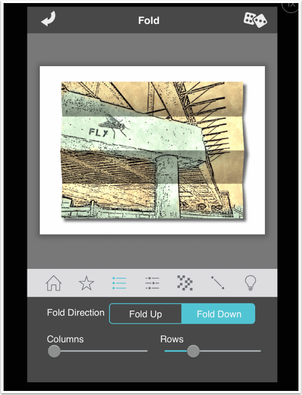
Depending on the category of Preset, there will be either one or two buttons with adjustable settings for those presets. Below is the first set of settings for the Fold presets, including the Fold Direction and the number of Columns and Rows (from zero to ten each).
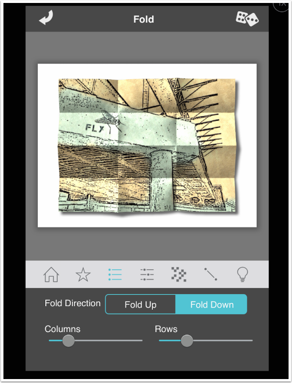
You’ll get an accordion-style fold if you reduce the number of columns or rows to zero.
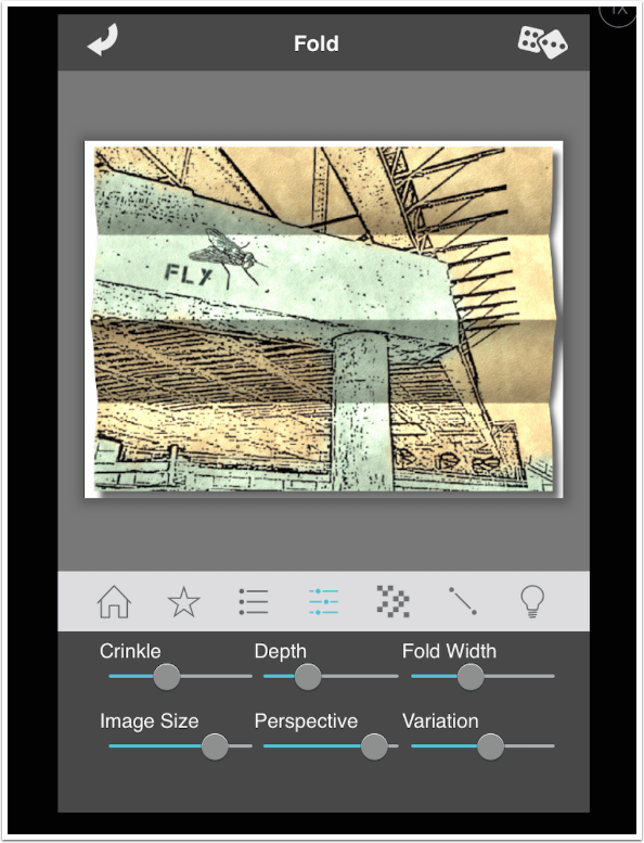
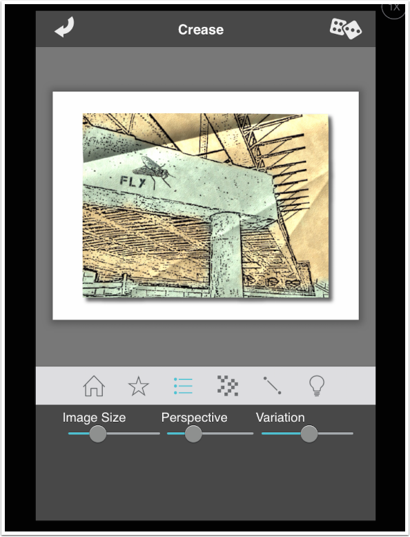
The next set of controls affects the subtlety of the effect. Depth is how strong, or deep, the fold is. Crinkle controls the precision of the fold, and Fold Width controls how far the crinkles spread from the fold. Image Size allows you to increase or decrease the size of the folded image on the white background.
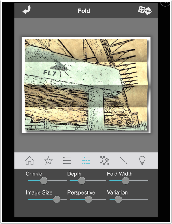
Perspective and Variation make very subtle changes to the results which, frankly, aren’t even worth bothering with.
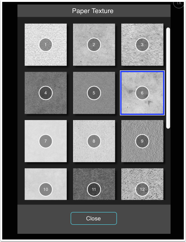
The next control is Paper Texture. The slider controls the strength of the texture, and tapping the thumbnail brings up a list of textures.
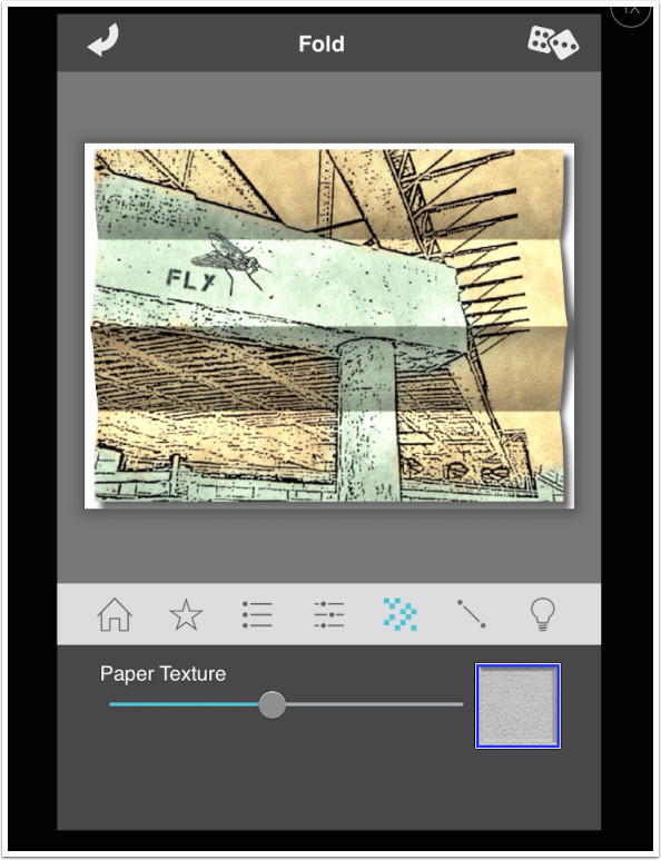
There are eighteen available paper textures.
The next control (single line) allows you to control the additional creases. The particular preset on display now does not have additional creases beyond the rows and columns, so it is inactive.
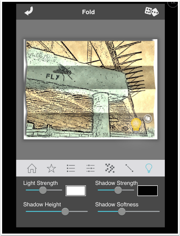
The final control is over Light direction and color. You can drag the lightbulb around, and tap the double box (copy) to create a second light source. The controls for light and shadow at the bottom can be adjusted separately for each light source.
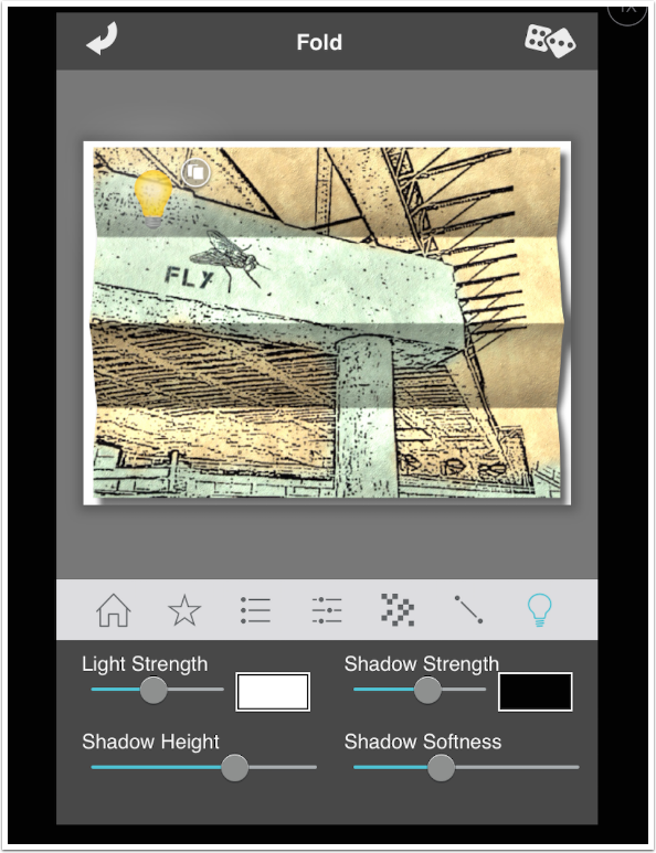
The only change I made below was to move the light source to the lower right corner.
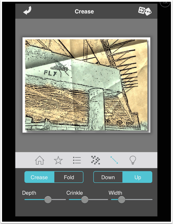
When we look at the controls for the Crease presets, we see that the controls for depth and direction are missing.
That’s because the depth and direction can be controlled separately for each individual crease. Below you’ll see white lines overlaying each crease. Each crease can be deleted (X) or copied (double box). The controls at the bottom affect the currently selected crease.
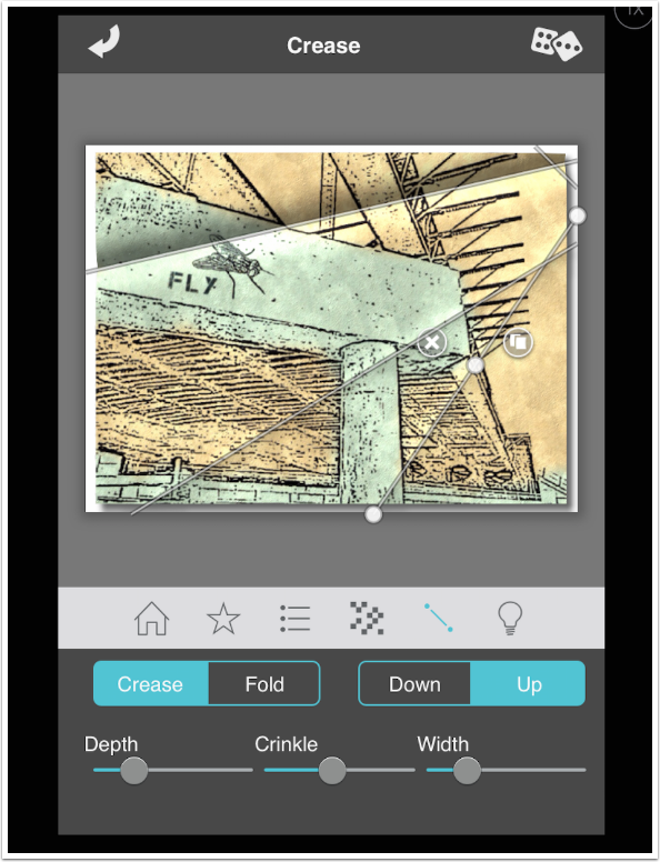
Adding a crease is a simple matter of drawing a line from one point outside the image to another.
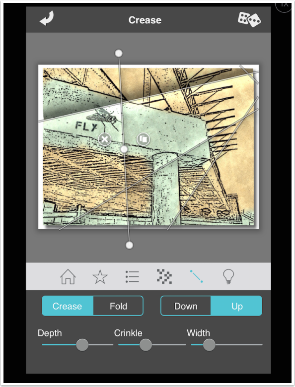
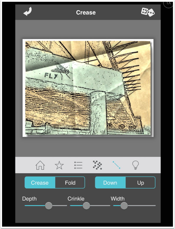
A single tap in the gray outside the image will hide the control lines so that you can see the creases clearly.
I changed the Fold Direction from Up to Down on the added line below.
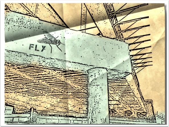
And the result is seen below.
Two things about Fold Defy before I wrap it up. First, I didn’t show much of the Crumple presets. They are too strong for my taste, even when the Depth is reduced to its lowest settings.
Second, placing the folded image on a plain white background with a shadow is very limiting. It looks fine on a web page with a white background – it really stands out. But the value of Fold Defy for me would be in use in a composite. Dropping the folded paper into a desk scene or as a crumpled piece of litter is an appropriate use. The last thing you want to have to remove in a composite is a white background AND a shadow. There should be an option to export it as a PNG with a transparent background.
So, what happens if you use both of these specialized apps together?
Never mind. I can’t really recommend spending money on either of these apps. Until next time, use another Jixipix app, like Vintage Scene, Moku Hanga or Grungetastic.
Jerry Jobe
Never content with just scratching the surface of what an app can do, Jerry Jobe decided to pass on what he learned about imaging apps to others. He’s constantly trying to figure out just what tools other artists have used, and trying to incorporate them into his own work, in an attempt to find his style. He’s written tutorials on over 145 apps so far, which you can find (along with his Song of the Day entries) at http://enthusiasmnoted.wordpress.com/ He lives near Atlanta, Georgia, where he also finds a creative outlet in acting and directing in community theater.
2 Comments
Diana Nicholette Jeon
I don’t even know where to start on these two apps. They look SO artificial and canned. You use the words “too strong.” I think we both are saying the same thing there. Buzzzt. Thank you for playing, Jixi, but maybe another vendor will come out with a better, less fake implementation.
Deborah McMillion
Great tutorials, Jerry. I am backtracking through all this wonderful, useful information. This is one I have needed, the Fold Defy. It is a bit faux but my use is little floating notes that fall through my work, tiny messages, and this is just the ticket. I also use Mirage for perspective slants or rippling, bending effects also used on blowing paper. The chalk ones, meh, look interesting but are a bit to specific. Thanks!