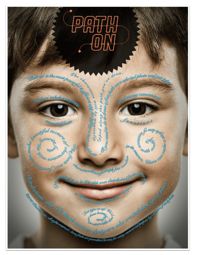
Mobile Photography/Art Tutorial – ‘Path On’: Points on a Curve
We are delighted to publish Jerry Jobe’s latest mobile photography/art tutorial for our reading and viewing pleasure. This week Jobe takes a look at the mobile photography textural app, Path on. Read his thoughts as he puts it through its paces (foreword by Joanne Carter).
Path on retails for $1.99/£1.49 and you can download it here
“Now and then I’ll get questions about apps I haven’t covered. Usually those apps are the behemoths that do a little bit of everything. Sometimes, though, I get a very specific question along the lines of “do you know of an app that can do ____?” That blank is often filled with “circular text” or “text on a path”. It just so happens that I have a good recommendation for that very task – Path On by Peta Vision.
It’s not a perfect app, by any means. The main drawback (presented here so you don’t have to search through the long article to find it) is that you can move, but not modify, the path after typing. If your path does not follow the contour as you would like, or there are curves that are too tight for text, then you have to delete your path and start over. That aside, it works fairly well. Let’s get started!”
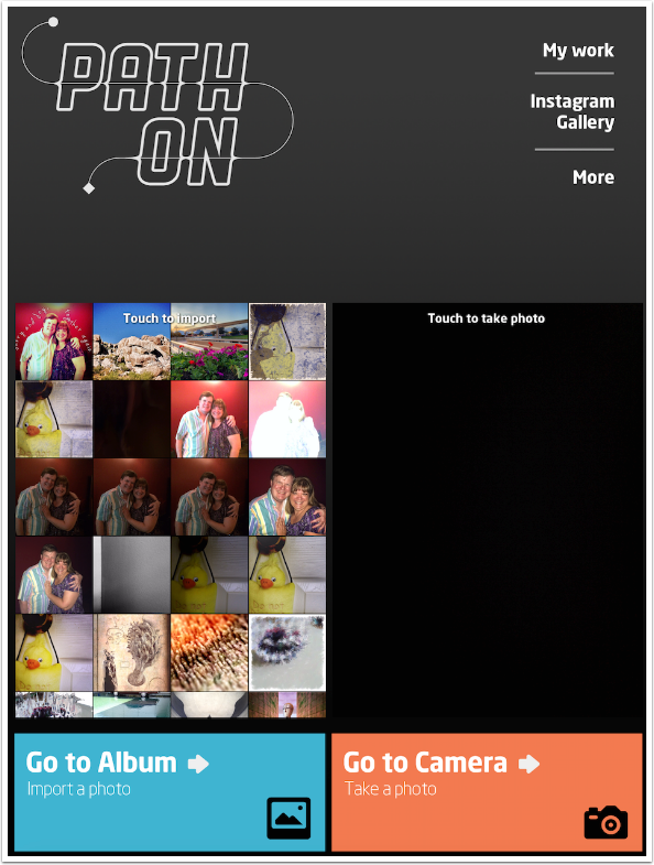
You choose your source on the opening page. The app is universal, and the controls are similar between the iPhone and iPad version (shown here). At the upper right you have buttons for “My Work” (a gallery which will be discussed later), Instagram Gallery (which takes you to #petavision, including their other apps), and More (support information). You can choose from you most recent images or tap the Album button to access all you albums. You can also tap the large viewfinder area (blank here) or the Camera button to access the camera.
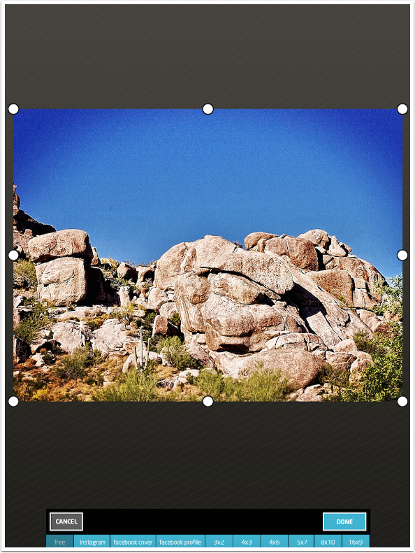
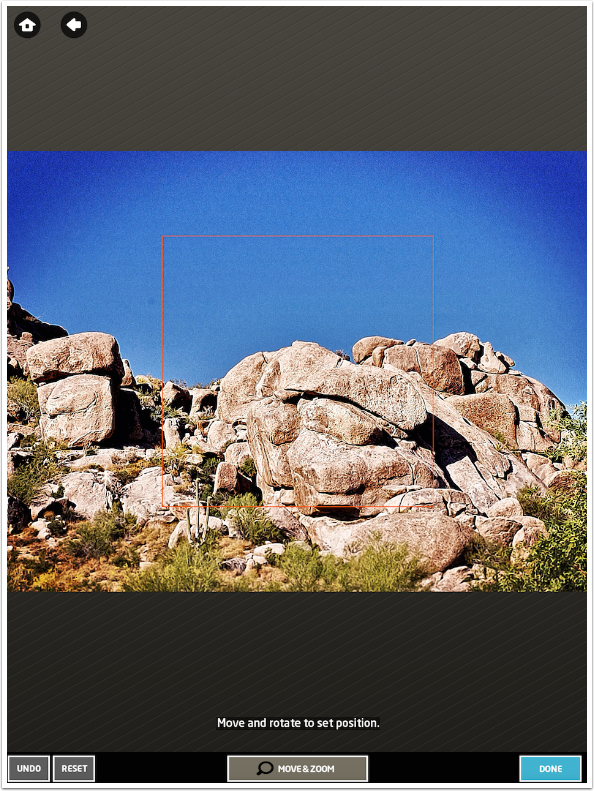
Once you’ve chosen the source, you are led to the Crop screen. There you can choose from among several crop ratios, including Facebook Cover. (I’m not sure why they offer both Instagram and Facebook Profile, since those are both square formats.) Tap the Done button when you are ready to enter the editor.
The first thing you are required to do is to set the path that your text will follow. You can draw a path or select a square, circle, paragraph, spiral or heart. (To access the heart path, it is necessary for you to “like” Peta Vision on Facebook.) We will start with a square, and go over drawing your own path in a moment.
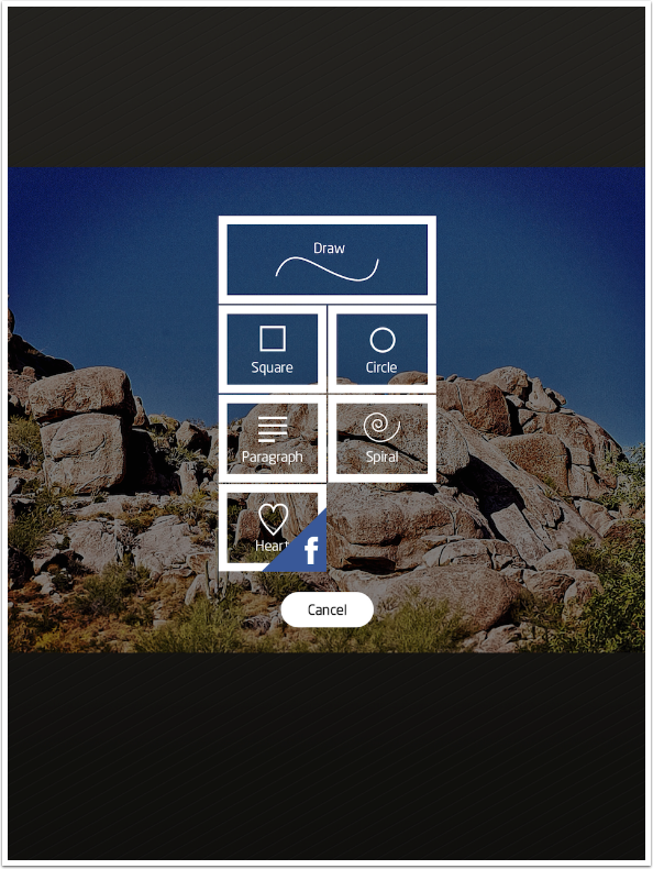
At this point you can modify the size of the square with a two-fingered pinch, and move it with a drag. Make absolutely sure you have the size correct, because it cannot be modified later. When you’re ready, tap Done.
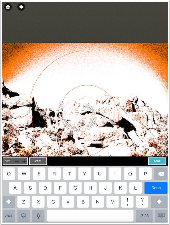
Now a keyboard appears, and you can enter your text.
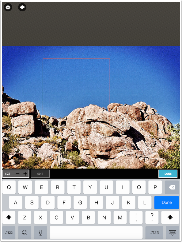
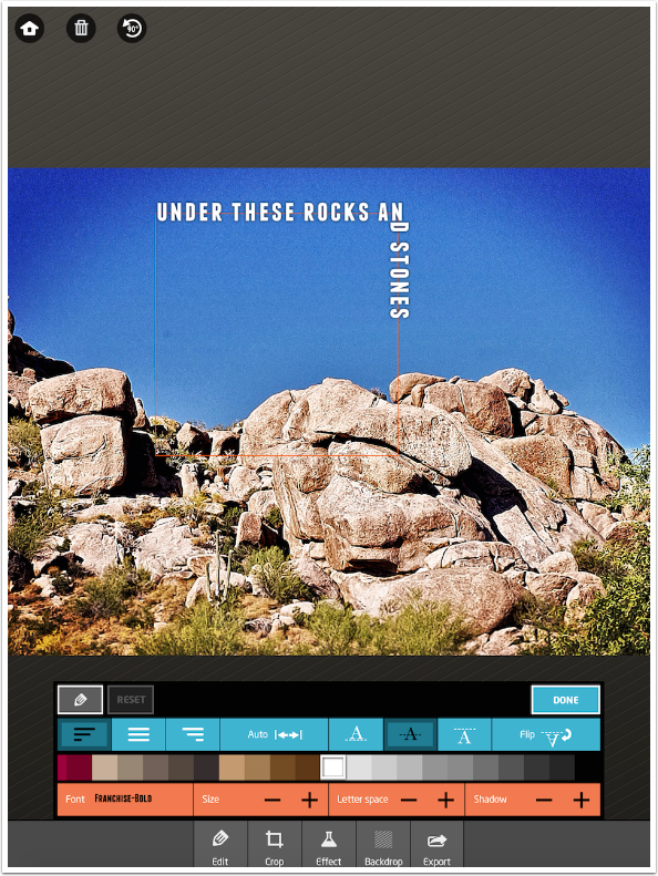
The font defaults to Franchise Bold, and the text is centered on the path (the path runs through the center of the text). You can see in the screenshot below that when the corner in the path is encountered, the text will break in the middle of the word to turn the corner.
Once the text is entered, you can tap the Edit button to change the characteristics of the text – the size, font, spacing, color, etc. In the screenshot below you can see that the text is left-justified, centered on the path, white, and uses the Franchise Bold font.
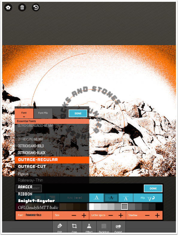
Tapping the font name brings up a list of fonts from which to choose. All of the fonts loaded to your device are available. Just scroll through and choose an appropriate font. When finished, tap Done in the upper right of the list.
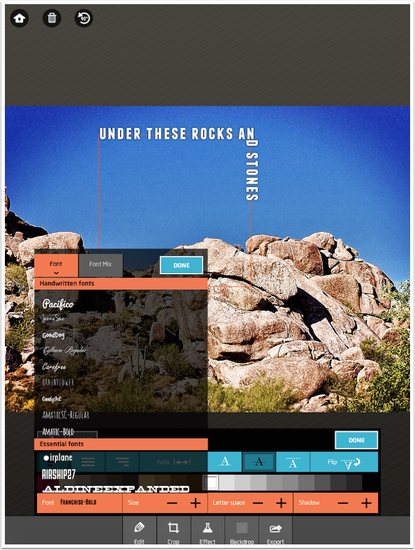
If you tap the Font Mix button, the same list of fonts comes up. However, there are check boxes by each font. You can choose up to five different fonts and they will be randomly chosen for each letter in your text.
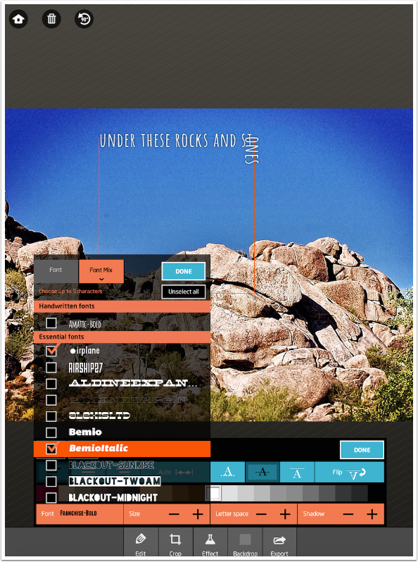
Below you’ll see the results of mixing three fonts.
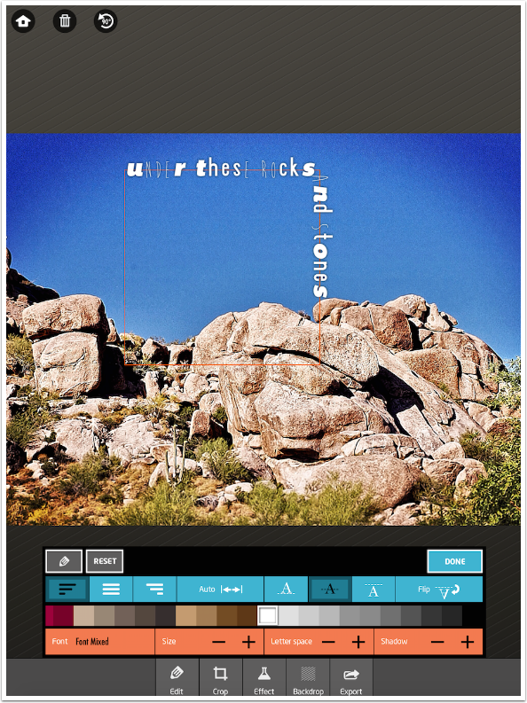
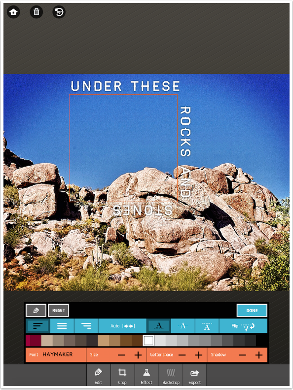
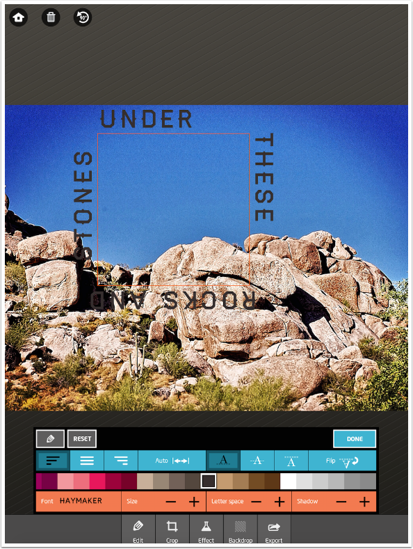
I went back and changed my font to a single one, Haymaker. Below you will see that I also changed the justification to right-justification, which moved the text around the square to the “end”.
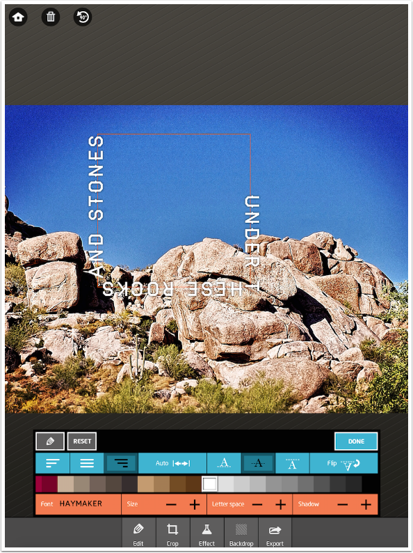
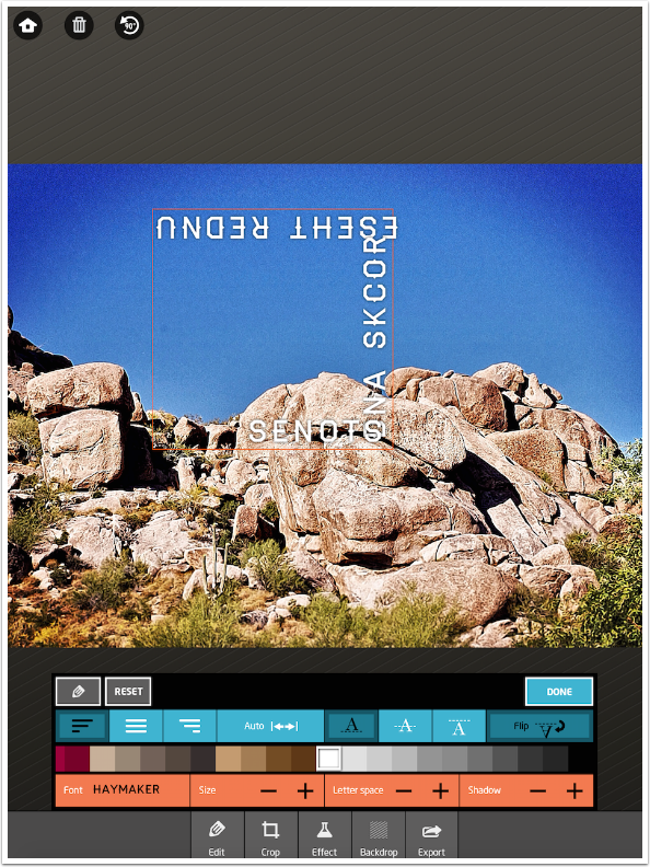
At the end of the row of buttons that holds the justification buttons is one called Flip. This actually mirrors the text, which almost makes it unreadable. I don’t have a use for the Flip button, but perhaps you do.
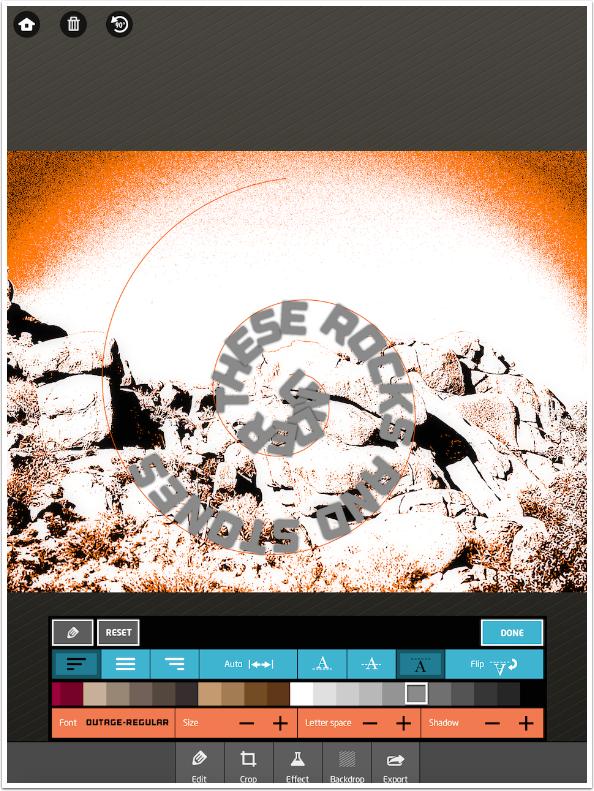
The Auto button uses font spacing to make the text fit over the entire path. It does not change the font size, so you can set that before tapping the Auto button.
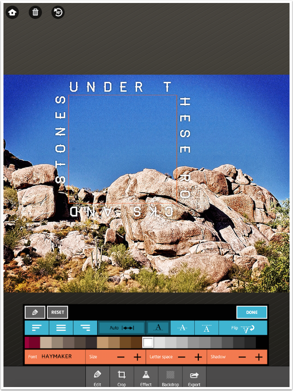
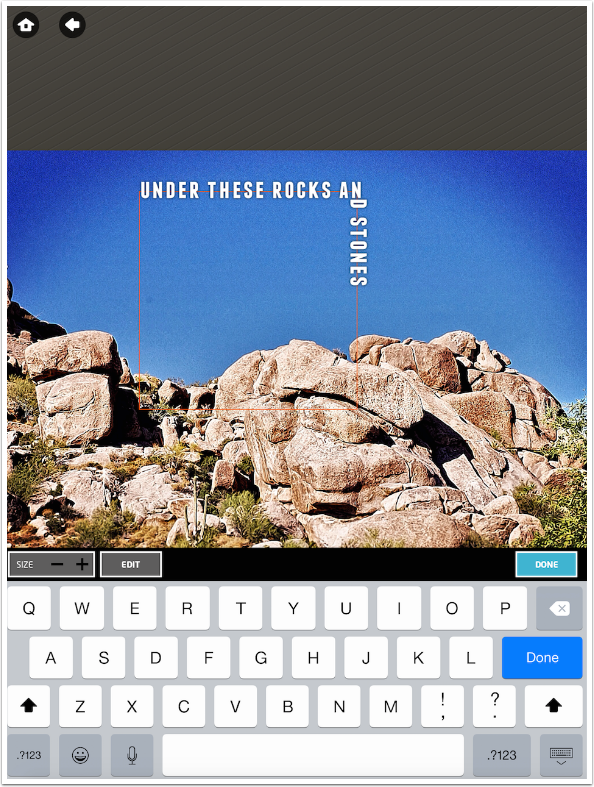
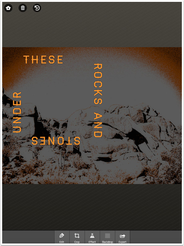
Below you can see that I added extra spaces between “under” and “these”, so that the word “these” would not break around the corner. Now “and” is broken around a corner, and if I add spaces before “and”, then there wouldn’t be enough room left for “stones”. Since Auto is on, that would force Path On to adjust the spacing to fit everything in. And “these” would once again be broken on the corner.
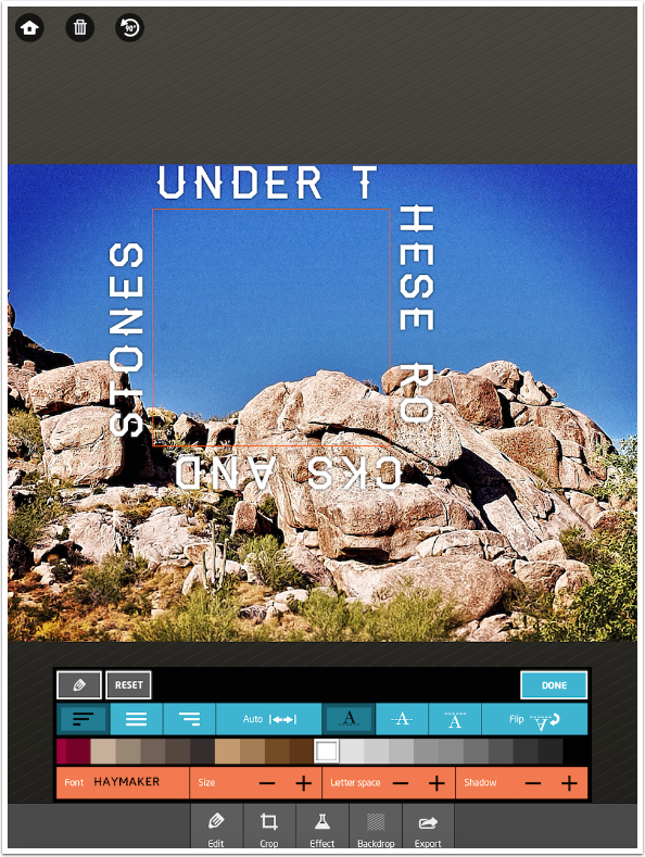
It would be nice if you could let Auto do most of the work, and then adjust the Size, Letter Space and the actual spaces between words to taste. But if you switch Auto off, the text is not left spaced out by the Auto function. It returns to the default spacing, as shown below.
The Size -/+ button allows you to decrease or increase the size of the font. These controls are rather touchy, so it may take some back and forth to get the size correct.
The Letter Space -/+ button controls the kerning, or space between letters.
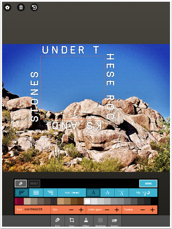
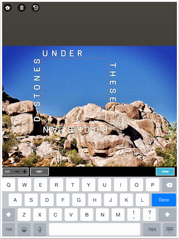
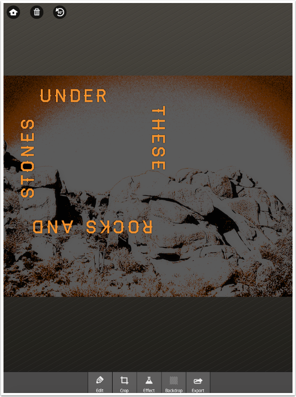
Through judicious use of the Size and Letter space buttons, as well as returning to the keyboard (accessed with the pencil button) to add spaces between words, I was able to make sure no words were broken on a corner.
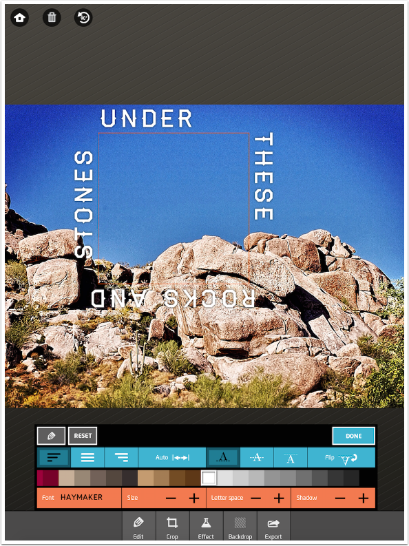
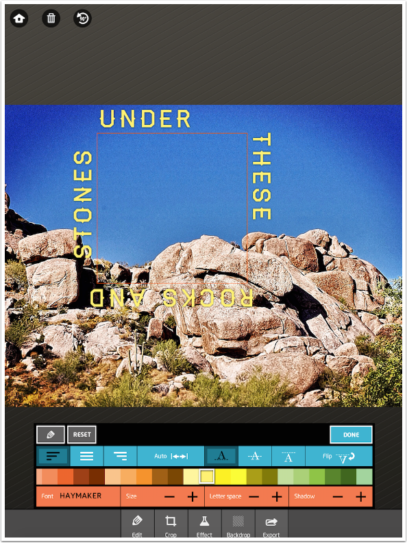
The color of the text is changed using the palette buttons that run through the center of the control area. The Shadow, which is added by default, can make darker letters look fuzzy. I removed the Shadow below by tapping the Shadow – button.
Lighter colors can use a shadow, and I added the shadow back when changing the font color to a yellow.
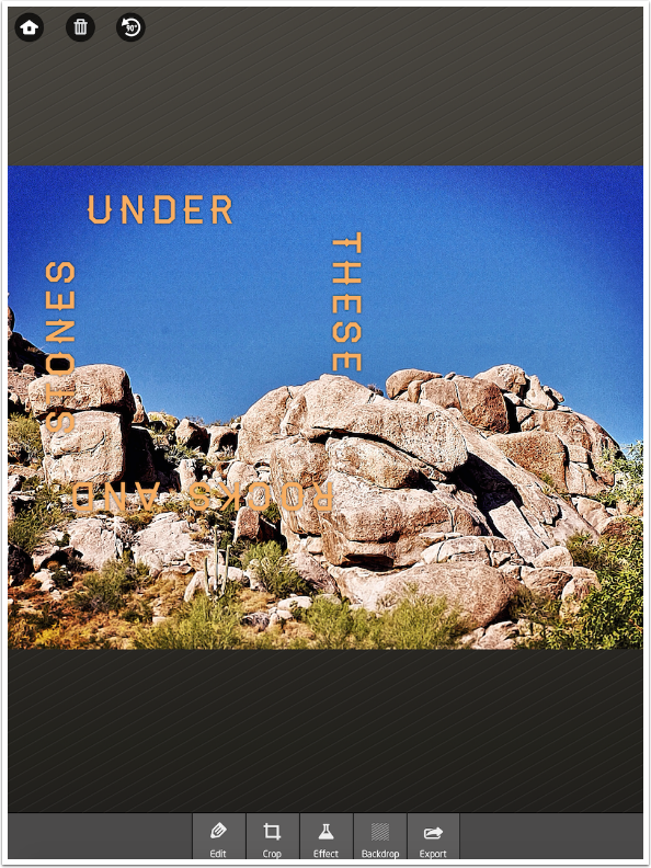
Below I went to an orange color, and moved the path by dragging it. At this point, remember, I can no longer change the size of the square path.
Down at the bottom you will see a series of buttons. I’ve been working entirely with the Edit button so far. The Crop button returns you to the Crop function seen earlier. Cropping at this point can be a problem, if you also crop the path. Even if you crop the image, you cannot make the path smaller to fit within the crop. You will lose part of your text that way.
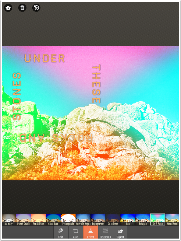
The third button is Effect, which gives you some 26 different filters to apply to the image underneath the text.
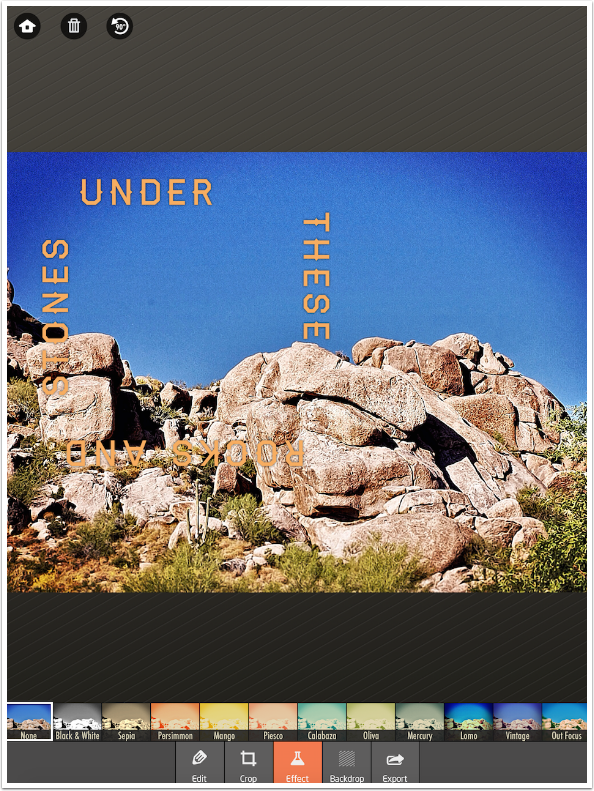
These filters do not affect the font at all – neither the color nor brightness.
The next button is Backdrop, which gives you two sliders to affect the image. Tap Opacity or Blur to access the appropriate sliders.
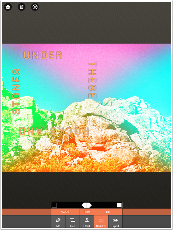
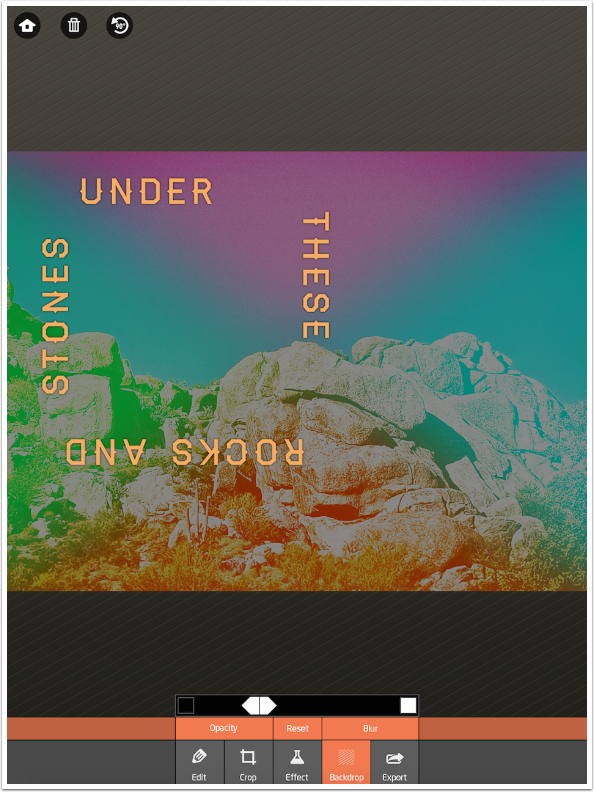
The Opacity slider is actually Brightness. It starts in the center; moving it left darkens the image and moving it right brightens the image.
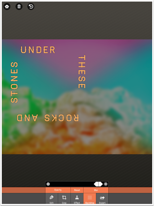
The Blur slider starts off at the left (no blur). Below you’ll see the amount of blur added by moving the slider all the way to the right.
Effect and Backdrop work independently of each other. I left the Backdrop with a considerable amount of darkening, then went back and changed the effect. The darkened setting remained.
Up at the top left are three buttons. The rightmost is a rotation button, which rotates the path 90 degrees counter-clockwise.
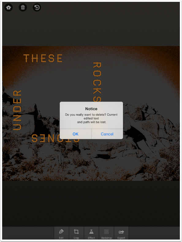
The trash can button will delete the text and path. A confirmation dialog is shown before the deletion occurs.
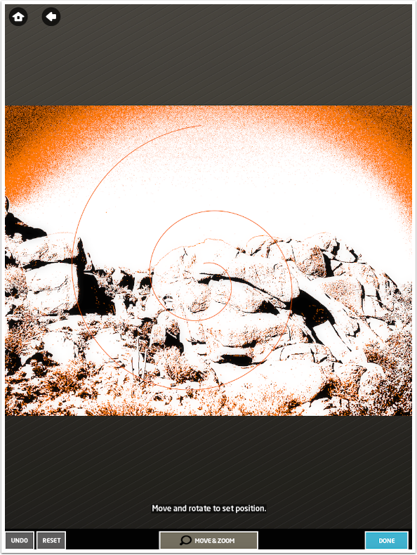
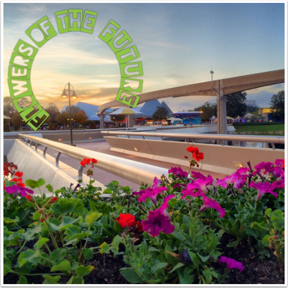
The image stays the same, but you are given the chance to create a new path. I chose the spiral this time. In the image below, I have made the spiral smaller, since by default it trails off the edge of the image.
As the text is typed, you’ll see it goes back to the default Franchise Bold, centered on the path. Notice that the tight curve at the center means that each letter is rotated more than the previous, giving an impression of italics when it isn’t.
Below I’ve changed the color to a dark gray and the font to Outage Regular.
In the next image, I increased the size and moved the text to below the line, to illustrate that severe curves can result in overlapping letters.
Using Auto spaces out the letters so they reach the very end of the spiral.
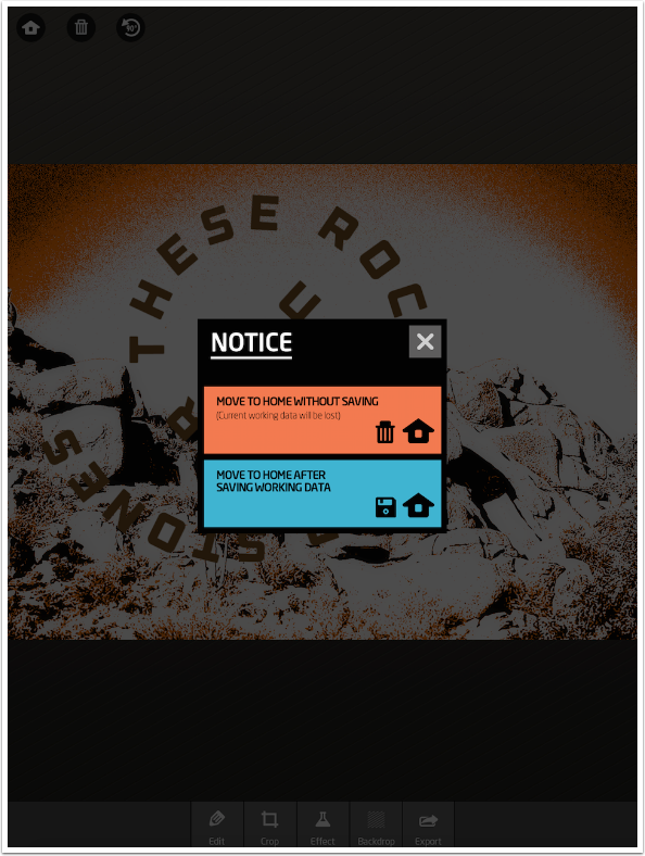
The Home button allows you to choose another image to work with as well as getting rid of the path and text. You’ll see below that a dialog box appears. You are given the choice of discarding everything, or saving the image, path and text into the “My Work” gallery. Items saved in the “My Work” gallery can be re-edited. The text is not applied to the image, so it can be changed in a future session.
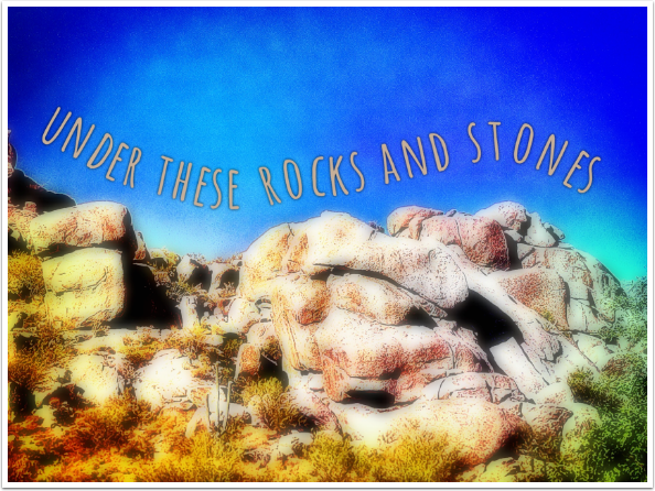
I chose the same image to work with, and chose to draw my path. As it says at the bottom: “Draw a line for your text to follow. You can draw as many lines as you like.” If you draw multiple lines, then your text will fill the lines in the order in which they are drawn. If you draw your first line at the lower right, and the second at the upper left, most people will not be able to make sense of your text.
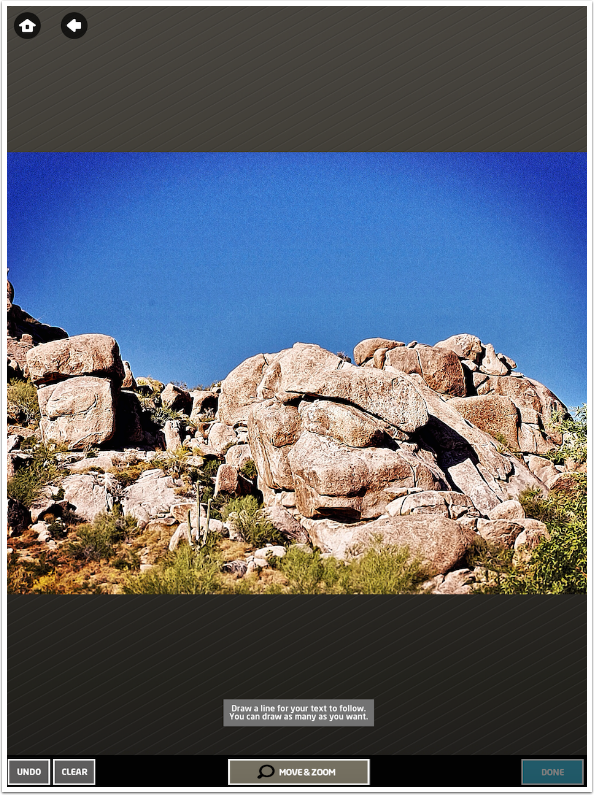
I drew a line following the contour of the rocks against the sky.
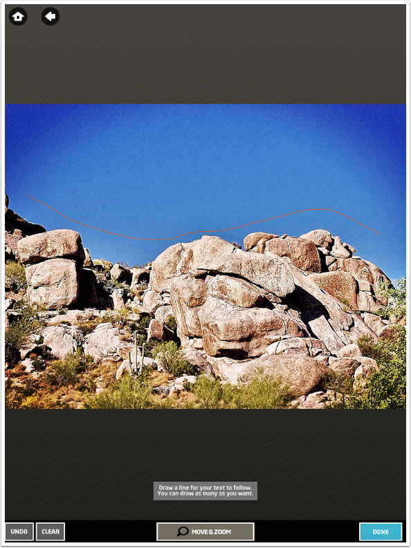
When I added the text, changing the font to Amatic Bold, I found that the curve back up towards the top was sharp enough that the last “e” in “these” and the “r” in “rocks” leaned towards each other so much that they overlaid the intervening space. It looks like “theserocks”.
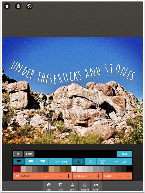
That problem was solved by adding another space between “these” and “rocks”.
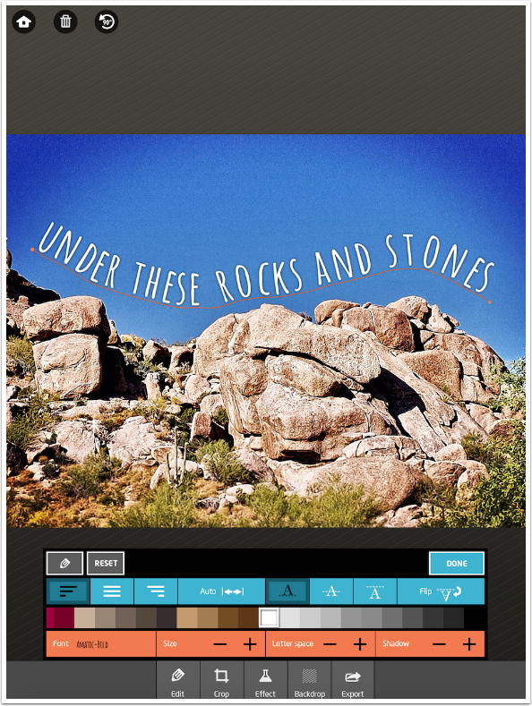
Drawn paths can also be moved. Below I dragged the path down towards the rocks. It’s really too close now.
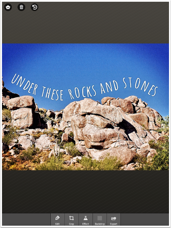
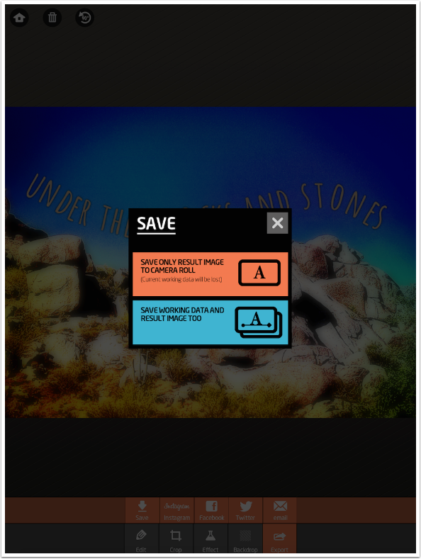
After adding an Effects filter and a Backdrop blur, I am ready to save. I tap the final button at the bottom, Export, and am given the options shown below.
Just as with the Home button, I am given the chance to save the Working Data in addition to saving the flattened image.
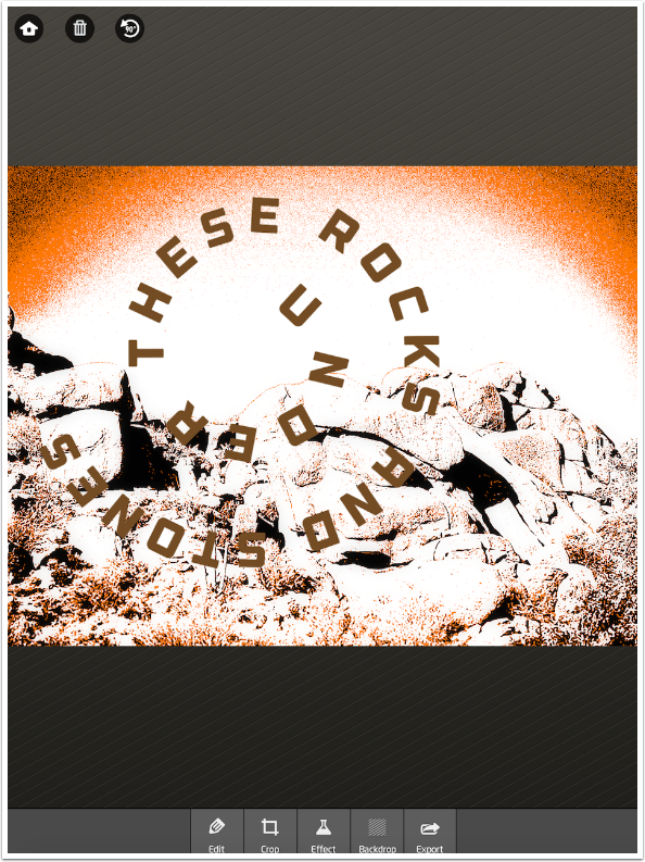
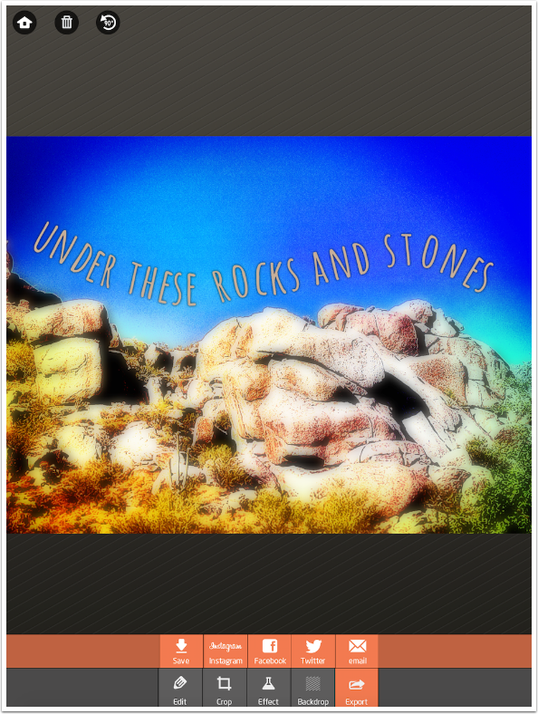
Here’s my finished image.
Fitting text to a path and making it look right is a labor-intensive task. Path On gives you the tools to do the task, but it doesn’t make it easy. But if it was easy, Path On would have more competitors. If you’d like to twist your text around your images, then give it a try. Until next time, enjoy!
Jerry Jobe
Never content with just scratching the surface of what an app can do, Jerry Jobe decided to pass on what he learned about imaging apps to others. He’s constantly trying to figure out just what tools other artists have used, and trying to incorporate them into his own work, in an attempt to find his style. He’s written tutorials on over 145 apps so far, which you can find (along with his Song of the Day entries) at http://enthusiasmnoted.wordpress.com/ He lives near Atlanta, Georgia, where he also finds a creative outlet in acting and directing in community theater.

One Comment
Carlos
Thanks Jerry!