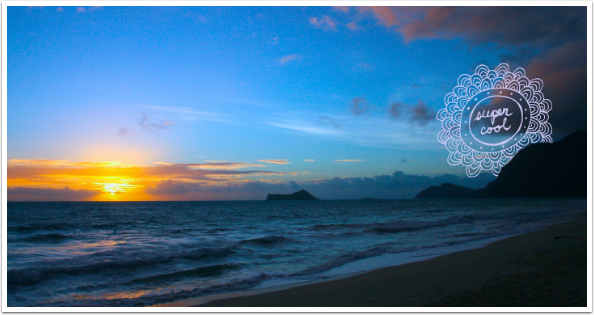
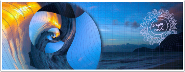
Mobile Photography / Art Tutorial – ‘Over’ Release 3.0: Does it Add the Right Features?
We are delighted to publish Jerry Jobe’s latest mobile photography/art tutorial for our reading and viewing pleasure. This week Jobe takes a look at the new the update to the app ‘Over’. Read his thoughts as he puts it through its paces (foreword by Joanne Carter).
Over retails for $3.99/£2.99 – click here to download
“Over is a type-and-clipart app that has been around for a few years. I hadn’t covered it up to now, and I’m glad I didn’t. The newest release of Over (3.0), which arrived last week, is a major rewrite of this app with multiple new features. I hate writing articles that are out of date within weeks, so now that the rewrite is done it should be fairly stable for a while.
The new features include: Masking, Drop shadows, Color picker, Undo button, and a Font Manager. This is a significant number of new features. Does that mean that the app, up to now, has not been a value? Unfortunately, I would say that without these features, Over was an also-ran app. Did they add the right new features to make Over stand out in a crowded field of typography apps? Let’s find out”.
Over is a universal app, running on both the iPad and iPhone. In addition, Over will run in landscape mode as well as portrait on the iPad. Landscape mode is best suited for my tutorials, so I will use that for most of the screenshots.
The folks at Over had obviously been getting complaints that the controls overlaid the image workspace, so they have created a much sparer look. When the app is brought up, there are buttons for Menu (the = sign), New, Save (grayed out initially), Tools (the large plus sign), and Add New Content (the plus sign in a circle).
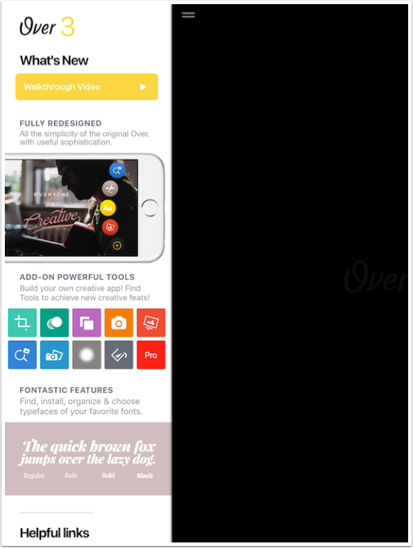
The Menu includes an introductory video as well as some other help as you scroll down. It’s definitely worth taking a look at.
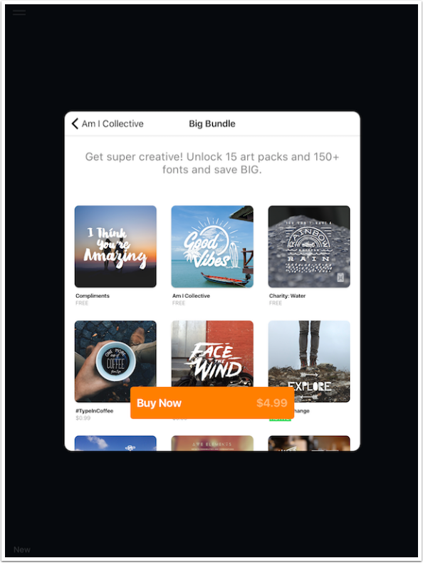
Anywhere in Over you see the + sign within a circle, you use that button to access the Content store. All the tools are free, and you should access them immediately. You can see in the Artwork category that some sets are free, while others are just under a dollar. Scrolling horizontally takes you to more packs within a category, and scrolling vertically takes you to different categories, like fonts.
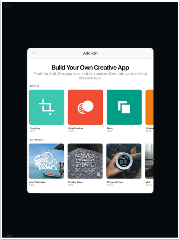
If you tap on a purchasable pack, you may be asked if you want to purchase the “Big Bundle” instead. This is definitely a sound decision, as the bundle is well less than half the total cost of the packs individually. It would be nice if they had a pricing scale like Pixite, which allows you to spend a dollar or two more and get all future packs free.
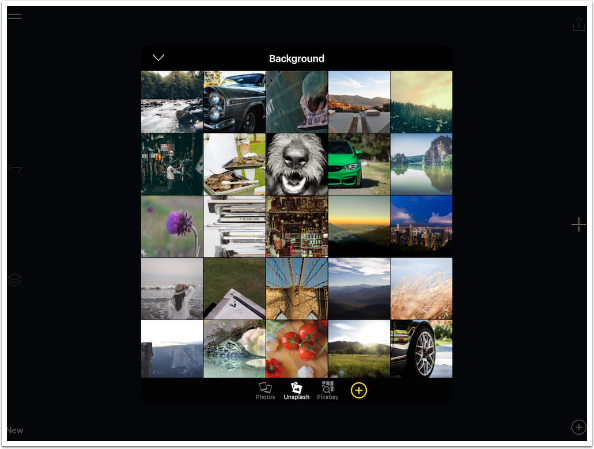
Over is particularly suited to creating inspirational images. Most of the clip art in the Artwork category is short phrases designed to be uplifting. So it’s really a nice touch that they have partnered with two stock photo companies as sources for your artwork. When I tap New to create a new project, I can choose from three different sources for my background image. Of course, I can select from my library. Below, you can see that I can select from a group of images from Unsplash. There are a number of great images here, and you can scroll down and tap Load More to see even more of them.
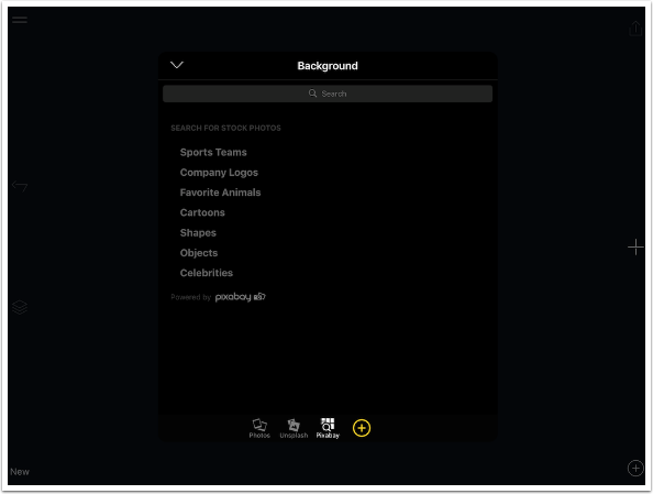
For even more fine tuning, you can use the search engine on Pixabay to get images tailored to a particular subject. My understanding is that you can freely use these images in any way you want, but I would research further before deciding to use them commercially.
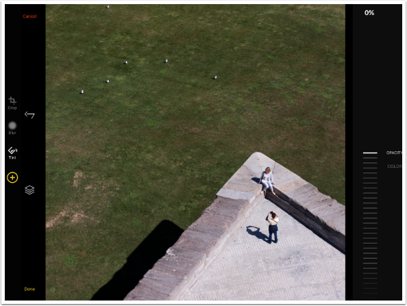
I chose an image from Unsplash, showing a photographer and a model on a wall. Over’s workflow has you initially edit the photo before adding text or artwork. After choosing the image, you immediately get to make a crop decision. The other tools, Blur and Tint, are accessed by scrolling the tools up and down until the chosen tool is highlighted. Options for the tool are on the right side of the screen. In addition to standard aspect ratios, there are handy choices for social media such as Facebook and (the old) Instagram.
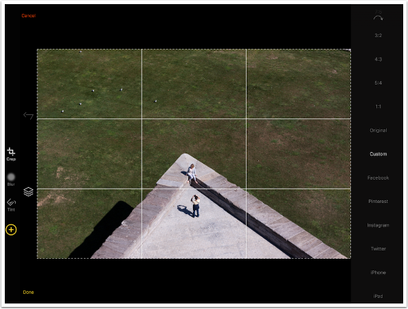
I believe they’ve made an error in the Facebook cover photo crop. The image below was cropped using the Facebook option in Over. It has a 2:1 ratio. It looks great, and would seem to be correct, if you only look at mobile Facebook platforms.
However, I have always found that Facebook crops cover photos to a non-standard 8:3 ratio, because that is what is used on the desktop version. The 2:1 image above would have a quarter of its height taken away in Facebook desktop, and then an additional portion taken from the sides when moved to mobile. I took the image above through Filterstorm and iColorama to crop it to 8:3 and modify it somewhat.
I cropped the test image to a square. The next edit Tool is Blur. It does not have a continuous slider, but rather ten blur settings, from 0 to 9.
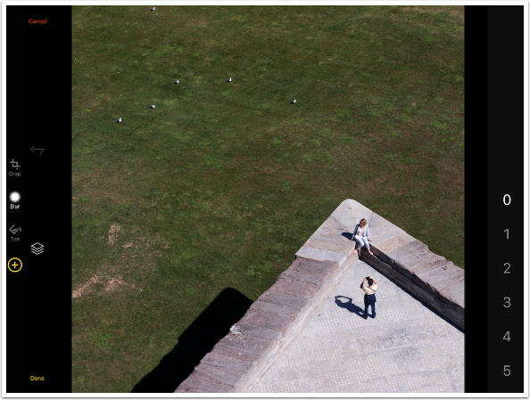
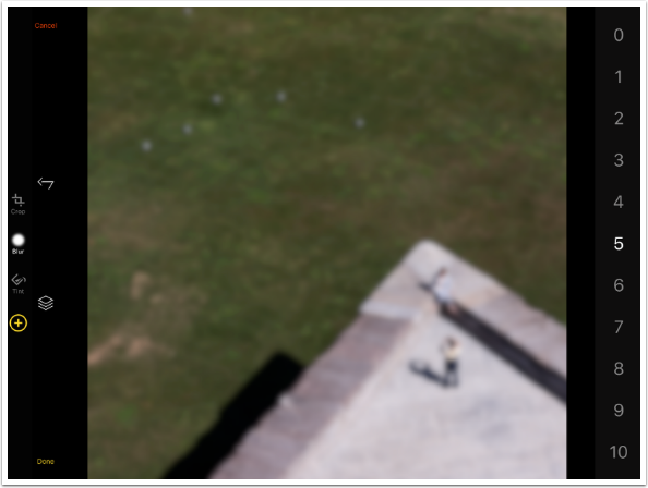
There are often times you might want to blur the background, to make sure the details of the image do not lessen the impact of the text or clip art added. You can see, below, that the setting of 5 is already overdoing that blur. You can’t see the model or the birds on the grass. I will choose a setting of zero for my project because there is a large amount of open space where I can place text and Artwork.
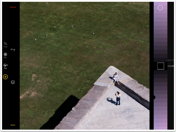
The final Edit tool is Tint. Tint has two options, Opacity and Color. Opacity is displayed below, and the slider is at 0%. Let’s change the color before adjusting the Opacity.
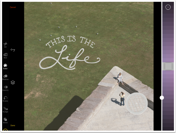
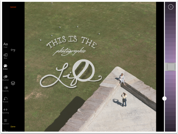
Tint, as well as the color for Text, Artwork and Shadows, all use the same type of color picker. You have various shades of a color going up and down from a center box, which shows the currently chosen color. You can scroll the colors up or down (left or right in portrait mode) to choose the shade (brightness or luminance). There is a slider immediately to the right of the colors (above in portrait) that adjusts the saturation. By scrolling the colors themselves left and right (up and down in portrait mode) you can change the hue.
The circle with the dot is used to choose a color from the image itself. After you tap it (and wait an inordinate amount of time, 2-3 seconds) the circle appears in the middle of your image. There is a white outer circle, and immediately within it is a circle of the new chosen color. You can drag the circle around until the center dot is over the color you wish to use. Then tap anywhere else on the image to “turn off” the picker.
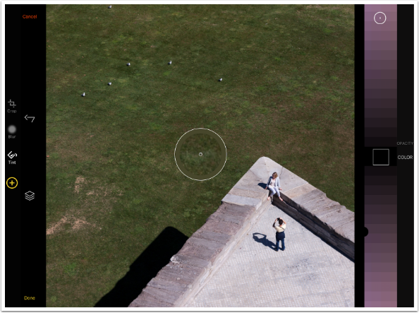
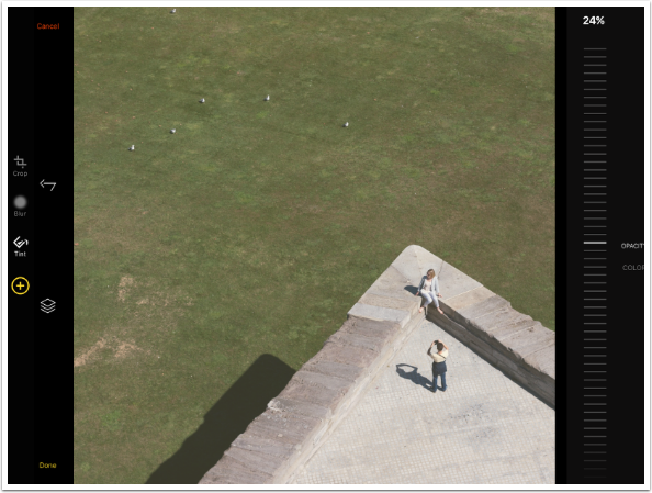
I decide to “warm up” the image a bit with a slight yellow tint. I scroll the color sideways to go from purple to yellow, then scroll the colors vertically to choose a lighter shade. I do not touch the Saturation slider, because I don’t want the tint to be overwhelming. But I see no change in the image. That’s because the Opacity is a separate slider which is currently set to zero.
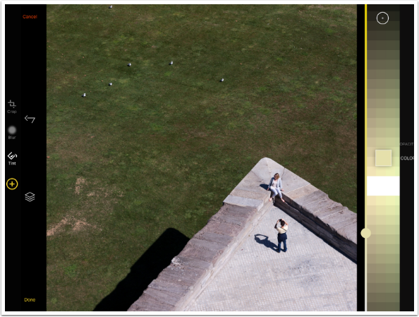
I changed options from Color to Opacity, then dialed up the opacity to 24%. Like the Blur, Opacity is best kept to a smaller number.
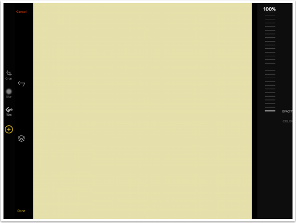
As a matter of fact, the Tint is not tinting the image at all; it is laying a flat color of some transparency over the image. If we dial up the Opacity to 100%, we can no longer see the image at all.
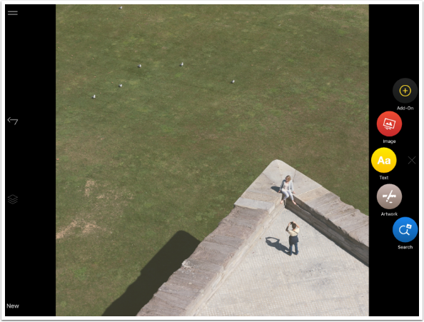
I return the Tint to 24% and tap Done. I’m through with adjusting the image and am now ready to add elements. If you don’t see the “carousel” of available elements, tap the plain plus sign.
I’m going to start with Artwork, since I have an idea for what I would like to add to this image.
As I said, Artwork is clip art elements that you can add to your images. They are grouped within the Artwork tool, and you can scroll through the groups to find the one you like. I am choosing “Fresh Exchange”, on the second row.
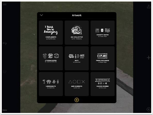
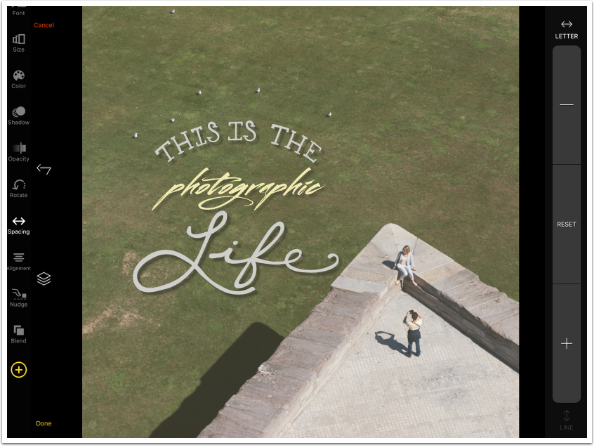
The clip art elements within the Fresh Exchange group are displayed on the right. As you scroll through them, the chosen piece of clip art changes on the screen. I scroll down to find one called “This is the life”.
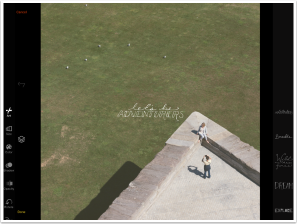
On the left side are various tools to change the piece of Artwork selected. I will not go through them all, but they include Size, Color, Shadow, Opacity, Rotate, Nudge and Blend. As alternatives to using Size, Rotation, and Nudge, you can use a two-fingered pinch on the Artwork itself to resize and move the Artwork around. That’s what I did to move the Artwork into place. I saw the semicircle of the words “This is the” fit naturally into the rough semicircle formed by the birds on the grass, so I place the Artwork accordingly.
Rather than using the default glaring white for the Artwork, I choose Color on the left of the screen, then use the eyedropper tool to pick up a neutral color from the patio where the photographer is standing.
Next I want to add a shadow, something Over was unable to do until now. There are four qualities of the shadow you can adjust: Angle, Blur, Color and Opacity. Angle, shown below, is controlled by Up, Down, Left and Right arrows. Don’t try to move the shadow Angle by dragging on the image; you will just move the Artwork around instead.
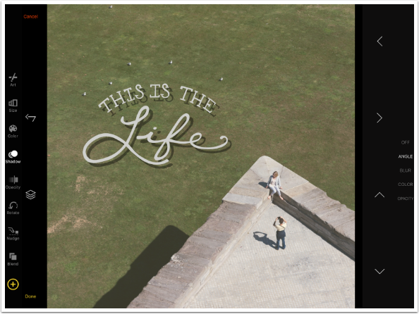
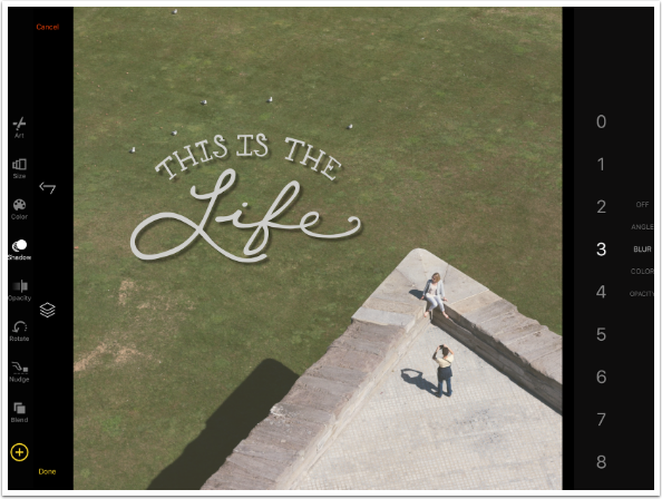
By default, the shadow has a sharp edge. You can blur it by adjusting the Blur control. Once again, I do not recommend going above a setting of 3, or the shadow will disappear.
You can choose whatever color you like for your shadow, but I recommend using a color already in the shadows of your image, as I have below.
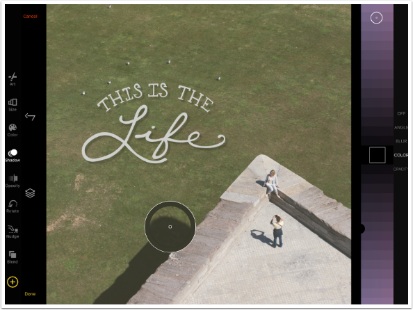
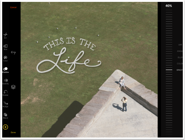
The default Opacity for shadows is 40%. I leave it there.
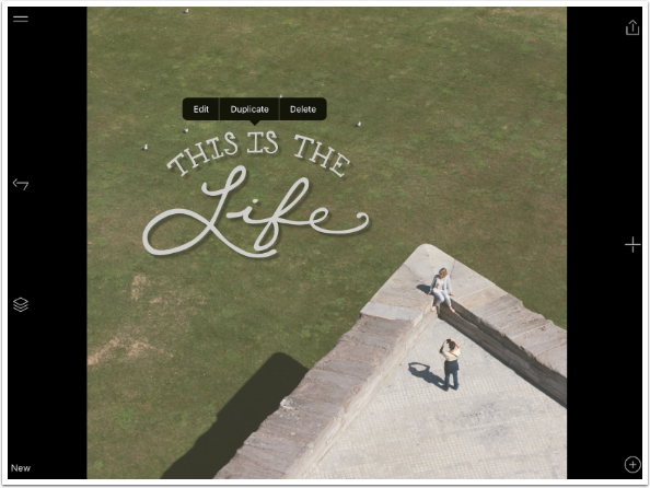
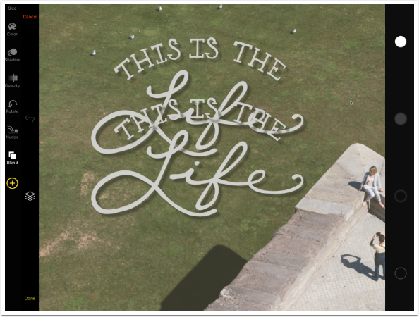
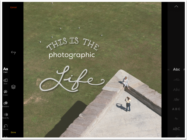
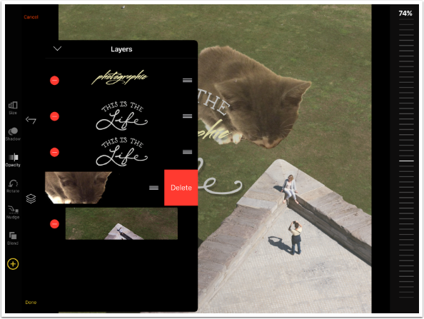
I tap Done because I am finished with the characteristics of the Artwork for the moment. The look I have in mind requires me to split the Artwork between the words “the” and “Life”. That means I have to have a duplicate of the modified artwork, and erase (or mask out) parts of both the original and the duplicate. Tapping the element brings up a fly-out menu which includes Duplicate.
I moved the duplicate Artwork down by dragging it. It is now obvious that the color and shadow was duplicated as well as the original clip art.
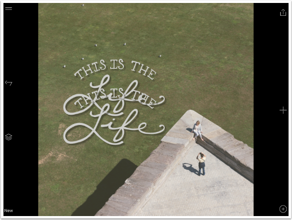
I want to mask out the bottom of the original clip, and the top of the duplicate clip, leaving a gap in the middle. I tap the Layers button so that I can make sure I’m dealing with the correct layer. The image is at the bottom of the stack, followed by the original clip, with the duplicate clip at the top. Using the bars at the end of the layer, I can change the order to the layers by dragging a layer up and down. I tap the top layer and am taken into editing on the duplicate.
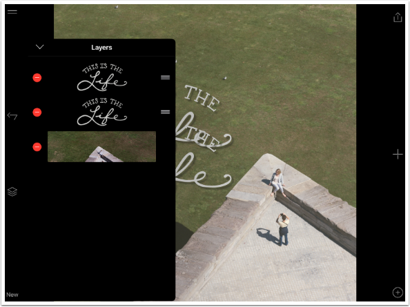
I go to the Blend tool on the left. On the right are four brushes for masking. The filled-in circles are a hard-edged and soft edged brush for masking out, while the empty circles restore the masked area. There is no Opacity control for masking; it is either masked or it is not.
Because I am masking the duplicate, I don’t need to worry about my brush going over the original. I am only masking the words “This is the” from the duplicate.
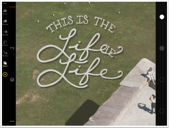
I go back to my layers and select the original (the middle layer). Now I can erase the word “Life” from the original.
Notice that the shadow has to be erased as well. In the screenshot below I have erased part of the word without erasing the shadow for the erased part. This “orphaned shadow” will also appear if you return to that layer and adjust the angle of the shadow so that it comes out from under the mask.
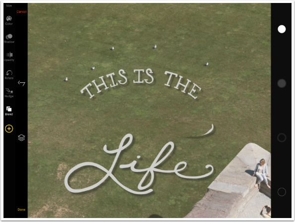
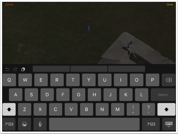
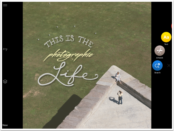
Now that I have the gap, I want to put some text into it. I tap Done on the Artwork, then tap the + to bring up the “carousel”, then Text. That brings up a keyboard so I can enter my text.
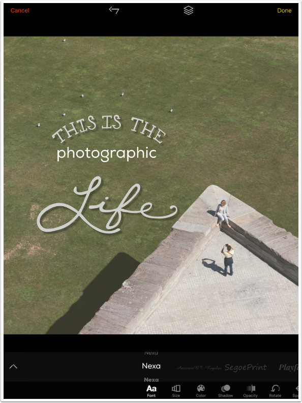
I’ve entered the work “photographic” so the words now read “This is the photographic life”. You can see on the left below that I have the same tools to change the text that I had for the Artwork: Size, Color, etc. The current tool is Font, and on the right you can see “Abc” representations of the fonts available. (By the way, the ^ – or caret – sign allows you to access the Font Manager, so that you can delete or turn off unwanted fonts. You can also change the order of the fonts in the same way as you change the order of layers – by dragging them into place.)
Below I’ve rotated my iPad into portrait orientation so that you can see that in this mode, you don’t see “Abc”. You see the name of the font instead. Currently that is Nexa.
If you look closely above and below the highlighted name Nexa, you will see other iterations of “Nexa”. That means there are variants of the font you can use by scrolling to them. Those variants include bold and italic, as well as other changes in some fonts. Some fonts have no variants. In landscape mode, you access the variants by scrolling horizontally instead of vertically.
Below, I changed to Lulo font, and you can see that I have the standard variant.
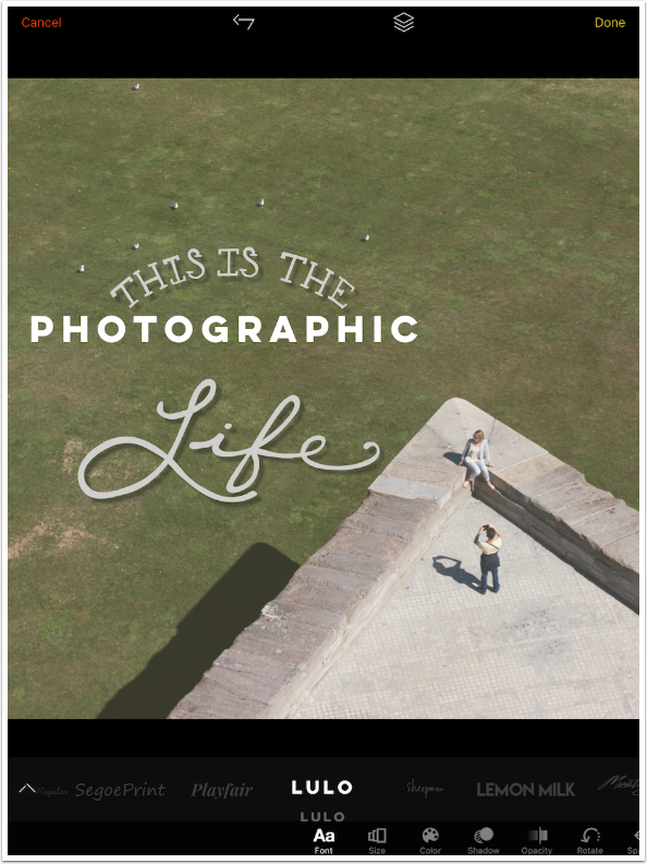
By scrolling down, I can get an outline variant.
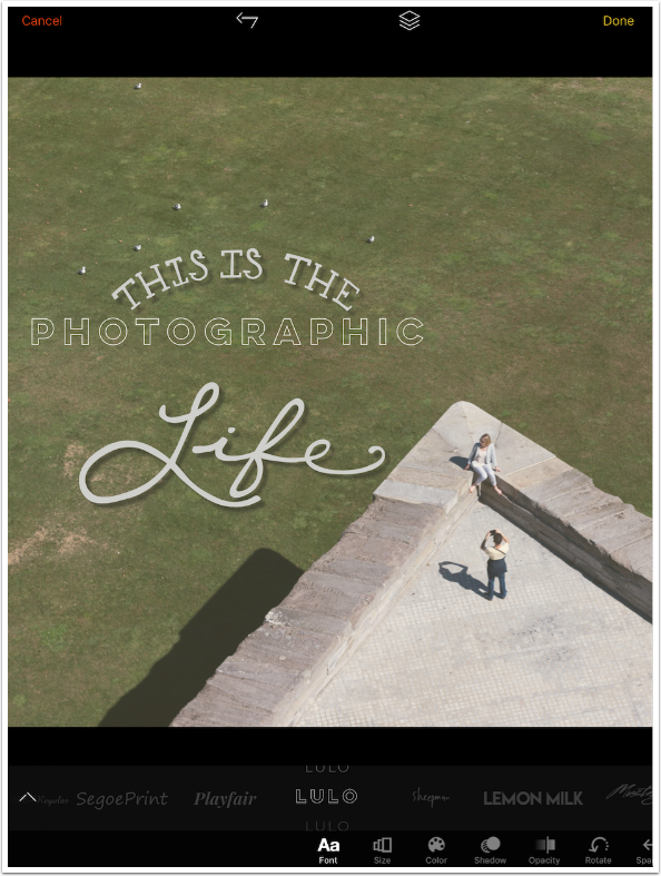
I decide to use the Mustang font. Once again, I can use the Size, Rotation and Nudge tools to place the word, or I can use a two-fingered pinch and drag on the text itself.
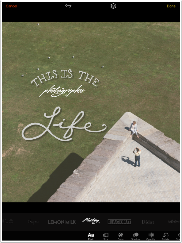
I can easily match the color of the text to the Artwork by using the eyedropper tool. In order to match the Shadow, I have to take note of the values for the shadow of the Artwork and recreate then on the text.
There is a Spacing tool for the text also. At the top you can choose letter spacing, or tap the word Line at the bottom for line spacing (which is not needed in this single line of text).
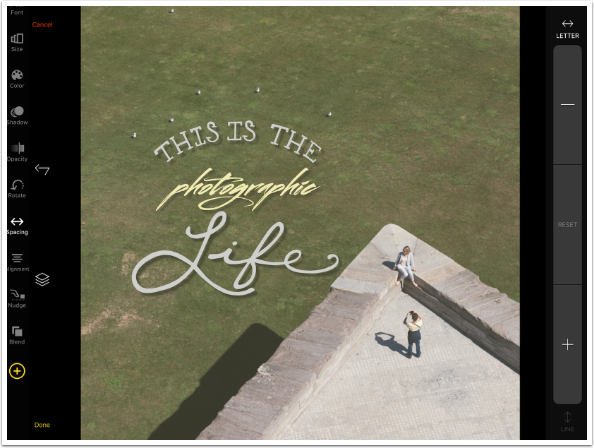
Tapping the + button increases the space between the letters. Reset is now active, in case you want to easily return to the default kerning. (I decided to change the color of “photographic” also, to help it stand out.)
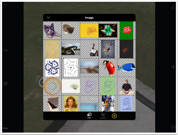
So we’ve added Artwork and Text. But our Carousel also includes Image and Search. What of them? Below I’ve chosen Image, and Over goes into my Photo Library. At the bottom of the picker “PNG” is highlighted. Over makes it easy to choose images with transparent backgrounds, which are the types of images you would generally want to add to your piece. If you like, you can switch the picker to see all images in your library.
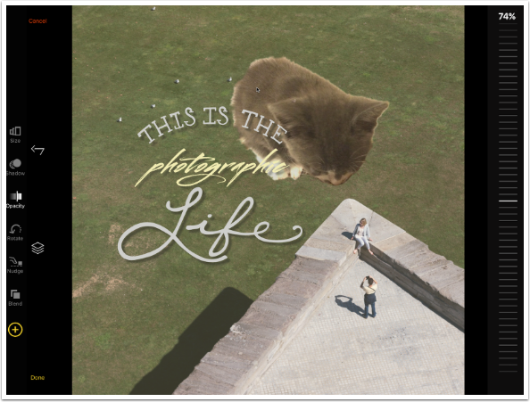
I added an enormous kitty to the image. You can see it is the top layer. One caveat: Your Tint (in this case a light yellow) is added to the image itself. It cannot be moved so that it affects all layers. So the Tint cannot apply to the kitty. This makes color matching somewhat difficult.
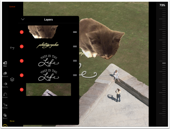
By dragging the cat layer below the Artwork and Text layers, those elements now overlay the cat.
The cat is not really working, so I return to the Layer palette and tap the minus sign on the cat layer. A Delete box appears. Deleting a layer is a two-step process, so that you will not mistakenly delete a layer.
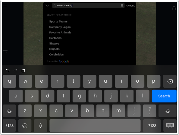
The Search tool also looks for PNG elements with transparent backgrounds. Instead of looking through the images in your Photo Library, it goes against the stock libraries of Pixabay.
Below I’ve typed in “yellow butterfly” as my search term.
It brings up a number of choices for elements to go into my project as a separate layer.
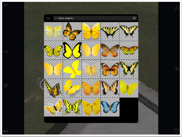
I add one of the butterflies, and add a shadow for it. Since the Angle places it “farther away” from the ground than my text and Artwork, I reduce the Opacity to make the shadow more “realistic”. (Yes, I put “realistic” in quotes: who’s going to believe the butterfly was actually there?)
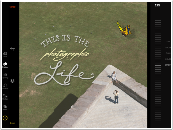
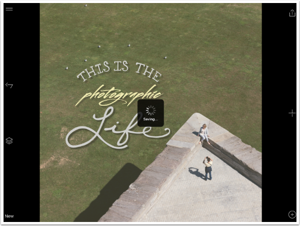
I deleted the butterfly layer and decided to save the image as is. Over has to Render the image and then Save the image. This takes a few seconds, and you get the spinning icon while it happens.
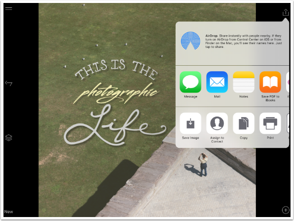
At this point you get the standard iOS dialog. There is no need to tap Save Image, since it is already saved to your Camera Roll. If you don’t want to open the image in another app, email it or send it to social media, just tap anywhere outside of the dialog box.
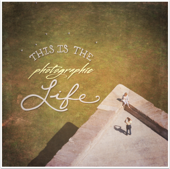
And here’s my finished image, after running it through Stackables.
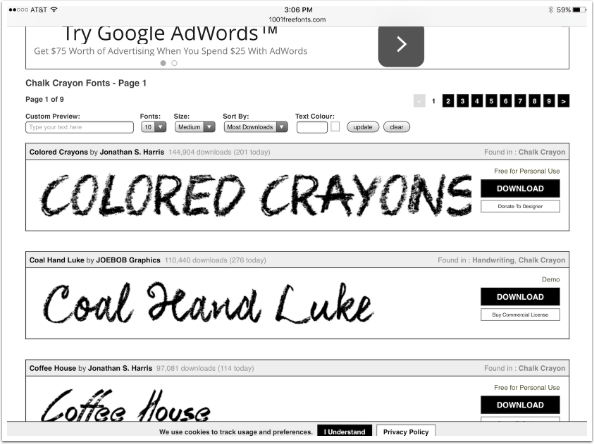
As with Phonto, the other typography app I’ve covered, you are not limited to the fonts that come with the app or in the add-on packs. There are multiple free sources of fonts on the internet, and Over will incorporate these fonts. Below I’ve gone to the site 1000 Free Fonts and found a crayon font.
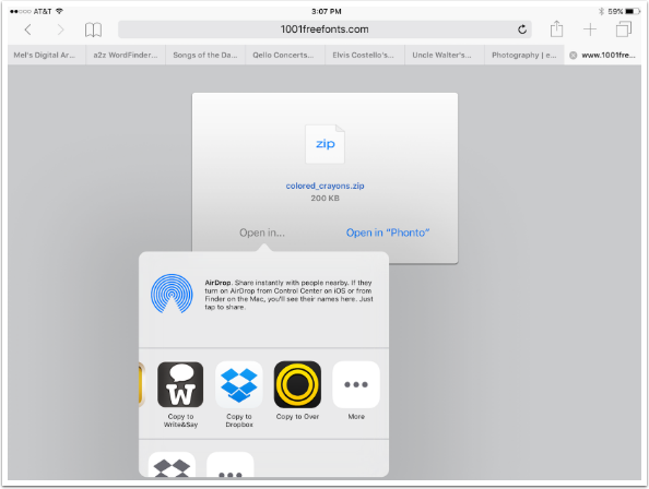
Tapping the download box brings up the following page in Safari. I tap the “Open in…” link and scroll until I find “Copy to Over”.
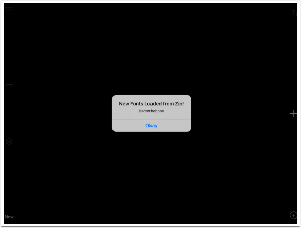
Over opens and I get a confirmation telling me the font is loaded.
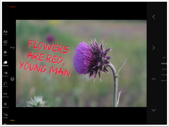
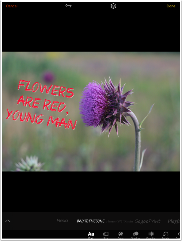
And then I am able to use that new font in my projects. The quote is from a Harry Chapin song about creativity. The light edge on the letters was created with a light shadow with no blur snuggled up close to the letters.
When I rotate into portrait mode I can see that the font I added is actually called “Badtothebone”. There are no variants.
So, are the new features what Over needed to become a heavily used app? I think that they are a good start towards that. The Drop Shadow and Masking features were absolutely necessary, and well-implemented here.
Let’s compare it to my go-to typography app, Phonto. (It’s not entirely fair, since Over goes beyond text with its Artwork and import of PNGs with transparent backgrounds.) Both have shadows, while only Over has masking. But Phonto has several more type-exclusive features, like stroke, background for text, and gradient fill. Phonto’s Angle and Distance sliders for shadow placement work more smoothly than Over’s arrows, and are more “industry-standard”.
Bottom line: if I am just needing to add some text to a project, Phonto will still be my go-to app. But if I need a little bit extra, if I need an inspirational boost that some of the included Artwork will give me, then Over has become an app that I will use without hesitation.
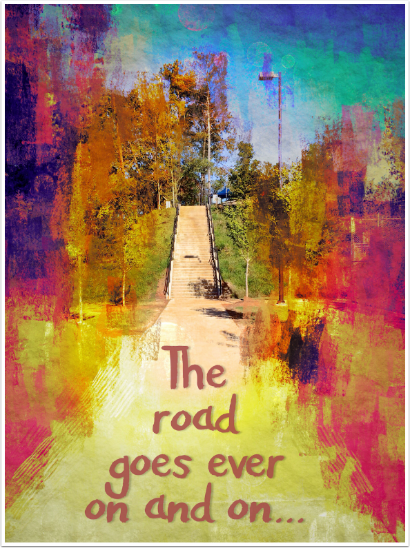
My final piece above was captured with vivid HDR, then processed in Repix and iColorama before finishing in Over with a Bilbo Baggins quote. Until next time, enjoy!
TheAppWhisperer has always had a dual mission: to promote the most talented mobile artists of the day and to support ambitious, inquisitive viewers the world over. As the years passTheAppWhisperer has gained readers and viewers and found new venues for that exchange.
All this work thrives with the support of our community.
Please consider making a donation to TheAppWhisperer as this New Year commences because your support helps protect our independence and it means we can keep delivering the promotion of mobile artists thats open for everyone around the world. Every contribution, however big or small, is so valuable for our future.
Jerry Jobe
Never content with just scratching the surface of what an app can do, Jerry Jobe decided to pass on what he learned about imaging apps to others. He’s constantly trying to figure out just what tools other artists have used, and trying to incorporate them into his own work, in an attempt to find his style. He’s written tutorials on over 145 apps so far, which you can find (along with his Song of the Day entries) at http://enthusiasmnoted.wordpress.com/ He lives near Atlanta, Georgia, where he also finds a creative outlet in acting and directing in community theater.