Mobile Photography / Art – Three Years of Tutorials: A Recap, an Assembly Feature, and an iColorama Procedural
Huge thanks to Jerry Jobe on his Mobile Photography / Art Tutorial Third Year Writing Anniversary. We have loved and enjoyed every single one of Jobe’s tutorials and we know that you do too. This week, Jobe does something a little different, take a look…(foreword by Joanne Carter).
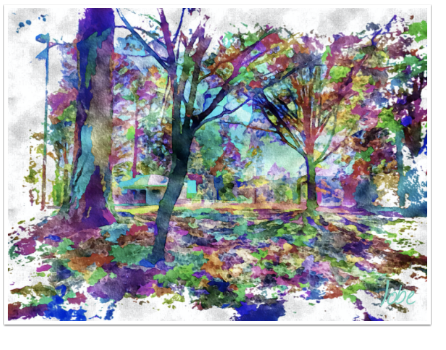
“On November 7, 2012, I published my first tutorial on Hipstamatic. As usual, on my anniversary, I like to take a look back. But there’s more to this article than a walk down memory lane. There’s a feature currently in beta for Assembly that I’d like to show you, and an iColorama procedural on how to create a multicolored water color painting like this one. So let’s get started!”
A look back
I know I have some loyal readers, but I doubt that anyone has read all my tutorials over the past three years. As I well know, life intervenes. Here’s a handy list of the apps I covered over the last year, listed in alphabetical order. The total does not come to 52 because there were several iColorama updates and procedurals.
Abstract Painting
Aerograph
Ansel
Ariista Impresso (2)
Assembly
Brushstroke (2)
Chalkspiration
Colorburn
Diana
Enlight
Fold Defy
Hollow’s Eve
Hipstamatic 300 (2)
Imaengine
Kaleidacam
Learn Photo365
Leonardo
Monokrom
NIR Color
Nowvel
Oggl
Over
Path On
Pixelmator (6)
Polamatic
Polarr (2)
RipPix
Shift (2)
Snapseed 2.0 (4)
Stackables (3)
Tintype
ToonCamera
Union (2)
Assembly update
I usually do not cover any feature still in beta, but the anniversary column is a good time to wrap up some loose ends. This new feature of Assembly, the Pixite app I covered just a few weeks ago, is one I mentioned/requested in my previous article. It should be available to the general public before the end of the month.
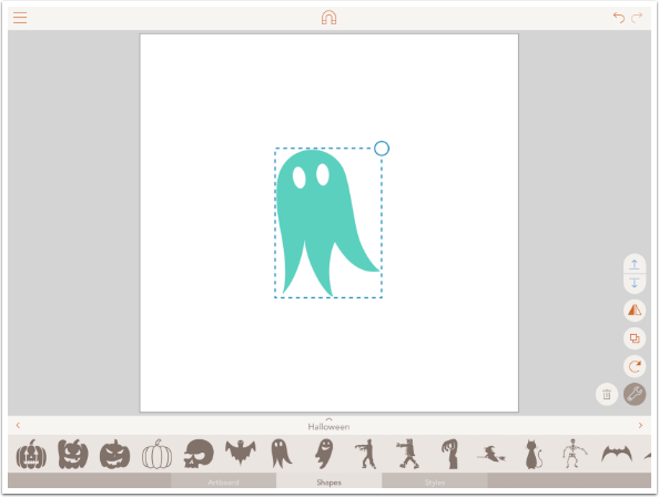
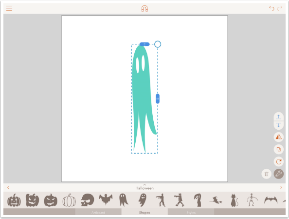
I mentioned that shapes could be manipulated by size and rotation, but that it was not possible to stretch the shape. For example, it was not possible to turn a circle into an ellipse. That will be remedied in the next release. (In addition, you can order t-shirts directly from the app – a nice feature, but not a “must-have”.) Below you’ll see a ghost figure that was included in the free Halloween shape pack.
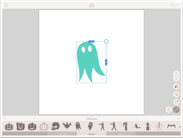
In the next image, rather than dragging the circle at the corner of the bounding box to resize or rotate the shape, I tapped the circle. Two blue handles move out from the circle along the top and right sides of the bounding box. These are the two “stretching” handles.
By moving the right handle in, and the top handle up, I made a very long ghost.
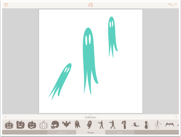
After stretching the ghost, I can still duplicate and rotate the shapes with the “stretch” intact. I would still like a “free transform”, which would allow for moving corners independently. For example, I could have a ghost with a bulbous head and tiny “feet”. But this new feature is certainly a welcome change.
iColorama Procedural: Multicolored water painting
It’s easy to look with disdain upon a formula used in digital artwork. A series of steps, followed to the letter, no matter how many apps or tools are used, can become as sterile a look as any single Instagram filter.
At the same time, a formula, when used as a starting point, can help you achieve the look you are trying to get. The trick to making it your own is to evaluate your image every step of the way, and changing a component or two. Perhaps the stated opacity is not right for your photo. Maybe a particular tool should only be applied to part of your image. In this way, a formula can become less “formulaic”, and more a step on your journey. It’s like knowing that to go for a walk, you’re always covering the same path to get to your front door before the whole world opens in front of you.
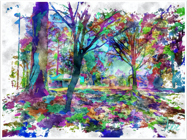
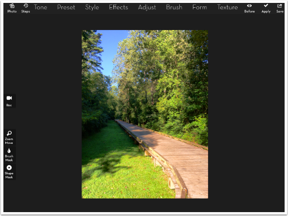
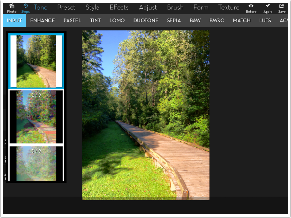
The image below is the one I’ll be using for my watercolor. Because it is different from the park image shown at the top of the article, any formula applied to it will have to be modified to bring out what I want from this particular piece.
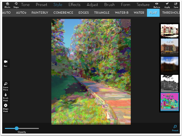
I came up with this particular look while experimenting with a particular preset: Style>Flat>18. You’ll see this preset below, shown at 100% opacity.
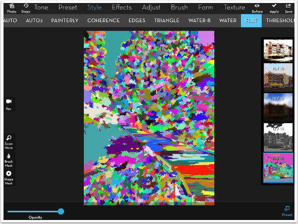
That’s nice, in it’s own way, but it obscures the original image of the wooden path with its lack of contrast. I can barely tell that it is a path among the trees anymore. So in order to still see the structure of the image while getting the multiple colors of the Flat preset, I lower the opacity to about 33%.
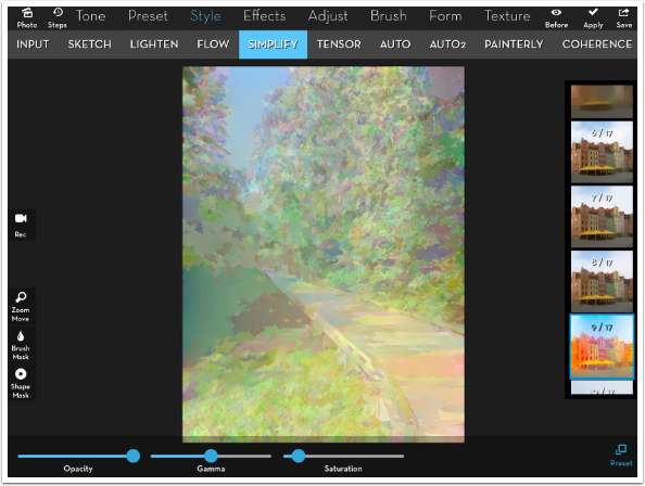
There are many fine details still visible in the trees. Fine details are not really appropriate for a watercolor, so I use Style>Simplify>9 to retain the saturation of the colors, while smoothing out some of the smaller details.
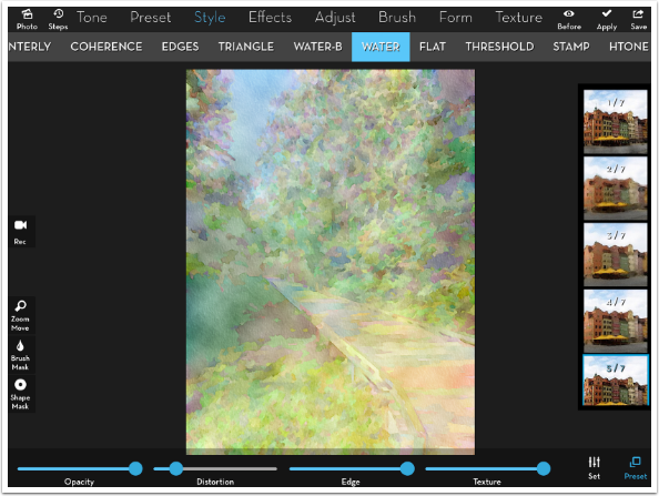
At this point I use Style>Water>5 to create my watercolor. I generally use preset 5 because I like the edges. Moving the Edge slider all the way to the right produces black lines, while moving it to the left produces white lines. Because there is little contrast between the color areas, there is little in the way of edges added.
This is where the mottling of the image, as if it was done on soft paper, appears. That is controlled by the Intensity slider under Settings on this particular preset. Paper Texture is also added with this preset.
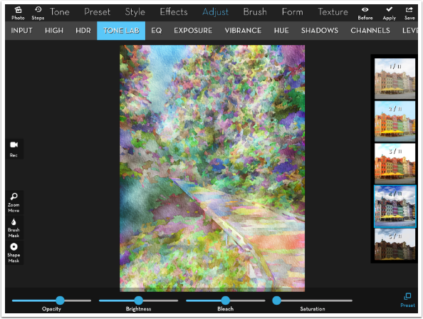
Well, this watercolor is too washed out, pardon the pun. So I add back some contrast with one of my favorite presets, Adjust>Tone Lab>4. At 100%, as shown below, it’s too strong. I will have to make another adjustment to the formula to suit this image.
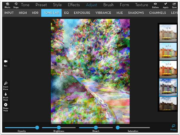
I lower the opacity of the Tone Lab to about 60%.
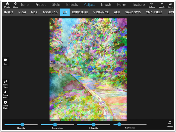
That’s a nice, muted watercolor look. I tend to like a more intense look myself, so I punch it up with Adjust>EQ>1 at about 50% opacity. (This preference of mine for a more intense look can certainly be a drawback, as it can sometimes ruin an image and make it too harsh. Watch out for tendencies in your own work that you have to fight against.)
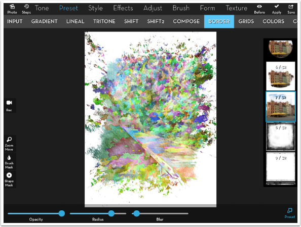
I may not know much about painting, but I do recognize that many times the artist does not paint out to the edge of the paper. The brush strokes result in a more organic edge to the image on the paper. I use Preset>Border>7 to create that organic edge.
The default Blur setting creates much too soft an edge. An artist would really have to work to create that soft an edge. So I lower the Blur to next to nothing, and adjust the Radius. If you have white bleeding into the center of your image, then you can always mask out the offending pixels with the Brush Mask.
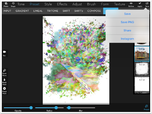
The border should be showing the canvas that the image was painted onto. Stark white does not do it for me. I want to change the canvas. So I save off the work done so far so that I can work on the canvas.
I choose to apply a two-color gradient (Preset>Gradient>2) to establish the canvas. There’s an eyedropper in the color picker to allow you to choose colors from the underlying image. When I touch the image after tapping the eyedropper, the underlying image appears. As I move my finger over the image, the color in the thumbnail changes. When I am satisfied, I lift my finger and the color is chosen.
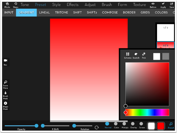
In that way I chose the two colors that are shown below.
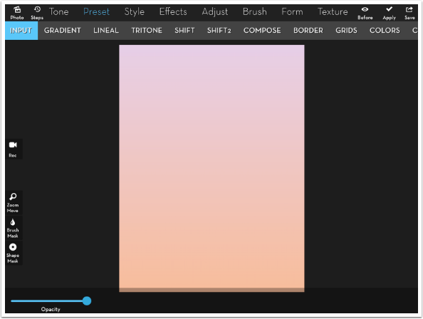
That canvas is too dark for me, so I raise the exposure in Adjust>Exposure, and Apply it.
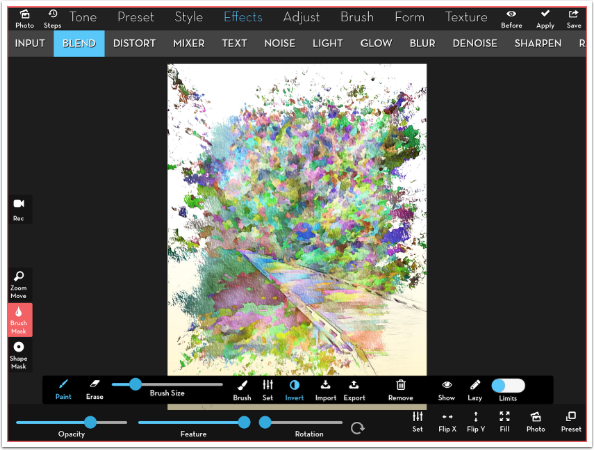
Now I want to place my painting on the canvas, using Effect>Blend. I chose the saved Photo from my Camera Roll, and it overlays the canvas – including the white! How can I easily remove the white to see the canvas underneath? With the Blend settings.
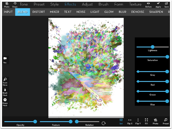
By moving the right end of the Gray slider ever-so-slightly to the left, I drop out the whitest pixels of the top image, allowing me to see the canvas below. I Apply that.
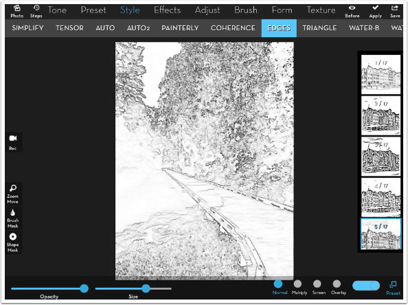
We’re coming into the final stretch now. I look at my image, and realize that I want to have that wooden path stand out more. One way to do that is to add some edges – almost as if I’d penciled in the path and allowed some of that pencil to show through the paint. However, I want to see the edges of the original path, not the painted version. So I tap Steps to go back in history to my original image (Step 1/9).
I use Style>Edges>5 to create my edged image. I do not Apply! Apply would re-establish my Steps or History, losing the work I’ve done. I Save this black-and-white edged image instead. Then I can go back to Steps and choose Step 9/9, recovering my painted image.
I now use Effect>Blend to bring in my edges in Multiply mode. That’s way too much edge, and it goes over into the canvas where it isn’t wanted. Now is when I decide where I want edges, and only apply them in those particular places.
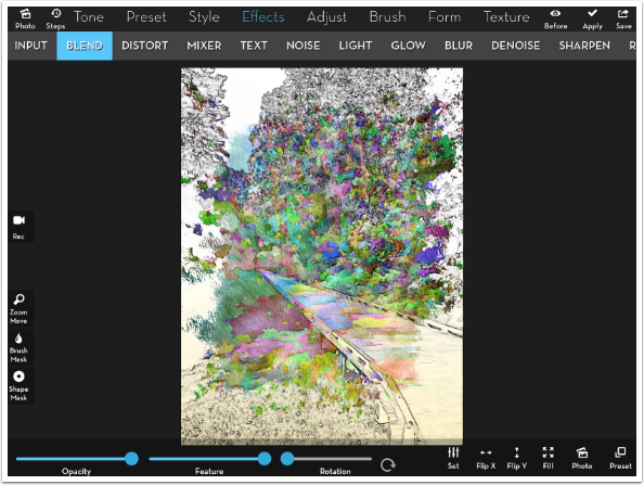
I bring up the Brush Mask and Invert it. Then I can paint in the edges only along the path. Those masked-in edges are still too harsh, so I lower the opacity to 65%.
The canvas is too smooth for a watercolor, so I add Texture>Paper>10, lowering the opacity to taste.
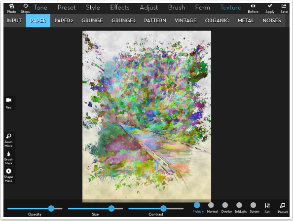
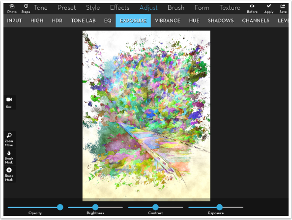
By using Multiply blend mode on the paper texture, I made the image grayer and darker. I compensate by using Adjust>Exposure to brighten it up a bit.
I’d still like to define that path a little more. By losing the original colors, in which the brown of the path helped distinguish it from the green of the foliage, I lose some of the structure of the original.
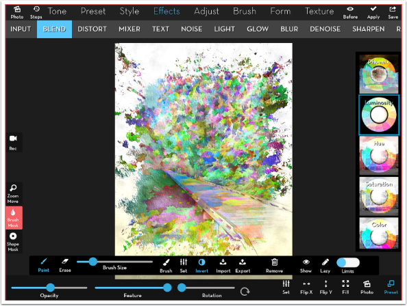
Here’s a trick to get some of it back. I use Effects>Blend to bring back the original in Luminosity mode. That means the details come from the original, while the color comes from the painting. (Ugly, ain’t it?)
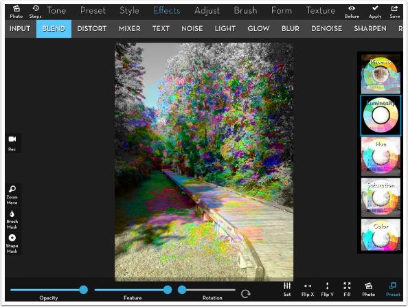
I bring up the Brush Mask, invert it, and lower the Opacity of the blend to 50%. Now when I brush the blend in along the path, I can bring in some of the shadow underneath the path that helped define it. Cool, huh?
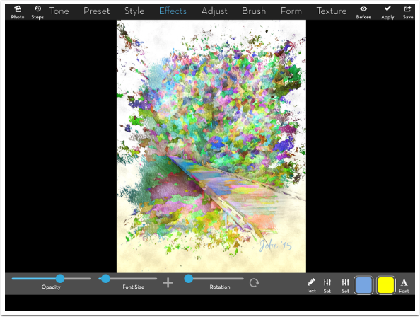
I decide I want to sign it, which I do using Effects>Text.
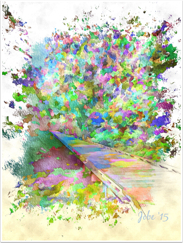
And here’s my finished image, using a formula of sorts: Flat 18, Simplify 9, Water 5, Tone Lab 4, Border 7. But, due to the requirements of the original image, I had to go in and tweak that formula every step of the way by masking and changing opacities.
Three years is a long time to be writing regular, detailed columns. As of this moment, I have no intentions of abandoning my endeavors. However, my “payment” for the hours I spend on this column weekly is in the form of feedback and suggestions, made on the enthusiasm noted and App Whisperer sites, or on Facebook where the articles are cross-posted. I know I’ve got some loyal readers; let’s get some conversations started! Otherwise, it can seem like I’m throwing these columns out into the void.
As we move into the next however-many-years I have of writing about iPhoneography and digital art apps: enjoy!
TheAppWhisperer has always had a dual mission: to promote the most talented mobile artists of the day and to support ambitious, inquisitive viewers the world over. As the years passTheAppWhisperer has gained readers and viewers and found new venues for that exchange.
All this work thrives with the support of our community.
Please consider making a donation to TheAppWhisperer as this New Year commences because your support helps protect our independence and it means we can keep delivering the promotion of mobile artists thats open for everyone around the world. Every contribution, however big or small, is so valuable for our future.
Jerry Jobe
Never content with just scratching the surface of what an app can do, Jerry Jobe decided to pass on what he learned about imaging apps to others. He’s constantly trying to figure out just what tools other artists have used, and trying to incorporate them into his own work, in an attempt to find his style. He’s written tutorials on over 145 apps so far, which you can find (along with his Song of the Day entries) at http://enthusiasmnoted.wordpress.com/ He lives near Atlanta, Georgia, where he also finds a creative outlet in acting and directing in community theater.

2 Comments
Michael Austin
I would like to say a special thanks to Mr. Jerry Jobe for all of his wonderful tutorials and videos. Without his instruction I would spend weeks going in circles with iColorama and Stackables. Thank you for giving so much to beginners just trying to find a starting point.
George
This is pretty amazing stuff flawless explanation of using app its almost hard to put into words like its almost soft yet details and sharp suggestions and explanations its awesome im new here and i got stuck reading alot of your reviews/tutorials polarr brought me here.. at first i thought i hope this has a video at the end i was like holy shit… glad there wasnt..