Mobile Photography / Art Tutorial – MaxCurve Part Two: Unexpected Curves!
We are delighted to publish Jerry Jobe’s latest mobile photography/art tutorial for our reading and viewing pleasure. This time Jobe takes a second look at the app called MaxCurve. This is Part 2 of 3 Tutorials that we will publish on this app. (If you missed Part 1, please go here). Read Jobe’s thoughts as he puts it through its paces (foreword by Joanne Carter). Take it away Jerry…
MaxCurve retails for $2.99/£2.29 and you can download it here.
“In the first part of my series on MaxCurve, I showed how MaxCurve implements the most basic of curves: the RGB curve, which affects all the pixels within the image, changing the luminosity and contrast; and the separate Red, Green and Blue curves. Remember, these are the curves referred to when other apps like Leonardo, Enlight, Filterstorm and Laminar give you curves capability.
But MaxCurve steps beyond those standard curves, giving other adjustments the fine control that you can only achieve through a curve. As with the RGB curves, you can make much subtler changes than I show here. I am trying to make the changes obvious for these screenshots, but expect you to use them judiciously in the final toning steps in your workflow”.
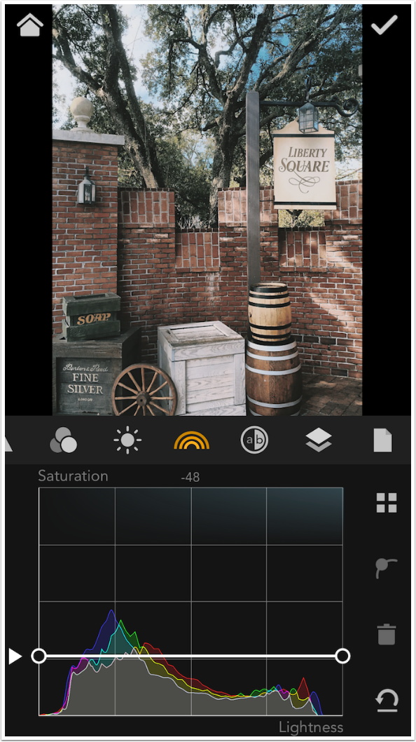
Before we go on to the next two curve “kits”, Lightness and HSL, I want to show you the Layer Kit. Each change you make to one of the curves (as well as adjustments like Grain or Vignette, see part 1) is listed in the Layer Kit. Last time I made a negative Grain adjustment, seen at the bottom of the layers, to reduce the noise in the image. I made an overall adjustment with an RGB curve, reduced the midtone reds with a Red curve, and gave the Blue curve an inverted S to increase the blue in the shadows and warm the highlights. Each of those adjustments is a layer, which can be revisited and readjusted later. Grabbing the three bars at the right side of the layer allows you to change the order of the layers by moving a layer up or down in the stack.
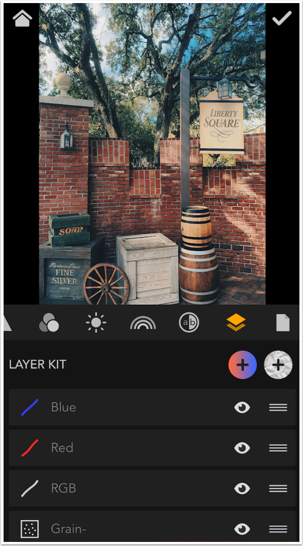
Swiping a layer to the left gives you the ability to delete a layer.
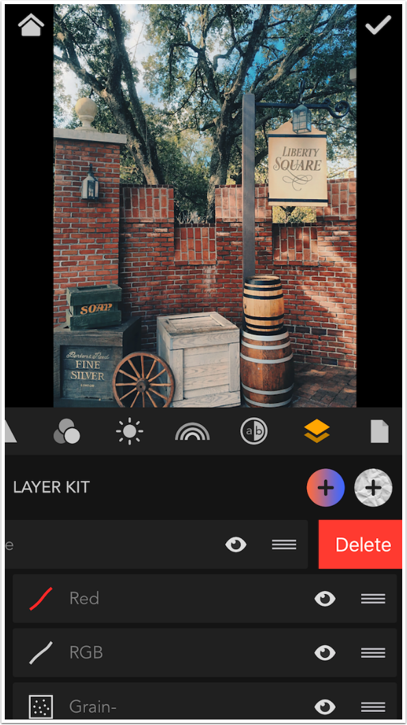
You can also hide a layer by tapping on the eye on that layer. Below I have hidden the Blue curve.
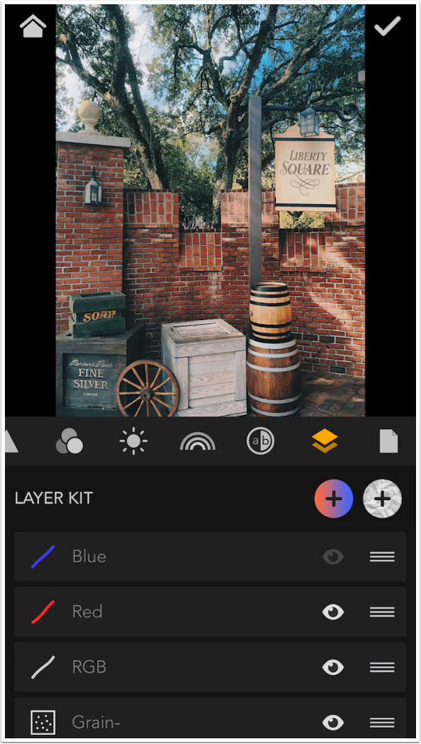
At the right end of the “Layer Kit” header there are two buttons with plus signs. These buttons allow you to add two kinds of layers to your image: Color and Texture. I will go into Color now and into Texture in part 3.
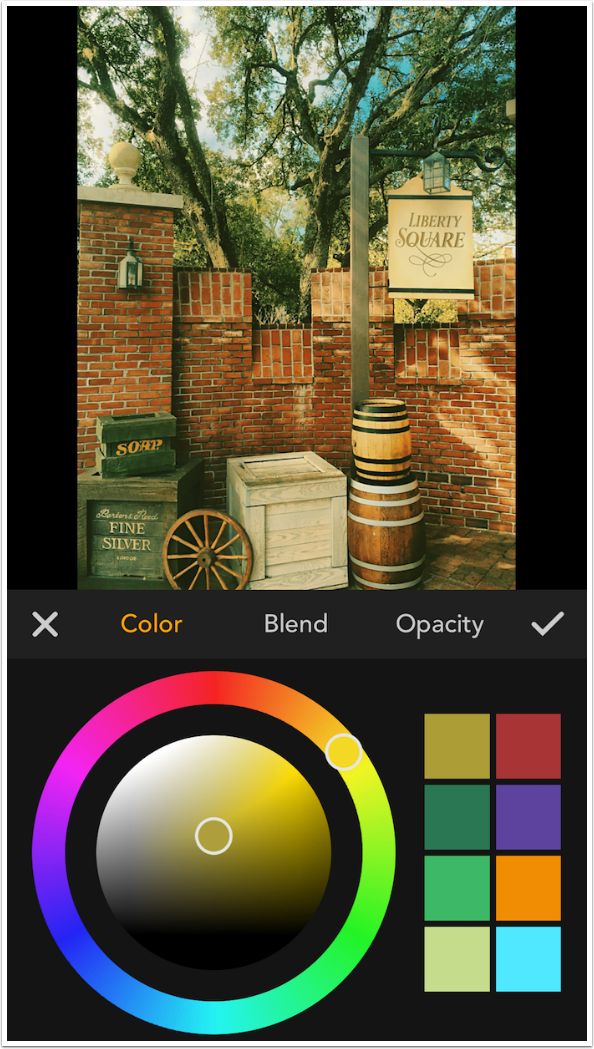
Color layers have three controls: Color, determined by the color picker seen below; Blend mode of the layer; and Opacity of the layer. The colors in the palette are nice, but I could have hoped to see the colors for standard warming and cooling filters.
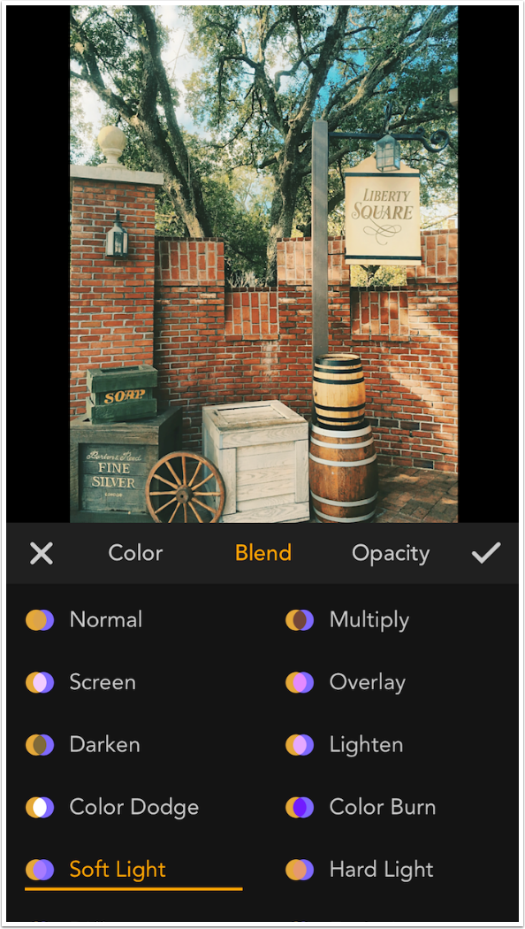
There are 16 different blend modes. Color defaults to Soft Light. MaxCurve even includes the Luminosity blend mode, which is an interesting choice for a flat color layer. Try it and see what I mean.
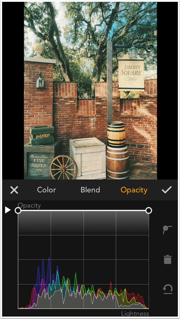
Here’s where it gets interesting. Opacity is a control that normally uses a slider and affects the entire image. MaxCurve gives you a curve to control opacity. By default the curve runs across the top of the grid, which means 100% opacity from shadows to highlights. The entire curve can be moved down by dragging the arrow at the left side of the grid.
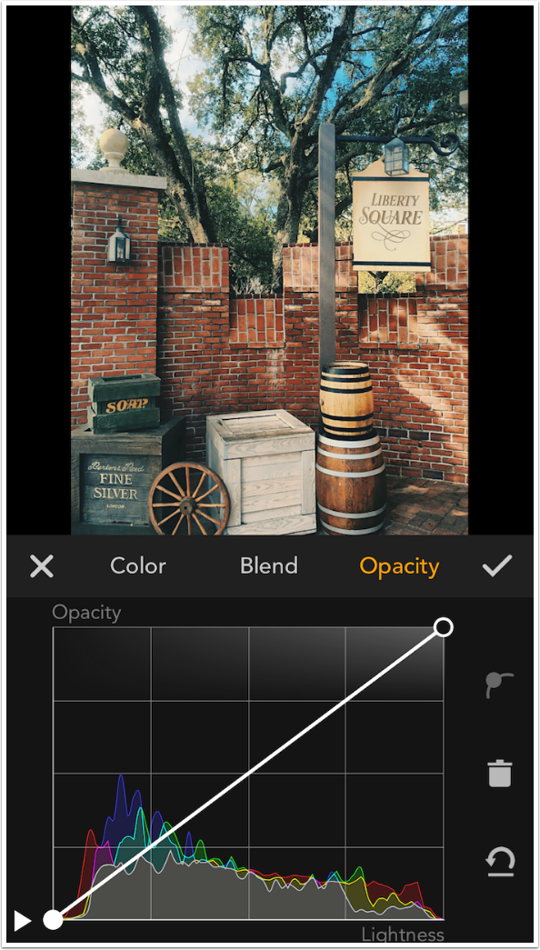
Below, by just dragging the leftmost endpoint downward, I create a curve that does not add the color to the darkest shadows, but adds more color as the image gets brighter. This gives the user an incredible amount of control over how strong the color is in the different tonal areas of the image.
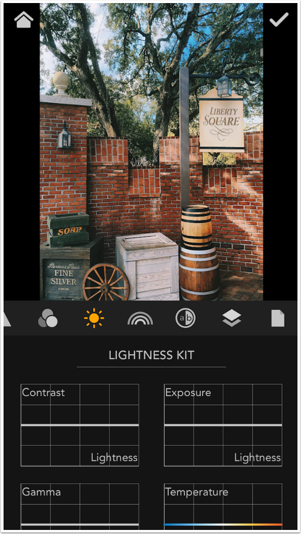
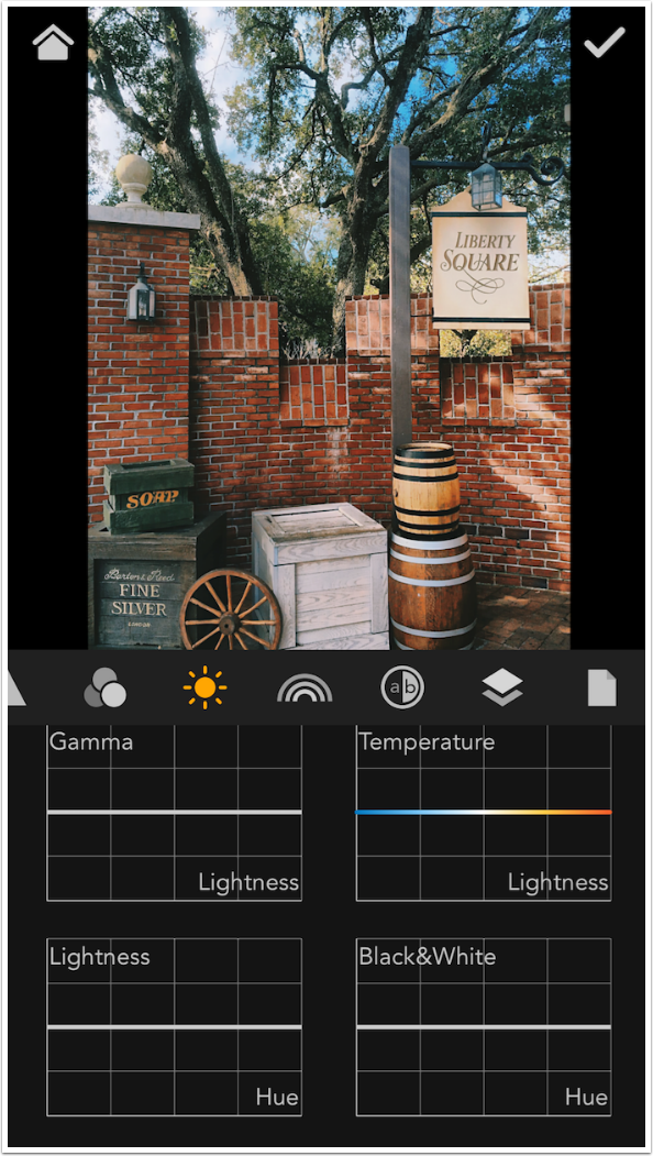
Opacity of the Color layer, by default, is an example of a flat curve. The adjustment applies equally across the whole image. All of the curves in the Lightness Kit also default to being flat curves. The difference is that these curves run across the middle of the grid to signify no change, and each point can be moved either up or down. The Lightness Kit curves are Contrast, Exposure, Gamma, Temperature, Lightness, and Black & White. The four curves that you see below are all based on Lightness, as told in the lower right of each grid. This means that the grid is based on Lightness, just like the RGB curves, with shadows on the left and highlights on the right.
The remaining two are based on Hue rather than Lightness. These grids are different than any curves you have ever seen.
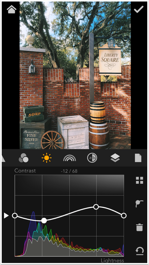
The first curve in the Lightness Kit is Contrast. Contrast controls usually apply across the entire image. If you increase contrast in the midtones, you are also increasing contrast by the same amount in the shadows and the highlights. This can result in obscure shadows with no detail and blown-out highlights. But by adding a few points to the contrast curve as shown below allows you to increase the contrast in the midtones without affecting the shadows and highlights. This can really make your image pop.
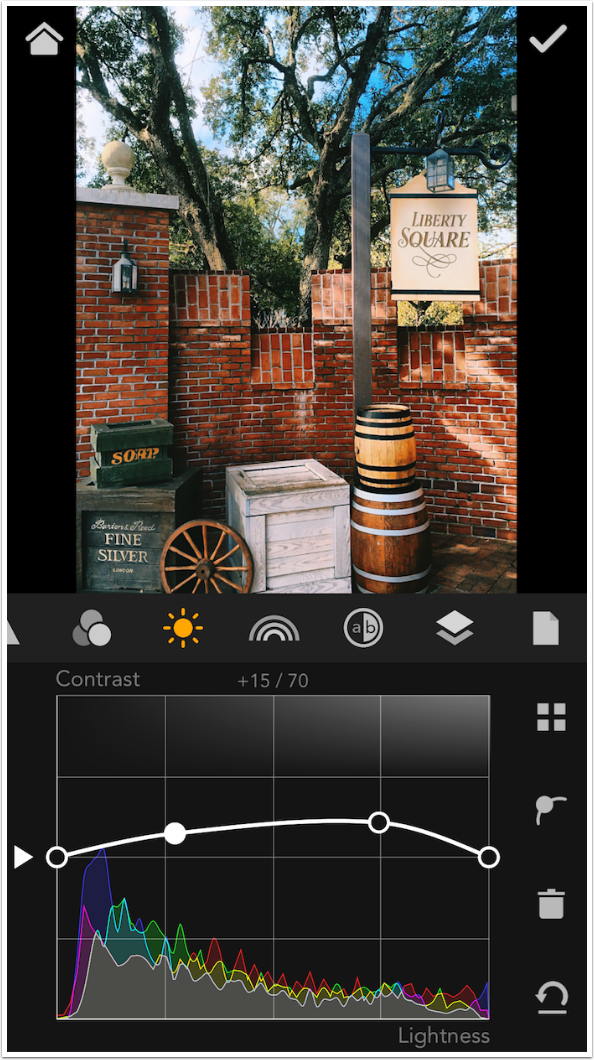
You can make the curve as complicated as you like. Below I’ve decreased contrast on the darker part of the image and increased it on the lighter. Don’t forget that with the “point on a curve” button at the right, you can change any point from a smooth curve to an angled one.
The next curve is Exposure. I placed an anchor point at about two-thirds of the way along the curve, and pulled down the highlight end point. This darkens the highlights without affecting most of the tones in the image.

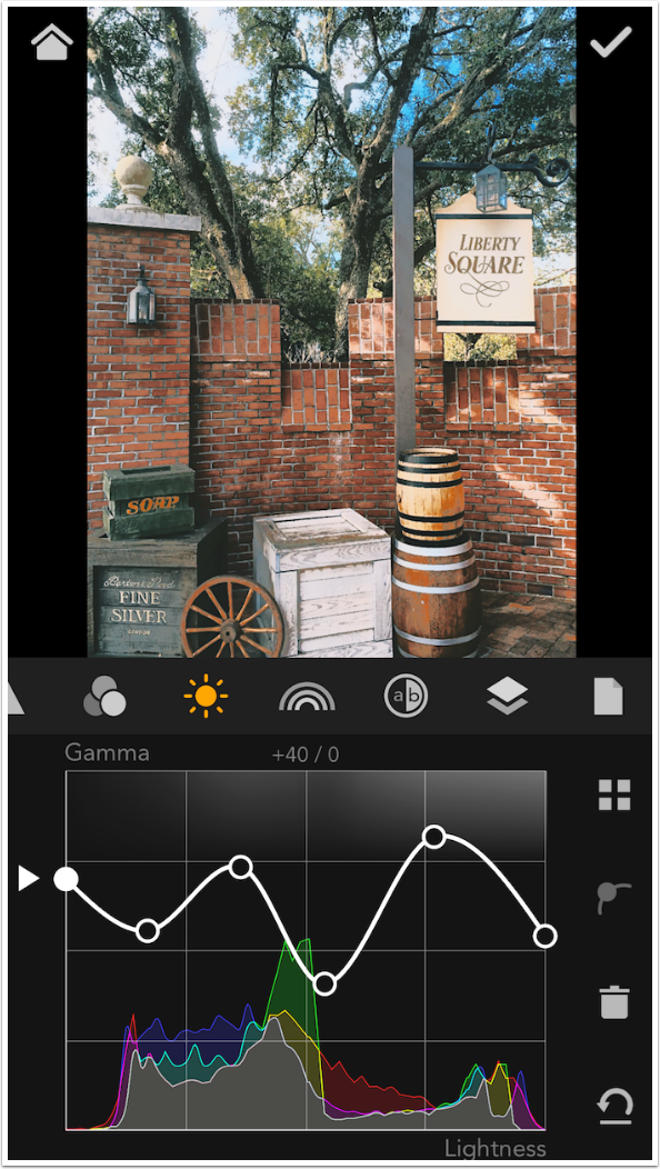
Gamma is a brightness control. I tried to look it up and make it comprehensible to you, but I couldn’t get past “gamma is the name of a nonlinear operation used to code and decode luminance or tristimulus values in video or still image systems.” So I don’t understand it, but I can tell you that changes in Gamma are not as drastic as changes in Exposure. I went wild on the curve below and it did not cause the image to be unrealistic.
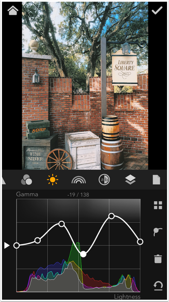
Below is a screenshot that emphasizes that you can move the endpoints as well as any of the interior points.
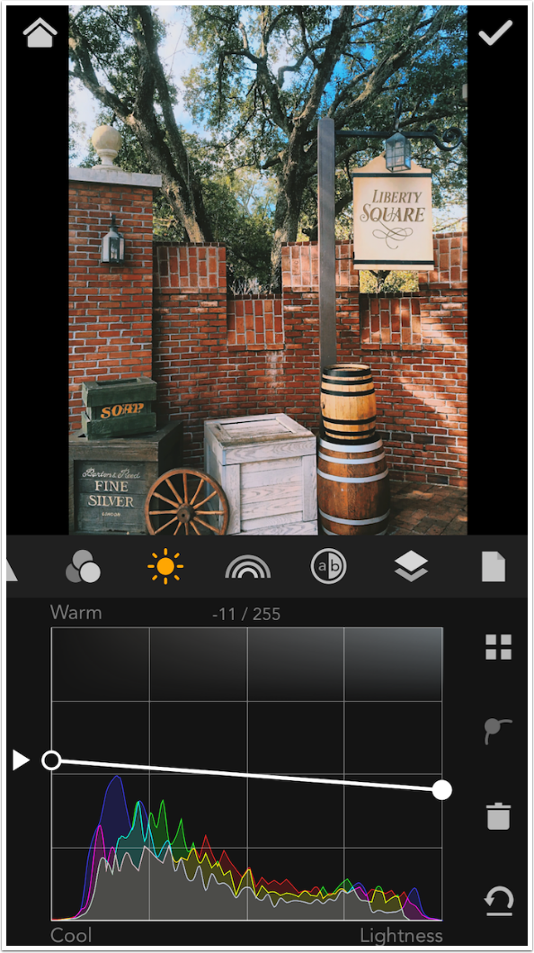
The Temperature curve is a different way of performing another task I covered last week. Remember that I used the Blue curve to cool the shadows and warm the highlights. The Temperature curve below warms the shadows and cools the highlights. I did not have to add any points to the curve to accomplish this; I merely moved the endpoints.
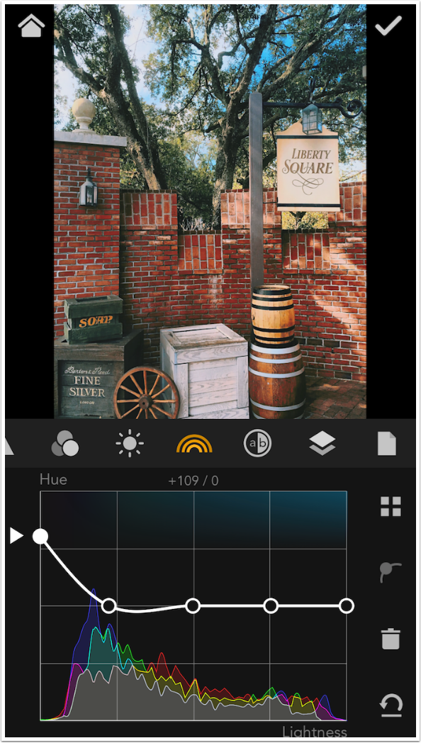
The Lightness curve is on a grid that, rather than going from dark to light, circles through the color wheel. This allows you to do things to your image like make the greens darker and the reds lighter. You are targeting a color rather than a tonal range.
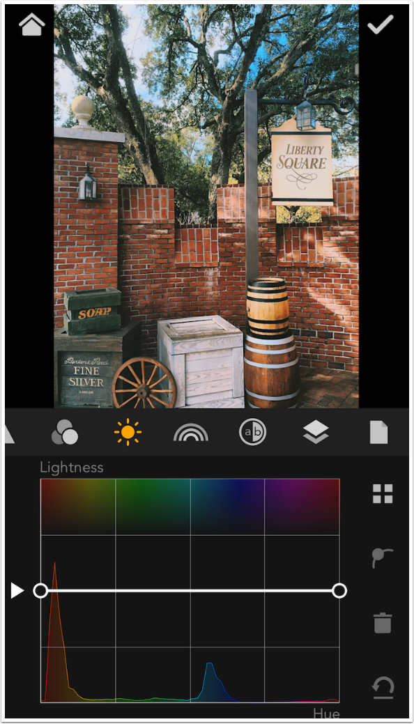
Because it is a color wheel, reds are at both endpoints. MaxCurve won’t let you move them independently; if you move one red endpoint, the other moves with it. The curve below makes the reds darker.
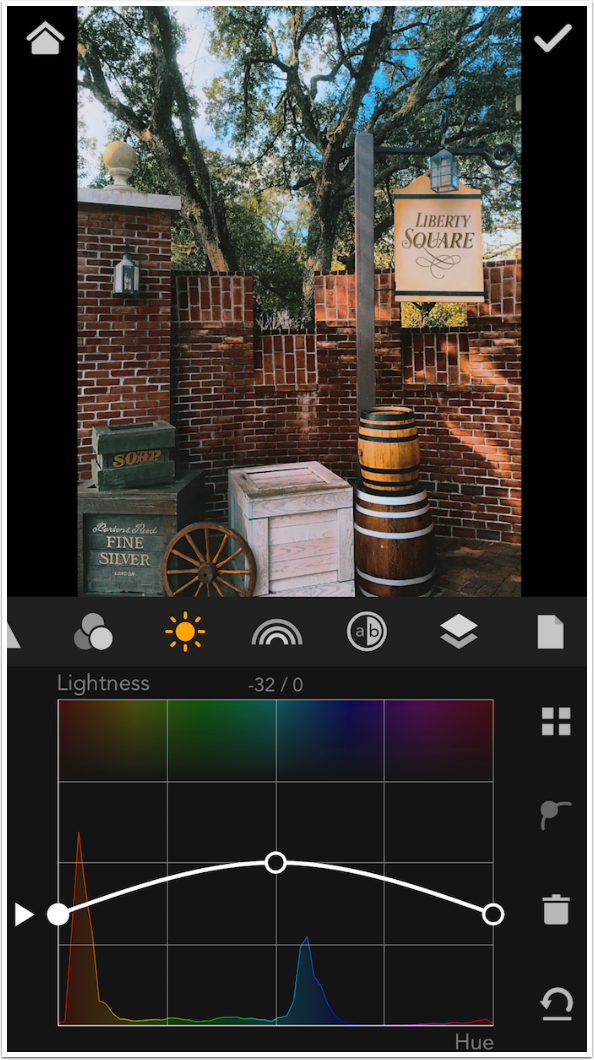
Once I build a curve, I can move the entire curve up and down using the left arrow.
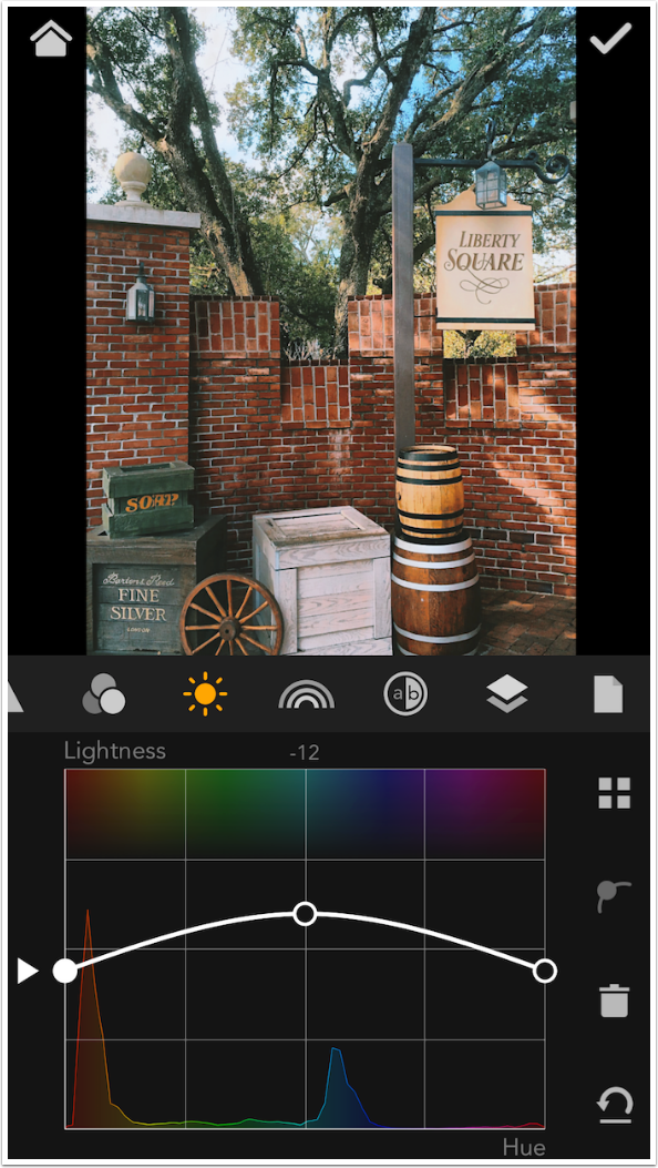
The final curve in the Lightness Kit is Black & White. Selecting this curve for adjustment desaturates the image. To restore the color, delete the Black & White layer.
Black & White also uses a Hue-based grid, and makes the original colors darker or lighter, like a color filter does on monochrome film.
Take care; look what happens when I make a major change to the blues from the original.
Once again, moving the entire curve up and down is accomplished with the left arrow.

In the HSL Kit, there are two types of curve: Hue and Saturation. In addition to basic Hue, which swaps colors around, there is Hue based on how saturated the color is, and Hue based on the Lightness of the tone.
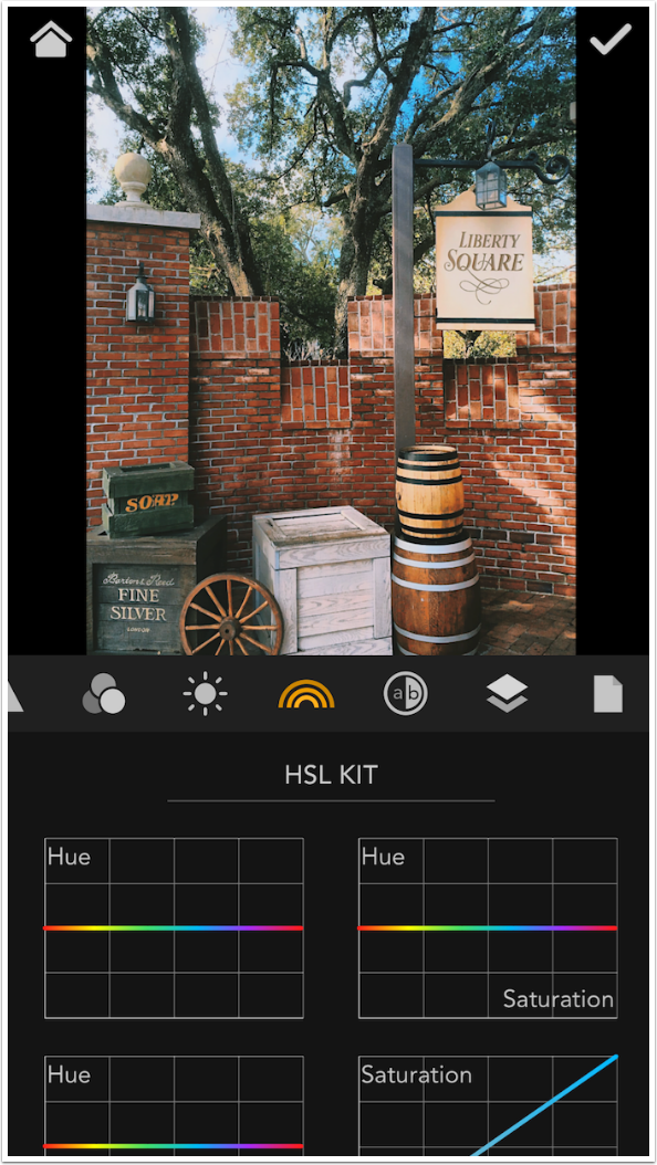
There’s a standard Saturation curve, and then there’s Saturation based on Hue and Saturation based on Lightness. Six curves in all, and you can end up getting a bit lost if you don’t pay attention to what you’re doing.
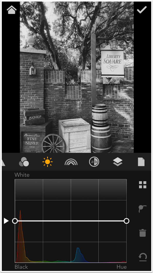
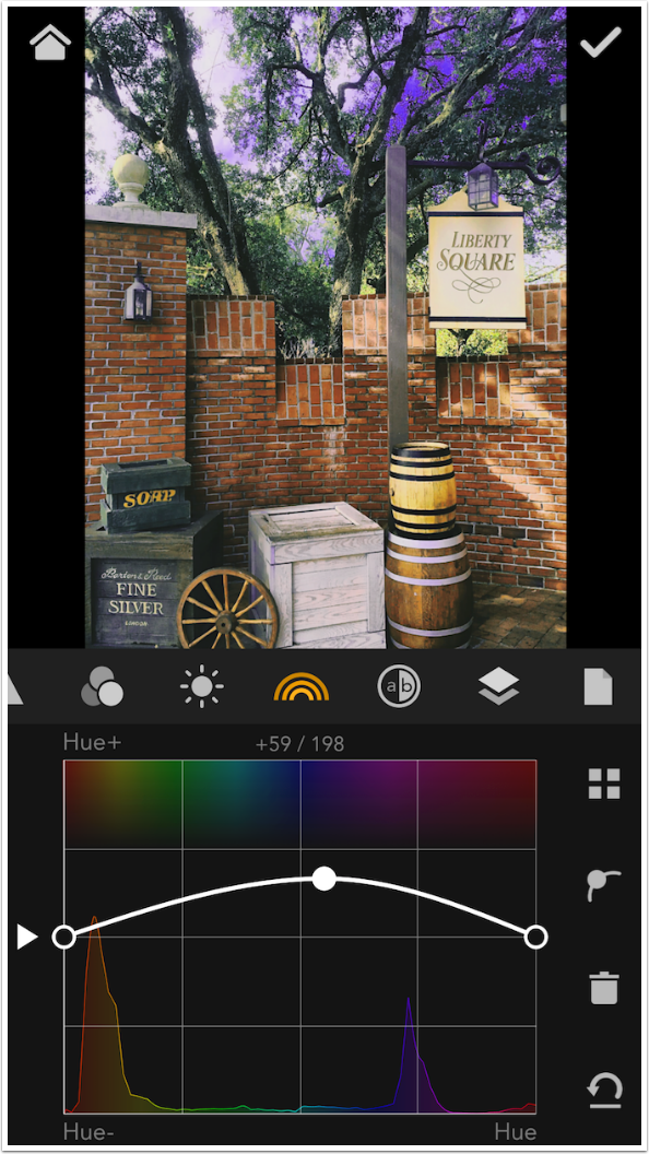
Below is the basic Hue curve. Notice I have placed a point over the blues, as indicated by the histogram at the bottom.

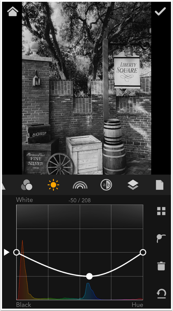
As I move the point up, the blues in the image get moved up the color wheel into the purple area. If you look at the blues in the histogram, they are now under the purple in the hues along the top of the grid. That turns the blues in the images purple, as seen in the sky.
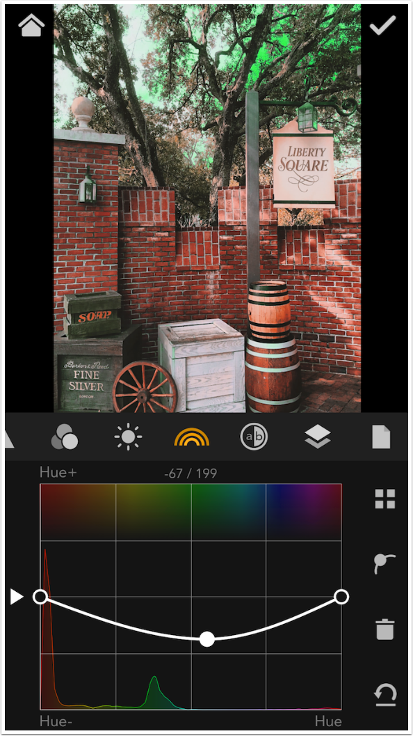
Moving the point downward moves the blues down the color wheel into the greens. That is one toxic sky.
The next curve is Hue by Saturation. In the example curve below, the hue is changed on only the most saturated colors, since I only moved the right endpoint.
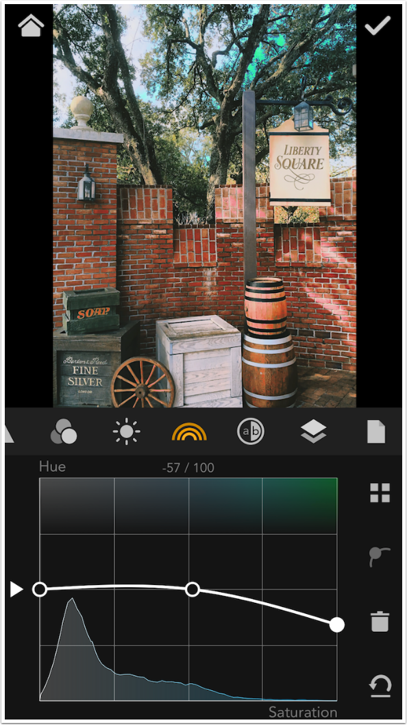
Hue by Lightness allows you to change the color of pixels based on their brightness or darkness. By using a few anchor points in the curve below, I was able to change the hue of only the darkest of the shadows. I’m not sure that you can actually see the change in the image here.
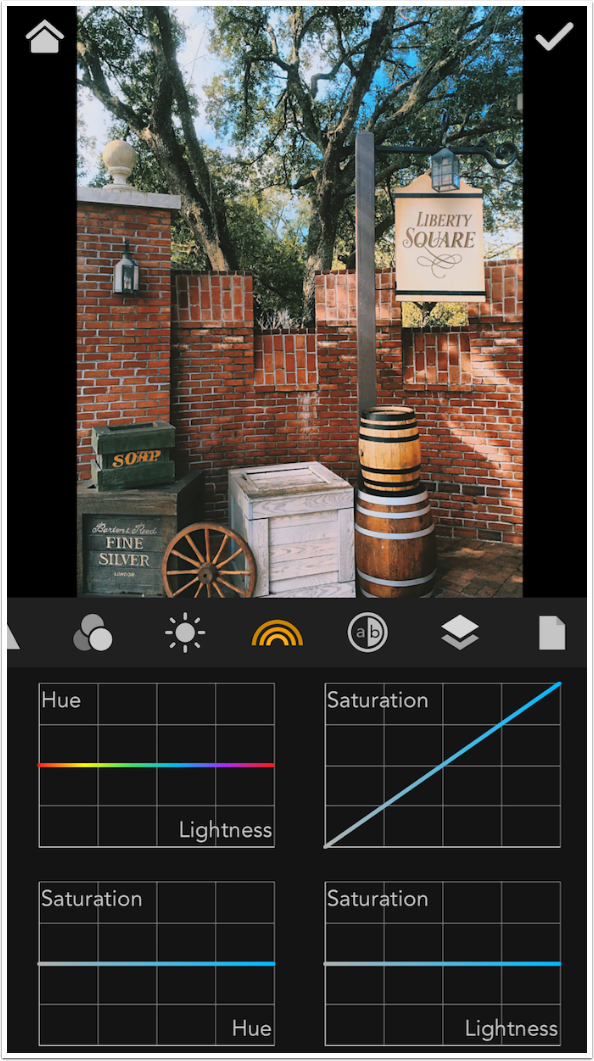
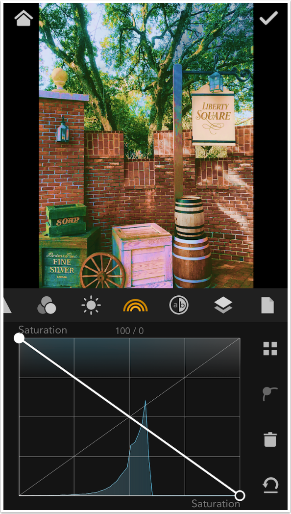
The Saturation curve is not a flat curve, but resembles the RGB curves. The S-curve below makes the most saturated more saturated, and the grayer colors even more gray. Think of it like contrast, only with saturation. This curve increases the slope between the least and most saturated.
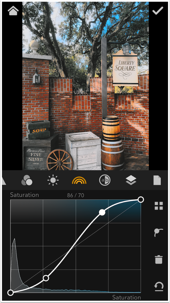
By swapping the endpoints, I completely desaturate the blue in the sky (which was the most saturated area of the image), and make the grays very saturated. Look at the blue in the shadow of the white box, and see how it now become day-glo.
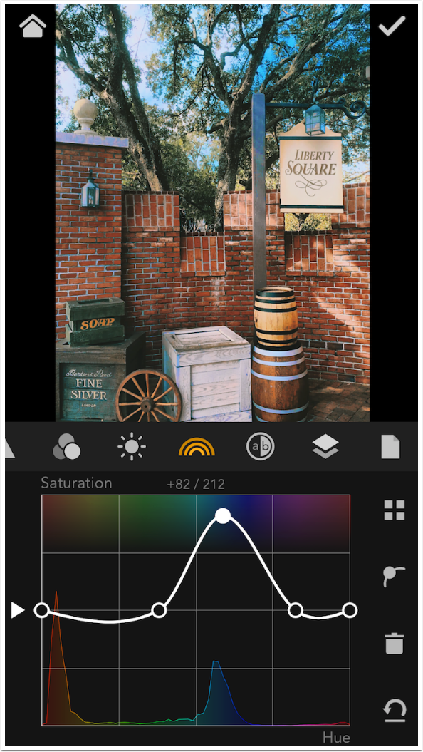
With the Saturation by Hue curve, you can increase or decrease the saturation of certain colors. Below I established a couple of anchor points so I could target the increase in saturation to the blues.
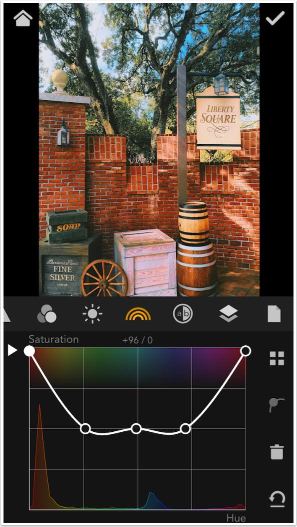
Below I did the opposite and targeted the reds for increased saturation.
The final curve in the HSL Kit is Saturation by Lightness. I decreased saturation across the entire range by moving the curve down using the left arrow.
There’s a lot to absorb here in part 2 of my MaxCurve articles. Just take a breath and relax. First of all, you haven’t seen controls like Opacity, Contrast and Exposure with a curve attached to them before. Even Photoshop doesn’t do that.
In addition, you probably haven’t imagined that you’d have a need to change Hue by the amount of Saturation, or Lightness by Hue. But someday you might be looking at a sunset photo where the fiery reds are perfect, but you would like to target the remaining washed-out blues with a tad more saturation. And MaxCurve will be the easiest way to accomplish that.
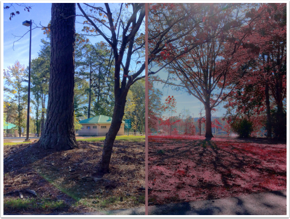
My final example for this article is split down the middle between the original and the altered versions. I have to emphasize that I made major changes – ugly changes – to make the changes obvious. (I don’t want you to think I like the result.) I lowered the contrast, lowered the exposure on the highlights, and changed the hue of the greens to red.
Next time we’ll cover a/b curves, textures and presets. Until next time, enjoy!
Donating = Loving = TheAppWhisperer.com
TheAppWhisperer has always had a dual mission: to promote the most talented mobile artists of the day and to support ambitious, inquisitive viewers the world over. As the years passTheAppWhisperer has gained readers and viewers and found new venues for that exchange.
All this work thrives with the support of our community.
Please consider making a donation to TheAppWhisperer as this New Year commences because your support helps protect our independence and it means we can keep delivering the promotion of mobile artists that’s open for everyone around the world. Every contribution, however big or small, is so valuable for our future.
Jerry Jobe
Never content with just scratching the surface of what an app can do, Jerry Jobe decided to pass on what he learned about imaging apps to others. He’s constantly trying to figure out just what tools other artists have used, and trying to incorporate them into his own work, in an attempt to find his style. He’s written tutorials on over 145 apps so far, which you can find (along with his Song of the Day entries) at http://enthusiasmnoted.wordpress.com/ He lives near Atlanta, Georgia, where he also finds a creative outlet in acting and directing in community theater.