Mobile Photography / Art Tutorial – Training your eye and the use of Snapseed
We are delighted to publish Jerry Jobe’s latest mobile photography/art tutorial for our reading and viewing pleasure. This time Jobe takes a look at Snapseed but in a unique way. Read his thoughts as he puts it through its paces (foreword by Joanne Carter). Take it away Jerry…
“I’m a relative newcomer to photography. Not in the sense of handling a camera; I’ve had cameras for decades that I used to capture snapshots. I am a newcomer in the sense that I have never had training, and that I realize that training helps you assess what you want from a shot, and how to get it.
I consider the first part of training in photography, as well as all forms of visual art, to be training your eye. What is your subject? What are you trying to convey about that subject? How do you convey that feeling? There are hundreds of books and articles that go over composition and lighting, and they often contradict each other. I read an article this past weekend that trashed the vaunted “rule of thirds”, and said that method of composition should never be followed.
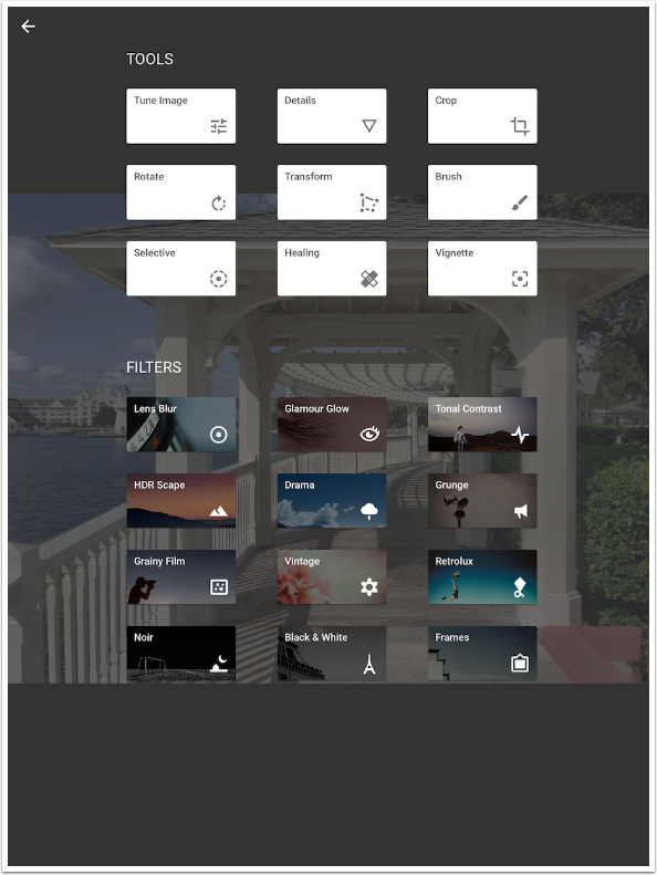
I can’t and don’t want to dictate what your images should look like. What I can help you with is using apps to get from the image you captured to the image that reflects what your eye truly “sees”. I’m going to be using the powerful and free app Snapseed, but the principles apply across the use of all photo/art apps. It is a beginner tutorial, but I will not be describing how to operate Snapseed in detail; please visit my three-part tutorial from last April/May for that (see here).
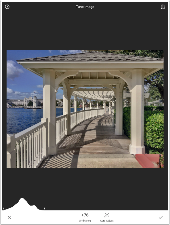
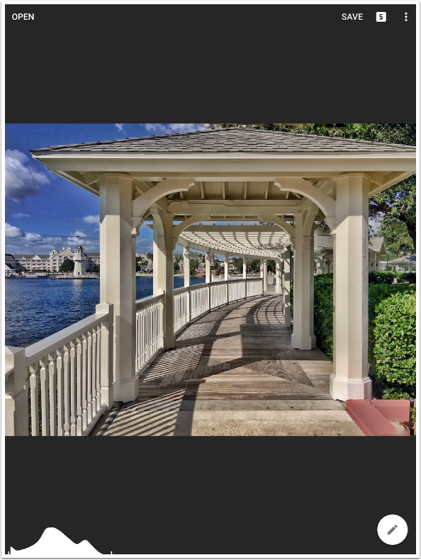
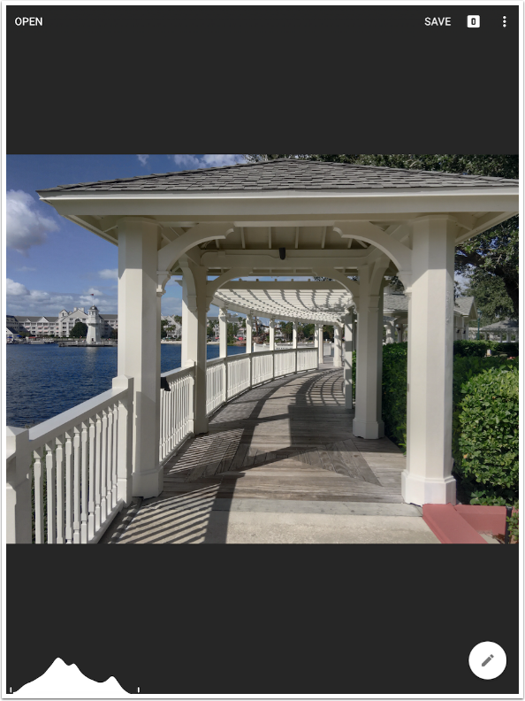
The test shot is one I took while walking along Disney’s Boardwalk at Walt Disney World with my iPhone 6S+. A beautiful sky, a nice balance of architecture and nature, and a balance of exposure that has no impenetrable shadows or blown-out highlights. (Look at that histogram!) Is it exactly what I wanted to capture? When I look closer, I have to admit that it’s not a perfect shot”.

The first thing that bothers me is that there are horizontal lines that are not truly horizontal in my image. That’s not what I saw when I captured it! That’s because the eye will compensate and tell the brain that they are horizontal even when they aren’t. I can fix that by using the Transform tool. Transform includes Perspective Vertical (needed when shooting tall subjects), Perspective Horizontal and Rotation.
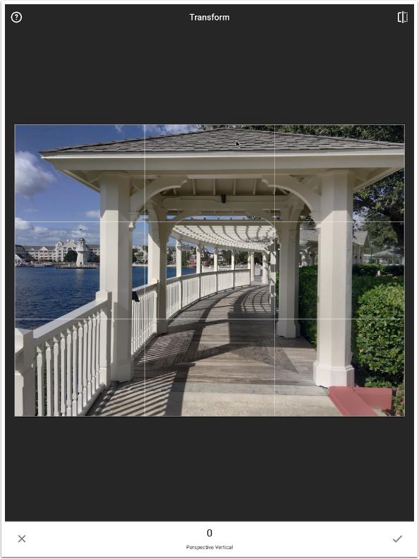
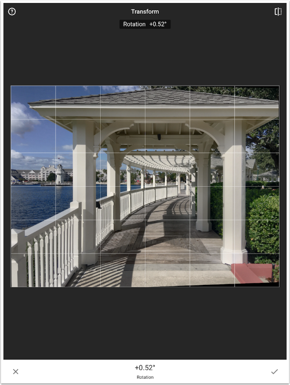
I switch to Perspective Horizontal and swipe to change the value to -36. Even though my most prominent horizontal lines (the roofline and the base of the columns under that roofline) are not level, they are parallel to each other, which is what I was shooting for. Those wedges of black at the right top and bottom will be filled in by Snapseed, but imperfectly. I will crop them out later.

Now it’s just a matter of rotating the image slightly to make the horizon lines level. Another wedge to be filled appears at the lower left.
The next thing I want to do is delete a couple of unwanted elements. It’s amazing how the eye can automatically block out objects it doesn’t want to see. How often have you taken a picture and then thought, “There weren’t any power lines there! How did they get in the picture?”
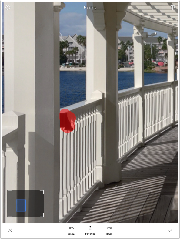
In this case I’ve got a large black speaker at the middle top of the second arch. I use the Healing tool and a swipe to get rid of it.
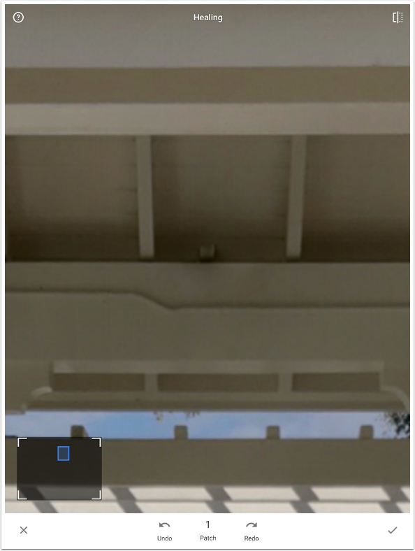
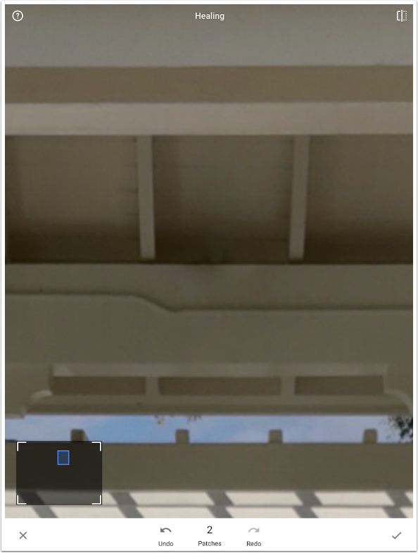
It leaves a hint of a support timber behind. The healing function clones from another part of the image, and you cannot control the source. For that reason, you might want to use TouchRetouch or Handy Photo for this kind of work. In this case, I am happy with the results gotten by adding a second patch over the new partial support, as seen below
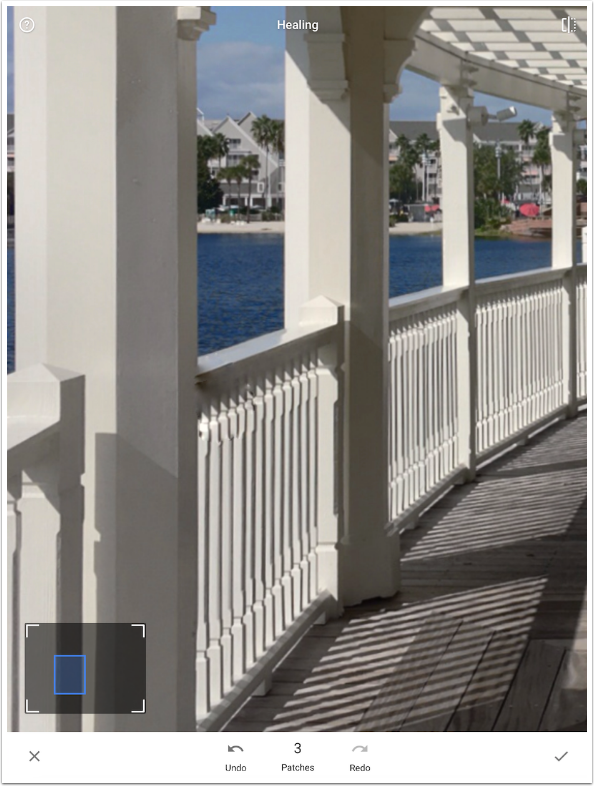
There’s another object that I did not see at all at the time: a large black plumbing fixture. This fixture will be tougher to get rid of because it is not surrounded by smooth boards, but by a solid post, a railing and multiple small posts.

I paint over the fixture as shown below.
The result is not optimal. The flaws will automatically draw the viewer’s eyes to that part of the picture. Humans excel at pattern recognition, and if it is this far off, we see it immediately.
However, the dark blotch remaining is the main problem, so I make a few more strokes/patches to fix that. These patches extend along the railing, so that the app gets an idea of where I want to clone from. Notice that I’ve already made enough strokes below to go from 3 patches to 8
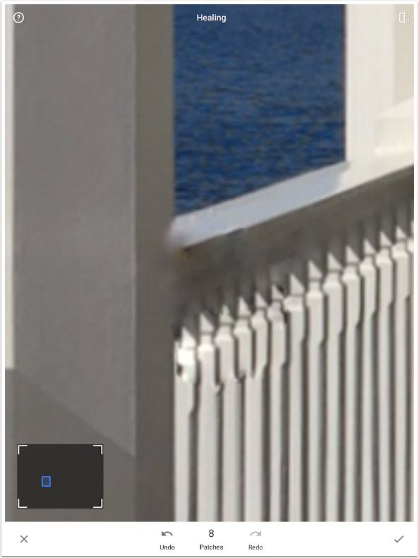
Zooming out shows that, although the patchwork is not perfect, it is close enough that it no longer draws the eye.
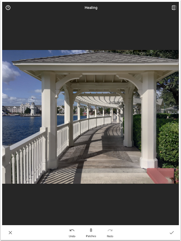
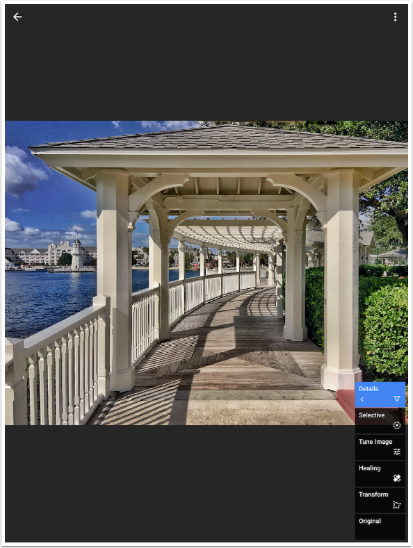
In my workflow, I find myself working back and forth between the whole picture and parts of the picture. I’ve gone from Transform (whole) to Heal (part) and now I go back to the whole. I find that it makes sense to Tune the entire image before I go back and do Selective Adjustments to part of the image. What good would it do to darken the sky, only to find out I want to darken the entire image and make that first adjustment unusable? So my workflow usually includes a Tune Image before Selective Adjustments. If needed, another Tune Image can come afterwards.
I boost the Warmth and Ambiance overall. At this point I know I am veering from what my eye actually saw: the Ambiance, at this level, hints at hyper-realism. Hyper-realism shows you more than what the eye actually captures. That’s a look that I actually like, as long as you don’t take it too far. HDR cranked up to eleven with crunchy, overdone halos is not something I want in any of my images.
Now that I’ve done an overall tuning, I go back to adjusting areas of the image with Selective Adjustment. Is this area too washed out? Do I want my foliage to pop? Do I want to de-emphasize a feature? I can do all this, and more, with Selective Adjustment.

I do want the leaves on the trees to be a more saturated green. I tap into the foliage to place the B button. If I move my button around, a circle “loupe” appears. The outline of the circle identifies the color under the crosshairs of the button (a gray in the image below). This helps to show you what colors will be affected.
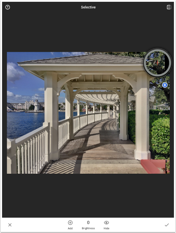
A two-fingered pinch allows you to define the area of the adjustment. By default it is a very large circle that covers the entire image. As I squeeze the circle to the size of the leaves, a red overlay shows exactly what pixels will be changed by the subsequent adjustment to Brightness, Contrast or Saturation.
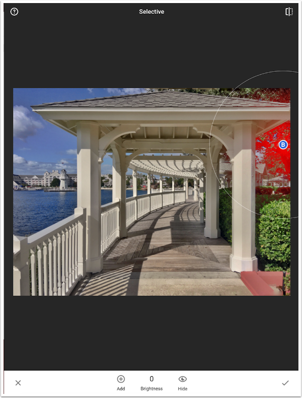
I swipe my finger up to access (S)aturation, then to the right to increase the Saturation. This color adjustment only affects the leaves, not the rest of the image.

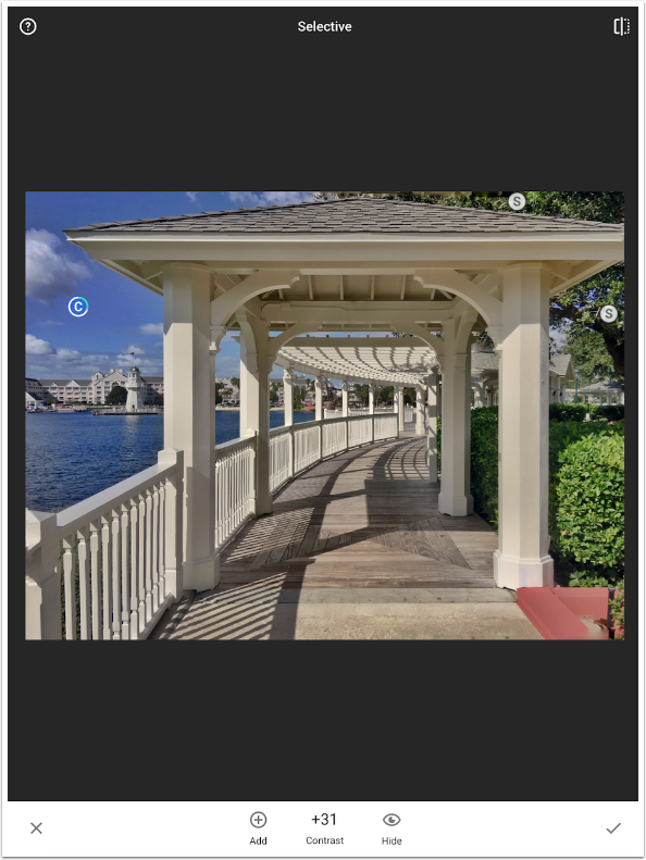
By pressing the Add button at the bottom, I can make more selective Adjustments. I add a Saturation button at the top to get the leaves over the structure. I add a button to the sky and increase the Contrast to get even more pop in the sky.
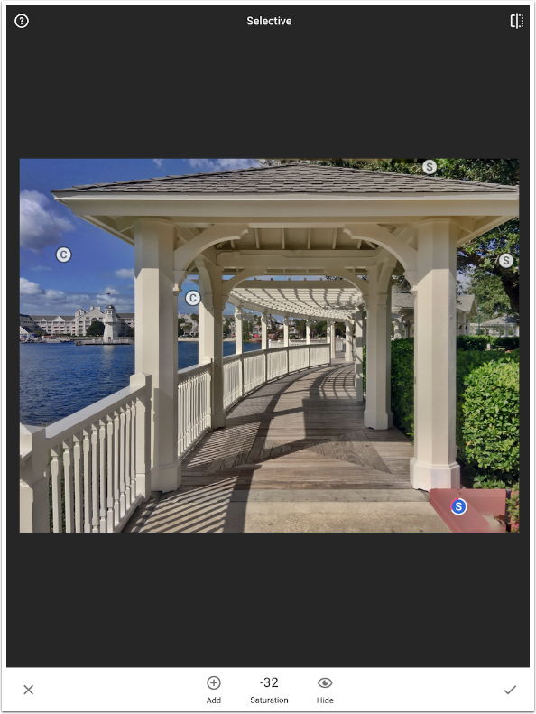
The last Selective Adjustment is to the red concrete curb at the bottom right. I want this portion of the image to get less attention – it’s not important. So I lower the saturation so the red won’t draw the viewer’s eye.
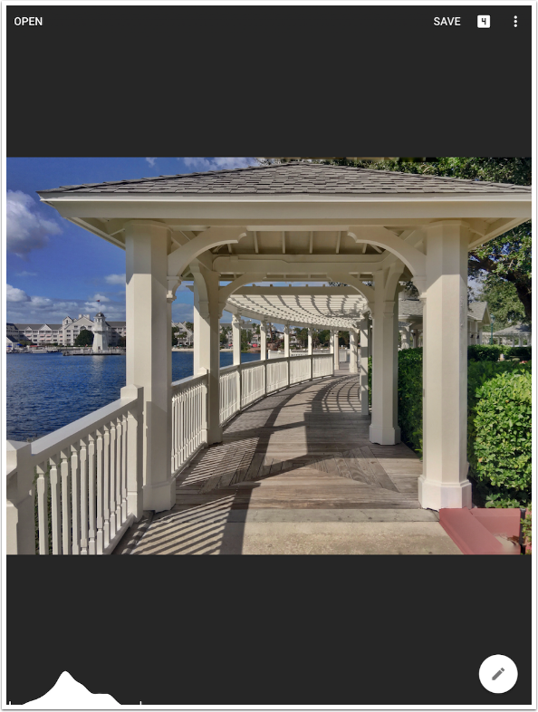
Remember, at any time when you are on the main screen, as shown below, you can tap and hold the image to see the original. (The image below is with all the changes to this point.)
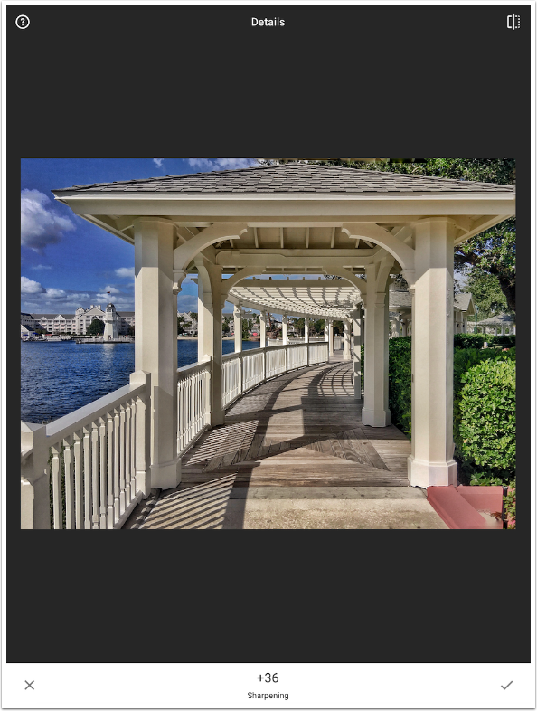
In keeping with my hyper-realistic edit, in which I show more than the eye was able to pick up at the time, I want to see more of the grain and texture of the wooden walkway. I do that with the Details tool. Looking at just the wood walkway, I increase the Structure and Sharpening until the walkway is to my liking. The rest of the image, unfortunately, is too sharp – I’m beginning to get big dark halos where the white railing and the dark water meet. So how do I target these changes?
The latest version of Snapseed added masking, so it is possible to mask global changes to only one portion of your image. First I accept the Details changes, and it looks as though I’ve committed to the change for the whole image. Masking is done by accessing the stack, or history of changes, by tapping the white box with the number in it (5, in this case) at the top right
There are five editing steps in the stack on top of the Original image: Transform, Healing, Tune Image, Selective Adjust, and Detail. I want to mask the Detail, so I tap the “<” on the Detail edit to access the fly-out menu.
The options are to delete, mask, or edit the particular layer on the stack. (Some options, such as Transform or Crop, do not allow masking.)
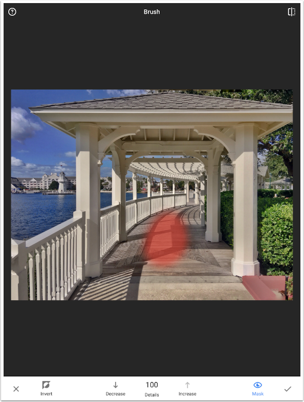
The default on masking is to paint the edit in. So when I get to the masking screen, the Detail edits disappear, and can be brushed in.
Tapping the Mask button puts a red overlay over the brushed area. This will help you to accurately create a mask, with no missed areas.
I zoom in using a two-fingered pinch to allow me to do a better job of painting the mask.
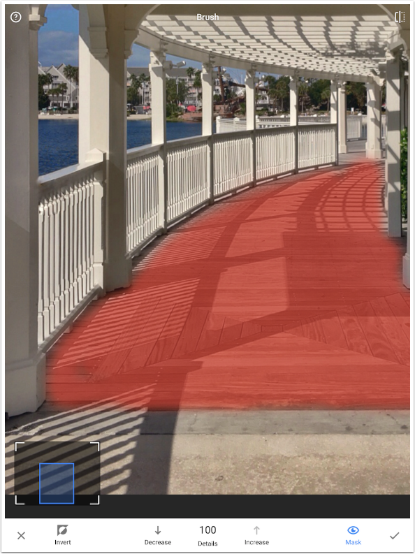
When I zoom back out and remove the red overlay, I can see that the Details edits are only applied to the walkway. I accept the masked changes with the check mark.
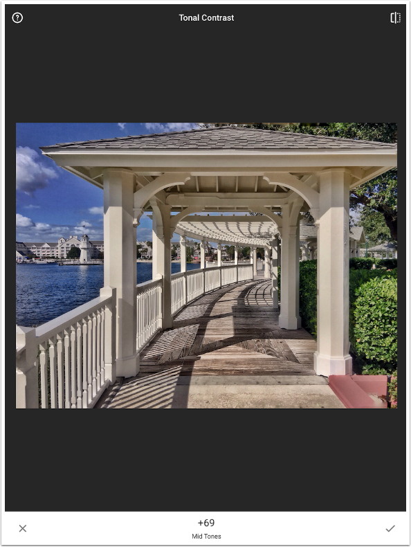
Next I make an overall change with Tonal Contrast. This works like the Structure control in Details, but it allows you to target the High, Mid and Low Tones. In the screenshot below, I’ve added some Tonal Contrast to the Mid Tones.
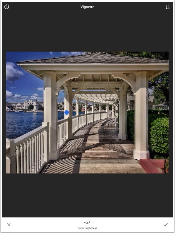
I like to pull the viewer’s eye into the image. This can be done with a vignette. Especially on a screen or a white piece of paper, an edge that is consistent in tone with the image subject can cause the eye to drift. I use the Vignette tool, and move the center of the vignette to the left, so that it will include the lighthouse in the background. I turn the Outer brightness to -100, its maximum setting, to help place the vignette. Then I move it to 0 (no vignette), then decrease it until it’s just barely enough. As you can see from the screenshot below, the maximum setting can obscure most of your image.
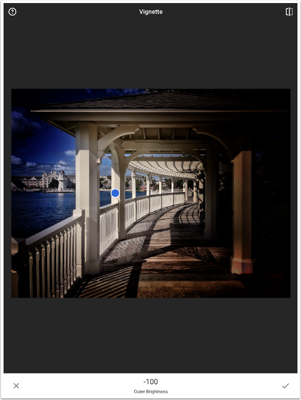
I like the vignette set at -57.
Once again, let’s see a before and after. Here’s before my changes.
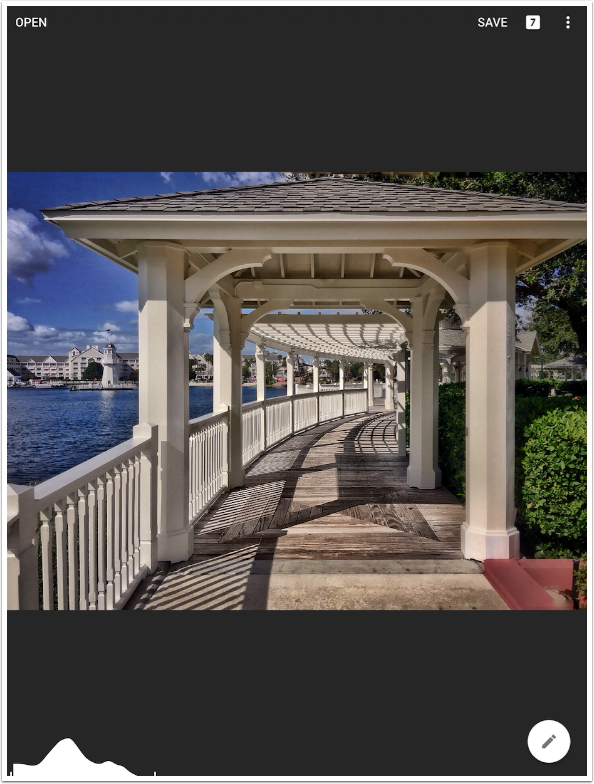
And here’s after. I get so used to being able to check before and after that when I encounter an app that does not allow for it, like Hipstamatic, I feel ripped off.
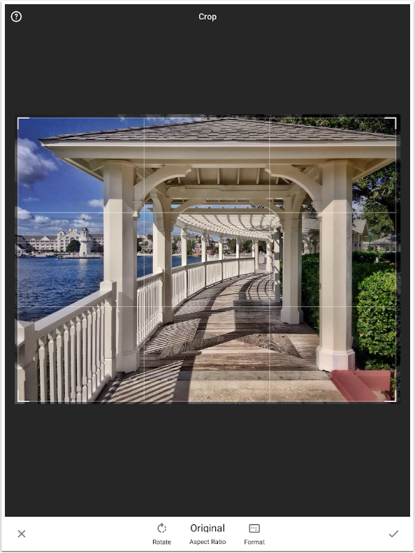
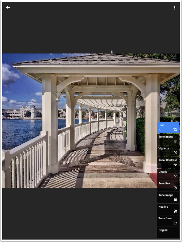
Now is the time when I choose to trim the outside edges with the Crop module. As you might remember, Transform added some cloned wedges to the corners. These wedges are obvious if you zoom in, especially along the top, where Snapseed cloned part of the inside of the structure instead of leaves.
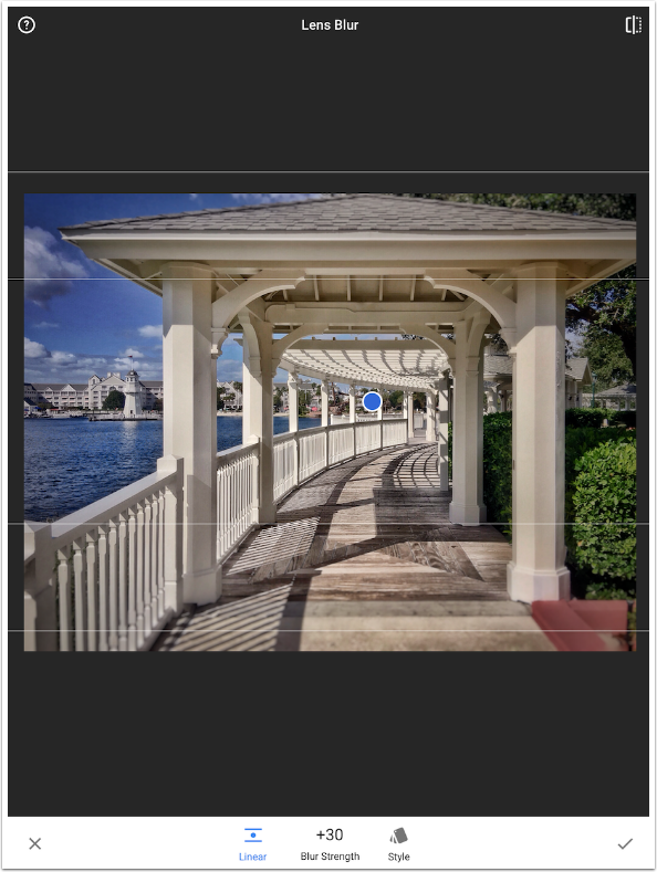
Not every idea will pan out. I thought it might temper the hyper-realism a bit if I added some Lens Blur. Wrong pathway, and I hit the X to exit without applying the change.
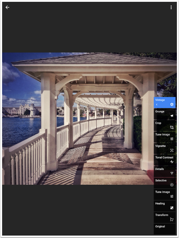
Snapseed has a number of filters and textures to apply to your images, in the modules Grunge, Retrolux and Vintage. These are some very strong filters! For many of us, this takes it from a tool that helps us tailor our images to the conscious choice of a particular look, one that is very harsh. But with the advent of masking, Grunge, Retrolux and Vintage can be toned down and used as an enhancement.
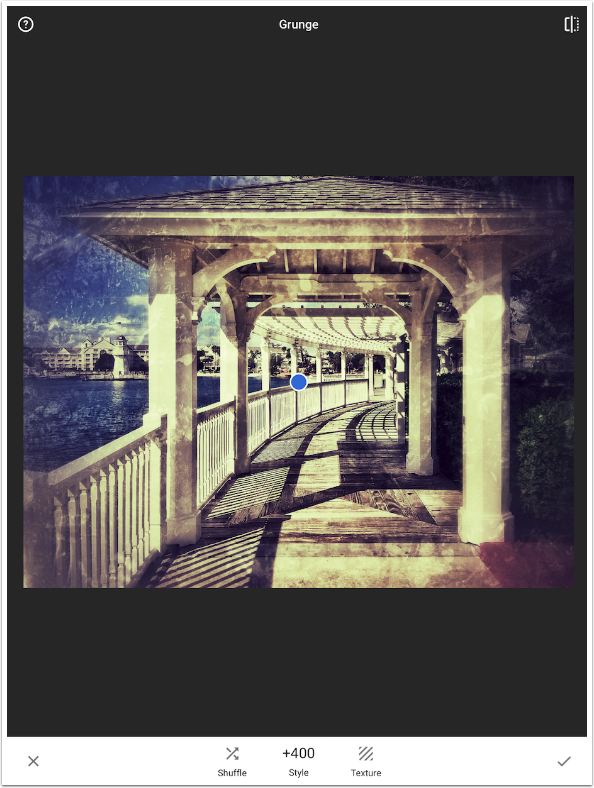
First, I choose a Grunge preset, tune it and hit the check mark.
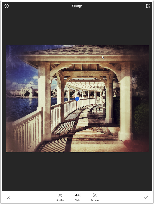
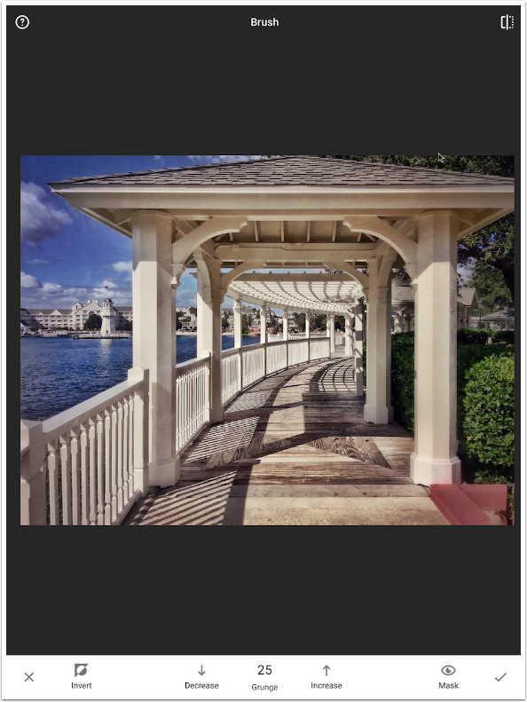
I return to the Stack and choose the Grunge layer for masking. In the masking screen, I tap the down arrow until it says 25. Then I can paint back in just a hint of the Grunge over the entire image.
I return to the Stack and choose the Grunge layer for masking. In the masking screen, I tap the down arrow until it says 25. Then I can paint back in just a hint of the Grunge over the entire image.
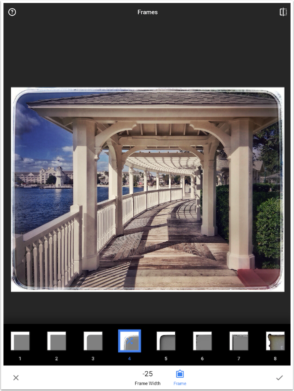
Normally I don’t add a frame to photos, but something about this image seems to call for it. So I finish up with a Frame. Because the frame covers the edges of the image, I could go back into the Stack and eliminate the Crop step. That would include a few more pixels into the image. Since I cropped only a sliver of the edges off, I did not bother.
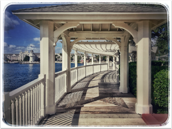
Here’s the finished image. The original was not bad at all, but I thought through what I liked and didn’t like about it, and I improved it (at least in my eyes). I made changes to the perspective in Transform and in Tuning with Tune Image. I made Selective Adjustments that emphasized and de-emphasized portions of the image. I masked Details to emphasize the texture of just the path, and masked Grunge and Vintage to make slight changes to the overall look. And all along I was training my eye to see beyond what the camera picked up on its sensor to what I was trying to capture.
Don’t forget that the stack also allows you to go back to any point and move in another direction. In the screenshot below I have removed all the adjustments after the crop.
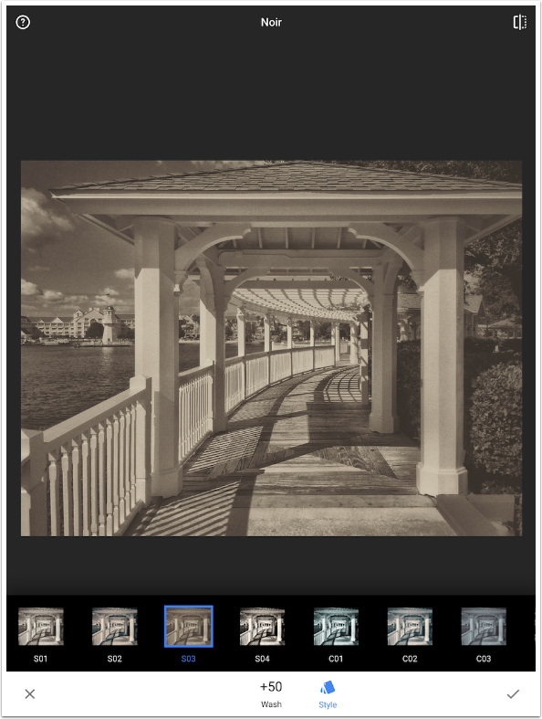
Now I can go in another direction, using a sepia setting in Noir.
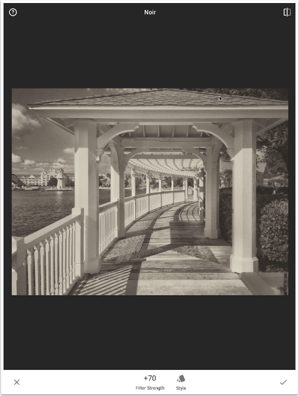
The brown was a bit strong, but that can be adjusted with the Filter Strength (which I reduced to 70).
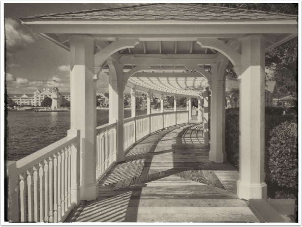
Once I added a frame, this is my washed-out Noir version.
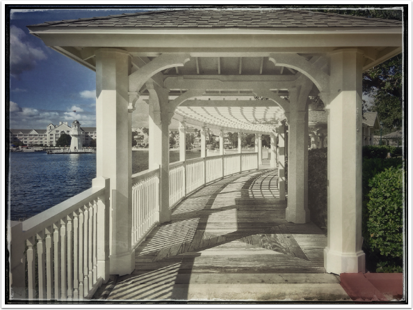
By masking the Noir layer, I created “Entrance to Yesterday”.
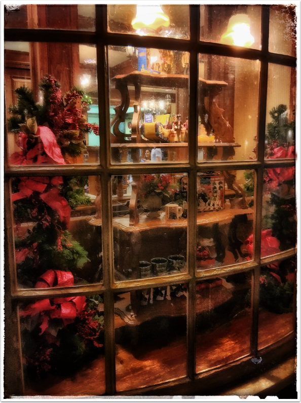
Here’s an image of a shop window. It does have a cozy, warm feeling, but seems a little oversaturated and even a bit too orange. It’s also a bit washed out at the top and on the bottom shelf.
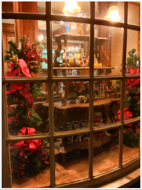
I ended up adding a bit of Glamour Glow, which resulted in even more saturation, so I masked in a Tune Image that lowered the saturation. The mask limited the desaturation to the darker edges, where the colors were most intense.
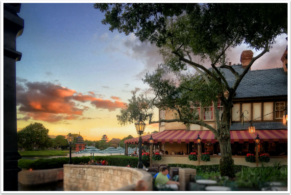
What would you change on this next image? I found a number of things. Take some time and give it some thought.
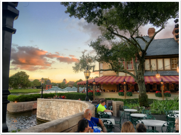
I pulled the upper corners out to correct the vertical perspective. I found the center to be a bit washed out, so I added some contrast to the orange clouds and darkened the center lamp and branch. I cropped out some of the people in the foreground, but didn’t want to crop them out entirely, so I desaturated and darkened the day-glo green shirt and added lens blur to the bottom. I found natural framing with the left lamppost and the tree, so I didn’t want to add any frame. Anything else you would have done? Probably so – your taste is your own.
This was a long tutorial, but it really just scratches the surface of what you can do with Snapseed and other apps to make your images speak to you. I don’t need to tell most of my readers that there is so much that can be done with apps – much more than slapping on a filter – that will help the people who view your images see what you want to show them. Before you can show them, though, you have to see it. Until next time, enjoy!
TheAppWhisperer has always had a dual mission: to promote the most talented mobile artists of the day and to support ambitious, inquisitive viewers the world over. As the years passTheAppWhisperer has gained readers and viewers and found new venues for that exchange.
All this work thrives with the support of our community.
Please consider making a donation to TheAppWhisperer as this New Year commences because your support helps protect our independence and it means we can keep delivering the promotion of mobile artists that’s open for everyone around the world. Every contribution, however big or small, is so valuable for our future.
Jerry Jobe
Never content with just scratching the surface of what an app can do, Jerry Jobe decided to pass on what he learned about imaging apps to others. He’s constantly trying to figure out just what tools other artists have used, and trying to incorporate them into his own work, in an attempt to find his style. He’s written tutorials on over 145 apps so far, which you can find (along with his Song of the Day entries) at http://enthusiasmnoted.wordpress.com/ He lives near Atlanta, Georgia, where he also finds a creative outlet in acting and directing in community theater.


2 Comments
Carlos
Excellent job Jerry…probably one of the most popular app’s out there for mobile photographers to enhanced their images. Thank you!
Gerry Coe
Good tutorial and well explained.