Mobile Photography / Art Tutorial – Preset App: Helps To Build Filter Presets – Is It Any Good?
We are delighted to publish Jerry Jobe’s latest mobile photography/art tutorial for our reading and viewing pleasure. This time Jobe takes a look at the app Preset. Read Jobe’s thoughts as he puts it through its paces (foreword by Joanne Carter). Take it away Jerry…
“Like many of you, I have not totally abandoned the use of my DSLR (a Nikon, in my case). I take production stills for a local theater group, capturing the performance as it happens. The difficult, and sometimes quite dim, lighting of a theater production is incapable of being handled by a phone camera – at least at this moment.
I find it easier to use Lightroom and Photoshop to process these images on the desktop. The desktop still processes hundreds of larger images better than a mobile device. There are some actions I take on every image from a shoot – lens correction, noise reduction, clarity – and these actions can be created once and bundled into a preset. Other actions – white balance, exposure – change with the lighting and have to be handled on individual photos. Presets, however, can save a lot of repetitive adjustments.
On the mobile side of things, we deal with presets all the time. After all, what are filters but presets? A filter changes exposure and contrast, changes colors, sharpens or blurs, adds vignettes. Presets do the same thing, bundling individual changes into one click or tap.
Venkat Rao of Rao Studios contacted me to try out his new app, Preset. Preset allows you to build your own filters by bundling individual adjustments together to create a whole new look. It sells for $3.99 on the App Store, placing it in the realm of full-featured editing apps. Let’s see how it stacks up against them in ability and ease of use”.
We have promo codes to giveaway of this app today, please go here to find out more.
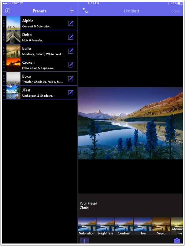
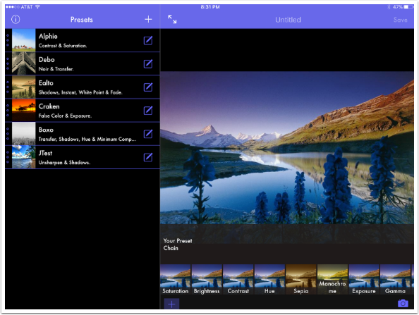
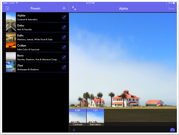
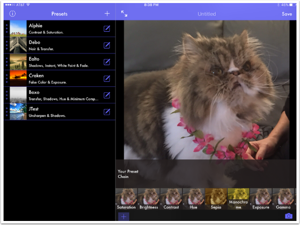
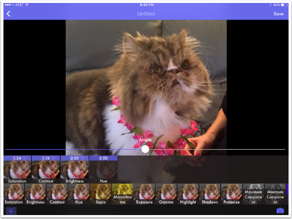
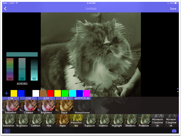
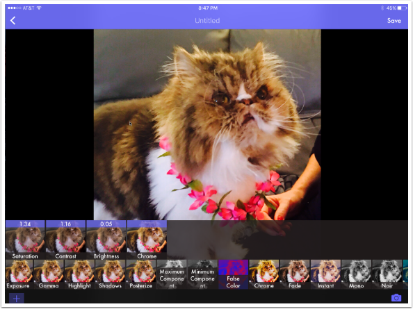
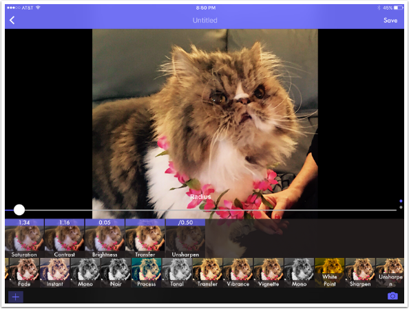
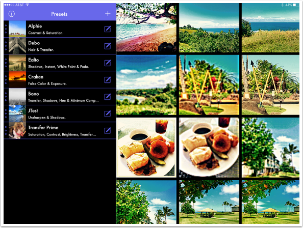
Preset is a universal app, running on both the iPhone and iPad. The screenshot below is from the iPad version held in portrait mode. On the left side are the presets – five are already packaged with the app, and one was a test preset I created. On the right is a test image, and along the bottom right are the controls you adjust to build your own preset.
Turning the iPad to landscape mode will make landscape photos easier to see. My beta version does not extend to the iPhone, so I can’t say whether landscape mode is available on that device.
The Info button at the top left is not very helpful, save for the oddly named “View Onboarding”.
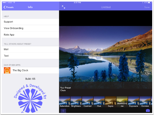
“View Onboarding” means “show the introductory slides again”. Translation can be horribly difficult sometimes.
Tapping the Edit box at the right end of a Preset brings up the image used to create the preset and the steps in the preset, in order from left to right. Alphie contains Contrast and Saturation adjustments.
Tapping the + sign at the bottom of the edit window brings up additional adjustments you can add to the preset.
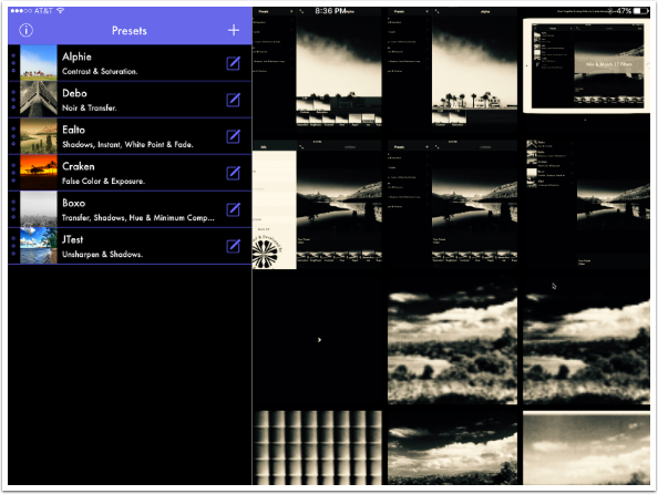
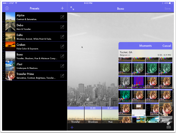
If you tap the filter name in the list, you are shown thumbnails of that filter applied to every image in your library. The images are in Moments order, meaning that your Camera Roll, Photo Stream and all albums are in chronological order. You are unable to change to a certain album.
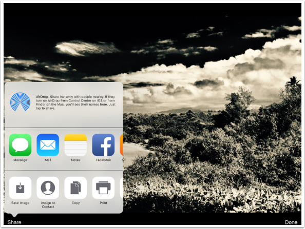
Tapping on an individual image shows you the preset applied to that image. You can tap Share at the bottom to save the image.
The Share button brings up the standard iOS dialog, and you choose Save Image to save to your Camera Roll.
Tapping the Camera button at the bottom right of the Edit window allows you to choose an image from your Moments as a basis for creating a preset. There are no steps in the Chain, and your possible adjustments are listed at the bottom.
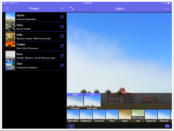
Tapping the double arrow at the top left of the edit window expands the edit window. This is recommended, since you don’t need to look at saved presets to build a new one.
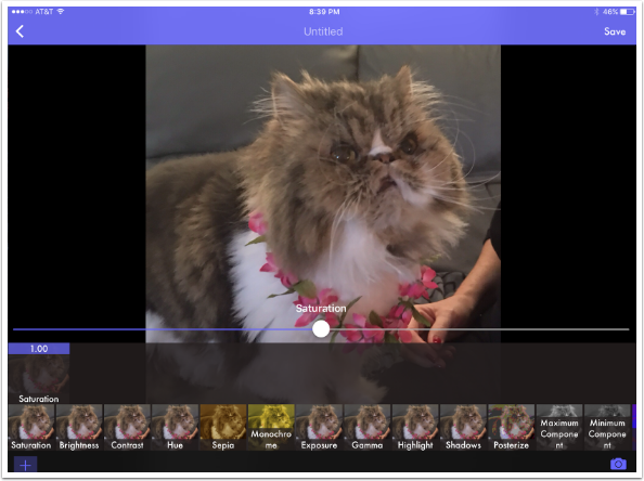
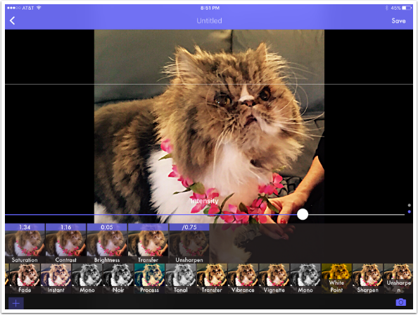
Many, but not all, of the adjustments have sliders to fine-tune the adjustment. A value of 1.00 in Saturation means that no adjustment is made; the slider is in the middle, and the image is neither saturated nor desaturated.
Moving the slider changes the value of the adjustment, as shown in the thumbnail in the Chain.
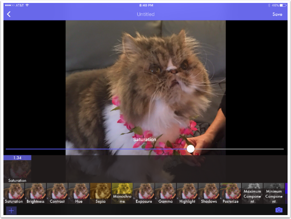
As you add links to the Chain, the thumbnails at the bottom for the adjustments change, to show how the adjustment will affect the current version of the image.
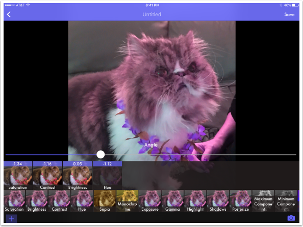
I’ve added some Contrast and Brightness to the image, and now I’m looking at Hue. Hue’s control is labeled Angle, which may be a translation error, or may be a way of measuring change in Hue I’m not familiar with.
You can change Hue Angle to a negative or positive value.
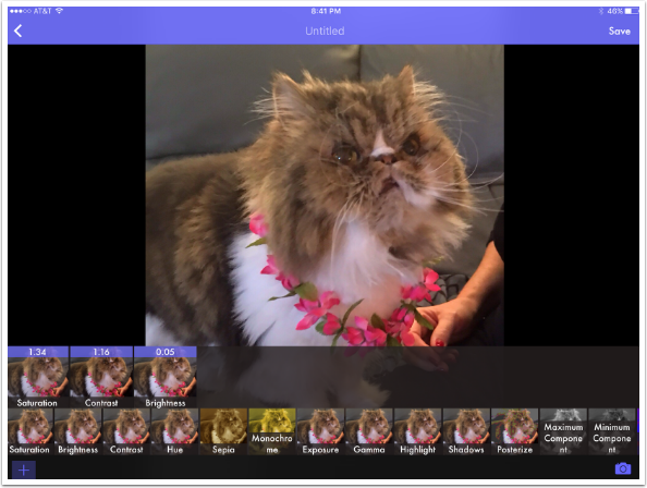
If I’m not happy with a particular link in the Chain, like this Hue adjustment, then I can eliminate it by holding the thumbnail and swiping up.
I can temporarily hide the effects of a link by double-tapping the link. I’ve hidden the Contrast link below. Double-tapping again brings it back.
You can also change the order of the links by dragging them along the chain. The order can certainly make a difference.

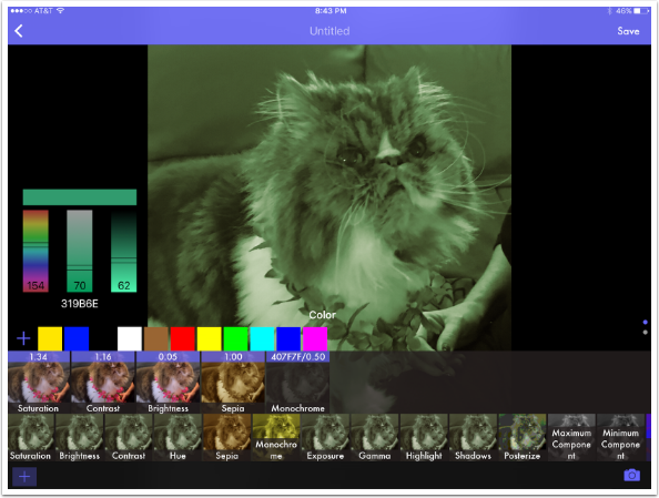
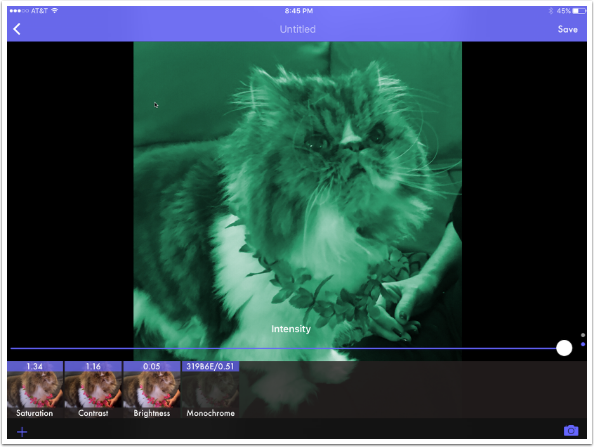
Monochrome is a tinting of your image. There are several colors to choose from. The blue dot signifies that the yellow is the currently chosen color.
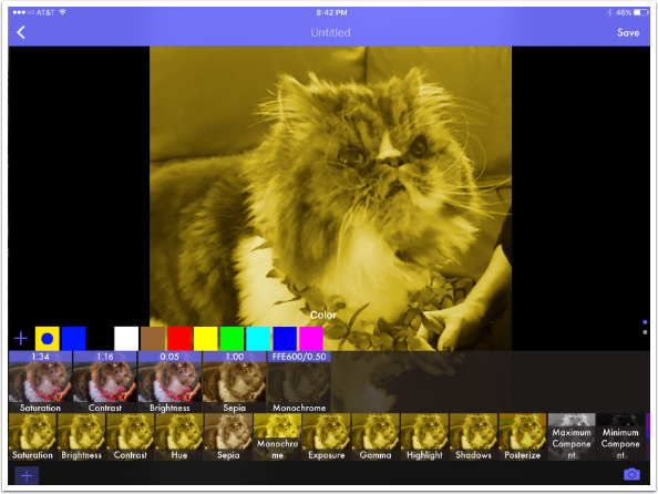
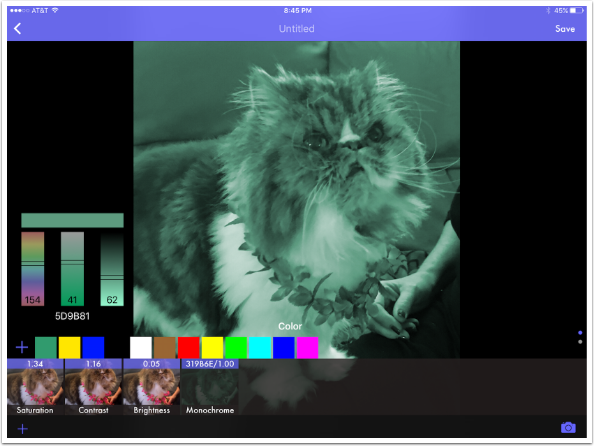
If you are not happy with any of the supplied colors, you can add one to the palette by tapping the + sign at the left end of the palette. Three bars appear with hue, saturation and lightness sliders. The new color is shown in the long block above the sliders.
Moving the sliders affects the color which affects the image.
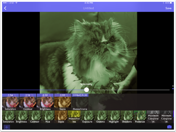
Some adjustments have more than one control. Monochrome, in addition to the Color, has an Intensity slider. Adjustments with more than one control have dots out at the right end of the controls. The Intensity slider is accessed by swiping up from the Color palette.
The controls cover part of the image. In order to see more of the image, you can temporarily gain more space by tapping the lower left + sign. You can also use two fingers to pinch the image to zoom out.
I’ve eliminated the Sepia link below so you can see that a default intensity of .5 will not change the red entirely to a dark cyan.
The Monochrome Intensity slider moved all the way to 1 will completely tint the image with the selected color.
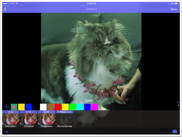
Once you’ve changed the Intensity slider, you may find that you want to change the color. The problem is that the color is already committed to the palette. It can’t be changed – or deleted. I add another color close to the same cyan. That color is committed also, and will show up in your palettes forever. I see no way to edit the palettes, so you could end up with dozens or hundreds of colors that you will have to scroll through. That is a design flaw.
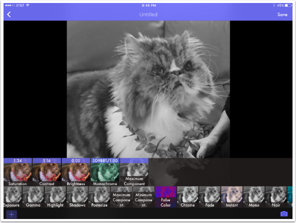
Some adjustments, like Maximum and Minimum Component, have no controls/sliders. You either apply them or not.
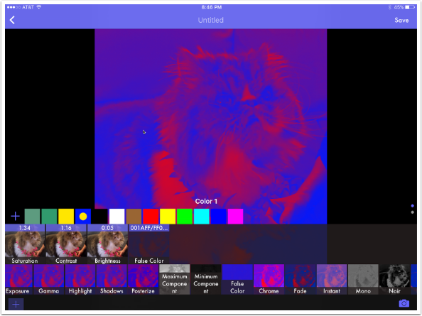
False Color is a full duotone. By that, I mean it is not a tint, it is fully changing the color. Color 1 is the dark parts of your image, and if you change it to a light color, an inversion of tones takes place. Color 2 is the color assigned to the light parts of your image.
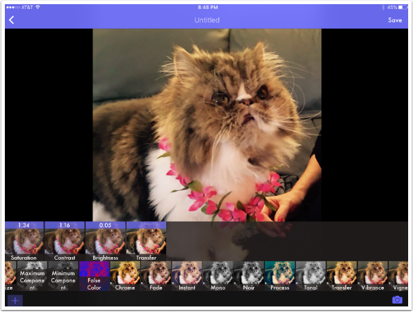
The next several adjustments are on/off adjustments. Chrome, Fade, Instant, Mono, Noir, Process, Tonal and Transfer have no Intensity or Opacity sliders.
The difference made by these on/off adjustments can be subtle. Compare the Chrome above with Transfer below.
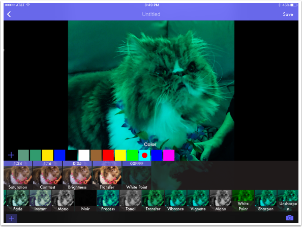
White Point changes the whites in your image to the chosen color and changes the hue of other colors accordingly. It’s a variation on tinting that I find hard to control, especially since there is no Intensity slider.
The last two controls are sharpening tools. The first is Sharpen, with a Sharpness slider.
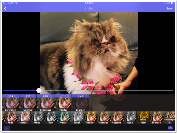
The Sharpness can get rather harsh if the slider is moved all the way to the right.

The second is Unsharpen, which does not actually blur. Instead, it uses an Unsharp Mask technique such as is found in Photoshop. It has a Radius slider as well as an Intensity slider.
With the wrong settings, you can get some really unpleasant results.
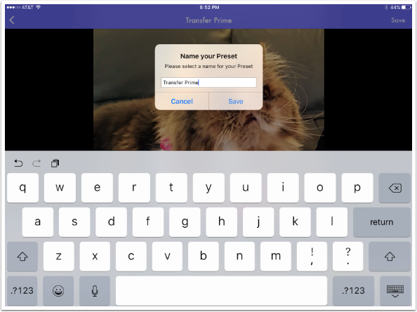
Tapping the word “Untitled” at the top of the screen allows you to name your Preset. Naming it also saves the preset; you can save the preset without naming by tapping Save at the upper right. I name mine Transfer Prime.
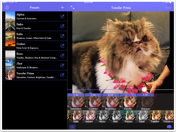
You now see Transfer Prime included in the list of presets. It is made of a chain of Saturation, Contrast, Brightness, Transfer and Sharpen. Now that we have saved the preset, let’s save the image with the preset applied. We know that the Save at the upper right saves the preset, but we saw Share earlier in the tutorial when we tapped an image to make it full screen.
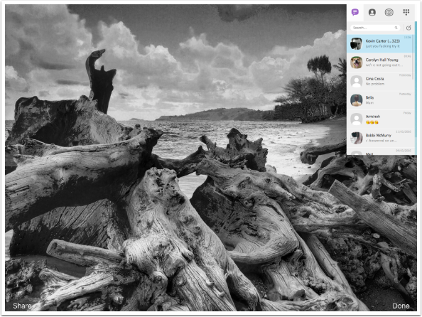
I tap the image and make it full screen, expecting to see the word Share in the bottom left corner. It’s not there! Preset does not allow you to save the image that you used to build the preset. Big mistake!

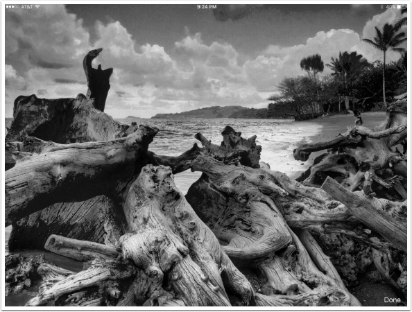
Instead, I had to go back to the Preset list, tap Transfer Prime to see it applied to all my images, then go back and re-select my image. Only then did a Share button appear, and I was able to save the image below.

Now a preset is built. When I tap Transfer Prime, I see it applied to all my images. The next question becomes, is it useful for other images? Possibly, if I have multiple shots taken at the same time with the same lighting and color. But as I look through other shots with Transfer Prime applied, I’m not seeing much need for this particular combination of adjustments.
I tap one image to bring it up. Transfer Prime is not the filter/preset for this image.
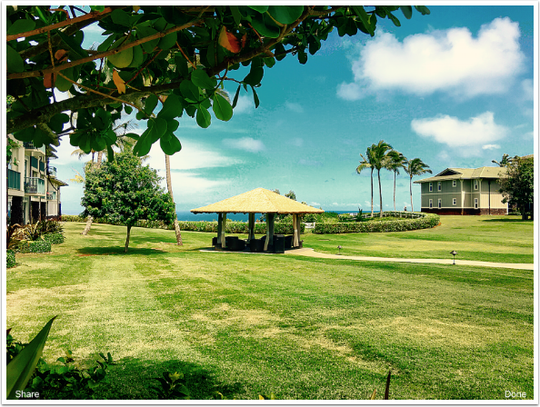
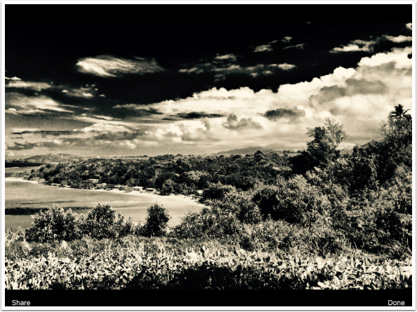
What if a Preset is close to what I want, but not exactly? Here’s a beach shot with the Boxo preset that comes with the app. I tapped the Boxo preset, then selected this image from the thumbnails. I have the Share button at the bottom, but I want to change the Shadows link slightly.
I tap the Edit box to edit the Boxo preset. By default it puts the sample image in the Edit window. I tap the Camera to load my beach image.
Once the image is loaded, I change the Shadows link in the Chain from a value of 0.35 to 0.20.
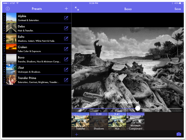
I tap the image to get to the Share button and…it’s not there. Once again, I would have to save the preset, overwriting what is already there, tap the new preset and reload the image from the library, just to be able to save the image.
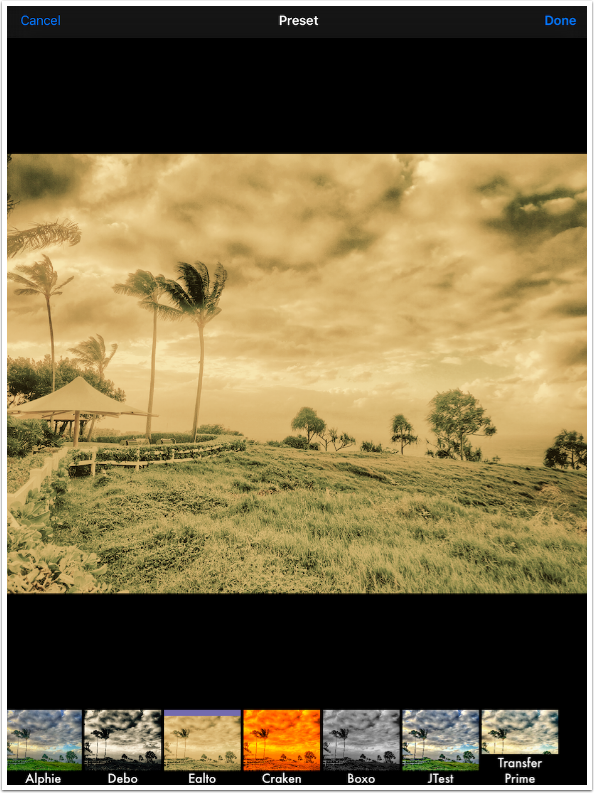
Preset offers a Photo App extension so that you can access your already-constructed presets when browsing your library. Tap Edit when viewing a picture, then the icon that is three dots in a circle. (The first time you do this after installing Preset, you’ll have to activate Preset through the More button, found by scrolling the edit apps to the left.) Select Preset.
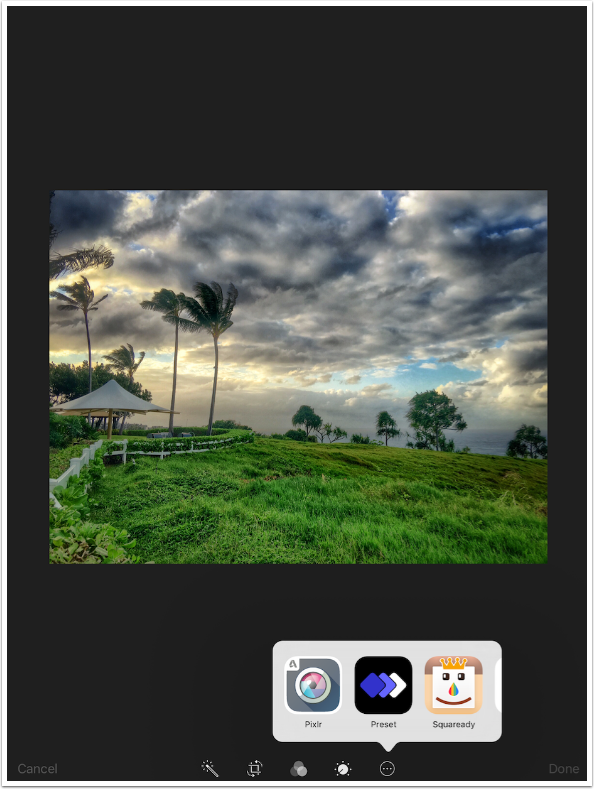
The presets appear at the bottom, and tapping one applies it to the image. This is a “destructive” edit, one that modifies an existing image rather than giving you the opportunity to create an edited copy. Even though the Photo app allows you to revert the image later, I still do not care for this type of editing.
OK, so what is Preset? To me, it looks like an app that allows you to build Instagram-like filters, to be applied with no further modification. What Preset is not is a photo editor. It is not built to load an image, and modify that image as you see fit. It is designed to have you build a filter for later use on other images than the one you start with.
Because it’s not a photo editor, I have no further example images. I am not a fan of static filters that cannot be modified to fit the edited image, and so I am not a fan of Preset.
Please help us…
TheAppWhisperer has always had a dual mission: to promote the most talented mobile artists of the day and to support ambitious, inquisitive viewers the world over.
As the years pass TheAppWhisperer has gained readers and viewers and found new venues for that exchange. All this work thrives with the support of our community.
Please consider making a donation to TheAppWhisperer as this New Year commences because your support helps protect our independence and it means we can keep delivering the promotion of mobile artists that’s open for everyone around the world.
Every contribution, however big or small, is so valuable for our future.
Jerry Jobe
Never content with just scratching the surface of what an app can do, Jerry Jobe decided to pass on what he learned about imaging apps to others. He’s constantly trying to figure out just what tools other artists have used, and trying to incorporate them into his own work, in an attempt to find his style. He’s written tutorials on over 145 apps so far, which you can find (along with his Song of the Day entries) at http://enthusiasmnoted.wordpress.com/ He lives near Atlanta, Georgia, where he also finds a creative outlet in acting and directing in community theater.