Mobile Photography / Art Tutorial – Paper Artist: Intermediate Artistic Play with Jerry Jobe
We are delighted to publish Jerry Jobe’s latest mobile photography/art tutorial for our reading and viewing pleasure. This time Jobe takes a look at the app Paper Artist. Read Jobe’s thoughts about this app as he puts it through its paces (foreword by Joanne Carter). Take it away Jerry…
Paper Artist retails for $2.99/£2.29 and you can download it here.
“JFDP Labs is the maker of another app I have covered called Paper Camera. That app is an introduction to turning your photos into artwork. I call it an introduction because Paper Camera is a filter app that applies one look to the entire photo and does not allow for any user interaction through adjustments or masking.
If Paper Camera is an introductory app, then JFDP’s Paper Artist is an intermediate app. It does still limit the user in the looks that can be produced, but the ability to adjust the look, plus allowing (in essence) two looks per image, masked according to the user’s whim, gives it power beyond a beginner app.
Paper Artist is a universal app, operating on both the iPhone and iPad. I’ll be looking at the iPhone app today, but it works similarly on the iPad. It also has an Android version, so I get the rare treat of being able to write a tutorial that should translate just fine to that platform”.
Paper Artist is also one of those rare apps that work in landscape mode on the iPhone. Screenshots from landscape mode do work better in my tutorials, so that’s what I’ll be using. Don’t think that you can’t work in portrait mode if you prefer.
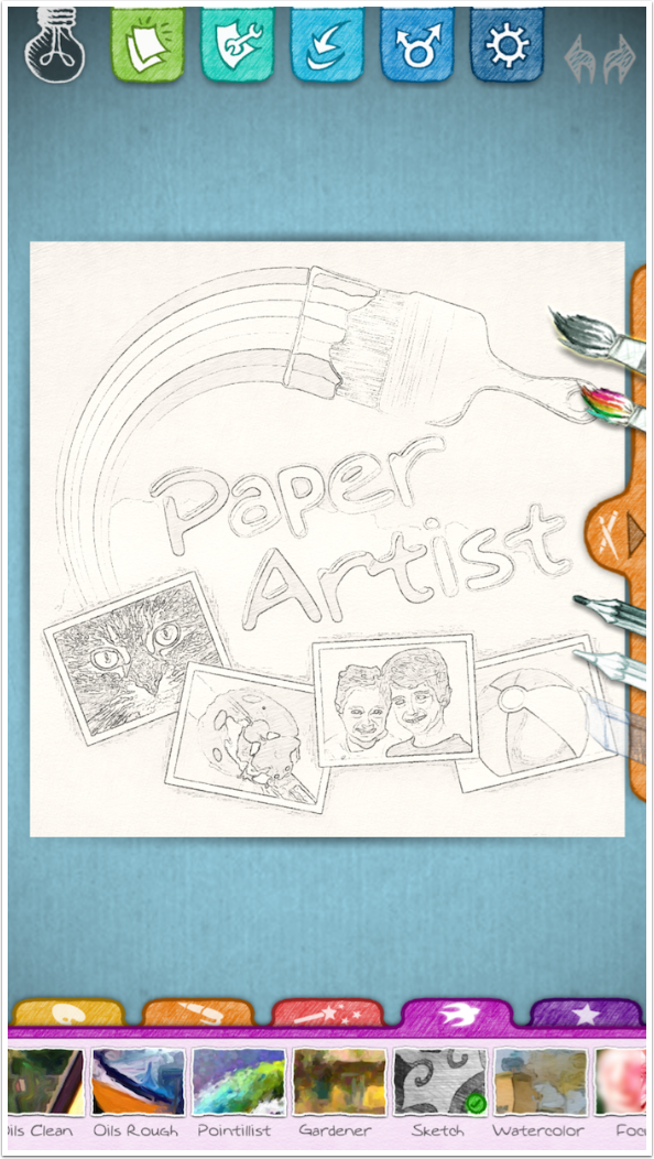
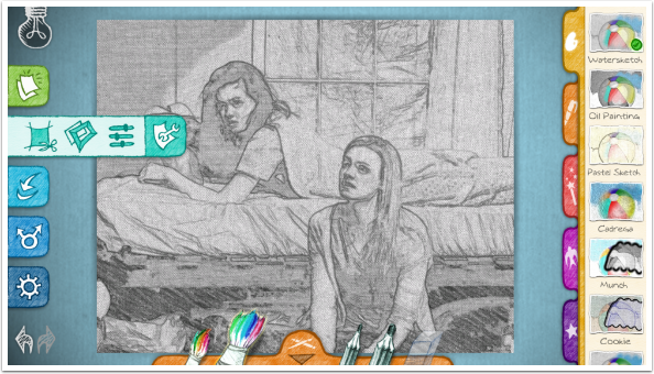
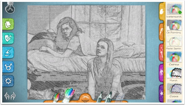
The icons, which are not very self-explanatory, are grouped into three sections. Along the left side (top in portrait mode) are the file-handling icons. On the right (bottom in portrait) are the filters, grouped under tabs. At the bottom (along the right in portrait) are the brushes and erasers.
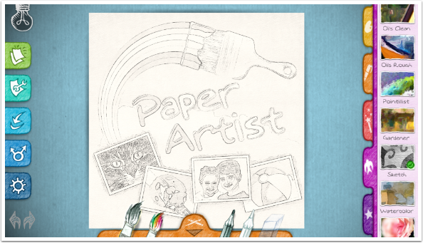
Let’s start with the file-handling icons. The Bulb icon allows you to see the original image at any time. The “Shiny paper” icon is used to choose your input: Photo Library or Camera.
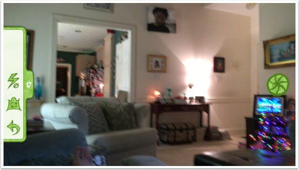
If you choose the Camera, you get a simple camera. The green button on your right is the shutter release, and buttons on the left allow you to adjust the flash settings, choose between the front and rear cameras, or return to the main screen.
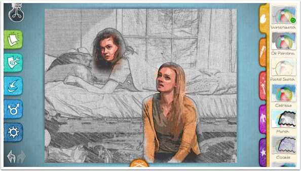
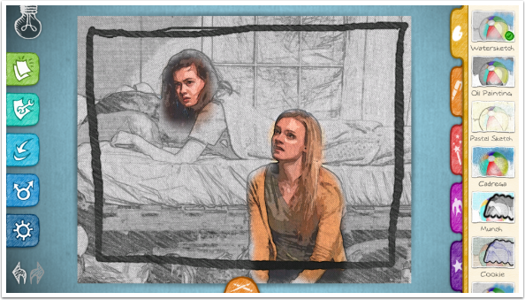
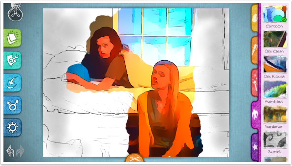
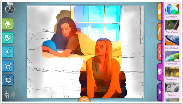
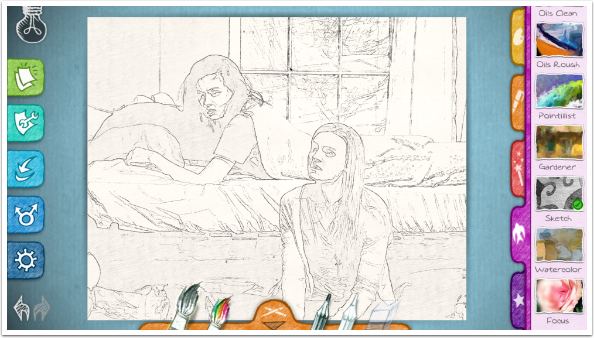
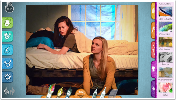
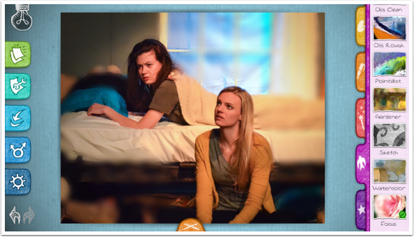
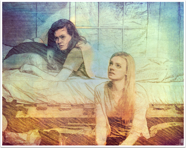
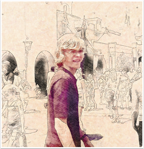
I choose an image from my library instead. Today’s image is from a play called “The Spins” featuring my friend Jessie, aka “Pizza Girl”. The other actress, Kathrine, lies on the bed.
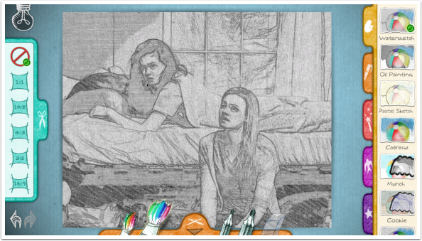
The Wrench icon gives you three choices: Crop, Frame and Adjust. Let’s take a look at Crop.
Crop gives you several options for the proportions of your image, but this crop is not adjustable. It takes the correct proportion from the center of your picture. You cannot zoom or move the crop handles on your image. I recommend cropping elsewhere.
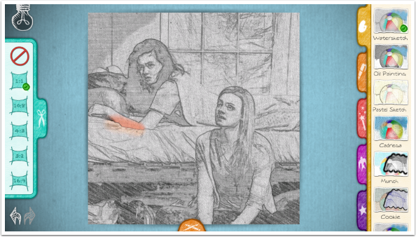
Below I tapped the square crop. You can see it takes the area from the center of the image.
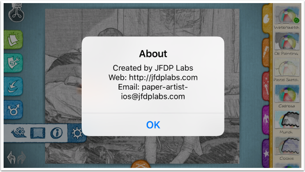
The next two icons are Save and Share, and we will see those at the end. The final icon has three options. The “i” icon, unfortunately, is not help, but the About window you see below. The icon that looks like a snail with a gear – because Paper Artist has no help option, and no website to help explain, the snail remains a mystery to me. It defaults to on, but I did not see that turning it off made any difference.
The third icon under the Gear allows you to change the colors of the workspace. There are four different choices.
Tapping any of the icons changes the look of the workspace.
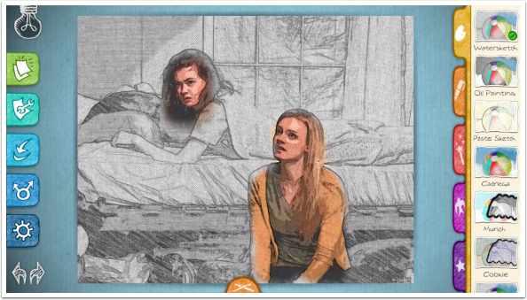
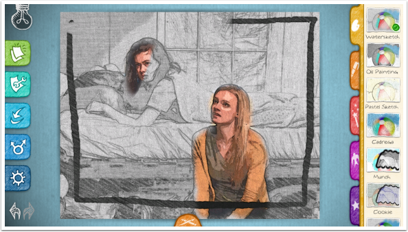
I notice that I have accidentally brushed on the canvas, and use the Undo button at the bottom to remove the stray stroke.
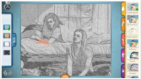
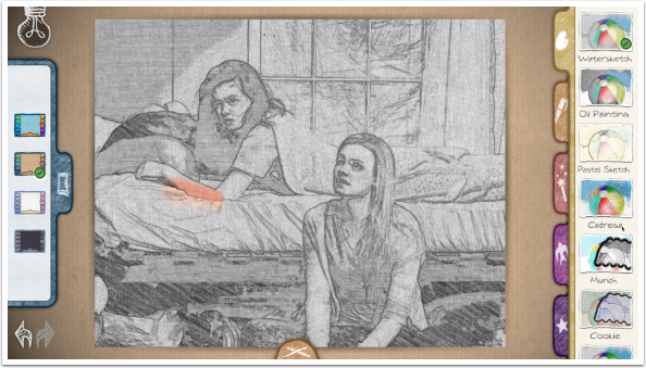
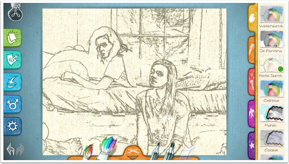
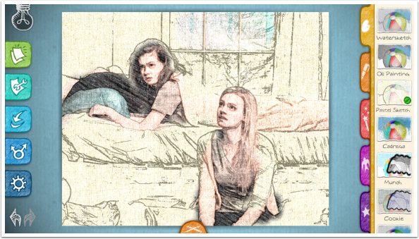
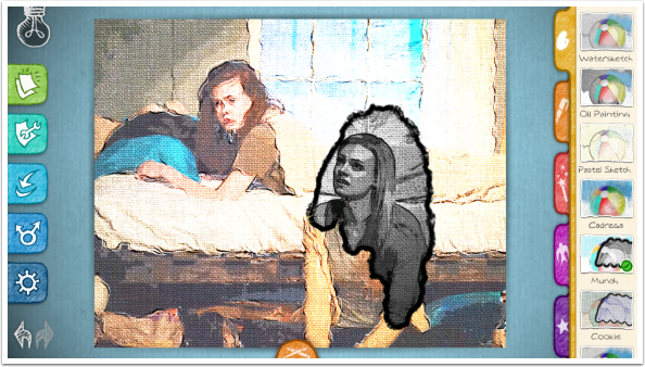
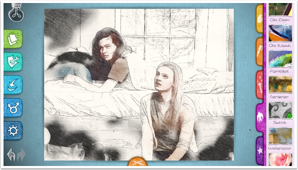
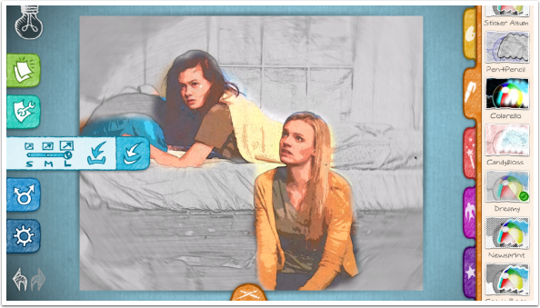
Paper Artist works by applying a basic look or sketch when a filter is chosen. The filter chosen below is Watersketch (indicated by a green check). The user can then add color/detail to parts of the image using the Brushes. The choice of brushes varies based on the filter. All of the filters under the Palette group have the same set of brushes: large and small color; large and small pencil; and the Eraser. The default brush is the large Color brush.
As said earlier, each filter is actually two looks: the default sketch and the brushed-in look. The Color brushes produce the second look. Watersketch has a default pencil sketch, and the Color brushes add warm posterised color to the image.
The small Color brush does the same, just using a smaller tip. The size of the brush tip cannot be adjusted directly, but you can make the size change by zooming in and out on the image with a two-fingered pinch.

At any time you can use Undo to remove the previous brush stroke.
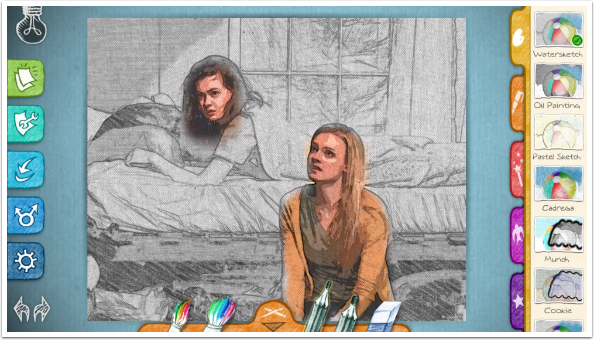
The brush choices disappear as you are brushing. You can bring them back by tapping the small brush icon at the bottom (right side in portrait).
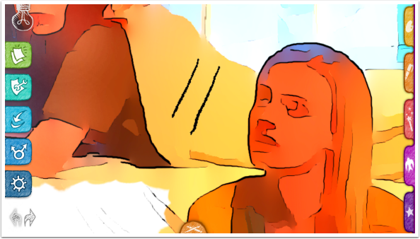
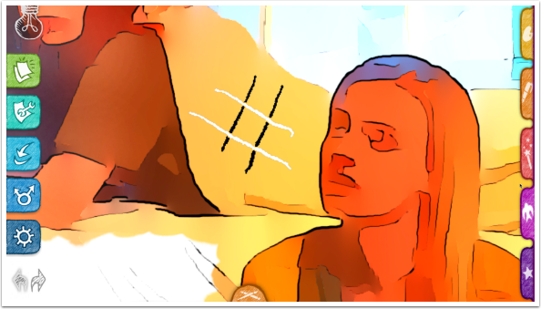
The pencils work differently based on the filter chosen. Below I’ve made a mark with the small pencil, and it looks just as you might expect.
When I use a large pencil on the Watersketch filter, I get a “braided” look to the stroke, almost as though it is made of rope.
The Eraser works on all kinds of strokes, whether they were made with the Brushes or the Pencils.
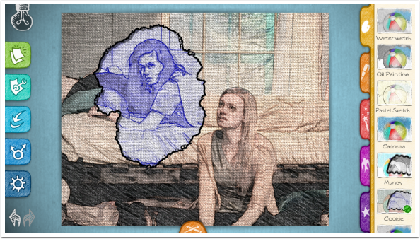
Choosing another filter redraws the image, removing all Brush and Pencil strokes.
Remember, the two looks in each filter are set in concrete, and you cannot change them. The Pastel Sketch filter has thick strokes on a yellow-spattered paper as the base look, and you brush in a light color with diagonal strokes.
Some of the filters are not my style at all. I can’t ever see myself using Munch, which starts with a loose coloured sketch on canvas, and brushes in a dark, detailed monochrome with a thick edge. I could see using either one individually on the entire canvas, but in combination – not so much.
Cookie is much the same, with a washed-out color sketch as the base, and a “blueprint” look to the brushed-in areas.
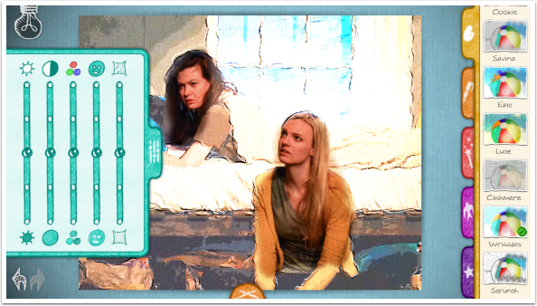
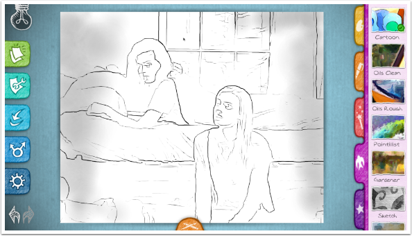
When you have a filter you like, I would suggest then moving on to the Adjust sliders, found under the Wrench icon. These adjustments apply to the entire image. You cannot adjust the brushed and default areas separately. The number of sliders available changes based on the filter. The five sliders available here, while using the Wriggles filter, are Brightness, Contrast, Saturation, Line Thickness and Paper Texture. A single tap on any slider returns it to the default position.
You can see below that lowering the contrast affects the entire image, even though it’s more noticeable on the default area.
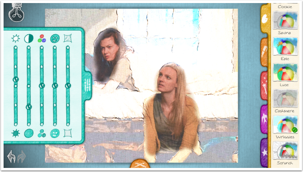
I’ve changed multiple sliders below. My favorite change is making the lines thicker. In many of the filters I prefer to make lines thinner instead.
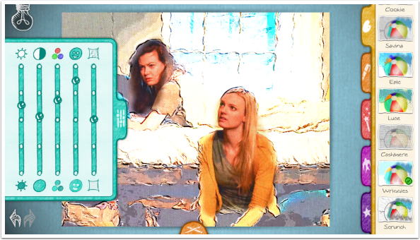
The Paper Texture on many of the filters is too strong in my opinion. I’m glad there is a way to reduce the texture with the last adjustment slider.

Of course, if you’re a lover of obvious texture, you can increase it as well.

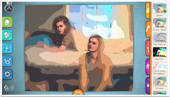
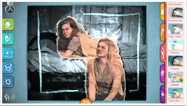
There are 12 filters under the Palette group. The next group is the Pen group, and it contains eleven filters. Below you’ll see the default look for the Detail filter.
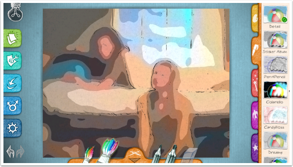
The second Brush look for the Detail filter is added below.
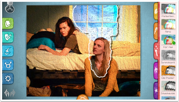
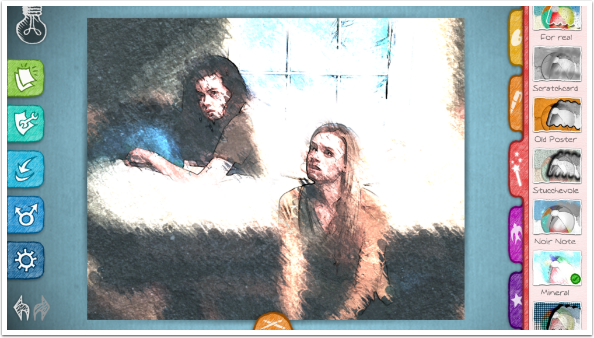
The next group, Magic Wand, has eleven filters. Once again, you will find filters that make odd pairings, like the stucco-and-raindrop pairing in the For Real filter.
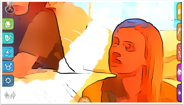
But they aren’t all bad. I like Mineral with this particular image, especially when I brush some detail in on the window as well as the actors.
The Pencils, as I mentioned earlier, work differently based on the filter. Here on the Jaybee filter, I get a light outlined stroke rather than a dark stroke from the large Pencil.
The next group of filters (the one marked with a bird) contains eight filters. The brushes change with this group. There is one color brush instead of two. Following that are a Lighten brush (marked with a sun) and a Darken brush (moon). There are two Pencils; black and white.
The Darken brush will darken any area of the image, either default or brushed.
Below I used the color brush to paint in the second look to the Cartoon filter.
The Lighten brush works on both default and brushed areas, but it’s only visible on the brushed areas below.
To show you the pencils, I’ve zoomed in and made a couple of strokes with the black pencil.
Then a couple with the white pencil.
Just as a reminder – the Eraser gets rid of both pencil and brush strokes. In order to get rid of the pencil strokes but leave the brush colors, you can use Undo or just paint over the pencil with the Color brush.
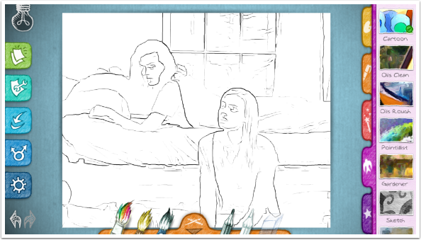
The Sketch filter does not have Lighten and Darken brushes. Instead, it has a Monochrome brush and a Color brush.
The Color brush in Sketch is not very saturated. Below I’ve used the Color brush for the actors and the pillow. Then I used the Monochrome brush in the corners. Be aware that the Monochrome brush is the default, and you have to switch to Color if you want it.
The Focus filter is not an artistic filter at all. All it does is paint in blur. Below is the “default look” of Focus, without any brushing.
The Color brush produces a uniform blur. Since effects can’t be stacked in Paper Artist, giving you the ability to add blur and then a filter; and since blurring is done better and more effectively in other apps, I recommend staying away from the Focus filter.
Once you’ve found a filter you like for your image and you’ve brushed and adjusted, you can Save your image using the “arrow into a curve” icon. The artwork is redrawn, so you have the ability to save at a larger size than your original image. Choose Small, Medium or Large for your output (choose large) and tap the “arrow into a box” icon to save to your Camera Roll.
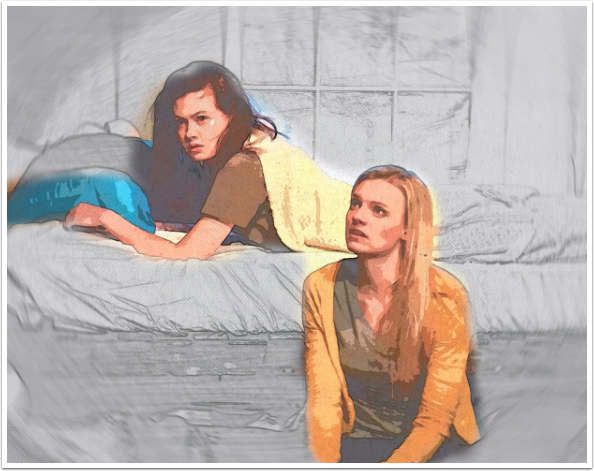
Here’s my saved image.
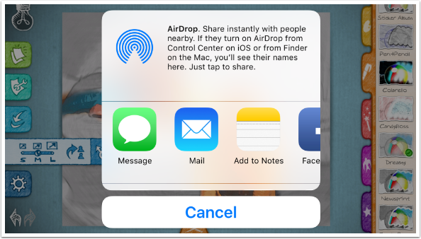
If you want to Share your image to another platform, tap the icon that looks like two arrows coming out of a circle. Once again, you choose the output size. Tap the “one person to another” icon and the standard iOS dialog is shown.
You can get a lot of great images out of Paper Artist, but why stop there? This version used iColorama and Stackables on top of the output from Paper Artist.
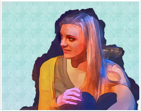
Here, in another image featuring Jessie, I used iColorama to bring back some of the eyes and mouth from the original, as well as adding color and texture to the paper. (The Cartoon filter has no paper texture.)
Here’s an image using the Pastel Sketch filter that I did crop within Paper Artist.
This is the uncropped version using the Woody filter.
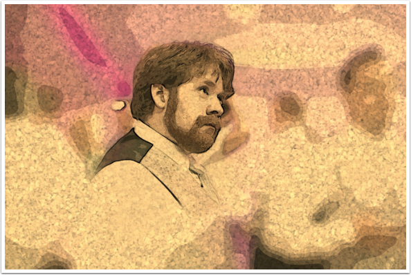
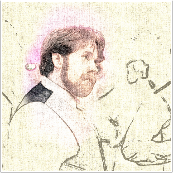
You can even do some interesting things with old images. Here’s yours truly, from Disney World circa 1976, and the Sketch filter. I went to iColorama to bring back some of the face detail from the original and to add some texture.
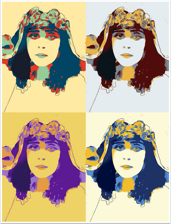
After I had already chosen the images for this article, I started messing around with a monochrome image of silent film legend Theda Bara, just to see what could be done. Using the Cartoon filter and the app Colorburn afterward gave me an image I knew I would have to include.
So what do we take away from this look at Paper Artist? I will say that there are several filters that I like to use. The fact that the output size can be raised over the original resolution is great, but really large images will be reduced even at the largest output size. The biggest drawback is lack of support. Apps by JFDP seem to appear and then are never modified. There’s no help facility and no website. So if you like some of the results you see (and I freely admit that I do), spend the three bucks on Paper Artist. Just don’t expect to get any more filters or enhancements to the app.
Until next time, enjoy!
TheAppWhisperer has always had a dual mission: to promote the most talented mobile artists of the day and to support ambitious, inquisitive viewers the world over. As the years passTheAppWhisperer has gained readers and viewers and found new venues for that exchange.
All this work thrives with the support of our community.
Please consider making a donation to TheAppWhisperer as this New Year commences because your support helps protect our independence and it means we can keep delivering the promotion of mobile artists that’s open for everyone around the world. Every contribution, however big or small, is so valuable for our future.
Jerry Jobe
Never content with just scratching the surface of what an app can do, Jerry Jobe decided to pass on what he learned about imaging apps to others. He’s constantly trying to figure out just what tools other artists have used, and trying to incorporate them into his own work, in an attempt to find his style. He’s written tutorials on over 145 apps so far, which you can find (along with his Song of the Day entries) at http://enthusiasmnoted.wordpress.com/ He lives near Atlanta, Georgia, where he also finds a creative outlet in acting and directing in community theater.
One Comment
Pingback: