Mobile Photography / Art Tutorial – Good Hydrations: How Much Water Do You Need?
We are delighted to publish Jerry Jobe’s latest mobile photography/art tutorial for our viewing pleasure. This time Jobe takes a look a new watercolour app – Paint Logue and compares it to some of the other current popular watercolour apps. Take it away Jerry…(foreword by Joanne Carter).
“How many hammers do you need? Given my ability to bend any nail, I definitely need a claw hammer. I’ve got a pipe wrench with a hammer head on the back, for those frustrating moments when the pipe fitting WON’T BUDGE. But since I’m not pounding dents into or out of metal, I have no real need for a ball-peen hammer. (Besides the fact that I love the phrase “ball peen hammer”. It’s fun! Say it with me: Ball Peen Hammer.)
Why am I talking about hammers when I should be talking about iPhoneography apps? It just came to mind when I saw that another watercolour app was available for free this past weekend. It’s called Paint Logue (yes, there is a space in the middle – it’s not Paintlogue) and it is by a company called Nine Curves. It was first released in September, but it’s already on release 3.1.
At first I wasn’t even going to bother downloading it, because watercolour effects are easily obtainable in many, many apps. To use my analogy, who needs another hammer? It would have to be very special, and Paint Logue is not a special hammer. So rather than go into depth with an app that isn’t that deep, I think I’ll compare it to other watercolour effects. In addition to Paint Logue, I’ll look at Waterlogue, Becasso, Aquarella, and my go-to app, iColorama.
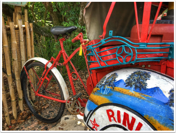
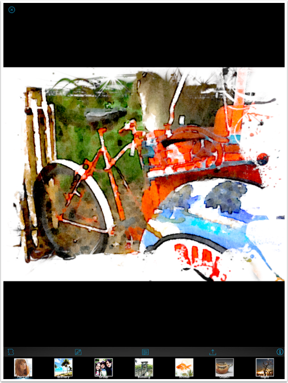
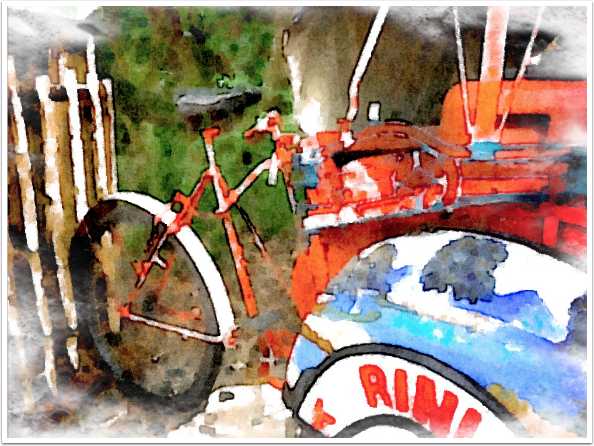
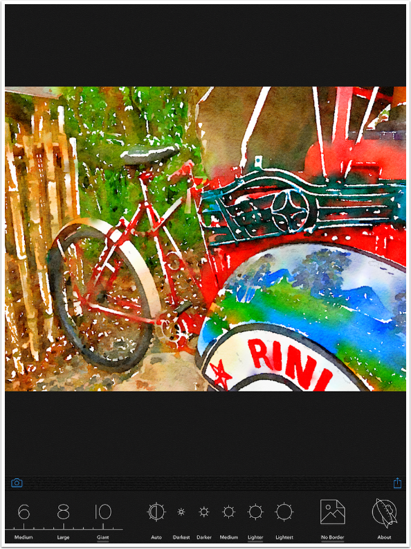
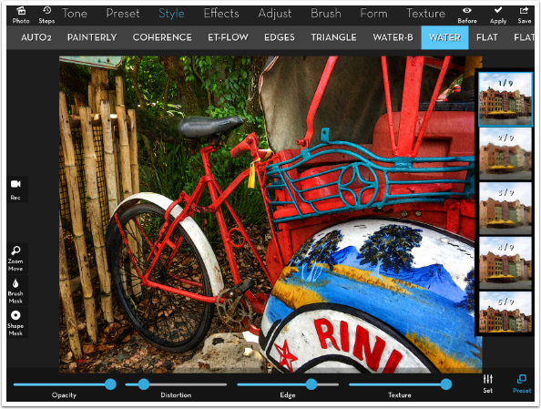
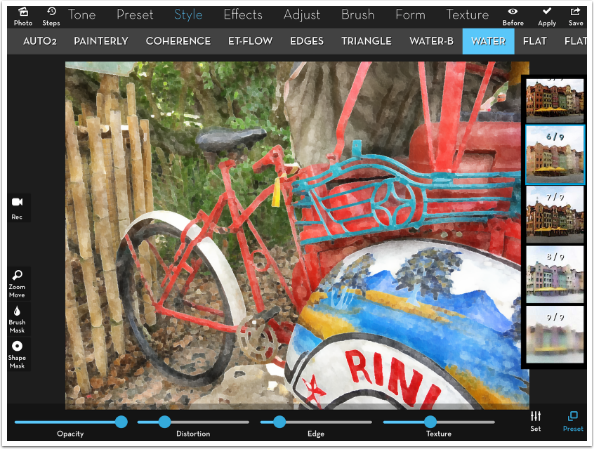
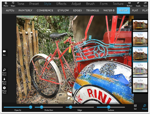
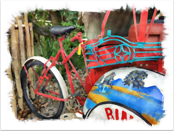
I’ll be using this bicycle image that I captured last week at Disney World’s Animal Kingdom”.
Paint Logue is a universal app. It is also available on the Google Play store, for non-Apple devices. It only works in portrait mode.

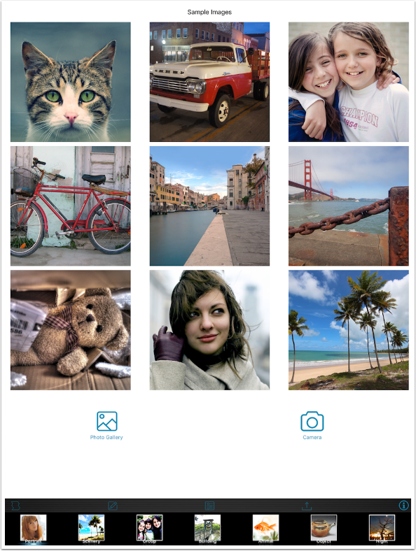
When you enter the app, you can choose from nine sample images or access the Photo Library or the Camera.
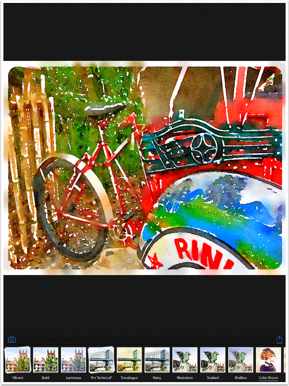
Once an image is loaded, you can choose from seven different presets. Seven is a low number of presets, particularly when you realize there are not many adjustments to be made.
The first adjustment is a number of borders. To Paint Logue’s credit, the preset borders are not a strong suit of other apps.
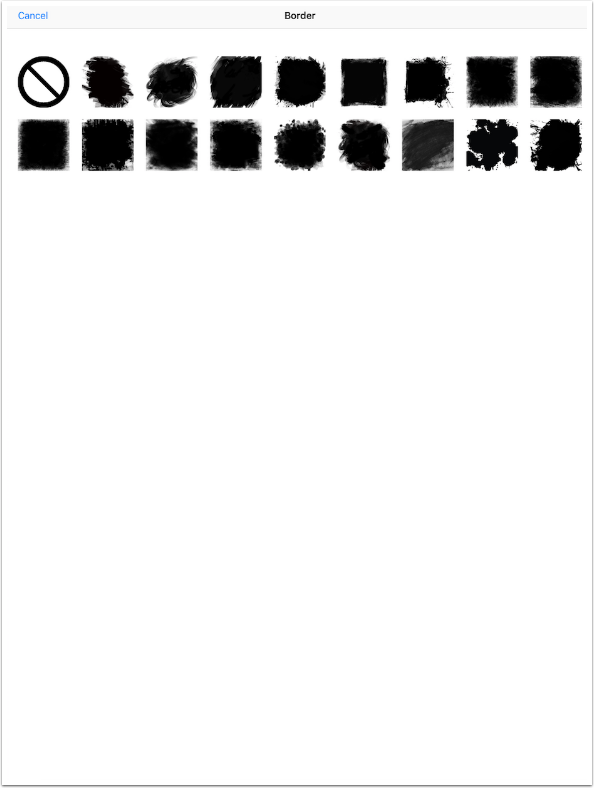
The borders are not adjustable in size or color. The paper texture applied to the image is not applied to the border. The borders also cannot be rotated. You have to take them exactly as they are
Paint Logue allows you to add a signature. Use all of the square provided to create your signature, because it will be shrunk to place on the image.
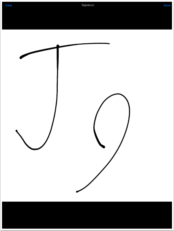
The signature is placed on the image below. It is always black, and cannot be resized or rotated.
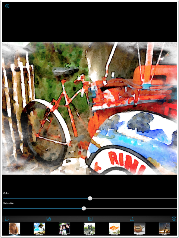
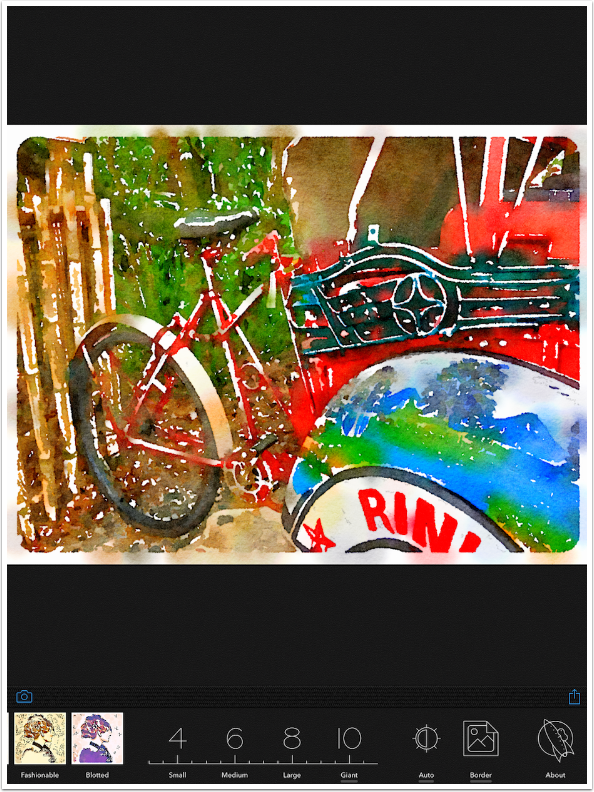
The two remaining adjustments are sliders for Color (Hue) and Saturation. You can’t make any changes to the Edges, Wetness, Strokes, Texture – all the qualities the make a watercolour distinctive. The presets determine all those qualities, and you’ve only got seven of them.

I decide to reduce the saturation a bit.
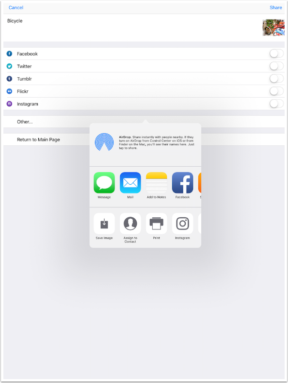
The Save/Share options allow you to add a caption, which is placed in the EXIF data on the image. Paint Logue really emphasises the sharing aspect – in order to save to the Camera Roll, you have to tap the “Other…” option.
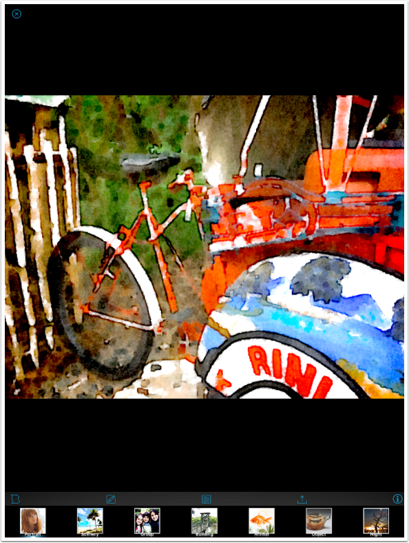
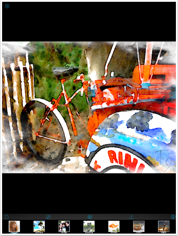
Here’s my finished image. Not horrible, but certainly a watercolour effect that can be improved, if I were allowed to change some aspects of it.
The question I’m left with is, why develop and publish an app that is less than the competitors? Shouldn’t you at least take a look at those competitors and find a niche where you could shine? Paint Logue offers borders that most other apps do not – couldn’t you work on making them the best in class, and therefore a reason for buying your app over the others?
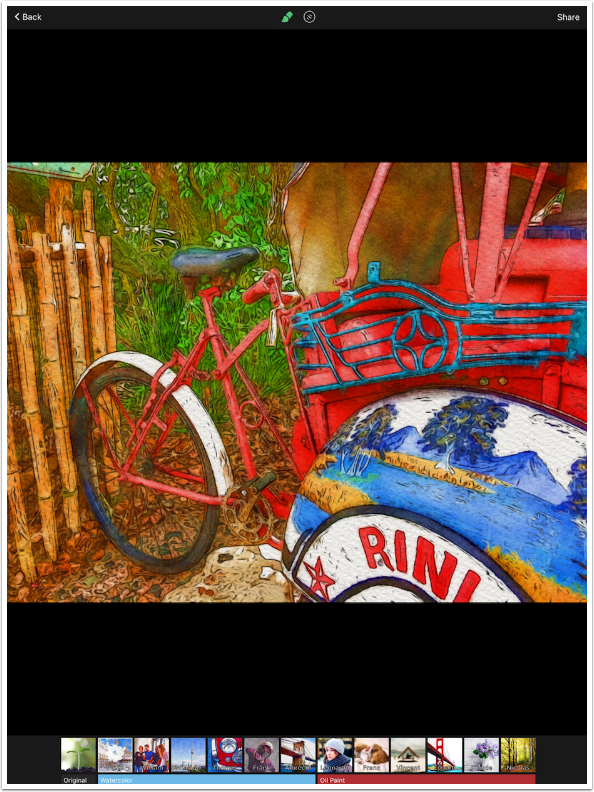
Paint Logue would seem to be in direct competition with Waterlogue. Waterlogue only offers one kind of border – a thin edge with rounded corners. There are twelve presets, with truly different looks.
There are adjustments to the size of the strokes, from Small to Giant.
There are also adjustments to brightness, from Darkest to Lightest. There are still no Edge adjustments, and no separate adjustments for Hue or Saturation. Where Waterlogue gets an edge over Paint Logue is in the larger variation in their presets.
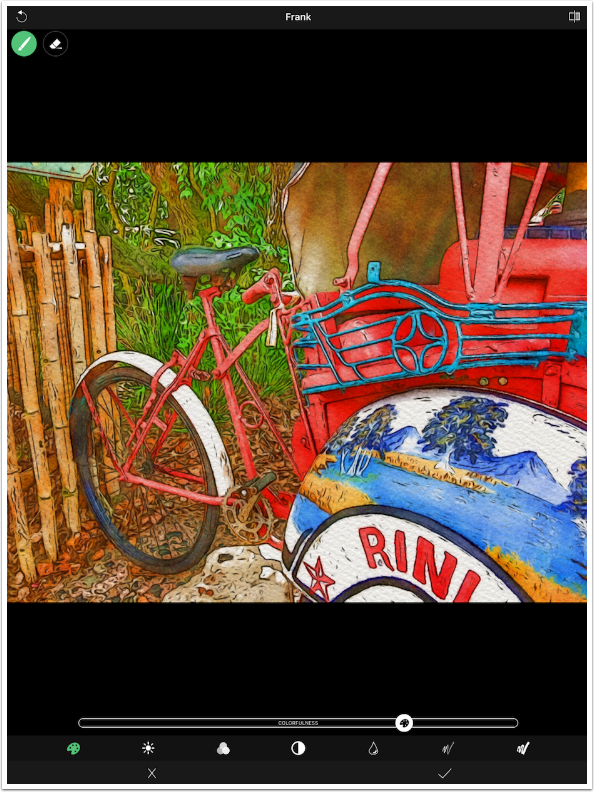
How about Becasso? There are only six presets here. There are no borders. However, there are adjustments that are specific to the qualities of a watercolour image, including Wetness and Edge. This expands the six presets to an exponentially larger number of “looks” for your image.
The Colourfulness command actually controls the amount of canvas that is covered by color. At low values, a lot of the white canvas shows through. There are still Brightness, Saturation and Contrast controls.
Becasso has a Wetness slider as well. It controls how the watercolour bleeds into the paper. A wetter stroke will spread out more. Look at how the dark at the top of the fender bleeds into the white below.
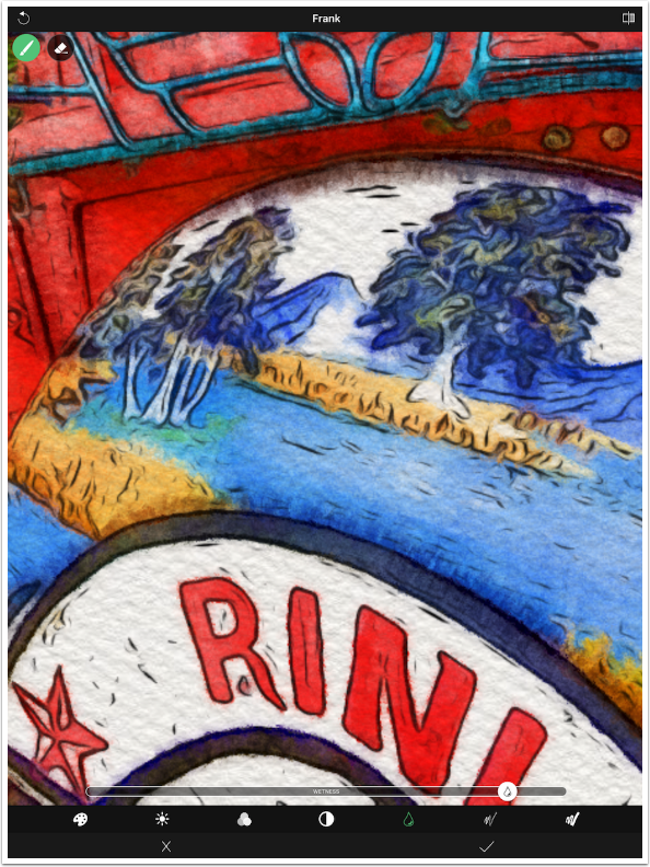
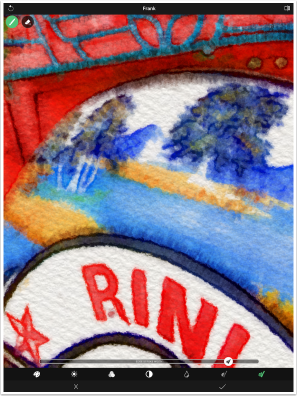
There are two controls for Edges. The first is Edge Amount.
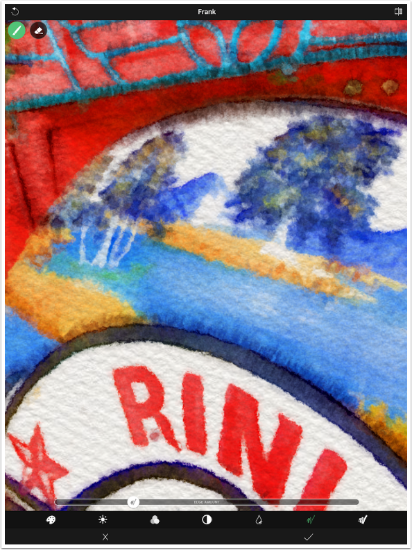
The second is Edge Stroke Width. The number and width of edges used in a watercolour greatly impacts the look of the finished image, and Becasso takes advantage of that to give the user many more “looks” than the six presets would indicate.
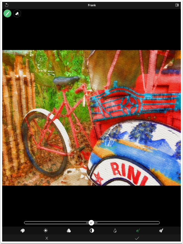
Notice how the adjusted “Frank” preset looks nothing like the original preset look.
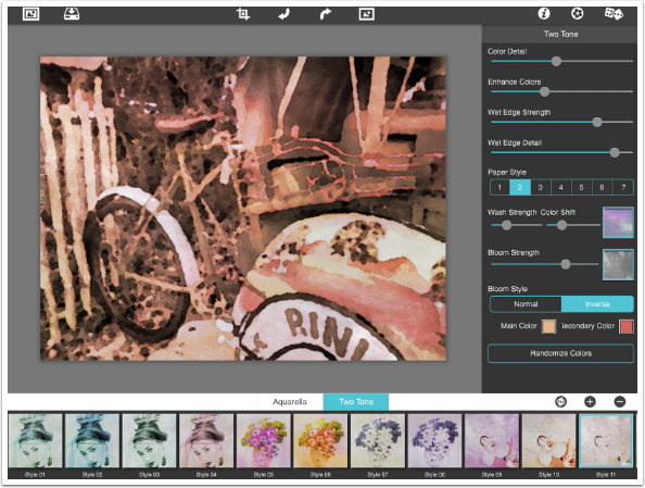
Aquarella is a JixiPix app that I have not covered yet, but is worthy of a full tutorial. As might be expected, there are a ton of presets – 60 under the two categories of Aquarella and Two Tone.
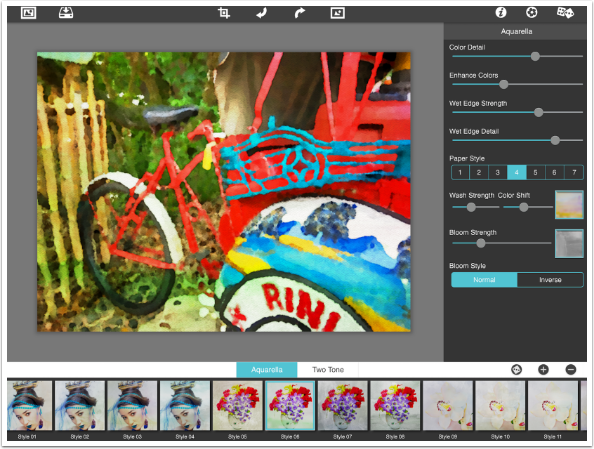
But that’s not all. You have control over Color Detail, Enhance Colors, Wet Edge Strength and Wet Edge Detail through sliders. There are seven paper styles which control the texture. There are also 63 different washes, which can give you subtle or bold color variation within the image.
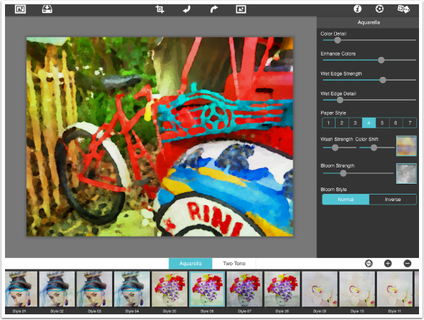
There are 41 different Bloom textures. Darker areas within the Bloom texture make your image darker, and adds to the blooming or bleeding within those areas. The Inverse switch effectively doubles the Bloom textures to 82.
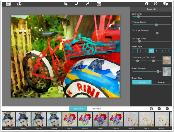
The Paper Styles change the texture of the paper, but unfortunately, the intensity cannot be adjusted.
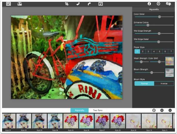
The Two Tone presets give you a duotone look, and the colours are infinitely adjustable. All of these preset, controls, and textures make Aquarella the most powerful dedicated watercolour app out there. It is strange, however, that they offer no borders, since many JixiPix apps do have borders.
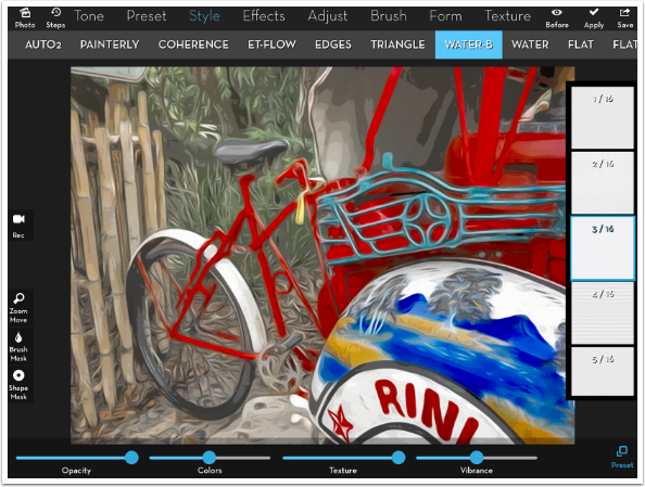
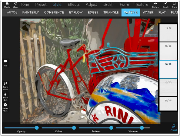
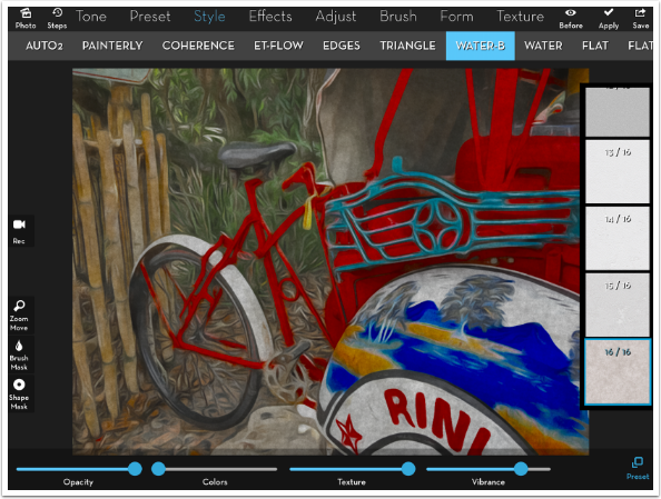
But how about iColorama? It’s not a dedicated watercolour app, but it does have two different watercolour Styles that are tremendously adjustable. The first is Water-B, which has 16 different paper texture presets.
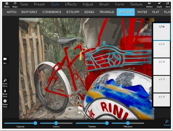
Below I chose Preset 3, which is a much subtler texture.
The Colors slider performs a “posterisation” of the colours, grouping more of them together as the slider is moved to the right. At the leftmost setting, the colours would not be posterised at all.
The sixteen different paper textures, combined with the Texture slider to reduce the effect, gives you a lot of different opportunities with this specialised water-ish look.
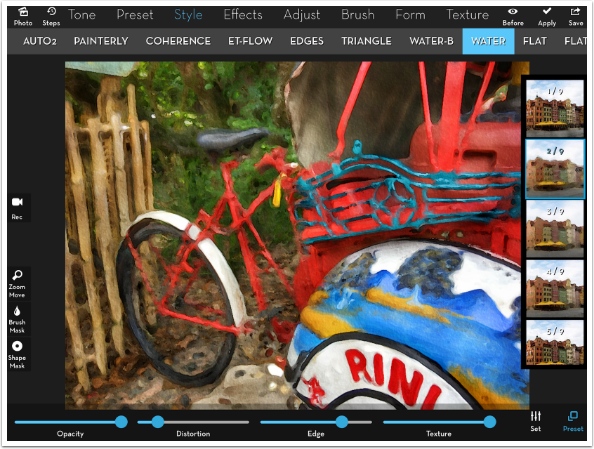
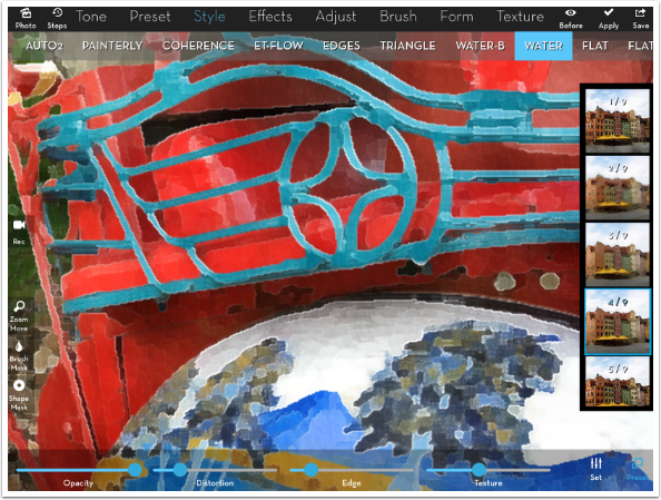
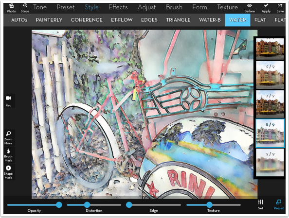
True watercolour looks are found under the Water Style. There are nine different presets, each of which make radical changes to the stroke width and other preprocessing decisions.
Below I just changed from Preset 1 to 2 and you can see there’s a radical change in the look. It looks to me as if a Tensor effect was added before the “painting” commenced.
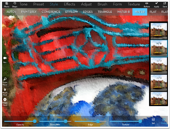
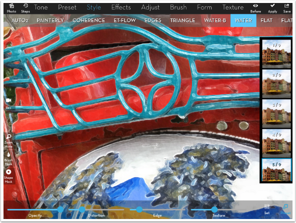
There are three sliders along the bottom, and I zoom in to show the difference the sliders make more clearly.

Below I increased the Distortion, and you can see that the edges become more fuzzy as the paper distorts the paint.
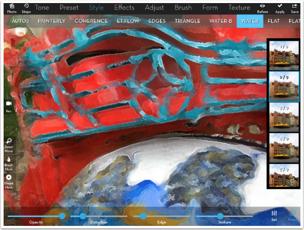
The Edge slider does something no other app does. The center position is no edges, and towards the right is the familiar black edge. But moving the Edges slider to the left end adds white edges instead. This gives a lighter airier feeling to your watercolour.

Of course, you can lessen the Texture of the paper also.
Let’s look at some of the other presets. Below is #4, which uses square brush strokes (not a favorite of mine).
The fifth preset is very clean, and I like what it does to the metal along the top of the zoomed-in image.
Below you’ll see Preset 6, and you may notice a cloudy mottling of the image, making some areas lighter and some darker. The visibility of this mottling is controlled with the Intensity slider under the Set button at the bottom right.
Preset seven adds some black edges that resemble Sumi-e. these edges are not controlled by the Edge slider. In the example below, I have moved the slider to the left, which outlines the thick black Sumi-e lines with white edges.
Presets eight and nine allow much more of the paper to shine through, and the resulting pastel colours really say watercolour to me.
Of course, there is an advantage to using a full-featured art app for the creation of your watercolours. If you want a border, you can add it. If you need to adjust brightness, contrast, saturation, levels, or even curves and sharpness, all the tools are available to you. Below I painted in a border before using Style>Water, and the border got a painted look also.
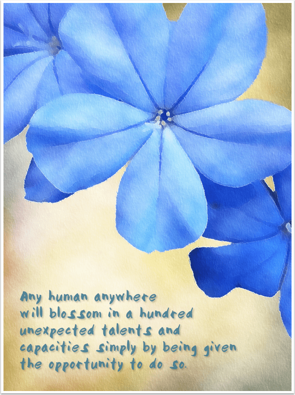
I was able to preprocess the shot below by masking a textured yellow background around the blue blooms from my original image. Then I passed the entire image through Style>Water in iColorama before adding the text in Over.
The point I’m trying to make here with this article is that new apps come along every day. It can be hard to figure whether you need a new specialised app or not. First look at the hammers you’ve got, and see if the new one offers something you don’t have. It can be looks you can’t get elsewhere, it can be degree of control, it can be ease of use. But if you’re like me, with tons of apps already on your device, most apps offered will not have any advantage over what you already have. If you’re looking for my specific recommendations on the five apps I showed today, I would keep iColorama, Aquarella, and (most likely) Becasso. I don’t know that I’ll ever use Waterlogue or Paint Logue again. They just don’t offer the degree of control and the variety of looks that the other apps do.
Until next time, enjoy!
TheAppWhisperer has always had a dual mission: to promote the most talented mobile artists of the day and to support ambitious, inquisitive viewers the world over. As the years passTheAppWhisperer has gained readers and viewers and found new venues for that exchange.
All this work thrives with the support of our community.
Please consider making a donation to TheAppWhisperer as this New Year commences because your support helps protect our independence and it means we can keep delivering the promotion of mobile artists that’s open for everyone around the world. Every contribution, however big or small, is so valuable for our future.
Jerry Jobe
Never content with just scratching the surface of what an app can do, Jerry Jobe decided to pass on what he learned about imaging apps to others. He’s constantly trying to figure out just what tools other artists have used, and trying to incorporate them into his own work, in an attempt to find his style. He’s written tutorials on over 145 apps so far, which you can find (along with his Song of the Day entries) at http://enthusiasmnoted.wordpress.com/ He lives near Atlanta, Georgia, where he also finds a creative outlet in acting and directing in community theater.

One Comment
YJ
Thank you for your comprehensive review, Jerry. I am the developer of Paintlogue. We take in much seriously on all feedback. Would you think if we add manual drawing brush feature to the current Paintlogue, it would be a good value to our user? It is basically like what Adobe Sketch app is. Hope to hear from you. Thanks again for constructive feedback.