Mobile Photography / Art Tutorial – Manipulating Sort in iColorama with Jerry Jobe
We are so delighted to publish Jerry Jobe’s latest mobile photography/art tutorial for our reading and viewing pleasure. Read Jobe’s thoughts about manipulating Sort in the hugely popular iOS app, iColorama. Take it away Jerry…..
(foreword by Joanne Carter)
“It’s been a while since I’ve covered any new features in iColorama, the premier mobile art app. The feature I will cover today, Form>Sort, was added a few years ago, and has been used repeatedly in brilliant works by many mobile artists.
There aren’t a lot of modifications to the effect that can be accomplished in the Sort command itself, but I’ve discovered that you can make subtler, beautiful effects by modifying the image before applying sort, and I’d like to show you how to do that”.
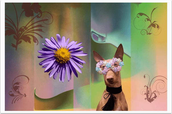
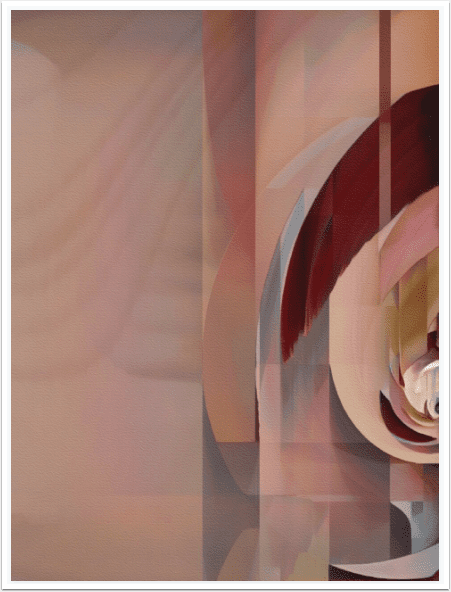
My first image here used Sort on the background, and I added the flower, dog, and painted elements after.
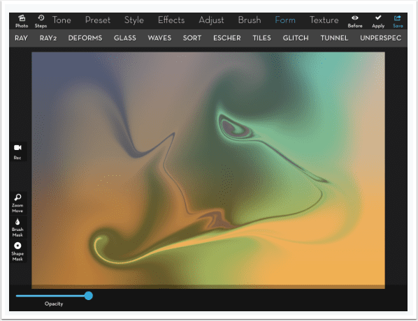
How did I create the smeared colours and the vertical areas in that background? Using the Sort command. Below you will see the background before Sort was applied. I used two functions only seen in iColorama, the iPad version, and not iColorama S, the iPhone version.
The first was Preset>Gradient>8, which allows you to build horizontal gradients of up to five colours, colours which can then be rotated. The second was Brush>Abstract>Swirl.
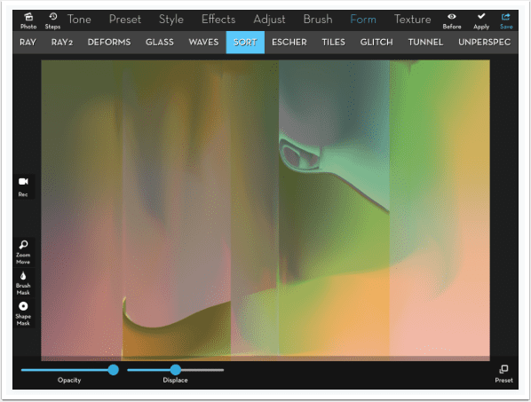
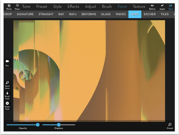
When you access Form>Sort, the first preset is automatically applied. I liked the result, and did not manipulate it any farther.
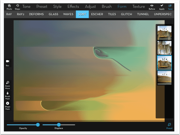
Sort Presets 1 and 2 give you vertical lines, as if the pixels are sliding downward. Presets 3 and 4 give you horizontal lines, as if the pixels are blown to the right.
One of my favorite ways to intensify a washed-out image is Adjust>Tone Lab>4. This does affect the colours, so you have to watch out using it on photographs. But for this abstract image, I like the color shift.
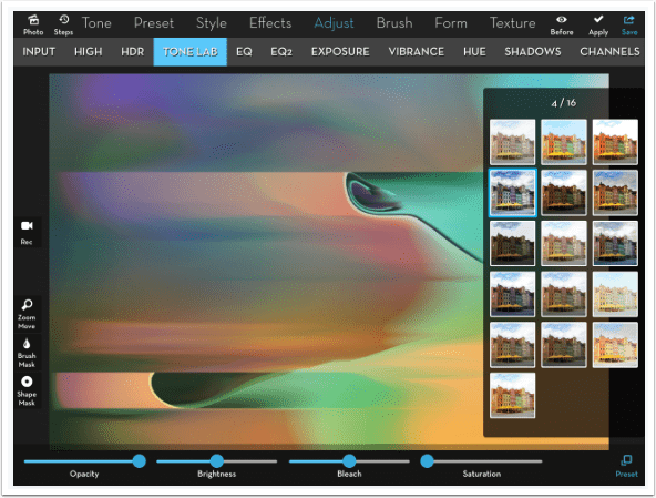
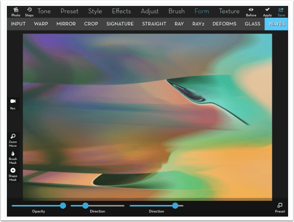
If you don’t like the straight lines, you can use Form>Waves>1 to impart some sway. The default look is too intense, so just pull the first Direction slider over to the left until there are only two or three waves, then move the second Direction slider to tilt the waves and pull them apart.
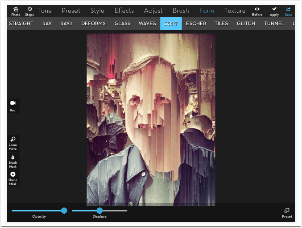
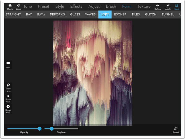
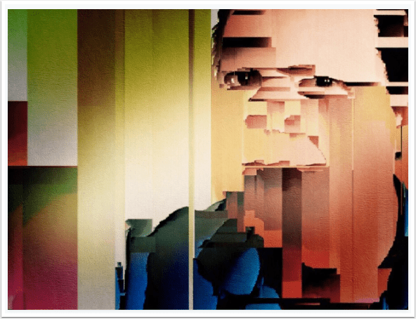
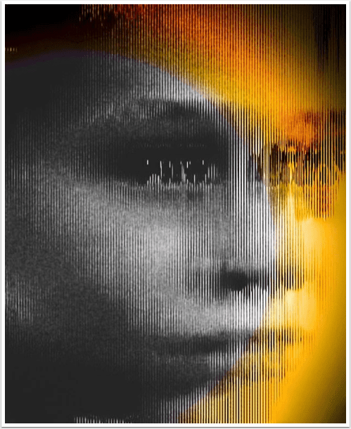
So we’ve seen the result of applying the Sort command, but what are we actually doing? If you look at the selfie below (look! Me in a bar!), you will see vertical bars running down. Sort looks at surrounding pixels. If the surrounding pixels are close enough in value, the pixels are averaged together. Once the averaged area gets large enough, the pixels run downward.
The larger the averaged area, the farther the color will run. For example, you will see the large area in my neck running right over the collar of my green t-shirt. If a strong enough change is encountered, then the color will be halted. My eyes are not completely covered by the runoff from my forehead because there were strong shadows in my eyes.
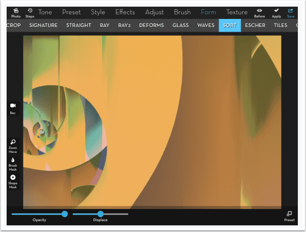
There is one slider, Displace. Displace breaks up the downward runs. I generally do not care for that additional breakup, so I don’t move the Displace slider – it can be very difficult to reset the slider to the original position. Below, moving the slider to the right breaks up the runoff in a downward direction.
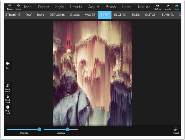
Moving Displace to the left breaks up the runoff in an upward direction.
Presets 2 and 4 break up the runoff without Displace even being applied, but you can break them up more by using the Displace slider if you want
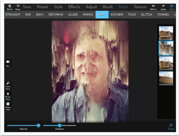
Below is an example of using Preset 3 on the same selfie. It shows the pixels being “blown” to the right. The same averaging is done, and the same “brakes” are applied when an abrupt change is encountered.
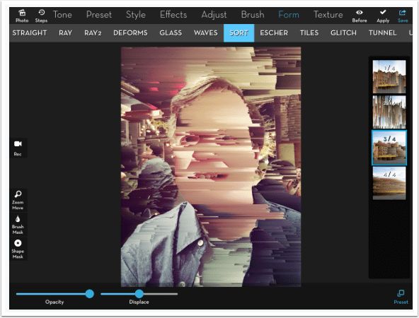
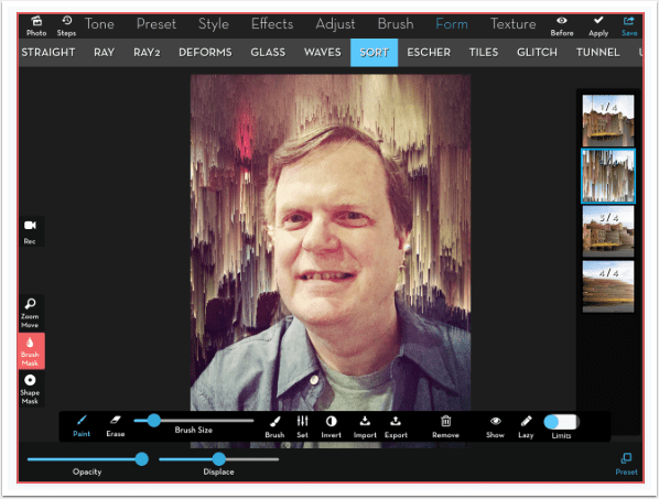
Well, that’s an interesting look, and that “cubist” feel has been useful to me, because I like to deconstruct faces in my work. But you can’t adjust it – the algorithms for averaging groups of pixels and determining the breaks are not available to the user. You basically get what you get. So the first manipulation to Sort is to mask it away form areas that you don’t want to affect. Below I masked the Sort so it would only apply to the background. That can certainly be useful.
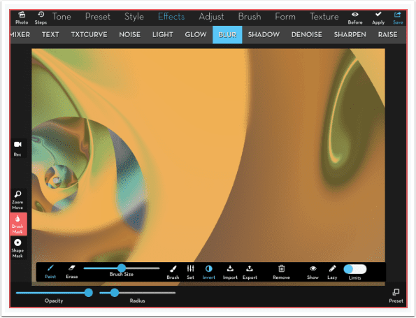
But let’s think about what Sort does. Is there a way to change the results, even though we can’t change the algorithm? Well, if you change the values of the pixels going into the sort, you change the results. In order to have more pixels average together, and eliminate the harsh edges that make the runoff stop, you can blur the image. Below I am using Effects>Blur>2, which really blurs it too much.
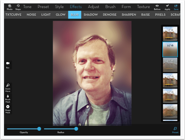
Pulling the Radius slider to the left to a value of .10 to .12 gives us the right amount of blur, several times stronger than Blur>1.
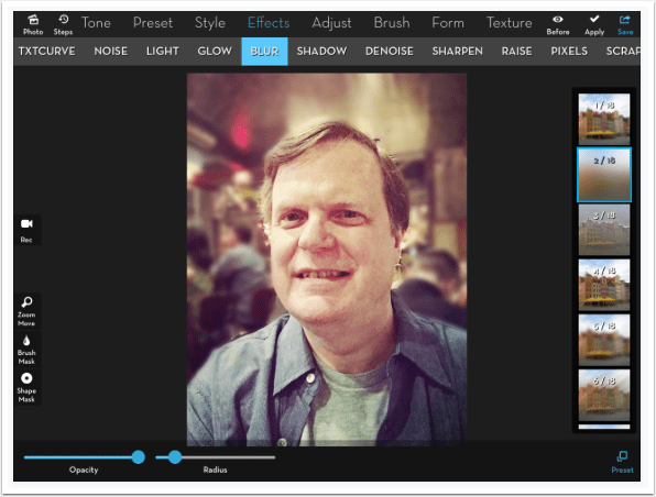
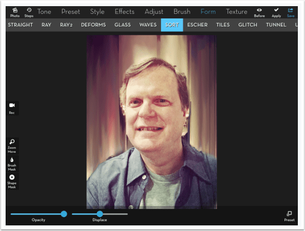
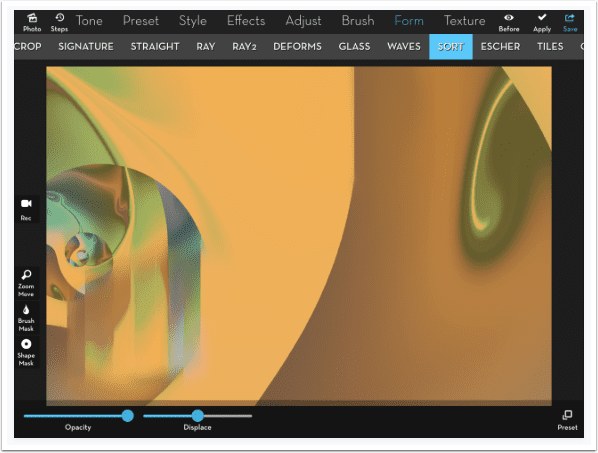
Now when I apply Sort, I get a beautiful painterly smear of the colours that are already present in the background.
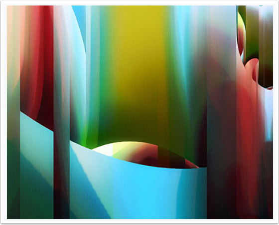
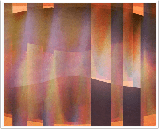
And so, a combination of masking and blurring can give you some really wonderful results. Remember the first background I created? The multicoloured gradient and the swirls had its own built-in blur with only a couple of harsh transitions that made the smear or runoff break. When you use Form>Escher on a gradient, hard transitions are formed on the created curves.
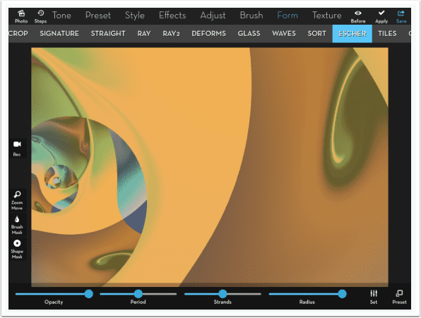
When you apply Sort to those hard transitions, they remain intact with no smearing.
I decided to mask in some Blur on parts of those hard edges – in the lower left and the upper center.
If I leave the mask in place for the Sort, you can see that I get some lovely smears in those places.
But if I remove the mask from the image before applying Sort, strange things happen, Look at the additional orange vertical at the bottom center. It wasn’t there when none of the image was blurred. But that blur changed the algorithm enough to affect other parts of the image.
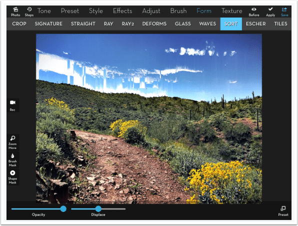
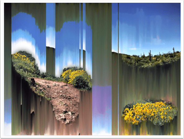
Sort won’t do much of anything to an image that has lots of contrasty details. In the desert image below, only the sky is affected in any real way, and it is just plain ugly in my opinion.
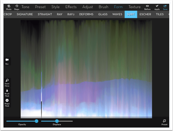
If you blur the whole image before applying Sort, you get something that’s almost as ugly – a smeary mess.
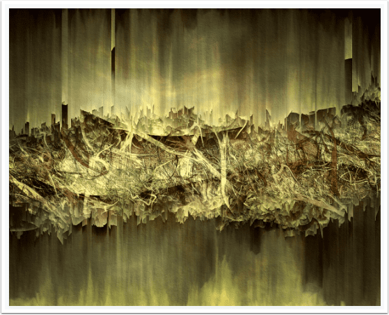
I find that the best results come when there are at least some hard edges to break up the smear. Below, instead of blurring the entire image, I used a mask to blur everything but a few bushes and parts of the trail and the skyline.
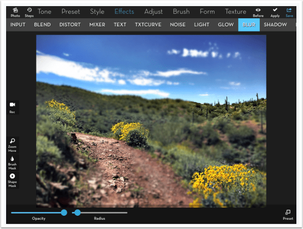
I kept the mask in place so that I would only Sort the area that was blurred. I love the results.
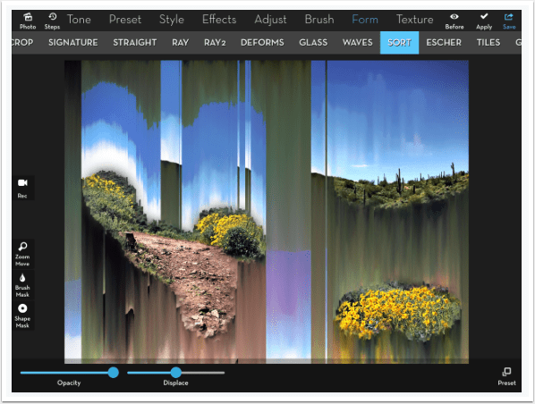
Here’s my desert scene, using masking, Blur and Sort.
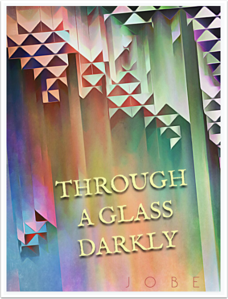
Sort will give unexpected results. Changes in the hard edges and the blurs will end in very different results, as seen above. In the fake book jacket below, I added a Glass setting to add the hard edges in the form of triangles. I used Form>Straight to skew it from the vertical.
A hard enough straight edge will end up with a jagged, pixelated look, so you may want to add Coherence or Flow, as I did here, to soften the jagged lines.
I will wrap up with some works I’ve created over the last several months using Sort. “Scratching the Surface” used both Preset 1 and Preset 3, so some flows down and some flows right.
“I’ve Fallen and I…Think I’ll Stay a While” was an experiment that turned out better than I could have hoped for. The chance of the Sort algorithm!
The work below came out looking like an ear to me, and I called it “The Listening Hour”.
“As Though Seen Through a Veil” is another happy accident, polished with adjustments and textures.
Using Explode brushes on a gradient, I filled the canvas with a lot of action. I left the middle intact and blurred and sorted the top and bottom. I got “There’s a Little Complication with My Complication”.
Finally, “Until Next Time” added a plate from Retype in the upper right, and Effects>Text at the bottom.

iColorama’s Sort really does things that I don’t see from any other app. Since it is not adjustable and does not give you exactly what you expect each time, it may not be a function for people who are looking for an exact experience. But it is wonderful for playing with. Until next time, enjoy!
TheAppWhisperer has always had a dual mission: to promote the most talented mobile artists of the day and to support ambitious, inquisitive viewers the world over. As the years passTheAppWhisperer has gained readers and viewers and found new venues for that exchange.
All this work thrives with the support of our community.
Please consider making a donation to TheAppWhisperer as this New Year commences because your support helps protect our independence and it means we can keep delivering the promotion of mobile artists that’s open for everyone around the world. Every contribution, however big or small, is so valuable for our future.
Jerry Jobe
Never content with just scratching the surface of what an app can do, Jerry Jobe decided to pass on what he learned about imaging apps to others. He’s constantly trying to figure out just what tools other artists have used, and trying to incorporate them into his own work, in an attempt to find his style. He’s written tutorials on over 145 apps so far, which you can find (along with his Song of the Day entries) at http://enthusiasmnoted.wordpress.com/ He lives near Atlanta, Georgia, where he also finds a creative outlet in acting and directing in community theater.

3 Comments
Carol Wiebe
Jerry, I love the way you look at things, so playfully and open to experimentation. I am an avid iColorama user, and have to say that what you call a lack of control is, for me, one of its best features. I love surprises. But, that said, I have seen some effects in other apps that were similar to those iColorama uses, but with no sliders, or very minimal adjustments, that made me realize, once again, how awesome iColorama is.
I also really enjoyed the work you presented here—and you have great titles!
Liliana Schwitter
Thats a true interesting useful tutorial about these options in iColorama.. thank you Jerry Jobe
Lash LaRue
Thank you, Jerry. I am new to iColorama, so tutorials like this one are very helpful to me.