DistressedFX+: a surprisingly worthwhile upgrade
Five years ago I wrote a tutorial on DistressedFX, a texture app to go alongside Stackable’s and Mextures in my library of apps. I couldn’t help but compare it to those giants in texture apps, and although I loved the textures, I found the interface clunky without the versatility of Stackable’s or Mextures.
In the intervening years DistressedFX has soldiered on, occasionally releasing new texture packs. But we have recently discovered that Stackable’s has ceased updates, and it is only a matter of time before that app crashes and burns. So I have revisited DistressedFX over the last few weeks, buying several packs that I had bypassed earlier.
So, having spent money on the app, what should happen except a new version of DistressedFX – one that is not upwardly compatible? DistressedFX+ costs a relatively steep $/£9.99, but it does include all present and future packs. Is it worth it?
I’ve got to admit, I initially thought that DistressedFX+ would be going to a subscription model, which would make it a definite “NO” for me. I have too many apps that will do everything I need that I don’t have to pay additional charges every month. But I was pleasantly surprised to see that not only are all packs included, but significant changes to the clunky interface have been made – enough to make me glad to support the developer with the additional upfront price. A developer has to eat, after all. I’m glad to pay for additional value.
So the new version has a colourful new splash screen.
One drawback of the original DistressedFX, which was quickly rectified shortly after my first tutorial, was that it only operated in portrait mode. DFX+ is still limited to portrait on the iPhone, but will operate in landscape on the iPad.
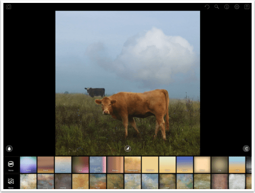
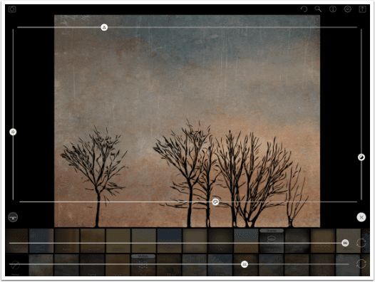
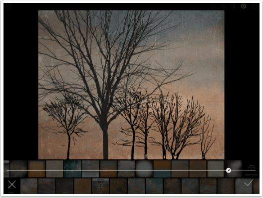
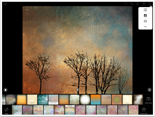
The default photo has changed, from the image of a shack to a couple of cows in a field. The layout remains the same, with the bands of Overlays and Textures on the bottom. Let’s first take a look at the buttons at the upper right.
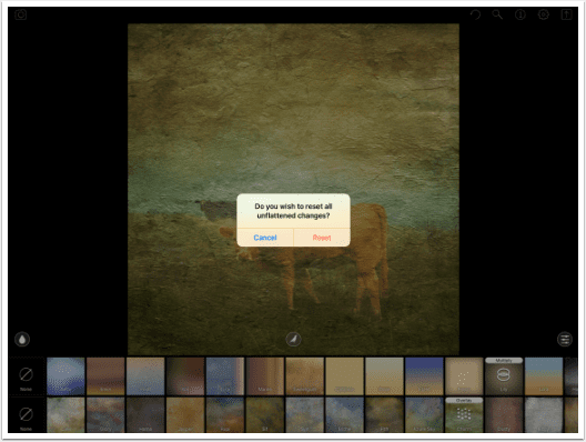
The counter-clockwise arrow is a reset button. Once you’ve added Overlays and Textures and birds or trees and blurs or whatever, you can press the reset button to return to the original photo. A dialog box will ask if you are sure.
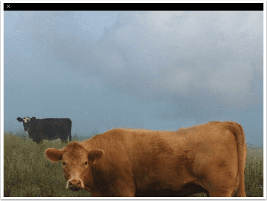
The magnifying glass will take you into a zoomed-in version of your image. You can move it around to help you see how the texture is affecting your image, but in order to make any further changes, you have to exit the magnifier using the X at the upper left.
The small i in the circle is for information, or help.
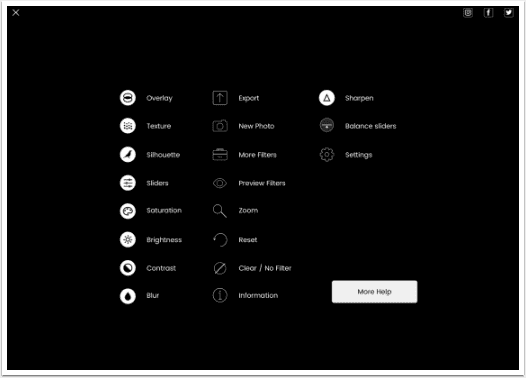
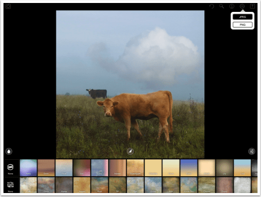
The new gear button allows you to change the format of your output, to either JPG or PNG. The arrow in the box is Save, which we will see later.
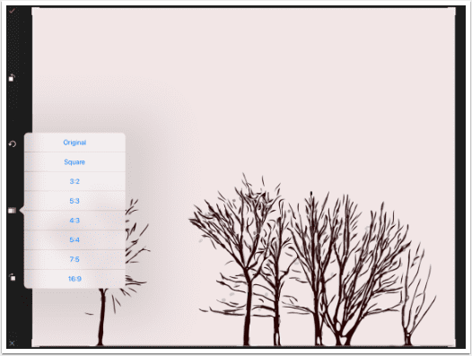
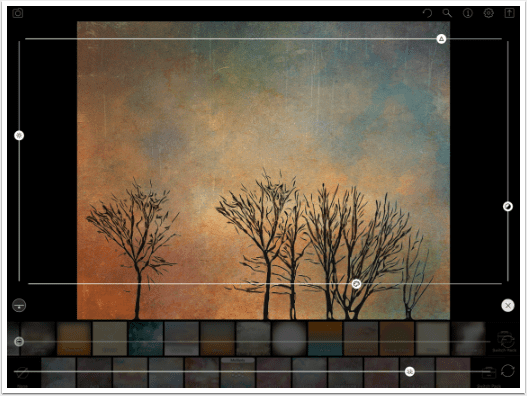
The Camera button at the upper left allows you to take or load a photo. Should you be using a texture app to capture images? (That’s a rhetorical question.) The original DFX had a very rudimentary import, which would allow you to keep the image as is or perform a square crop. The new DFX+ allows for many crop ratios, as well as rotating the image clockwise or counter-clockwise.
Here are the available crop ratios. They are all landscape; the rotate buttons allow you to change the landscape orientation to portrait. If you rotate the image, you will have to work with it rotated; you won’t be able to work with in portrait mode, and will have to rotate it back to vertical after saving.
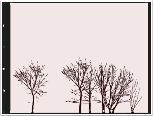
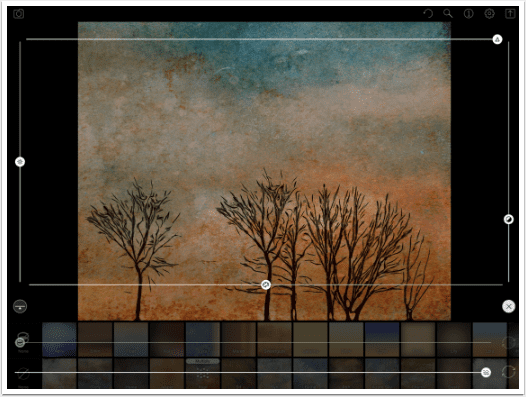
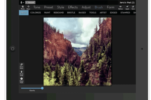
The image I’m working with here is a few tree brushes from iColorama on a plain background, taken through Imaengine. At the bottom of the screen shot below, you will see that I chose a texture, Rupi, identified by the 4×4 dots icon. Those of you familiar with the original DFX will notice the word Overlay on the selected texture also. DFX+ heeds the words of my prior tutorial and adds the ability to change the blend mode.
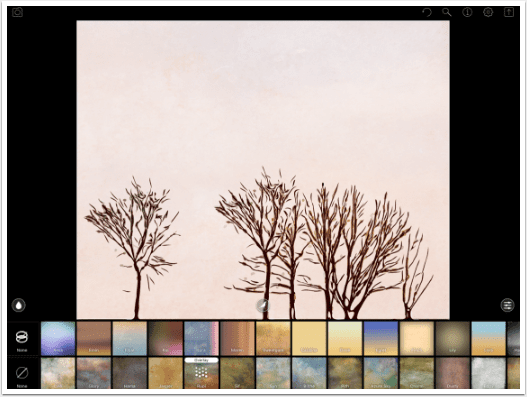
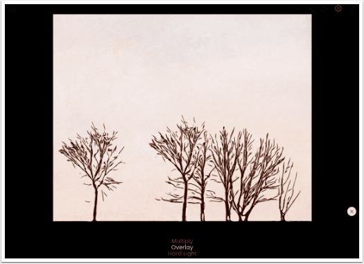
Tapping the word Overlay brings up the blend mode choices. There are only three: Multiply, which darkens the underlying pixels with the texture; Overlay, which brightens or darkens the underlying pixels based on whether the texture pixel is brighter or darker than 50%; and Hard Light, which is a more intense version of Overlay. You scroll up or down to the desired blend mode and tap the X on the right.
You will notice that the texture is barely noticeable in Overlay mode. That is because the background of the image is so light. Overlay and Hard Light do not affect very light or very dark pixels on the underlying image.
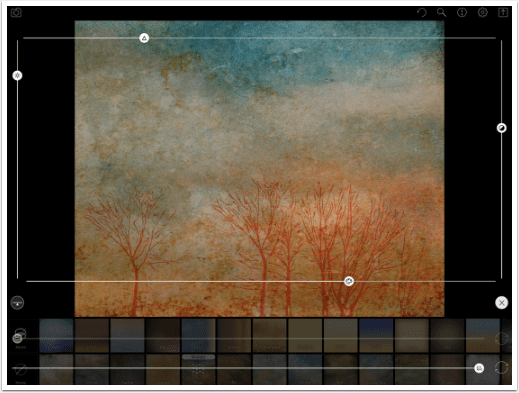
I decided to change the blend mode to Multiply so you could see the effect. It does make it awfully dark, though. We can fix that using the sliders accessed through the icon on the right.
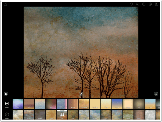
There are two sliders at the bottom which are opacity sliders for Overlays and Textures. The Overlays slider is greyed out at the moment because I didn’t select an Overlay. At the right ends of those bottom sliders are circular icons. These allow you to rotate the texture or overlay – another feature that I suggested in the earlier tutorial. I tapped the Rotate icon for the texture and you can see that the blue portion is now towards the right rather than the top.
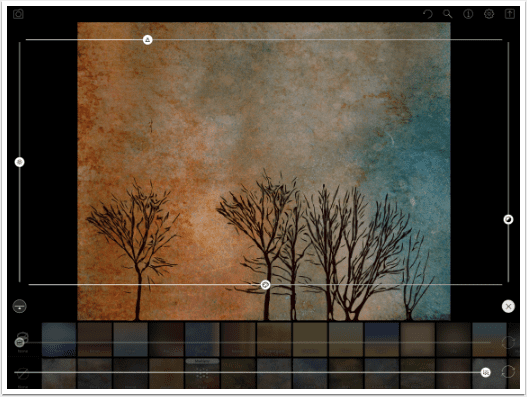
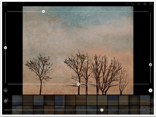
The four sliders over the image control features of the image itself. On the left is brightness; on the right, contrast. At the bottom is saturation. At the top is a new slider for sharpness. Be careful with the sharpness slider, as a little bit goes a long way.
All four of these sliders control the image without the texture. In the screenshot below, I boosted the sharpness, but it didn’t sharpen the texture, just the trees. The only control for the texture itself is opacity.
You can see that illustrated in the screenshot below. I raised the brightness, contrast and saturation to ridiculous levels, but the texture looks the same.
The little button that looks like a seesaw on the left resets all the sliders to the original positions. I then lowered the opacity of the texture.
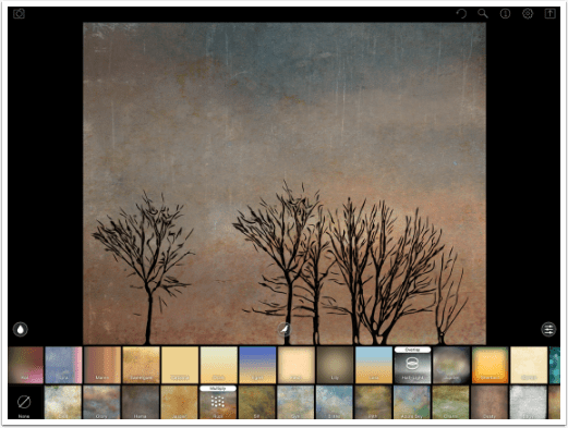
The Overlays are chosen in the same way. Below I chose the Half-Light overlay in Overlay blend mode.
When I access the slider, the Overlays opacity slider is now active.
When you scroll all the way to the right on either the Overlays or the Textures, you will see an icon Switch Packs. There are several extra packs in each type. These came with a cost in DFX, but are free for downloading in DFX+.
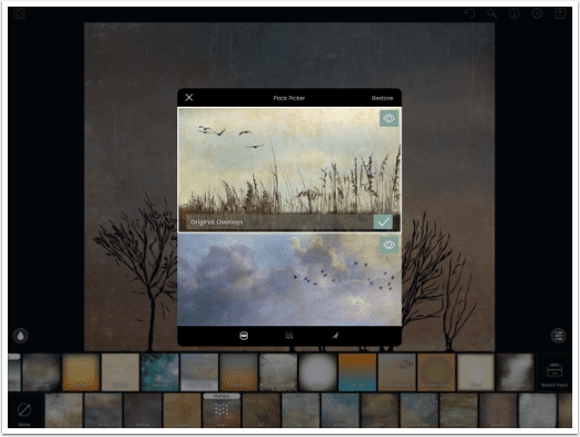
Below is an example of what you will see before you download all the packs: $0.00 Buy. If you download DFX+ on your iPhone, get all the packs, and then download it on your iPad, you can get all the packs on your iPad at once by tapping Restore at the upper right of the packs menu.
The center button of the main screen accesses packs of add-on birds and trees. When you choose birds or trees, you are shown the following screen, where you move the item around the screen, resize it, and change the opacity. The resizing allowed is limited; below you see the smallest the added tree is allowed to be.
And below you see the largest allowed.
Tapping and holding on the image on the main screen brings up the following dialog. This allows you to flatten the image, or permanently add the currently selected Overlays, Textures and Birds. You can then continue with additional Overlays, Textures and Birds.
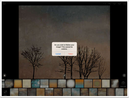
If you do flatten the image, then adjusting the brightness, contrast, saturation and sharpness will affect the flattened textures, but not the currently selected ones. In the image below, the blues and oranges from the original Rupi texture are boosted, while the current Fresco texture is not.
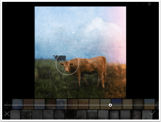
The final button on the main screen, the teardrop to the left, is a Blur control. In the original DFX, the blurred area was shown by a yellow overlay. You could change the size and placement of the focused area, but could not adjust the strength of the blur.
DFX+ changes the yellow overlay to a white circle which shows the area of focus. Also, there is a blur strength slider. It is still not the optimum solution for blurring, but it is a huge improvement.
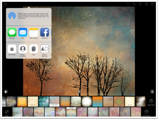
The Save dialog contains icons for Camera Roll, Instagram, email, and More. It will save as a JPG or PNG, depending on the settings under the Gear icon.
The More button brings up the standard iOS dialog.
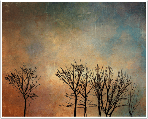
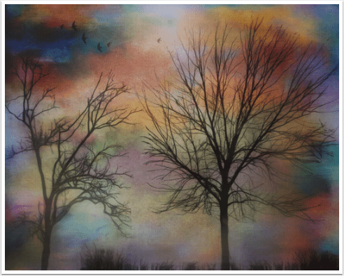
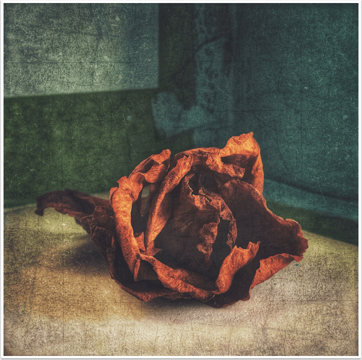
Through use of textures, a rather plain image can become something wonderful. Here is my plain tree brush image transformed.
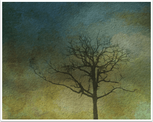
Below I brought in a plain background, added texture and a DFX+ tree, and finished the image in Glaze.
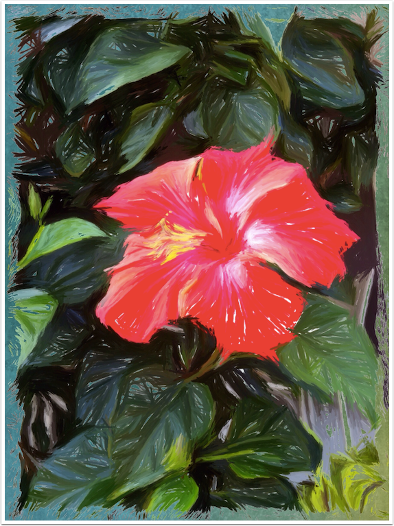
Here’s another plain background, with textures, trees and birds added, and finished in iColorama.
Below is a watercolour image using the new Water2 feature in iColorama, with some added texture from DFX+.
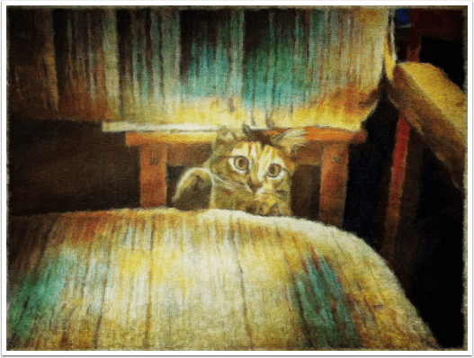
And here’s an ArtistaImpresso version of my cat, with lots of DFX+ texture.
Here’s an ArtistaOil of the cat a few months prior, along with a frame from FrameBuilder.

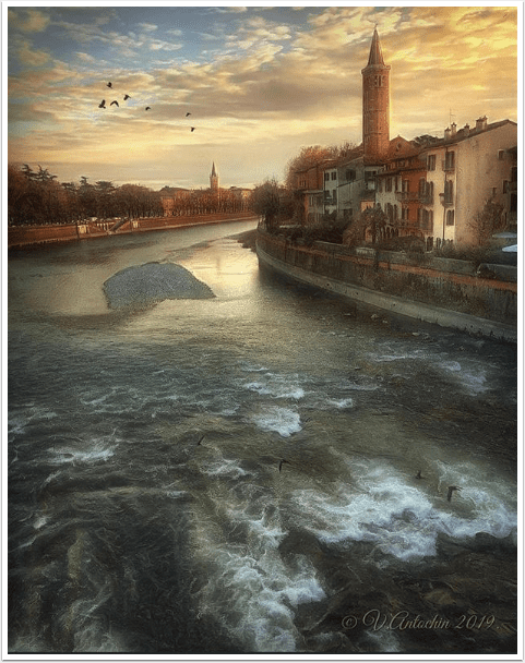
You don’t need to glop on a lot of texture. I stepped outside and got this photo, then added just a bit of DFX+.
To recap: I was wary of DistressedFX+. In reviewing the original version, I listed some issues with it, including inability to change blend modes, rotate textures, and adjust blur. All of those issues are eliminated in DFX+. It has become an app that I am pleased to work with, not an afterthought. I recommend it.
Until next time, enjoy!
Please help us…
TheAppWhisperer has always had a dual mission: to promote the most talented mobile artists of the day and to support ambitious, inquisitive viewers the world over.
As the years pass TheAppWhisperer has gained readers and viewers and found new venues for that exchange. All this work thrives with the support of our community.
Please consider making a donation to TheAppWhisperer as this New Year commences because your support helps protect our independence and it means we can keep delivering the promotion of mobile artists that’s open for everyone around the world.
Every contribution, however big or small, is so valuable for our future.
Jerry Jobe
Never content with just scratching the surface of what an app can do, Jerry Jobe decided to pass on what he learned about imaging apps to others. He’s constantly trying to figure out just what tools other artists have used, and trying to incorporate them into his own work, in an attempt to find his style. He’s written tutorials on over 145 apps so far, which you can find (along with his Song of the Day entries) at http://enthusiasmnoted.wordpress.com/ He lives near Atlanta, Georgia, where he also finds a creative outlet in acting and directing in community theater.
2 Comments
Manuela Vaz
A very detailed article about the app! Thanks!!
Patricia
Thank you Jerry. I have most of the packs in the original “distressed”, This appears to be a vast improvement. Maybe I missed this, but does it save the native resolution?