Mobile Photography / Art Tutorial – PhotoArtista – Haiku: For Best Results, Dilute
We are delighted to publish Jerry Jobe’s latest mobile photography/art tutorial for our reading and viewing pleasure. This time Jobe takes a look at the app PhotoArtista- Haiku by Jixipix. Read his thoughts as he puts it through its paces (foreword by Joanne Carter). Take it away Jerry…
PhotoArtista – Haiku retails for $2.99/£2.29 and you can download it here.
“I’ve covered quite a few Jixipix apps over the past few years: Vintage Scene, Grungetastic, Dramatic Black and White, Hallows Eve, NIR Color, Chalkspiration, Fold Defy, Rip Pix, Artoon and Artista Impresso. I stress in most of those articles that the results of these apps can be quite harsh when left alone, but that they are great when used in a blend. Today’s app, PhotoArtista Haiku, is no exception.
I will be using the HD, or iPad version. Many of Jixipix’s offerings are sold as separate apps for the iPhone and iPad; this is one of them. I, personally, am fine with having Haiku on just one device, and will not be paying the extra three dollars for the iPhone version”.
Haiku has not been updated to the new “gray” interface, so you will see the older interface familiar to readers of my Dramatic Black and White and Grungetastic articles. When the app is entered, the “Get Photo” drop down is entered automatically. You can also Take a Photo, but why bother? As I said, this app is best as a step within your workflow.
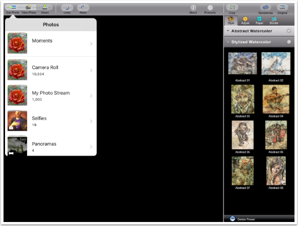
When you select an image, a preset is assigned to the image. Haiku is a combination of ink and watercolor on distressed paper. The presets, in the panel on the right side of the page, reflect that. File handling buttons (get and save) are at the upper left, Undo Redo and Help (a link to a web page) are over the center, and image control buttons (Crop, Randomize and Original) are over the preset panel on the right.
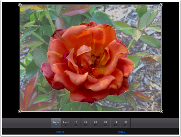
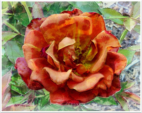
The Crop function shows you the original image. You’ll notice that I already modified the photo to de-emphasize the foliage around the flower. I want to crop the image closer to the flower. (Hint: Cropping the image outside of Haiku will make it easier for you to match different versions of the image when you later decide to blend the Haiku image with the original.)
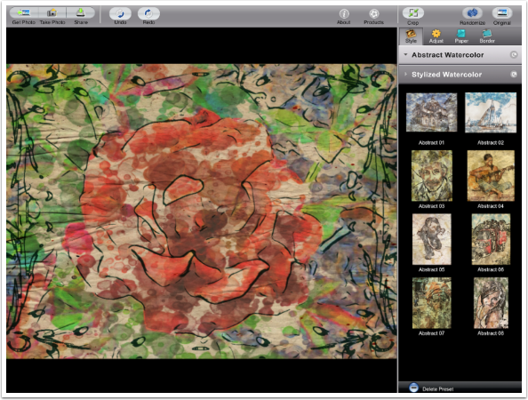
The following screenshot reflects the image after the crop and a tap of the Randomize button. I find myself using the Randomize button more frequently in Haiku than stepping through the presets. Haiku’s look varies greatly with the image; the same preset works great on one image and badly on another, and the thumbnails are usually no help in determining which is which for your photos.
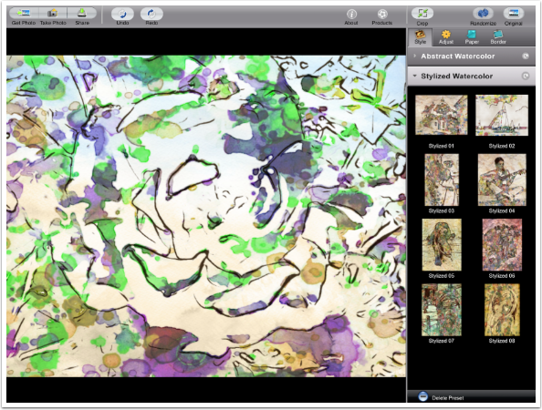
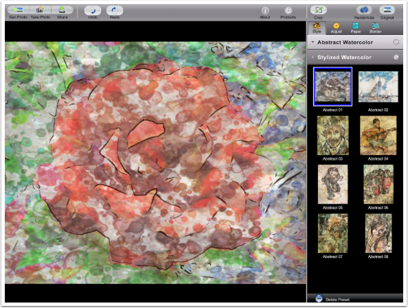
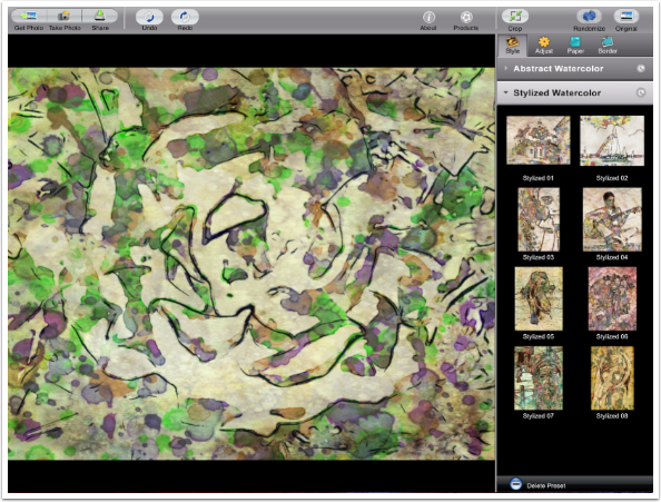
The presets are divided into two categories: Abstract and Stylized. Stylized, seen above, changes colors of paint and uses stronger values of paint. Abstract, seen below, is more muted, more blended, and gets its colors from the image.
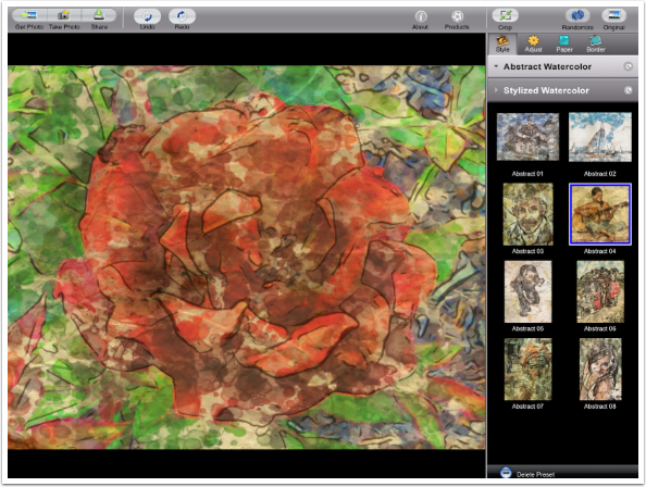
Choosing a different preset is just a matter of tapping it.
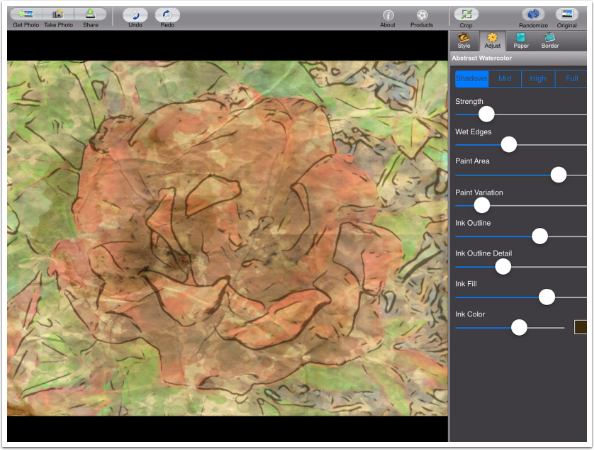
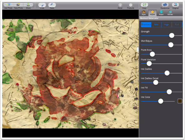
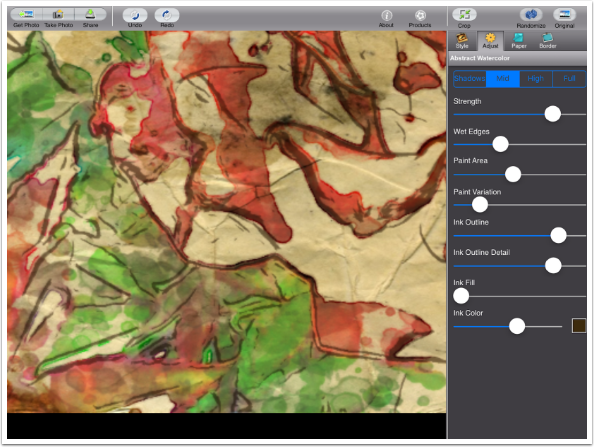
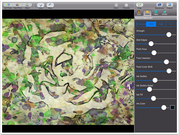
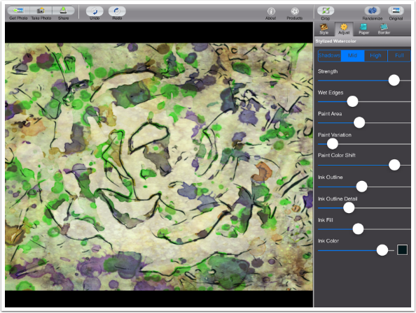
Once you’ve got a look that’s close to what you desire, then it is time to adjust or fine tune your watercolor. Tapping the Adjust button at the top of the preset panel gives you a range of controls. These controls differ based on whether the look you start with is Abstract or Stylized. The first control is a series of four buttons: Shadows, Mid High and Full. These buttons control which parts of your image are painted. This image, with its constricted tonal range, treats the Shadows as it were Full (the entire image).
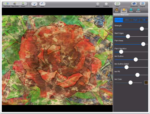
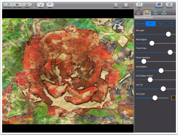
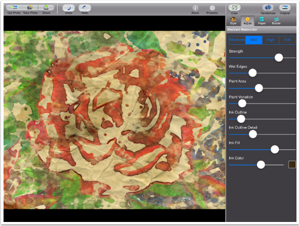
Choosing Midrange for this image removes paint from a small percentage of the image.
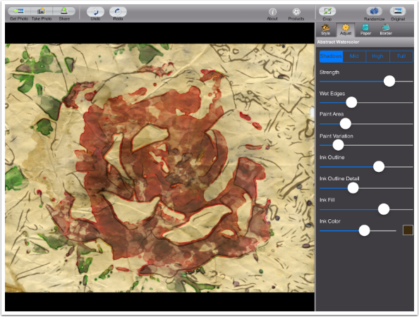
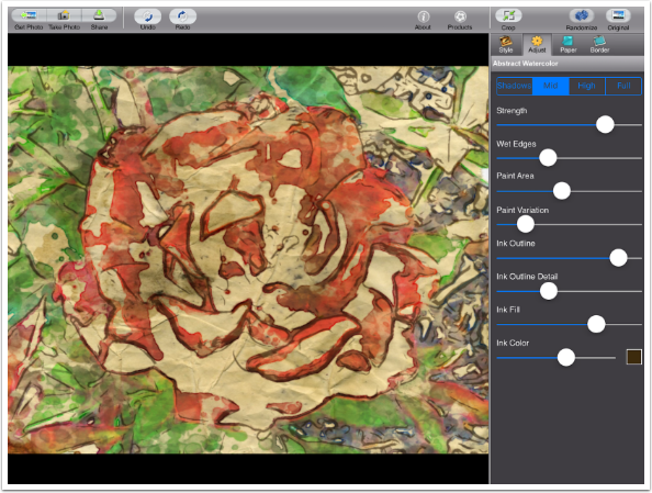
The Strength slider alters the opacity of the paint.
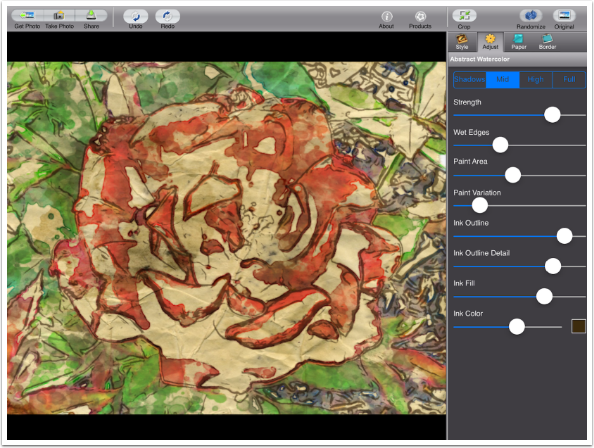
I’ll skip Wet Edges for a moment and move on to Paint Area. By lowering this slider less of the image is painted, showing more of the paper.
Now that I have an obvious edge to the paint, I can show you that Wet Edges controls the bleed at the edges of the paint blotches.
Moving the Paint Variation slider will randomly change the blotches (not shown here).
The remaining sliders manipulate the ink outlines. Ink Outline changes the width and opacity of the outlines. By pulling the slider all the way to the left you can eliminate all the ink.
Moving the slider to the right can give you very bold ink lines.
The Ink Outline Detail slider controls how many edges are outlined with ink. Moving it to the right gives even the finer edges within the flower ink outlines.
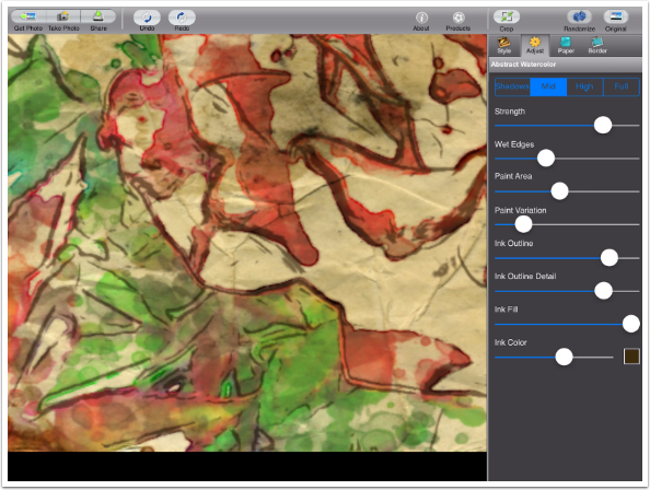
The darkest areas of the image, rather than having ink outlines, can be completely filled with ink. The image I’m using doesn’t have much in the way of dark areas, so I’ve zoomed in with a two-fingered pinch to allow you to see the difference between no Ink Fill, seen below, and a larger Ink Fill value.
With Ink Fill turned up all the way, I get a few extra blotches of ink.
Most of the time, you will be happy with a black or dark brown ink. However, Haiku does give you the ability to change the color of the ink, with an accompanying slider to control the strength of the color. Below I changed the color to a bright blue.

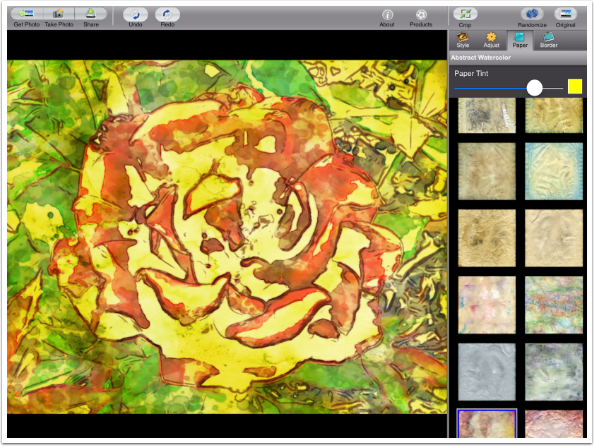
The next tab at the top of the preset panel controls the paper texture and tint. There are 54 different paper samples to choose from. This would be improved with the ability to rotate the paper.
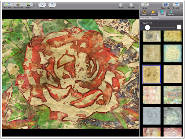
Choosing a different paper can make a big difference in the look of your Haiku watercolor.
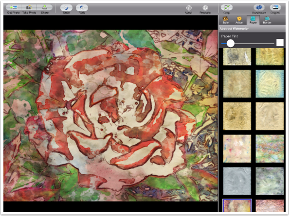
You can add an overall tint to your paper by changing the color using the color picker and moving the Paper Tint slider to the right.
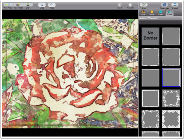
The final tab on the preset panel is Border. These are drawn around your image in the ink color chosen for the outlines. The size and width of the border is not adjustable. There are thirteen different borders, plus the option of No Border (which I prefer).
As I said above, Stylized Watercolor presets both change the colors and make them more intense.
There is one additional slider with Stylized presets: Paint Color Shift. The further the slider is from the left, the more the colors will shift away from the original.
Below I changed the Paint Variation but not the Paint Color Shift. The colors did not change, but the placement of the blotches of paint did.
Next I moved the Paint Color Shift slider to the left, and the colors of paint used are much closer to the original colors.

The Share/Save options include an option to Save Presets, handy when you’ve adjusted random settings to a state you like.

When you tap Save Preset, you get the opportunity to name your preset.
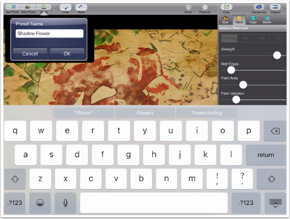
The preset is saved to the category that was the basis of your adjustments, and the thumbnail for the preset is the image you used when creating the preset.
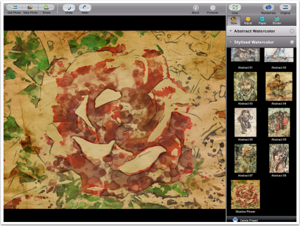
Here is my saved Haiku watercolor. It’s nice, but it’s not anything I would want to present to anyone.
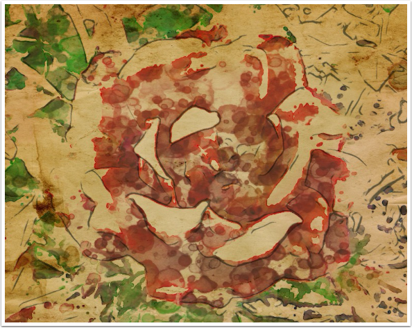
However, if I blend it with the original in Soft Light mode, then I get a very nice result.
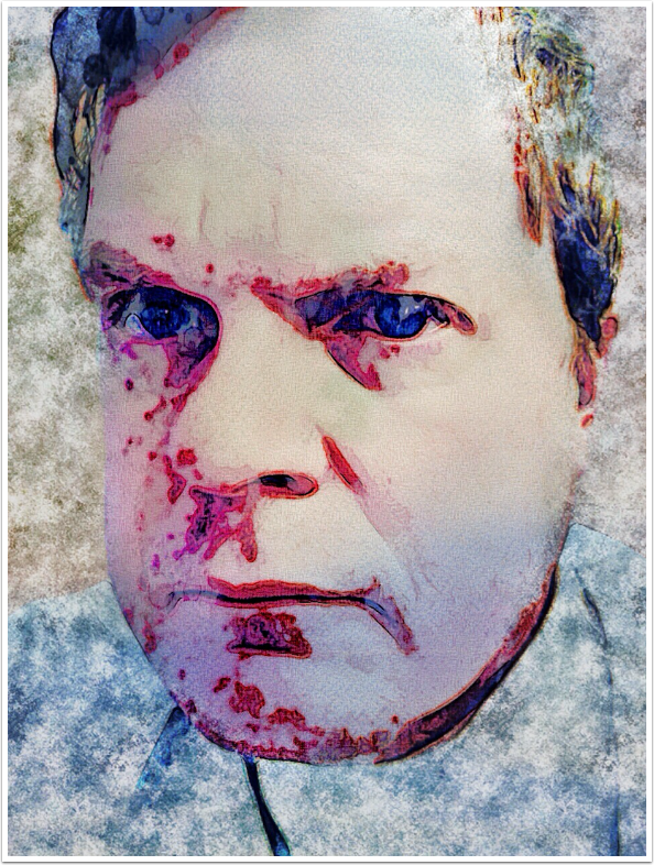
For my next example, I took a Brushstroke selfie through Haiku, then blended the Haiku version back with the Brushstroke version in iColorama, finishing with an iColorama texture around the edge.
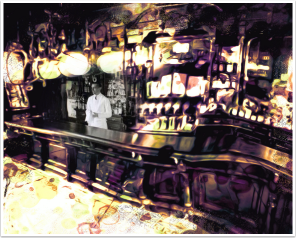
The next piece, “Chester Never Sampled What He Sold”, came from an old public domain photo and used Haiku and iColorama Warp and Coherence to get a dreamlike quality.
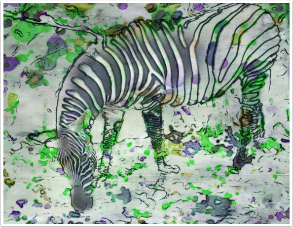
For my final example I tried to get an image that was straight from Haiku, but I had to blend back in a bit of the original zebra’s head to get something that made sense visually to me.
Artista Haiku is another Jixipix app that tries to be a finishing app, but is better suited to the middle of your workflow. That is not a drawback to those who app-jump on a regular basis. I recommend it to you: a bit if diluted ink and watercolor may be just what you need! Until next time, enjoy!
Jerry Jobe
Never content with just scratching the surface of what an app can do, Jerry Jobe decided to pass on what he learned about imaging apps to others. He’s constantly trying to figure out just what tools other artists have used, and trying to incorporate them into his own work, in an attempt to find his style. He’s written tutorials on over 145 apps so far, which you can find (along with his Song of the Day entries) at http://enthusiasmnoted.wordpress.com/ He lives near Atlanta, Georgia, where he also finds a creative outlet in acting and directing in community theater.

One Comment
Hetta
Oh Jerry, the one thing I wanted to know how to do is just
How did you blend the Haiku image back to the original image in soft light mode?
Did you use a different app to do that or can you do it in the Haiku app?