
Technical Tutorial – iColorama – ‘Taking A Closer Look At The Brushes’ By Jerry Jobe
We’re about to publish Jerry’s sixth iColorama tutorial but before we do that, here is the fifth one and the sixth will follow very closely behind…over to you Jerry – (foreword by Joanne Carter).
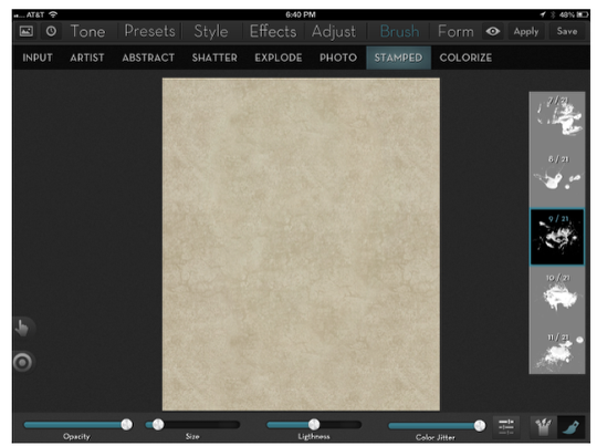
“About six weeks ago I began the discussion of the Brushes submenu of iColorama with the then-new artist brushes, added with release 3.2. Now there’s been a new release of this great app (3.3), with additions to the 531 existing brush tips, three new HDR presets, a Flow function under the Effects submenu, and Stamped Brushes. Today we’ll take a look at these new Stamped brushes, as well as catch up on the other types of brushes iColorama offers.
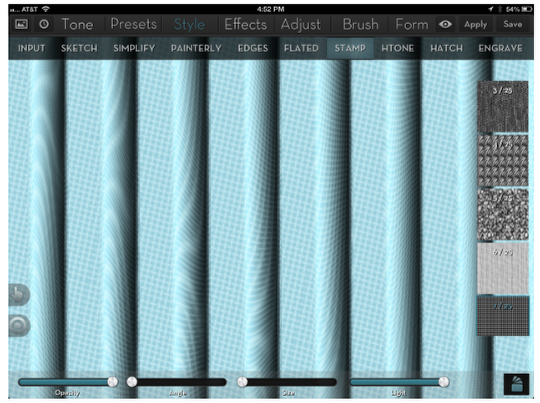
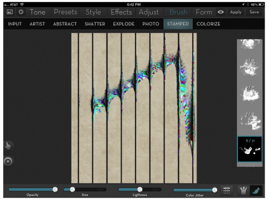
Before we talk about Stamped Brushes, we’re going to take a quick look at the Stamp Style, because it gives us insight into the behavior of the Stamped Brushes. (The Style submenu will be covered more thoroughly in a future tutorial.) In order to illustrate what happens with stamps in iColorama, I have created a background using the Presets>Gradient and Presets>Line tools. I then chose Style>Stamp>7, a grid texture. Notice how the application is not of a flat grid – the grid is warped by the underlying image. When the tone is flat, in between the gradient lines, then the grid is flat also. But when the grid goes into lighter or darker areas, it is pulled and pushed in unique ways. Each gradient it crosses – even though the gradients themselves are uniform from line to line – distorts the grid in a random way.
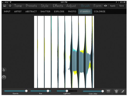
The Stamped Brushes are just as random and unpredictable, and they are affected strongly by the contrast in the underlying image. Just like the Artist Brushes, the Stamped Brushes start you with a blank canvas that overlies your image. You then paint on that canvas to let the underlying image show through, distorted by the brush. Due to the distortion of the brush, control of the edge of the brush is not as useful on Stamped brushes as it is for Artist brushes, so those controls are not present. By default, the Color Jitter is turned all the way up, so that the brush gives you wild variations. Here, using the same “gradient lined” image as I used in describing Stamped Style, I’ve taken the large square brush (Basic category) and made a single tap just below the center on the right. You can see that the “paint” has travelled far beyond the place where the brush touched the canvas, following the darkest portions of the underlying image.
Larger brushes will make the color “travel” farther. To illustrate, I’m starting to process the same lines image by loading a canvas, using the “landscape” button at the lower right. I then tap the “can of brushes” to bring up the categories of brush. I choose Water.
I tap the single brush icon to choose #9. I also lower the size of the brush.
Starting midway on the left side, I make a stroke up to the right, then sharply downward. Because the brush size is so small, the spread is not as radical, only becoming larger as the stroke hits the black lines.
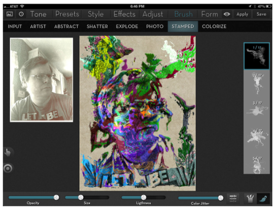
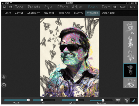
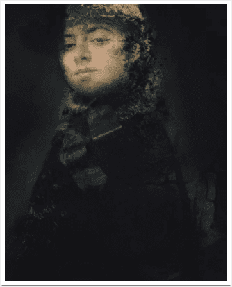
My next example uses a picture I took of myself. I dabbed at various places around the photo. (You can choose particular places to dab by lowering the opacity slider until you can see the underlying photo. Don’t forget to raise the opacity back to 100% before saving or applying!) I chose brush 1 in the Water2 category, and lowered the size slightly. See what just a few dabs can produce?
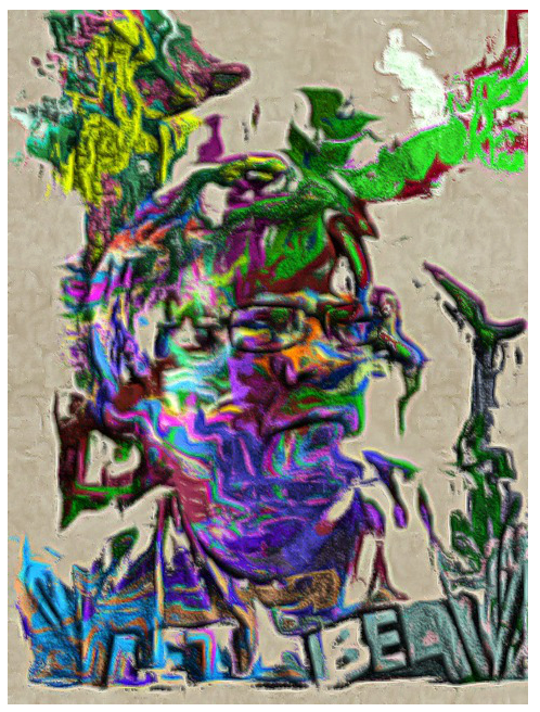
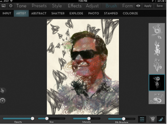
Teresa Alonso, the developer of iColorama, suggests that you use the new Effects>Flow to smooth out the Stamped Brushes, so I tried that. The effect is strong, smoothing out the edges a lot.
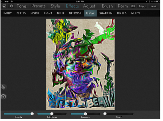
At this time, the amount of flow is not customizable, so I fade the opacity back of the Flow to make it more pleasing to me.
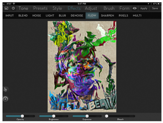
And here’s the result.
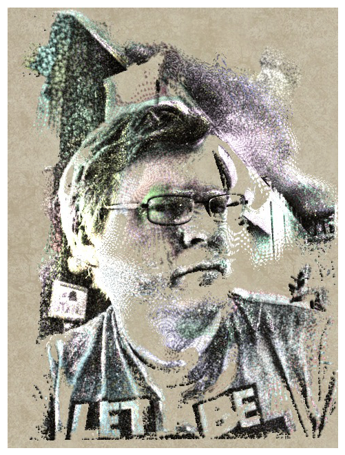
The wild colors generated by the Color Jitter slider are not necessarily what you will desire. Here I’ve loaded the same canvas, and chosen brush 12 from the Halftone category. I’ve lowered the Color Jitter to about 25%. (I’ve also upped the contrast on the underlying photo using one of the new HDR presets, since the Stamped Brushes will follow edges more if there is a sharp contrast).
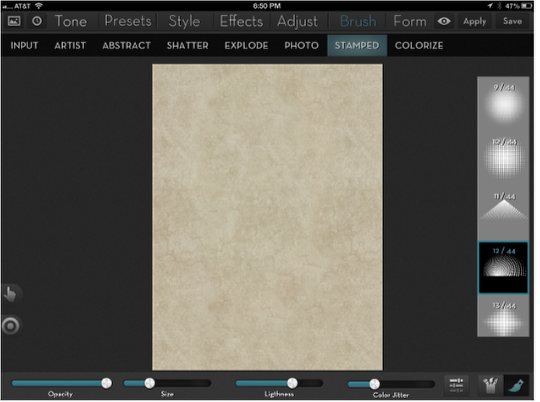
And this is the result.
Stamped Brushes are meant to do most of the work for you – a few dabs here and there will cover more ground than many strokes with the Artist Brushes. Here I’ve used an abstract background as the canvas, and a portrait where the background had already been removed. I’m using brush 4 in the new Drawn category. I touched the canvas in 4-5 places.
Now I use the same setup, using Artist instead of Stamped brushes. It took well over 20 strokes just to get to this result. I need to emphasize this again and again – Artist brushes offer a lot of control, and are perfect for those that want that control. They can be frustrating to those who don’t have the patience or the ability to control them properly. Stamped brushes are unpredictable, and can be frustrating to those artists who want a specific result. Both are terrific tools – try not to let your expectations blind you to how useful each can be.
So the Stamped brushes can be a boon, when used on pictures with high contrast. The results are unpredictable, and you may find yourself trying multiple times to get the effect you want – but the rapidity of making a few dabs, then just discarding the changes and trying again can offset the lack of control over the effect.
Abstract Brushes
The remaining brushes under the Brush submenu in iColorama modify the image directly. There is no canvas to paint over. Abstract, Shatter, Explode and Photo move the image in some way; you can push, smear, and blur the edges around the image. Colorize leaves the edges in place, but changes the colors with a brush.
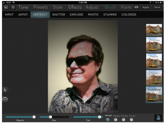
There are 12 different abstract brushes. You can use any combination of the brushes without having to Apply between, but for clarity’s sake, I will be showing you examples of each effect one at a time.
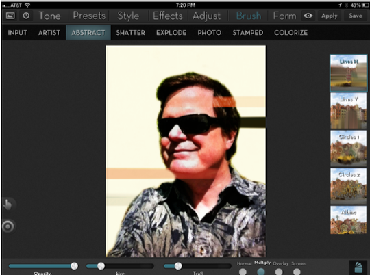
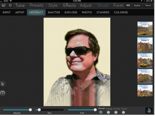
The first is Lines Horizontal, and will smear from the brush tip to the left or right edge. When the trail slider is in the center, then brush strokes to the right or left of center will smear to their respective sides. Moving the trail slider to the left will include more points left of center that will smear to the right – see the forehead trail in the example.
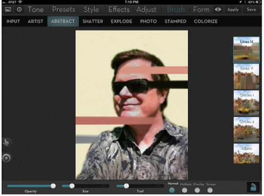
Don’t forget that you can change the blend mode on the image. Take note that the blend mode is applied to the entire photo, not just the brush strokes.
Lines Vertical always extends the smear to the bottom of the image. I can’t figure out what Trail does here. Also, although the smear goes from where you touch the screen, the colors are actually picked up from somewhere above the stroke you make.
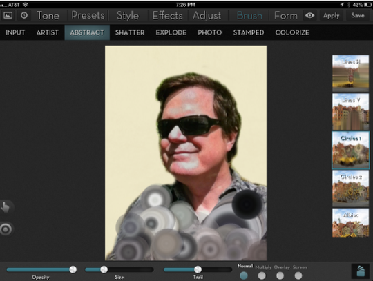
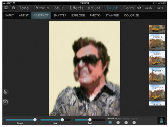
Circles 1 creates blurred concentric circles from the brush stroke.
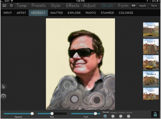
Circles 2 creates more defined circles.
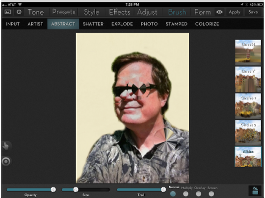
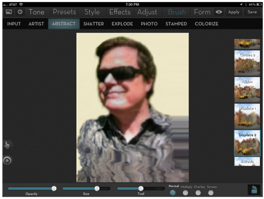
There are three examples of the Albiac brush in the following image. The stroke over the left eye uses the Trail slider in the default position, the center. The stroke over the right eye (barely noticeable) is with Trail all the way to the left, and the stroke on the collar is with the Trail slider to the right.
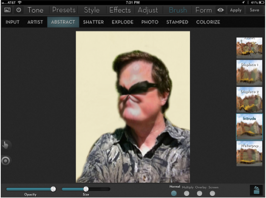
Displace 1 gives a melted look to your image.
Displace 2 takes a portion of the photo and “scoots it across” the photo. Notice the portion that is dragged is blurred as well.
Intrude pinches the image toward the brush.
Waterpop bloats the image, but leaves a circle of a single color in the middle, as if the photo had been damaged by water.
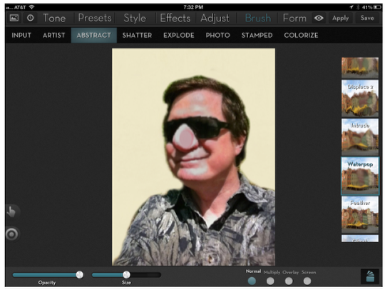
Feather is a more extreme bloat.
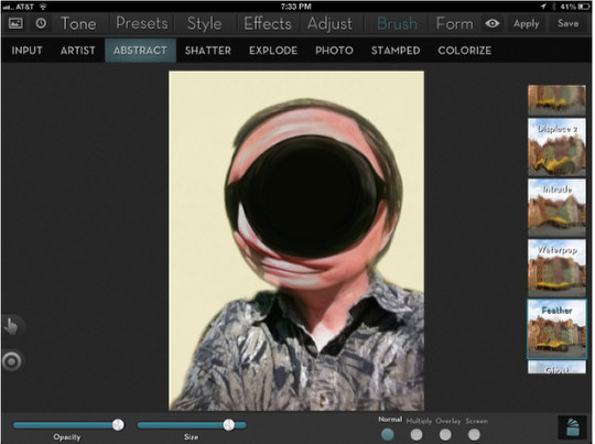
Ghost is an effect I like. It leaves ghost images behind as you move the portion of the image under the brush around the screen.
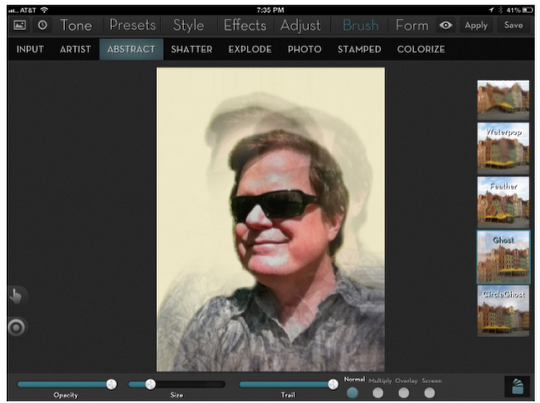
Circle Ghost distorts the image and adds vignetting
Shatter Brushes
Shatter gives you 54 different brushes to let you break up the image in creative ways. The Deform slider controls how much the image is displaced by the brush. In the first example I have the Deform slider at a low setting.
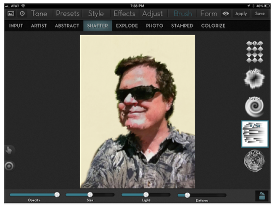
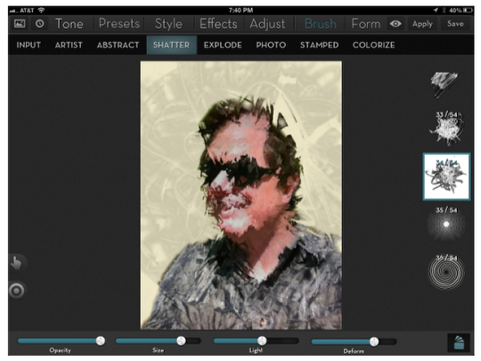
It’s much more obvious what the Shatter brushes do if we raise the Deform slider and move the Light slider to the left
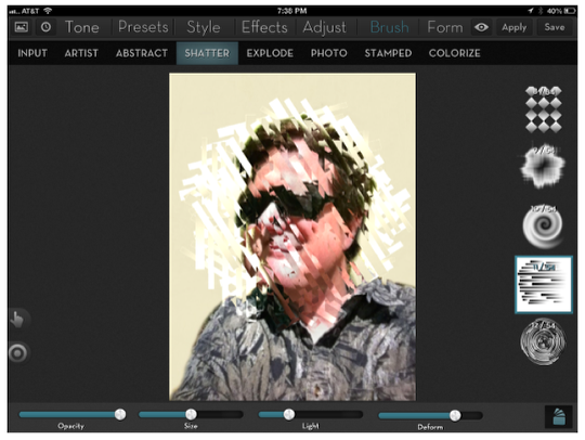
The Light slider works the opposite of what you might think: left adds more light, while right makes it darker.
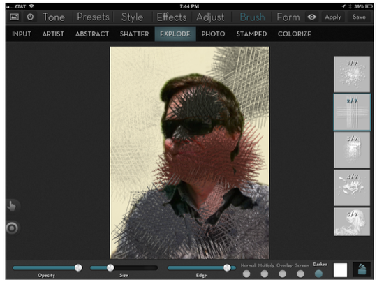
Explode Brushes
The Explode brushes (7 in all) make the color “explode” from the brush tip. You can control the blend mode, the size, and the strength of the edge of the brush.
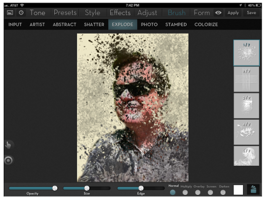
If you change the color from white, the explosion will be tinted with that color.
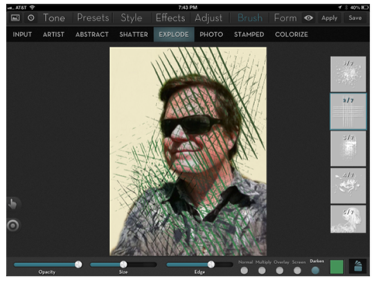
The next two slides show that you can mask these brushes just like any other effect in iColorama. First, we add some Explode crosshatching in Darken mode.
Then, we use the mask brush to bring the face back.
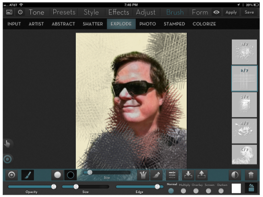
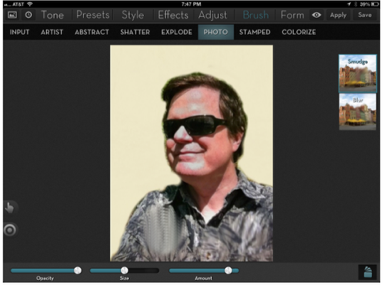
Photo Brushes
There are two Photo brushes that give much more subtle effects. These are brushes you might use with your normal photos, not ones that you want to make into distorted artistic visions. The first is the Smudge brush. Notice, on the left part of the shirt, that increasing the Amount slider results in a “skipping” smudge rather than a smooth one.
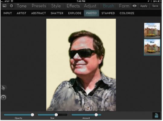
Using the Blur brush could, potentially, allow you to take a photo that is totally in focus and blur the background to give emphasis to the subject. (There are entire apps, like Big Lens which I reviewed earlier, with this purpose.) I have not had the time to experiment that heavily with this one brush, however. You’ll see two strokes here – the one on the left was made with the Amount slider farther to the right.
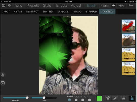
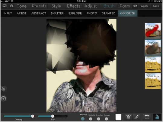
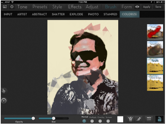
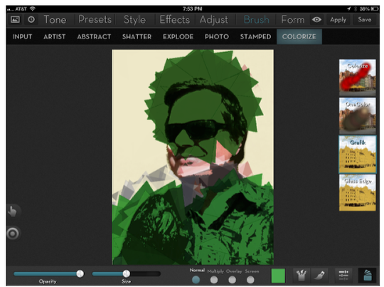
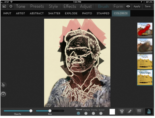
Colorize Brushes
There are 4 Colorize brush effects. Each can use any of the over 500 brushes in iColorama. (In the examples, I use Geometric 5.) The first, Colorize, just adds the color that you select over the top of the image.
One Color picks up the color where you start your brush stroke and carries it through the stroke.
Grafik takes the color under the brush (if the brush color is white) and puts large blocks of color (shaped like the brush tip) onto the photo. It’s much like the Stamped brushes in that the result is unpredictable, but I really like the effect.
Changing the brush color applies that color in a Grafik way. Notice the black edges that are created.
Glass Edge works like Grafik, but creates white, “glass” edges.
Conclusion
The Stamped Brushes are a terrific addition to an already strong product. Like the Artist Brushes, they allow you to do some highly creative things to your images. They also allow you to create art from scratch, without any initial photograph. I’d like to walk you through an image I recently created.
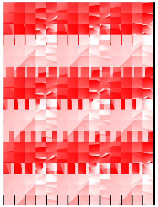
First of all, I created a red-and-white gradient using Preset>Gradient. Then I changed the look through Form>Escher. I created 9 copies of the result with Form>Tiles>2. I saved the result, passed it through Decim8 (already reviewed) and brought it back into iColorama.
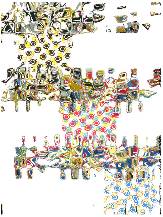
Next I used the Stamped Brush Geometric 13 and just a few strokes to create this and saved it.
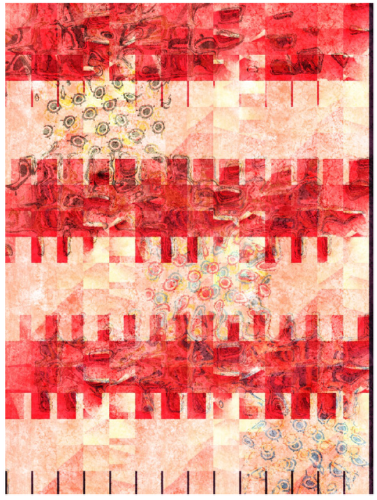
Then I blended it back into the original in Multiply mode. I added Tone>Lomo and Presets>Grunge. I call the result “Chemistry 102: Inorganic and Organic Principles”.
All of the brushes can help you in creating something more than just a photo. Experiment freely, and go where the image and the tools take you. Have fun!
Jerry Jobe
Never content with just scratching the surface of what an app can do, Jerry Jobe decided to pass on what he learned about imaging apps to others. He’s constantly trying to figure out just what tools other artists have used, and trying to incorporate them into his own work, in an attempt to find his style. He’s written tutorials on over 145 apps so far, which you can find (along with his Song of the Day entries) at http://enthusiasmnoted.wordpress.com/ He lives near Atlanta, Georgia, where he also finds a creative outlet in acting and directing in community theater.
2 Comments
Andrea Bigiarini
Great and very helpful tutorial Jerry.
Thanks a lot!
Kathy Little
Is there a way to upload iColorama work to higher resolution for larger prints?