
iOS Photography Tutorial – ‘PhotoToaster Part 2: Colors, Vignettes and Textures’
We’re delighted to publish the second of three Photo Toaster tutorials by Jerry Jobe (if you missed Part 1, please go here). This time Jerry Jobe takes a look at colors, vignettes and textures – I am sure you will enjoy this very much, take it away Jerry (foreword by Joanne Carter).
PhotoToaster retails for $2.99/£1.99 and you can download it here.
“We’re taking a multi-part look at one of the many basic photo editors available to mobile photographers, PhotoToaster. In the first part we looked at importing images, controlling the settings, using and saving presets, and the first set of basic sliders that help control your image.
Note: After the first part was published, I received a nice letter from Steven Troppoli of East Coast Pixels. It seems that I made a couple of minor factual errors in my article. We will begin the next article with a few notes to straighten those out. Thanks, Steven!
We’ll continue with the next three categories of changes you can make to your photos: FX, Vignettes and Textures.
We’ll start with FX. As with the other categories of edits found under the icons at the bottom of the screen, you are first presented with presets that are related to the current category. The first category dealt with the tone of the image; these presets deal with the color and sharpness”.

I count 19 presets in the FX category, accessed by scrolling horizontally.

Applying a preset is just a matter of tapping it, as I’ve tapped the Intense preset below.

Using a preset adjusts the underlying sliders for that category. You access the sliders directly by tapping the Sliders button at the top left of the Preset pop-up.
As you can see below, the Intense preset moved the Intensity slider. That’s too much Intensity for me – look at the halo around the building.

I could move the slider individually, but I choose to reset all the sliders in the FX group by tapping the circular arrow (Reset) icon. This will not reset the sliders in any other category, like the Tone sliders we adjusted last time.

Then I boosted the Saturation and Sharpen sliders to give the image more pop.

The Sharpen slider defaults to the middle of the bar, meaning that you can both sharpen and blur the image. Below you’ll see the Sharpen slider at the default setting.

And then you’ll see Sharpen moved to the left. It’s an interesting blur effect; not Gaussian, not median, not even motion. I don’t know quite what you’d call that.

Let’s look at the blur applied to the whole image. First, we see a completed image with the sharpness slider at the default setting.

When the Sharpness slider is moved all the way to the left, it blurs the image – but not the added Texture or Border! That’s because all changes are added from left to right. First Tone, then FX, then Vignette, then Texture and finally Border. So you can’t sharpen a Texture, and you can’t change the color of a border with Cross-Processing.

Returning to the FX sliders, we move on to the second set of sliders, which have to do with tinting the image. You can choose a different hue for the shadows and highlights, giving the image a duotone feel.

Below I’ve given the shadows a green tint, and the highlights a blue tint. Because I only moved the Tint Intensity slider a bit to the right, the result is just slightly colored, and not a full-fledged duotone.

Moving the Shadow or Highlight Tint sliders all the way to the left will disable the tint. For example, below there’s a blue tint to the shadows, but none to the highlights.

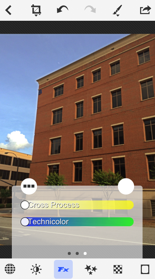
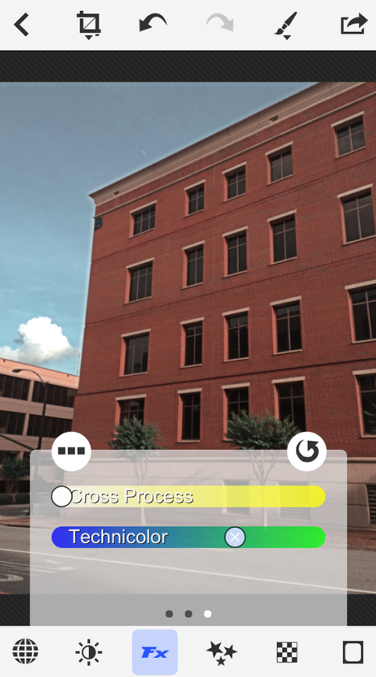
The final two sliders for FX are Cross Process and Technicolor. Both slides default to off, all the way to the left. Below you’ll see Cross Process at about 70%, and it’s a strong effect.

Many people think Technicolor is the same as bright or saturated color. This is not necessarily true. Early Technicolor was a two-color system using red and green, so blues were not as saturated, and would be shaded towards green. See what I mean while looking at the next two images. The first has no Technicolor applied to it.
The second has the Technicolor at about 65%, and the blues (and the reds) do not “pop” as much.
NOTE: The 6.5 release of PhotoToaster eliminates the Technicolor slider in favor of breaking down the Cross-Process slide into Red, Blue and Green sliders. In addition, picking the B&W preset will give you access to three B&W sliders that allow you to adjust the monochrome as if you had red, blue and/or green filters over the lens – a typical feature of monochrome processing.
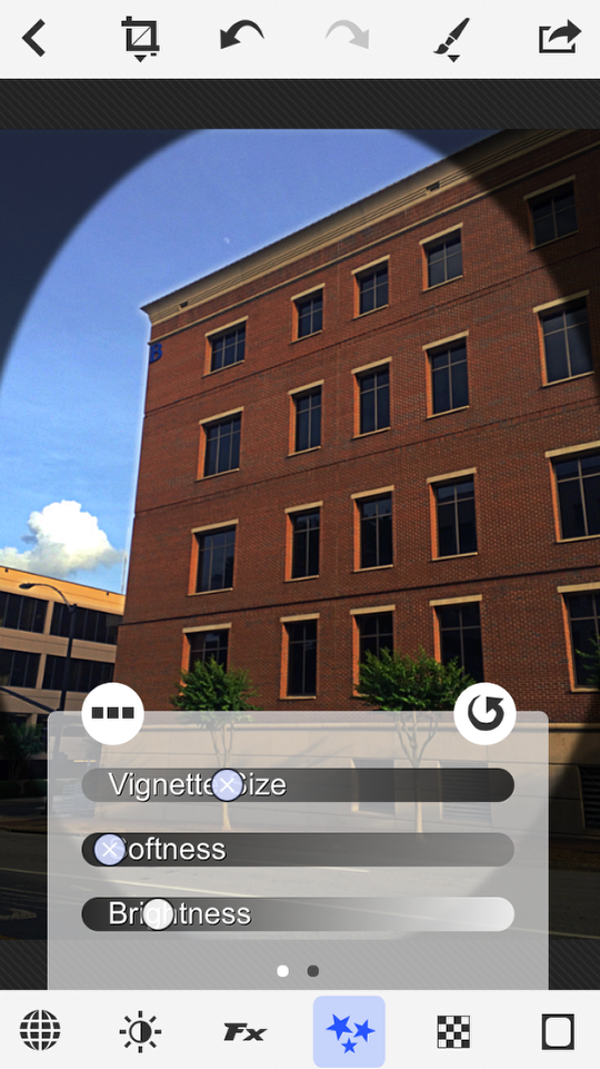
The next category of effects is Vignettes. As with all categories, there are presets available.
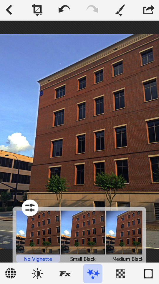
There are two sets of sliders for Vignettes. The first set includes Size, Softness and Brightness. Softness and Brightness are grayed out until you add a vignette by adjusting the Size slider.
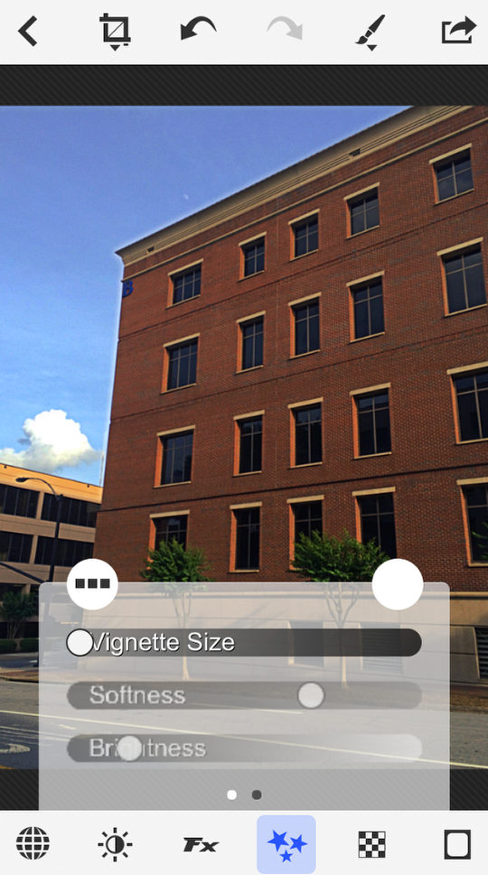
Below I’ve increased the Size, and moved the Brightness slider far to the left to show a dark vignette. I’ve also moved the Softness slider far to the left, and the vignette almost has a hard edge to it. Vignettes in PhotoToaster always conform to the aspect of the photo, so you can’t get a circular vignette on a rectangular image; you’ll get an oval instead.
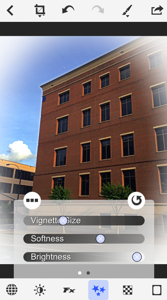
You can get a white vignette by moving the Brightness slider all the way to the right, as I show below.
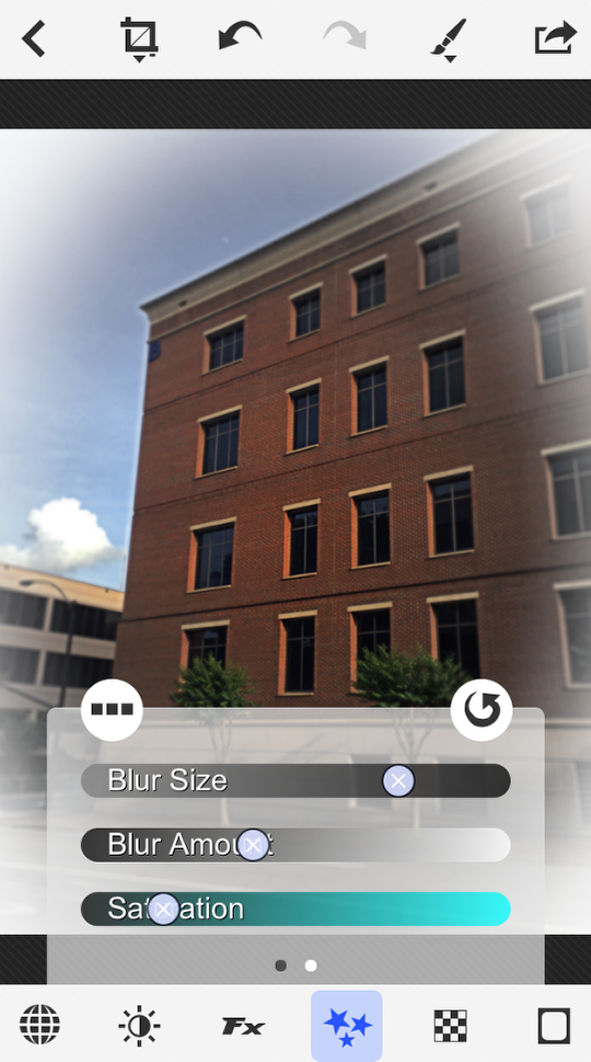
The other three sliders in the Vignette category deal with a “secondary” vignette made with blur and saturation. Blur Amount must be changed before you have access to Blur Size.
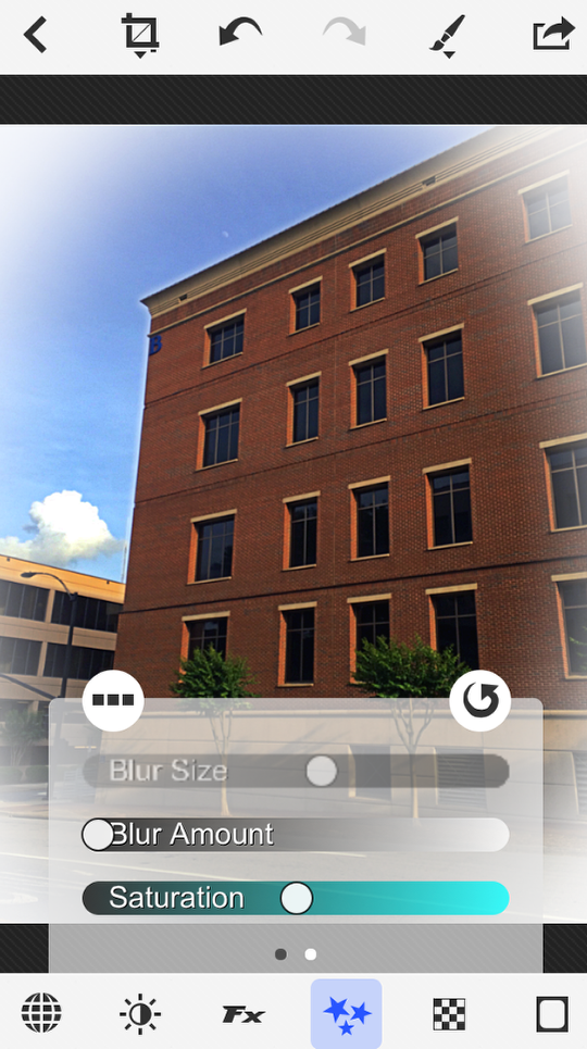
Having a Blur Size slider means you can have the blurred portion of the image correspond with the normal vignette, or make it larger or smaller. In the image below I’ve made it slightly larger than the white vignette, and lowered the saturation within the blur as well.
NOTE: The 6.5 release of PhotoToaster will allow for movement of the “in focus” area as well. Press and hold on the image and a “circle of focus” appears, which you can move around the screen.
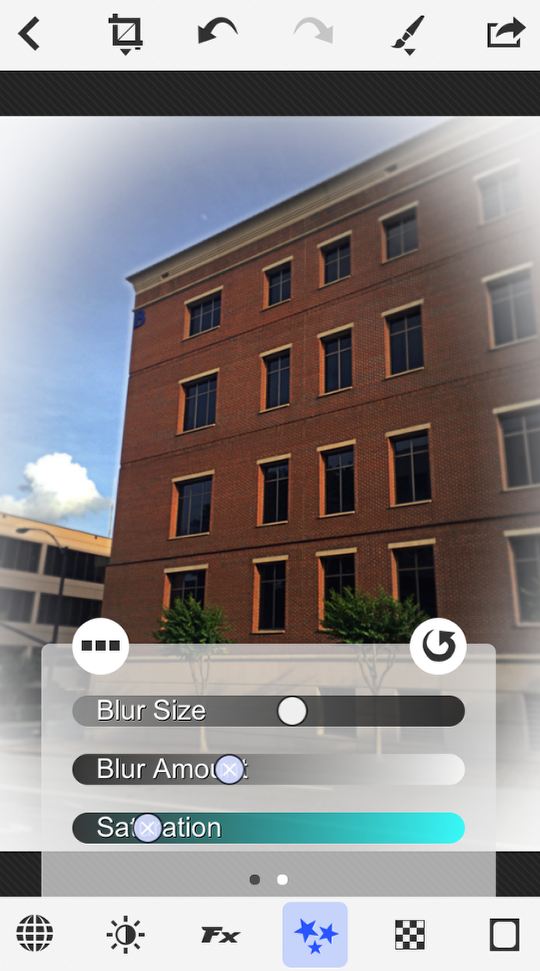
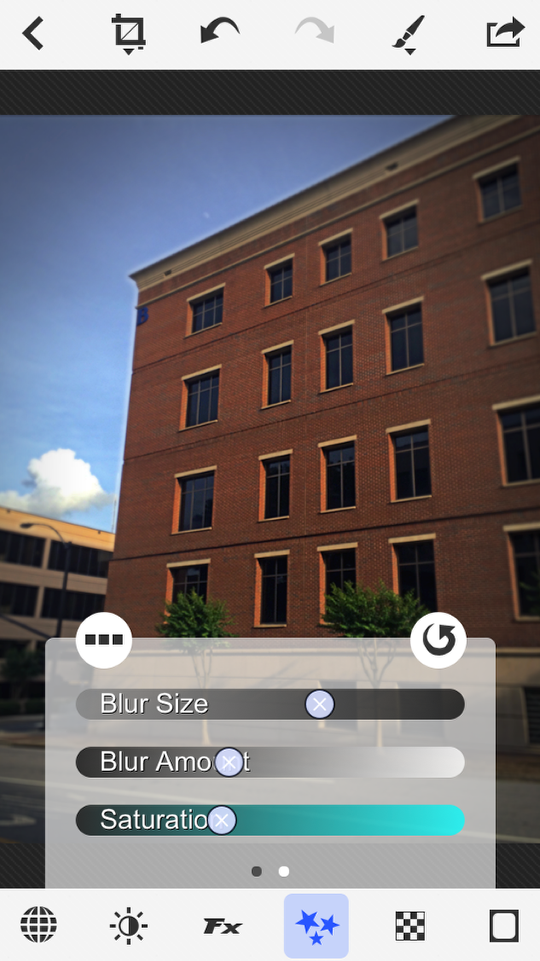
Below I increase the size even more, until only a very small portion of the image is not blurred.
I prefer dark vignettes, so I’ve changed it below.
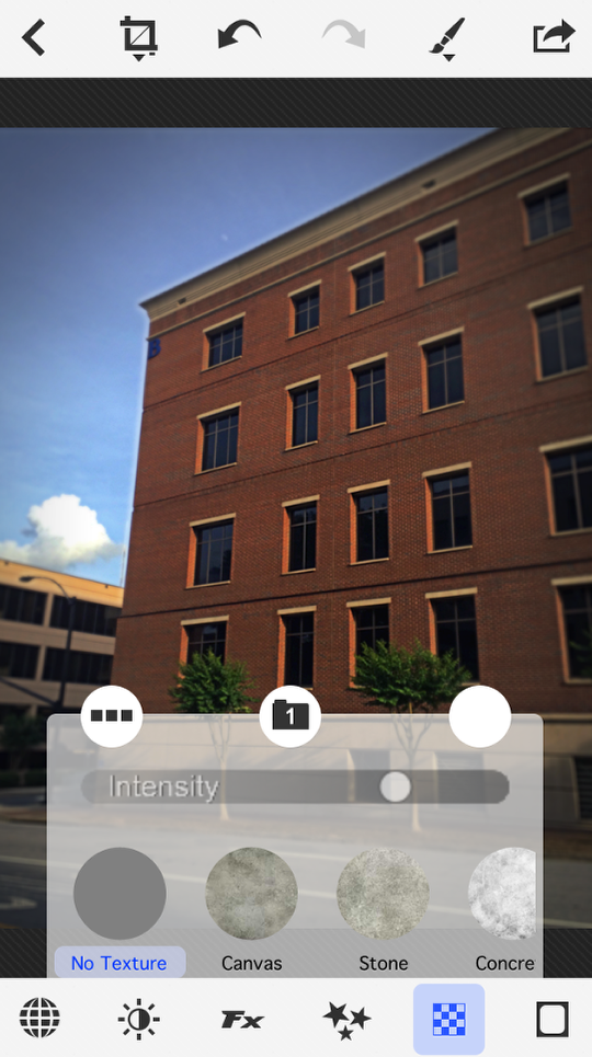
The final category we’ll talk about this time is Textures. Once again, there are presets available.
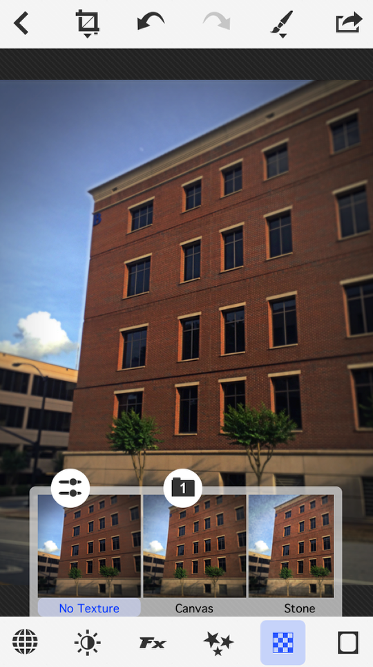
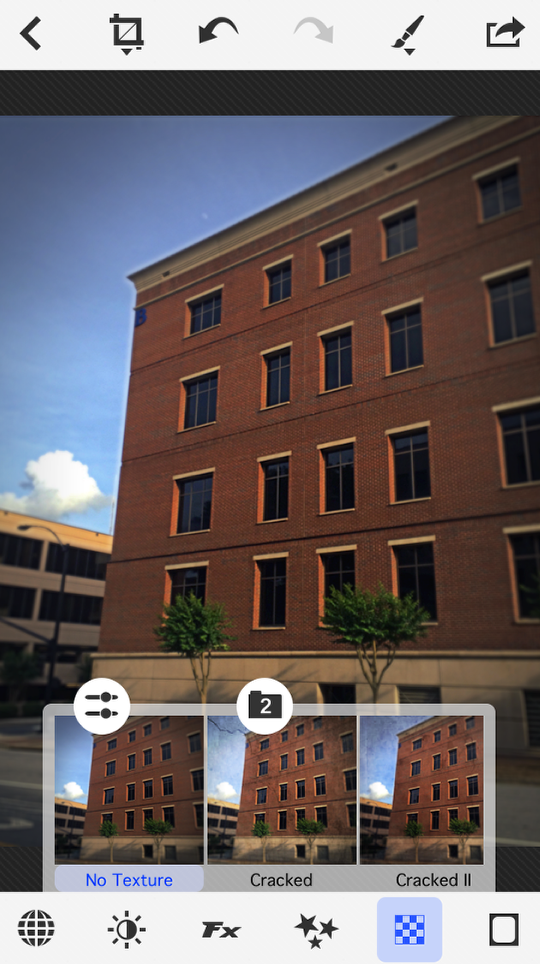
There are two sets of Textures, grouped into two “file folders”. You can see the Folders icon in the top center of the presets pop-up. You tap it to go from 1 to 2 and back.
There’s only one slider that’s made available by tapping the Sliders icon, and that’s Intensity. All textures are added in Overlay mode, so you don’t have modes such as Multiply and Screen available. You choose the Texture and dial in the Intensity with the slider.
I chose Old Paper and boosted the Intensity to about 85%.
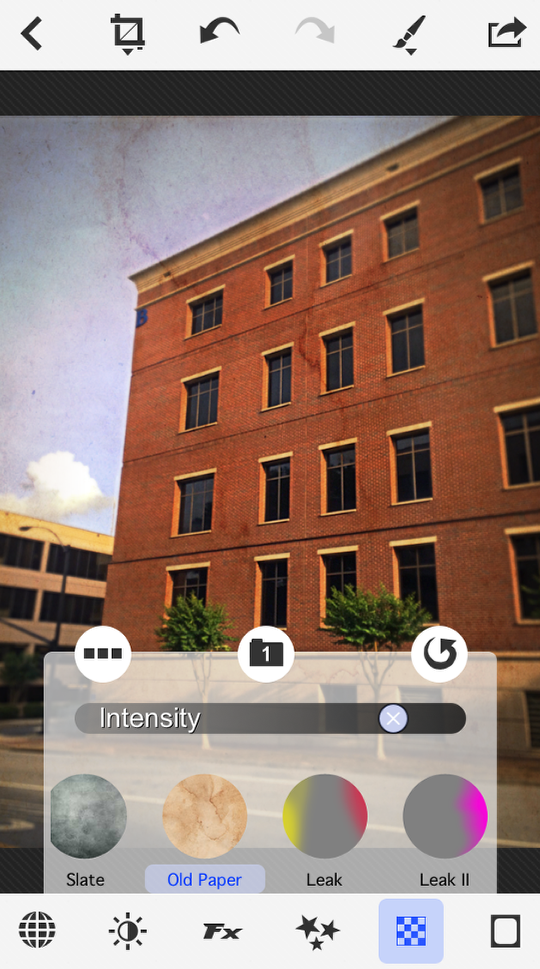
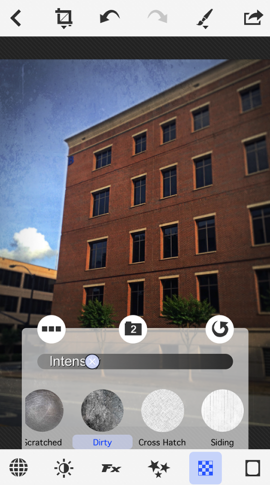
Textures cannot be layered. When I tap “Dirty”, the Dirty texture is not added on top of the Old Paper texture I chose above. Dirty replaces Old Paper.
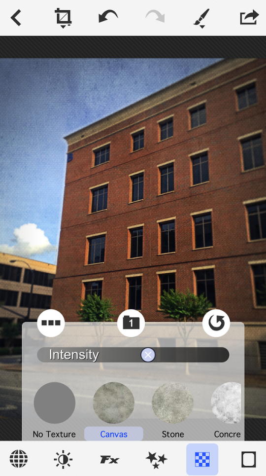
My final choice was the Canvas texture at about 60% intensity.
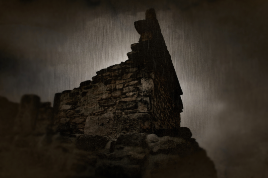
Next time we’ll wrap up our look at PhotoToaster with a look at borders and brushes. You won’t want to miss it! I’ll leave you with an image I took in Cancun and passed through Dynamic Light. Then I added a texture and a blurred vignette in PhotoToaster before finishing in Rainy Daze HD. Enjoy!
Jerry Jobe
Never content with just scratching the surface of what an app can do, Jerry Jobe decided to pass on what he learned about imaging apps to others. He’s constantly trying to figure out just what tools other artists have used, and trying to incorporate them into his own work, in an attempt to find his style. He’s written tutorials on over 145 apps so far, which you can find (along with his Song of the Day entries) at http://enthusiasmnoted.wordpress.com/ He lives near Atlanta, Georgia, where he also finds a creative outlet in acting and directing in community theater.

One Comment
Tracy Mitchell Griggs
PhotoToaster sat in a folder for a looooong time – I recently started using it again and me likey-likey 🙂