
iPad Photography App Tutorial Pixelmator Part 3 – Layers and Selections by Jerry Jobe
We are delighted to publish Part 3 (of 5) of a wonderful series of tutorials covering the brand new Pixelmator app for iPad. If you have missed Part 1, please go here and for Part 2, go here. This time Jerry discusses Layers and Selections in this extensive tutorial. We’re quite sure you will find this tutorial invaluable (foreword by Joanne Carter).
Pixelmator for iPad retails for $4.99/£2.99 and you can download it here
“In Part 3 of my series on Pixelmator, we’ll look at different sources for layers and glance at selection tools as well. I’m covering a lot of ground here, with over 40 screenshots of the app, so let’s get started.
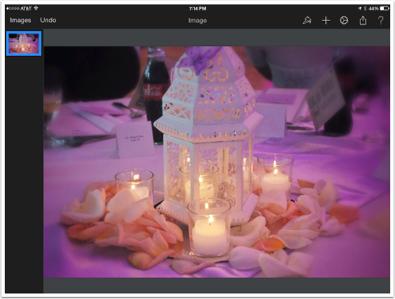
We’ll begin with the same image of candles we used in the overview. Over on the left is the Layers palette, and on the right top is a + sign used to add layers from different sources. (Remember, if you swipe down on the Layers palette, another + sign will appear that allows you to add a blank layer).”
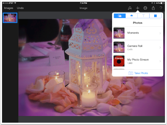
The + sign at the upper right drops down a menu. At the top of this menu are four buttons, which differentiate between the four types of sources for your additional layers. The first (the camera) is used to add a layer from your photo library. In addition, you can always take a new photo using the camera – but how much use is that?
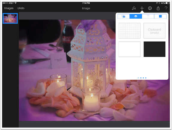
The second button provides you with many options to fill an entire layer. There are four options on this portion of the drop-down menu, and you can see by the four dots at the bottom that there are four scrollable sets of additional options. The rectangle broken into smaller squares represents a blank layer, just as the + sign in the Layers palette provides. If you have copied an image from another app into the clipboard, you can paste it as a new layer here. There are also options for plain white and black layers.
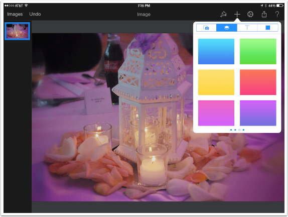
I do not show the second set of options, which are merely six different colored backgrounds. The third section, shown below, is a set of gradients.
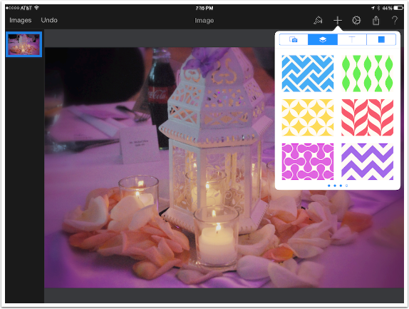
The fourth is a set of patterns, shown below. The choice is limited and the size is not adjustable. By the way, if you continue to scroll the selections past this fourth one, it will scroll back to the beginning, just as with all sideways-scrolling menus in Pixelmator.
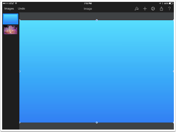
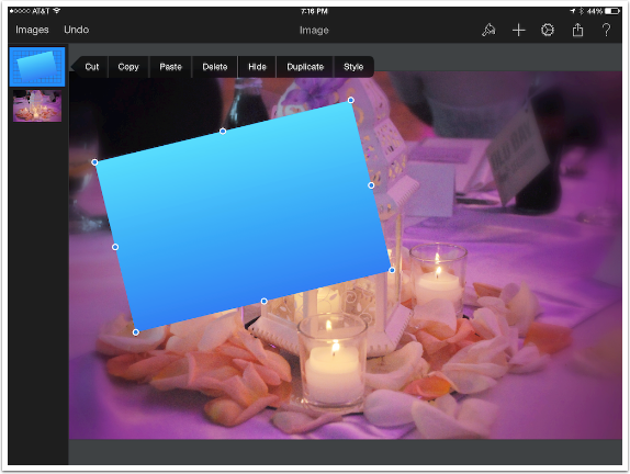
I chose a gradient, and it was added as a new layer, filling the entire image. You can see the new layer in the Layers palette. The handles on the sides, top and bottom of the gradient allow you to change the size of the layer.
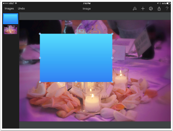
Below I’ve used the handles to resize the gradient layer. The resizing is not reflected in the Layers palette until another layer is selected, “committing” the resize.
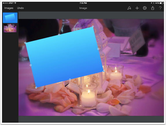
Below I’ve used two fingers to rotate the gradient layer. As I stated in the overview, rotation can be somewhat difficult to accomplish; Pixelmator has trouble distinguishing between a two-fingered zoom and rotation. Once it’s rotated, that is reflected in the thumbnail in the Layers palette, where you can see the tilted gradient surrounded by the transparent “squares” background.
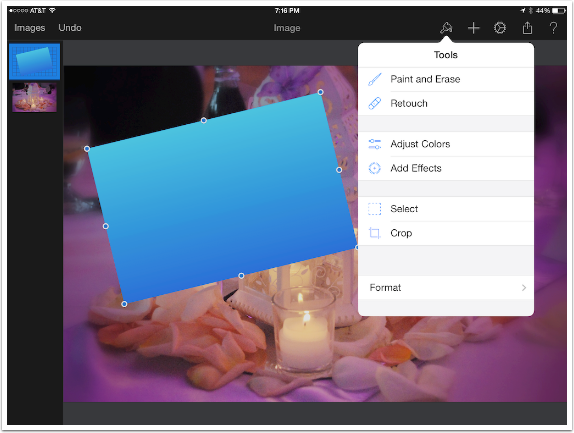
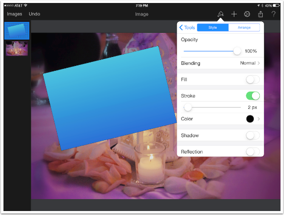
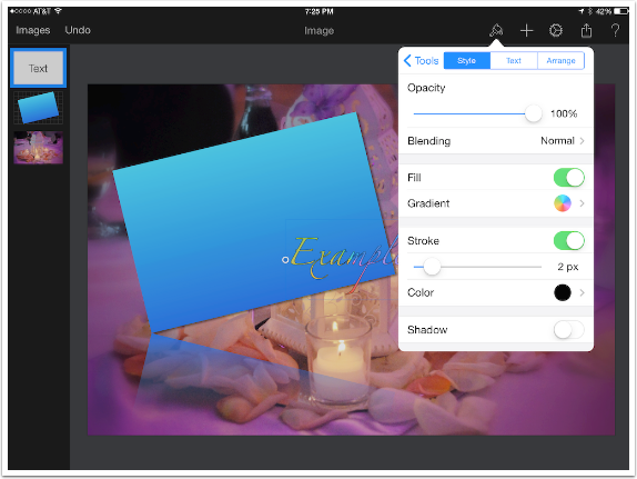
There are several ways to change the Style or Format of a layer, and there are two ways to get to the various styling methods. The first is by double-tapping the layer in the Layers palette, then selecting Style in the resulting menu bar.
The other is to tap the Paintbrush icon in the top menu, then Format at the bottom.
Either way, you get the drop-down menu seen below. In the overview, I used this method to change the Opacity and Blend mode of the layer. Below I’ve turned on Fill, which overlays the visible pixels in the layer with a color or gradient.
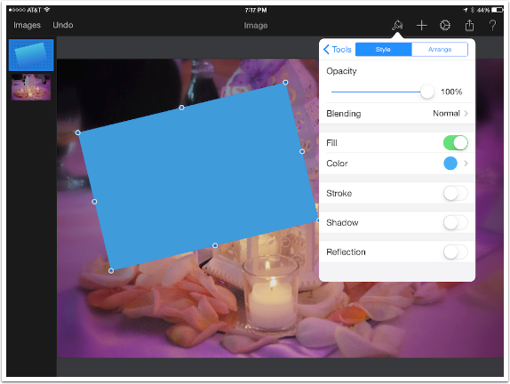
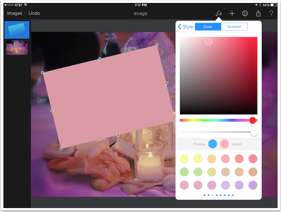
Tapping the Color indicator under Fill brings up a color palette. Predefined colors are shown at the bottom, or you can select a color using the color picker square at the top.
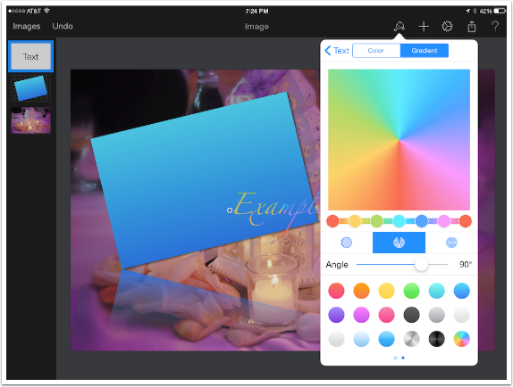
Selecting Gradient at the top allows you to define your own gradient fill or select from various options at the bottom. The square at the top shows you a representation of the selected gradient. The slider immediately below that is used for color selection. You can tap either of the buttons shown to access a color picker, and you can tap along the line to add a button.
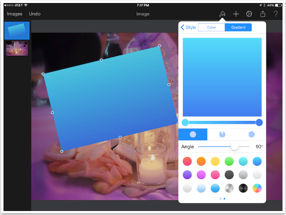
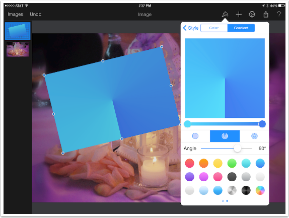
Below the gradient color selection slider are three buttons for types of gradients: Linear, Rotational and Circular. Below you’ll see a representation of the Rotational gradient. On either the Linear or Rotational gradient you can make use of the Angle slider – but it obviously doesn’t change the Circular gradient.
Below you’ll see the circular gradient.
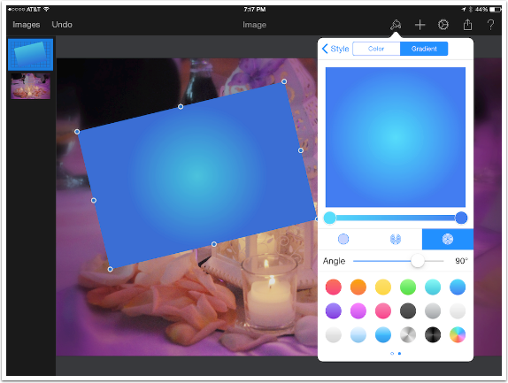
Notice, however, that the Fill Gradient is not reflected in the thumbnail of the layer in the Layers palette. Styles are not shown in the Layers palette, and the thumbnail reflects the original Linear blue gradient rather than the Circular Fill gradient.
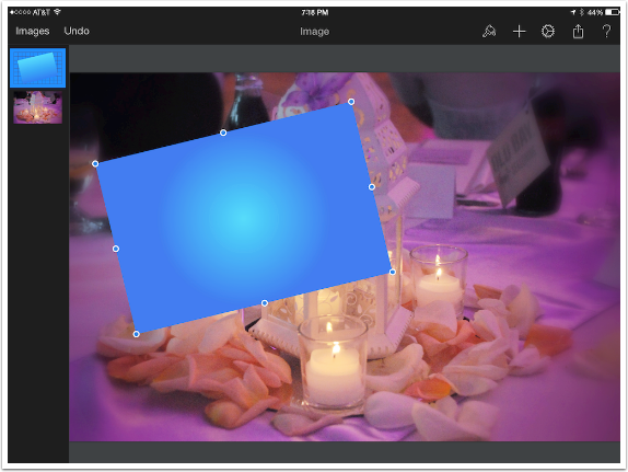
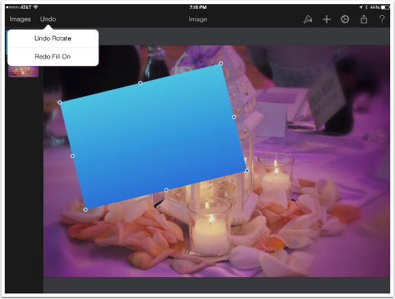
I like the original gradient. I could go back into the Style/Format menu and turn off Fill. Instead, I tapped the Undo button at the top left. Below you’ll see a representation of what happens when you hold the undo button. A small menu show up to allow you to undo the immediately prior step (Rotate) or redo the recently undone step (Fill).
The next entry in the Style/Format menu is Stroke, which outlines the layer. You can set the width of the stroke and the Color/Gradient of the stroke.
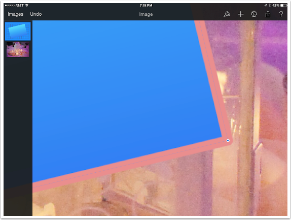
The close-up below shows that the stroke is applied evenly to the inside and outside of the border of the non-transparent pixels of the layer. This results in rounded corners, and there is no way to adjust the application of the stroke.
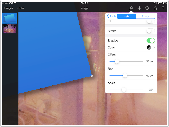
The next option in the Style/Format menu is Shadow, and switching Shadow on brings up controls for the Color, Offset, Blur and Angle for a drop shadow applied to the layer.
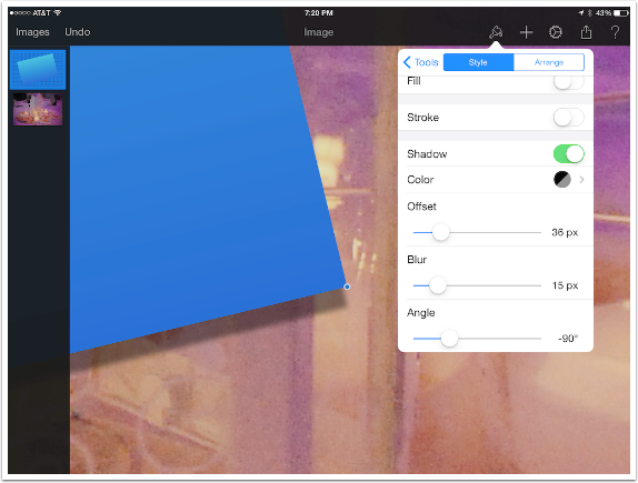
The Offset controls how “far away” the layer is from the background; a larger offset produces a shadow that extends farther from the layer. Angle changes the angle of the light that produces the shadow.
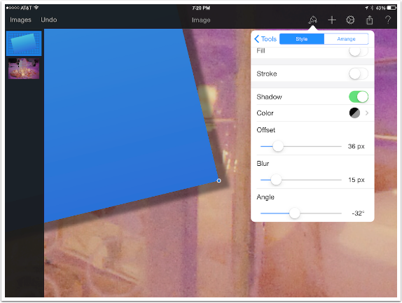
Blur produces a shadow that’s less harsh, as might be produced by indoor lighting.
Below I’ve left the Shadow on and activated the final option, Reflection, which defaults to 50%. You can begin to see the tilted rectangle “reflected” immediately below the lowest corner of the rectangle. Notice that the Shadow is not reflected; Stroke and Fill would be reflected if they were applied.
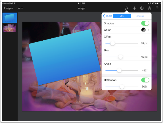
There is only one slider for Reflection – an Opacity slider. The reflection is not modifiable in any way other than opacity.

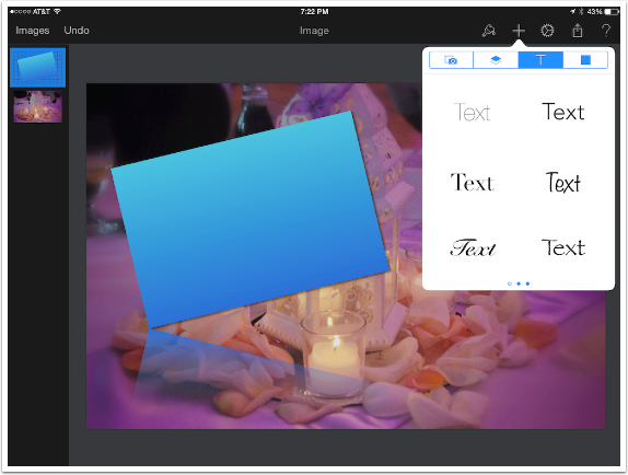
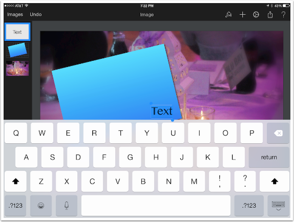
After Import Image and Rectangular Object options, the next option for a new layer is Text. Hitting the large T at the top of the Add Layer menu results in a scrollable list of thumbnails for 18 different fonts, in black. Font and characteristics are changed after the text is added.
Double-tapping the word “Text” brings up a keyboard to allow you to change the text.
Pulling up the Style/Format menu while a text layer is active (outlined in blue in the Layers palette) shows a new set of format changes exclusive to text – Font, size, spacing, etc.
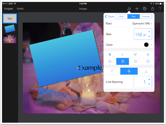
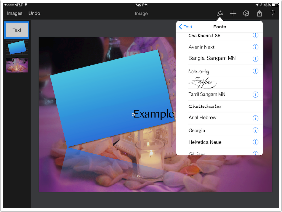
Tapping Font brings up a list of fonts installed on the device. Those marked with the “info” icon have other options available for your use, such as bold, italic or condensed.
Size can only be adjusted with the arrows; the point size cannot be entered directly. Also, the maximum size is limited by the bounding box around the text. If you have a problem expanding the size, use the handles on the bounding box to expand it, then increase the size using the arrows.
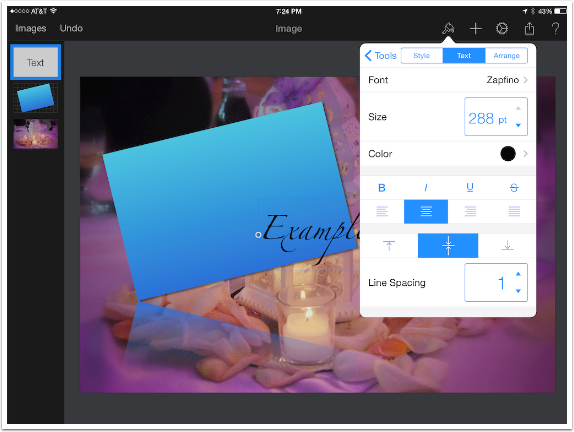
You can change the color of the text or apply a gradient. Below I’ve changed the font to Zapfino and added a rainbow Rotational gradient.
Just as with any other layer, you can add Styles to your text layer. Below I’ve added a 2 pixel black stroke to my example text.
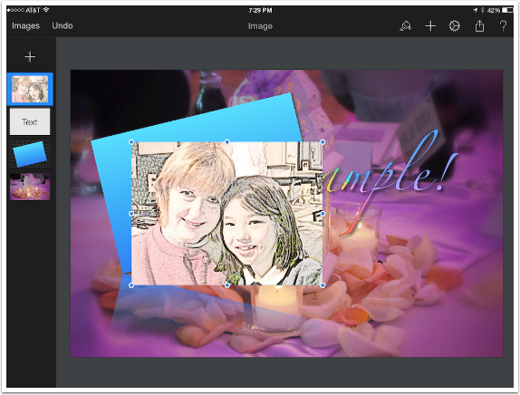
I added a drop shadow to the text, made it larger and repositioned it before moving on to the last option for new layers, Shapes. Shapes can be treated just like the rectangular layers, and you can move them around and add various styles. But they can also be used as “cookie cutters” for other images by using the selection tools – and that’s what I’ll be doing here. I start by loading the image I wish to “cut” as a new layer.
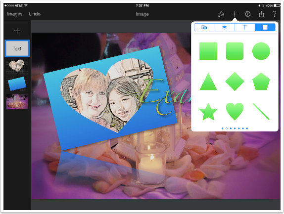
You see the shapes that are available in the menu; scrolling sideways does not give you any new shapes, but change the color of the shapes. On the image you can see that I’ll be using the Heart shape to “cut” my image.
I add a blue heart Shape layer above the added image.
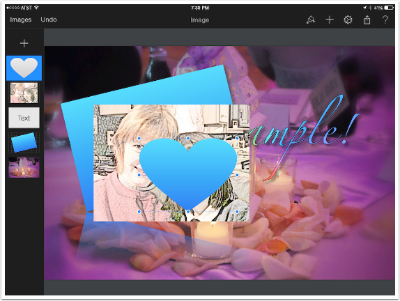
Using the handles, I resize the heart to fit the image. When you resize an image using the handles, the proportions of the image are constrained, so that no stretching of the image occurs. When you resize a shape, there are no constraints. The heart is able to stretch to cover the rectangular image.
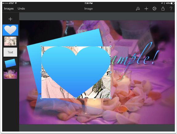
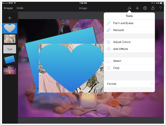
Now I have to select the heart and use that selection to cut the image. Select is found under the Paintbrush (Tools) icon.
There are four selection tools: Free, where you draw around a selection; Elliptical, Rectangular, and the Magic Wand, which selects pixels of similar color. Since the heart shape is all blue, I’ll choose the Magic Wand.
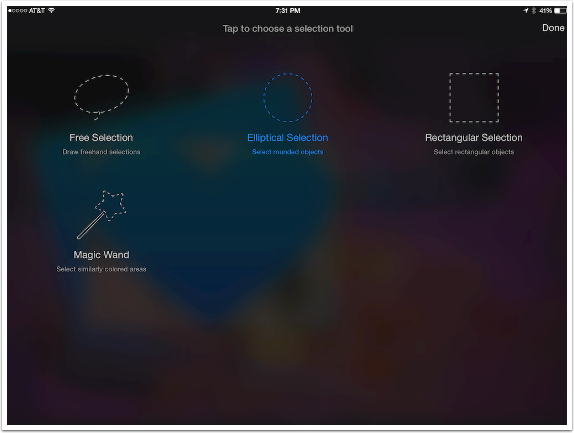
As I drag my finger across the heart, a purple overlay shows the pixels I have selected. But it’s selecting the rectangle also! The Magic Wand selects from all visible layers, and cannot be used to select from just one layer unless the other layers are hidden.
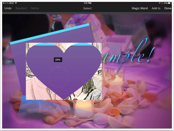
I go to the layers palette and hide the rectangular layer, and reselect the heart using the Magic Wand.
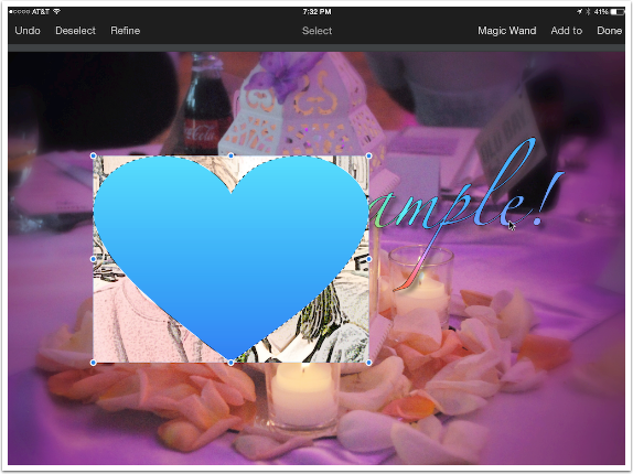
I return to the Layers palette and select the layer that holds the image I wish to cut. Double-tapping the layer brings up the menu bar, which includes Duplicate. Duplicate only copies the selected pixels within the layer.
Now I’ve got a layer which only contains the image in a heart shape. I can discard the original image layer and the Shape layer, since I won’t need them again. If you look at the Layers palette below, you’ll see I’ve already done that cleanup.
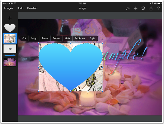
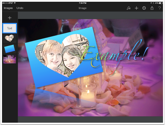
I can then move the image into place over the rectangle. But it covers part of the text.
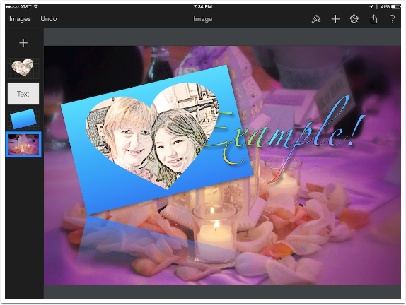
Layers can be rearranged by dragging the layer within the layer palette. By dragging the Text layer above the image layer in the stack, the text overlays the image in the workspace.
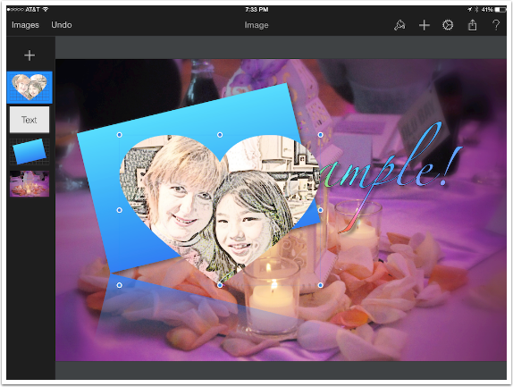
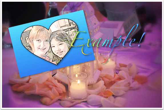
Using the Style/Format menu, I add a black stroke and a shadow to the heart-shaped image. I also remove the Reflection attribute of the rectangle layer, as it was unnecessary clutter. Here’s my finished example image.
Pixelmator can do a lot, but there are certain things I wish it could do better. Selections could be improved, in my opinion. The Magic Wand could be adjustable on the range of colors selected, and all selections could use the ability to be feathered for a softer edge.
Feathering can be accomplished by duplicating an entire layer, and erasing the unwanted pixels with a soft-edged eraser – but that is needlessly complicated.
Next time we’ll be venturing into uncharted territory, as I venture into using brushes, smudgers and erasers. Please be kind to this non-artist as he tries to show artists what Pixelmator is capable of! Enjoy!
Jerry Jobe
Never content with just scratching the surface of what an app can do, Jerry Jobe decided to pass on what he learned about imaging apps to others. He’s constantly trying to figure out just what tools other artists have used, and trying to incorporate them into his own work, in an attempt to find his style. He’s written tutorials on over 145 apps so far, which you can find (along with his Song of the Day entries) at http://enthusiasmnoted.wordpress.com/ He lives near Atlanta, Georgia, where he also finds a creative outlet in acting and directing in community theater.

2 Comments
Carolyn Hall Young
Thanks, again, Jerry!
Karina Cass
I wish to learn how to apply a gradient layer onto a photo so it looks like a sunset……..can’t seem to work it out.