Mobile Photography/Art Tutorial – Colorburn: Color Your World
We are delighted to publish Jerry Jobe’s latest mobile photography/art tutorial for our reading and viewing pleasure. This week Jobe takes a look at the popular mobile photography and Art app Colorburn, previously known as Colors. Read his thoughts as he puts it through its paces (foreword by Joanne Carter).
Colorburn retails for $0.99/£0.79 and you can download it here
“Should you worry if an app is released and seven months later they change the name? Normally, I’d be a little leery that perhaps the developers wanted to remove all traces of a bad first attempt. But in the case of today’s app, Colorburn by Wanman, Inc., I think it was a fine decision. You see, it was originally called Colors. That’s too generic a name, and I’m sure it proved hard to find on the App Store.
But Colorburn is actually a nice little app for 99 cents. It’s universal between the iPhone and iPad, but it only operates in portrait mode. It actually has the 1000 filters that it promises, and the engine used to deliver those filters is easy to use and fairly robust. As you would expect with an app called Colorburn (or Colors), the filters manipulate color. There are no light leaks, textures, bokeh, blur or grunge. Let’s take a look”.
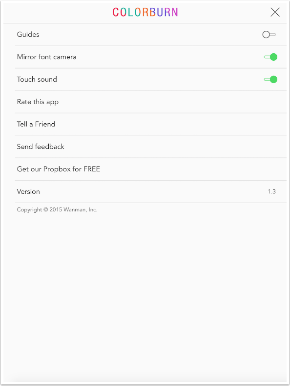
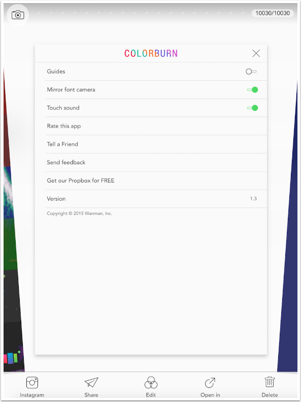
Once you get past the splash screen, you are taken to the camera, with the last used filter and grid in place. Colorburn was designed as a camera app, but they quickly realized that the number of choices they give users make it nearly impossible to choose an appropriate grid/filter combo while capturing images. Therefore, they allowed users to use Colorburn on existing images – and that’s how we’ll use it. All the controls you see on the camera screen are available when editing images – except the settings (Gear icon at upper right corner). Let’s take a look at those settings.
The first setting is Guides, for use when using the in-app camera. Next is the mislabeled “Mirror font (front) camera”. When this is turned on, selfies are presented as if you saw them in a mirror, or as you see them on the screen. I part my hair on my left, and normal pictures put the part on the right side of the image, as others see me. This switch flips left to right, so that the picture is shown as I see me.
The only other setting is for the shutter sound. All the settings affect camera use, and there are no settings for editing.
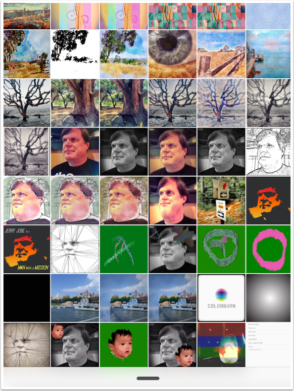
I tap the box at the lower left of the camera screen to access my photo libraries. All the images are shown together, with the most recent image (in this case, the screenshot I just took of the settings) shown first. You scroll through them by swiping left and right.
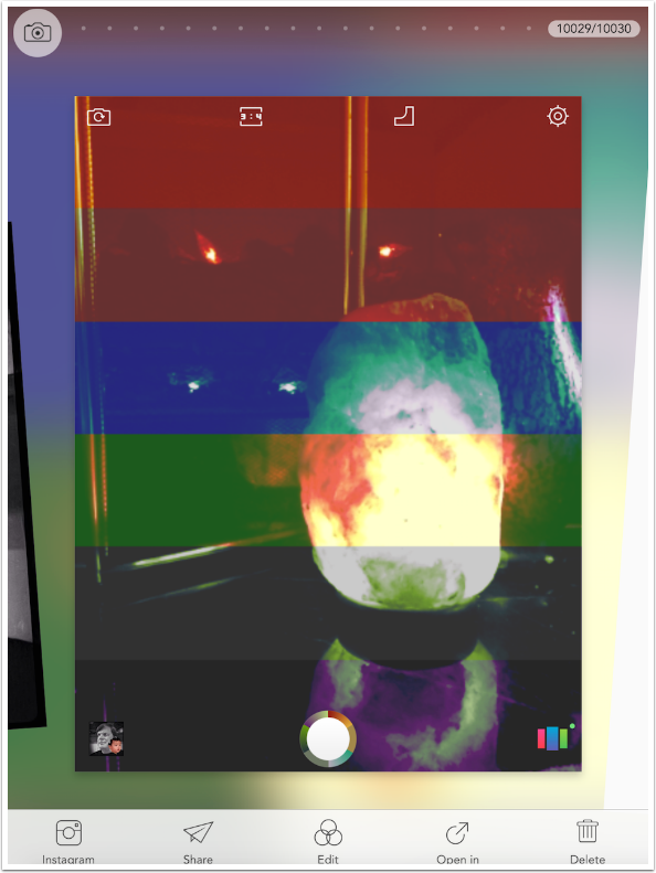
In the screenshot below, the medium blue block you see to the right side of the image is the camera, so if you swipe from right to left, you’ll find yourself back at the camera.
If you swipe from left to right, you will see the next most recent image (the screenshot of the camera screen). You can see that it would quickly become tedious to scroll through all your images, Camera Roll and Photo Stream, one by one. If you look at the upper right corner, you’ll see I have over 10000 images.
If I tap on the image counter, though, I get a grid showing the images in rows of six, making it easier to scroll back to earlier images.
Tapping any thumbnail brings it to the front, and you tap the Edit button at the center bottom to apply filters.
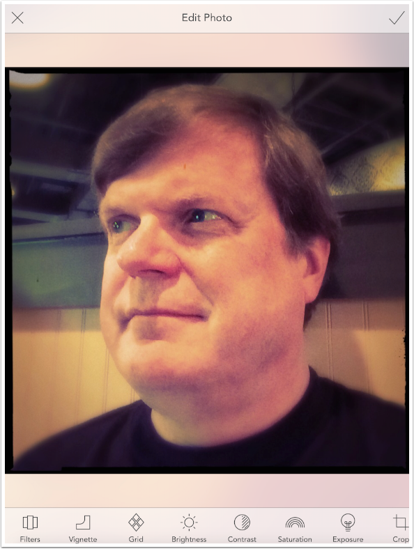
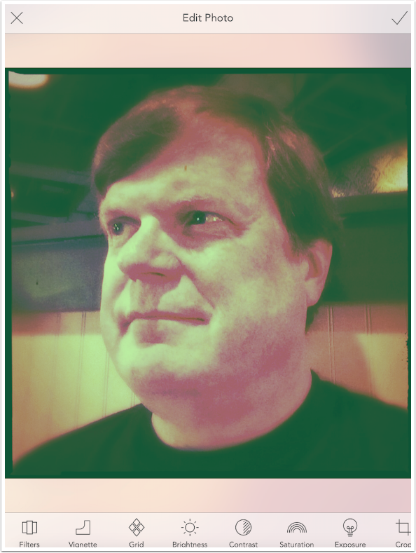
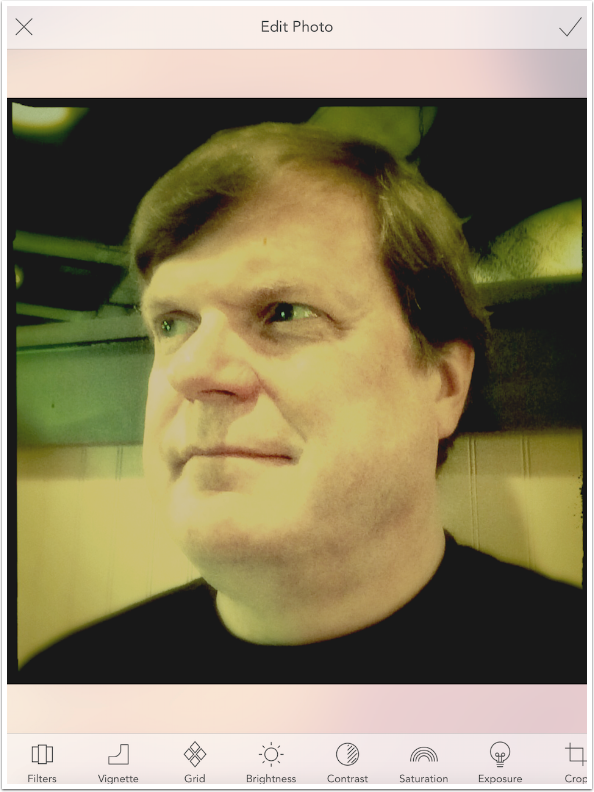
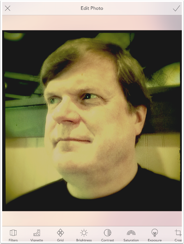
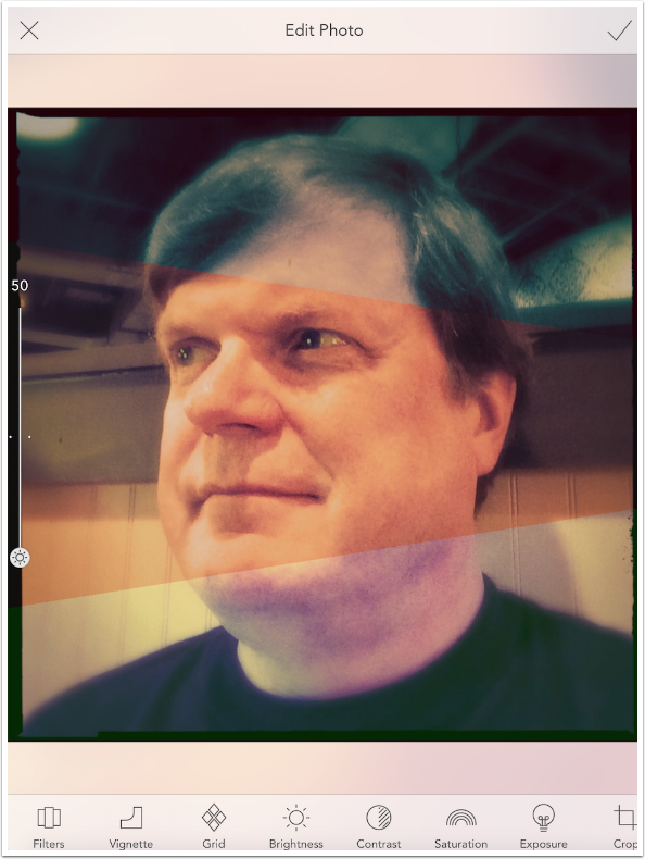
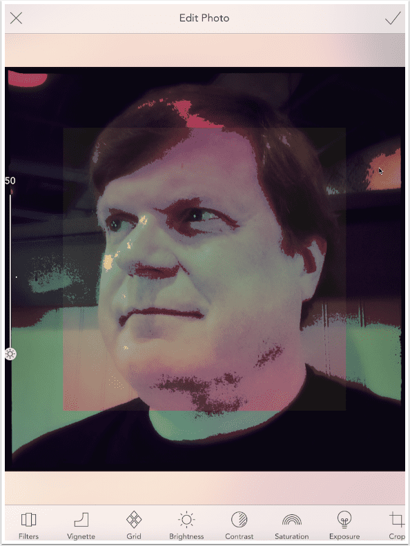
As seen below, the edit screen has an X and a check mark at the top. The X returns you to the Photo Library, and the check applies changes and saves the image. The editing controls are along the bottom: Filters, Vignette, Grid, Brightness, Contrast, Saturation, Exposure, Crop and Frame.
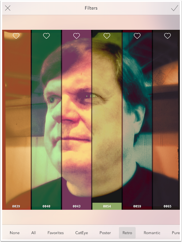
When you tap the Filters button, you will see vertical representations of the currently selected filter, along with its neighbors. A numerical identifier is at the bottom of each filter swatch, and a heart is at the top. Tapping the heart adds the filter to the Favorites category.
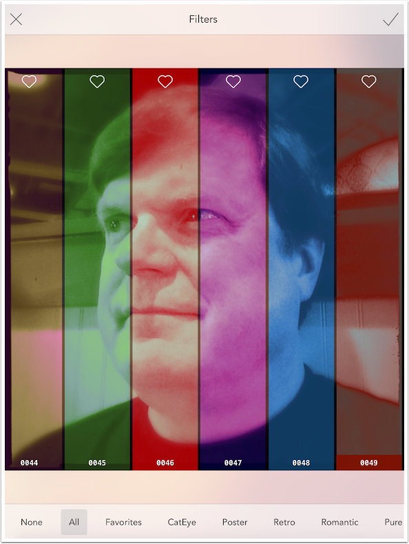
You can move through the filters by swiping left and right, and you will see the filters move across the image. It’s a surprisingly effective way to see six different filters at once.
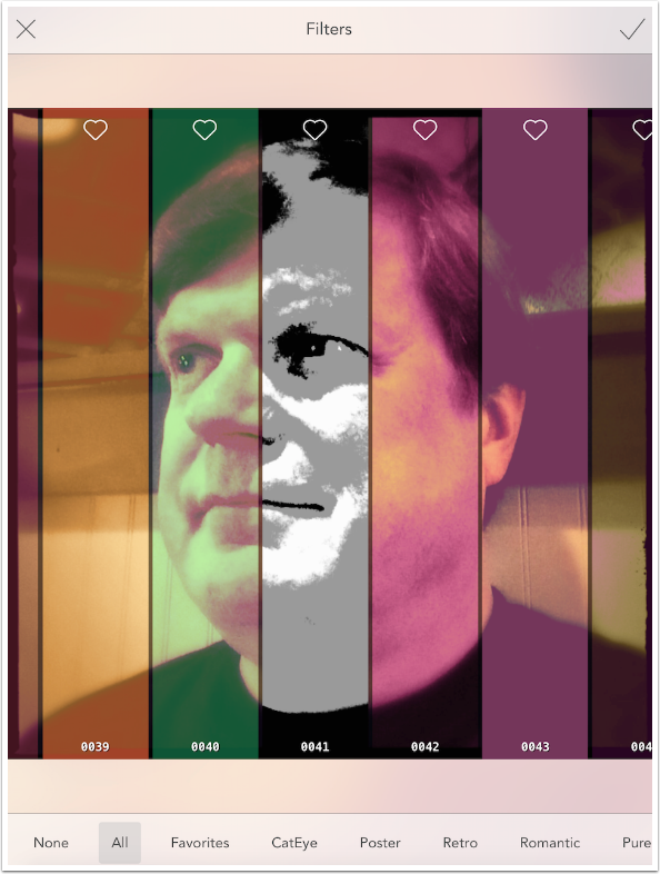
Tapping on a filter expands it to cover the entire image. Below I tapped filter 0040. When a filter is shown, and not the swatches, then you can scroll through filters one by one by swiping left and right on the image.
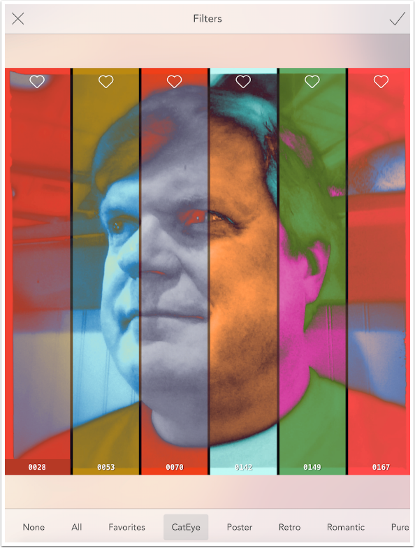
Filters are broken into categories, based on properties of the filters and how they are applied to the image. The first category is CatEye, which actually reverse the tonality of parts of the image. Notice how the dark pupil of my eye is made a bright orange in filter 0070, and the shadows in my hair are made a light blue in filter 0142.
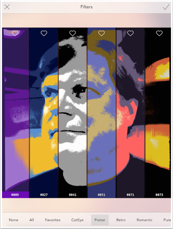
Poster filters posterizes the image first, breaking the image down into four different tones from dark to light and assigning a color to each. Those colors may be black to white, as in filter 0041, or blues, browns and yellows, like 0051.
Retro reduces contrast before applying standard color filters.

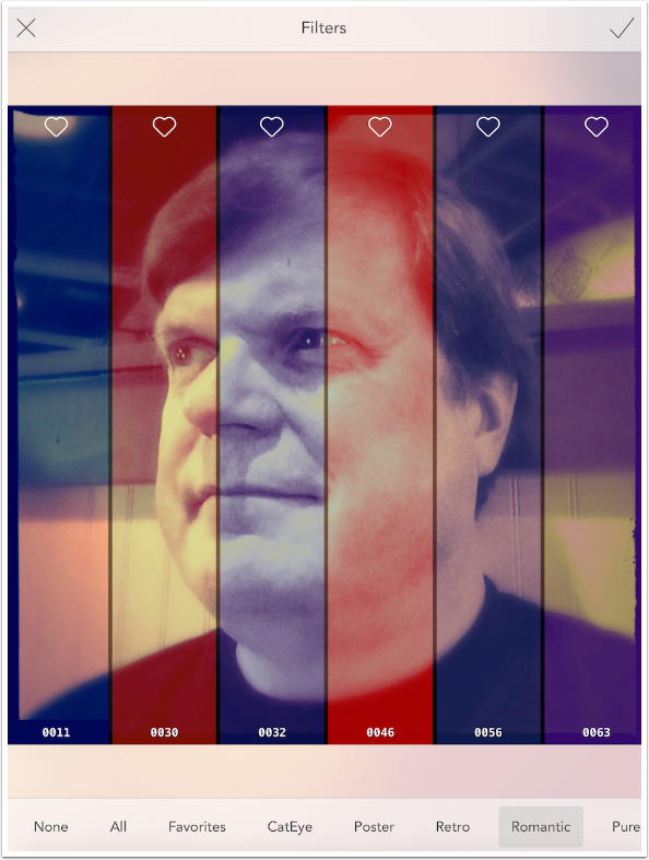
“Romantic” in most apps implies adding some glow, but not in Colorburn. I guess they think of some color palettes as being more romantic than others.
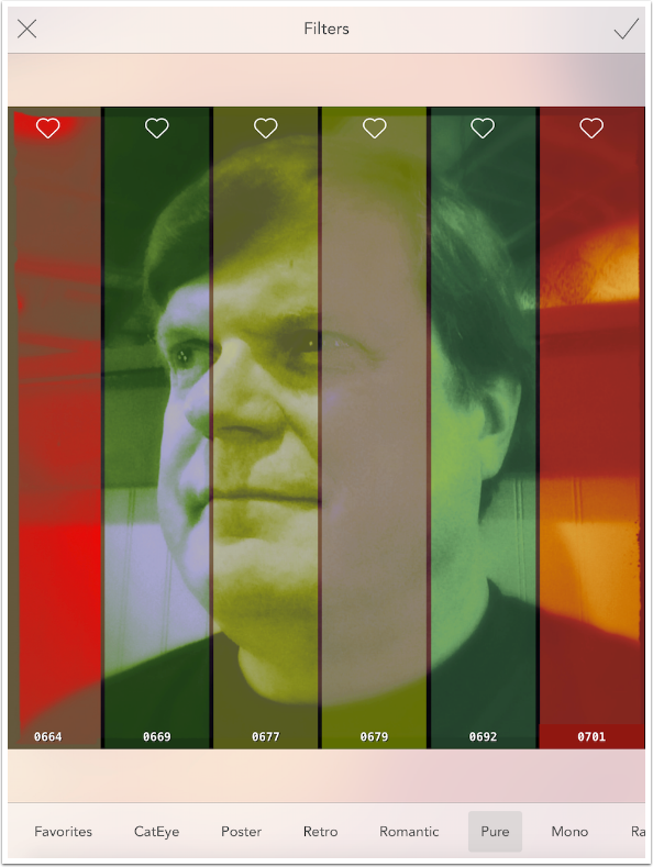
Pure are single-color filters. Some will adjust contrast, as with 0679, some will not.
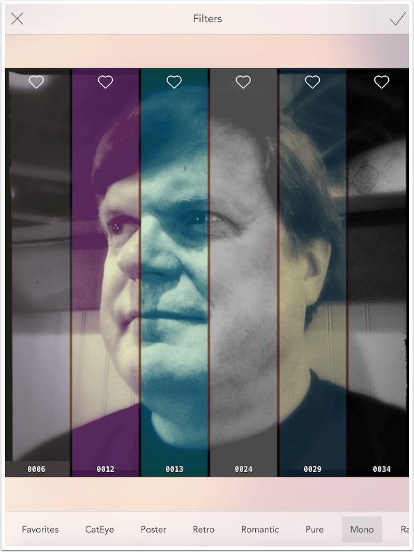
Mono are also single-color, but I don’t see any contrast differential created with them
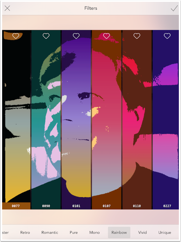
Rainbow filters are nice. A threshold filter is applied, turning the original image into either black or white. Then a color gradient is applied vertically to the image. Look how filter 0101 goes from purple at the top to yellow at the bottom.
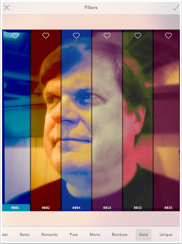
Vivid consists of bright monotones or duotones.
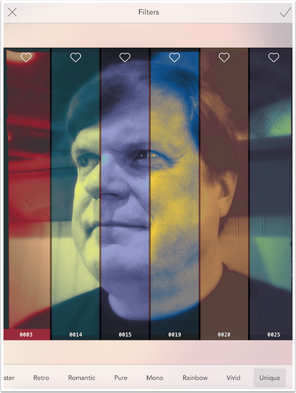
Unique…well, I don’t see anything unique about these filters. Perhaps you do.
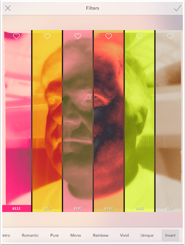
Invert filters create a kind of color negative. There are only twelve of these filters.
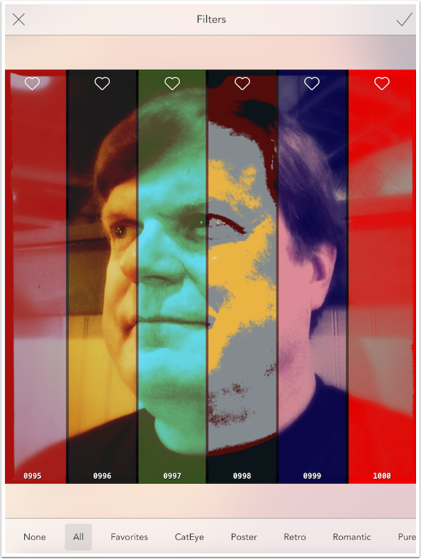
Put them all together, and you actually have exactly 1000 filters, as shown below.
Below I applied one of the filters by tapping the swatch. This takes me back to the main editing screen.
Vignette has no real control. It’s either off, as above, with an empty Vignette icon, or on, as below, with diagonal stripes through the icon
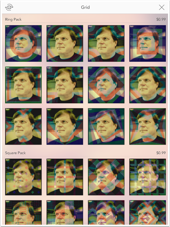
The next control is Grid, which allows you to apply multiple filters at once to your image in patterns. Colorburn comes with fifteen different grid patterns, including None, which is a single filter.
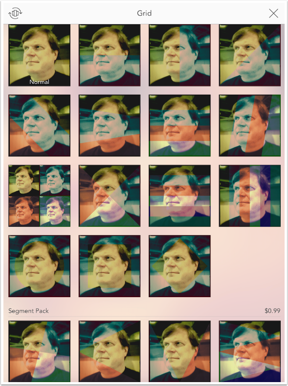
Four additional packs of grids are available, including Segment, Ring, Square and Circle. Each are 99 cents. I have not purchased any, because I prefer to wait and find out if they will have a “buy all” discount at a later date, or an opportunity to obtain a “master collection” pass that includes all future grids, as Pixite does.
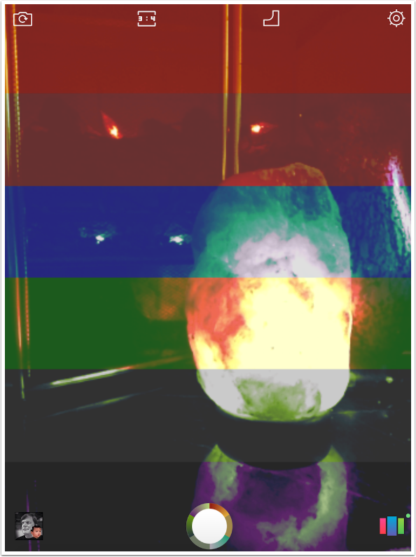
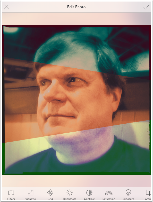
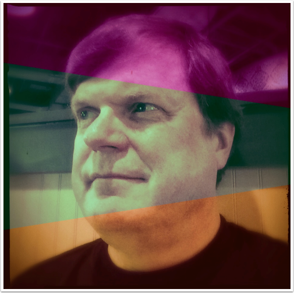
Below I’ve applied a grid with three different sections. A different filter is applied in each section. How are filters assigned to the different sections? How did Colorburn decide green at the top, blue in the middle and orange at the bottom?
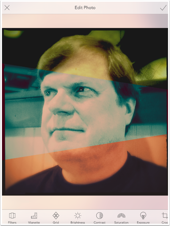
If I go back to filters, I see that I’m in the Retro category and that 0054 is highlighted. That is the green filter at the top. Colorburn then just takes the next two filters in the list, 0059 and 0065, and assigns them to the remaining two sections.
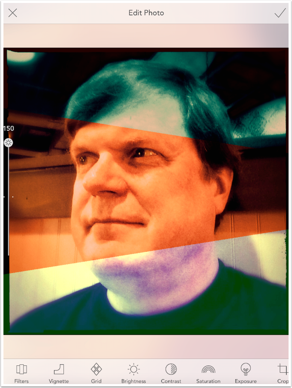
Remember how you can move between individual filters by swiping on the image? When a Grid is in place, the filters just move up and down in the list. In the screenshot below, I swiped from right to left and 0059 (blue) moved to the top. 0065 (orange) was moved to the middle, and a new filter was assigned to the bottom.
There’s also a hidden intensity slider that is accessed by swiping vertically anywhere on the image. The default value, in the middle, is 100. This default is easy to return to – it is marked with a dot on either side of the slider, and it’s a bit “sticky”, and will “drop into” that position as the button reaches that point on the slider.
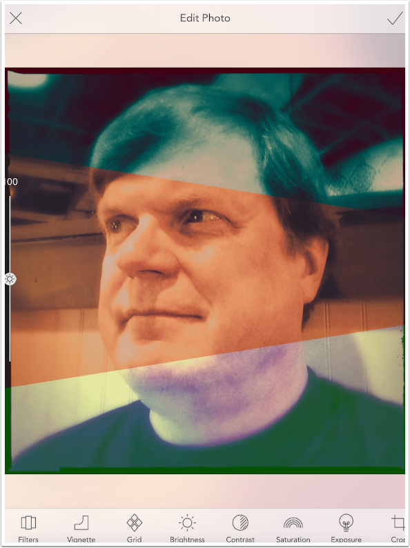
The top intensity value is 150, as shown below.
The minimum value is 50. It’s often the case with apps that a filter is overdone even when it’s at the minimum value, but Colorburn does a good job of making the filter more subtle while still being obvious.
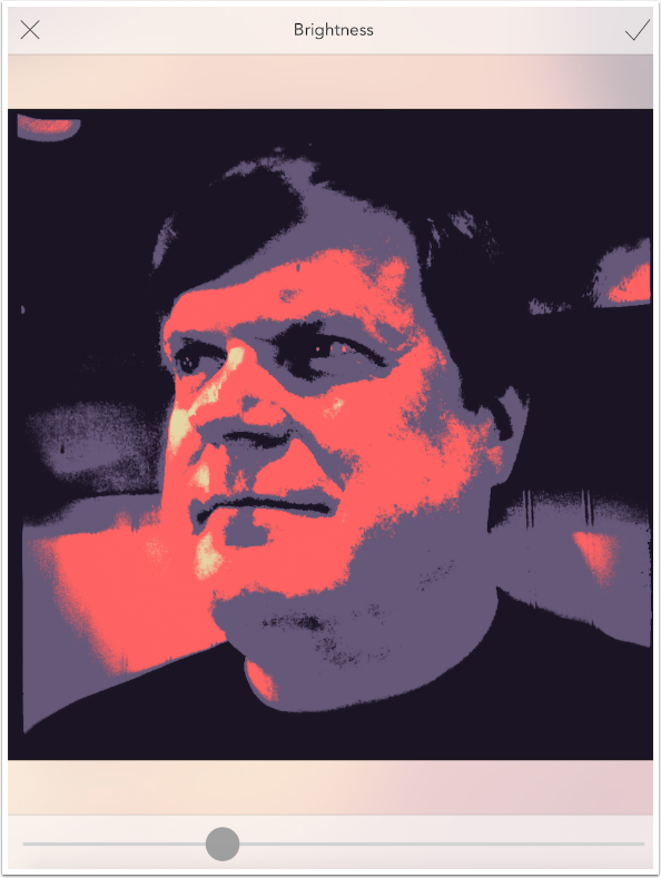
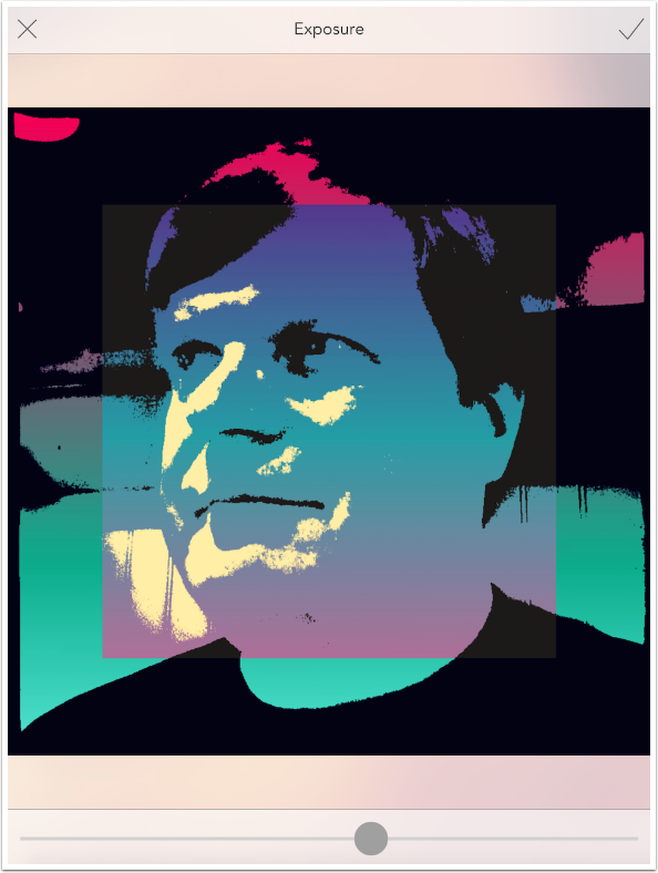
The four Adjustment controls – Brightness, Contrast, Saturation and Exposure – are standard sliders, with default positions in the center. As you slide the button on the slider, a number appears on the image. This makes it easy to return to the default position of 0. What makes these four controls unique is that some are applied before the filter is applied, and some after. Brightness is shown below in the default position.
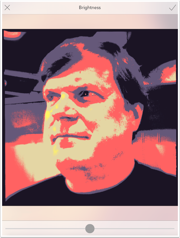
The reason I used a Poster filter is to show that Brightness is applied before the filter. Thus, as the image gets darker, there are no longer any bright areas that get the yellow color, and the brighter midtones that are tan are reduced considerably. Everything becomes coral or blue.
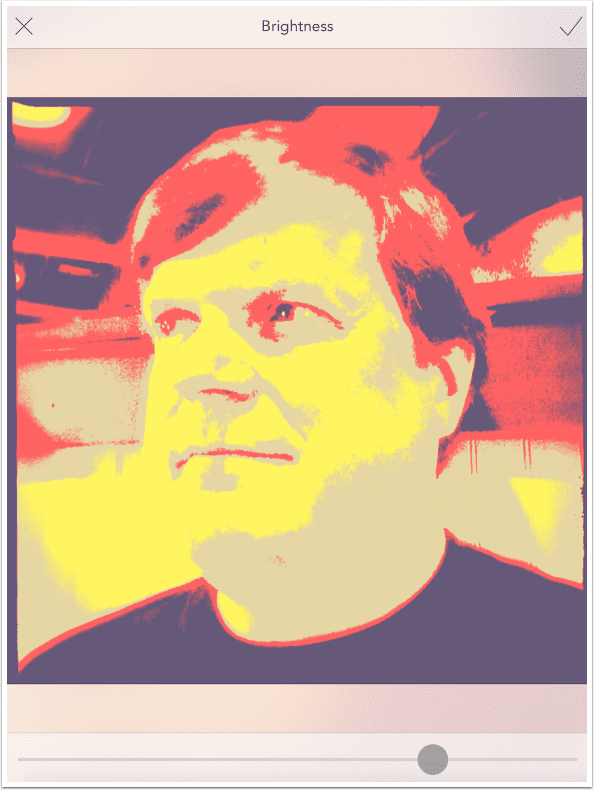
Increase the brightness, and the yellow and tan expand. This would only occur if the brightness changes the image before colors are assigned to the tonal areas of the image.
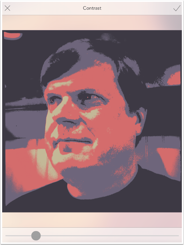
Contrast, on the other hand, is applied after the filter. Yellow, tan, coral and blue are all still in the same places, but the contrast between those assigned colors is increased or decreased.
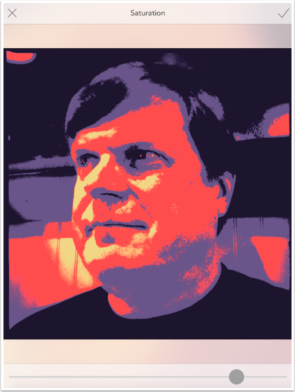
Saturation is also applied after. You can see below that the saturation was increased, but the colors did not move.
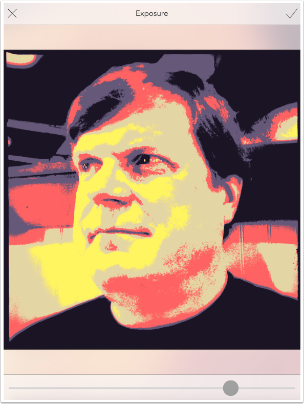
Exposure, like Brightness, is applied before the filter. The assigned colors move around on the image as the slider is moved.
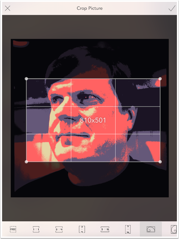
Crop is interesting. There are several standard sizes as well as a free crop
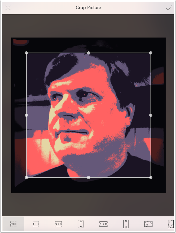
The two icons at the end with the spirals are what is called the “golden ratio”. In addition to it being the “right” ratio, objects of interest are supposed to fall along the spiral. But the overlay shown as the crop box is moved and sized does not contain the spiral! It contains the size, and a grid that’s appropriate for the Rule of Thirds, but no spiral.
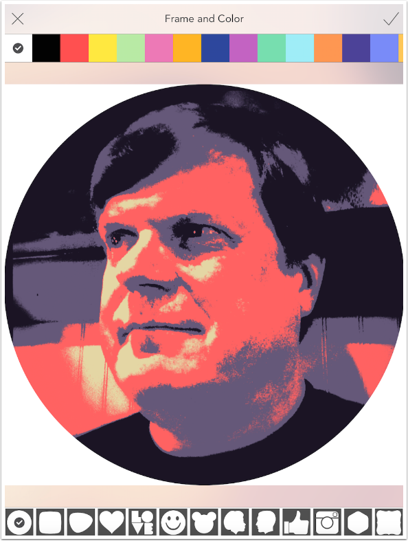
Up to this point, I am digging Colorburn. Lots of filters, fairly adjustable. But the Frames control is cheesy, along the lines of having clown stickers for your images. Below you’ll see the frames along the bottom, and the colors at the top. Who wouldn’t want a white circle frame? Me, for one.
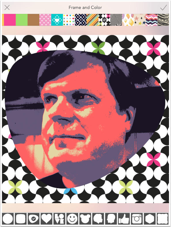
And it just gets worse. Beyond the colors are some truly awful wallpapers you can use instead! Take my advice and just stay away from the Frames control entirely.
Let’s return to the intensity slider once again before we save, in order to show you that you might get some results that you didn’t expect if you inadvertently swipe vertically on the image (adjust intensity) rather than horizontally (change filters). Below is an image with a Rainbow filter at an intensity of 150.
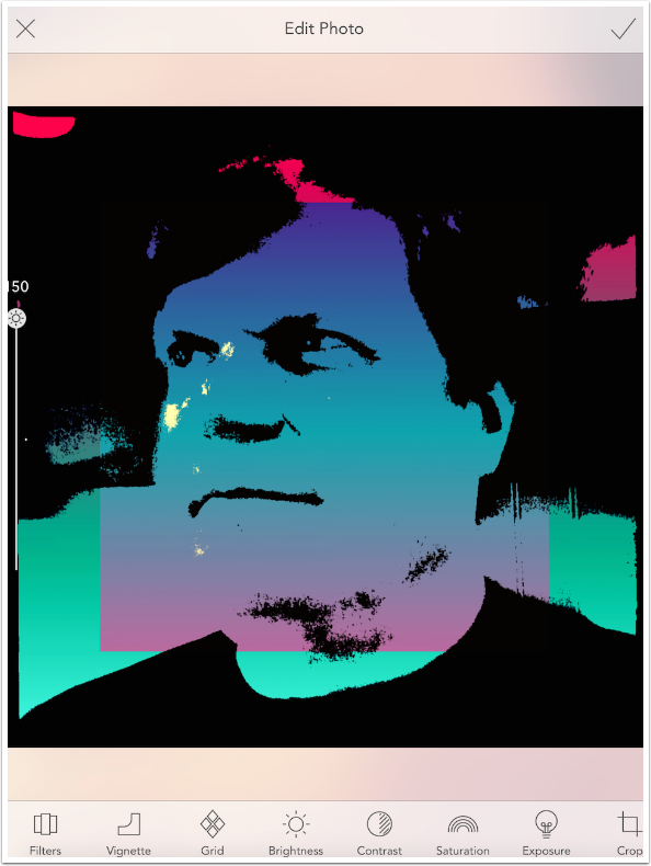
Now look what happens if the intensity is brought down to 50. Everything becomes muddy. The threshold no longer is producing crisp black and whites, and the rainbow color gradients are muddy also. Be careful how you swipe!
If you want to change the look of a Poster or Rainbow image, stick to Brightness and Exposure controls.
I returned to Retro filters and the three-section grid before tapping the check mark at the upper right to confirm the change and save the result. Below is the result image.
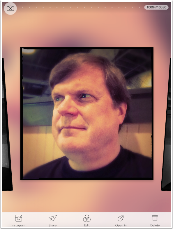
Colorburn takes you back to the Photo Library after saving. The saved image is now the most recent image, and will be shown in the library. You can send the image to Instagram, Share it in other social media, Edit it again, Open in another program, or Delete the image.
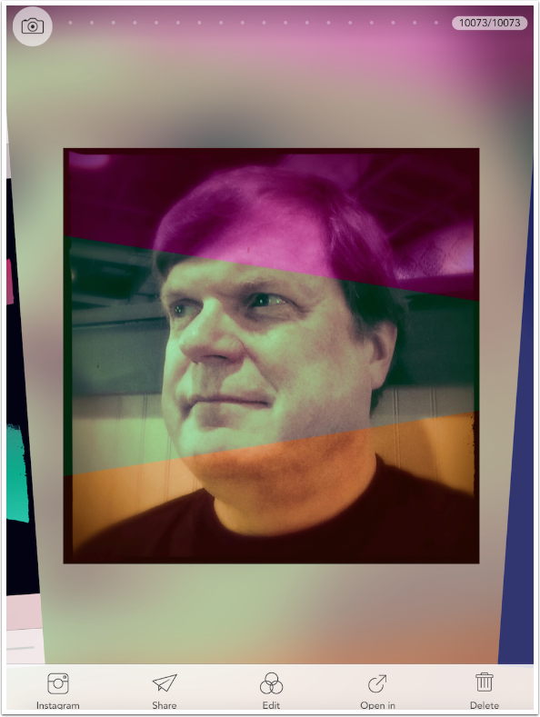
Below you’ll see the Share options. They include Propbox, another app from the same developers, and one I have not explored.
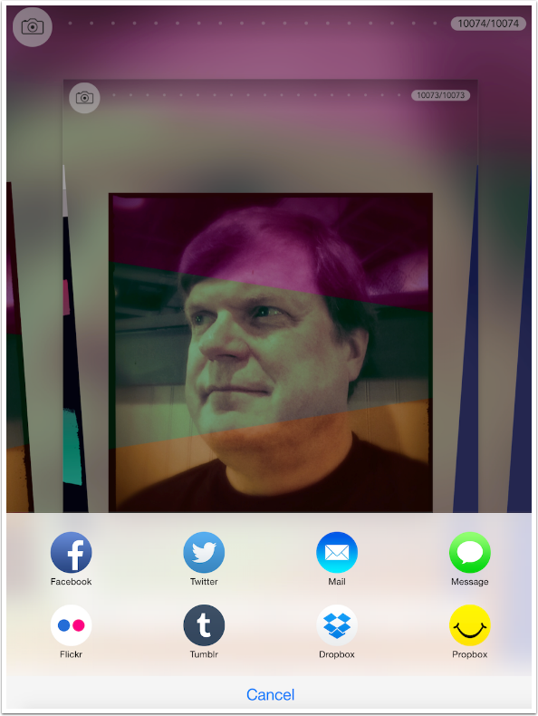
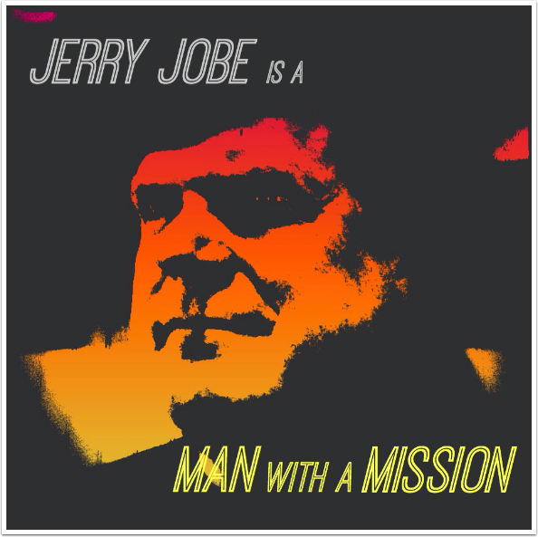
The “Open in” option is buggy, and needs work. I attempted to send an image directly to Phonto, and it seems to have sent a very small, thumbnail-sized image. So I just opened the saved image directly in Phonto, and added some text to this Rainbow-filtered image.
Colorburn, as I said, is a very nice program for the initial price. I am not convinced that the Grid packs are a worthwhile purchase. I almost think I’d spend another dollar to get rid of the Frame option entirely. But if I can get results like the image below at original resolution, then it’s a worthwhile addition to my arsenal.
And, of course, you can use it while app jumping as well. I took the following image through Brushstroke after Colorburn.
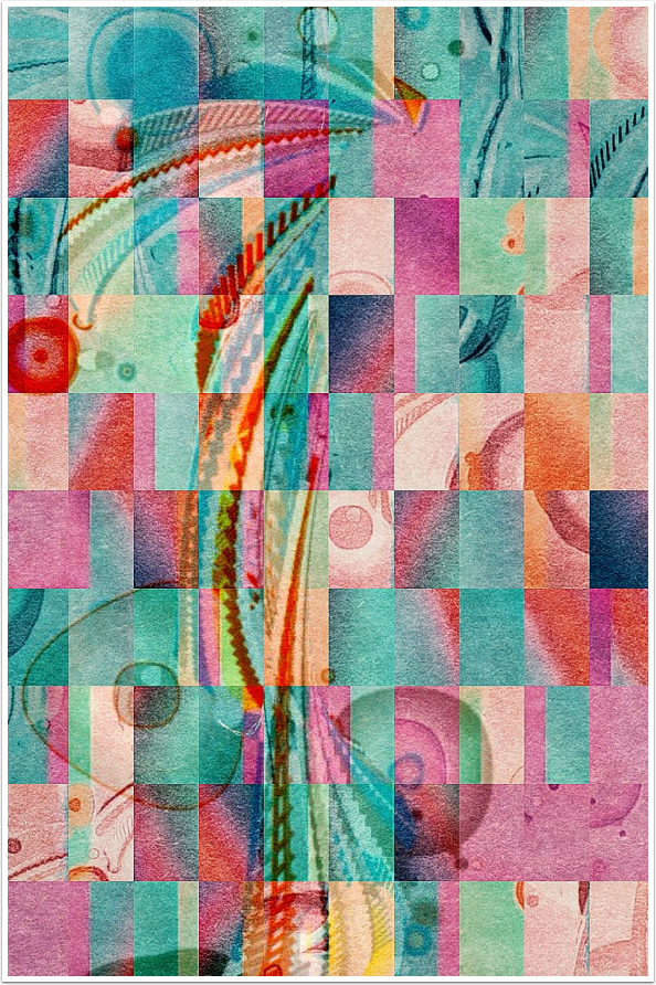
I’ll leave you with an image I called “The Girl at the End of the Pier”. It started in Code::Brush and was taken through Colorburn and Brushstroke. I finished with Tile, Blend and assorted other effects in iColorama. Until next time, enjoy!
Jerry Jobe
Never content with just scratching the surface of what an app can do, Jerry Jobe decided to pass on what he learned about imaging apps to others. He’s constantly trying to figure out just what tools other artists have used, and trying to incorporate them into his own work, in an attempt to find his style. He’s written tutorials on over 145 apps so far, which you can find (along with his Song of the Day entries) at http://enthusiasmnoted.wordpress.com/ He lives near Atlanta, Georgia, where he also finds a creative outlet in acting and directing in community theater.