Tips From Amazon To Make Your App Stand Out In The Soon To Be Crowded Amazon App Store
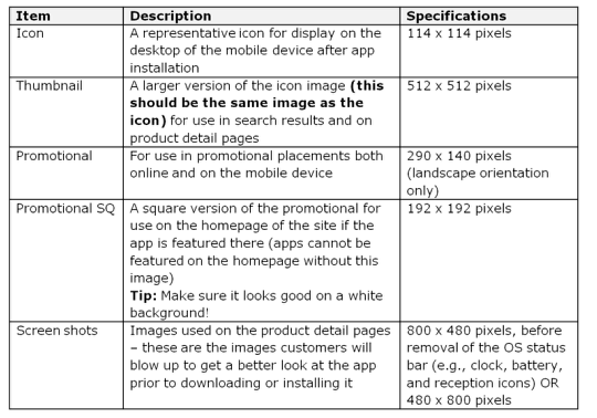
The momentum is certainly growing in the Amazon camp regarding their brand new Appstore for Android. They have now published some tips to help make your app really stand out. Take a look at this chart below…
Do’s and Don’ts
They have also published some Do’s and Don’t’s to help you on your way, these are the Do’s:
Do’s
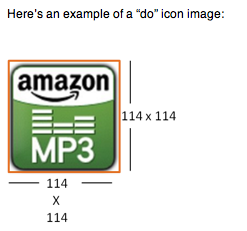
• Create separate app icons and thumbnails. These images should be the same with dimensions being the only difference between the two. This will be the first image customers interface with, so keep the image simple, vibrant, and most importantly clear.
• Fill the space required with all images. For icons especially, if your image is not a perfect square, or if it has a curved border enclosing the image, add a transparent background. Icons show up against both a white background and a black background in our store.If you have a non-transparent white background to fill the dimensions for the required image, it will look broken against the black background.
• Provide screenshots that really show what your app can do – put your (app’s) best face forward. This is your opportunity to show-off your app’s best features.
• Make sure you own the rights to the images you use. Think the top selling apps have cool images? The developers behind those apps think so too. So, if you want to use someone else’s images you must prove that license-free images are indeed free, you own rights to and/or can use the images without a license, or have permission to use licensed images.
• Use high resolution images only – stretching and morphing images just to fit our required dimensions will look … well, stretched and morphed. Aka, not great.
Don’ts
• Use whitespace to fill the required dimensions
• Cut out important parts of the image (think about all those old family pics where no-one has feet. Looks funny, right?)
• Watermark the image or try to alter the colors from the real color (this is especially important for screenshots. Altering the colors and/or image for screenshots alters the customer’s expectations. Altering the colors for the icon leaves customers with an inconsistent experience and they’re not sure if this is the “real” version of the app.
• Squeeze words into the image or icon – remember, your picture is worth a thousand words! You don’t need to tell a story on top of the picture. If there’s text you think is important to include with your app listing, include it in the details about the app so we can use it on the detail page for that app.
• Add a wannabe iTunes app sheen (you don’t need to put a glossy 3D effect over your icon)
• Add a drop shadow to the bottom or around your images. When the images are small, the drop shadow can look like a mistake or smudge.
• Stretch your images to meet our requirements – stretching just makes them pixilated and looks bad.
Joanne Carter
Joanne Carter is a British photography journalist, editor, curator, and the founder of *TheAppWhisperer.com*, one of the world’s leading platforms dedicated to mobile photography and art. Since its launch in 2009, TheAppWhisperer has become an international hub for artists of all levels to discover, learn, exhibit, and engage with contemporary photographic practice.Built on principles of inclusivity, accessibility, and artistic excellence, Joanne has spent almost two decades championing mobile photography as a serious artistic medium. Through interviews, critical essays, exhibitions, competitions, and education, she has helped shape and document the evolution of mobile art on a global scale.Her work has taken her internationally, lecturing on photography and mobile art at institutions and events including the Museum of Art in Seoul, South Korea, alongside appearances in the UK and Europe. She has served as a juror for international photography and mobile art awards across Portugal, Canada, the United States, South Korea, Italy, and the UK.Joanne is also the founder of *TheAppWhispererPrintSales.com*, one of the first online galleries dedicated exclusively to collectible mobile art, connecting artists with collectors across Europe, the United States, and Asia.Before founding TheAppWhisperer, Joanne worked extensively in print journalism and photographic publishing, including roles at a paparazzi photo agency and as deputy editor of a leading photography magazine. Her freelance journalism, criticism, and commentary have been published widely in both the UK and the US, with bylines in *The Times*, *The Sunday Times*, *The Guardian*, *Popular Photography*, *NikonPro*, *DPReview*, *Which?*, *Vogue Italia*, *LensCulture*, the *BBC*, and more recently, the *Financial Times*, where her published letters on photography continue to contribute to wider conversations around the medium.Alongside her editorial and curatorial work, Joanne’s own photographic practice has been exhibited internationally across the UK, Europe, South Korea, and the United States. Her work increasingly explores themes of grief, loss, death, memory, and the body.Her current research interests centre on grief, death, and poverty, with forthcoming postgraduate study leading towards doctoral research in these areas.Joanne is currently developing new long-form writing and photographic projects and is available for commissions, editorial projects, speaking engagements, and collaborations.Contact: joannetheappwhisperer@gmail.com)