
TangledFX – iPhone Photography App Tutorial – Part 2 – By Jerry Jobe
We’re delighted to publish the second of a three part special series of iPhone Photography Tutorials with the app TangledFX by our incredibly talented Tutorials Editor, Jerry Jobe, don’t miss this. If you missed Part 1, please go here. (foreword by Joanne Carter).
If you haven’t picked up TangledFX yet, you can download it here.
‘In part 1 of our discussion of Tangled FX, we looked at the basic interface, and saw how you can turn your photos into illustrations with the presets available. We discovered that the presets are too intense for normal use. This time, we’ll see how to adjust the presets through the use of sliders to achieve a more subtle, pleasing effect.
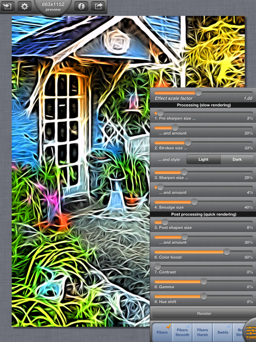
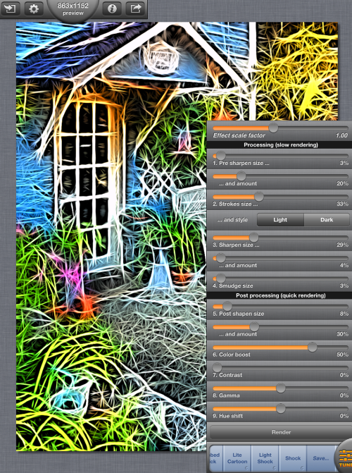
We’ll begin with the same image I used last time, the curio shop. I tapped the Tune button at the lower right, which brought up a series of sliders and buttons that will affect our results. The preset Fibers is a result of the sliders being at their current settings; there is no processing done in a preset that is not a result of using different values for the sliders. (That’s all a way of saying there’s no hidden processing in Tangled FX that you cannot control).
There is a division of work within the sliders. The Processing sliders at the top dictate how the lines and smoothing are handled. Changing these sliders result in longer processing, because the app has to redraw the image whenever they are changed. The bottom group is post-processing, changes that are made after the image is drawn. Changes to these will execute much faster.
Right above the presets is the Render button. Changes made by sliders are not made real-time – the processing sliders take too much time for instant feedback. Therefore, you can make several changes to slider, and then hit Render to see how they affect your image.
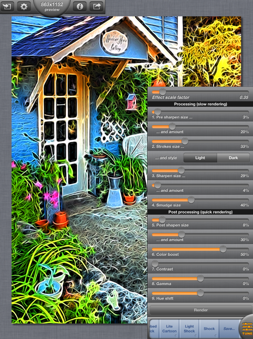
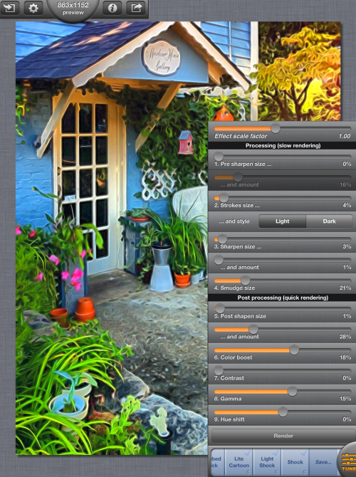
The top slider, Effect Scale Factor, is a master slider for all the processing (not post-processing) sliders. Changes to it are a quick and easy way to scale the total effect up and down. Above, you’ll see that the default Effect Scale Factor for all presets is 1.00. Below you’ll see what happens when the only change made is to ESF, bringing it down to 0.35. Now you can actually recognize objects like planters and the bird house.
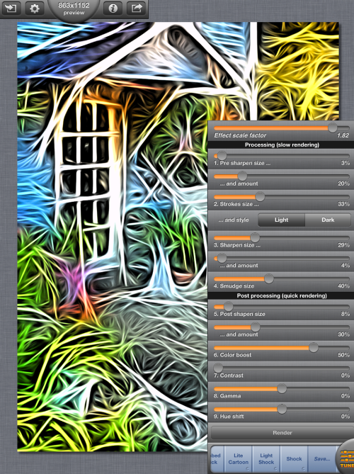
You can also emphasize the effect as below, cranking up the ESF to 1.82.
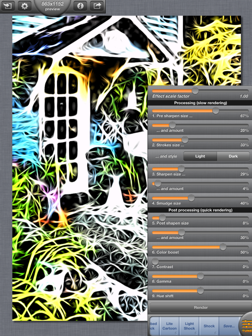
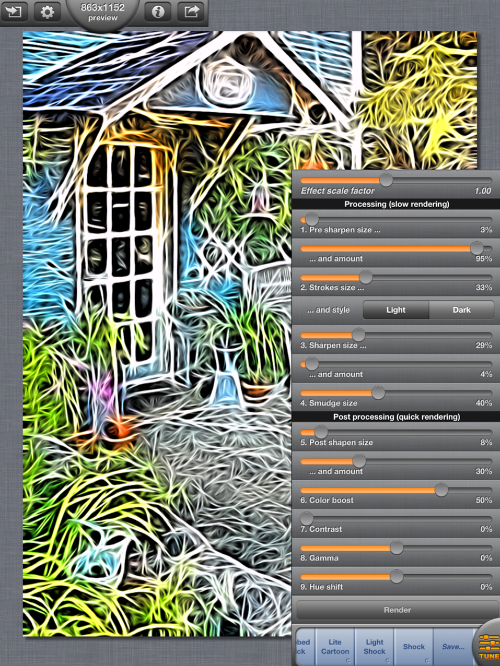
There are two sets of Processing sharpening sliders. They use an edge sharpening method, which boosts the contrast along the edges in the image. The size sliders dictate how large the edges must be to receive this sharpening, and work like the Threshold settings in other apps that use edge sharpening. A low setting will sharpen small details, while a high setting will only go after the large structural edges, such as those present in the door.
The amount sliders will work like the Radius settings for edge sharpening, controlling how far from the edge this boost in contrast will spread. The practical result is that as the Amount setting is increased, more of the image is forced to pure black and white, and you will lose the colors in the image.
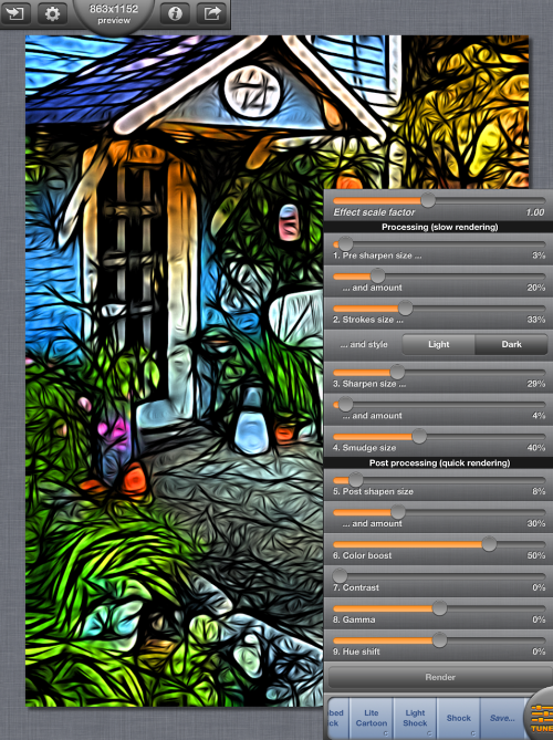
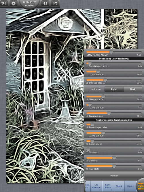
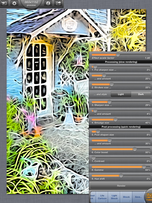
Strokes size, simply enough, affects the width of the strokes. Once this setting gets above 10% or so, blurring eliminates much of the detail in your image. Stroke style is a simple choice: light or dark. This affects the edges of the strokes. Below you’ll see the dark edges on strokes at 33%.
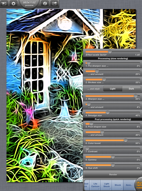
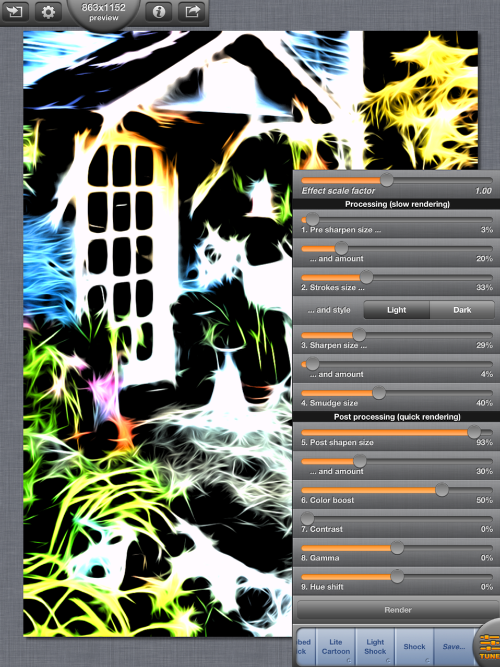
The next two sharpening controls are applied after the strokes are made, emphasizing the edges of the strokes. Below you’ll see the post-stroke sharpening size at a high level.
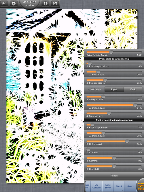
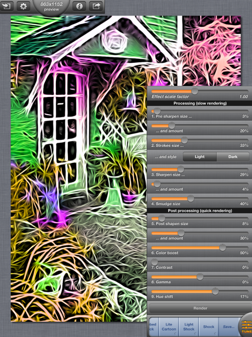
In the example of post-stroke sharpening amount below, you can see this high setting leaching all of the color out of the image by forcing all to white or black.
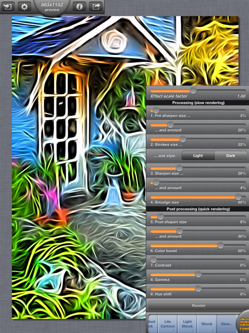
Smudge size affects how the strokes flow. A low setting, as shown below, allows the strokes to more closely follow the edges in the image. Short strokes allows for better fitting to the edges.
A high setting on Smudge size makes the lines longer and more flowing. Corners are rounded, and objects are smoothed together. The planter to the right of the door seems to flow right into the concrete below it.
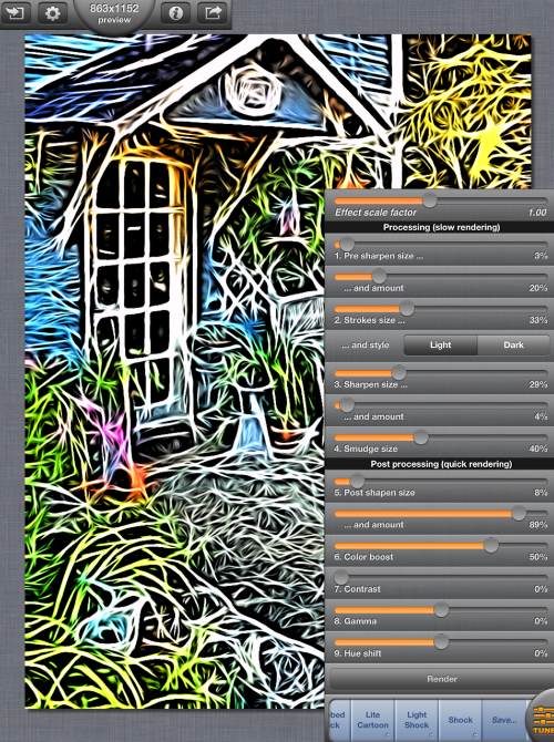
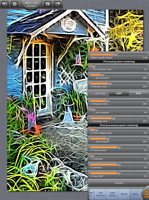
The remaining controls affect the image after all strokes have been made, sharpened and smudged. The calculations made post-processing are minor and are rendered quickly. The first setting is yet another sharpen size…
…and amount.
Color Boost is the Saturation control. By moving the slider to the left you can desaturate the image, while moving it to the right adds saturation.
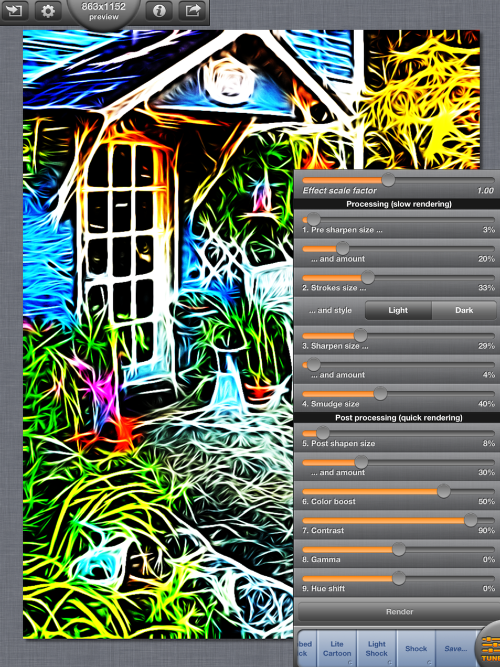
The Contrast control is only used for adding contrast, not removing it. It goes from 0% at the left to 100% at the right.
Here the contrast is boosted to 90%.
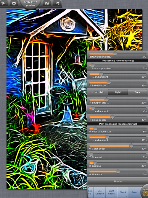
The Gamma control is Brightness. It starts out in the center at 0%. You can darken the image by moving the slider to the left.
Or brighten the image by moving the slider right.
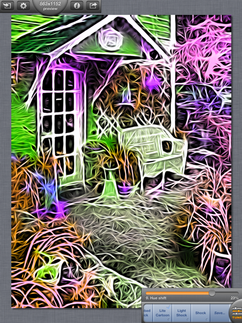
Finally, there is Hue shift if you want to play with the colors of the photo and make them unnatural.
Tapping the Tune button will collapse the sliders down to the one last used. When only a single slider is present, there is no need for a Render button – the change in setting will automatically happen when you release the slider.
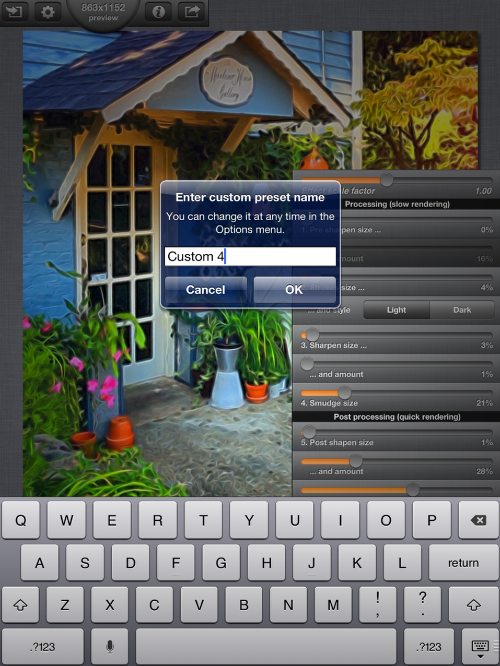
Once you’ve adjusted the sliders and found a setting you really like, you can save it as a preset. Changing any slider will add a Save button to the right of the preset list on the bottom of the screen.
Tapping the Save button will bring up a dialog box to allow you to enter a name for your preset.
My closing example today will show you the power of the Effect Scale Factor slider. Changing just that slider, since you are not changing the saturation, gamma, contrast or hue, will allow for easy blending of two images into one. In the photo below, I’ve scaled down the Brush Strokes preset so that the facial features are close to natural.
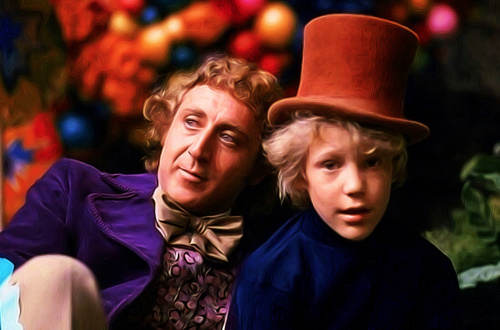
Then I raise the ESF to get a flowing, painterly feel to the image. However, I hate what it does to the faces.
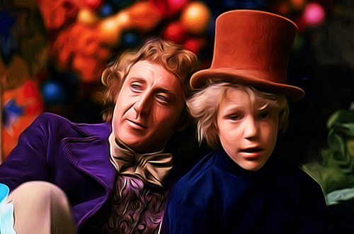
So I take the two different versions into a blending app (I used iColorama) to simply mask the faces from the first into the second, I don’t have to retouch anything to make it blend well.

Next time we’ll look at how to import/export your presets, as well as the app settings. Enjoy!
Jerry Jobe
Never content with just scratching the surface of what an app can do, Jerry Jobe decided to pass on what he learned about imaging apps to others. He’s constantly trying to figure out just what tools other artists have used, and trying to incorporate them into his own work, in an attempt to find his style. He’s written tutorials on over 145 apps so far, which you can find (along with his Song of the Day entries) at http://enthusiasmnoted.wordpress.com/ He lives near Atlanta, Georgia, where he also finds a creative outlet in acting and directing in community theater.
One Comment
José Freitas
Great tutorial.