Mobile Photography Tip Of The Day – Number 11
Welcome to another brand new section from your favourite mobile photography website and one of the most popular in the world. Today, we’re publishing our eighth Mobile Photography/Art Tip Of The Day to our brand new section of the site.
Every day we will publish a short quick tip to help you with your mobile photography, this may be related to editing your image, capturing your image, printing your image, all manner of things, across the complete photographic and art mobile genre – we’ll be featuring great mobile street photography tips, great blending tips, great cloning tips, we will cover it all from some of the greatest mobile photographers and artists in the world.
We’ll also have a widget in our right hand column, displaying the Tip of The Day every day, just click on that and you will be taken to our tip of the Day archive.
We are delighted to publish our eleventh Tip Of The Day, with three-in-one from our Head of Technical Tutorials, David Hayes. If you’ve not had a chance to check out David’s Technical iOS app tutorials, then we highly recommend you go here. Over to you David… (foreword by Joanne Carter).
Tip of the Day:
K.I.S.S.

K.I.S.S.! As in “keep it simple, stupid!”
-or-
Composition, composition, composition!!
-or-
Just because you can, doesn’t mean you should!
Okay…so these are three tips…but they all are of the same mind. Keep it simple. It is as…well…as simple as that.
Always keep in mind that you are conveying a story, a feeling, a thought, an emotion…with any image you create. And you only have a short time…a nanosecond…to do it in before the viewer moves onto the next image. Keeping things simple means they’ll “get it” right away…and then maybe stay awhile longer…
It’s all in your composition. The placement of key elements, how you use color or the lack of, exposure, focus points…all of that. Each element must compliment and support each other element. Not a simple task to do, but you have to make look like it was…
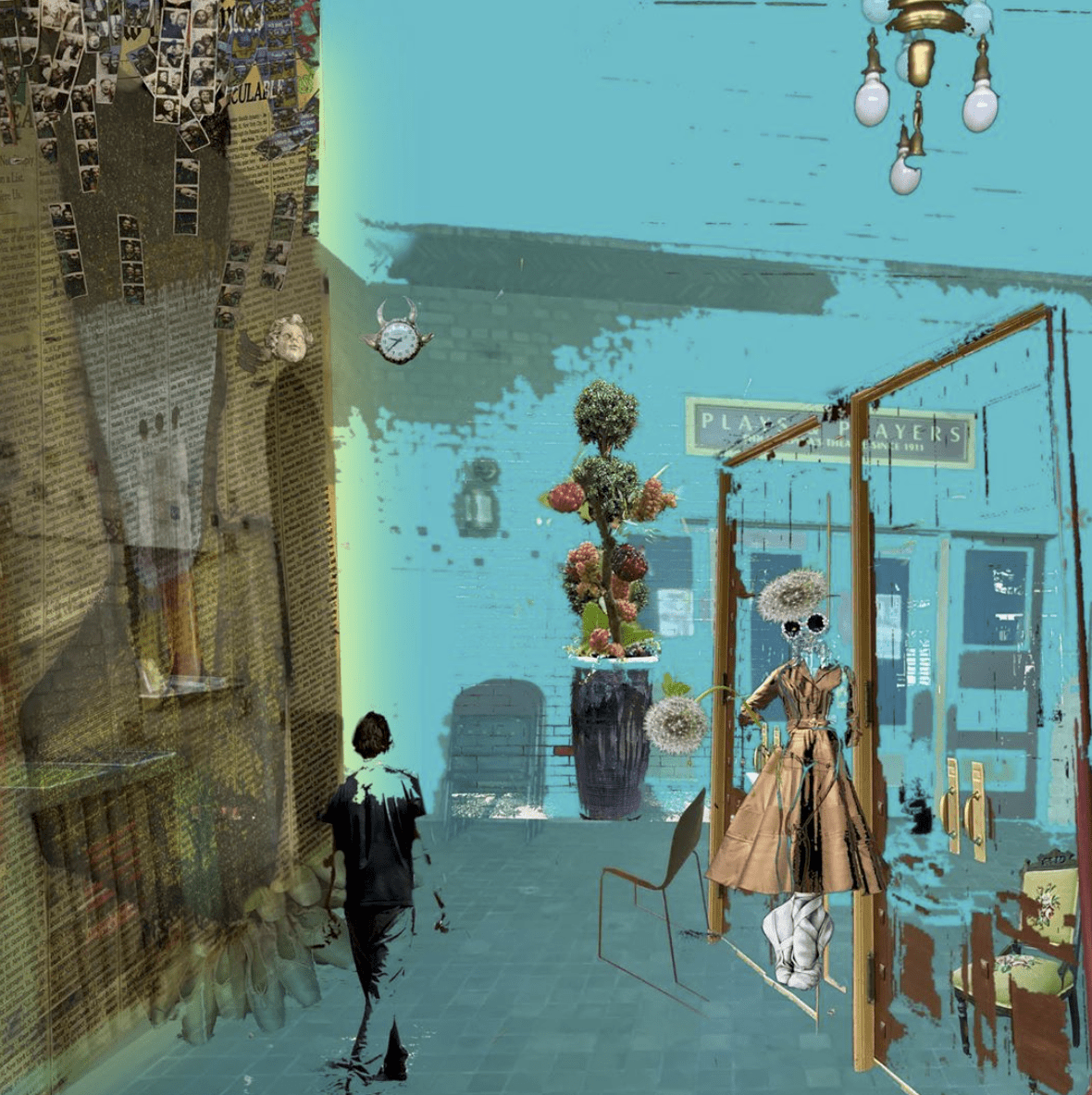
This next thought is coming from someone who has hundreds of apps…more than he knows what to do with half the time. Just because I have them, doesn’t mean I need to use them all…at once…on the same image. Decide before you even open an app…how is it going to help you tell your story? If you can’t answer that question…then don’t use it! Can you do it with just one app? Two? No more than three? Layer upon layer upon layer doesn’t necessarily make for a good composition. Remember…keep it simple.
One last thought. When does an image cross over the boundary of “iphoneography” and become “digital collage”? Just wondering.


6 Comments
Janine Graf
I could not agree more with you even if I wanted to David! 🙂
David
I know what you mean, Janine. I know what you mean….
My next tip will be entitled “Bacon and Boobs….Hold The Mayo!” I haven’t decided what it will be about…still working on that…but at least I have the title!
Janine Graf
Literally laughing out loud! 😀
Dave
Sure…you can laugh. But have you ever tried to get mayo out of your apps? Stuff gets into everything!! I’m sticking with Miracle Whip…
Poetic Medium
Photography vs Illustration? Good question.
Dave
Indeed it is! And I won’t even ask if it’s art….