
iPad Photography Tutorial – iColorama Update 3.85 – by Jerry Jobe
We’re delighted to publish Jerry Jobe’s latest tutorial looking at the latest update to iColorama 3.85. It is a very extensive update and we know you will appreciate this wonderful tutorial very much, over to you Jerry…(foreword by Joanne Carter).
iColorama for iPad retails for $2.99/£1.99 and you can download it here.
iColorama S for iPhone retails for $2.99/£1.99 and you can download it here
‘iColorama 3.85 – Lots of goodies
While I was off talking about Pixelmator, there was (as usual) a lot going on with iColorama (and the sister program for iPhone, iColorama S). So much that it becomes difficult to cover everything in much detail.
This will cover many of the new features of iColorama 3.85 and iColorama S 3.85. The two apps, for iPad and iPhone respectively, have (for the most part) matched capabilities as the release numbers have come into sync. I’ll try to note any differences’.
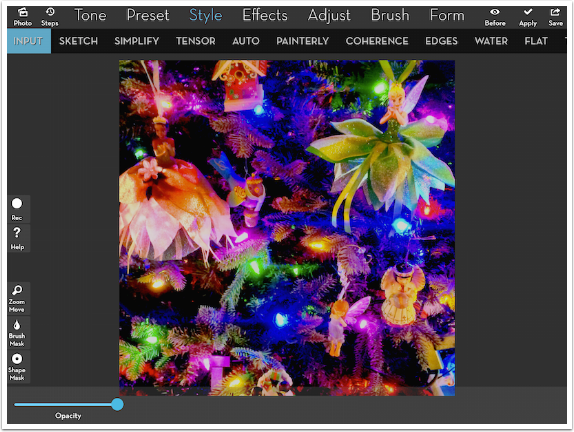
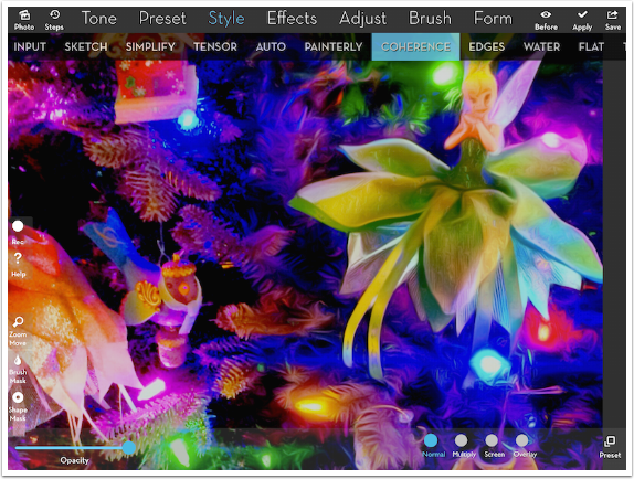
We’ll start with Tensor. Introduced in Release 3.84, the painting style has reduced the settings and presets to one. Below you’ll see the image I’m working with – detail of a Christmas tree.
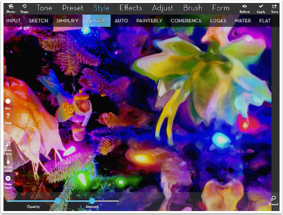
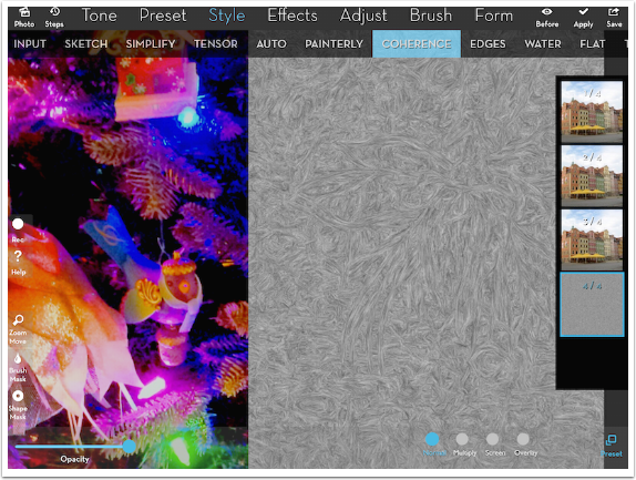
Below I have zoomed in and split the image so that you can see the unchanged image on the left, and the effect on the right. This split screen masking is a new feature that will be covered later in this tutorial.
There are two presets in Tensor; the second is a multicolored image that works to distort a photo loaded on top, as described in the Release 3.83 tutorial. The controls for the first preset are limited to an Amount slider that defaults to 50%. As you can see, that gives a wonderfully smeary painted look.
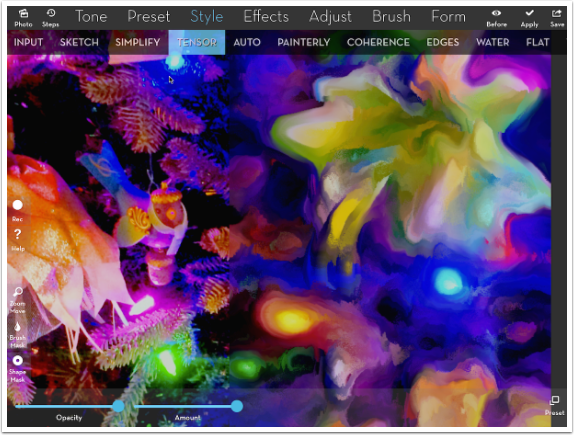
Increasing the Amount to 100% loses even more detail; reducing Amount to less than 10% gives a nice, subtle result.
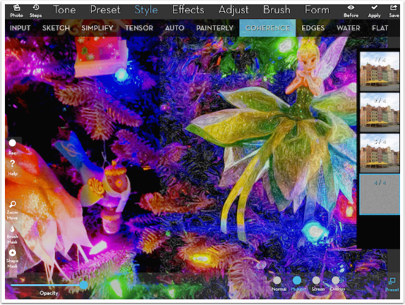
Coherence is a new Style that combines Simplify and Flow to create an illustrative look. On the iPad, Preset 1 is automatically applied when Coherence is chosen; on the iPhone, the preset must be chosen before any processing takes place. All presets are processor intensive, and may take a while on your device.
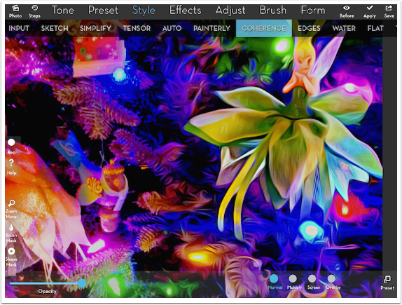
Below you’ll see Coherence preset 2, which produces a stronger, darker edge.
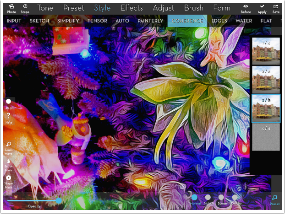
Preset 3 seems to do some flattening along with the Coherence, as shown below.
The fourth preset does a low-contrast black-and-white treatment of the image, which is not that useful in Normal blend mode. Luckily, the blend mode can be changed with buttons at the lower right.
Below you’ll see the results of preset 4 in Multiply blend mode. It produces a sketchy look.
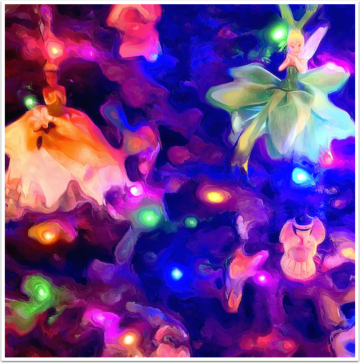
I call my finished image “Tensor and Tinsel”. It uses a mask over some of the ornaments. Outside the mask, Tensor was applied, while inside I used Coherence 1.
Back in my discussion of Release 3.83, I showed how it is possible to load brushes from an ABR file into iColorama. That same method can now be used to import True Type fonts. I won’t repeat the process here, since the methodology is so similar; just take a look at that tutorial from just two months ago.
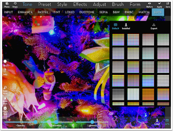
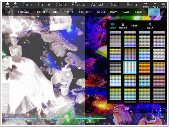
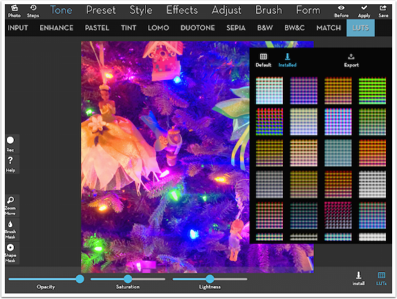
There’s another new feature in iColorama that enables loading of user presets: LUTs. LUTs are color Look Up Tables, and they map one color to another. All manipulations of color can be set up through LUTs: B&W, sepia, duotones, inversions, even “color splash” effects, where a single color remains in color while the rest is changed to B&W.
LUTs are under the Tone submenu. There are square thumbnails of the different available LUTs, accessed by touching the button at the lower right. You can get a basic impression of what the LUT does at a glance – whether it intensifies colors, removes color, makes everything sepia, etc.
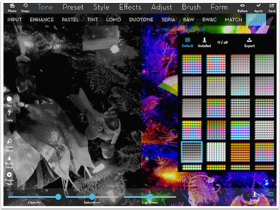
Let’s see some examples. First, I choose a B&W thumbnail, and the result is shown on the left.
The second example is a “color splash” effect, keeping the brightest blues and greens.
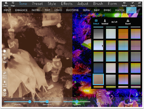
The third example is sepia.
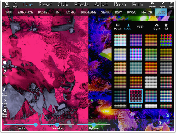
The iColorama Facebook group has set up a Flickr account for user-built LUTs, and below you’ll see one I downloaded and installed. It does an inversion to pink and blue.
So how do you go about creating your own LUT? You take in an LUT and modify it. Any modifications you make to the LUT will be made to the image that you apply the LUT to. You can take an already existing LUT by Exporting the LUT (see the Export button in the LUT thumbnail window above). Any further changes you make will be in addition to the changes already made by the LUT. Conversely, you can start with a totally neutral LUT, which makes no changes by itself. You do that in the Open dialog, seen below.
Below you’ll see the neutral LUT. Remember, it makes no change to the colors when you apply it.
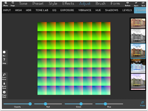
Below I’ve used Adjust>Channels>4 to reduce the Red and Blue and increase the Green. I also increased the contrast by using Levels (not shown) before saving the LUT to my Camera Roll.
LUTs are installed from the Camera Roll, using the Install button at the lower right when LUTs are chosen.
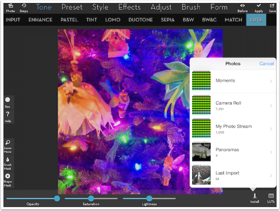
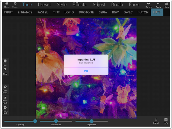
When you select an LUT from the Camera Roll to install, the following dialog box appears.
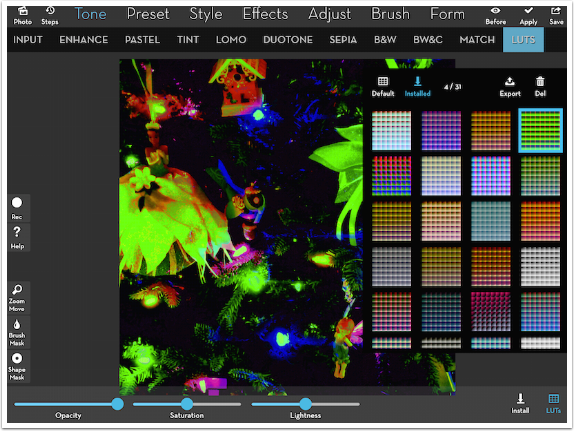
The Installed LUTs are accessed by tapping the Installed button at the top of the thumbnail window. At present, there is no way to predict where your new thumbnail will appear within the list. My newly-loaded LUT now shows up at the end of the first row, rather than first or last within the entire list.
Below you’ll see the results of my LUT: lots of green and increased contrast. It really does nothing for me, so I delete it by tapping the Del (trashcan) button. Keep loaded brushes, fonts and LUTs to a minimum to save on application space!
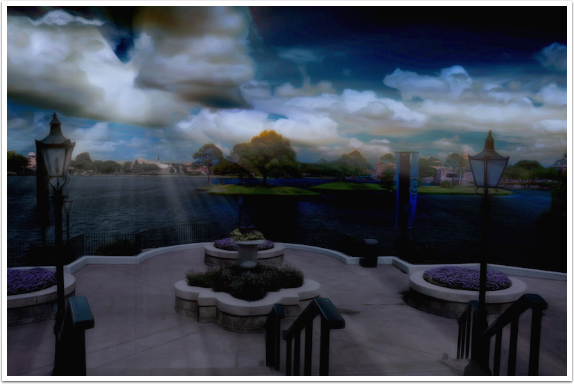
I think you’ll really like LUTs if you give them a chance. I used Default #29 for a “day for night” look in the image below.
If you look at the far-left edge of the workspace, you’ll find a new white circle button. This button is used to record a movie of the process you use in creating your image. Tap it once, and it turns red. From that point everything you do within iColorama is recorded until the point that you tap the Record button again, changing it back to white. I’m including a sample video, recorded on my iPhone using iColorama S, that shows using the sliders on Style>Flat>14 to create a drop-shadow-like effect. As you can see, you can’t record audio at the same time, so it’s not as useful for recording complicated processes, but it helps convey an idea of the steps taken in real time.
[youtube=http://www.youtube.com/watch?v=O24_SjnKKwI]
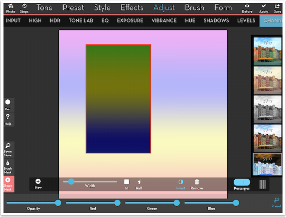
There are several changes made to masking in iColorama 3.85, and the first I want to show is the capability for rectangular masks (not yet available in iColorama S). In earlier versions of iColorama, you had a choice between Brush masks and Circle masks. The Circle Mask button has been changed to Shape mask, with the addition of rectangles.
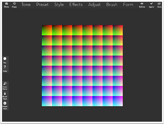
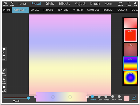
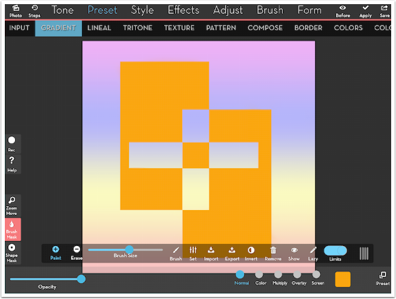
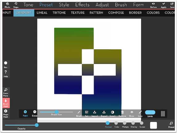
But before showing you the mask, below you’ll see a screenshot of a new Preset>Gradient setting (available only on the iPad) that allows you to include four user-defined colors in a gradient. Each color is changed by tapping the round button on the gradient bar at the center of the bottom, then using the square color picker to change the color. The round buttons on the gradient bar can be moved to apply transitions that are more rapid or more spread-out.
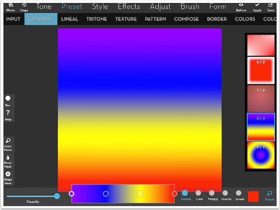
Below I’ve changed each of the four colors to more pastel versions.
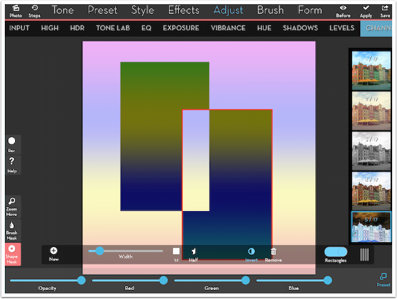
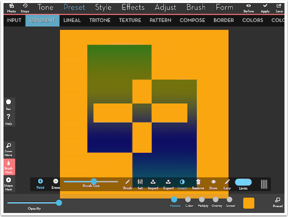
I bring up the Shape mask and flip the Rectangles button at the right end of the mask toolbar. The flip of the switch changes the other buttons and sliders on the toolbar. (I used the Half button above to show the effects of Tensor and Coherence.) The New button is pressed to add a new rectangle to the screen. The height of the rectangle is changed with a two-finger pinch, while the width is controlled by the slider in the toolbar. There are no control handles on the rectangle as you might see in other apps.
I have inverted the mask so that the changes I make affect the interior of the rectangle rather than the exterior. The change I’m making is Adjust>Channels>5, which inverts the image, like a negative.
I hit Apply, then move the rectangle. Applying Channels 5 again inverts the section in the middle back to a positive image. Finally, I added a third short, thin rectangle (not shown) using Channels 5 to invert the colors. Rectangle masks come in handy in making borders for your images. I’ll show you that use at the end of the tutorial.
Brush masking can be a tedious job. Getting the mask to hug the edges of an object that you want to “cut out” is a trial-and error process, brushing and erasing and zooming in and out of your image. But there are two tools in the new version of iColorama that aid in the creation of complicated brush masks: Limits and Lazy. We will look at Limits first.
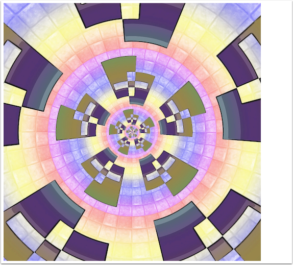
Below I’ve chosen an orange overlay to apply using Presets>Gradient. I brought up the Brush mask toolbar and flipped the Limits switch at the right end. I increased the size of the brush and stroked over the right side of the image, which I knew would be the pastel background.
Look at the results! When the masking brush encountered the darker rectangles, it recognized that those were different colors than the pastels under my finger, and did not extend the mask into those dark rectangles. In addition, when the edge of the large brush encountered the pastels in the center, it masked them out as well, even though they were completely separated from where my finger was.
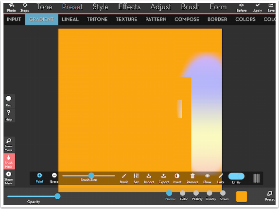
It’s quick work to mask right up to the edges of the darker area, as long as I keep my finger over the pastels.
By using the Invert button, I can force any changes I make to affect the inside or outside of the mask.
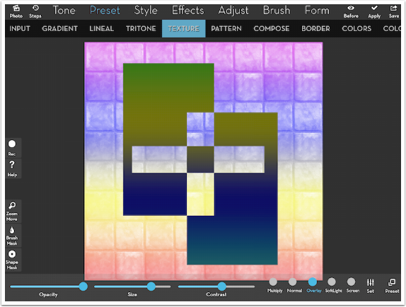
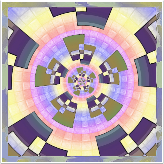
Below I’ve added a texture to the outside, where the pastel colors are.
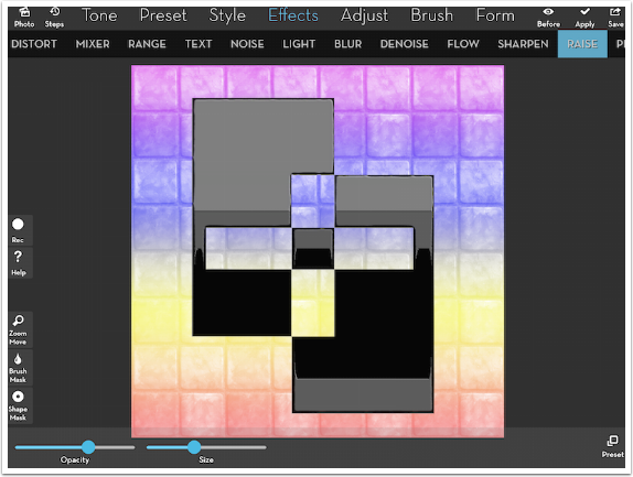
I Inverted the mask, and used a B&W LUT, Style>Flat>2 and Raise on the interior portion.
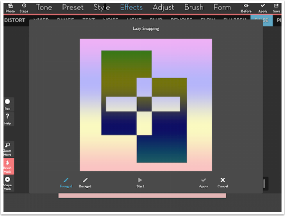
Lazy Snapping works like limits, but not as cleanly, unfortunately. A copy of the image is brought up in the workspace, and you have tools to mark the foreground and background areas before creating the mask.
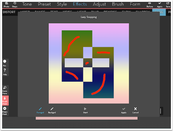
The foreground is marked in red. I make red strokes in the darker areas.
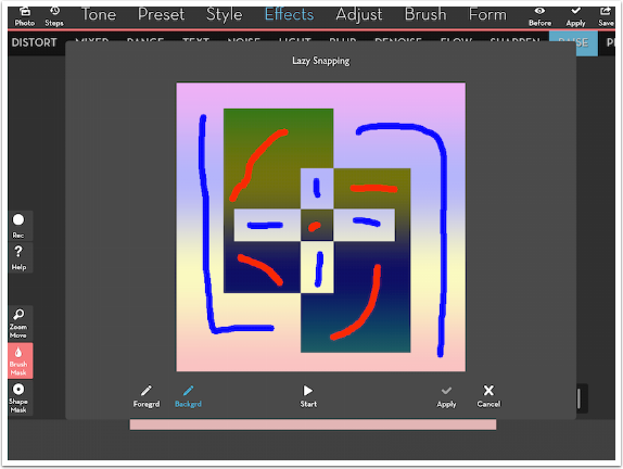
The Background is marked in blue. Then I tap the Start triangle to create the mask.
Even though the edges are fairly obvious, Lazy Snapping had some trouble with them.
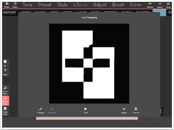
The resulting mask is easily cleaned up using Limits, as seen below, but Lazy Snapping is, at the moment, just an extra step in my opinion.
My result is nothing to be excited about at the moment, but I like what happens to it when I use Form>Deforms>1 on it.
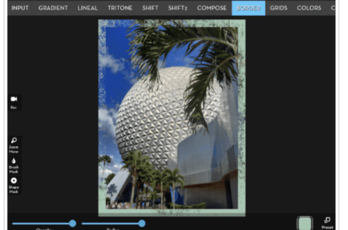
As I promised earlier, I can make an interesting border for the image by using a rectangular mask and then running the following steps on the unmasked edge: invert the colors using Channels 5; lowering the contrast with Adjust>Exposure; Tensor; and Coherence.
iColorama keeps getting better and better. Features that would merit major releases in other apps are thrown into iColorama in bunches. I think that Limits, Coherence and Recording are among the finest enhancements ever made to the program, and that’s saying a lot. Enjoy!
Jerry Jobe
Never content with just scratching the surface of what an app can do, Jerry Jobe decided to pass on what he learned about imaging apps to others. He’s constantly trying to figure out just what tools other artists have used, and trying to incorporate them into his own work, in an attempt to find his style. He’s written tutorials on over 145 apps so far, which you can find (along with his Song of the Day entries) at http://enthusiasmnoted.wordpress.com/ He lives near Atlanta, Georgia, where he also finds a creative outlet in acting and directing in community theater.
One Comment
Carolyn Hall Young
Thank you, again, Jerry! This is another fine tutorial for iColorama! Thanks to the App Whisperer, for publishing this valuable help.