Mobile Photography / Art Tutorial – Percolator: A Strong Brew
We are delighted to publish Jerry Jobe’s latest mobile photography/art video tutorial for our viewing pleasure. This time Jobe takes a look at the app Percolator. Take it away Jerry…(foreword by Joanne Carter).
Percolator retails for $2.99/£2.29 and you can download it here
“One of the effects of covering as many apps as I have is that you can begin to know, just by looking at an image, whether certain apps are being used. If the look of output from an app is particularly strong, that lessens its utility in my eyes. Of course, that may be because I am constantly trying to figure out how an artist achieves the look. These strong apps are obvious, able to be discerned at a glance. Percolator, today’s app, is the one I consider to be the king of these apps, in that the use of it is the most obvious effect I can imagine.
Percolator is from Tinrocket Apps, makers of This, Waterlogue and Popsicolor. It is a universal app for both iPhone and iPad. It can run in landscape mode on the iPad, but not the iPhone. My screenshots today come from the iPad”.
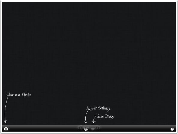
There is a spare user interface. You have four controls: Open, Adjust, Save and Help.
The Information screen is more promotional than helpful, inviting you to see images on Flickr or Instagram, follow their blog or email support.
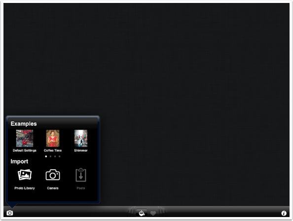
You can choose an example image to work on, Choose from your Photo Library or capture an image using the Camera. You can also Paste an image that has been saved into the Clipboard.
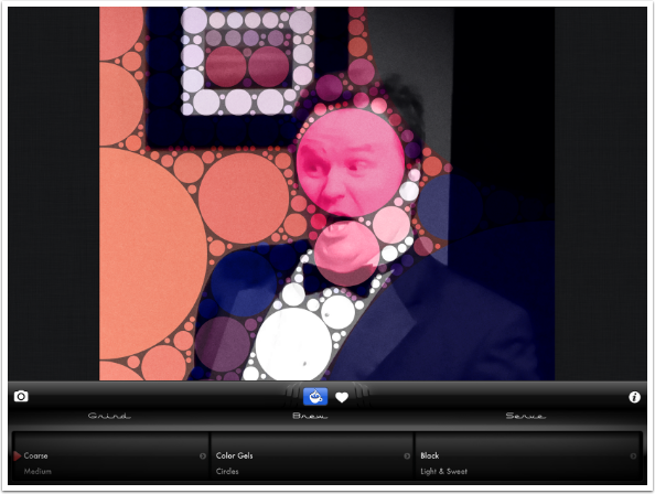
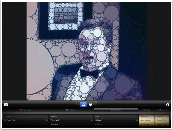
I’ve chosen a shot of an actor from a show I directed a few years ago, “There Goes the Bride”. I took the shot from the lighting booth, which resulted in a high perspective that included the edge of the set.
Once an image is loaded the Adjust panel automatically opens. Adjustments are gathered into three categories: Grind, Brew and Serve. Each category has multiple settings you can scroll or “spin” through.
The Grind is currently set to Extra Fine, and you can see a small arrow to the right of the dial. Tapping that arrow expands the control, allowing you to further control the Circles and Effect within the Grind. On the iPhone, expanding the category hides the other two categories, Brew and Serve, but they can be seen again by tapping the arrow to hide the expanded controls.
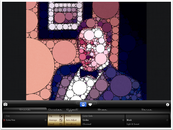
Once you change the expanded controls in the Grind category, you are asked to Re-grind. This takes some small amount of time. The other categories change in real time.

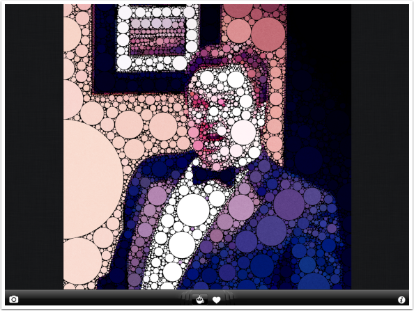
Here’s what the workspace looks like after re-grinding, using Tiny Circles and High Contrast Effect. In order to see the Adjust controls again, you will need to tap the coffee cup icon.
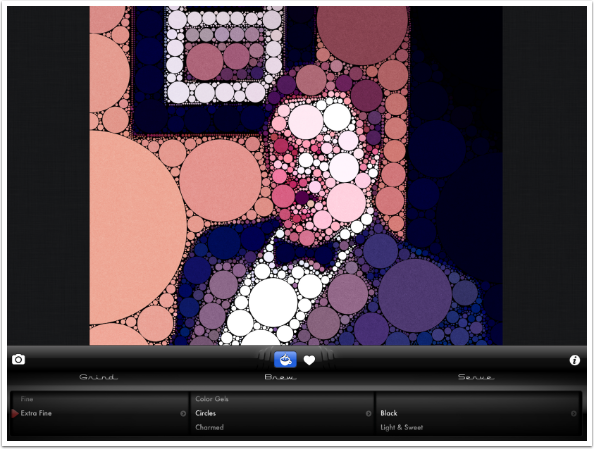
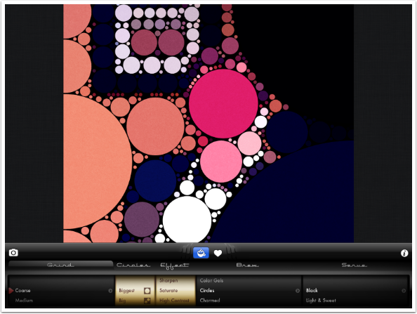
There are five sizes of Circles under Grind: Tiny, Small, Average, Big, and Biggest. There are seven Effects: None, Auto Adjust, Woodblock, Sharpen, Saturate, High Contrast, and Inky Edges. Here’s the Biggest/Saturate combination, which really gets into the abstract and obscures the original photo.
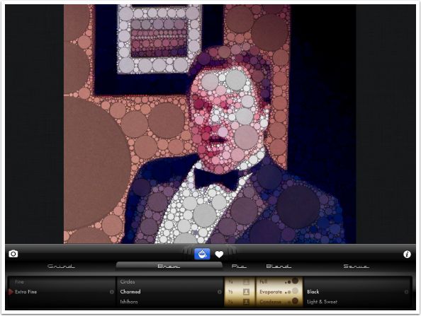
The Brew category changes the look of the circles that make up the image. The default is Circles. Below you can see the Color Gel setting, which makes the circles semi-transparent.
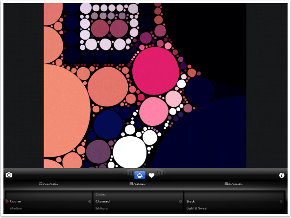
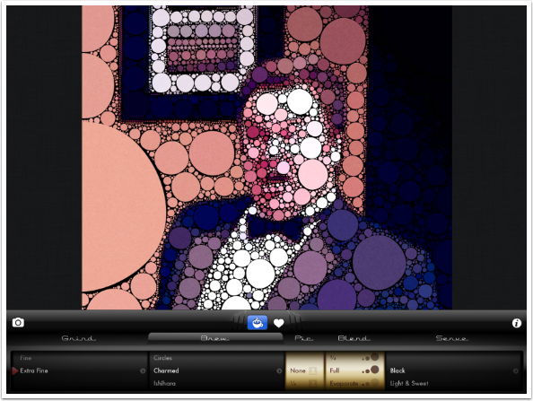
Charmed skews the circles somewhat, making them less than perfectly round. I like this look.
Ishihara lowers the tonal contrast between the circles, bringing them all into the midtone range.
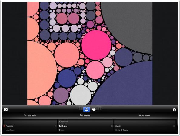
Rings gives you circles within circles.
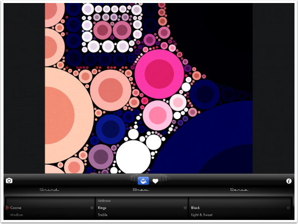
Treble gives a third level of circles within circles, as well as making some circles semi-transparent.
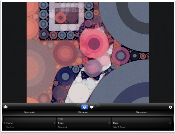
Overprint seems to take one Percolated version and overlay it on another.
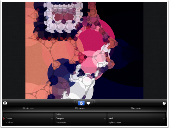
Tripstamatic is like the Treble setting. However, notice how the internal circles or rings are offset from the center. It also introduces more color variation.
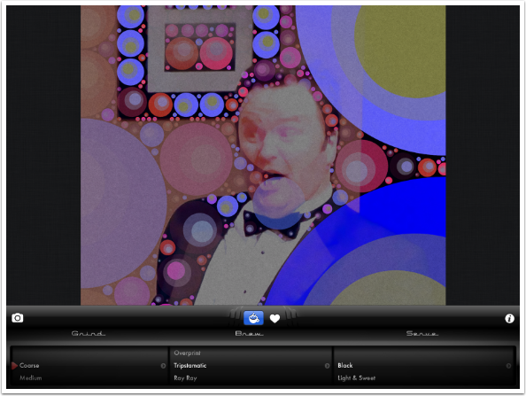
Ray Ray adds random rays emanating from the center of the individual circles.
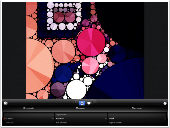
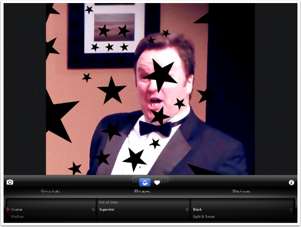
Full of Stars uses all black, semi-transparent circles with a single white star in the center. In this way, you are able to create a “constellation” version of your image.
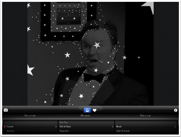
The last Brew setting is Superstar, which defaults to single black stars in the middle of fully transparent circles. The black is due to the black in the background, and would change depending on the image. I find this the least useful of the settings.
Of course, there are expanded controls for the Brew category as well: Pic and Blend. The default settings for the Charmed Brew option are None for Pic and Full for Blend. This means that None of the original image is showing through, and that the circles are Full opacity
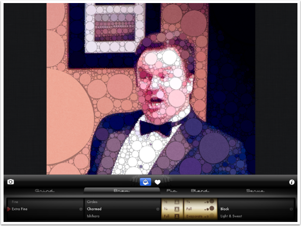
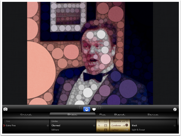
As I move the Pic setting from None to ¾, I begin to see more of the original image coming through. Available Pic settings are None, ¼, ½, ¾, and Full.
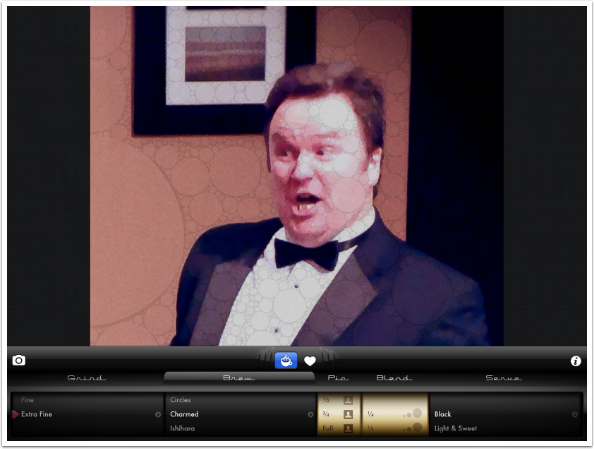
The Blend setting can’t be set to None – who needs the circles to be completely invisible? However, they can be set to ¼, ½, ¾, and Full. ¼ is a very subtle Blend.
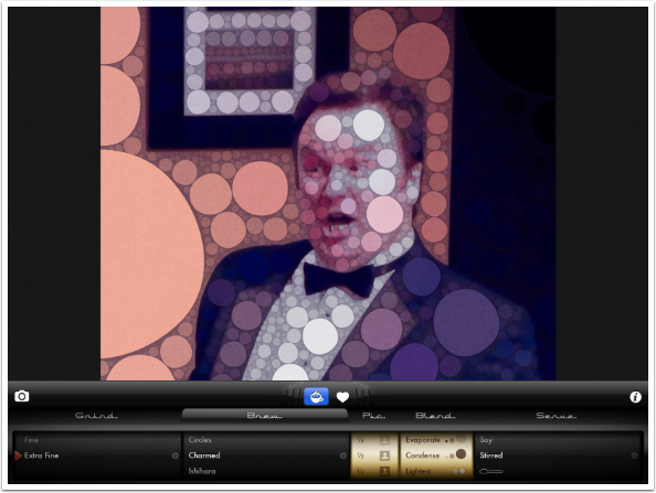
There are additional Blend settings. Evaporate makes the largest circles more transparent, while leaving the smallest opaque.
Condense is the opposite, leaving the largest circles opaque. Lightest and Darkest settings change the opacity based on the tone of the circles rather than the size.
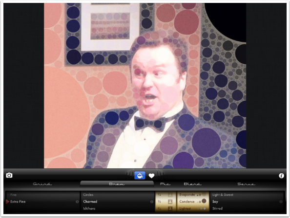
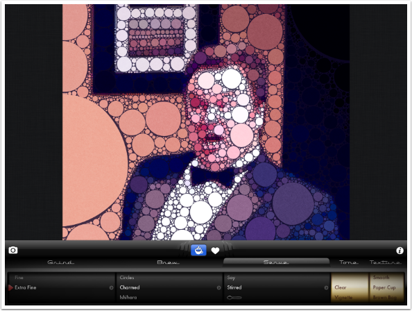
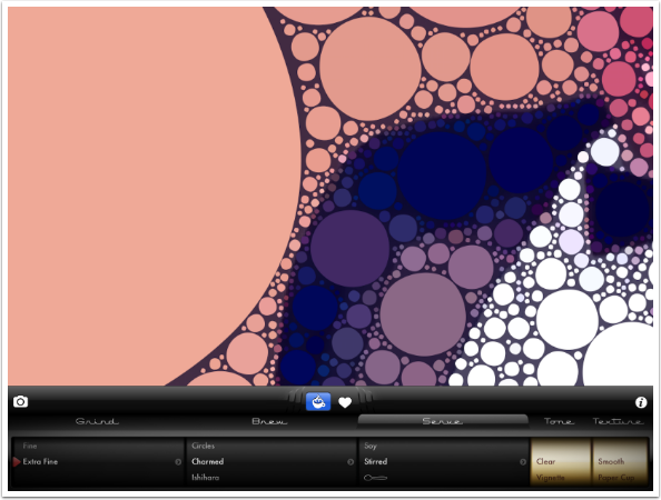
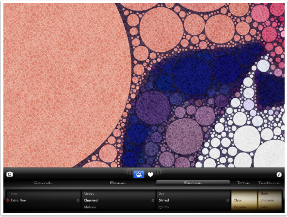
The options under the Serve category are named for how they change the spaces in between the circles. Black, which we have been using so far, is obvious. Light & Sweet uses a white “surround”, Soy (shown below) is a light tan, and Stirred is a more random color chosen from an amalgamation of the colors in the image.
You can see a little spoon beneath the Stirred option below. That gives the color an extra “stir”. As with real coffee with cream, after a few stirs the color will not change further.
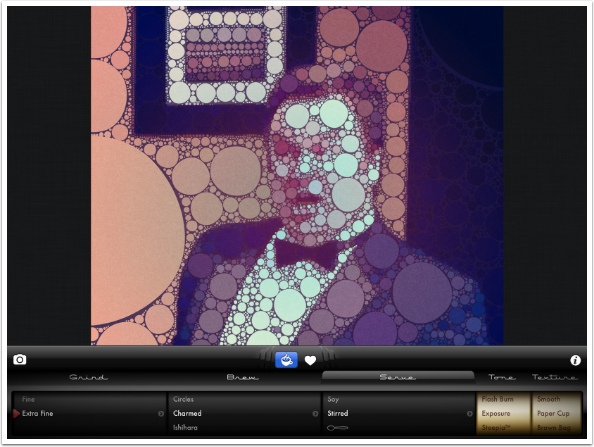
There are two extended controls under the Serve category: Tone and Texture. The Tone option changes the underlying image. These options include Clear, Vignette and Flash Burn.
Exposure works like a fade. Steepia is a sepia tone.
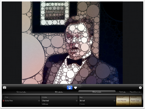
Sad Hipster desaturates the colors. Rise-n-Shine gives warmth. Cross-Perc is a cross-processed look.
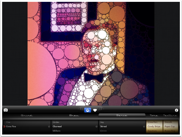
Candy Stripe adds a rainbow tint in vertical stripes. Spectrum is Candy Stripe with a fade. Saccharin is a purple tint.
Aspartame is a blue tint, and Sucralose is a yellow tint. None of these Tone options has a strength slider, and you can’t combine options, like adding Steepia and a Vignette.
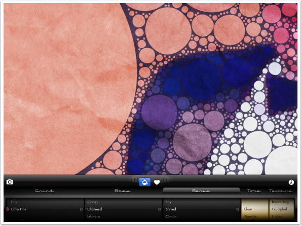
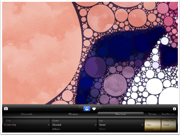
Textures apply to the entire image, both within the circles and outside them. I’ve zoomed in using a two-fingered pinch so you can more clearly see the textures. Smooth means no texture is added.
Paper Cup is what you’ve seen on the image throughout the tutorial. Brown Bag is a more intense version of Paper Cup. Crumpled (shown below) is as though the entire image was wadded up and then smoothed. Folded adds fold lines.
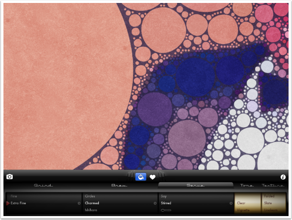
Slate is a nice rock texture.
Linoleum is an intense “tiled” look, while Patio is less intense. Napkin looks like a canvas, and Coffee Filter looks like fibers.
There’s even a Clouds texture. Once again, there are no intensity sliders on Textures. Consequently, I find myself using less intense textures if I use any.
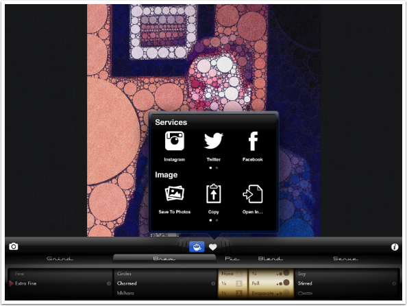
Once you’ve got a look you like, you are ready to save. Tap the Heart icon and a box pops up with options.
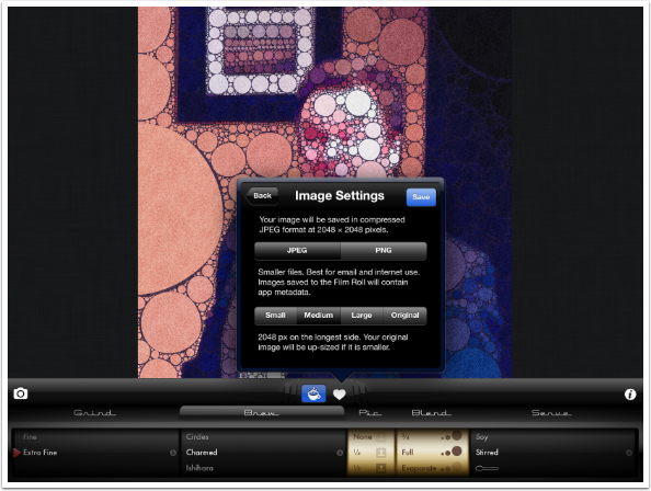
If you scroll the bottom row to the left, you will reveal a Settings icon. The two settings are shown below. You can save the output as a JPEG or an uncompressed PNG. Because the image is completely rebuilt using circles, you can save the output at a larger size than the original image. Medium will save at 2048 pixels on the longest side, while Large will save at 3072 on the longest side.
That reminds me: although my example images here are all square, Percolator will work with portrait and landscape orientations just fine.
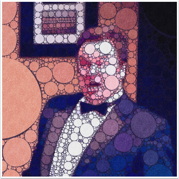
Here is my saved image from Percolator.
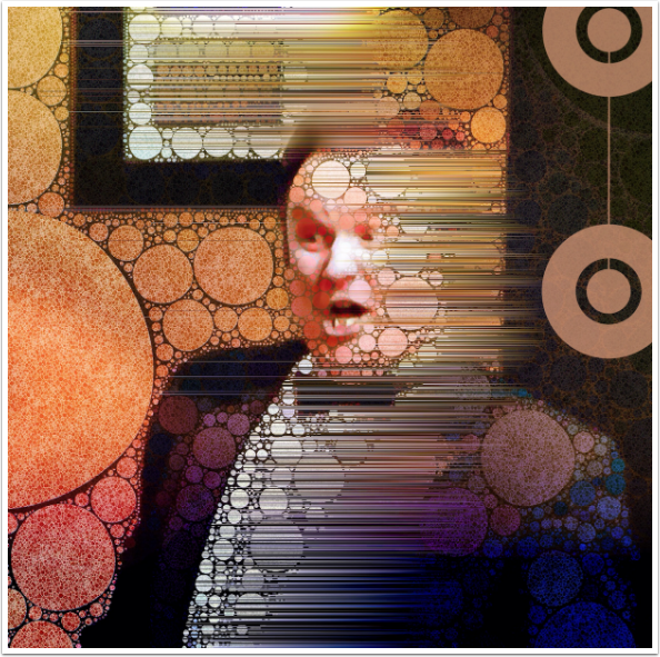
Of course, I never like to leave images alone, especially when they use as strong a look as Percolator gives. Here’s the same image modified in Decim8 and iColorama.
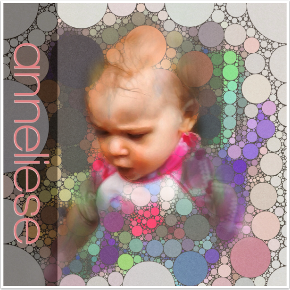
You can always use blending to bring back the original. Here’s the lovely Anneliese, modified in iColorama.
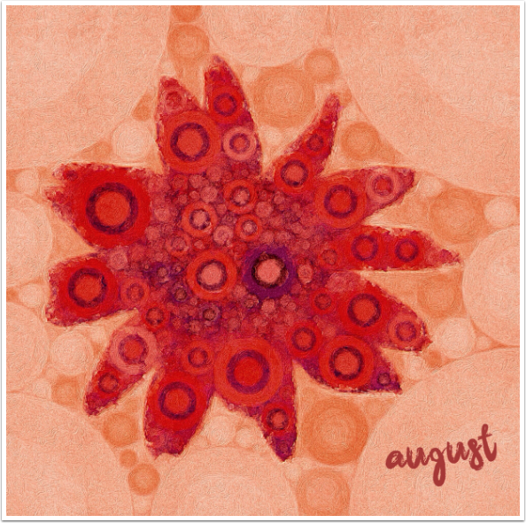
I find that the simpler the original image is, the happier I am with the results of Percolator. Here I took a simple Flower brush tip on a plain background from iColorama, then put it through Percolator, Brushstroke and Over to add the text.
As I’ve said, Percolator’s effects are too obvious for my taste. I do not use it very often, but I know that there are many out there who do. Either way, it’s a well-built app that allows for a large amount of control within a narrow range of effects. If this looks like your kind of app, give it a try! Until next time, enjoy!
Jerry Jobe
Never content with just scratching the surface of what an app can do, Jerry Jobe decided to pass on what he learned about imaging apps to others. He’s constantly trying to figure out just what tools other artists have used, and trying to incorporate them into his own work, in an attempt to find his style. He’s written tutorials on over 145 apps so far, which you can find (along with his Song of the Day entries) at http://enthusiasmnoted.wordpress.com/ He lives near Atlanta, Georgia, where he also finds a creative outlet in acting and directing in community theater.