
Mobile Photography Tutorial – The Value of Layers, featuring Leonardo – Photo Editor
We are delighted to publish Jerry Jobe’s latest mobile photography/art tutorial for our reading and viewing pleasure. This week Jobe takes a look at the comprehensive mobile photography app, Leonardo. Read his thoughts as he puts it through its paces (foreword by Joanne Carter).
Leonardo retails for $4.99/£3.99 and you can download it here.
The current explosion of mobile art and photography has introduced multitudes to digital techniques of manipulating images. Many, if not most of them, have no experience with the behemoth of desktop image editors, Photoshop. There’s certainly nothing wrong with that. Those of us that have, though, realize that there is an enormous value in using layered files to create art. I’m going to introduce some concepts of layering through the use of Leonardo, a brilliant photo editor with hundreds of features.
Layers can be thought of as stacks of glass, with the viewer looking down through them. The bottom glass contains the base image, and each glass on top of that covers part of the composite image below. Each glass has pixels either on part of the glass (with the remainder of the glass being transparent), or covering the entire glass, but being partially transparent in some way. The advantage of layers is that you can go back and adjust each piece of glass: move it around, adjust how clear it is, paint more pixels on it. If you want to add a green tint to a scene, but don’t want it to affect the butterfly you added to the scene, then you move the green tinted glass below the butterfly glass.
Layering is possible in a few apps, like Pixelmator and Laminar. My favorite layering app is Leonardo, by Pankaj Goswami, the creator of Superimpose. It’s a universal app, working on both the iPhone and iPad, and is worth the (relatively) hefty price of $4.99. Like Superimpose, Leonardo has no splash screen, so here’s the app’s icon, blown up ridiculously large.
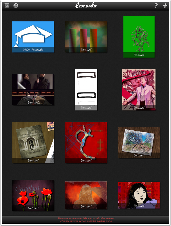
Leonardo opens up into a gallery, which means I need to talk about the major drawback of the layering technique: the amount of room the layered images take up on your device. In order to take advantage of having all those pieces of glass and being able to go back and change them later, each piece must be kept. Apple’s operating system cannot save layered files in the Camera Roll, so every app that uses the layering technique requires a gallery to store these layered projects. These add to the size of your app, and are stored within the app. If you have to delete the app for any reason, all your projects will be lost.
There’s a message at the bottom of my gallery, saying “Too many sessions can take up considerable amount of space on your device, consider deleting some.” I’m going to clear a few, so I tap the icon at the upper left, that looks like a pencil over some lines.
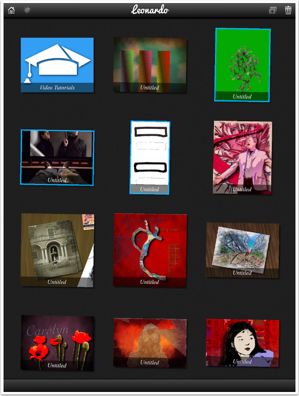
The projects, or sessions, start shaking or jiggling. I tap three of them, then tap the trash can icon at the upper right to delete them. Leonardo asks you to confirm the deleting.
The help files are pretty comprehensive. The text Instructions include a basic look at layering as well as descriptions of the different areas within Leonardo. There are also video tutorials. These, like the video tutorials for Superimpose, are silent and will require repeated watching for those new to layering apps. Help can only be accessed from the Gallery, by tapping the ? icon at the upper right.
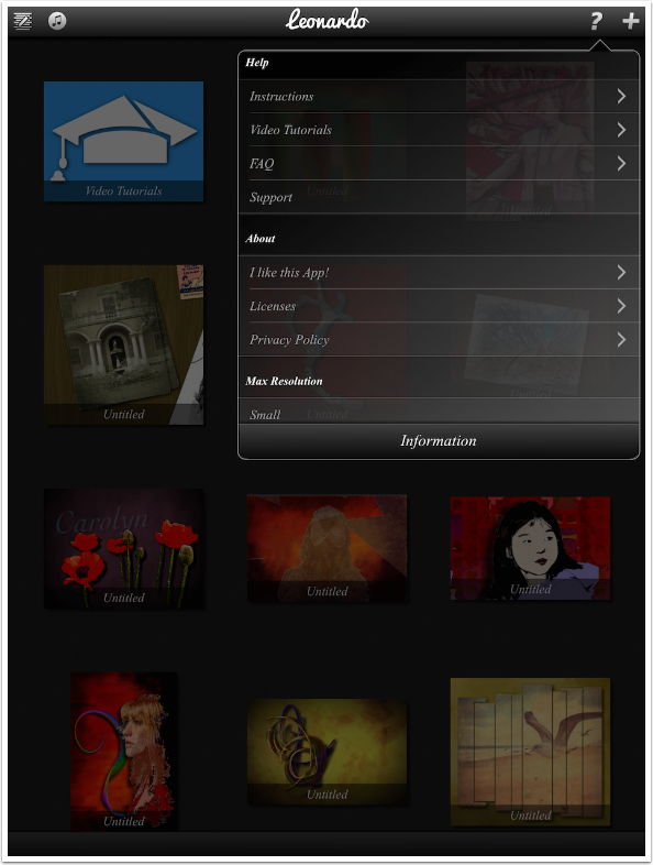
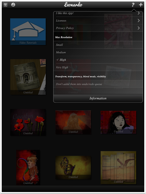
In addition to help, there are also some settings you should visit at the bottom of the help menu. First, change the Max Resolution setting. It defaults to Medium, but should be set to High at least. The last setting should remain turned off – “Don’t addd [sic] them into undo/redo queue”. Those settings (Transform, Transparency, Blend Mode, Visibility) should be kept in the History queue so that you can easily back out of any changes you might make that weren’t what you wanted.
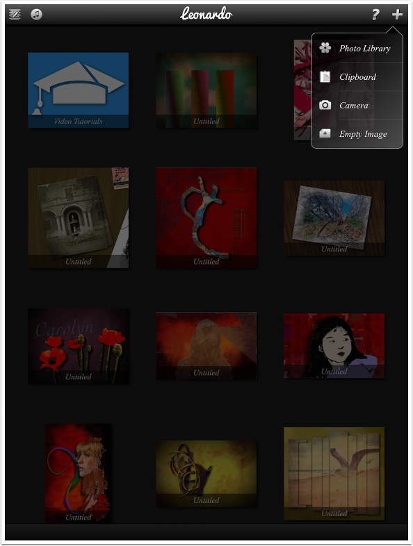
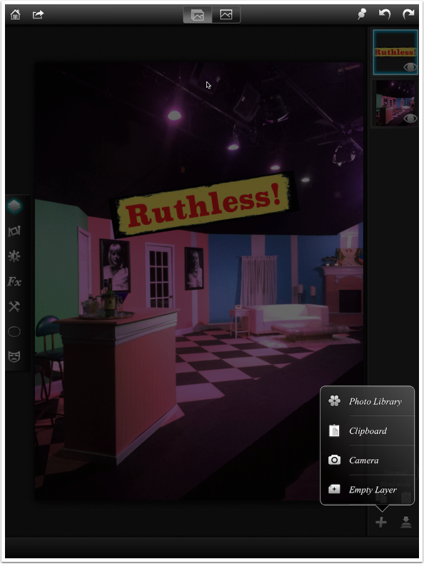
The + icon at the upper right is used to add images to the gallery for editing. You can choose an existing image, capture an exiting image, or load a blank canvas. I’m going to load an image from the Photo Library.
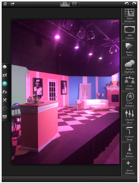
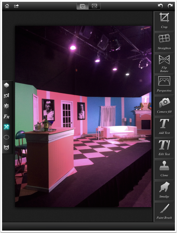
The workspace for Leonardo is fairly straightforward. At the top, from left to right, there’s the Home button for returning to the Gallery, the Save button, two View buttons that allow you to see the entire stack or just a single layer, the Pin for EXIF data, Undo and Redo. On the left is the Function menu: Layers, Transform, Filters, Effects, Tools, Selection and Masking. The column on the right changes based on the Function chosen. In the image below, Layers is the chosen function and you can see only one layer, the base.
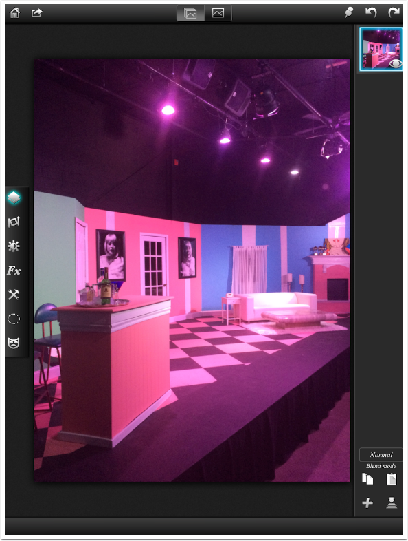
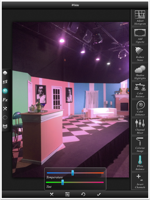
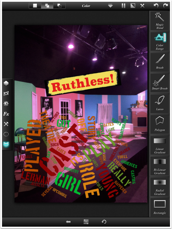
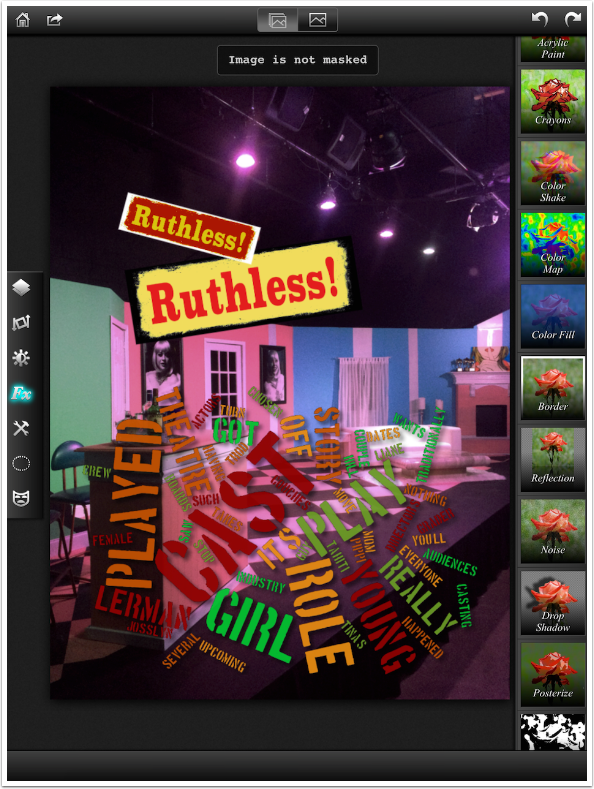
The image I’ve chosen to work with is a stage set for a musical. The lighting very definitely skews towards the magenta, so I want to touch it up before adding layers. I touch the Filters function and scroll to the bottom of the Options column to find the White Balance function.
When I tap White Balance, a set of controls opens at the bottom of the screen. I move the Tint slider towards the green to counteract the magenta. I also remove a bit of yellow by slightly moving the Temperature slider towards blue.
There are four buttons at the bottom. X deletes the changes, the Sliders button shows and hides the controls, the Circular Arrow resets the controls to the defaults, and the Check mark accepts the changes. I accept the changes.
The image is a little washed out, so I go into the Adjust Histogram control to manipulate the levels. The peaks in the histogram do not cover the entire range of possible values; the blacks, at the left end, are not fully black.
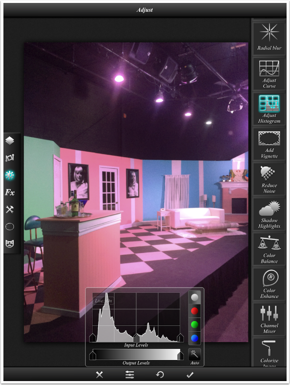
I adjust the leftmost end of the histogram inward, which makes the blacks truly black. I also move the middle to the right, which makes the entire image slightly darker. All controls work in real time, so I can see the adjustment as I move the sliders rather than having to release the slider to see what change I made.
Next I want to add some text: the name of the show. Text is found under the Tools function.
I’m able to add text, change the font, and change the text and back colors.
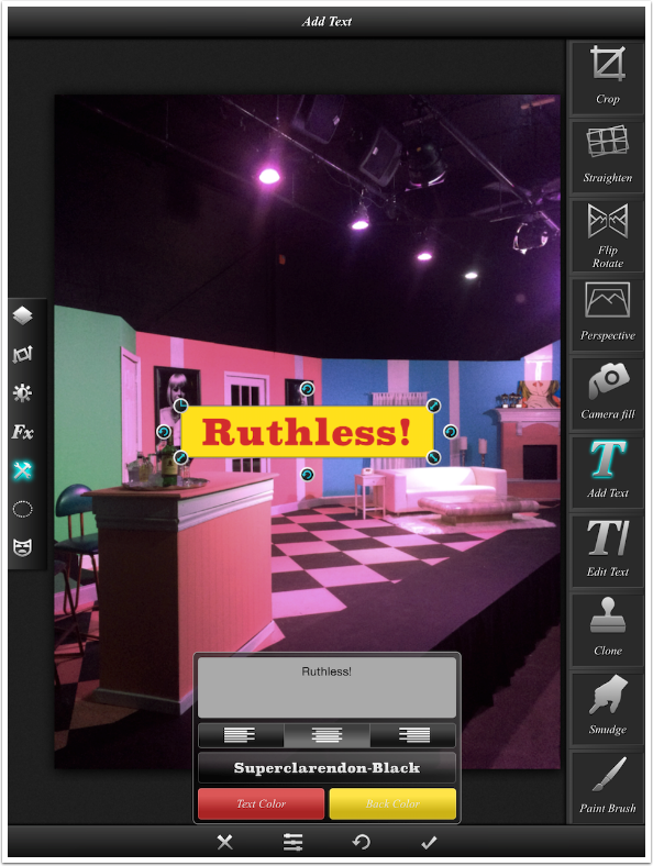
I use the handles to resize and rotate my text and accept the changes.
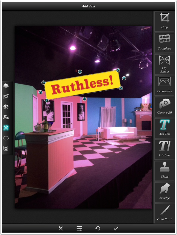
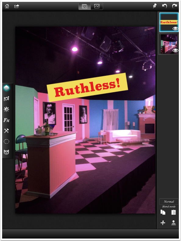
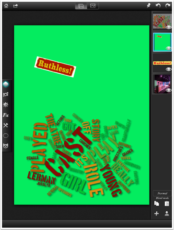
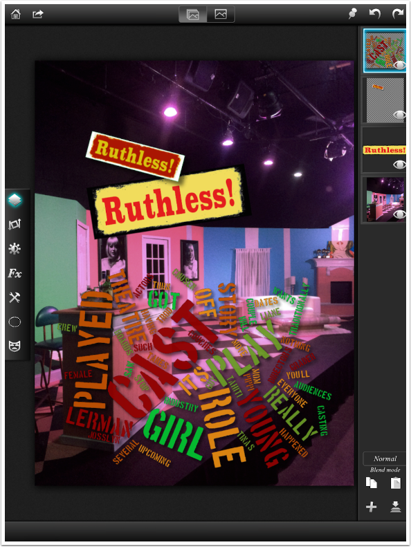
When I return to the Layers function, I see that there are now two layers. Text always is placed on its own layer, so that it can be modified later on. Notice that the thumbnail shows the text as square, rather than rotated. Notice also the blue border on the text layer. That border tells us that the text is the currently selected layer.
Any filters or effect apply only to the currently selected layer. I can add an effect to the text without it affecting the shot of the stage. I decide to add a grunge border to the text. It is tilted to the same angle as the text itself.
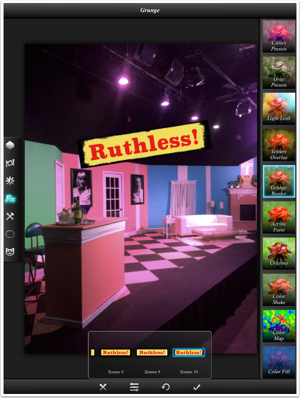
So the text itself is another layer, but we can bring in layers from other sources as well. Returning to the Layers function, I tap the + icon at the bottom of the Layers palette. I have the same four sources as I had for the base image.
I load an image from the Photo Library. The image is a word cloud, based on a review of the show, created in Cloudart.
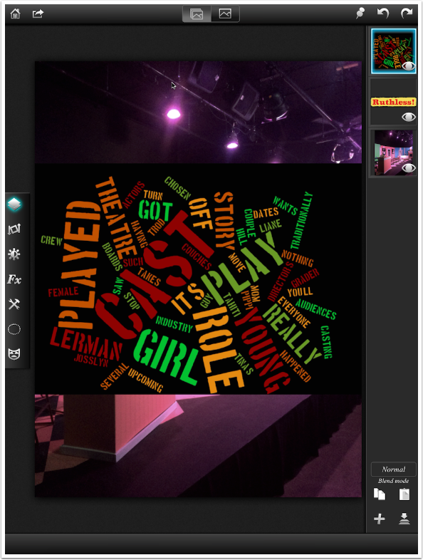
I use the Transform function to move the cloudart image to the bottom of the base image. I want the black to disappear, leaving the words. I could use a Screen blending mode for that layer, but that tends to lighten the words and make them semi-transparent. What I really want to do is mask out the black. I can do that in Leonardo. I tap the masking function, and look at my masking options. The second one down is Color Range – just what I wanted.
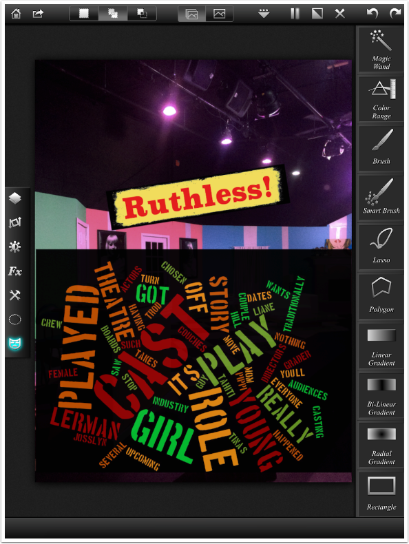
A single tap on the black part of the currently selected layer and the black disappears. It’s still there, saved as part of the project, and I could restore it at any time by deleting the mask. But right now, this is what I want.
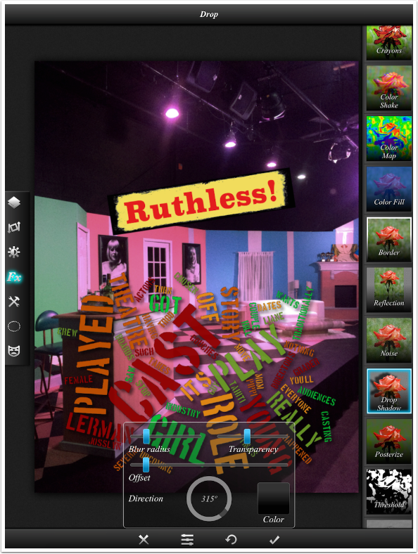
I want to add a bit of depth to the cloudart. The best way to make it stand out from the page is to add a drop shadow. The shadow makes it look as though the cloudart is raised off the image so that it casts a shadow. Drop Shadow is under the Effects function. I adjust the blur, transparency and offset.
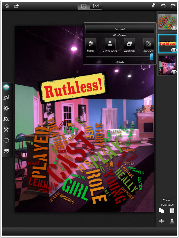
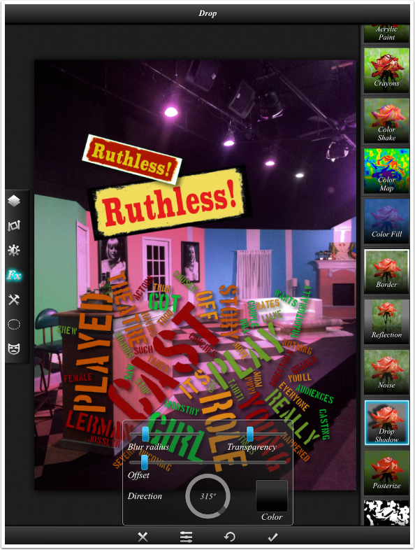
All layers are still modifiable. I return to Layers, select the text layer, and then use the Transform function to make it “squatter”. I return to the Layers function and tap the text layer again, and a fly-out menu comes up. I can change the Blend Mode and Opacity, and can also Delete, Merge Down, Duplicate, or Scale Fit the layer. I choose Duplicate.
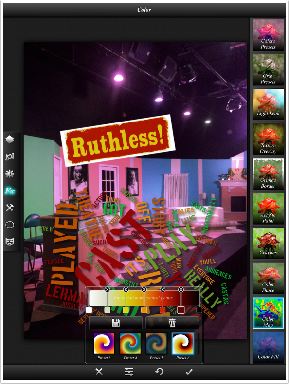
I change the new text layer’s colors with the Color Map Effect.
I transform the new layer to make it smaller, rotate it and move it. It might help set the new text off a little bit if I could add a Drop Shadow. I know it will not show on the black over the set, but it would separate it from the text box below it.
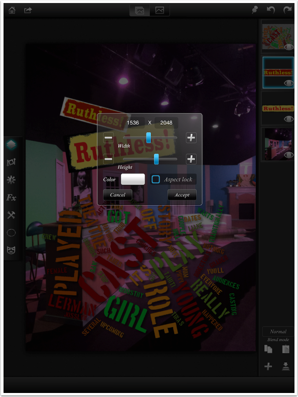
When I try to add the Drop Shadow, a message appears at the top of the screen: “Image is not masked”. A drop shadow is created based on the edges of a masked area. Internally, Leonardo considers the text box to extend to the edges of its own layer, so any shadow would have to fall outside the layer. That is not allowed. So is there a way to make Leonardo see the edges of the text box as the edges of a mask, and thus allow a shadow? Do you think I’d ask the question if there wasn’t?
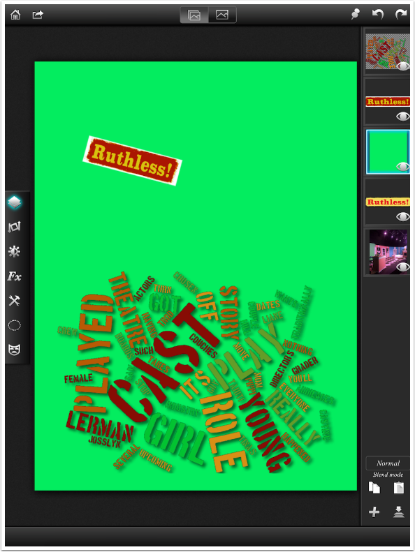
The way to make Leonardo (or Photoshop, for that matter) see the text layer as a normal layer is to flatten the text layer onto a normal layer. The first step in accomplishing that is to create a normal layer. In the Layers palette, I tap the + button and choose Empty Layer. Since I want to mask the color in the normal layer out, I want to choose a color for the normal layer that is not in the text layer. The default value is white, but there is white in the border of the text layer, so I change the color to a green.
New layers are always added to the top of the stack. By holding and dragging the green layer in the Layers palette, I can move the green layer below the text layer in the stack. I can still see the cloudart layer since it is higher in the stack.
Now I can select the text layer and tap it again to bring up the fly-out menu. I tap the button to Merge Down. That takes the current layer and merges it with the layer immediately below it in the stack. Layers above and below the currently selected layer, like the cloudart and the base image, are not affected. (Warning: once the two layers are merged, the text is no longer editable. Make sure you’ve checked your spelling!)
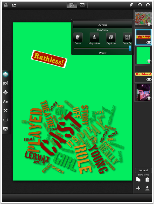
Now the two layers are merged into one, and you see them as a single layer in the stack.
I use the Color Range option once again in the Masking function to mask out all the green. I can now use Drop Shadow under Effects to add my shadow to the masked text box.
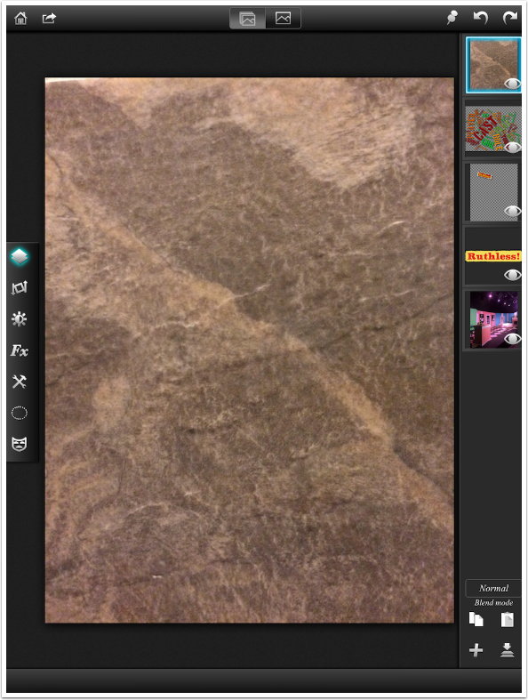
I’ve written a lot about texture apps like Stackables and Mextures. What is a texture but an image applied as a new layer over a base image in a semi-transparent blend mode? I return to the Layers palette and load an image of a stone tile to use as texture. It defaults, of course, to Normal blend mode at full opacity, hiding all layers below it.
I tap the stone layer and change the Blend Mode to Screen, which lightens the base image based on the luminosity of the selected layer. I also lower the Opacity until it pleases me.
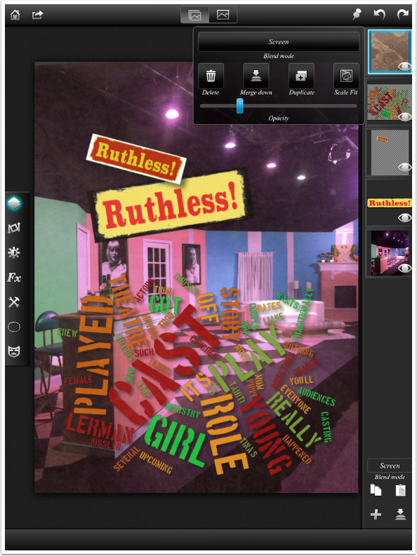
It didn’t please me all that much, so I decided to discard the layer by tapping the layer and then tapping Delete on the fly-out menu. I could also hide the layer by tapping the eyeball icon within the layer thumbnail. But that hidden layer still adds to the size of the saved project. If you don’t think you’ll need the layer in the future, it’s best to delete it.
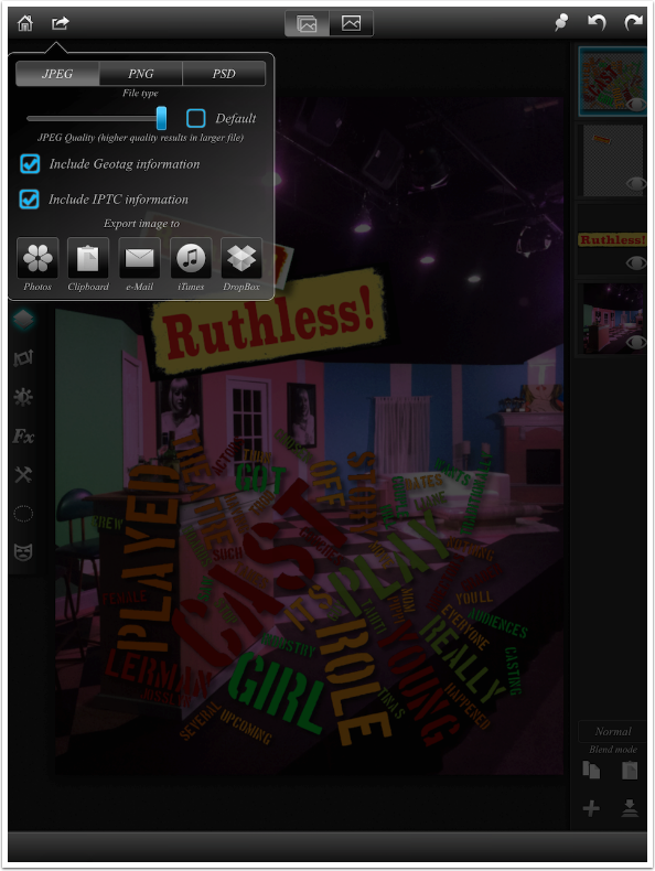
It’s time to save my image. When I tap the Save icon, it includes several options. The point that needs to be emphasized here is that Projects or Sessions – the layered files with their associated history – are automatically saved. This Save is to allow you to save the flattened file as an image that can be read by other apps, as a JPEG or PNG. (It can also be saved as a layered Photoshop PSD file, but those files have to be moved onto your desktop for use in Photoshop using iTunes.)
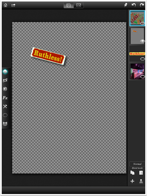
Let’s talk about PNG files for a moment. The PNG format allows you to save images with transparent backgrounds, something that JPEG or TIFF format does not allow. That means you can save a masked layer as its own file that can then be brought into other projects.
But there is no “Save single layer” option in Leonardo. Don’t worry, because you can save a single layer by turning off the visibility of all other layers. That’s what I’ve done below. I can save the text box, with its shadow, as a PNG with a transparent background, by tapping the eyeballs of the other three layers in the Layers palette.
(Caution: While Leonardo can handle the partial transparency of the shadow in the PNG file, other apps that can handle PNG files, like iColorama, can not. iColorama converts partial transparency to full opacity, leaving an ugly black smudge around your object. Consider removing any partial transparency from your object if you want to use it in other apps.)
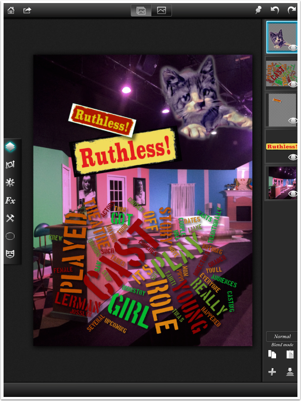
Below I’ve added a layer that was saved as a PNG with a transparent background. Notice that the soft, feathered edge (partially transparent) is retained around the cat. (I deleted the cat layer. C’mon, you can’t add cats to EVERYTHING.)
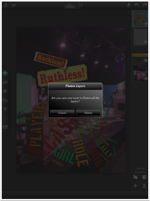
One question you may have at this point is “What if I want to adjust the contrast, or histogram, or color balance, or sharpness of ALL the layers at once?” This is a common practice, making final finishing touches before saving. Since Filters and Effects apply to a single layer, you have to make the image a single layer. You do this by tapping the Flatten Image icon down at the bottom right of the Layers palette. You get the confirmation window shown below.
Flatten is saved in the history. Even if you exit your session while the image is flattened, you can return to it after a day, week or month and tap undo until all the layers appear again. It’s all saved in the Gallery.
After I flattened the image, I could apply a curve to the entire image as shown below.
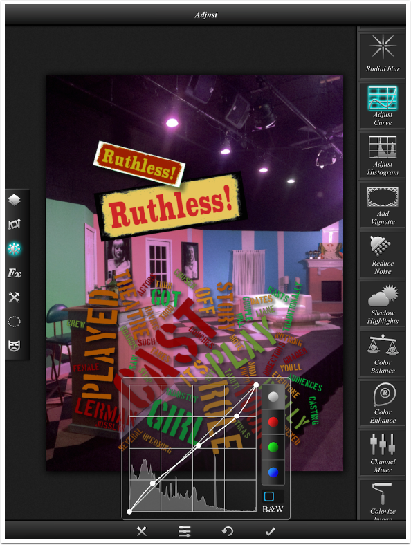
And below I’ve stepped back through Undo to remove the Curve and the Flatten steps. All four layers are restored.
The value of layers lies in the ability to adjust each layer individually, after adding other elements to the image. Those apps that do not use layers ask you to commit changes before adding the next element on top, so you have to plan ahead. Layering adds a flexibility that quickly becomes addictive. (Photoshop users can get very frustrated when they don’t have their layers on mobile apps.) It’s really a technique that could be useful to you, no matter whether you use Leonardo, Pixelmator, or any other layering app.
I will continue to post tutorials on Leonardo. Like iColorama, the app is so rich that I can write dozens of articles about the ins and outs. On the other hand, Leonardo is not updated with features at anywhere near the pace of iColorama.
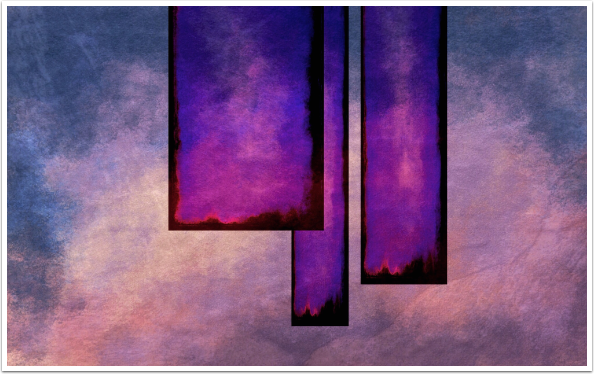
I’ll wrap up with a couple of abstracts created from blank images in Leonardo. The first used the stone texture shown earlier over three duplicated layers. Those layers were transformed separately to change the shape and position, so they could overlap. I flattened the image at the end to improve the contrast and lower the saturation.
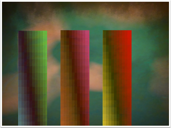
The second used much of the same technique, except I pixilated the columns and changed the Hue of two of them to get different colors. I also used a Gradient Selection (selections are not described in this article) to apply a grunge vignette to the top of the background.
I hope you enjoyed this discussion of layers and Leonardo. If you have any questions, please feel free to comment at The App Whisperer or enthusiasm noted. Until next time, enjoy!
Please support our work
TheAppWhisperer has always had a dual mission: to promote the most talented mobile artists of the day and to support ambitious, inquisitive viewers the world over. As the years passTheAppWhisperer has gained readers and viewers and found new venues for that exchange.
All this work thrives with the support of our community.
Please consider making a donation to TheAppWhisperer as this New Year commences because your support helps protect our independence and it means we can keep delivering the promotion of mobile artists that’s open for everyone around the world. Every contribution, however big or small, is so valuable for our future.
Jerry Jobe
Never content with just scratching the surface of what an app can do, Jerry Jobe decided to pass on what he learned about imaging apps to others. He’s constantly trying to figure out just what tools other artists have used, and trying to incorporate them into his own work, in an attempt to find his style. He’s written tutorials on over 145 apps so far, which you can find (along with his Song of the Day entries) at http://enthusiasmnoted.wordpress.com/ He lives near Atlanta, Georgia, where he also finds a creative outlet in acting and directing in community theater.
3 Comments
Eva Gustafsson
I found this by coincidence today. Very informative – as always with Jerrys tutorials. Now I am certain that Leonardo is my best choice for creating a birthday collage for my brother. A lot of cutouts to insert on a background from their garden. The layering function will be perfect for this!
Thanks Appwhisperer and thanks Jerry
Joanne Carter
Thank you too Eva for this wonderful feedback!
Deborah Coulthard
I’m about to start a multi-image collage project – thought about using Superimpose, but the lack of ability to move all of the individual images about to get the right composition (and to adjust each layer ’til they blend right) would drive me nuts…..then I remembered the tutorials on Leonardo. Just read this and it looks like the app for the job….thanks 🙂