
iOS Photography App Tutorial with ‘Monokrom’ – Instantaneous Monochrome by Jerry Jobe
We are delighted to publish this very interesting tutorial with universal photography app Monokrom which retails for $0.99/£0.79 and you can pick it up here. Over to you Jerry. (Foreword by Joanne Carter).
“Every so often, an app will come along that does not dazzle with the effects it brings to your images, but instead with an entirely new way to control the app. There are many apps available to change your image to monochrome, whether that is straight black and white or a tinted monochrome, and I’ve covered a few of them. Monokrom (a universal app by Darren Richards), however, does not use a raft of sliders to fine-tune your photos; rather, it uses circles it calls pucks as editing controls. The changes made by these pucks are instantly visible on the screen, with no processing wait time, making editing quick and simple. You can easily finish an editing session in under thirty seconds”.
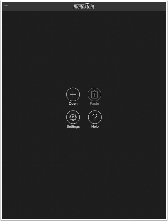
The initial screen is self-explanatory. You can open an image or paste an image from the clipboard. (Monokrom is not a camera app, and can only be used for post-editing.)
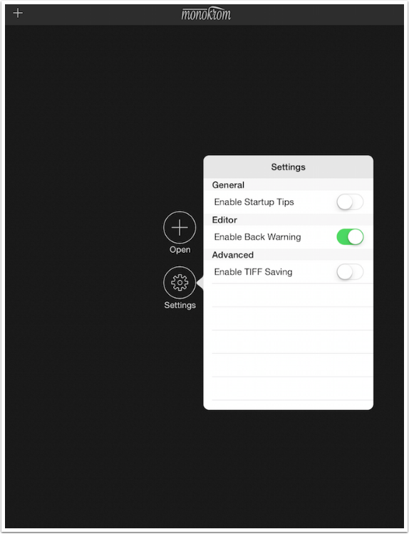
Settings are minimal. I have turned on the warning for loading another image without saving the current one (Enable Back Warning). I turned off the tips displayed at startup and also turned off saving as an uncompressed TIFF. (TIFF files are a great thing to have if you are creating prints, which can show JPEG artefacts.)
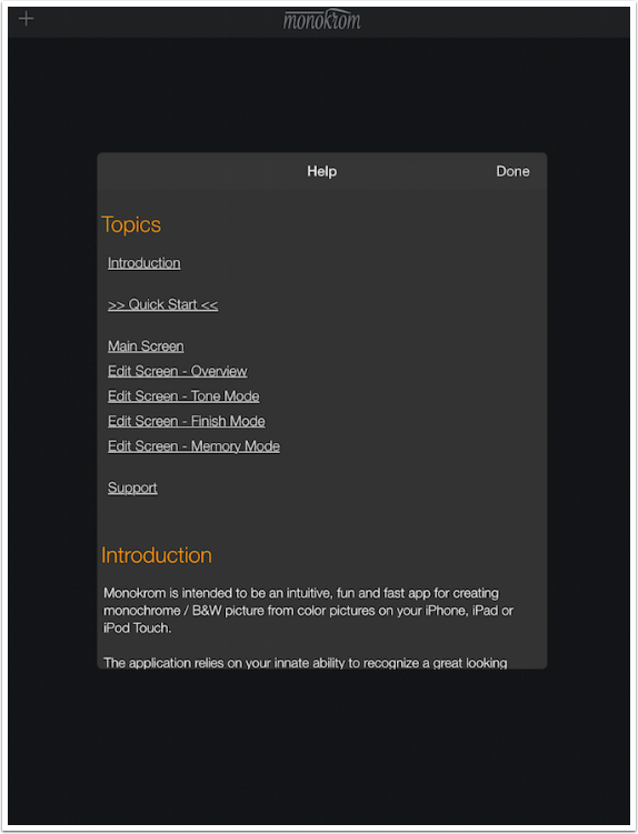
The help file is robust, and you may find yourself returning to it multiple times, since the controls are not labeled. I think you’ll see, though, that a quick move of each puck will give you an idea of the purpose of each puck without constant reference to the help file.
I’ve chosen an image that was taken at dusk. Because it contained a good bit of natural noise, I decided to smooth it out in iColorama Simplify before bringing it into Monokrom. It will be easier to see the Grain that Monokrom can add that way.
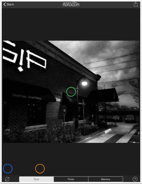
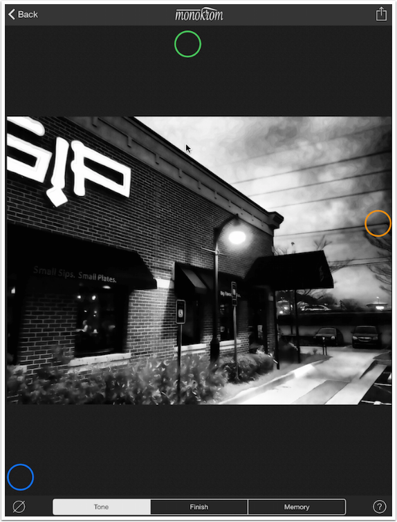
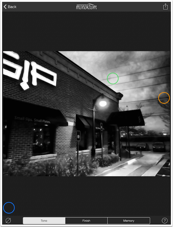
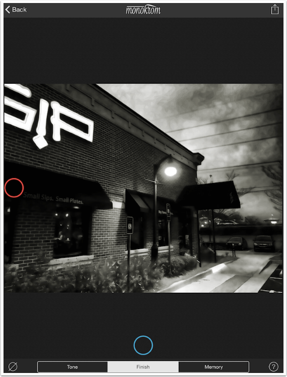
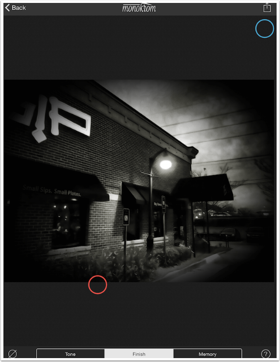
Once you’ve loaded the image, a default setting is applied to the image and it is displayed on the workspace. The initial controls are Tone controls. There are three pucks: Orange, Green and Blue. Notice how the Blue puck is at the bottom of the workspace, below the actual image. This shows you that you are not limited to moving the pucks over the image (whether landscape, portrait or square). The controls can be moved anywhere on the workspace.
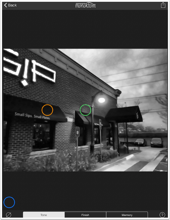
By tapping on the “empty set” icon (circle with a line through it) at the lower left, you can hide the pucks, giving you an unobstructed view of your image. Tapping the icon again will reveal the pucks.
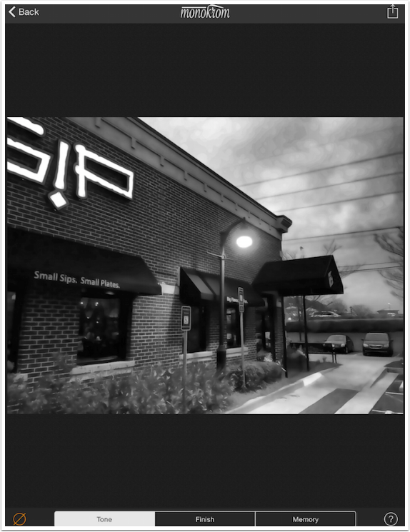
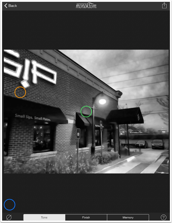
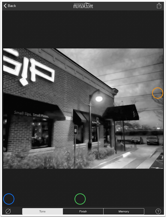
The first puck we’ll examine is the Orange one. The pucks have different controls associated with them, based on whether you move the puck on the vertical or horizontal axis. Moving the Orange puck vertically affects Brightness. Below it is moved to the top, making the image as bright as Monokrom will make it.
Moving it to the bottom makes it reasonably dark. Notice that you won’t get pure white or black; I like that Monokrom does not waste the “ends of the sliders” on useless settings.
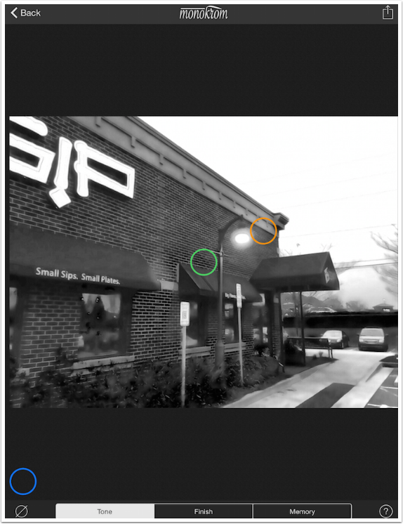
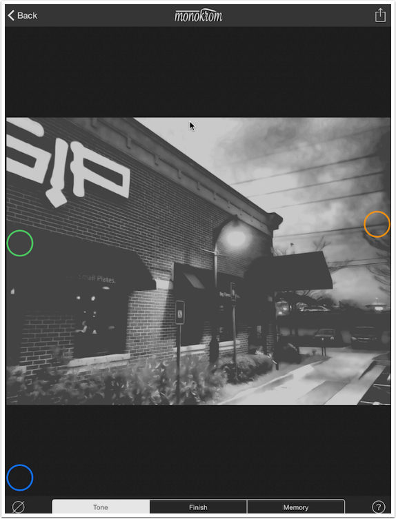
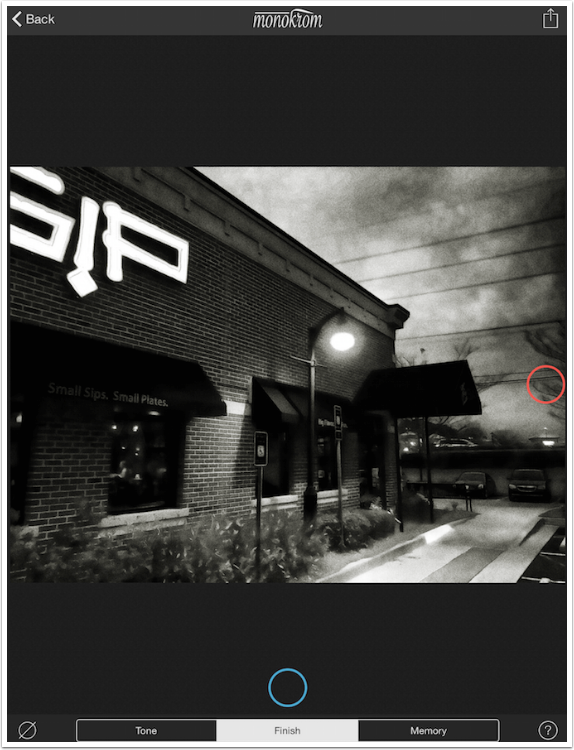
Moving the Orange puck horizontally acts as though a color filter has been applied to the image before converting to black and white. In that way, blues can be washed out or intensified, etc. Over to the left, I’ve got a filter that gives me a pretty good tonal range.
But when I move it to the center, the sky becomes completely washed out and the brick becomes the same tone as the awning.
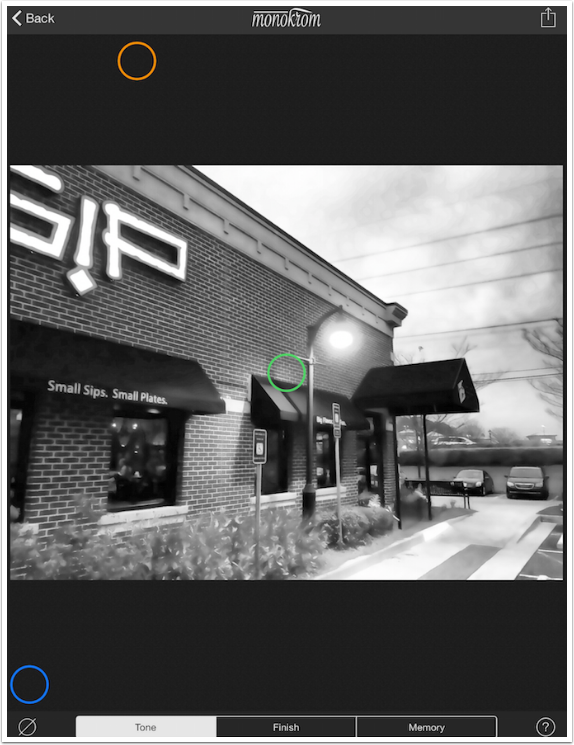
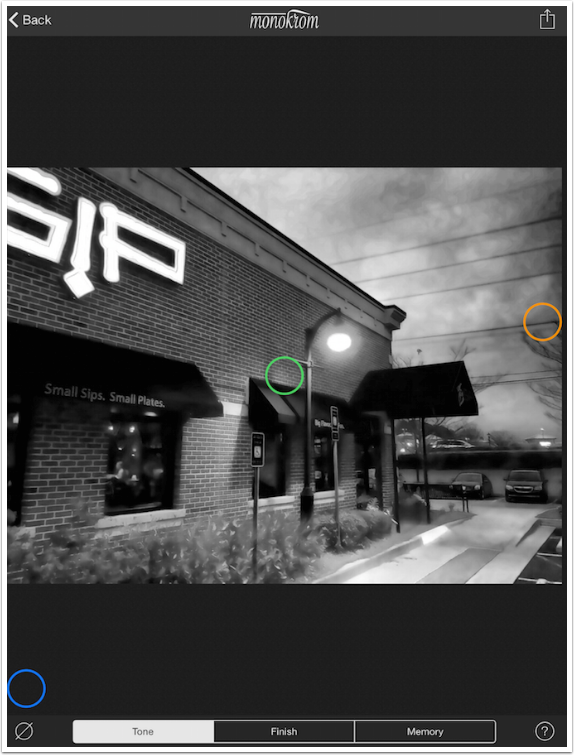
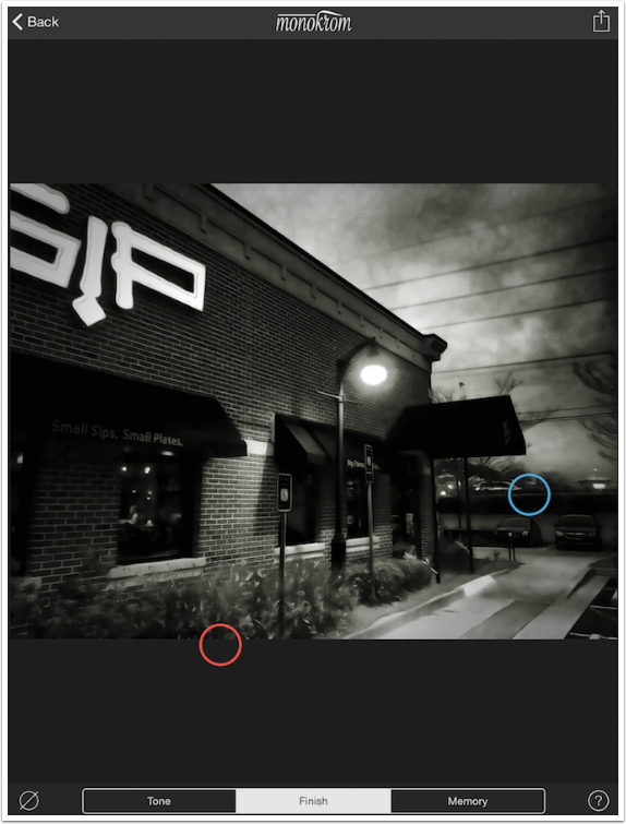
I like the differentiation in the sky that is achieved by putting the Orange puck at the center right.
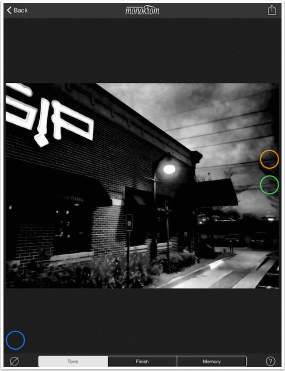
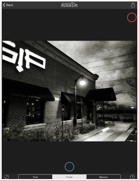
The Green puck controls contrast. The vertical axis is what is normally thought of as contrast, and moving the puck to the top strengthens the difference between black and white. Notice that the inner stroke of the sign at the top left is almost completely lost when the contrast is pushed this high.
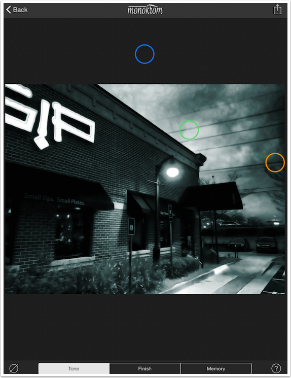
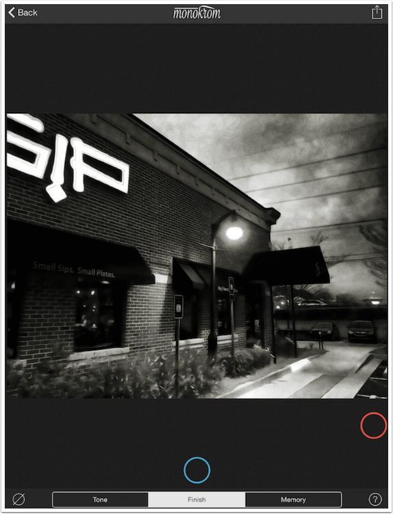
Moving the Green puck to the bottom of the workspace lessens the contrast, but keeps it within reasonable limits. No plain gray wash can be achieved here.
According to the help file. “Moving the [Green] puck left to right changes the range of tones in the image.” This produces a more extreme bit of contrast adjustment, in my opinion. Moving the Green puck to the left gives you a faded look, like an old photo.
Moving it to the right gives you harsh contrast. A bit too harsh, in my opinion – it really emphasizes the posterizarion that occurred around the streetlamp when I simplified the image.
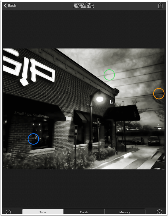
I got a slight bit of extra contrast by moving the Green puck up and to the right.
The Blue puck controls the tint of the final image. Moving the puck on the vertical axis changes the amount of tint added; moving it to the top imparts a generous amount of tint.
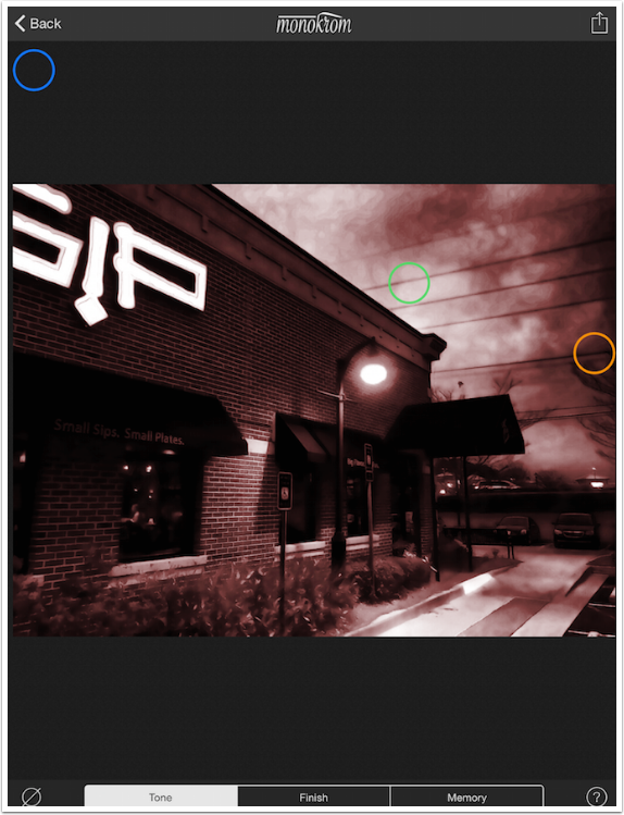
Moving the Blue puck from left to right changes the tint that is applied, from red to orange to yellow to green to blue to purple and back to red.
I place the Blue puck where it will give me a slight sepia tone.
There are two more control pucks under the Finish category, accessed by tapping the word “Finish” at the bottom of the screen. The Red puck controls Grain, and the Light Blue controls Vignette. The horizontal axis for the Red puck controls amount of grain; below you’ll see that the default for the Red puck is all the way to the left, or no grain.
Moving the puck to the right imparts maximum grain.
The vertical axis controls the roughness, or “clumpiness”, of the grain.
Below you’ll see the maximum amount of a fine grain.
I decide on a small amount of a relatively fine grain. Then I move on to the Light Blue puck. The vertical access controls the opacity of the vignette, while the horizontal axis controls the radius. Below I have a mid-level opacity with maximum radius (extending as far as possible into the middle of the image).

Below you’ll see the maximum opacity, maximum radius vignette.
I decide on a vignette that nearly extends all the way into the middle, but is below the mid-level of opacity.
That covers all the controls – three under Tone and two under Finish. Memory allows you to save the settings and apply them to other images. Once you apply them to another image, the controls are still available to you for tweaking. Tapping a labeled circle over on the right will apply the saved controls.
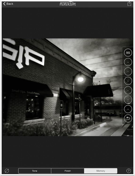
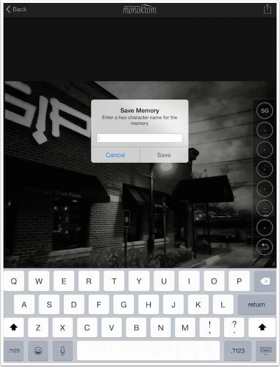
Tapping and holding a circle with a dash (an empty memory space) will bring up a dialog for you to give a two-character name to your saved settings.
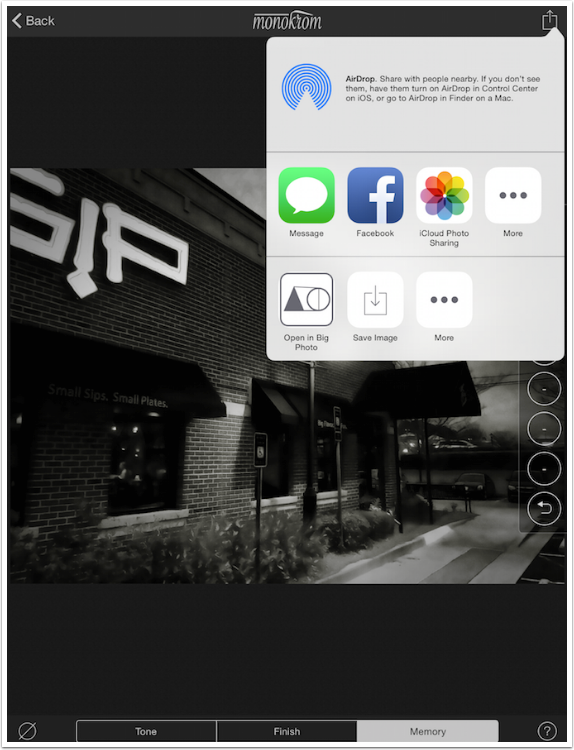
Tapping the box-and-arrow at the upper right will bring up the Save dialog. You’ll see Save Image (to Camera Roll) in the lower row.
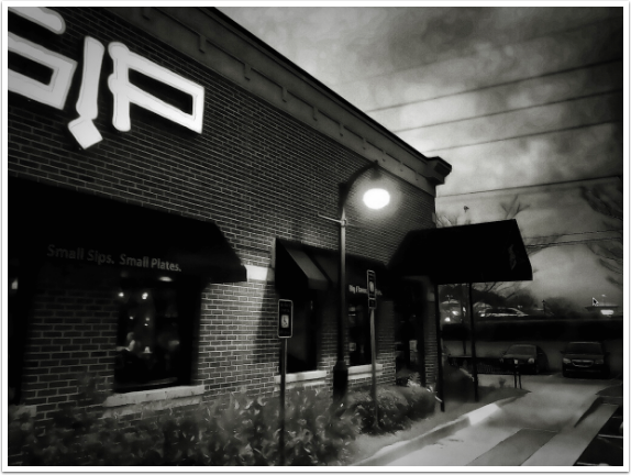
Here’s my saved image.
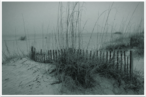
As I’ve said, Monokrom is fast and easy, and the limits on the controls make sure you don’t ruin your image by moving the pucks too far to the edges of what’s possible. Below is a reduced-contrast image with a bit of a blue tint.
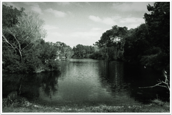
And here’s one with increased contrast and a very slight green tint.
Is Monokrom the “must-have” of monochrome apps, allowing you to toss out every other? No, since it doesn’t allow for spotlights like Noir or Dramatic B&W, or have borders like the late, lamented Perfect B&W (tops on my list of great apps that have disappeared). But it is a great app for quick conversions that look nice. Give it a try!
Jerry Jobe
Never content with just scratching the surface of what an app can do, Jerry Jobe decided to pass on what he learned about imaging apps to others. He’s constantly trying to figure out just what tools other artists have used, and trying to incorporate them into his own work, in an attempt to find his style. He’s written tutorials on over 145 apps so far, which you can find (along with his Song of the Day entries) at http://enthusiasmnoted.wordpress.com/ He lives near Atlanta, Georgia, where he also finds a creative outlet in acting and directing in community theater.

You May Also Like
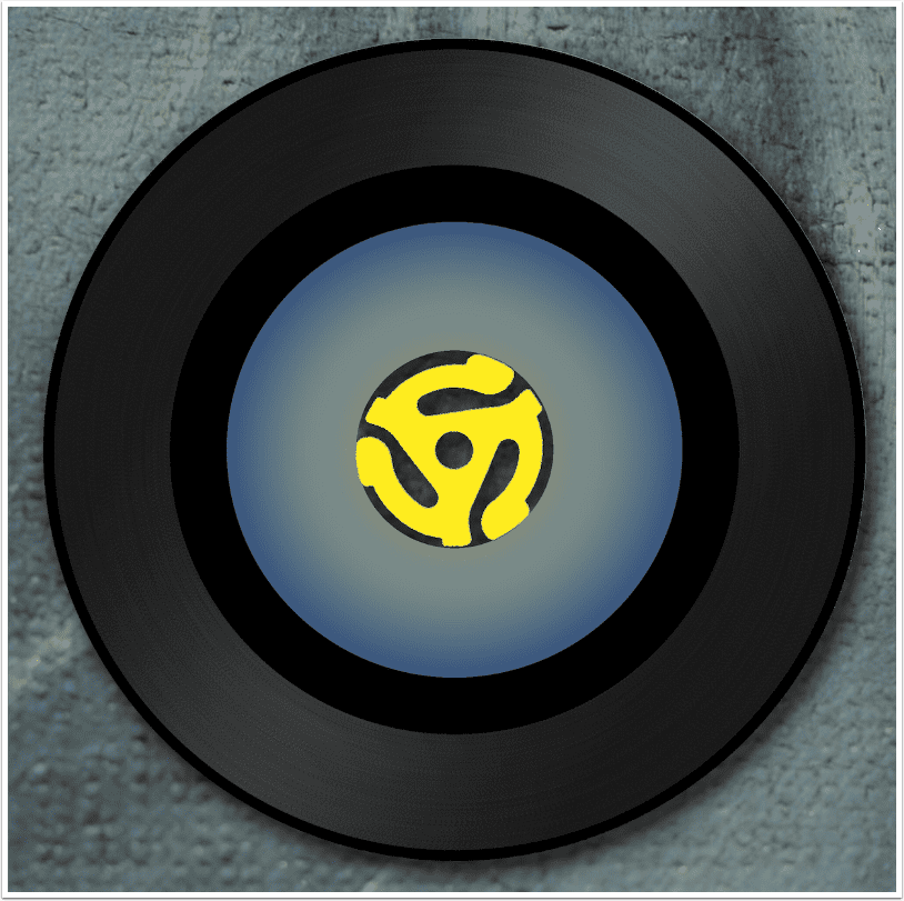
Mobile Art – Creative Tutorial – iColorama Procedural: Spinning Vinyl
Mobile Photography / Art – Three Years of Tutorials: A Recap, an Assembly Feature, and an iColorama Procedural
One Comment
Diana Jeon
This was great. I have had this app for a while, and though I could easily use it to convert BW to color, I never got into it, and did not know what the different sliders were each meant to do. It seemed too confusing with the unlabeled pucks. So I put it to the side and rarely open it. Now, while reading this, I just adjusted a random image of mine (though the app. changed my memory slider I was labeling from what I had set to something different, go figure…) and I got it to look close to what I would want, with only a little work left for other apps. Thanks, Jerry!