
iOS Mobile Photography App Tutorial – ‘Stackables’ Part 2 by Jerry Jobe
We are delighted to publish Part 2 of 3 mobile photography app tutorials with the app Stackables by Jerry Jobe, if you missed Part 1 please go here (foreword by Joanne Carter).
Stackables retails for $1.99/£1.69 and you can download it here.
In part 1 of my series on Stackables, I went over the general layout and talked about the Texture, Filter and Gradient presets. Here in part 2, we’ll cover Patterns and Adjustment presets, as well as show the new masking features. That’s a lot to cover, so let’s get started!
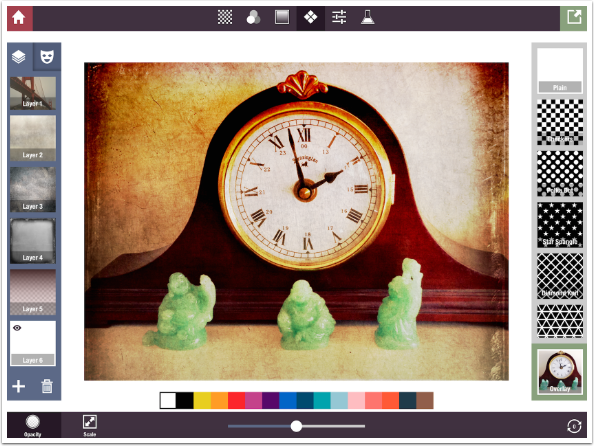
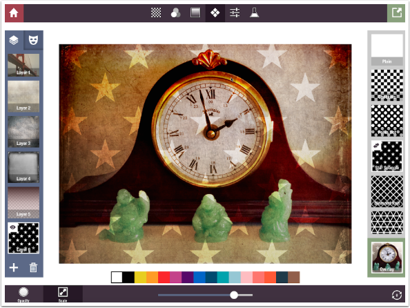
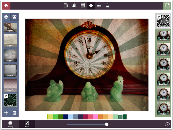
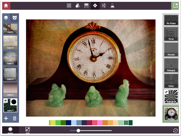
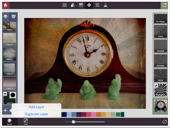
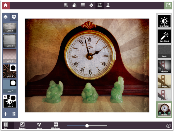
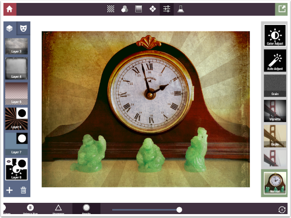
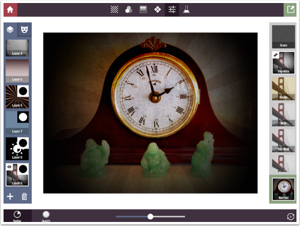
We were modifying an image of a mantel clock with jade figurines. As you see below, Layer 1 is a filter; layers 2-4 are textures, and layer 5 is a gradient that adds some dark brown to the top of the image. I have added Layer 6 and chosen Patterns at the top center. It defaults to the pattern of Plain, or no pattern.
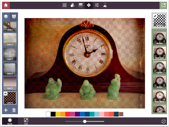
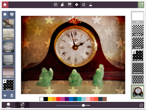
Patterns can be modified in many ways. The pattern can be applied in different blend modes – below, I’ve changed the blend mode to Hard Light. The slider at the bottom can be used to change the Opacity or Scale of the pattern, depending on which button is chosen at the lower left. There is also a color picker, a horizontally-scrolling palette of colors to choose from.
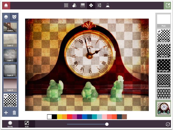
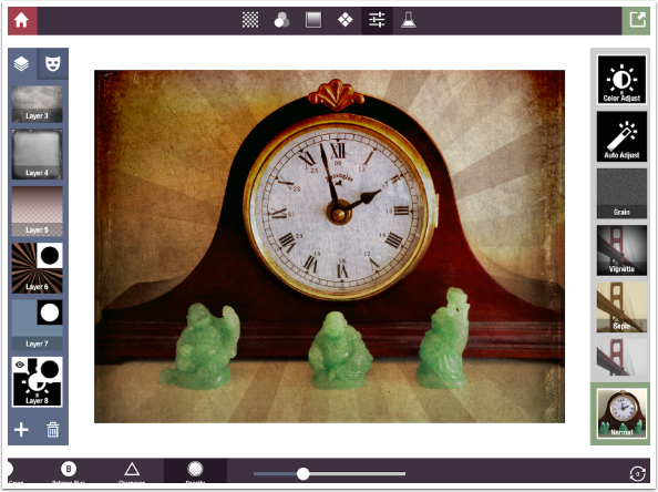
Below I’ve changed the blend mode back to Overlay and increased the Scale to make the pattern larger.
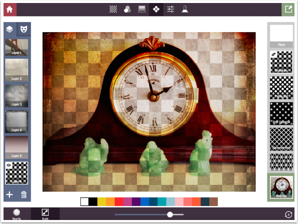
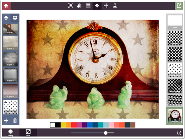
Notice that there’s a double-arrow icon in the top left of the Checkers thumbnail. That means that there are different “looks” available for the pattern that can be accessed by tapping the thumbnail. It is similar to the Gradient presets, which change from Linear to Circular gradients with a single tap. Below I’ve tapped the thumbnail, and some of the white blocks have become gray, signifying a partial opacity.
I change the pattern to Stars.
Tapping the thumbnail once gives me gray stars.
Tapping again reverses the black background and white stars to white background and black stars.
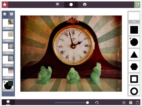
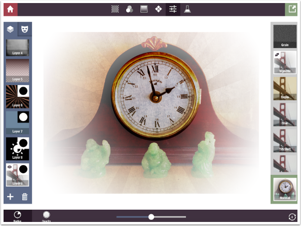
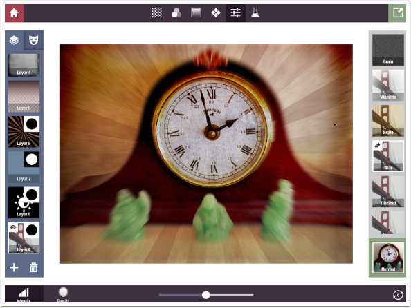
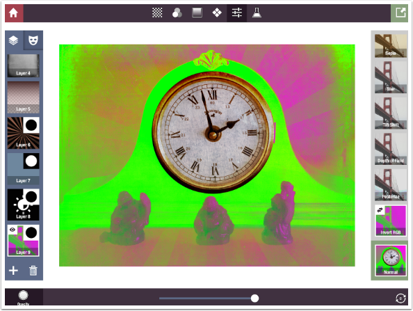
What I want to use is the Rising Sun pattern. Scale will adjust the width of the rays, but I cannot adjust where the center of the pattern lies. The center of a pattern is anchored to the center of your image, and cannot be moved around.
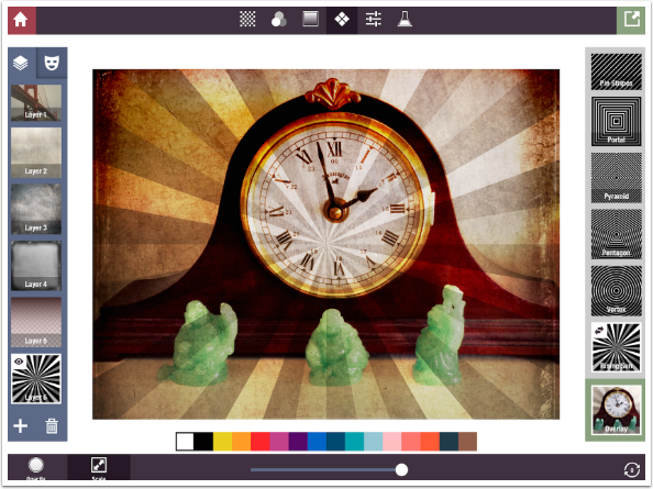
I make further changes to the patter, changing the blend mode to Multiply and the color to a blue-green to go along with the jade. But it still looks odd, because the center of the rays does not match up with the center of the clock face. We can make that less obvious by masking the pattern away from the clock face.
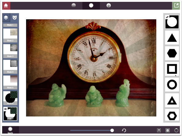
At the top of the Layers Palette there are two buttons: Layers and Mask. Tapping the Mask button changes the look of the layer thumbnails. They now become Mask thumbnails. In the screenshot below, all the masks are plain white, with a representation of the contents of the masks in the upper right of the thumbnails. Along the top of the screen are buttons for the three different types of masks: Gradient masks, Solid masks and what I will call Compound masks – interesting shapes with varying opacity. There are no painted masks, or ability to import masks built in other apps.
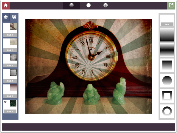
Below you’ll see the Solid masks.
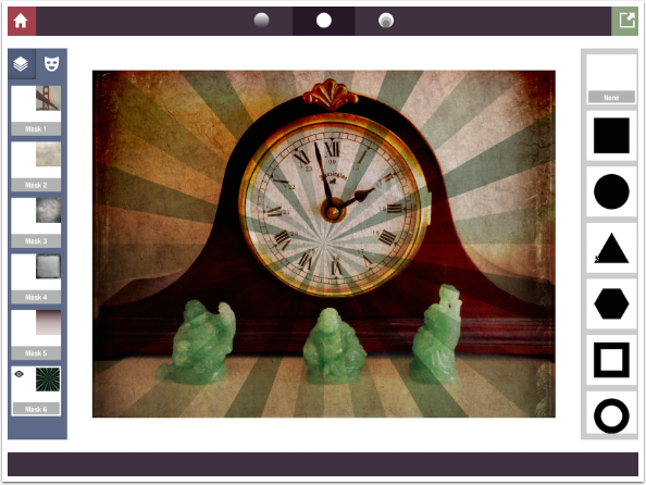
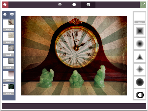
And next are the Compound masks
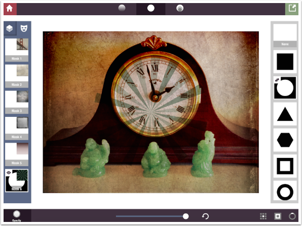
What I want is a solid circle mask to cover the clock face. I tap the Solid mask icon at the top and choose the Circle thumbnail at the right. It places the mask dead center.
Notice that the Circle thumbnail has the double-arrow icon. Once again, that means there are different options available at a tap. In the case of masks, the option is to change whether the mask will apply to the interior of the shape or the exterior. Below you’ll see the tap changed the rays from being seen on the outside of the circle to being seen on the inside of the circle.
These shapes can be moved with a single-finger drag and sized with a two-fingered pinch. As the shape is being moved/sized, an overlay will appear, helping the user to correctly place the mask.
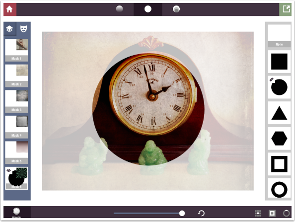
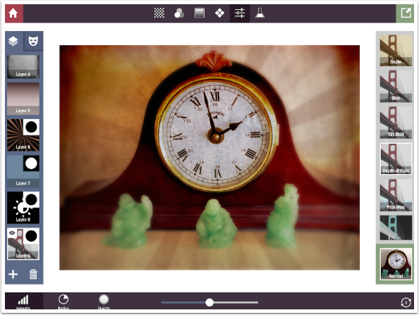
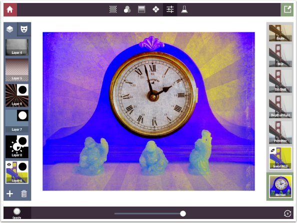
I have now placed the mask so it masks out the rays from the clock face and the surrounding gold. I could adjust the opacity of the mask by using the slider at the bottom, but that would allow the rays to show in the clock face, which is precisely what I am trying to avoid.

By tapping the Layer button at the top of the layer palette, I can return from mask mode and adjust the opacity of the layer.
Masks are tied to the layer, so you can change the shape and placement of the mask for each layer. What if you want to use the same mask on multiple layers? What if I want to add more changes that will apply just to the outside of the clock face, or just to the interior? Because masks are tied to a layer, in order to duplicate the mask you have to duplicate the layer. Then you can change the contents of the layer – say, Pattern to Texture – while leaving the mask in the same place.
In the screenshot below, I’ve duplicated my rays layer and gone into mask mode and tapped the circle thumbnail. So now Mask 6 applies the rays to the outside of the clock face, and Mask 7 applies them to the clock face. They are the exact opposite of each other.
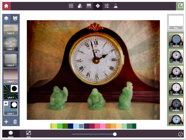
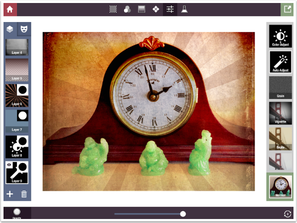
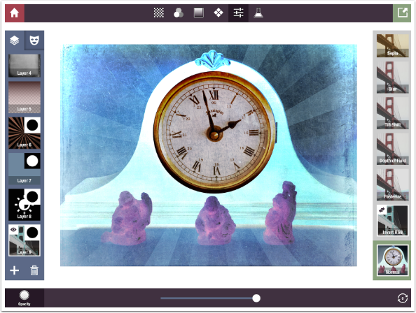
When I switch back to layer mode, I can use a plain Pattern, colored blue, in Overlay blend mode, to cool down the clock face. (This task can also be done by adjusting the white balance, as we’ll see when we examine Adjustment presets.)
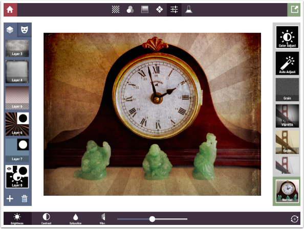
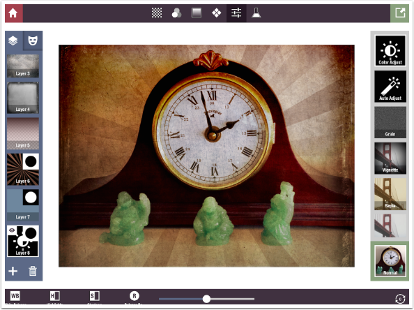
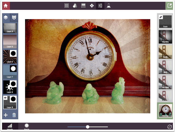
Let’s move on to Adjustment presets. I have duplicated the layer that masks out the clock face from changes (the rays layer) and dragged it to the bottom. Then I changed the layer’s contents to Color Adjust. If you look at the lower left corner, you’ll see that there are more buttons than will fit onto the bar. The changes you can make under Color Adjust start with Brightness, Contrast, Saturation and Vibrance.
They move on to Hue, Exposure, Gamma and White Balance (the slider makes the image cooler to left, warmer to right).
They continue with Highlights and Shadows.
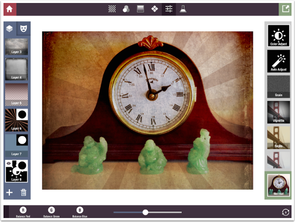
Next are Balance Red, Green and Blue.
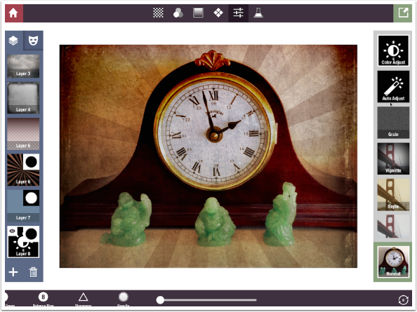
The final controls under Color Adjust are Sharpness and Opacity.
The Opacity slider works on all the changes you have made in the other controls. If you fade back the opacity, you fade the Brightness, White Balance, Sharpness, etc. Below you’ll see Opacity at 100%
The next screenshot shows all the changes faded back to about 30%.
Auto Adjust, the next preset, only has an Opacity slider. You either like the changes that Stackables makes for you or not.
Grain is next, and it includes Intensity and Opacity sliders. The double-arrow icon tells you that there are different kinds of color and monochrome grain to try.
The fourth Adjustment Preset is Vignette, with Radius and Opacity sliders.
Tapping the thumbnail will switch the vignette from black to white.
Next is Blur, with controls for Intensity and Opacity.
Other options for Blur include the horizontal motion blur seen below.
Tapping the Blur thumbnail a third time will apply zoom blur.
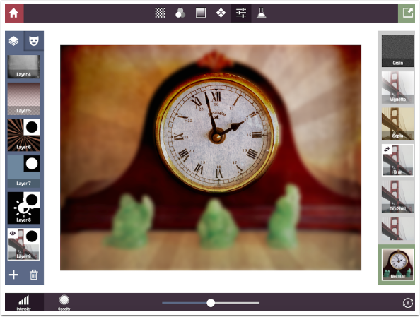
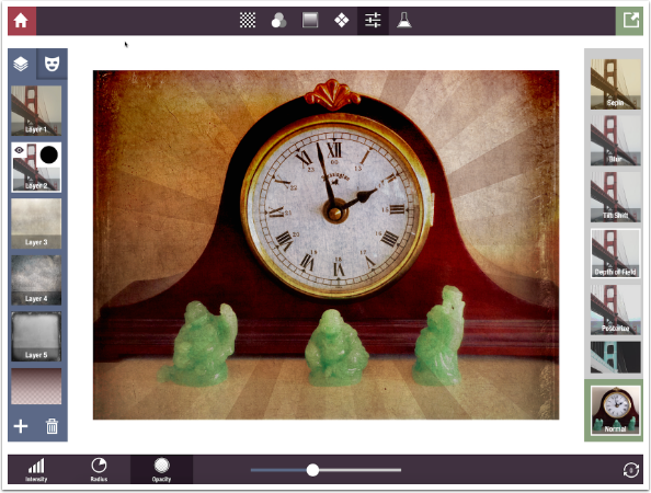
The next two presets are similar to Blur. Tilt Shift keeps a horizontal line across the center in focus, and gradually gets blurrier as it approaches the top and bottom edges. Controls are Intensity, Radius and Opacity. Depth of Field (shown below) works the same as Tilt Shift, only with a circular fade instead of a linear one.
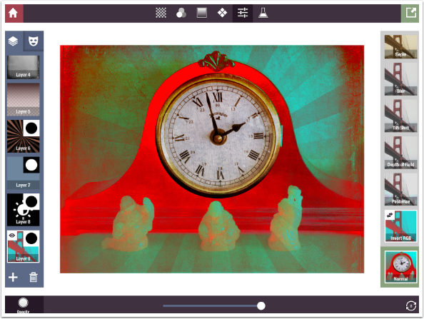
Posterize reduces the number of colors in your image, and Invert RGB makes a negative version of your image.
A tap of the thumbnail for Invert RGB gives you the option of inverting some colors without inverting all. Above, the light yellow wall was inverted to a dark blue. Below, it becomes a red/cyan switch.
Another tap effects a green/purple witch.
Finally, a third tap switches blue and yellow.
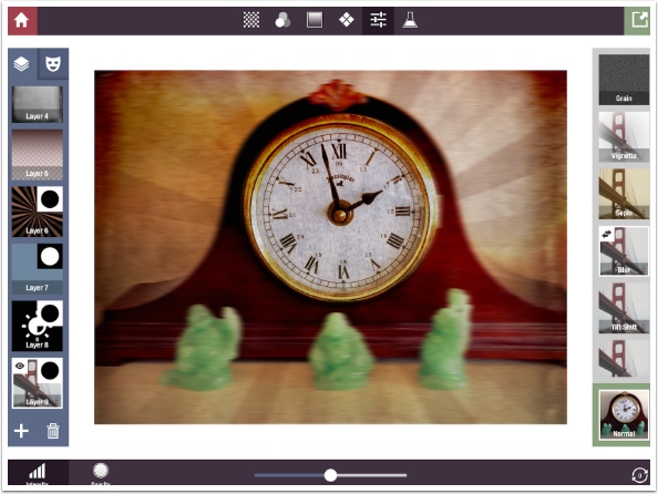
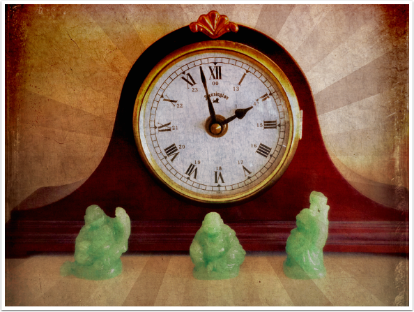
Don’t forget, you can always change the order of the layers, even after applying a mask. Below, I wanted to blur the edges of the image slightly, without affecting the clock face and without blurring the added textures. So I duplicated a layer that had the mask, changed the contents to a depth of field adjustment, and moved the layer up above the texture layers so they would not be affected by the blur.
When you have a result you’re pleased with, and you think you’d like to use that particular combination of layers again, you can save the layer stack as a formula. Next time, in the conclusion to the series on Stackables, I’ll explain how to save your images and formulas, and apply formulas packaged with the app. I’ll also create an abstract image completely from scratch within Stackables. What happens when you save that layer stack as a formula? Until then, enjoy!
TheAppWhisperer has always had a dual mission: to promote the most talented mobile artists of the day and to support ambitious, inquisitive viewers the world over. As the years passTheAppWhisperer has gained readers and viewers and found new venues for that exchange.
All this work thrives with the support of our community.
Please consider making a donation to TheAppWhisperer as this New Year commences because your support helps protect our independence and it means we can keep delivering the promotion of mobile artists that’s open for everyone around the world. Every contribution, however big or small, is so valuable for our future.
Jerry Jobe
Never content with just scratching the surface of what an app can do, Jerry Jobe decided to pass on what he learned about imaging apps to others. He’s constantly trying to figure out just what tools other artists have used, and trying to incorporate them into his own work, in an attempt to find his style. He’s written tutorials on over 145 apps so far, which you can find (along with his Song of the Day entries) at http://enthusiasmnoted.wordpress.com/ He lives near Atlanta, Georgia, where he also finds a creative outlet in acting and directing in community theater.

One Comment
Lash LaRue
This is indeed a powerful app; thanks for the information.