Streets Ahead – Eleventh Edition
We’re delighted to publish the Eleventh Edition of Streets Ahead, the wonderful Women’s Street Photography Column that we publish each week. If you would like to join the Streets Ahead Flickr group, please go here.
‘The enthusiasm and support for this collective has been tremendous – and we can’t thank you all enough! Our membership in the Flickr group is now over 100 and keeps growing every week.
For this week’s showcase, we thought it would be far more interesting to present a quality sampling of the work that was submitted, instead of selecting only 10 “favorites.” Please note, however, that we simply couldn’t help but comment on a few photographs that jumped out at us… you’ll find those images below with the showcase beneath them.
And if you feel compelled to share your thoughts, please do! (especially on the topics of composition, colors/tones, subject matter, bordered frame vs. borderless, etc.) This is OUR collective… and the more voices that are shared (and heard,) the better! We have recently set up a Facebook Group for our column we’d love for you to join us over there for open discussions.
In the meantime, we hope you enjoy this presentation… and we look forward to meeting you all back here next week!’
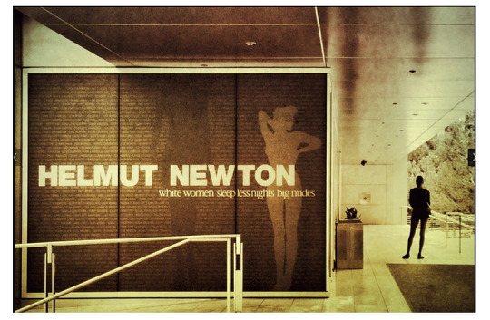
In Stark Contrast – Flickr link
by Sharon LuVisi
Brilliantly seen! And to be honest, I couldn’t help but smile when I saw this one. Visually, Sharon nailed it. She captured light vs. dark… the front of a woman vs. back of a woman… legs together vs. legs apart…. arms up and out vs. arms held close to the body. And she also beautifully framed the image with the golden section… utilizing the lines and the text to navigate our eyes to the woman’s silhouette on the far right. But, of course, the perfect punctuation to this image is that Sharon took it at an exhibition of Helmut Newton’s photography… excellent!
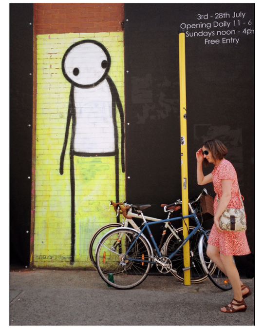
“Photo” – Flickr link
by Frederique Bellec (Eyephoneographer)
What a wonderfully whimsical image! For me, this is a visual interprestation of a human being interacting with street art. The obvious elements that initially grab our attention are the bold graphic colors, lines and overall composition… everything nicely divided and arranged within the rectangle. But the best part is the humor. The eyes on the streetart figure seem directed right at the woman walking… while her hand is raised over her face as though she’s trying to escape from being seen! Great instincts and capture, Frederique!
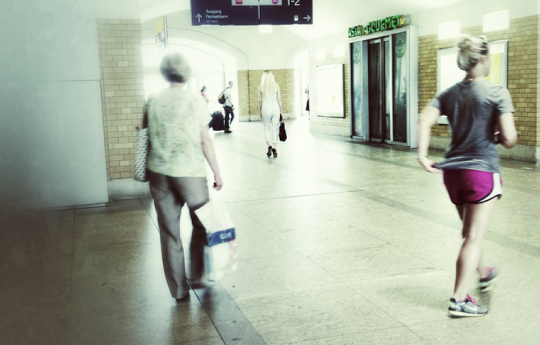
“Wandering 21” – Flickr link
by Manuela Matos Monteira
I think this is such a great capture of motion, and I completely love how the three main people are of the same gender, yet they have completely different characteristics… an older woman with a shopping bag… a woman in sports attire (who is obviously walking with a quickened pace) and the woman far ahead who appears to be dressed fashionably. Each one is beautifully spaced within the composition, moving at different speeds. I am also visually satisfied with Manuela’s processing choices – she created a very light atmosphere, which gives us the feeling of a passing glimpse.
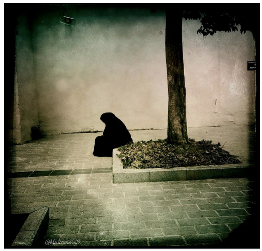
“Alone” – Flickr link
by Maj Jones
I find this image to be extremely powerful and moving. Maj definitely captured a lovely Hipstamatic moment with a dynamic composition. The strong vertical line (tree trunk) and the horizontal lines in the pavement divides the overall space beautifully, which gives the woman a clearly defined boundary of empty space. It’s not clear to us whether she’s sitting in prayer… or sitting in sadness. But either way, her body posture and hanging of the head indicates a mournful state. And just like our eyes can’t help but pause on her… our hearts can’t help but pause with her.
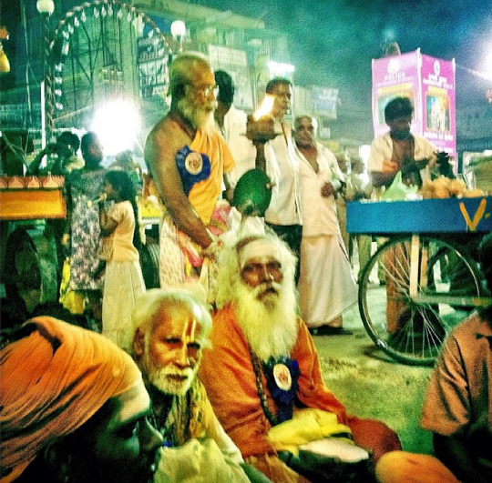
“Tamil Nadu” – Flickr link
by Cathy Scholl
This is such a stunning shot.! And to top it off, Cathy’s processing choices really turned this image into a visual treat… using a color filter to beautifully highlight the orange cloth. I just think the point of view is fantastic! Even though it’s clear that the photographer caused some attention by her presence, we don’t feel at all like we are unwanted. In fact, the sadhu with the long beard appears very accepting and inviting. The bright lights tell us that it is nighttime… and the fact that everyone is standing/sitting stationary, facing the same direction, iindicates that this is a festival or religious function of some sort (which, I must admit, piques my curiousity.) But for me, the true beauty in this image is its timelessness…. not due to the post processing, but because of the rich South Indian culture. The bright lights and pink poster are the only things that give away which century this image was taken in. Beautiful capture, Cathy!
Showcase

9 Comments
Connie Rosenthal
Joanne and JQ – thanks for including me in this week’s wonderful Streets Ahead showcase. I’m honored to be included with such amazingly talented fellow female photographers
Catherine
Just loved it!! Not only was the video filled with beautiful and intriguing street shots, the music had me bopping in my seat – what a great way to start my morning! Thank you Joanne and JQ for including me… 😀 xoxoxo
Stef LP
I second this comment!!!!
Vicki Oseland
Thank you, JQ and JoAnne for including my Savannah photo in this week’s showcase! What an honor to be included with all the amazing talent here!
Maj Jones
What a wonderful surprise and such a great honor for me to see my photo included in this weeks edition! Thank you so much, Joanne and JQ, your words fully summarize my feelings when I saw this woman. 😀
MartinaP.
Great showcase, as always, with so many beautiful photos! Thank you for having included one of mine, I feel very honored.
Paul J Rose
Great feature and loved the feedback.
JQ Gaines
Thank you all for sharing your wonderful images!!! Not to sound biased or anything… but I do think you ladies (and this women’s collective) is one of the coolest art groups around 🙂 Looking forward to seeing your work throughout the week!
Veevs
WOw awesome showcase from such talented ladies! Thank you so much for featuring one of mine! <3