
iOS Mobile Photography App Tutorial – ‘Stackables’ Part 1 by Jerry Jobe
We are delighted to publish Part 1 of 3 mobile photography app tutorials with the app Stackables by Jerry Jobe (foreword by Joanne Carter).
Stackables retails for $1.99/£1.69 and you can download it here.
“You would think, after covering 92 iPhoneography apps (this is number 93), that I have covered all of my favorite apps. You would be wrong.
It’s no secret that I do most of my apping in iColorama. It’s also no secret that I find Snapseed to be indispensable for quick, quality edits. And I’ve raved over apps by Pixite and JixiPix. But today’s app, Stackables, is such a joy to work with that I find myself using it to finish a great many of my images, and even start a few. Over the next few weeks we will see examples of using Stackables to finish or to create an image from start to finish.
Stackables is a texture app, or grunge app. I’ve covered several of these, including Distressed FX, Grungetastic and Mextures. Distressed FX has some beautiful textures built in, but it is not as flexible as Stackables. Mextures is also flexible, but the user interface is not as simple in my eyes, and the textures cannot compare to those in Stackables. Follow me through the Stackables app, in its most recent 3.0 release, and see if you don’t agree.
Stackables used to be a separate app for iPhone and iPad, but that was changed in an earlier release. The textures and capabilities are the same across the devices, and the user interface is similar, but the layout differences are necessary due to the available “real estate”. (Most of the screenshots will be from the iPad version, but part 3 of my series will show how the iPhone screens are laid out).”
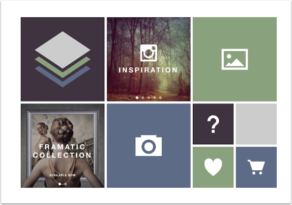
Stackables on the iPad, shown above, is always in landscape mode. The Home screen consists of seven buttons. The landscape icon is your photo albums; the camera icon is the Camera. Inspiration, if tapped, will take you to Instagram with the hashtag #stackablesapp; scrolling will show you a few other images modified with Stackables. The Collections button shows the in-app purchases available – there are two currently, Framatic and Cryptic. (You don’t purchase them here; they are available for preview among the presets displayed, and when you use them you are asked to buy them.) The Heart icon takes you to the App Store to rate Stackables; the Cart icon takes you to the app store to see other apps from Samer Azzam.
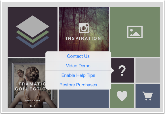
Tapping the Question icon brings up the following menu. The Video Demo is a ten-minute silent video that shows you most of what I’m going to cover. It’s a decent video, even if there are no explanations of what’s happening.
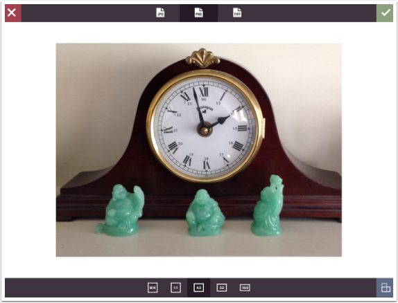
I’m going to do something I rarely do in these tutorials – capture my starting image with the camera. Whether you use the camera or pick an image from your albums, you are taken to the “image acceptance” screen, which gives you the opportunity to crop the image. There are no crop handles; instead, you choose the ratio of the image below and use a two-fingered pinch to place the image within the crop frame. Also, along the top are three icons to allow you to choose ahead of time what format will be used to save the image: JPEG, or the lossless PNG or TIFF.
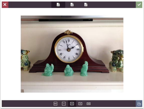
Below I’ve cropped the incoming image with a two-fingered pinch.
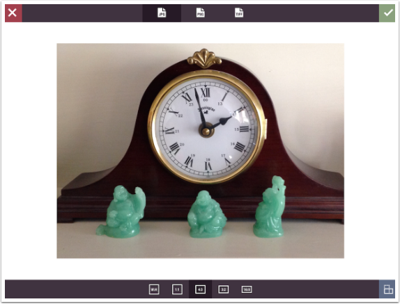
I change the format to PNG, which comes into effect when I save the image. Once you’re ready, tap the green checkmark at the upper right to start working with your image.
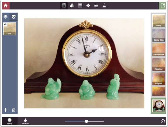
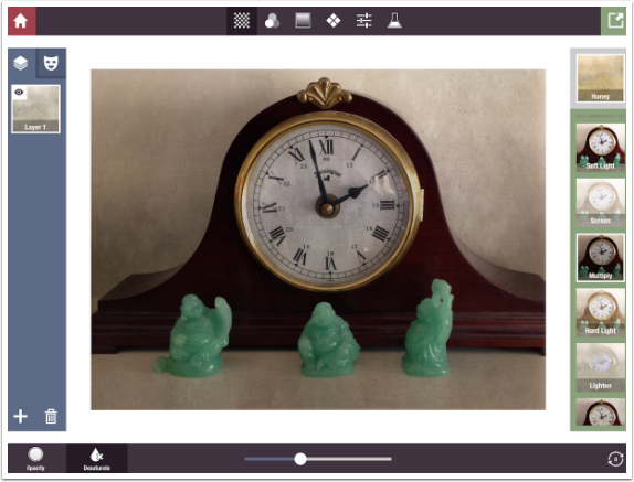
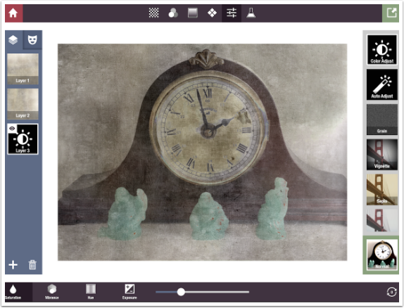
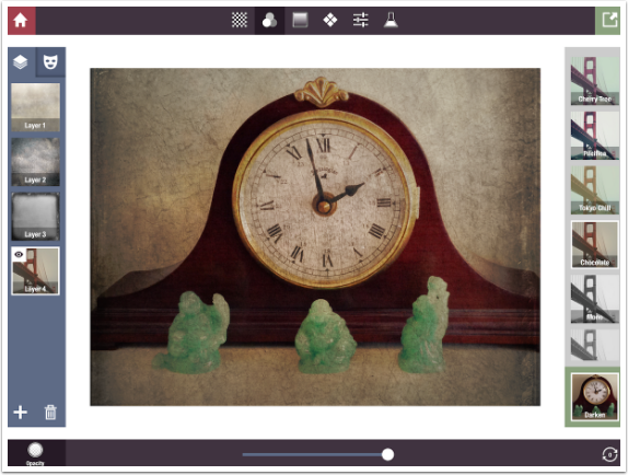
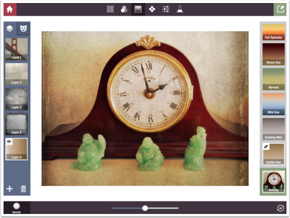
The workspace is divided into five separate areas. The image is in the center. The top bar contains a Red House to return home or clear all your layers. The Green Arrow is Save. The other icons along the top bar allow you to choose among the adjustments to your image: Textures, Color Filters, Gradients, Patterns, Adjustments and Formulas.
The left bar is for layers and mask. The right bar is preset thumbnails and blend mode options. The bottom bar is for adjustments to the chosen preset. The default Preset is Texture>Honey, and you have Opacity, Saturation and Rotation adjustments.
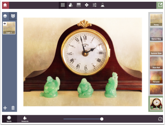
Below I’ve used the slider to increase Opacity to 100%. You can tell I’m adjusting the Opacity because Opacity is darkened in the lower left.
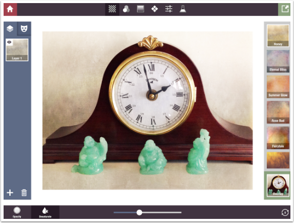
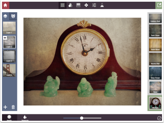
If I wanted to take the color out of the texture, I would tap Desaturate and move the slider to the left, as shown below.
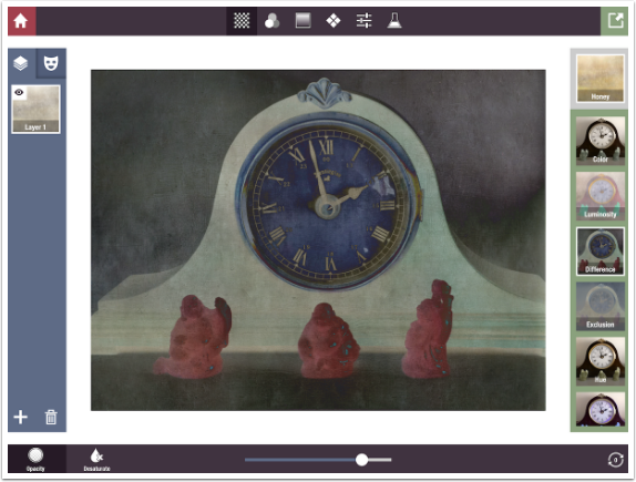
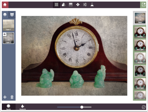
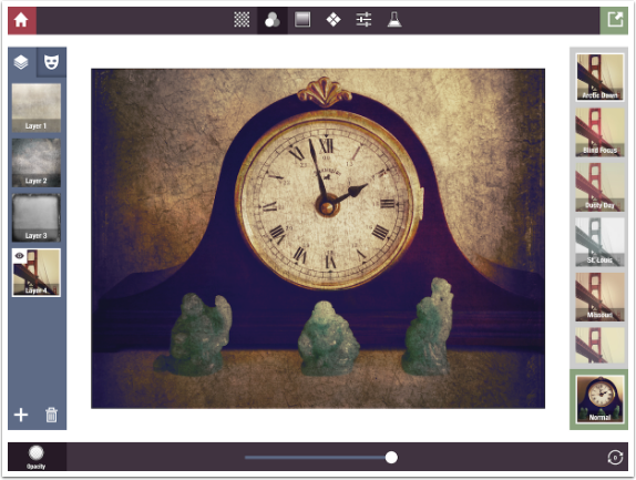
Tapping the blend mode, Overlay, expands the blend mode choices over the Texture choices, and allows you to scroll through the various blend modes. The thumbnails use your image to show you a representation of what that particular texture/blend mode combination will look like. Below I chose Multiply.
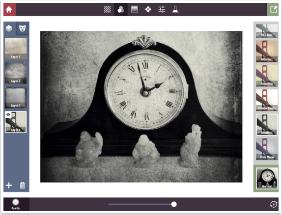
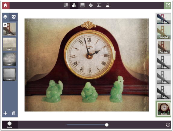
Stackables also includes the “funkier” blend modes, like Difference.
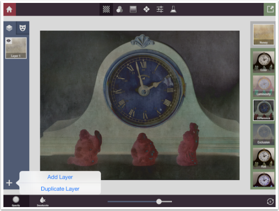
When you’re happy with your choice of preset and your adjustments to that preset, you can continue by adding other layers, using the plus sign at the bottom of the Layers palette. You can either add another layer from scratch or duplicate the current layer. Knowing how Difference mode works in a positive-negative manner, I know that duplicating a negative will lead to a positive image. So I hit Duplicate Layer.
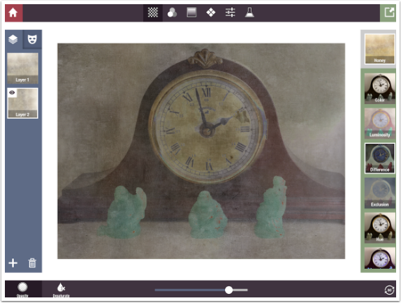
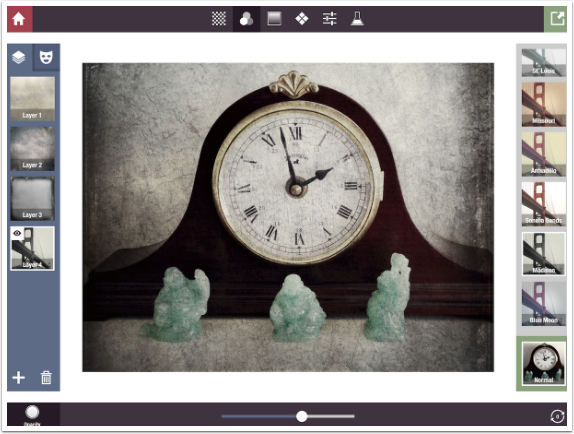
That leads to a rather intense grunge on my image.
Seeing as it is very dark and brown at this point, I can add a Color Adjust layer and adjust the brightness and saturation. (The Adjustments presets will be covered in detail in part 2.)
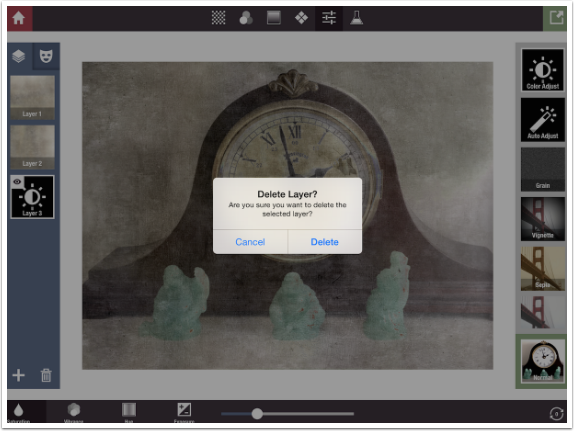
If I’m not happy with my changes, I can always go back and delete layers by tapping the Trashcan icon at the bottom of the Layers palette. A confirmation box will appear to make sure you want to delete the selected layer.
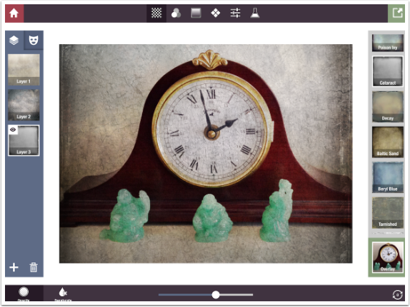
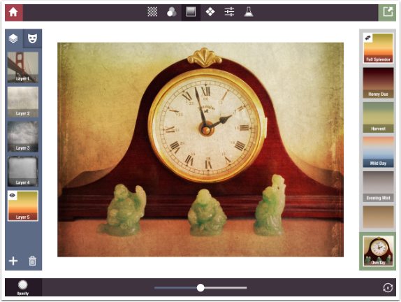
I deleted the Adjustment layer and the second Honey layer, and changed the blend mode of the first layer back to Overlay from Difference. Then I added a Layer of the Naos texture and changed the blend mode to Multiply, lowering the Opacity.
You can keep adding layers until you’re happy, or until you can’t see your original image anymore! Below I’ve added a Cataract texture in Overlay mode.
The next group of Presets, after Textures, is Color Filters. I have added a layer and touched the Filters icon at the top. Notice the bottom bar has changed also. Color Filters cannot be desaturated. Neither can they be rotated (even though the rotation icon is present).
The top layer works on all the layers below. Therefore, when I use the Madison filter to create a B&W effect, the color is removed from the textures as well as the image itself.
I can lower the opacity of the Madison layer to bring back some of the color.
It is also an option to change the blend mode of Filter layers. Once again, the blend modes expand over the Filter thumbnails to allow you to change the blend mode.
Here’s a nice look: Chocolate filter in Darken mode.
You can always go back and change the characteristics of a layer. Below, I lowered the opacity of the Naos layer a bit.
To return to the concept of which layers are affected by the current layer: what if I want the Chocolate filter to apply to the image, but not the added textures? It’s a simple matter to tap and drag the Chocolate layer to the top of the Layers palette. Now we can see some of the blue and red from the Naos layer again, because the Chocolate layer no longer turns those colors brown.
A new layer is always added at the bottom of the Layers palette, which is considered “the top of the stack”. Always consider yourself as looking up from the bottom through the layers at your image, which resides at the “bottom of the stack”. In the image above, I’m looking through the Cataract, then Naos, then Honey, then Chocolate layers to see my clock.
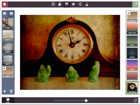
Next I go on to the third type of presets: Gradients. These default to the Overlay blend mode, but of course that can be changed.
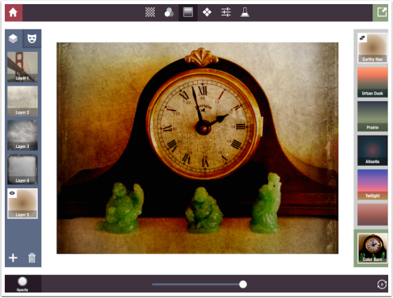
Below I’ve changed the Gradient to Earthly Hue, which is a dark brown to light brown gradient. It is presented as a fade from dark at the top to light at the bottom. What if we want the dark to be at the side, or the bottom? We can rotate the gradient using the Rotate button at the bottom right. This rotation is not freeform. Each tap of the Rotate button rotates the Preset 90 degrees. Below I’ve tapped the button once, and the gradient now goes from light to dark, left to right.
As I said, you can also change the blend mode of the Gradient. Below you’ll see it in Color Burn mode.
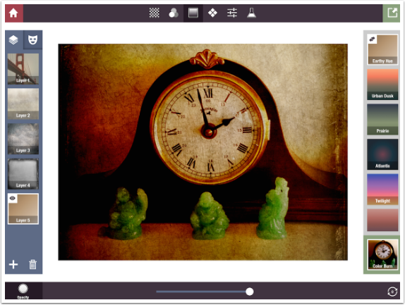
There’s something new to notice in the thumbnail of the Gradient currently selected, Earthly Hue. That does the double arrow mean? It means there are variations to the preset. In the case of Gradients, one tap of the double arrows changes it to a diagonal gradient.
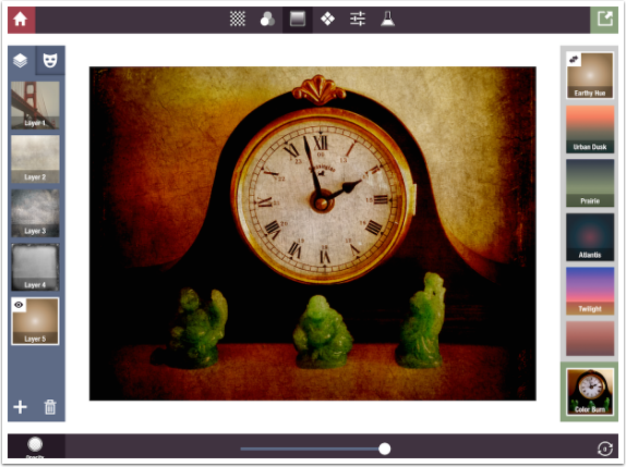
Another tap makes it a circular gradient, with the top color on the outside.
Finally, a third tap makes it a circular gradient, with the top color on the inside.
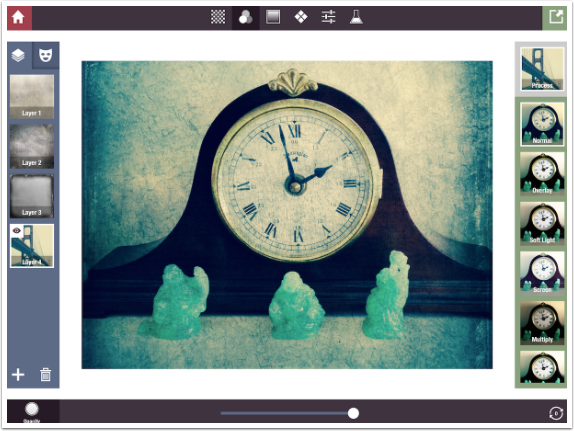
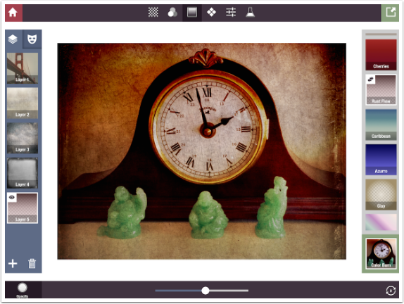
Gradients can also have transparent areas, that will not affect the underlying image. These transparent areas are represented by checkerboards, as in the Rust Flow gradient below.
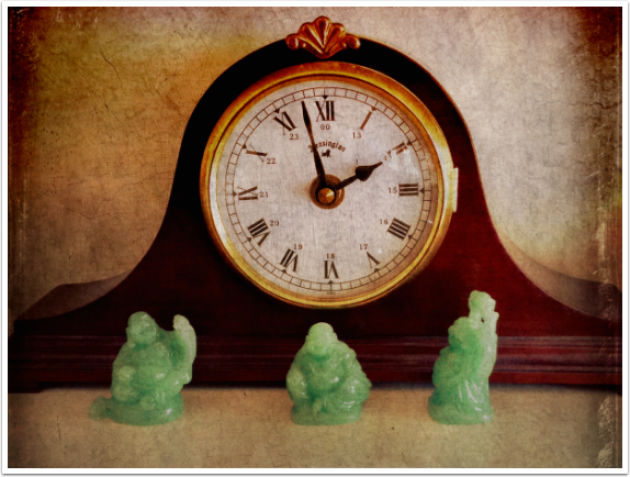
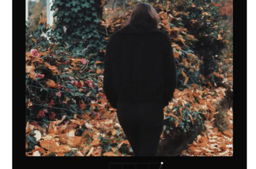
Our image is really beginning to shape up here, so let’s take a look at the result so far.
Next time we’ll continue with the same image, and look at the Pattern and Adjustments Presets, as well as a brand new feature, masking. In Part 3 we will look at Formulas and create an abstract from scratch in Stackables. Until then, enjoy!
TheAppWhisperer has always had a dual mission: to promote the most talented mobile artists of the day and to support ambitious, inquisitive viewers the world over. As the years passTheAppWhisperer has gained readers and viewers and found new venues for that exchange.
All this work thrives with the support of our community.
Please consider making a donation to TheAppWhisperer as this New Year commences because your support helps protect our independence and it means we can keep delivering the promotion of mobile artists that’s open for everyone around the world. Every contribution, however big or small, is so valuable for our future.
Jerry Jobe
Never content with just scratching the surface of what an app can do, Jerry Jobe decided to pass on what he learned about imaging apps to others. He’s constantly trying to figure out just what tools other artists have used, and trying to incorporate them into his own work, in an attempt to find his style. He’s written tutorials on over 145 apps so far, which you can find (along with his Song of the Day entries) at http://enthusiasmnoted.wordpress.com/ He lives near Atlanta, Georgia, where he also finds a creative outlet in acting and directing in community theater.
8 Comments
Jelly Beans
Jerry,
Thank you very much for a Stackable tutorial. This app is not as intuitive, and your examples are great. Keep ’em coming!
Best, Jelly
Sweetpea
Excellent tutorial, thanks a million!
I’ve been working with this app for ages and have never even tried some of the options you have described here – very eye-opening & I can’t wait to give them a test run. Also looking forward to your masking lesson …
Thanks again for all the helpful info.
Enrique
As always Jerry, your tutorials teach us to get the most of the Apps and become more creative. Thanks
Marilyn
Curious why you save as pig.
Marilyn
Of course I meant png
Sharyn
Thanks Jerry! Great tutorial.
Ros
Great tutorial. Thank you
Lash LaRue
Terrific, Jerry. Thanks.