Wedding Row – iOS Review
Described in the literature as ‘the ultimate wedding tool for gathering and organizing all of your wedding inspirations’, we’re inclined to agree. In essence, Wedding Row is an organized blank canvas for you to create your dream wedding. We recently interviewed the publisher of this app, Della MacNicholas to find out more information behind the scenes, you can read that here.
This time around though, we put the app through its paces to see if it lives up to its hype, read our review here…
Category: Lifestyle
Released: May 05, 2011
Version: 1.0
Developer: The Wedding Row, LLC
Price: $1.99/Download here
Getting
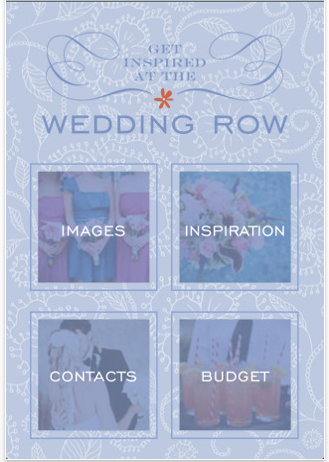
Getting started with this app is an exciting prospect and it doesn’t have to be limited to only brides, it would also be equally suited to wedding planners.
When you load the app the first screen you see is as the above. It includes Images, Inspiration, Contacts and Budget.
Images
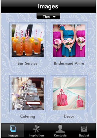
When you select Images you are then met with the above screen. From here, you can select any of the twenty five options and then select the + in the top right hand corner to take photos of specific items, or to add images from your photos folder.
For example, under Bridesmaid Attire, you may have seen a specific item that you want to replicate, or perhaps it is the actual item you want to use, whatever it is you can take a photo of it directly from your iPhone and it will be stored within that category. Long gone are the days of carrying around a note pad stuffed full of torn out magazine ideas – I remember those days well!
Inspiration
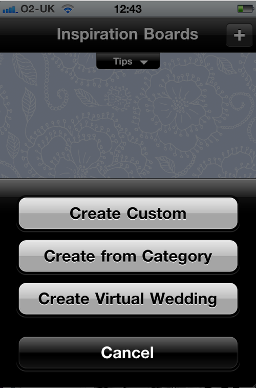
Inspiration allows you to create a new board of ideas for your wedding. Again, it is a similar operation to add information just click on the + icon in the top right of the screen and when you have created your board you can even share it with friends and family. You can also shuffle the images around with a shake of your iPhone.
Contacts
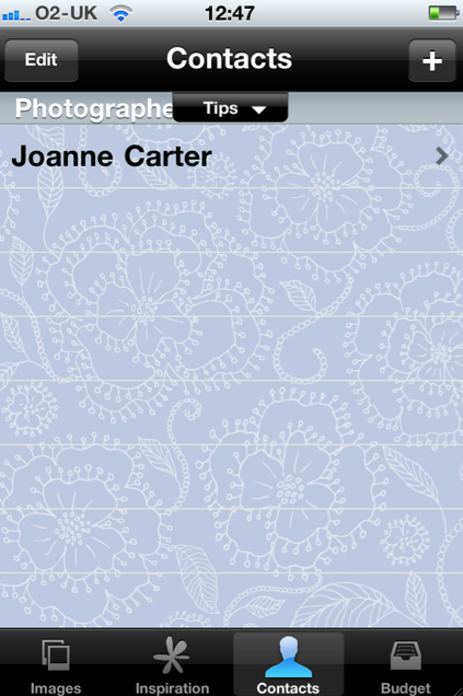
This is a very useful section. Again, following the operation as above just add all your important wedding contacts in one place. If you’ve already got some of your wedding contacts in your address book just select that to be added to this section. You can repeat this method vice versa too as The Wedding Row will put an entry in your address book for any new contacts too.
Budget
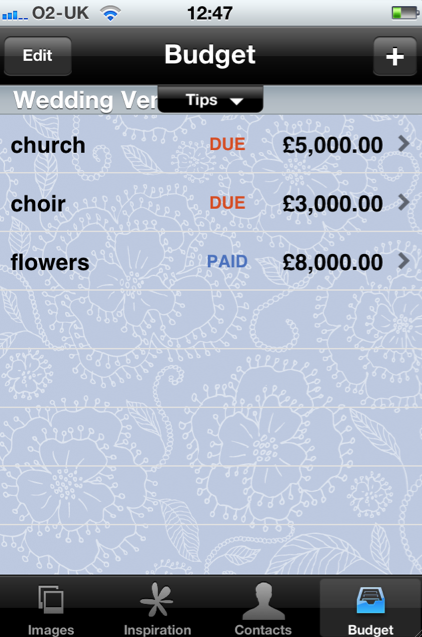
Lest we forget, the all important numbers game. The Budget section allows you to organize your budget on the go. Just type in a description, such as Wedding Cake and then the cost, again repeat it with the other expenses, flowers, church, choir etc and this section will keep tabs. You can also add whether this amount is due, paid, an estimate or a deposit.
Conclusion
There’s a lot we really like about this app, it’s impossible not to but there’s also a few tweaks we would like to see put in place. Nothing major and these can be added in a future update.
One aspect regarding the Budget section would be to have the facility to add a lump sum that was then deductible. So, if for example you’re allowing $25,000 for your wedding, to add that and then as you add the debits, you can see what you have left.
Secondly, the Tip bar obscures the screen occasionally and would be better placed elsewhere as once you are familiar with this app you don’t need to keep seeing it.
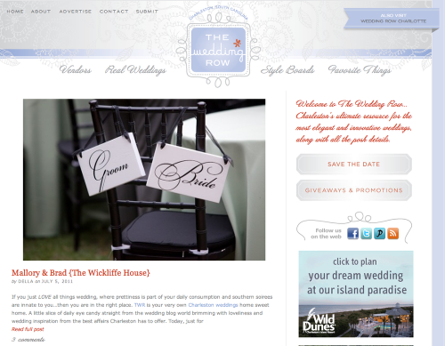
Thirdly, there is a wonderful Wedding Row website, see the link here, full to the brim with inspirational ideas, it would be really great, if you could access it from within the app and also to send up your ideas to it.
Not one of these points detracts from a very well put together app and a much needed one too. These few tweaks will make it even better.



3 Comments
Joel Anderson
First, why is there a row over a wedding? I should think that it would be a happy time. Second, congratulations! Third, you’re spending more on flowers than Will and Kate did?
Joanne Carter
Thanks Joel, I don’t think I could ever spend more than Will and Kate though 😉
Joanne Carter
By the way Joel, I’m already married, this was just an example!