Image Blender Tutorial – Using Image Blender To Create Your Own Stunning Collage
Image Blender can be used in a variety of ways, but the easiest and the main goal of the app is to get the right amount of an effect in a minimalistic way. Image Blender contains 18 different modes for blending your images. All of them will result in different effects. Even though Image Blender only allows you to work with two images at a time, with it’s flatten function you can build layer upon layer to create any possible of combinations. In this tutorial I will show you how I used four different images to tell a story through a digital collage.
(Just a quick note before I get started. Right after I first wrote this tutorial, the developer put out an updated version that made some great changes to the mask brushes. I have revised the tutorial to reflect these changes…however the screen shots showing the changes might be slightly different than the screen shots before and after them. Please overlook this…but I thought showing the mask brush revisions would be important! )
We hope you will feel inspired to try Image Blender for yourself after reading this tutorial. It is one of the most popular Photo apps available for the iPhone/iPad. It retails for $2.99/£1.99 and you can download it here.
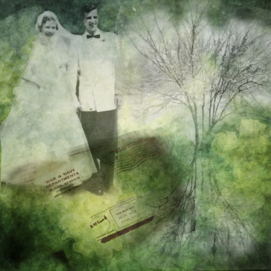
This is my final image, ‘Happy Couple’, each of the images that I used to create my collage were brought into my iPad and prepped in some fashion before I used them to create the final shot. I won’t be discussing how I did this…I’ll leave it up to you to create your own images to use for your collage.
Step 1
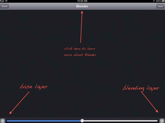
When you open Image Blender, this is the first working screen. The button/screen on the bottom left is where you pull in your base layer. The one on the right is for the blending image. (There are a number of functions available to you that I won’t be using in this tutorial. Image Blender has a nice tutorial built into it that you can activate by touching the Blender name at the top of the screen.)
Step 2
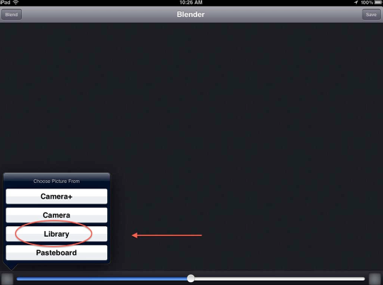
Touching this screen will bring up this pop-up selection window. I went to my camera roll to bring in my base image.
Step 3
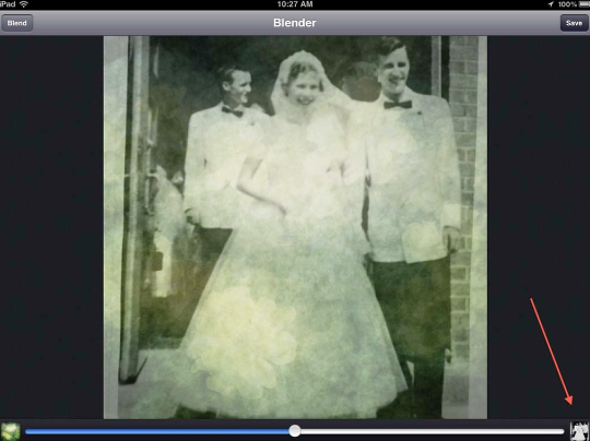
I then went to the screen on the right and brought in my second image. I now had a background base and an image of a wedding couple to work with. Again, the image shown in the left screen is always the base layer while the right screen is your blending image. This is important to keep in mind as you build your collages.
Step 4
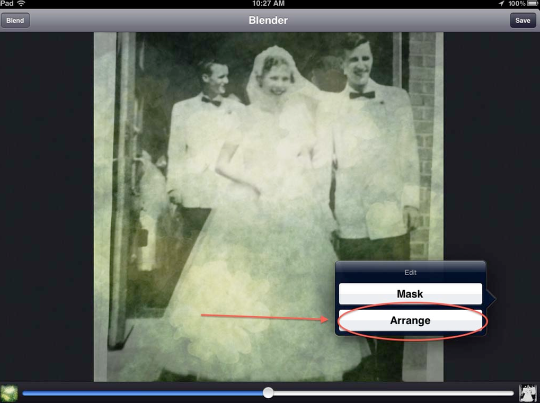
Now it was time to use Image Blender’s “Arrange” function to resize and place the top image where I wanted it. To activate this, double tap on the screen and the “Mask/Arrange” menu will appear. Click on “Arrange”.
Step 5
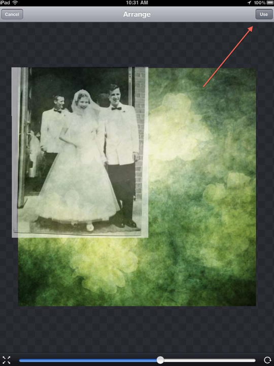
The top image will become a bit more visible allowing for easier adjustments. You can also use the slider bar (C) to change the image’s opacity. I’ve also pointed out two controls on the bottom of the screen, (A) and (B). If these have a lock symbol showing in their centers make sure to click on them to unlock these controls. (A) controls size while (B) controls rotation. Using the standard two- finger pinch/hold control, you can resize, rotate, and/or move the top image to where you need it in your collage.
When you’re happy with your adjustments, click on the “Use” button at the top right (D). This will activate you’ve done. (A note here. If you decide you don’t like what you see after clicking on “Use”, double click on the screen again to bring up the “Arrange” menu…and continue on!)
Step 6
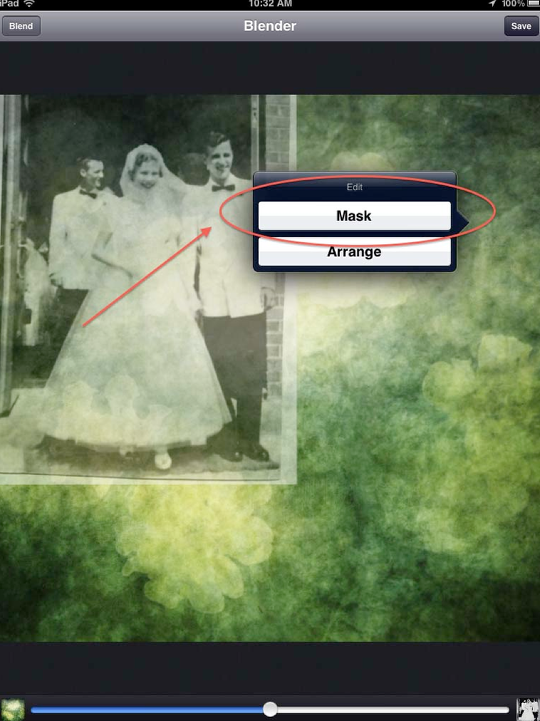
With the “happy couple” placed where I wanted it, it was time to do some masking. I double-tapped on the screen bringing up the “Mask/Arrange” menu…and this time had picked “Mask”.
Step 7
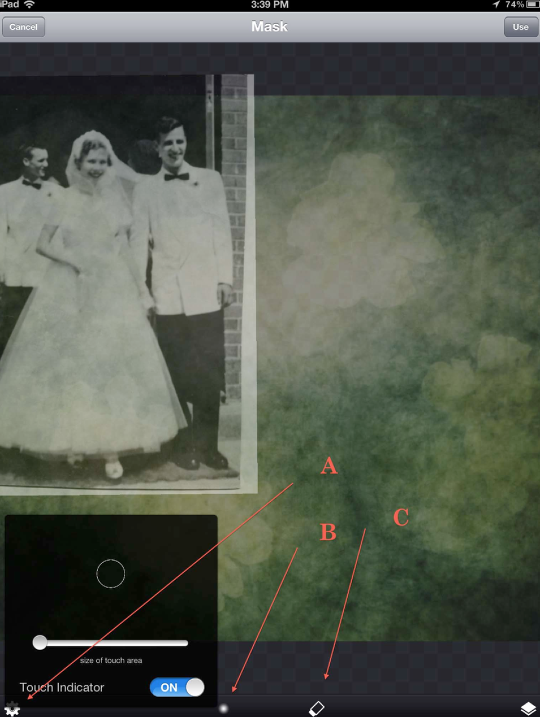
Once in the “Mask” screen, you have several controls at your disposal. The “Gear” control on the left (A) allows you adjust the “touch area” of your mask brush. This isn’t quite like controlling the size of the brush but it works quite well! You can zoom in and out of the image using the standard two-finger pinch. The brush symbol on the left (B) gives you two types of brushes…and solid brush and a more feathery brush the feathery brush is showing right now. The control just to the right (C) allows you to shift from “draw” / “erase”.
I typically will use the solid brush to erase away the major parts of the layer and then switch over to the feather brush to softened the edges blending them into the base layer so there are no hard edges showing.
Step 8
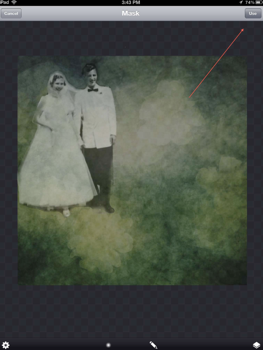
Once done with your masking, click on the “Use” button at the top (D).
Step 9
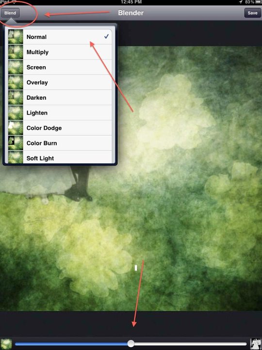
Time to do some blending. Click on the “Blend” button (A) which brings up the Blend Mode menu. I always need to try several different modes before settling on the one I feel works best. I’d suggest you do likewise. This time I decided on “Normal”, clicked on that and then used the slider bar to set the opacity at 50%.
Step 10
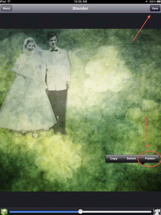
Okay…time to “flatten” my layers so I can continue to build my collage. To bring up this menu, touch and hold on the screen until it appears. Click on “Flatten” which flattens the two layers. If you look at the preview screen on the left, you’ll see this is now your base layer. The blending layer screen is blank…ready for you to choose your next image! (I also clicked “Saved” to create a backup copy in my Camera Roll. Always pays to be safe!)
Step 11
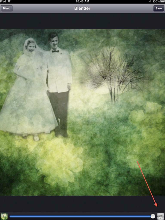
As in the beginning, I clicked on the screen, click on “Library” and went to my camera roll for my next image….a tree.
Step 12
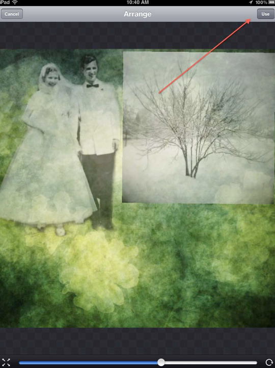
I double-clicked on the screen, brought up the Arrange menu, clicked on this and placed the tree where it needed to be for this collage….and clicked on “Use”.
Step 13
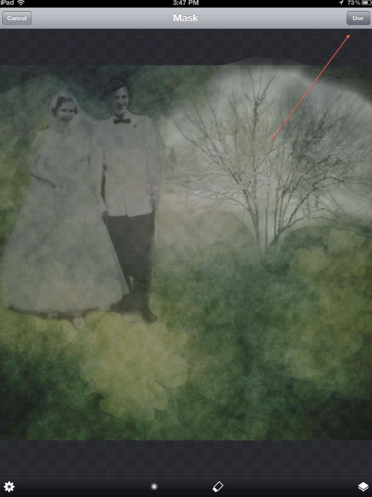
I brought up the Mask menu, clicked on this as before. Using the Erase/Draw and brush controls as the first time, I zoomed in and out of my image, getting the tree ready for blending.
Step 14
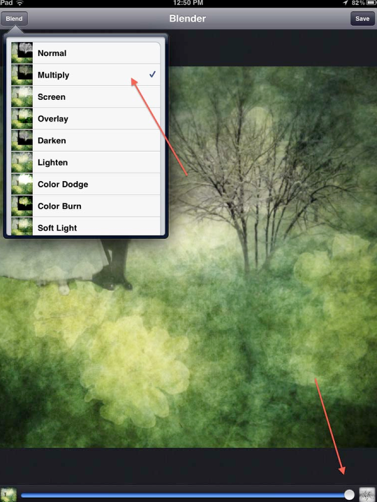
Clicking on the blend button and bringing up the blend modes, I tried several of them before deciding on Multiply @100%.
Step 15
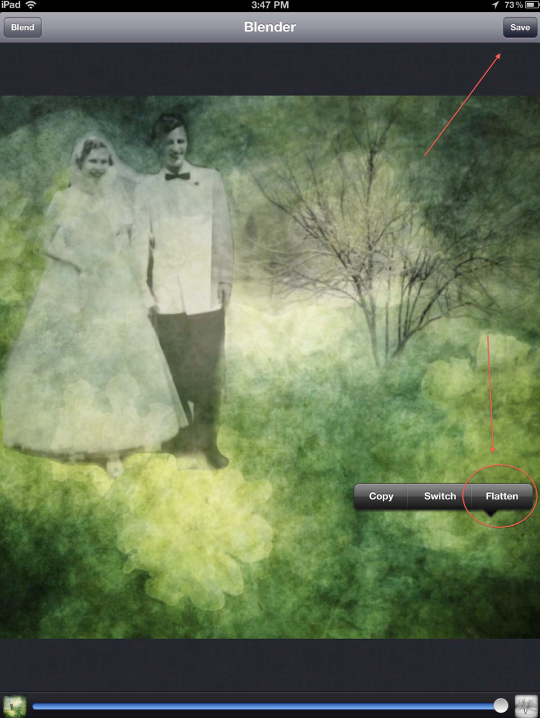
I once again touched and held the screen, bringing up the flattening menu and clicked on flatten as well as Save.
Step 16
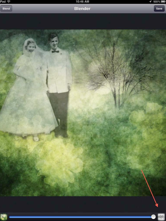
I wanted to use a mirror image of the tree…almost a shadow. So I clicked on the right screen, and brought up the tree image once again. Since the steps used to bring this second tree into the collage are just like above, I’m going to go through this pretty quickly.
Step 17
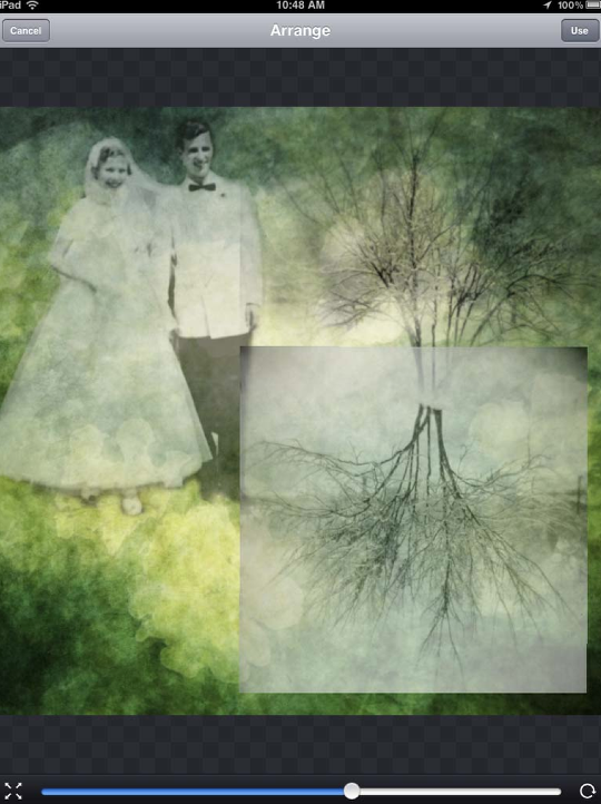
Placed the tree where I needed it…
Step 18
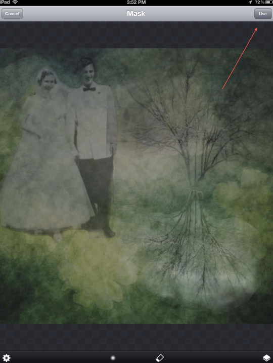
Masked the tree….and clicked “Use”.
Step 19
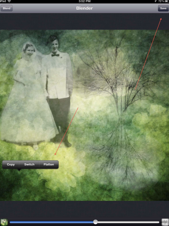
I used the normal blending mode at 58% to give it a shadowy feel. I clicked on Flatten…and saved this to my camera roll.
Step 20
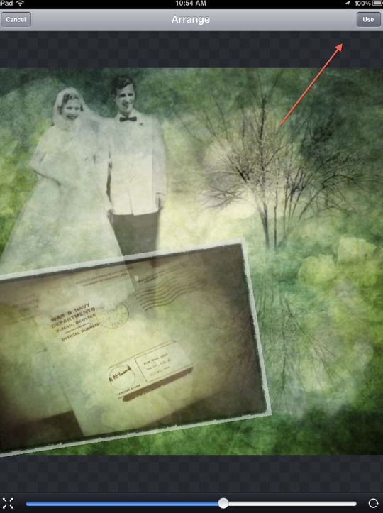
Time to bring in the final piece…something that would tie all the other images and “suggest” the story behind this collage. Clicking on the right screen as before, I brought in an image of a vintage envelope. And…as before, I brought up the Arrange function, placing the envelope. Finally, I clicked on “Use” so I could mask and blend this into my collage.
Step 21
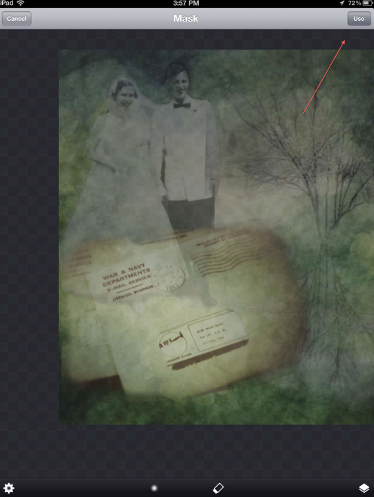
In this screen shot, you can see how I’ve masked the envelope…leaving only a hint. I clicked on “Use”…
Step 22
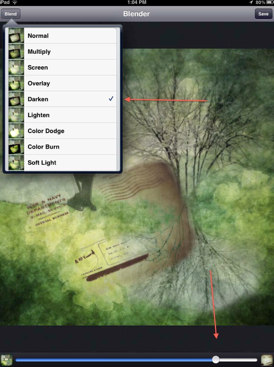
I then used the blend mode of “Darken” and 84% to blend my final piece into the collage.
Step 23
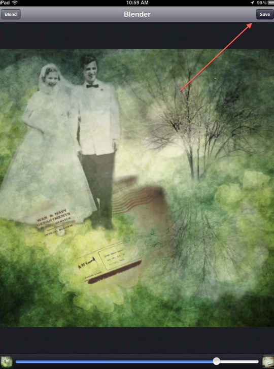
With everything in place, I clicked “Save” to send it to my camera roll.
Final Image
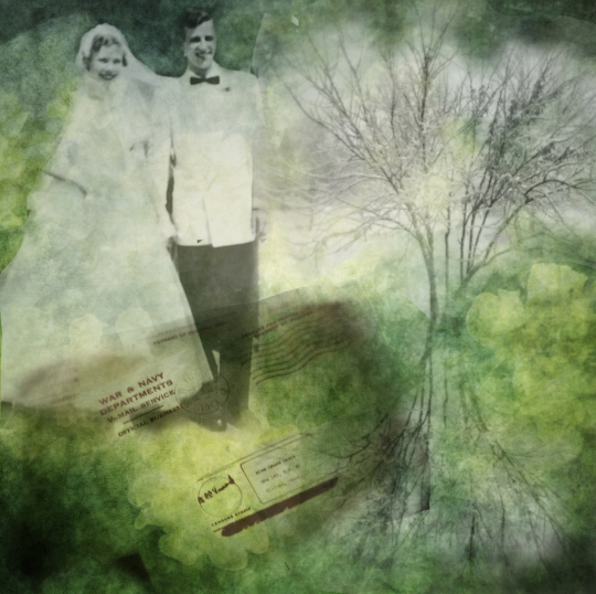
Here’s what the collage looks like at this point. Looking at it, I knew it needed some adjustments for brightness and contrast…just a little to tie everything together. So…I opened the image in another app and did just that!
We hope you found my tutorial useful and enjoyable. (2020 Update – we recently found this Photoshop tutorial talking about very similar techniques in case you’re interested) Please do not be shy about leaving comments and/or questions about what we did. We do appreciate hearing any and all feedback!! Thanks in advance!!

16 Comments
Kim Martino
Fantastic tute David, AGAIN! I’ll finally be able to use this app now, thank you so much! <3
David
Thanks Kim! I’m glad I was able to help!!!
melia
thanks again David. your tutorials are clear and easy. love your work. great “moods”
David
You’re welcome, melia! And thank you!! I’m glad you liked it!
Carol
Thanks, Dave, useful and clear instructions. I use Blender often but just learned a few new tricks.
David
Carol ~ That’s wonderful! When I can teach you new tricks then I know that I have done something!!! Thank you!!!
lisamjw
Great tutorial David!!
David
Thanks, Lisa! I’m so glad you liked it!!
Evie Ausley
Thanks David! . . . love your detailed tutorial!
David
Thank you, Evie!! I’m glad you liked it!!
Dan
Thanks to David for sharing. I love learning new techniques!
David
And thank you, Dan for your feedback. I do appreciate it!!
Anne
Somebody has a picture where there’s a girls head with a bun, and you see it from the side but you just see the outline, and inside there’s like a picture of trees. Around the head is just white. It’s almost like the white is outside the face shape, but instead of the side of her showing where it should be, there’s a picture, and the girl told me this is the app she used. Her username is pianogeek29 on Instagram
David
Anne ~ that sounds like an incredible image! Thanks for sharing this! I’m no longer on Instagram but I’ll check around to see if pianogeek29 is posting elsewhere!
Tracy Mitchell Griggs
Thanks – one of my goals this year is to self teach masking, blending, compositing and layering – I have used this app but not to full effect – I want to master thus before moving into other apps that offer similar functions
David
Tracy ~ I glad this tute was helpful. While there are a number of other apps that do the same thing, Image Blender is my go-to blending app. It keeps things straight forward and easy!