Pop Dot Comics Tutorial – Step By Step To Having Fun
It seems more and more that app developers are trying to out do each other with all the “bells and whistles” they’re putting into new apps…and I’m sure this will escalate with IOS 6 and the capabilities of iPhone 5. So I’m always happy when I run into an app that is designed for serious fun…and nothing more. Pop Dot Comics by JixiPix is just that type of app! I recently downloaded the app and thought it would be fun to try it out on this image! (I’m not going to show you the final until the end…but don’t worry, this isn’t a long tutorial!)
If you would like to try Pop Dot Comics for yourself, you can download it here. It retails for $1.99/£1.49/download
Step 1
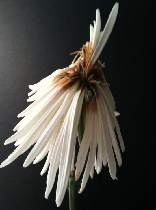
Here’s what I started with. Isn’t this an interesting still life? I shot this using 645 Pro on my iPhone 4. I had other ideas when I shot the series this came from, but as I said above…let’s see what Pop Dot can do!!
Step 2
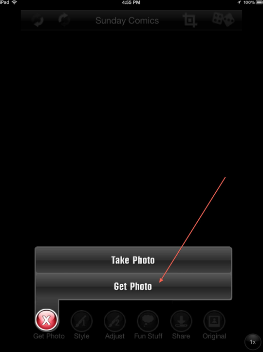
When you open Pop Dot, and after the title screen, you get JixiPix’s standard “get photo” screen.
Step 3
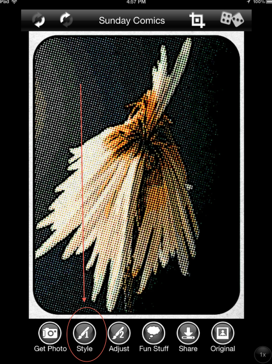
PopDot will pick, at random, a filter set to apply to your image. You can accept that one… or design your own set. Which of course, I did! I clicked on “Style” which opened the screen to all sorts of wonderful choices!
Step 4
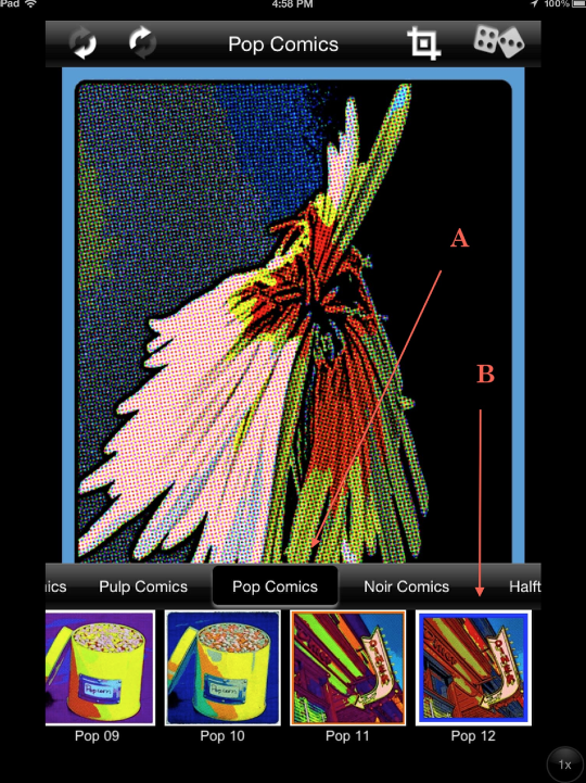
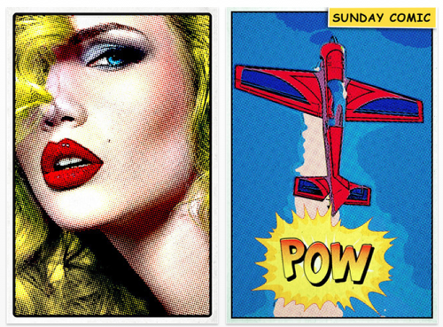
In the Style screen, you are presented with such choices as “Sunday Comics”, “Pop Comics”, “Pulp Comics”, “Noir Comics”, “Halftone”…it’s mindboggling! And in each style, you have something like 12 variations to work with. So many choices!!! I would suggest that you take some time and try them all out!! In any case, I choose “Pop Comics” (A) and “Pop 12” (B) to use with this creation.
Step 5
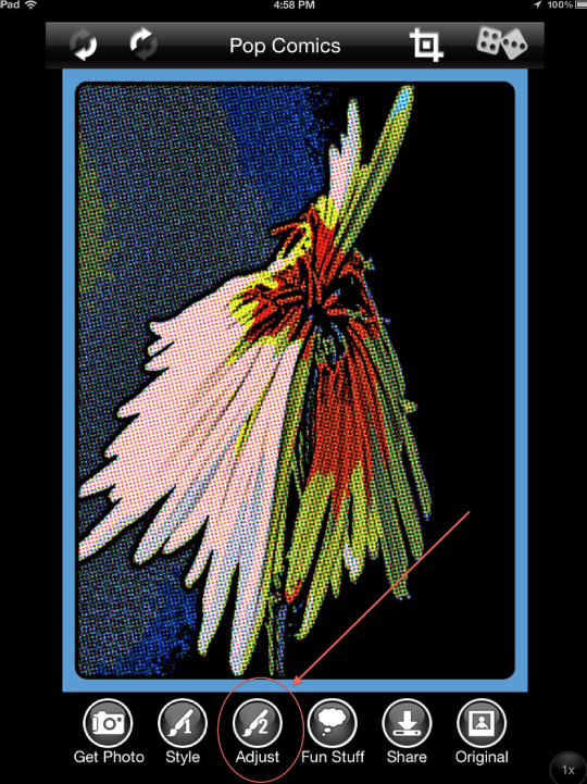
That done, the next step is to do a little fine-tuning! Clicking on “Adjust”….
Step 6
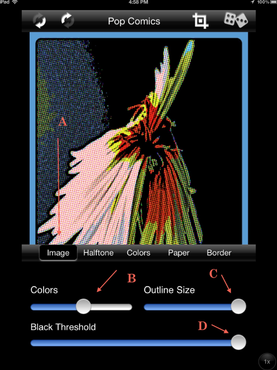
…opens a screen that gives you the ability to adjust the image colors, halftone pattern, paper surface, and border type. I started with “Image” (A) and adjusted the colors, outline, and black threshold as indicated by the slider bars. (Pop Dot’s slider bars don’t show a numerical value…so you’ll have to guesstimate what I did.)
Step 7
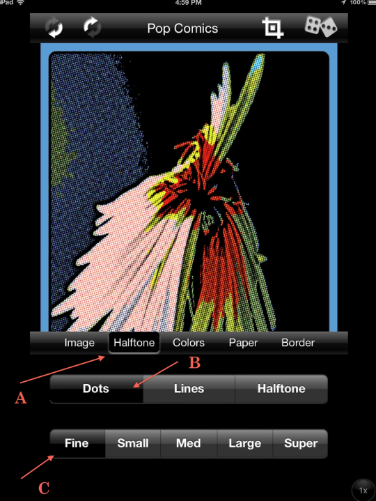
In the Halftone screen (A), I chose a dot pattern and set that for “fine”.
Step 8
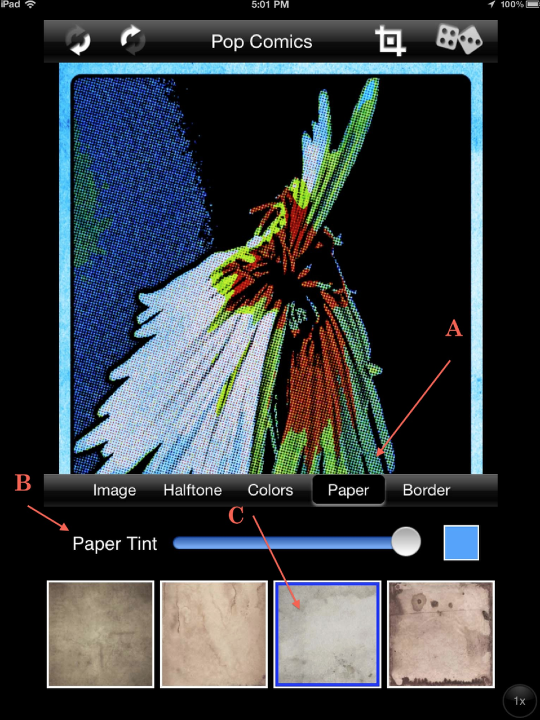
Moving to “Paper” (A), I adjusted the “Paper Tint” as indicated. (Clicking on the color box allows you to pick a different color while the slider bar adjusts the overall tint.) Below the slider bar are thumbnails of the different paper surfaces you can use (C) and I picked the one that’s second from the right end of the scroll.)
Step 9
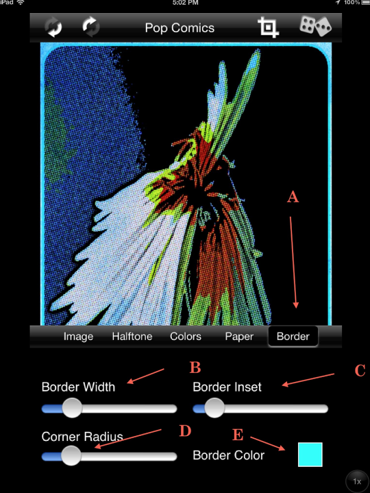
One last step…the border! After bringing up the “Border” selections (A), I adjusted the Border Width (B), Border Insert width (C), Corner Radius (D), and Border Color (E) as each of the respective slider bars indicate.
Step 10
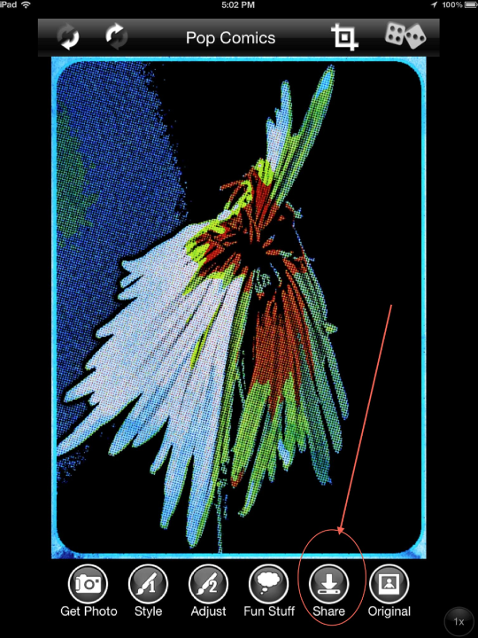
All done…time to save! Click on the “Share” button which opens…
Step 11
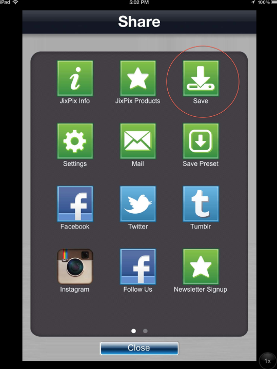
….this screen which gives you all sorts of choices as to where to send your final!
Conclusion
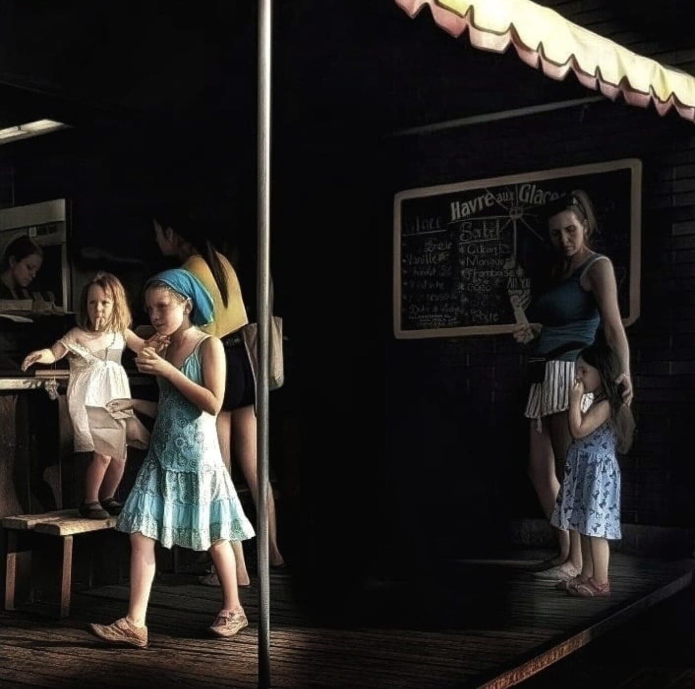
So there it is, how “Blue Rooster” came into being!! What I didn’t show you was how much fun I had going through all the different Styles and Adjust settings before I made my choices. I’ll let you do that on your own!
A couple of last points that I didn’t discuss earlier and probably should have. At the top of each screen you’ll see a crop symbol to the right. It does just what you’d think it would! And the double dices allow you to randomize your selections. Kinda of fun to play with as well! In the bottom of the screen…next to the “Adjust” button is one called “Fun Stuff.” This is where you can add text bubbles and comic book symbols! Very fun stuff!!!
I hope you found my tutorial informative and enjoyable to read. As always, please leave comments and feedback…I do appreciate knowing you where here…and what you thought!
9 Comments
lisamjw
Good tutorial!
David
Thanks Lisa!
Lilian Oliveira
I love the apps of JixiPix. I have all of them except for this one. Anxious to try it out. I just don’t like very much the ones of rain and snow. Don’t think they are very realistic or goes well with a pic. Never liked the edit results with those two, but love all the other ones and now – because your tutorial – I really want to test this one. Didn’t think it was so cool. Thank you!
David
Thanks, Lilian! I’m glad you like this one. I have to agree with you about the Rainy Day type apps…I haven’t really found much of a use for them myself. I’ll hang on to them for now…just in case!
Andrea Bigiarini
I use PopDot to print my artworks on an A1 plotter.
Halfone it’s the only option for print medium-res images.
Buy it and have fun. A professional fun.
(I love The AppWhisperer of course …)
Andrea Bigiarini
Sorry “Halftone” and not “Halfone” (I hate to write on a non ipad keyboard)
David
Andrea….thanks for your comments. I don’t have any experience working with an A1 plotter, but I do understand the use of halftones from my long ago days working with a commercial printer. Funny how some things never change!
Alon Goldsmith
How do you create description boxes? The ones that sit at the top and describe the action. (Like the one that says Sunday Comics in your last pic)
David
Alon ~ I’d like to take credit for those, but what I think you talking about is from a screen shot of the app…and those description titles…like Sunday Comics….don’t show up on the actual image. Now….you can use the word bubbles and action bubbles that are accessed thru “Fun Stuff” in the control panel. These are somewhat limited but are a lot of fun. Check these out!!