Halftone Tutorial – A Closer Look At The Photo Editor – ‘More There Than Meets The Eye’
In the “Tale of the Tilted Lamp” I showed you how easy it was to create a great comic book style panel using Halftone. In this article, I would like to take a closer look at the great Photo Editor that comes with this app and how you can use it to change the “feel” or “mood” of your panel. I also want to show you how the different paper styles available in Halftone and the dot settings can also be put to use! Sounds like a lot to cover in one article…and it is! So I’ll be moving through some things pretty quickly with the suggestion that you open Halftone and explore.
We hope this tutorial inspires you to try out Halftone for yourself. It retails for $0.99/£0.69, you can download it here.
Step 1
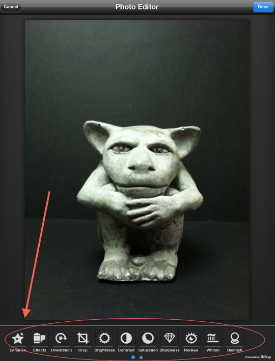
I don’t know if you remember Herbie! Here he is again as he’s willing to serve as my model for the upcoming demos. He just loves the spotlight!! (And I promise, no harm came to Herbie during any of the stunts you’re about to see. He is a professional.)
Okay…enough of that. When you first open Halftone, you are given the choice of sources for your image. Once you’ve made that choice, Halftone opens your image in its Photo Editor. As you can see at the bottom of this screen, there are eleven different editing functions you can use. Let’s start with the first one, “Enhance”.
Step 2
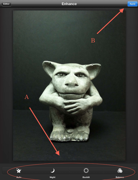
“Enhance” gives you the basic exposure/contrast/brightness controls. (These are all presets with no fine-tuning control available. You get what you get. This is true for all the editing functions in Halftone.) When you find one you like, click on “Apply” (B) to put this into effect….and to go back to the main control panel.
Step 3
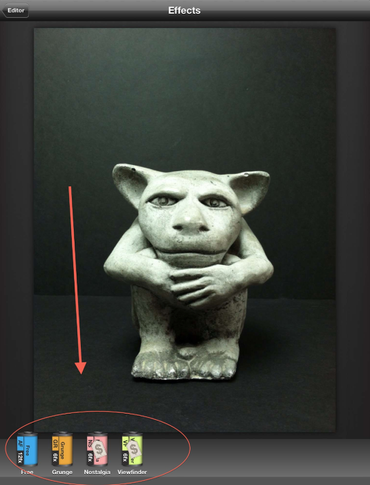
Going down the control panel, left to right is “Effects”. As I discussed in the first article, Halftone gives you four categories of effect filters…one “Free” set that contains 12 filters and 3 in-app purchase ($0.99) categories that have 6 filters. I’ve only purchased the “Grunge” set…that I like. The other two look interesting, so maybe later I’ll pick them up as well. We’ll take a closer look at these effects later on.
Step 4
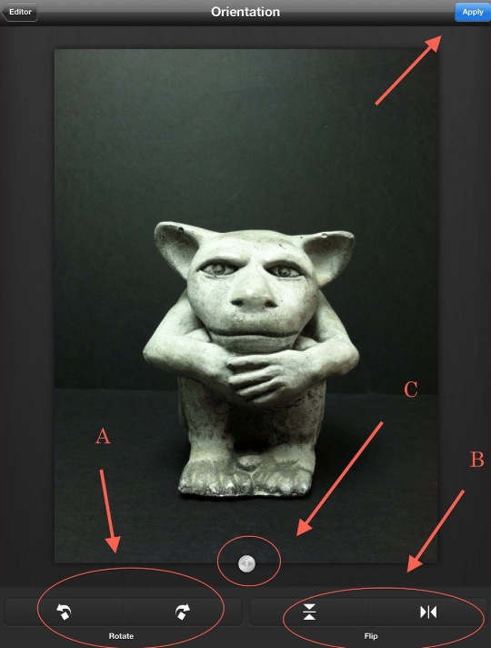
Next up is “Orientation”. In this mode, you can rotate, flip, and/or straighten your image for best results. Again, when done, click “Apply” to move on.
Step 5
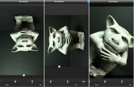
Sorry about the bit of silliness here, but Herbie insisted that I give him a spin while we were in this mode. He’s like that….
Step 6
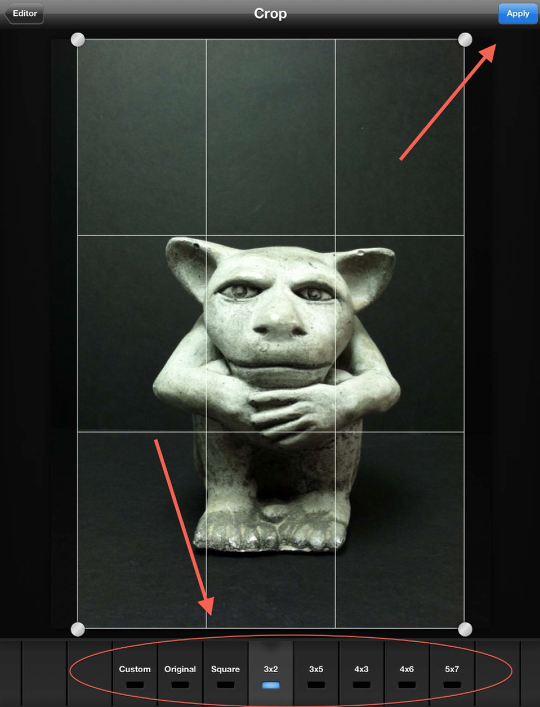
Time for a little cropping! In this mode, you have the usual presets and control points to work with. Nothing new here…which is fine. Do your cropping, if any, and hit “Apply”!
Step 7
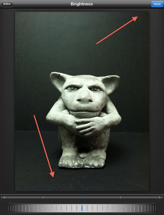
The next three controls, “Brightness”, “Contrast”, “Saturation” all work the same way. You use the dial to fine-tune your image for each of these settings. I feel these work a lot better than the “Enhance” presets…but that’s me! As always, make sure to hit “Apply” when done with each.
Step 8
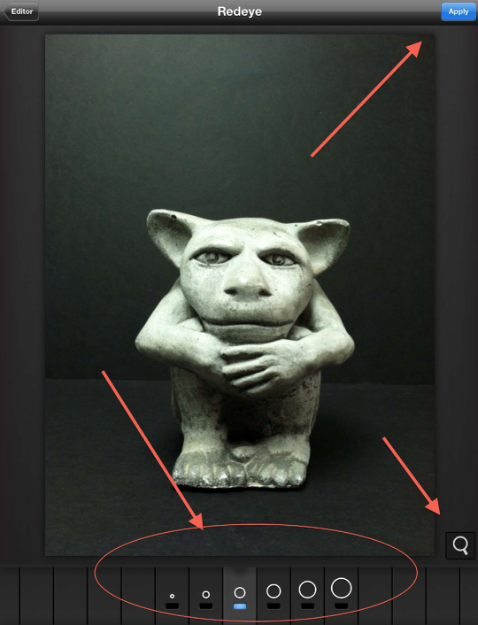
“Redeye”, “Whiten”, and “Blemish” all work in the same fashion. You are given brush sizes to work with and a selector tool. Since Herbie suffers from nothing that these could help…I can’t show you how they do. Give them a try on your own…they are great spot tools!
Step 9
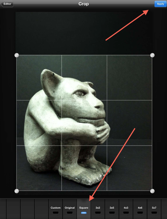
Time to put some of these editing controls to work. I had Herbie give me a profile…and in this screen shot you can see that I’ve “square” cropped him for a panel.
Step 10
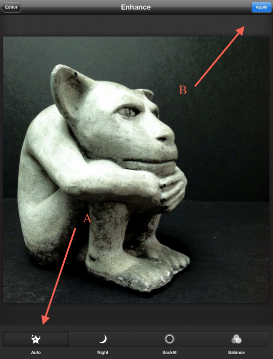
In the “Enhance” mode, I used “Auto” to even things out a bit.
Step 11
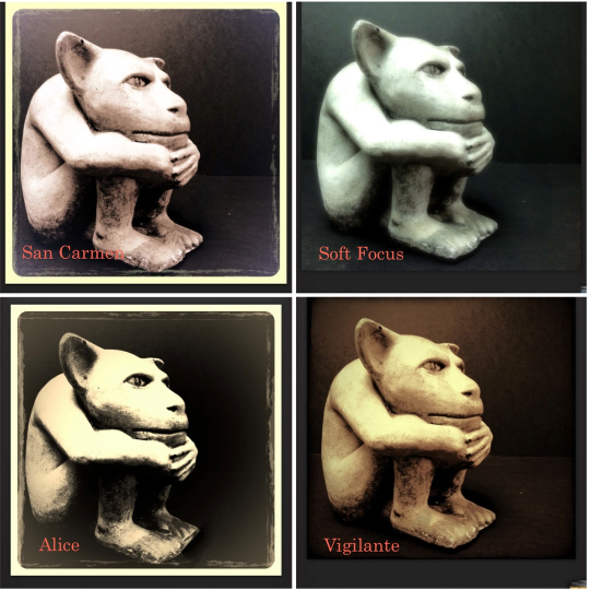
I tried out four different effects on Herbie: San Carmen, Soft Focus (both in “Free”) “Alice”, and “Vigilante” (both in “Grunge”) but couldn’t decide which one I liked best. So…I decided to combine them all!!
Step 12
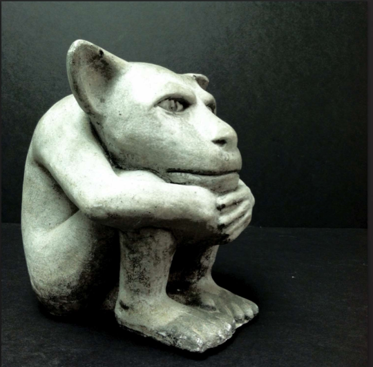
Here’s what Herbie looks like before “Effects”…..
Step 13
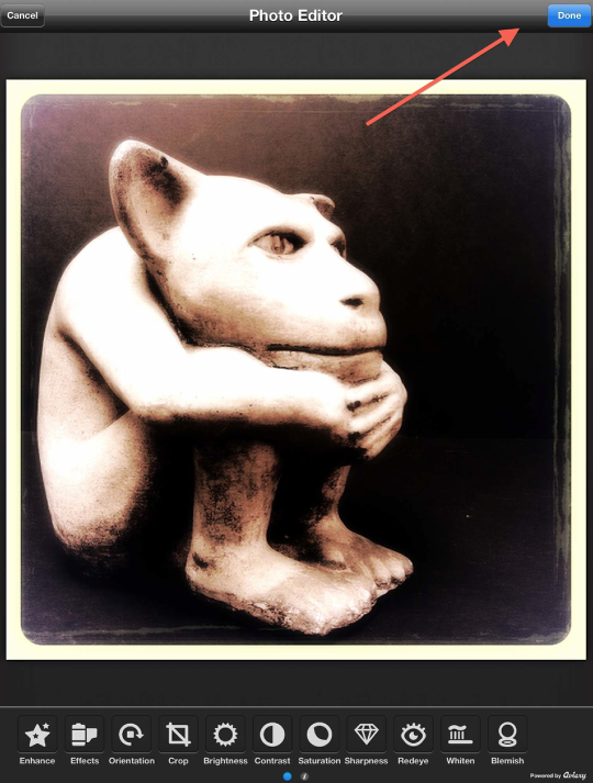
…and here’s what he looks like after “Effects”!!
My “recipe”:
1.) San Carmen – hit apply
2.) Soft Focus – apply
3.) Alice – apply
4.) Vigilante – apply.
Before closing the edit out, I did a touch of “Brightness”, “Contrast”, and “Sharpness”. Clicking the “Done” tab in the top right corner will close out your editing and put your image into a “comic” panel.
Step 14
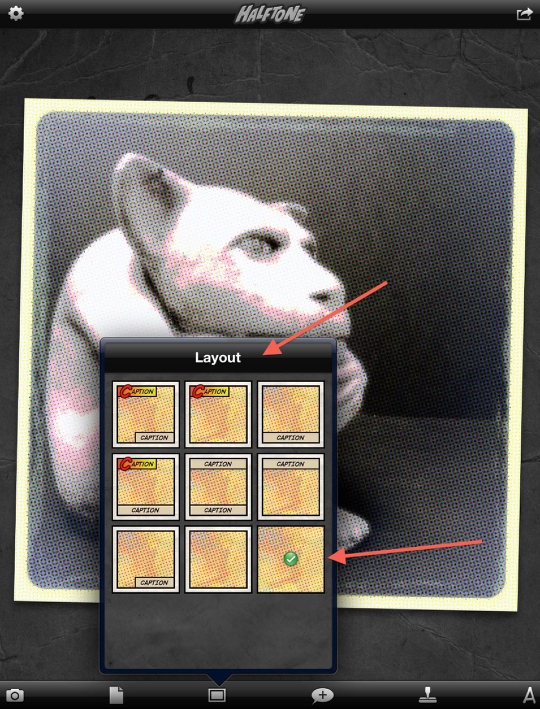
I forgot to save a screen shot of Herbie once he was in a panel…but you can see what the image looks like behind the “Layout” screen. It does look a bit different from the last shot…but here’s where we can make some changes.
I skipped over the “Paper” button for the moment to go to “Layout”. I wanted to use the indicated screen without borders and captions.
Step 15
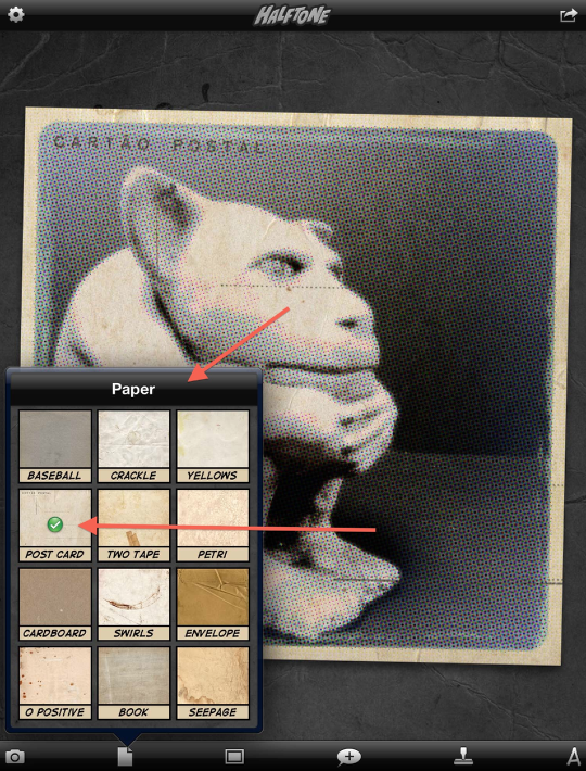
Moving back to the paper tab…the choice of paper background can make a big difference in the mood of your panel. In this screen shot, I’ve used a favorite of mine, “Post Card”. (There are more choices that this panel shows…do make it a point to try out several different ones!)
Step 16
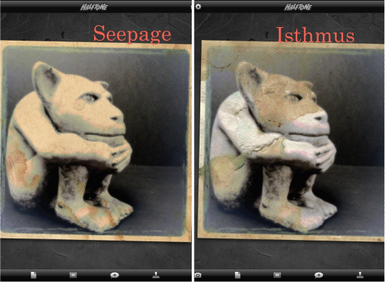
Just for fun, here is Herbie “wearing” two of the more extreme papers, “Seepage” and “Isthmus”. Both definitely change the mood of the panel. (I just love the masked Herbie on the right!)
Step 17
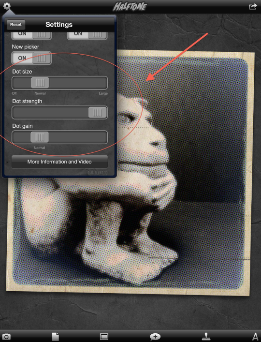
The last topic I want to touch on is the Dot size, strength, and gain. These can be adjusted in the Settings panel that’s activated by clicking on the Gear icon in the top left corner. In this shot, I’ve left the Dot presets on…and you can see how that looks on Herbie. (The paper background is “Post Card”.)
Step 18
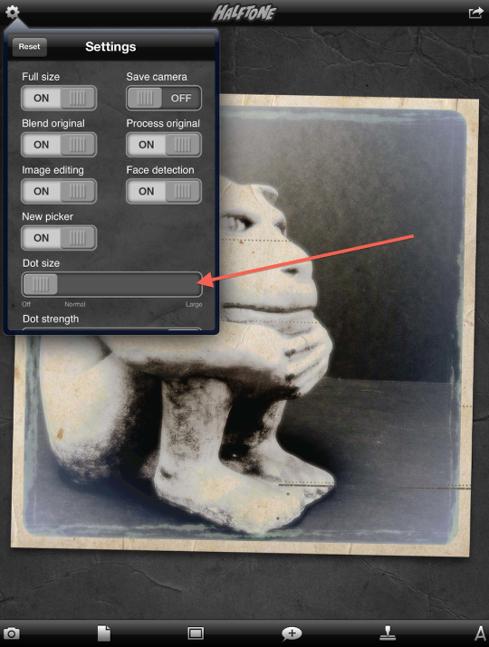
In this shot, I’ve turned the Dot size “off” giving me a panel clear of any dot pattern. I left Dot strength and gain at the preset levels.
Step 19
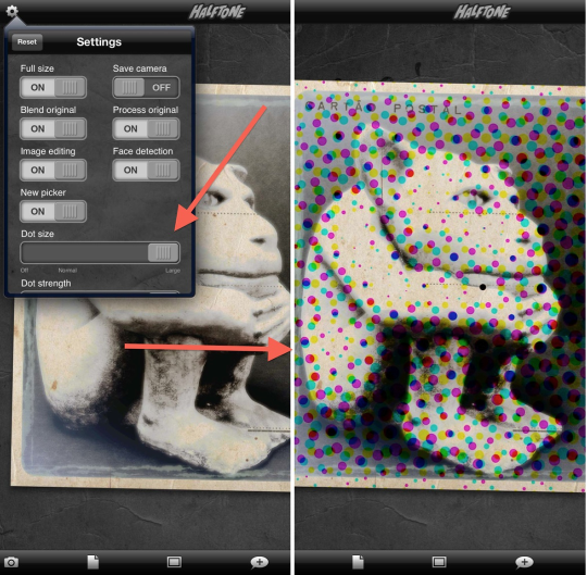
And…just for fun, I moved the Dot size from “off” to “large”. Herbie was not at all happy with this look!!
While I’ve not shown it, adjusting the Dot strength and gain can also give you similar results as in the other shots…or a dot pattern that’s in between. Play around…you can always change it back!!
Final
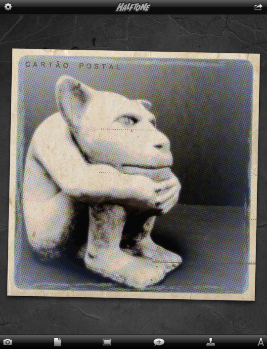
Here’s a final look at Herbie. From here, I’d add caption panels and text balloons…but that’s another story!
I hope you found this tutorial to be both interesting and enjoyable. Please don’t be shy with your comments and questions. I do appreciate hearing from you!! Thanks so much for stopping by!!

12 Comments
Dilshad
This is brilliant! Thanka David!
Dilshad
*thanks 😉
David
Thanks Dilshad! Glad you helpful!!
Robert Lancaster
Awesome tutorial. Thanks David!
David
You’re welcome, Robert! I’m glad you like it!!
Carolyn Hall Young
Unfortunately, It is not possible to edit full resolution images in Halftone. I wish I could use the editing tools, while maintaining full resolution – It just takes too much processing power. Without the editing tools, one can still use the halftone effects, and have plenty fun. The papers textures in Halftone are terrific – even if you’re not using the editing or halftoning features In the app. Watch the in app video. It will get you up to speed, quickly.
Thank you for this terrific tutorial. Your work is beautiful!
David
Carolyn ~
First, thanks for the compliments about my work. I do appreciate it!! I do find your comments about not being able to edit at full resolution interesting. I’ve never had any problems with that before. Just out of curiosity, what are you working on when you use Halftone? (In any case, I’m not one to worry too much about resolution when working in iphoneography….but that’s another discussion entirely!) And…I agree with you about the in-app video…it’s a good starter piece!
Thank you for bringing up the resolution issue…I learn so much from other iphoneographers…I just love everyone’s willingness to share!! I’m going to do some more looking into this – that’s for sure!!
Carolyn Hall Young
Dear David,
http://www.juicybitssoftware.com/halftone/halftone-faq/
From their FAQ page:
Why can’t I turn on “Full size” and “Image editing” at the same time under settings?
Same as the prior answer. Image editing requires additional processing power, and it doesn’t currently work well with full-size images. We are investigating ways to improve this situation in future updates.
•••••••••••••••••
That said, I just did an experiment , and though slow enough that I got up and heated a cup of coffee, I processed a 3000 X 4000 pixel image, with and without photo adjustments, without losing resolution. I didn’t try a larger one.
I recall from the olden days, before the last update – not with complete confidence – that I couldn’t turn on “full size” and “edit” sliders (not the haltone and texturing, but the photo adjustments) at the same time. I like the set of photo adjustment tools in Halftone.
I pay attention to resolution, because I go to print. Some low rez apps are worth it, such as ShockMyPic. I upsize with Big Photo, so I can use the results, at the same scale, for instance, in layers with the same image processed in a different app. It does a good job.
I strategize my steps, sort of like laying out all the ingredients and utensils you might need for cooking. It reduces the barriers. It’s a challenge to keep it all straight and keep the flow going, at the same time. I have probably gone off subject… Many thanks for the tutorial, it is terrific!
CHY
David
Hey Carolyn!
I’ve been meaning to get back to you for a couple of days now…but have been waylaid lately by a nasty head cold!
I’m finding this conversation to be most enlightening as I’ve never approach iphoneography as something that I would want to create large prints from…but I’m finding out that more and more photographers like yourself are pushing the envelope with this….which I find wonderful!! I’m an “old-school” photographer who cut his teeth using a Diana “toy” camera…and 8×10 would be the largest I’d print!! I guess I’ve always looked on iphoneography from the same stand point…but that doesn’t mean I can’t change!! (When I want to work hi-res, I reach for my Nikon DSLR and Photoshop!)
In any case…I have never had the issues with Halftone that you’ve described but I’ve never tried to process the hi-res images that you’re using. Just out of curiosity, what “platforms” are you using when you do this? Is there a particular camera app that you use…or are you importing into your iPhone/iPad from a DSLR? Are you processing on an iPhone or iPad…or both? I’d be most interested in anything you care to share…as I find this whole subject area fascinating!!
Thanks so much!!
Dave
Carolyn Hall Young
Dear David,
I am limited physically, so I use smaller cameras, usually the Canon s95, and or the Canon SX 260, as my higher rez cameras. I schlepped my father’s DSLRs for him, when I was a kid, and chose small, nimble cameras, when I came of age. I have my little cameras ready, all the time, and often “get the picture” when others are still trying to ready their “better” equipment.
I have worked in Photoshop since it first came out, but rarely go to my laptop, anymore, processing everything on my iPad — it is so much sweeter. I occasionally use the Adobe iOS apps, but find that other apps do what I need, faster and better, with fewer bumps in the road. I had to use Photoshop on my MBP, yesterday, for a larger rez image, and afterwards, I was even more grateful for my iPad, and its ease of use, and the creative mindset of the app developers…
I don’t have an iPhone, but would love to have one for the camera and apps, alone. (I do love my small Canons, though.)
I use an iPad 2 and the third generation iPad, to grab quick images, while I am layering, editing, or just thinking. Cortex Camera for iOS gathers more information and resolution if what you are shooting is motionless.
I just found Liquid Scale (for the iPhone) last night. It hadn’t been updated since 2010, what cinched the purchase was a recent review by Paul Caponigro. I wish the Apple Store let you see recent reviews by “this person” the way Amazon does…
I am primarily a painter, so photography was a tool for my work, and not the work itself, or so I thought. Now, because of physical limitations I mentioned, and because of the sheer joy of the process of the iPad, I am melding painting and photography, digital and hand made. I am exploring the possibilities. I’m old fashioned, even in digital: I like printmaking, I like holding something in my hands, no batteries needed, and I LOVE my iPad. I recently put a printed iPad painting in an invitational RISD art show, to prove a point – probably to myself – it held its own, and it sold.
On another note, for people who work with pigment or pencils: I am using Camera-Lucida by Peter Moeykins (iPhone, iPod and iPad app) for transfering images to real media, by hand, using front and back cameras to trace images onto panels. Through the iPad/Pod/Phone screen, at variable levels of opacity, you can see the original image, and your hand, beneath, drawing on the surface of paper, panel, etc., below. The app + iDevice works better than the old camera lucidas, ArtoGraphs, etc. for dealing with getting the basics down. Sheer wizardry! I have’t tried using it for images larger than 18″… yet.
So, there is some food for thought! I hope you feel much better, very soon.
Thanks for your generousity in sharing your iOS creativity and experience with the rest of us.
Adios,
Carolyn
P.S. Please forgive typographical errors. I haven’t updated my web site since 2007. I have more iOS images on my Facebook page (very public), acrylics on my web site.
David
Carolyn ~ Wow! I really should have looked at your most recent reply sooner. Lots of good info here! Thanks so much for sharing all of this! Yeah….I can see why you’d have problems with file size…using images from your Canons. That would do it!! I’m starting to run into this problem as of late as more and more apps are raising the res they save at…Glaze comes to mind with its recent update. I find I have to close down all the apps running in the background of my iPad so I can save at full res! (And I have an iPad3 with all the memory!)
On another note…I’m so glad I “found” your FB page! I’ve been enjoying your images very much and am looking forward to further conversations!!
Dave
Carolyn Hall Young
It’s a very sweet world we live in. Thank you, again, for your generousity!
XXOO
Carolyn