Flickr Gets A Major Update And Gives Everyone 1 Terrabyte of Storage!
Flickr has just laid out a fantastic new design and they’re giving everyone 1 Terrabyte of storage too.
We have three Flickr groups:
– Mobile Photography & Imagery – where we take the best images of the week for our Flickr Group showcase – see here
– Streets Ahead – the Flickr group that goes with the excellent column Streets Ahead edited by JQ Gaines and Maddy McCoy – see here
– App Nerds – Flickr group that goes with the fabulous column The App Nerds edited by Lola Mitchell – see here
NB:
The Pro subscription has now ended, new levels include Free, Ad Free and Doublr. Ad Free accounts will cost $49.99 per 12 months and exclude ads. Doublr accounts are $499.99 per year and you’ll get two terrabytes of storage for that. One terrabyte with a 200MB image will support around 500,00 images.
Here’s the full text from their blog:
“In the beginning, Flickr innovated the way people share and discover photos. Today, we are shifting the photo-sharing landscape again. We’re releasing a Flickr that’s more spectacular, much bigger, and one you can take anywhere.
Biggr. A free terabyte of space
At Flickr, we believe you should share all your images in full resolution, so life’s moments can be relived in their original quality. No limited pixels, no cramped formats, no memories that fall flat. We’re giving your photos room to breathe, and you the space to upload a dizzying number of photos and videos, for free. Just how big is a terabyte? Well, you could take a photo every hour for forty years without filling one.
And yep, you heard us. It’s free.
Spectaculr. A new, beautiful experience for your photos
We want Flickr to be the most amazing community and place for you to share your photos. So, we’re also revealing a beautiful new design that puts photos at the heart of your Flickr experience, where they should always be. Whether it’s a sweeping landscape or a family portrait, we want every photo to be at its most spectacular.
Your homepage is now a gateway to everything you care about, and all the photos Flickr has to offer. Our new Activity Feed combines your friends’ recent uploads with activity on your own photos, and all in a beautiful design that lets you share and interact right on the page.
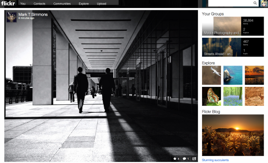
Our new photo experience displays images in as many pixels as possible, with all the context you need to easily chime in on the conversation around every image.
There’s also a new slideshow mode that beautifully showcases photos so you can simply lean back and enjoy them without lifting a finger. We combined elegant transitions and facial detection technology to make sure the key elements in every photo are highlighted.
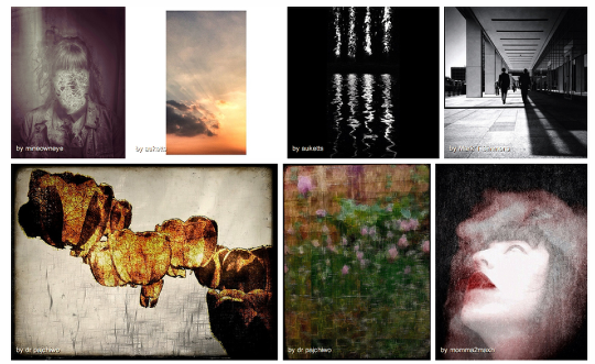
Now that everyone has one terabyte, we also wanted to give your longer videos a home on Flickr, whether you’ve shot a timelapse or caught a friend’s reaction to their surprise party. We are now supporting up to a full 3 minutes per video of 1080p HD quality. (And yes, you can upload as many as you have space for.)
Wherevr. A Flickr you can take anywhere.
The world is going mobile, and in December we took the first big step to send Flickr wherever you go with a new and beloved iPhone app. Our brand new Android app pushes the boundaries on beauty even further. We designed it with your needs in mind: how you interact, how you share, and how you view photos when you’re on the go.
So Android users, head over to the Google Play store where the new Flickr app is waiting for you”

8 Comments
Janine Graf
Oooh golly . . . I’m on the fence about the new layout / design. I usually embrace change, but not sure how I feel about this one . . . harrumph.
Mike
Are you kidding me?????? This is what Flickr has been missing!!! Wow Factor! I love it.
Janine Graf
What I don’t like about the new design is the absence of the sets on the right hand side. Then when you go to view your sets, the thumbnails are all messed up; they are no longer scaled to fit. Hopefully this is just a glitch and will be worked out soon. Baby steps towards approval for me. 😉
Colleen Gutschenritter
I’m not too comfortable sharing anything full res…except maybe family photos. I’ve read loads of stuff lately on the swiping of even lo-res … What do you all think?
Janine Graf
I agree with you Colleen. 🙂
Ale
The new Flickr is ridicolously wrong and bad, disappointing everyone in terms of service, design, features. Something gone horribly, terribly, awkwardly wrong.
A tragedy: we’ve lost the only good photosite we had.
(and you’re going to pay a huge load of money only for getting rid of banners!)
Carlos
http://www.slrlounge.com/flickr-steps-towards-improvement-and-leaps-towards-stupidity
Carlos
The video about the roll out is embed in this article. Worth a look even though it is a bit long.
Our changing world!
How long can Flickr afford to buy servers to host full res files? What about copyright? Nobody else is offering one TB. Most people don’t even know how much space that is. This is a game changer, not only for Flickr, but also Facebook, Instagram and Google+. Wait and see.
Time will tell.