Tangent iOS Photo App Tutorial – By MaryJane Sarvis
Tangent, the recently released photography/design app is a very simple to use yet potentially powerful tool. This first example demonstrates a texture I picked up from the web, put through a Tangent trip, then 2 ReTangents. This app is loaded with possibilities!
We’ll look at a few paths to take. Tangent retails for $0.99/£0.69 and you can download it here.

The UI is very clean and easy. Your first choice is whether to shoot from in app or import from camera roll. Second choice is whether to ‘start fresh’ or begin with using one of the 15 design templates. If you Start Fresh you can jump into the next groups of design choices without the first set, which are mostly shapes and frames. Honestly I got a bit dizzy discerning between this first set of possibilities. Personally I tend to make these decisions intuitively rather than making a grand plan. This app is perfect for both approaches.
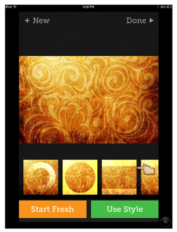
After deciding which approach to start with you then have many choices of shapes and designs. First are shapes and frames. Your opacity is adjustable by using the sliders. When you’ve made a choice you’ll see 3 buttons above that.
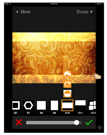
It will help you decide which area you want shaded or even opaque, then a tap on the arrow directs the lines or dots’s direction. Each tap on the arrow gives 45′ turn.
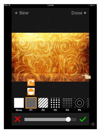
The designs or graphics to choose from range from dots and dashes, circles, lines, explosions and on. Everything moves quickly so you really have time/ no wait to try many options. I just bounce around until something catches me.
Third Choice – Color!
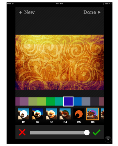
You can add color from the fabulous selection. Then there’s the blend mode choice. Opacity with the slider. Again, things move quickly, so it’s great to try several colors and blends before you decide. I’m always a pushover for B6, or the ‘difference’ mode.
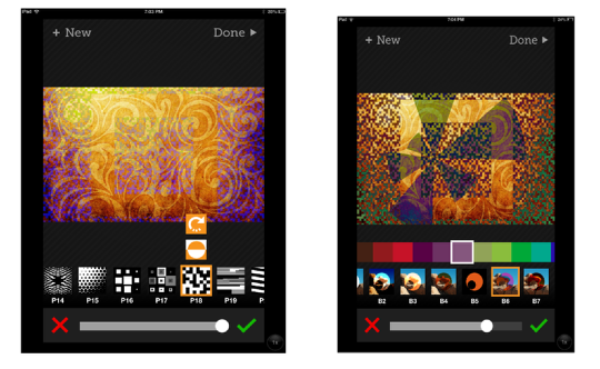
I think the fun really starts after you save or at least finish and choose to Re- Tangent. Go in for round 2!
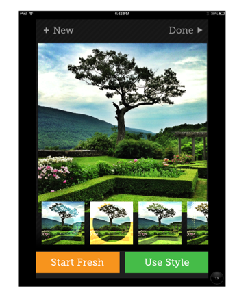
Hold the abstract presses for a minute. Taking an image that you just want to frame or mildly tweak can be done beautifully with Tangent. I thought I’d play with the geometry of these gardens. Here’s a 3 round trip through Tangent. 2 color choices. 3 patterns plus the original circle frame.
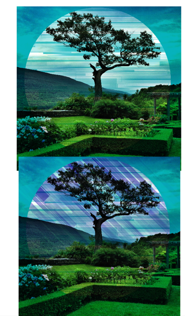
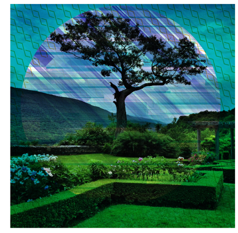
I feel that the first “Tangent Trip” was probably the best but I can’t help but try everything within this app!
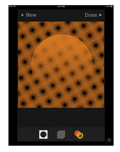
I want to add that Tangent is very much like working with layers and you actually are. This image had a photo under the graphics but I like just the 2 color image before I went to ReTangent. There are some color blends to try that block out your first few layers.
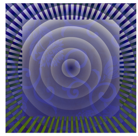
Here’s another basic wallpaper type texture which became much more interesting as the original image disappears.
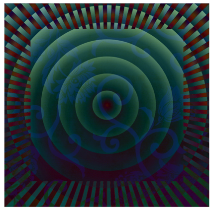
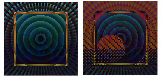
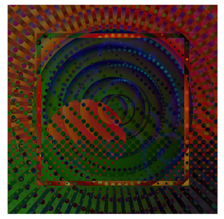
Tangent, and ReTangent is really what interests me the most. Perhaps once I get over how much fun it is to pile on the possibilities I’ll be able to choose what I want to make. For now my best advise is to bounce around, try a lot of mixes and blends, get to know it, then decide what to make. I’m still in my first week of fun! Jennifer Bracewell has gotten so good at using it with her own style of photography. I feel her recent work really shows the less design/more photo image approach at its best.
6 Comments
Jerry Jobe
B6! Yes, MaryJane, that difference mode is terrific!
kachouro
Very inspiring tutorial (and well explained!), very inspiring app – the next one on my wish list 🙂 Thank you, MareJane!
Maryjane Sarvis
Thanks Jerry! Yes, use that setting most often but I still seem to need to try them all too. Great app.
Maryjane Sarvis
Thanks very much .kachouro! I’m never quite sure if I’m explaining well. Helps to hear!
Bongwaterjoe
I’ve been really enjoying mixing tangent and glaze together. Makes for some really cool textures.
Maryjane Sarvis
That’s a really interesting app combo! I think I must try. Thanks!