Technical Tutorial – Getting Creative – Etchings and Snapseed
We are delighted to publish the fourth of many tutorials that we’re planning with the app, Etchings. In this tutorial, our Head of Technical Tutorials, David Hayes, mixes Etchings with another popular app, Snapseed, with some very interesting results. Don’t miss this (foreword by Joanne Carter). Over to you David…
With the coming of summer images of flowers abound everywhere you look. And why not? Flowers make for very cooperative and beautiful models to work with. Just look at my photo streams on Flickr, EyeEm and 500px …flowers!! Combine such fantastic source material with two of favorite apps, Etchings and Snapseed is bound to produce an interesting image. In this article I’ve done just that!
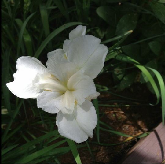
Let’s start with my source image. A close up I took in my garden of a Siberian Iris at its prime. Lots of good things going on in this image…as well as some things that need some work! In this case I decided to open this image in Etchings.
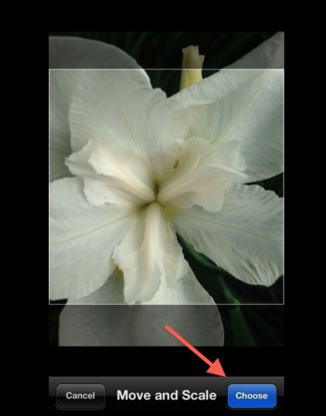
In Etchings, I used the “Move and Scale” feature to zoom in a bit more on the Iris and to give me a square crop. Clicking “Choose” moves me to the next step.
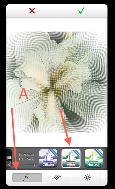
In its “fx” mode, I picked “Alice” which is in Etching’s Florence FX Pack…an in-app purchase.
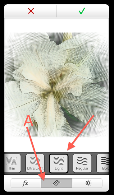
Moving to the line weight settings (A), I chose “Light” (B) giving my flower a fragile look.
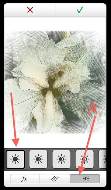
Finishing my work in Etchings, I used the indicated Exposure setting…this really made the white in the iris pop-out from the background.
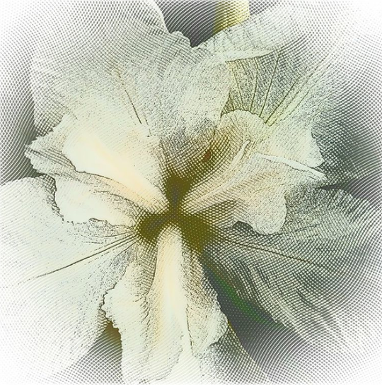
Here’s a full screen view of the image so far. Pretty cool!
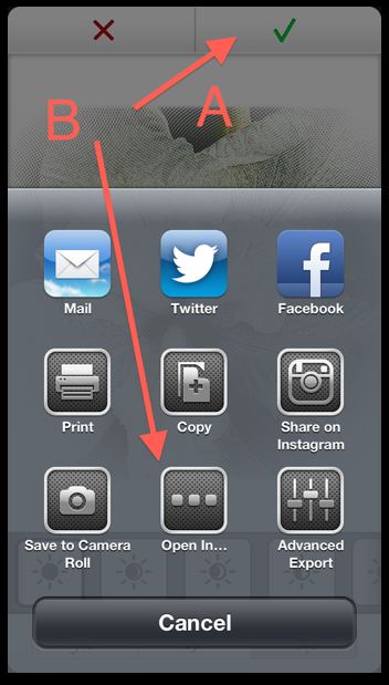
Since I knew I wanted to use Snapseed next, I decided to use Etchings “Share”
function to do this. First I clicked on the green check mark (A) and in this menu I clicked on “Open In…” (B). (Keep in mind that by using this function, you won’t save to your Camera Roll. That would be an extra step).
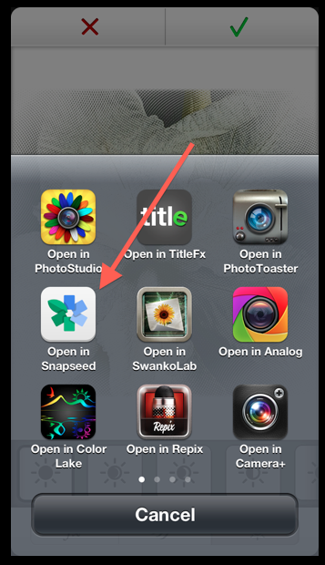
In the menu that then opens, I clicked on “Open in Snapseed”. Etchings closes…. and my image opens in Snapseed…just like that.
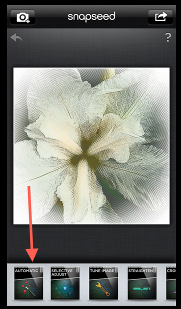
(Just a quick note here before going on… I’m not going to show all the “clicks” I made while in Snapseed. Even still, I know you’ll be able to follow along!) First, let’s do a little “Automatic” adjusting.
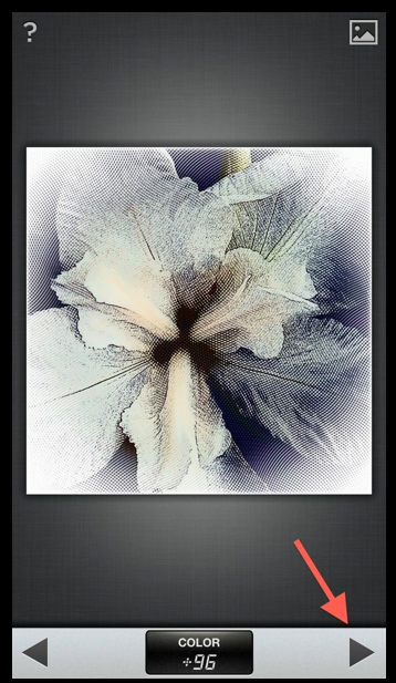
Using “Color Compensation”, I dialed it up to +96. Clicking on the right side arrow puts this into place and lets me move to the next step.
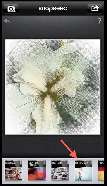
Time for some “Retrolux”. (This…and Drama…are two of my favorite places in
Snapseed!).
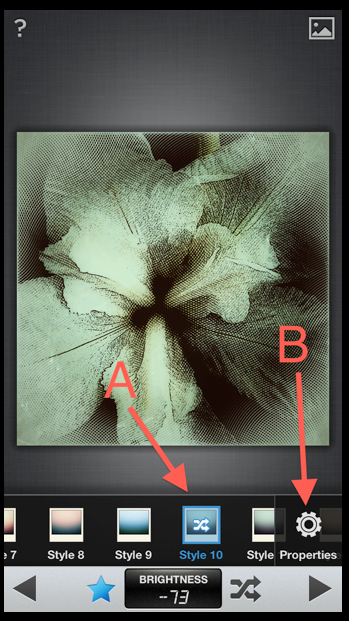
Now things get a bit interesting! I picked “Style 10” (A) and clicked on “Properties” (B) to do some fine-tuning!
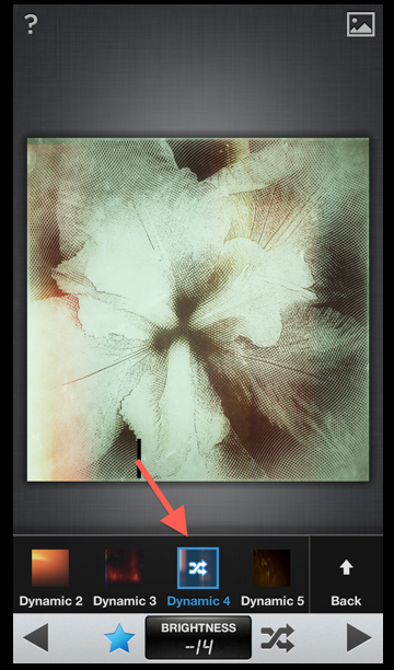
In “Properties” I picked “Dynamic 4” and dialed the Brightness to -14.
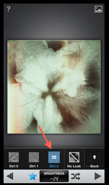
Still in “Properties”, I decided to use the “Dirt 2” filter.
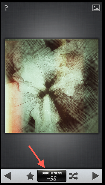
And time for a little fine tuning of all that I just put down…I first changed “Brightness” to -58.
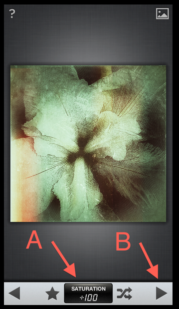
Going to “Saturation”, I dialed it to +100 punching out the colors even more! And…as before…I clicked on the right arrow to put all of this into place and moved on.
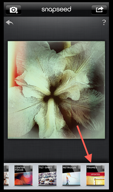
Deciding that I needed a frame, I clicked on “Frames”.
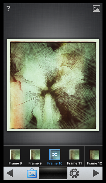
Lots of great frame choices in Snapseed…in the end I chose “Frame 10”.
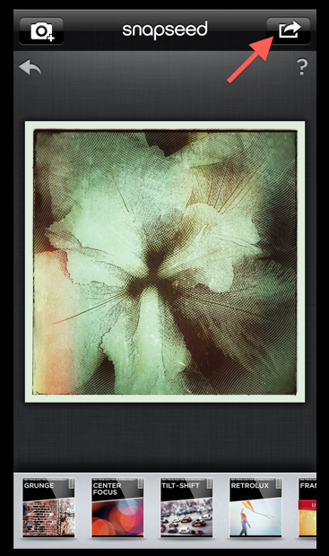
All done! Click to save!!
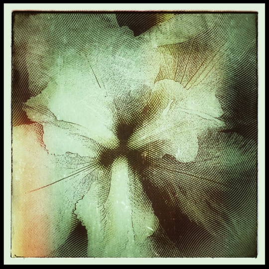
Here’s the finished image. I do hope you like it!!
As always, I love hearing from you so please don’t be shy about leaving your comments and/or questions! I do respond to each and every one!


3 Comments
Catherine
Great tutorial David! An interesting combo of apps that work well together. 🙂
David
Thanks Catherine! It was a fun one to put together!
Jennifer
David, thanks for the great tutorial!