TangledFX – iPhone Photography App Tutorial – Part 1 – By Jerry Jobe
We’re delighted to publish the first of a three part special series of iPhone Photography Tutorials with the app TangledFX by our incredibly talented Tutorials Editor, Jerry Jobe, don’t miss this (foreword by Joanne Carter).
If you haven’t picked up TangledFX yet, you can download it here.
“Have you ever taken drawing classes? Even in basic art classes in elementary school, you can see who some who have the skills to be an artist. There are those whose brushes and pencils move smoothly across the canvas, as if the medium was an extension of their arm. I was not one of them. I was a clutcher. For people like me, holding the brush in a death-grip so tight your knuckles shine, creating a smooth line was an impossibility. It’s as if we were trying to create by sheer force of will – no gain without strain.
Thankfully, in this digital age, we clutchers can still smooth out some of the rough edges in our lives. Tangled FX, by Orange Qube, can give an illustrative quality to your work that can range from subtle to other-worldly. It is simple to use, but offers great flexibility. I’ll be covering it in a series of 3 tutorials.
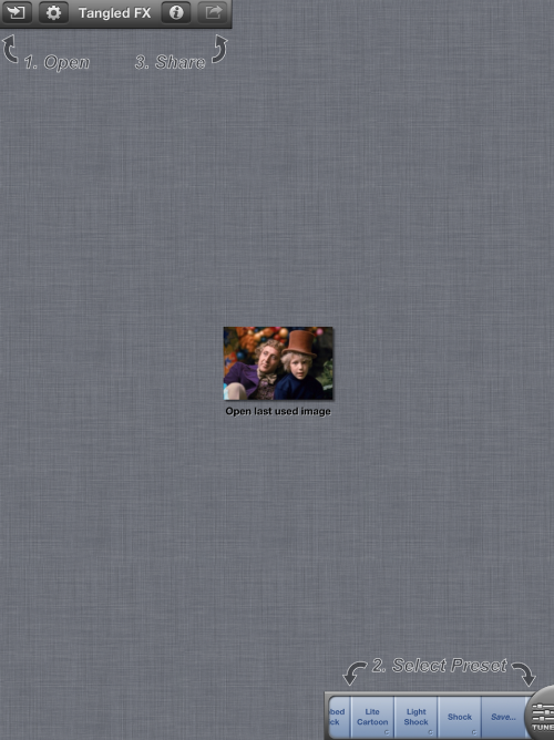
Tangled FX works in either landscape or portrait mode on the iPad (portrait only on iPhone), but the splash screen, seen above, is always landscape. Below you’ll see the home screen in portrait, much like you’d see on the iPhone. The four buttons on the top are Open, Settings, Info and Share/Save. The thumbnail in the middle of the screen allows you to re-open the last used image. At the bottom is a sideways-scrolling list of presets, with a pop-up tuning menu.
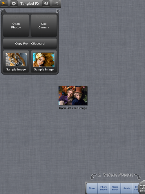
There are several options for getting an image into Tangled FX, in addition to the “last used” option. You can open from the Camera Roll/Albums, take a photo using the device camera, or copy from the clipboard. There are also two sample photos that you can experiment with, a tiger and a woman with lots of hair (to show off the smooth lines the app generates).
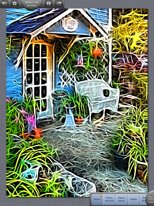
For my example, I’m going to use a shot I took of a local curio shop. I want you to notice a few things about the screenshot below. First of all, the app applies the last-used settings to the photo you open. In this case, it’s the first preset, Fibers. The next thing you should notice is that the effect is strong. All of the presets are very “obvious”. I will only use a preset “as is” on very rare occasions – most of the time I will use the tuning sliders to tone it down or blend the Tangled image back with the original.
The last thing I want you to notice about this image is the half circle in the upper toolbar. It reads “863×1152 preview”. The calculations done on an image are considerable (especially on an older iPhone, like I’ve got), so Tangled minimizes those calculations by working on a smaller preview at first. Once you have the settings to your liking, tapping on the half circle will switch to full-size mode, and recreate the settings on the larger image. This may take some time, and a progress percentage indicator will appear below the upper toolbar for you to watch while you wait.
To give you an idea of the possibilities of Tangled, I’m going to take you through a few of the presets. Below you’ll see Fibers Smooth, which takes out most of the “shadows” which surround the “fibers”, giving it a smoother, brighter look.
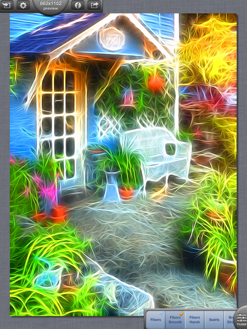
Swirls takes out the strokes, or “fibers”, entirely, letting you see much more detail.

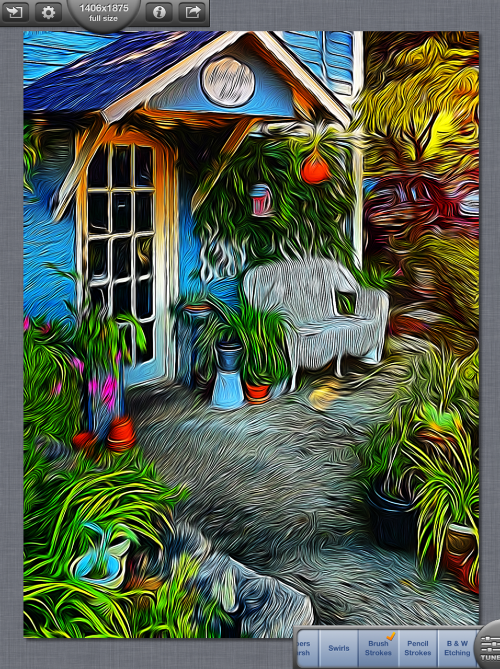
Brush Strokes lengthens the swirls, or smudging, considerably. The long strokes make me want to place a Munch-like screaming figure in the lower right.
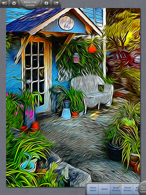
You can remove the color entirely, leaving a B&W Etching.
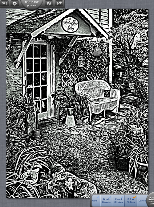
Cartoon also lowers local contrast, smoothing out some of the more subtle changes in color.
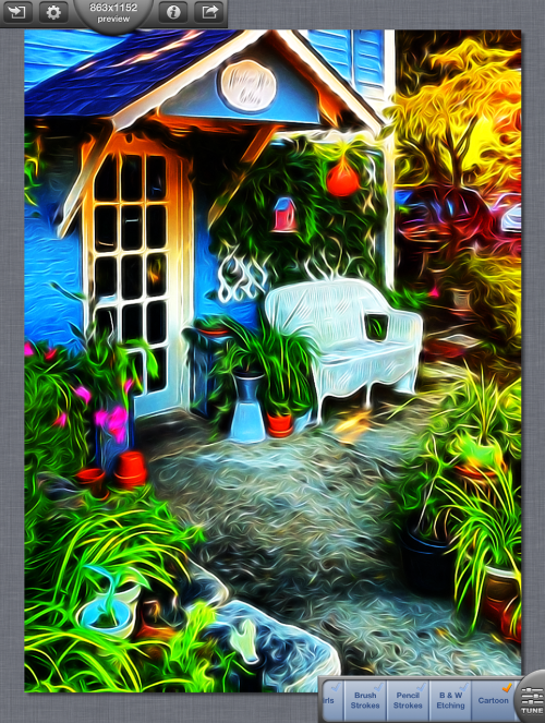
Small Details makes the strokes very small indeed – but even that can be toned down somewhat in my opinion.
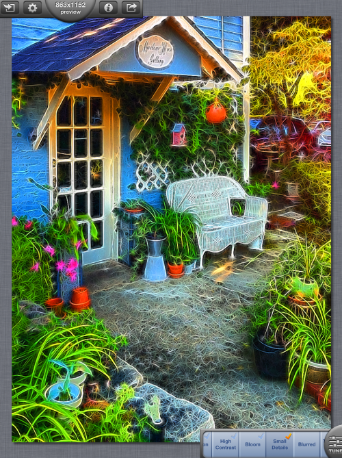
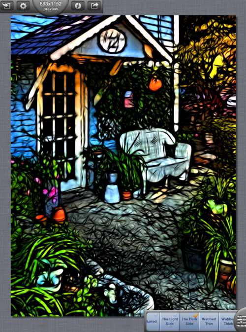
The opposite of the Small Details preset is the Blurred preset, which uses large strokes and an increase in contrast – so that for every bright line, there is a corresponding dark shadow next to it.
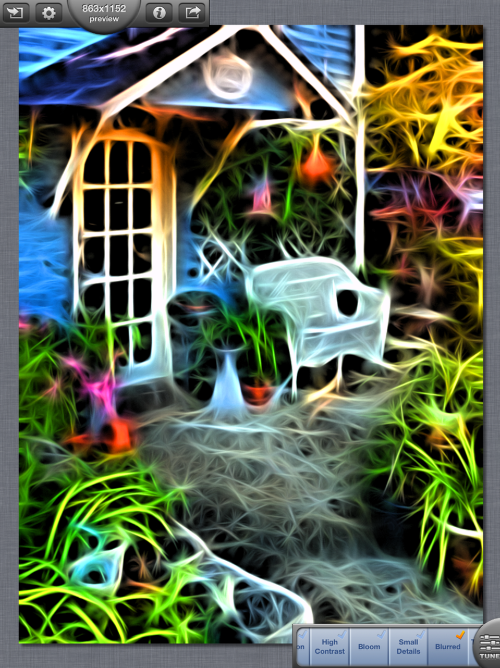
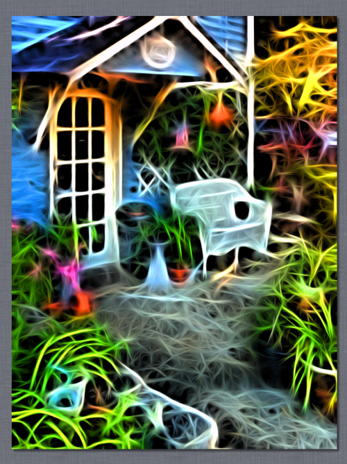
At any time, you can tap on the image to make the tools disappear and give you an unobstructed view of the image.
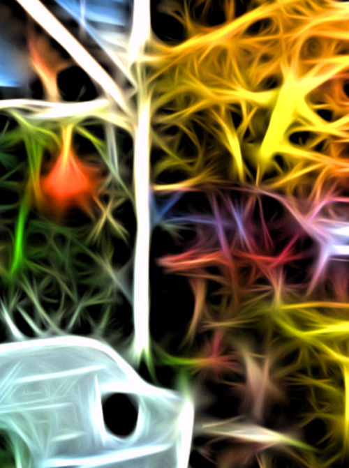
You can also use a two-fingered pinch to zoom in on the detail. I might think the image below is an abstract, if I had not just been working on it for so long.
Most of the presets use strokes bordered in a brighter color, that will brighten your image overall. But some, like The Dark Side, darken the edges and your image.
Below I’ve decided on using the Brush Strokes preset. I tapped on the upper half-circle, and now it says “1406×1875 full size”. Tangled does work with larger photos, but the rendering speed can get to be rather slow. So don’t worry about the larger images – just make sure you can wait a few minutes.
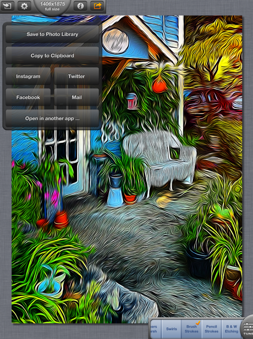
The Share/Save function gives you the usual suspects – Camera Roll, Instagram, Facebook, Twitter, Mail (although not Flickr) as well as a “Copy to Clipboard” feature.
You can also open it directly into other apps.
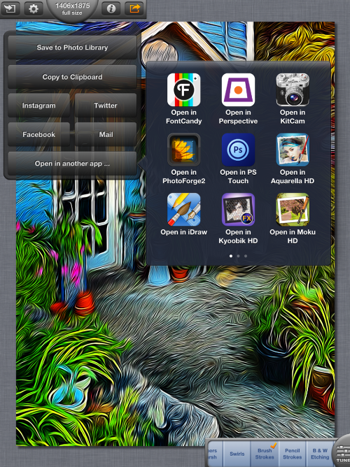
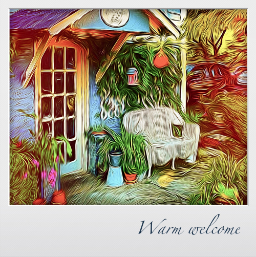
I have to admit, I can’t remember what app I sent this particular image to. I do know that I liked this Polaroid-style frame, and the resulting sentiment.
In upcoming tutorials, I’ll discuss the tuning sliders and what they do. I’ll also discuss how to create presets and share them with others and among your devices. Enjoy!
6 Comments
B Shepard
Thanks for this tutorial. I’ve been playing with TangledFX lately, and like it. However, I find it a little frustrating because I can’t quite duplicate the style that I get from ShockMyPic. The two programs seem to use a similar method of generating images, but ShockMyPic tends to turn out more to my liking. Only thing is, Shock uses a dreadfully low resolution. If it could get Tangled to generate a similar style, I’d love that!
Jerry Jobe
It’s possible to have results like those from ShockMyPic, as I show in the last part of this series when I talk about presets. All three of my current custom presets tone the effect way down to get closer to what Shock did.
I discuss the sliders in part 2. Make sure to bring your Strokes size and Smudge size to below 10% to get a more subtle effect.
Andrea Bigiarini
Great tutorial as usual Jerry!
You have the power to explain things clearly
Congrats my friend.
Tracy Mitchell Griggs
How do you add additional Fx within the app to layer the in app presets?
RegiB
Thanks for the tutorial!
Susan Detroy
Glad to have the info as I was thinking of purchasing this app.