Technical Tutorial – icolorama – ‘Simplifying the Creation of Art’ by Jerry Jobe
Yesterday we published Jerry Jobe’s fifth iColorama tutorial ‘Taking a closer look at the brushes’ – if you missed that, please go here. Today, we’re delighted to publish Jerry’s sixth very comprehensive iColorama tutorial. It’s outstanding, please enjoy, over to you Jerry. (Foreword by Joanne Carter).
“It’s been a while since I wrote about iColorama, and this awesome app continues to add new features to get your creative juices flowing. So much is added, as a matter of fact, that it makes it difficult to realize I haven’t covered all of the features that have been present all along.
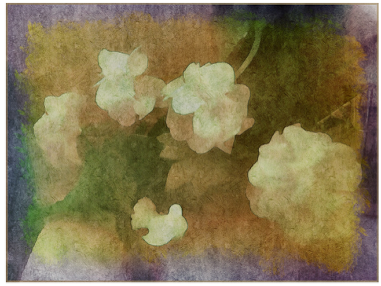
So last week I was messing around and created the work I’m showing here. I used Simplify and Edges from the Style menu, Texture from the Presets menu and Tone Lab and Channels from the Adjust menu. So I’ll be discussing each of these features in more detail as I recreate the work. (As usual, all of the features I am discussing are also part of iColorama S, the iPhone product. However, they may be under different menus and they may not have all the controls that you will find on the iPad version.)
The initial photo is not much to look at – it was the first photo I took with Light Boost, a low-light camera app. Because it was taken in dark conditions, the focus and colors are bad. But there’s not as much noise as I would have with the native Camera app. The bad focus is probably from not waiting long enough for the camera to focus.
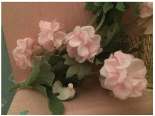
However, that blur can help when creating a “painting” from a photo because it allows for subtle gradations of color. In the screenshot below I’ve imported a mask and zoomed in so that it’s easier to see any changes I make. On the left is the original, on the right is the change made to the image. I’ve chosen Simplify, which has three presets. Simplify is a process of blurring and flattening, and Preset 1 does that.
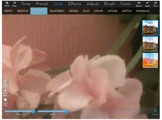
Below I’m still showing Preset 1, but I’ve got the Feature slider all the way to the left. Here you can see that the blurring is done, but not the flattening. Compare that to the previous image – especially the edges.
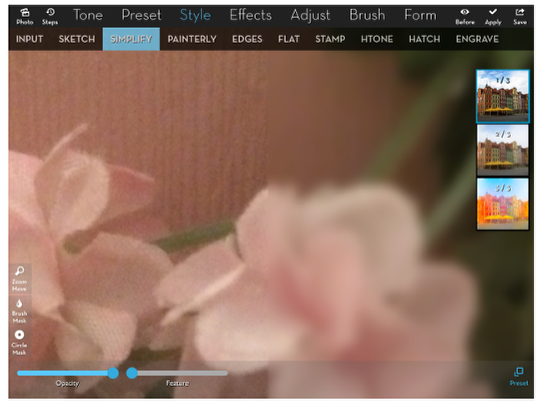
Preset 2 lowers the contrast, producing even more flattening.
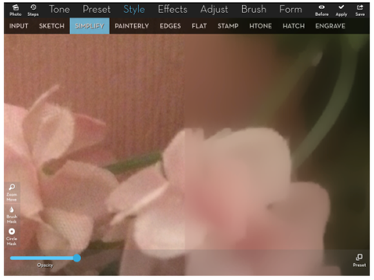
Even less contrast in Preset3, which also allows for boosting the saturation that is lost from the extreme flattening.
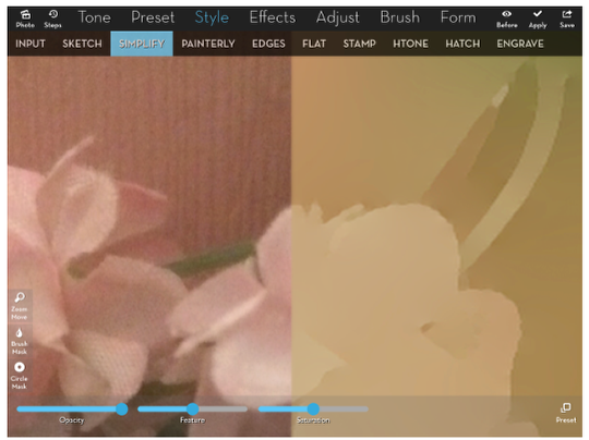
The Feature slider in Preset 3 allows you to brighten the result…
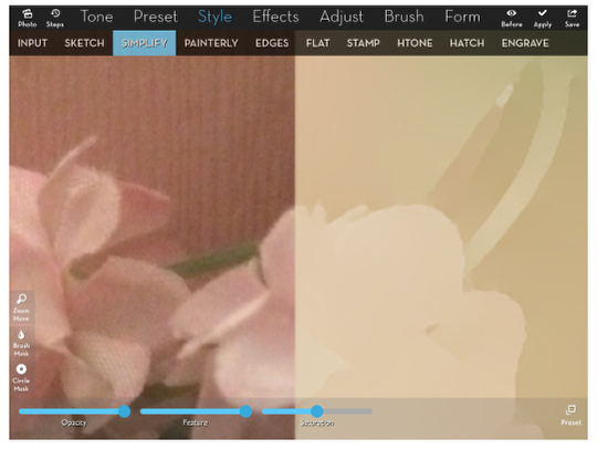
…or darken it.
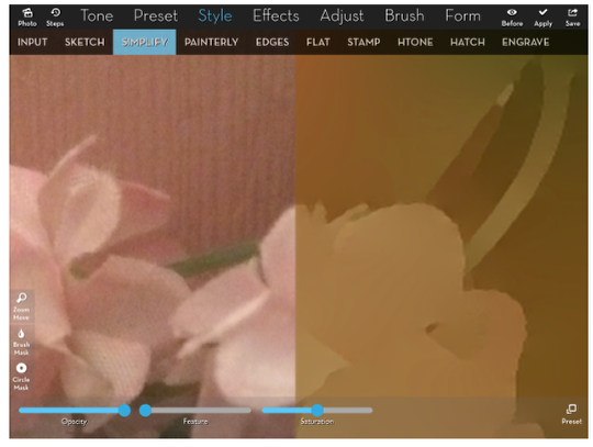
Now you’ll see what Preset 3 does to the entire photo. I pulled down the opacity until I could see a decent amount of detail, and bumped up the saturation, showing the blooming green color along the edge.
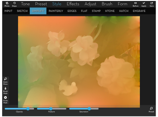
I then go back and add Preset 2 at .4, which flattens without eliminating as much contrast.
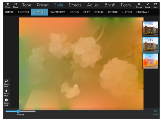
How do you make flat objects of similar color stand out from one another? One way of doing that is with an Edge. I’ve put the mask back in place so that you can see the difference between objects with edge and those without. The first Preset adds a rough edge.
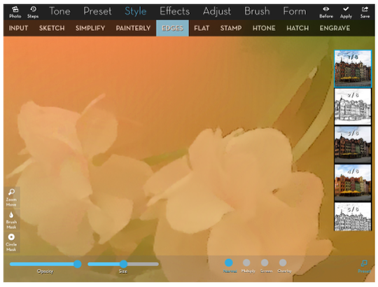
Preset 1 only adds edge without touching the rest of the image, so the blend modes are superfluous; using multiply or screen is the same as using normal. The default setting for Size is at .5; the following screenshot shows Size turned all the way up. It’s a subtle difference – you may have to flip back and forth to see it.
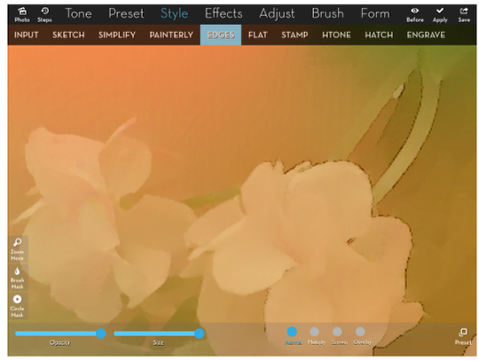
Preset 3 has more of the edge that I want – but look at the image. Even more flattening is being done! That’s fine if you haven’t already used Simplify, but it’s too much here. So how do I get just the edges to apply?
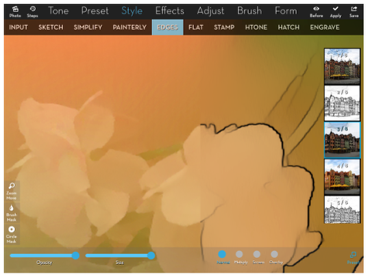
How about changing the blend mode to Multiply? No, since the flattened areas are darker than white. The darkness of the flat areas is added to the underlying image.
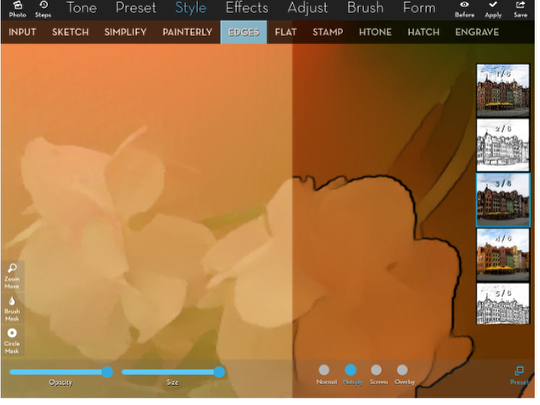
Overlay doesn’t work either, because the colors become way too saturated.
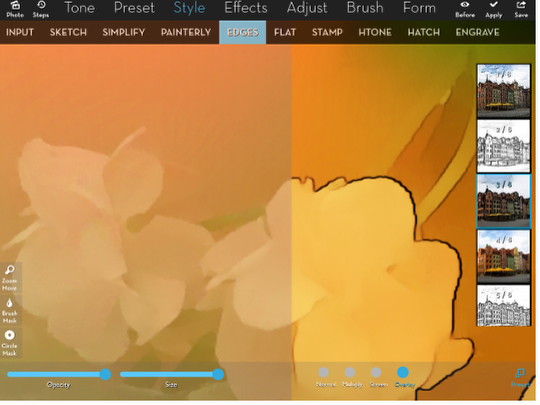
So let’s look at Preset 2. It has the same kind of edge as 3, but over a white background.
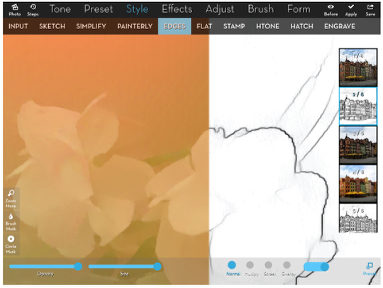
If we use Multiply blend mode on that, only the edge is carried through onto the underlying image.
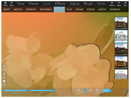
The unidentified switch to the right of the blend modes is an inversion switch. Flip it and the edges become white, the background black.
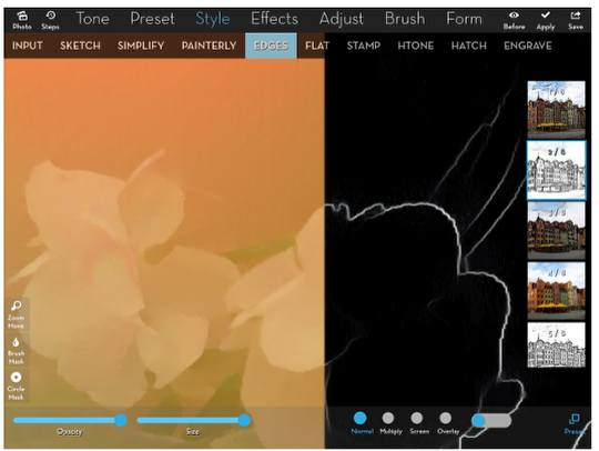
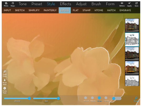
Use Screen mode with the inverted edges, and you get white edges on your objects!
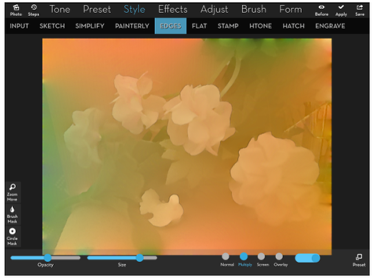
Here’s what I decided on, applied to the entire image. It was Preset 2 in Multiply mode, and I toned it down some by taking the Size down to about .85 and the Opacity to .5 – just a nice, subtle edge
At this point you may be thinking that’s a little too washed-out for your taste. Frankly, it is for me, also. But there are two features under the Adjust menu that will help your pictures pop. I touched on them when I did my second tutorial on iColorama back in April, but I didn’t give them enough credit. The first of these is Tone Lab, and back in April I only looked at the first preset. Finding it wanting in my work, I ignored the rest of the presets. But Tone Lab 4 performs miracles on low-contrast, yellowish images. Just look at what it does to our image below.
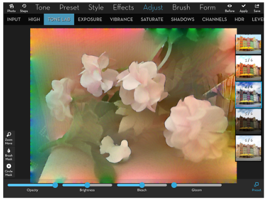
Granted, that was too much for me. I liked the more subtle coloring I had originally. But you can add just a little bit of the pop by taking the Opacity slider down to 0, then watching as you bring it up slowly until it gives just the right amount. For me, it was about .3.
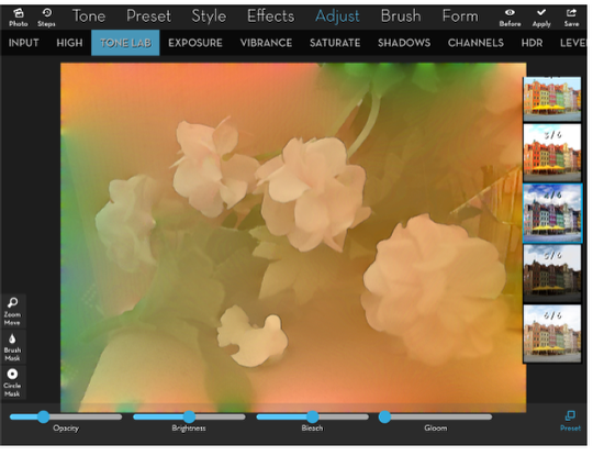
If you like Tone Lab 4, but don’t like the way it messes with your colors (especially the added blue), then you may want to check out Tone Lab 5. Below we have Tone Lab 5 with its default settings, and it’s really dark. Well no wonder – the Gloom is all the way up!
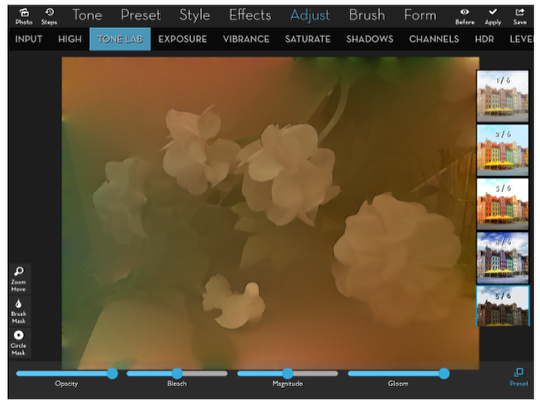
By lowering the Gloom and the Magnitude, I get a pleasing result. Note: at this point I am deviating from the original work, which used Tone Lab 4. Instead I am continuing with this Tone Lab 5.
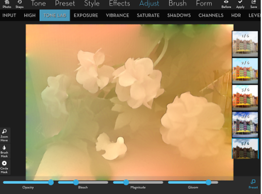
At this point I want just a tad more blush to the flowers, a bit more red. One of the ways to do this is by using the first preset under Channels. Again, I didn’t understand the Channels feature as much back in April. I thought it was too harsh and I didn’t know how to control it. Look at how red Preset 1 makes the image.
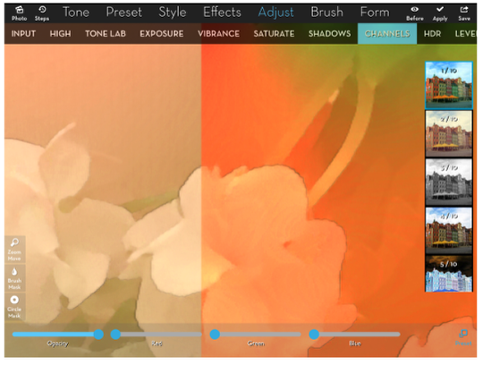
But if I take the opacity down to .25, it gives just that added blush.
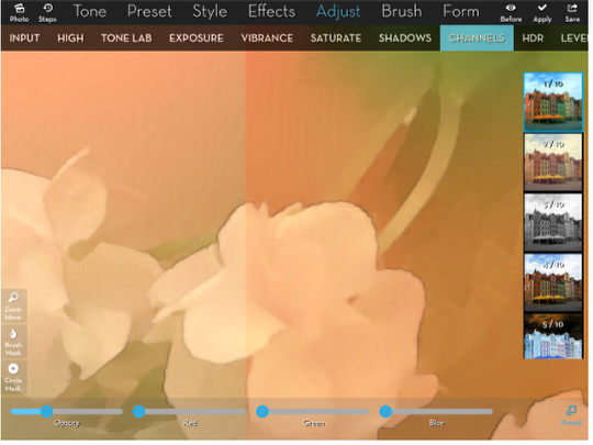
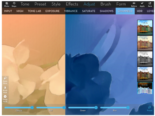
Other presets can be useful also. Preset 4, with default slider positions, doesn’t do anything. But once you move the sliders, you can change the colors much like the new Hue feature that’s part of release 3.70 (which I will cover in a couple of weeks). And Preset 5 is a color negative, which can come in handy for masking.
I’ve just spent a lot of time smoothing things out in the image. It doesn’t look right, though. That’s because texture is important to the total “feel” of a painting. So let’s add some texture.
Texture was recently overhauled in iColorama, and this is a feature that has not yet been ported to iColorama S. The only slider available in the iPhone version is Feature, which is actually Rotate. Instead of the 31 textures in iColorama S, there are 279 in the iPad version. The additional sliders, buttons and textures make this a powerful part of your workflow.
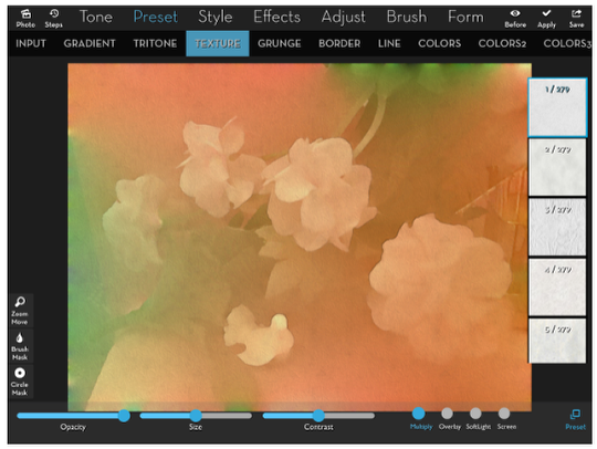
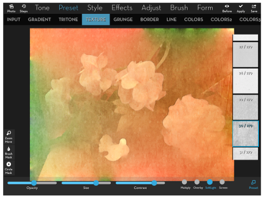
Below I’ve chosen one of my favorite textures, #30. Textures defaults to application in Multiply mode, blending the dark parts of the texture on top of the image. Since the texture is black and white, that adds a lot of gray to the image. But I’ve got a trick to lessen the color changing properties of textures.
But first I want you to look closely at the applied texture. If you look closely you can see a grid pattern, four wide by three tall. That’s because the texture is tiled to cover the image.
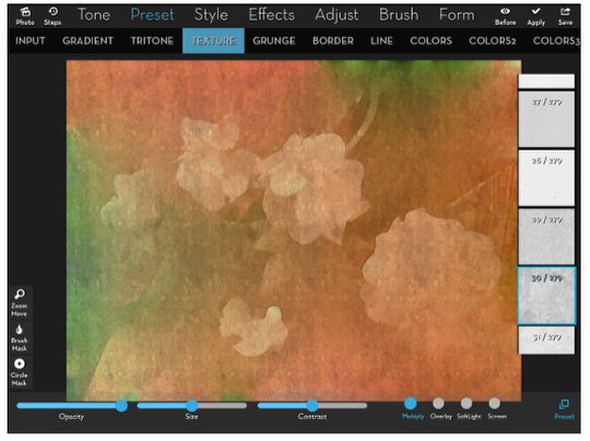
By increasing the size, visually checking as you move the slider, you can do a pretty good job of hiding the “seams” within the image. You can still see them in the lower third of our image, but that may be because we know what to look for.
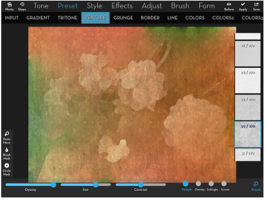
Now for the trick to eliminate the gray introduced with Multiply mode. The first thing I do is change the blend mode to Soft Light.
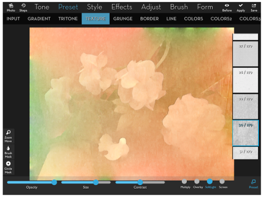
That brightens the image considerably. Also, the texture itself is much less noticeable.
However, if I increase the contrast, the image becomes as dark as before I added the texture. Also, the texture takes on the color of the underlying image rather than being gray. But it’s too much texture for our delicate image.
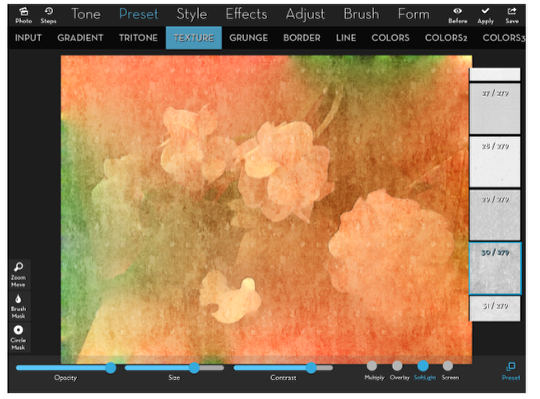
So I lower the Opacity to .5 or lower. I think you’ll agree that that’s a more natural texture than using Multiply. Remember, it’s Soft Light, increase contrast, decrease opacity.
I decided to add an additional texture – you can layer them as much as you want. This one, #117, makes it look as though your image is on stucco.
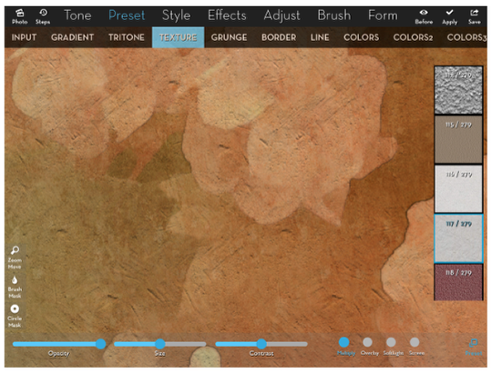
I use the soft light technique to arrive at the image below.
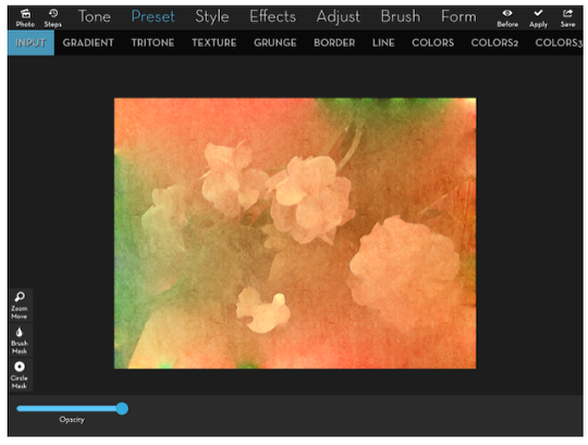
That gets me to the point where I want to consider edge treatments. Luckily, I’ve already got an “edge mask” that I use that makes a masked effect strong at the outside edge, fading as it moves into the center. I created the mask using Preset>Gradient (white) and Preset>Border>4 (black). I load that mask from my Masks album – you can see the thumbnail below.
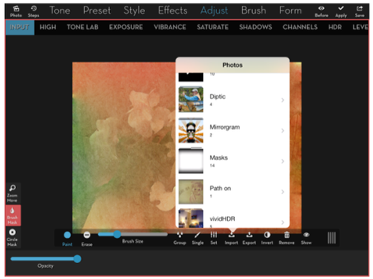
Now that the mask is loaded, I can apply various effects and they will only apply to the edges. First I go to Adjust>Vibrance and darken the edge with the Gamma slider. I also desaturate with the Saturate slider.
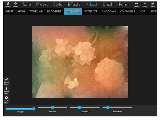
I want a strong texture on the edge. Really strong textures are in the Grunge category. I pick #9, and leave it in the default Overlay blend mode. I raise the contrast and lower the opacity to get the look I want.
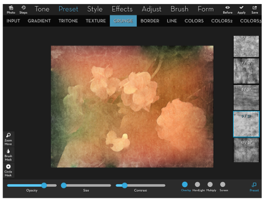
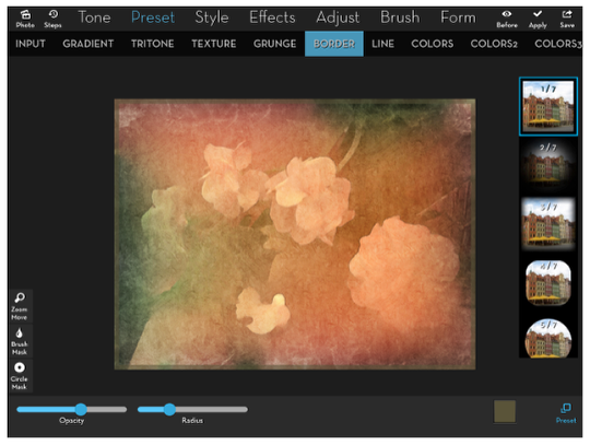
All the simplifying has given what I consider to be kind of a “puckered” look at the edges. If you look at the image before I did the edge treatment you’ll see what I mean: small bursts of intense color, light or dark, that looks like they were pulled in from somewhere outside the frame. I want to hide those a bit more, so I’m going to use the Preset>Border feature for that. The default color for Preset 1 is black.
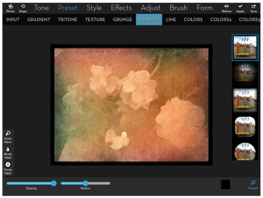
I want a more organic brown for my frame, so I bring up the color picker and choose a brown.
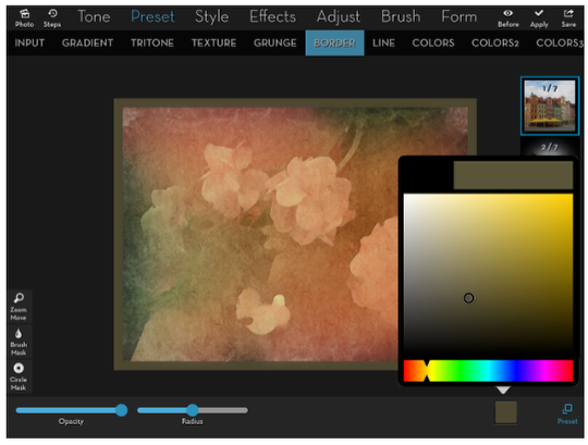
Finally, I lower the Opacity to about .6 and lower the Radius as well, making it thinner.
And here’s my finished image.
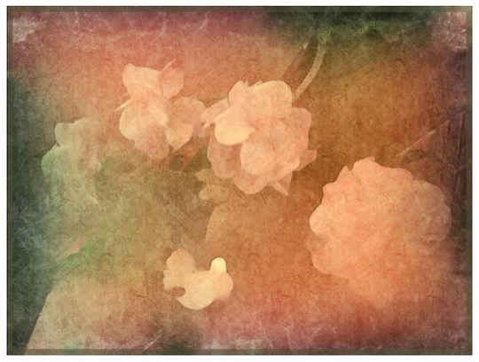
You’ll see, if you scroll all the way back to the beginning, that the finished picture is different than what I set about trying to recreate. iColorama is not an app with some pre-packaged “looks” – it is a creative program that will give you slightly different looks, even when you follow the same path. Just take a look at all the different paths to follow! There are 67 different menu choices in iColorama 3.70; we covered just 9 in this tutorial: Simplify, Edges, Tone Lab, Channels, Texture, Grunge and Border. The only one of those menu choices whose presets were covered completely was Simplify. Go exploring and enjoy! Look for another iColorama tutorial covering some of the new features of release 3.70 in a couple of weeks.
5 Comments
Andrea Bigiarini
Stunning tutorial Jerry. Thanks!
StickyQuote
Wow! Awesome tutorial Jerry! Thank you for sharing.
Denise
Such in depth info! Thank you!
Leon Apped As
Brilliant Jerry, iColorama has always bamboozled me somewhat, having read your tutorial I’m gonna go give it a try again, cheers mate.
RegiB
Thanks so much for these tutorials! You put in a lot of hard work but it is really appreciated. Easy to follow workflow and graphics!!