Technical Tutorial – Paint FX : Photo Effects Editor – Part 2 of 3 – By Jerry Jobe
Yesterday, we published Part One of this comprehensive series of three technical tutorials based on the updated Paint FX : Photo Effects Editor iOS Photography App (if you missed that, please go here). In Part Two Jerry Jobe delves deeper into these new features and in particular the contests. Over to you Jerry (foreword by Joanne Carter).
“If you read part one of my expanded look at PaintFX, you’ll remember that the app has repositioned itself to include aspects of social media – a community of users who post their works, and challenges or contests to spark your creative juices. You’ll also remember that the help function, while expanded, does not include a word about these social aspects of the app. I showed you how to upload an image into the community, and I’ll start this column with an explanation of how to enter the contests.
Some of the challenges involve modifying a photo provided to you, as was the case in the challenge shown below.

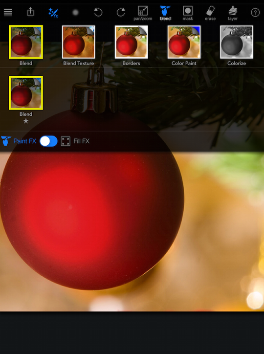
Tapping on the photo in the Challenge Detail loads the image into the workspace. I have an idea about what I want to do with it, and it involves blending other photos into the image. I tap on the “fx” button at the top and choose Blend on the top row, which then shows me the effects available in the category. In this case, there’s only one, also named Blend. Under the effects is a slider which says whether the effect will fill the image or will be painted in. It defaults to painted in.
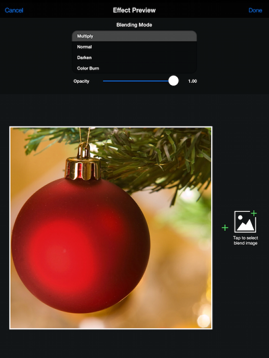
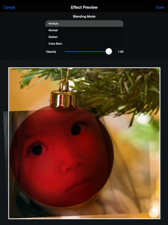
There are some categories of effects that require a dialog box to fine tune the effect, like Blend and HDR. Below you’ll see the dialog box for Blend. It has a scrollable list of blend modes, an opacity slider (you can adjust opacity here or in the brush settings which I will show you in a moment), and a button to the right of the image which allows you to load another image for blending.
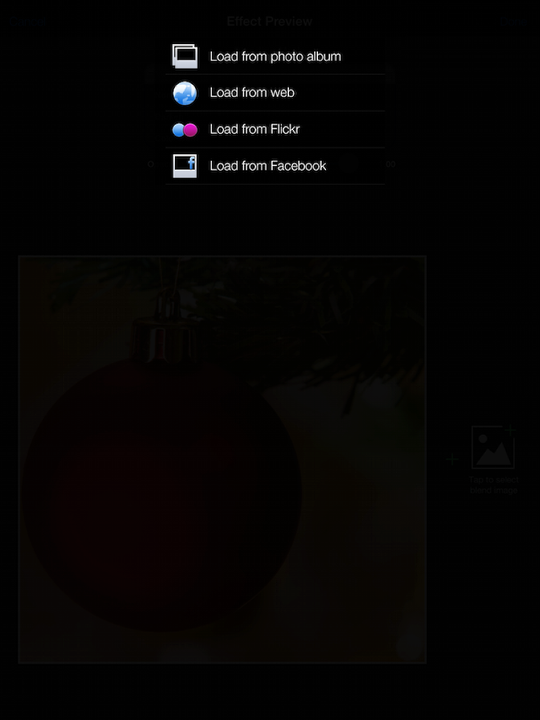
You can load an image from your library. You can also load images from the web, Flickr or Facebook, which makes this extremely powerful. Please remember to take copyrights into consideration when obtaining images from an outside source! I am using these images for instructional purposes only, but if I intended to profit from the images I use, I would make sure that the person holding the rights would be contacted and compensated.
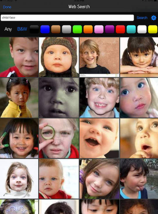
I choose to do a web search for a child’s face. I enter the search criteria and a grid of photos appears. You can use the settings under the gear icon on the right to specify the rights on the photo; it defaults to “No license specified”. I decide on the fourth image on the second row.
The image chosen is now shown overlaying the original image in Multiply mode. You can change the blend mode and reposition the image using the standard pinch and drag gestures. When you have it set, tap “Done” at the upper right.
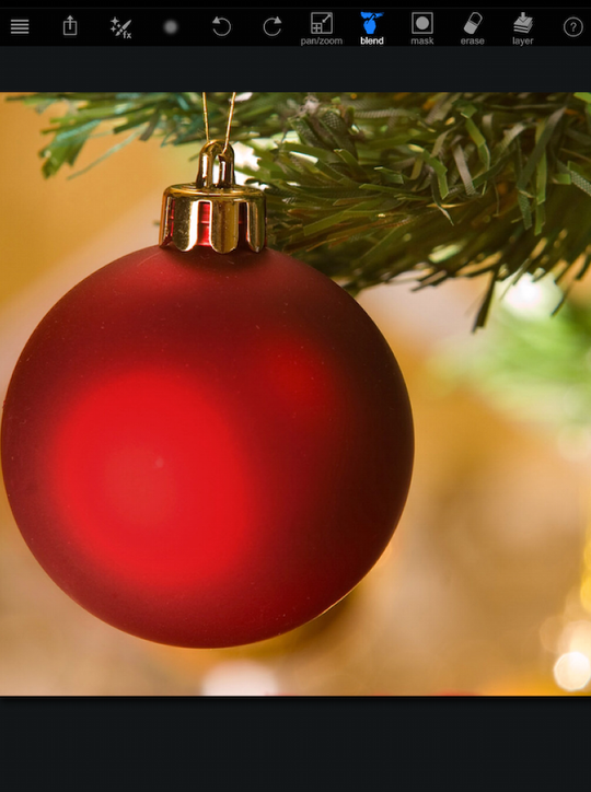
What happened? Where is the child? Remember, you had the effect set to be painted in. It will not appear until you paint it into the part of the image where you want it.
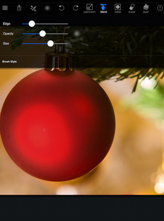
Before I start painting the effect in, I want to adjust my brush settings, which are kept under the circle next to the effect button. The possible settings are Edge (Soft to Hard), Opacity and Size. I lower the opacity and make it a soft edge.
I start painting in the child’s face over the ornament. If the brush settings are incorrect, merely tap the counter-clockwise arrow (Undo) and then redo the settings.
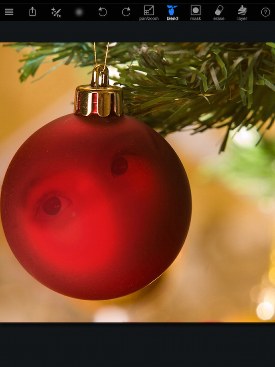
I continue painting, and start to see a dark area under the eye that I do not want. I could undo the stroke, but I’d have to step back through the strokes I made.
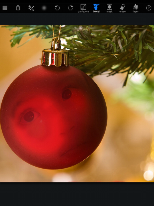
I decide to erase instead, using the eraser button third from the right on the toolbar. The Erase function is not affected by the brush settings. You will always be erasing 100% of the effect.
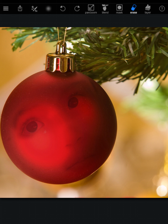
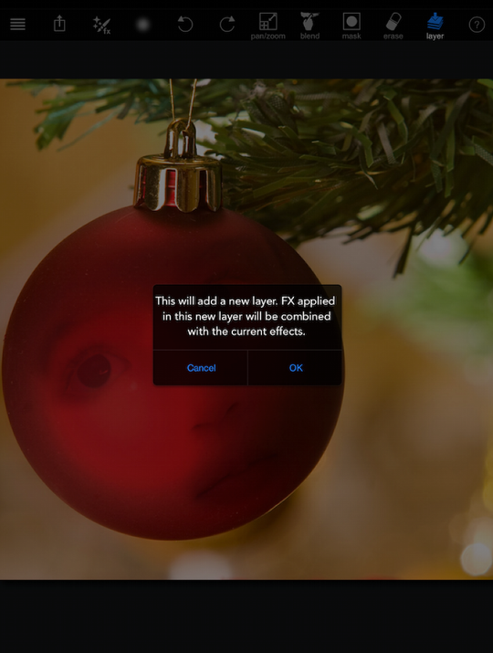
Once I have the effect finished, and want to do something else to the image, I have to commit the changes. I do that by tapping the Layer button on the top right. I have to do that because if I just changed the effect and started painting, the new effect would paint overtop of my Blend and get rid of it. When I commit the changes by tapping Layer, I get a dialog box asking me to confirm.
I want to put a “snow” frame on the image, so I use the Blend effect again, once again searching the web for “snow frame”. Since I don’t want the color of the frame to affect the image, I choose the first frame, a simple black and white, and apply it in Screen mode so that the black drops out.
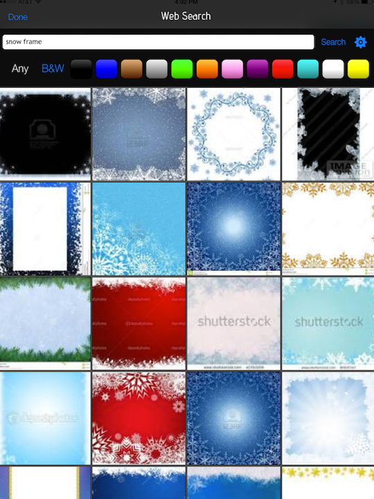
The frame I chose is not square, and the Blend does not allow you to warp the overlying image so that it fits the underneath image. What I did was Blend the same frame twice, once to cover the left half of the photo and once to cover the right. (I know, I missed a spot on the lower left. Sue me.)
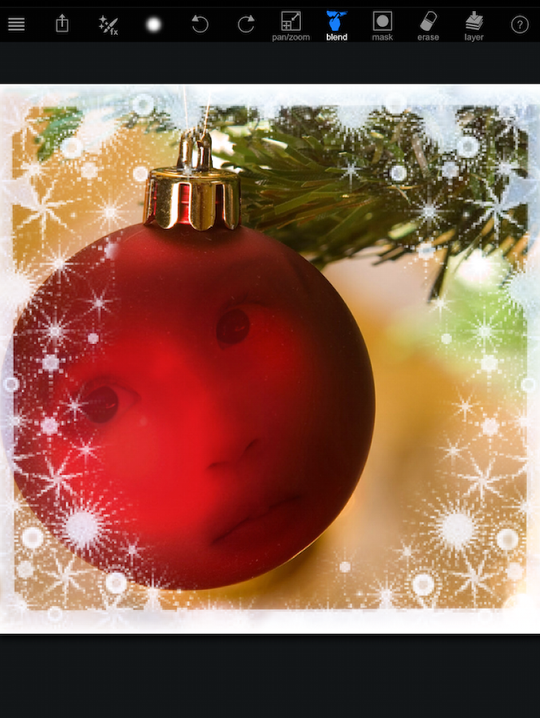
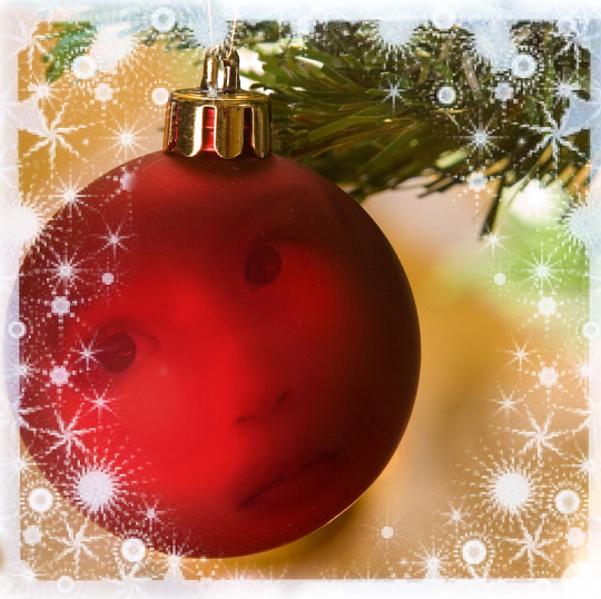
Below is the completed image. Since this was a contest entry, as soon as I tapped the Save button (box with upward arrow), PaintFX attempted to upload it into the contest. Since the contest was expired, that was not allowed. I then had to tap Save again to save it into my Camera Roll.
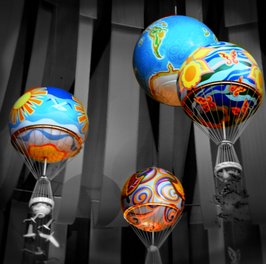
Instead I decided to enter a new contest, asking for part of the image to be monochrome. This challenge did not have one image for everyone to use – you start with your own image. Rather than loading a predetermined image into the workspace, entering the challenge asked for me to load my own image. I had this (unfortunately blurry) image from a restaurant at Epcot that I thought would be a nice one to use. I used the B&W effect in Fill mode, then erased over the balloons.
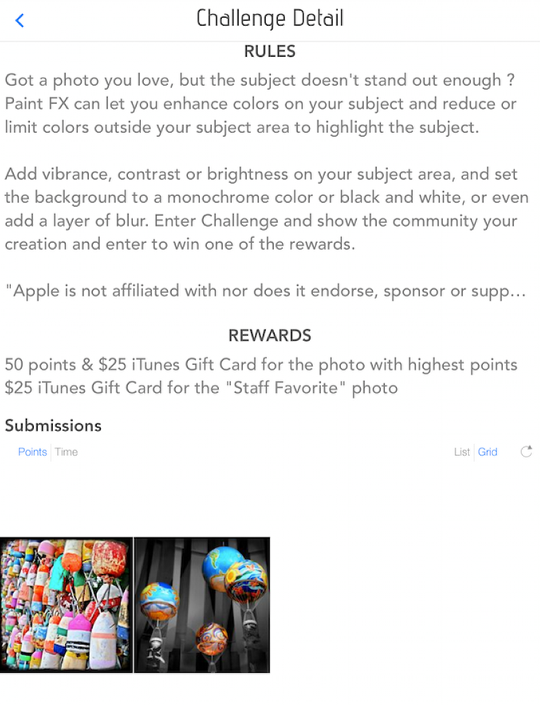
When I tapped the Save button, the image was entered in the contest. I had to tap Save again to save the image on the Camera Roll. Below you’ll see that I was the second person to submit to the contest.
So the community and the challenges are new features that give you ways to display your images created with PaintFX. Now let’s look into how those images are created. Below I loaded a Christmas selfie into the app. The Import Preview puts a square crop overlay on your image. I don’t know if you noticed, but the community and contest images have accepted the Instagram convention of square images. If the image uploaded is not square, then banding takes place, either top/bottom or left/right, to make the image square. If you have no intention of uploading the image, then you can cancel the crop by tapping the crop button in the lower left and no cropping will be done. (There are also buttons along the bottom that will flip your image top-to-bottom or left-to-right if you so desire.)
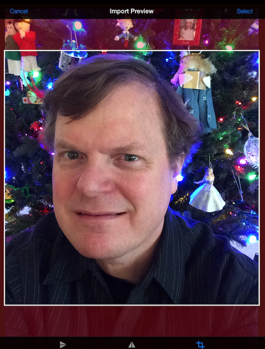
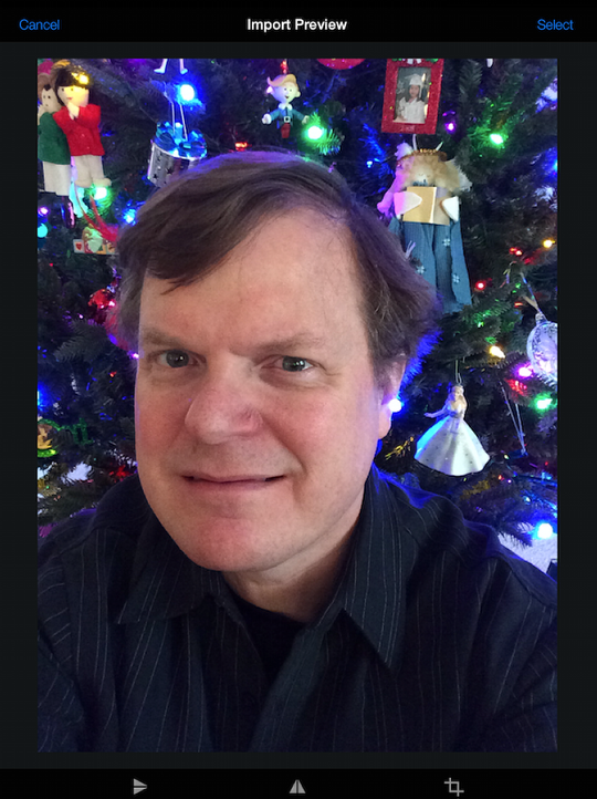
Once I tap the Crop button, it shows the full image, and I tap “Select” at the upper right to load the image into the workspace.
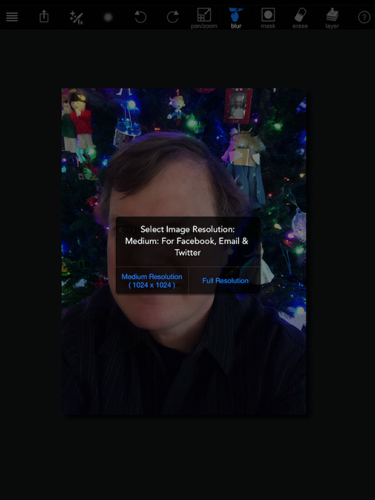
The app asks what resolution I wish the image to be in. I always select full resolution.
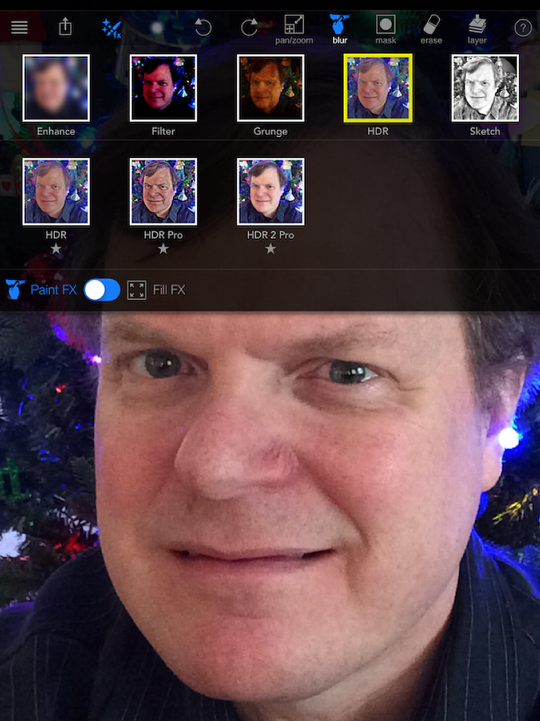
Now the image is in the workspace and I can begin to paint in effects. I think the first thing I might want to do is to brighten and sharpen the eyes (as if this were fashion photography – right). I know that HDR processing will do that, so I choose HDR Pro 2 in the HDR category of effects.
This brings up a second screen that has sliders to tune the HDR effect. Below you’ll see the default settings for HDR Pro 2.
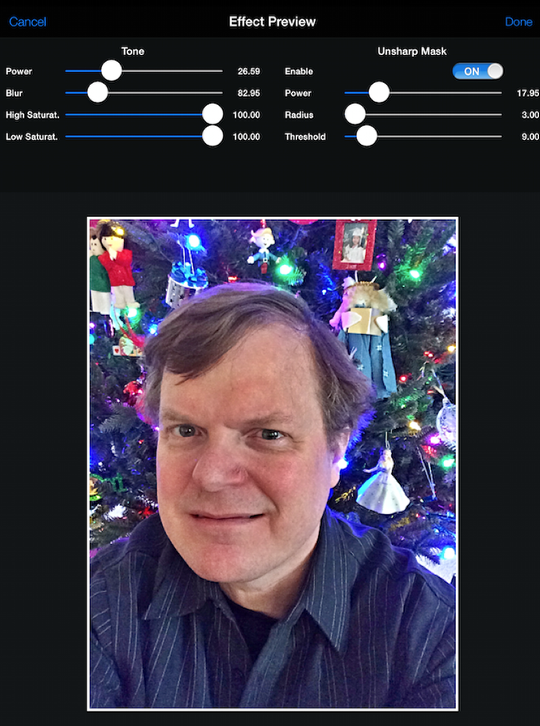
I could crank up the Power setting under Tone, but that looks very unnatural for this photo.
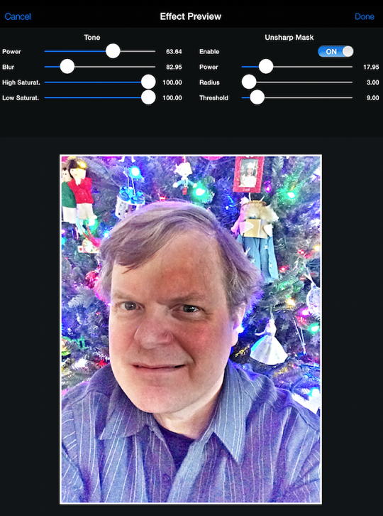
However, by raising the Blur slider under Tone, I do get a natural, pleasing effect.

Then I can increase sharpening by raising the Power under the Unsharp Mask settings.
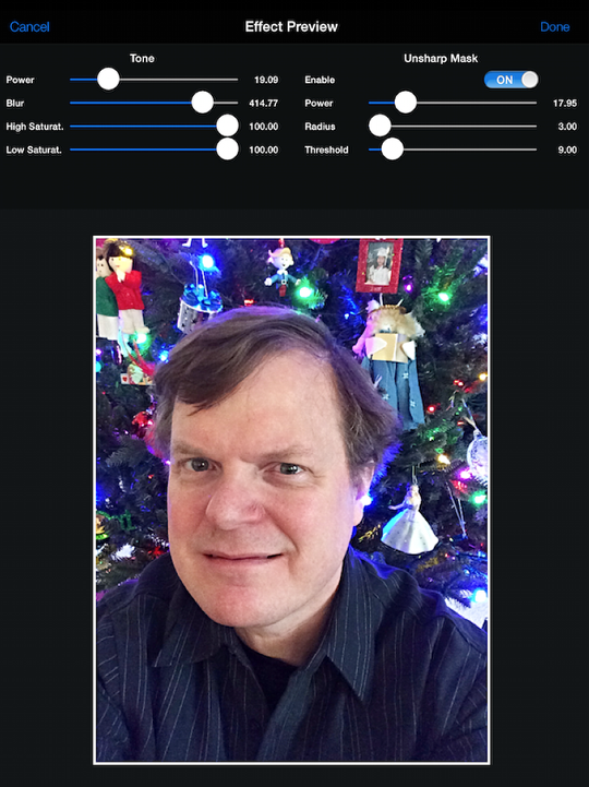
Let’s say that the settings were now what I desire. I tap Done at the upper right, and I am taken back to the workspace to paint in the effect. I use a two-finger pinch to zoom in on the eyes, and paint the HDR in at full strength on my right eye (on the left in the image). Wow, that’s some difference!
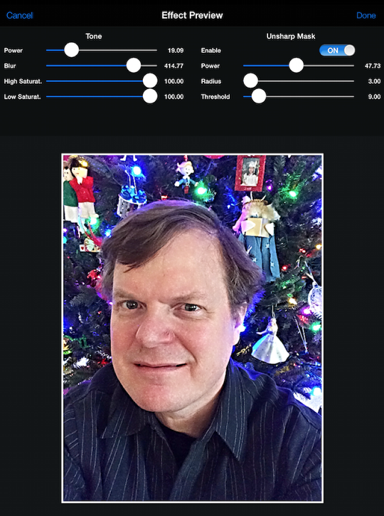
I could tone it down by undo-ing and lowering the brush opacity, but it’s more obvious for my teaching purposes to leave it as is. So I also paint in the other eye.
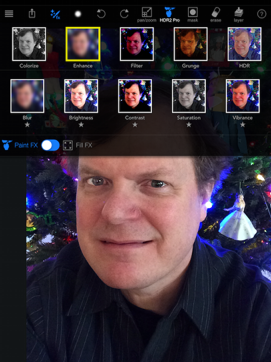
Then I want my face to be the obvious focal point. I can do that by darkening the black shirt, which comes across as too light in the image. I’m going to do that by painting in Enhance>Contrast.
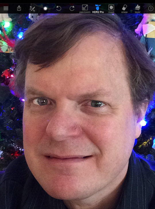
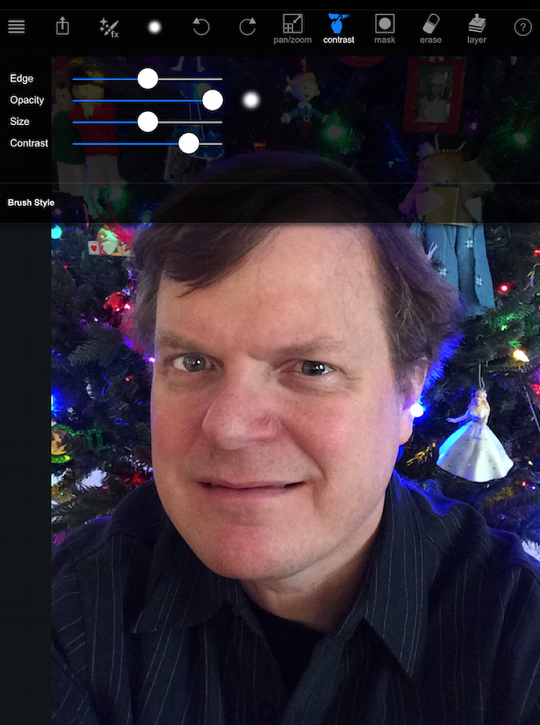
The brush settings, when Contrast is applied, are supplemented with an additional Contrast slider to allow you to adjust the amount of contrast. I raise that, since I want the dark greys in the shirt to get darker, without darkening the pinstripes as much. I also lower the opacity.
Below I’ve painted contrast on the left half of the shirt (my right) so that you can see the difference.
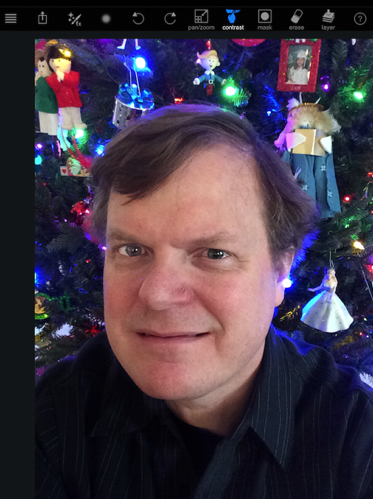
And in the screenshot below I finished painting the remainder of the shirt.
The tree behind me is too blue for my taste. I’d like a little more of the green to come out. I look in the Filter category and there is one called Green Glow that I think will emphasize the green.
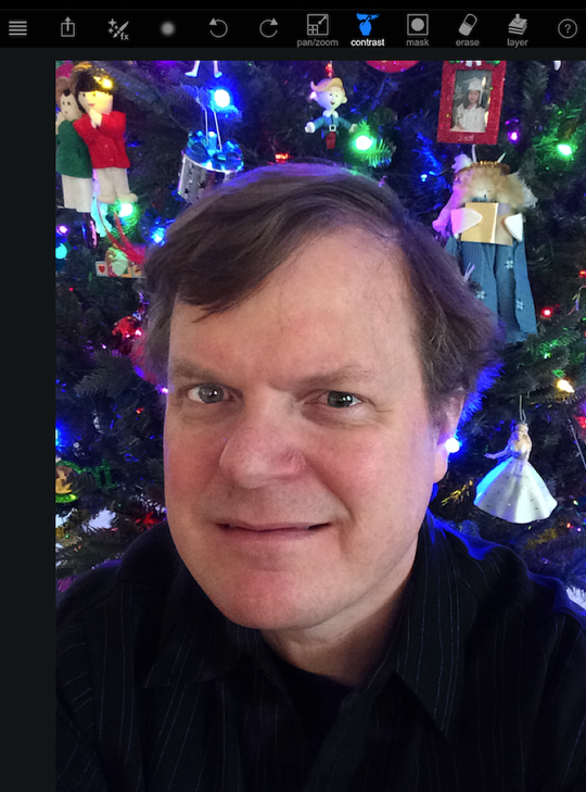
I painted over the tree, leaving the ornaments alone.
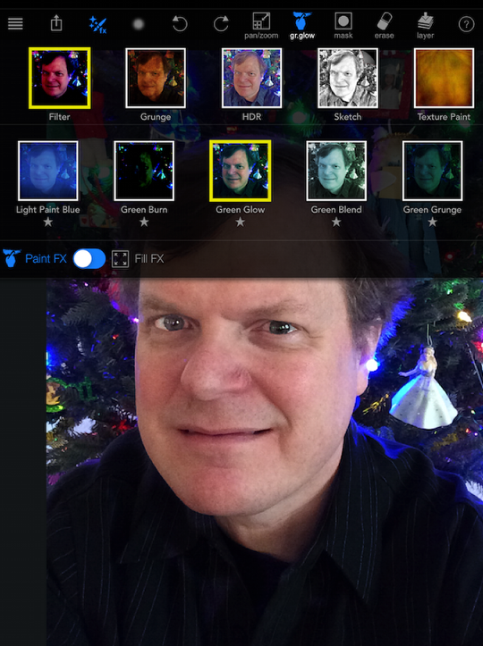
Finally, I think the skin could use some smoothing with a bit of blur. I find Blur in the Enhance category. Like Contrast, using Blur gives you an additional slider in the Brush settings to set the amount of blur.

I started painting in on my nose. Way too much blur! So I tap Undo, change the blur amount, and try again.
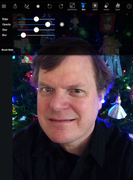
I decide to add a grunge border, but the brush opacity setting is initially too low. You can barely see the border.
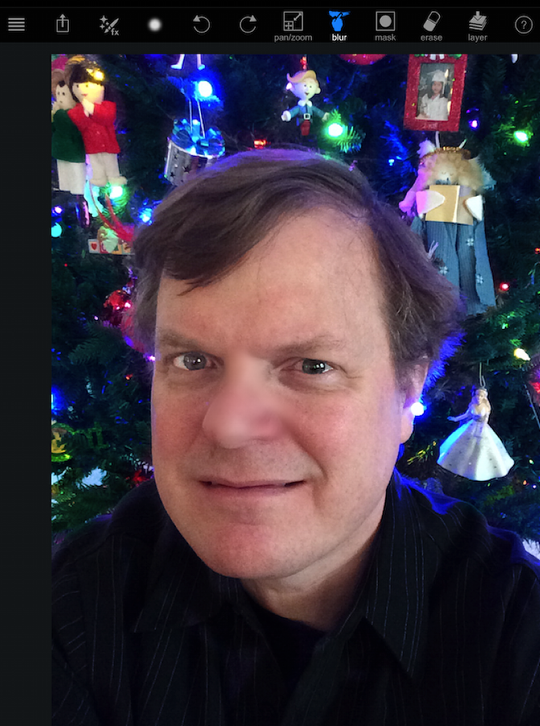
So I raise the opacity and paint again.
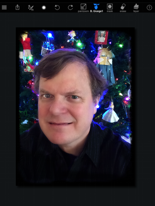
And here’s the result! (Please, no snickering.)

What would you do if you know you want to add effects to a portion of your image, but you’re not sure which portion? Well, you can paint in a mask instead of an effect, then change effects until you find what you want to use. Below I’ve tapped the mask button, and started painting over my head and neck.
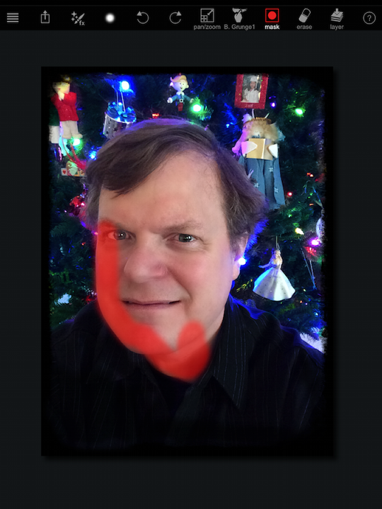
The red overlay shows where the mask is applied. I continue painting until the mask is finished.
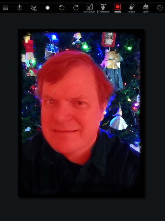
Now I can choose different effect to be applied to the masked area. Remember: while in mask mode, tapping with two fingers will not zoom the image out – it will clear the mask! The first effect I apply is Sketch>Color Sketch.
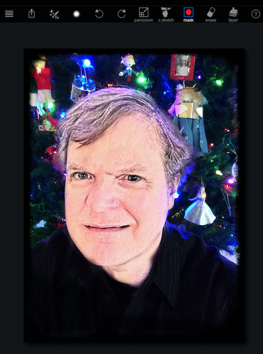
Next I try Sketch> Custom Sketch. Custom Sketch defaults to a black and white sketch, but there is a color picker within the brush settings to allow you to tint the sketch.
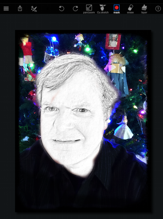
Here’s the thing about masking in PaintFX: the mask is only good for a single application of a single effect. If you want to add a sketch, then a texture, you will have to rebuild the mask. The mask is cleared when you tap the Layer button to commit the first effect. If you have a complicated area to mask, this can be extremely frustrating.
It also means you can’t invert a mask. There are many times where I would want to emphasize a subject using brightness or contrast on the subject, and darkening/blurring the background. This would be much easier if you could continue to use the mask you built and invert it.
To be quite frank, I wish the folks at Sprite Labs had spent the time on improving the masking function over all the social media community functions. Combine single-use masks with the ability to accidentally clear the mask with a gesture universally used to zoom out on your image, and you have a recipe for frustration.
We’ll wrap up our discussion of PaintFX in the next article with a documentation of the effects that are available. Until then, enjoy!
