iOS Photography Technical Tutorial – PhotoMotion – By David Hayes
We’re delighted to publish David Hayes’ latest technical iOS Photography tutorial. This time it’s on the very new and popular app, PhotoMotion. We are sure you will really enjoy this, over to you David(foreword by Joanne Carter).
“East Coast Pixels, the same group that produced such winners as PhotoToaster and TitleFx, have recently released PhotoMotion. This app allows you to add “motion” to your stills…and in the spirit of all filmmakers…gives you the chance to create narratives ala Ken Burns. If you are a follower of the mobile photographers, Cat Morris, Andrea Koerner, Roger Guetta, and myself you have already seen what this app can do! I’d like to take you on a short tour on using PhotoMotion if I might in this article. It’s one of those quiet but powerful apps…easy to use…with so much potential.
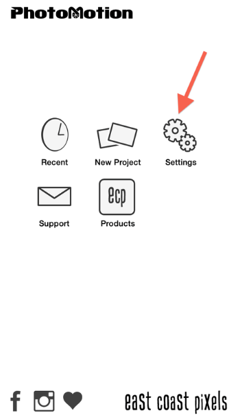
The app’s opening screen is pretty straightforward…and self-explanatory. I always start with Settings when I begin using a new app…so let’s go there!
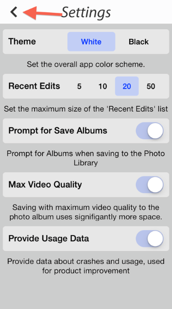
The Settings panel allows you to establish such basics as a White or Black background to the workspace, how many recent edits are shown…things like that. Set things up the way you want them and click on the arrow in the top left corner to take you back to Home.
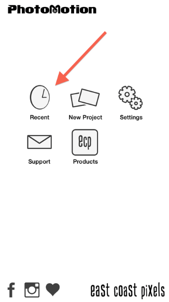
Clicking on the Recent icon takes you to your list of recent edits…

I’m only showing one right now…I deleted a bunch of “try-outs” before starting this tutorial. To open a Recent Edit, just click on its thumbnail.
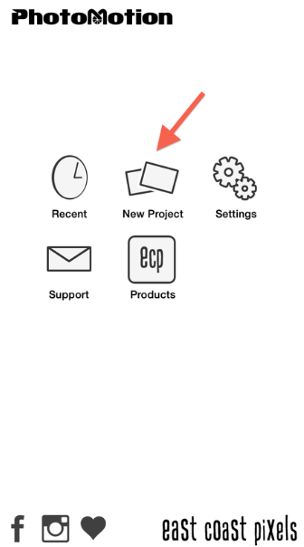
Back at the Home screen, it’s time to create a new project! Click on that icon and away we go!

You are first taken to your Albums to select your first image. (I’m not a believer in keeping many Albums…like to keep things uncluttered…)
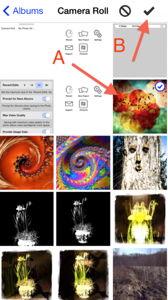
From my Camera Roll, I selected the indicated image (A) and then clicked on the check mark (B) to go to the edit screen. (Don’t you love the image of the Ent right below it? We had such a delightful conversation…)

Call it a personal preference…I like giving my projects a title right at the beginning. To do this, click on Add Title…
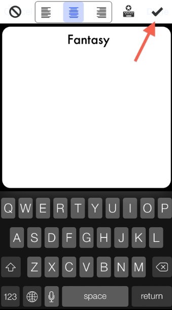
…And you are taken to a composing screen where I typed in “Fantasy”. This done, click on the checkmark to go back to the edit screen. (Later in this tutorial I’ll show you where you can change the style of your titles.)

Click on the Pencil icon to start your motion edits. (Clicking on the double arrow icon next to this will randomly establish this for you…but what fun is that!)
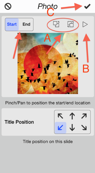
Here’s the main edit screen that you’ll use to establish the motion for each image. Lots going on here!!! Over at the “Start/End” box…click on Start then “Pinch/Pan to position the start location.” That established…do the same thing to establish the End point. Use the controls in “A” to reverse the order of things…. click on “B” to preview the animation…and click on “C” to put it all into place. You can also establish the Title Position in the lower control panel.

With the first slide completed, it’s time to add more slides! To do so, just click on “Add Photos”.
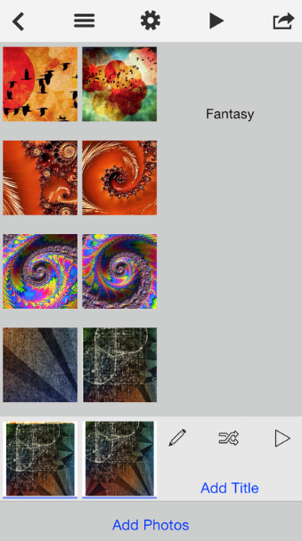
And…I did likewise for all 5 slides that you see on this screen shot. Each time I had to go back and forth with my Start/End points until I was happy with the flow. I also found out that I needed at least 5 slides for it to work in IG…about 15 seconds worth. You can also add Titles to each slide if you want…but I didn’t do that for this article.
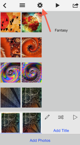
A couple of more controls to show you before I show you my finished video. Click on the Gear icon at the top…
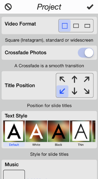
This brings up the Project screen where you can set the Video Format, Crossfade transition, Title Position for all titles, Text Style for the titles….
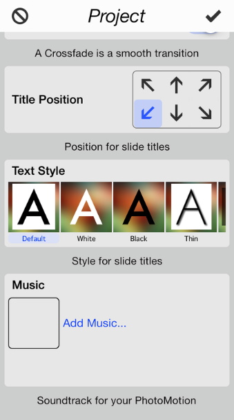
…. and add a soundtrack to your video. I’m not going to go into this step right now, but if you click on Add Music the app will take you through the steps. (Just a note…Facebook will most definitely delete your video if you use unlicensed music…and send you a nasty warning. I know from experience…)
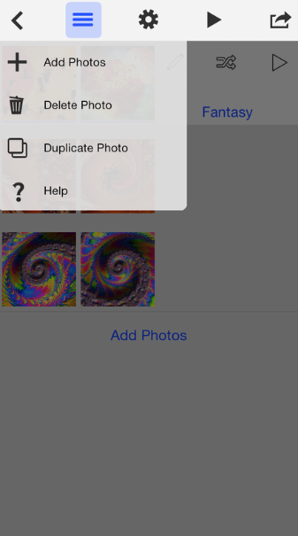
To the left of the Gear icon, the Bar icon lets you add, delete, or duplicate photos. The duplicate function comes in handy if you want a particular image to stay on-screen longer…just duplicate it for a number of slides without having to go back to your Camera Roll.
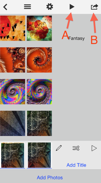
The Arrow icon (A) previews the entire video from start to finish…and the Save icon (B) takes you to the Save To screen.
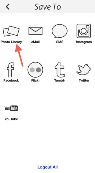
In this screen you can save/send your video to your PhotoLibrary…

Which includes your Camera Roll as well as any Photo Albums you would like.
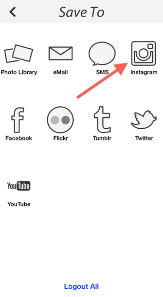
And you can send it to IG, FB, Flickr, etc. Click on the IG icon and…
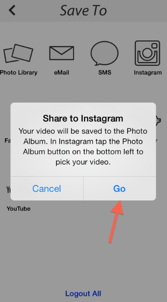
…this screen pops up. Once in Instagram, just follow the usual prompts to publish your video to the world!
And here’s my video!
pm23 from The App Whisperer on Vimeo.
Do make PhotoMotion a part of your toolbox. The possibilities that this app present for storytelling is incredible. The developer has indicated to me that they do plan further enhancements to the transition and animation controls in future updates…but why wait!!


