iOS Photography Technical Tutorial – Image Blender – New Masking Brushes – by David Hayes
We are delighted to publish this wonderful tutorial by David Hayes, this time he takes a look at the uber popular app Image Blender and puts its new masking brushes through their paces. Over to you David (foreword by Joanne Carter).
“If you are a regular follower of any of my photo streams (Flickr, EyeEm, 500px, IG) you know that as of late I’ve been doing more in the way of “digital collage” vs. “app stacking”. Which means that all my layering apps have been put through their paces as I work with each one’s given inherent strengths. At the end of the day I still have to say that Image Blender by Johan Andersson is still one of my all time favorites!
Knowing that I promised The App Whisperer a second article featuring this app, I sat down to put something together using Blender’s new masking brushes. What came about from this session was a pleasant surprise. (Don’t you just love it when that happens!)
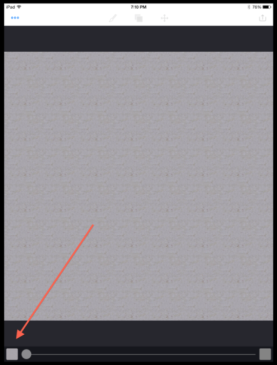
To get started, I opened Blender and pulled in a background that I had created earlier.
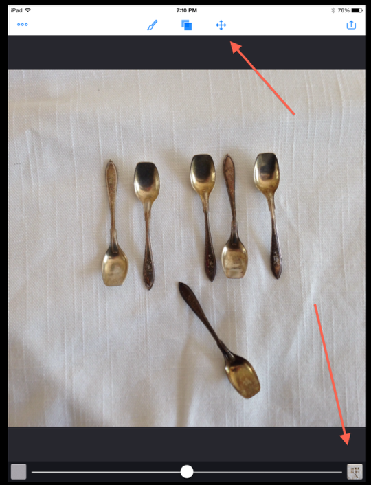
Then I pulled in a shot I had taken of silver salt spoons on a linen tablecloth. Nothing fancy about this image…but wait and see what happens later! Clicking on the “Arrange” icon…
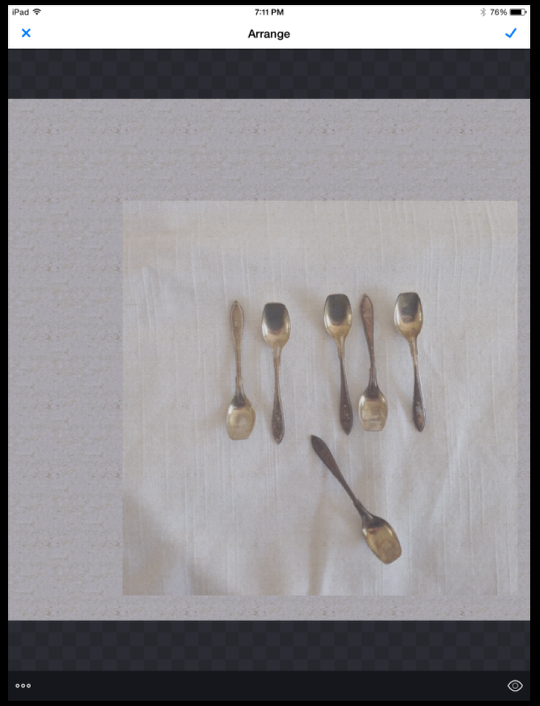
I pulled my foreground image down to the right corner and reduced it a bit.
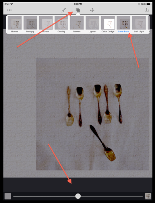
Going next to the “Blend” menu, I picked “Color Burn” and adjusted its opacity accordingly.
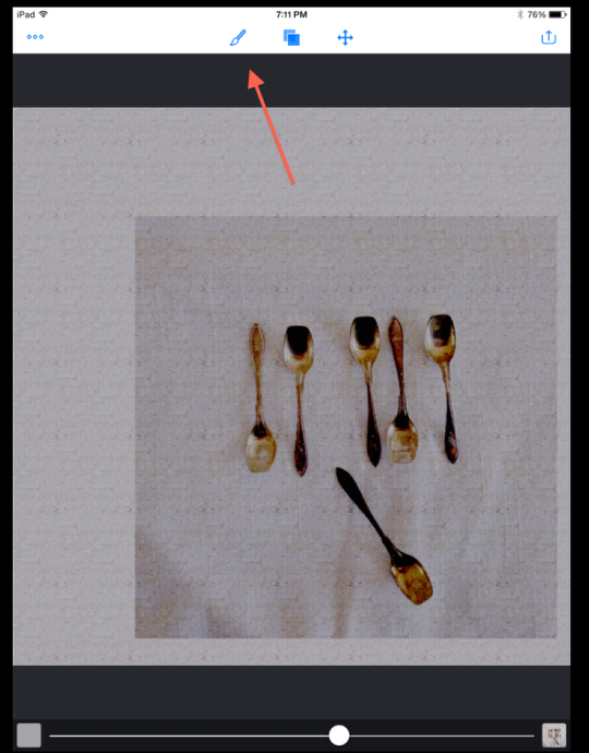
Now the real fun begins! I activated the “Masking” feature…
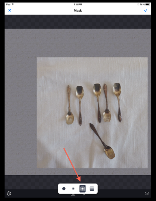
…and went for the new radial gradient brush! Watch what happens next!!
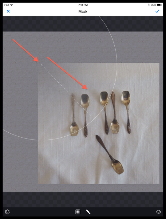
Starting in the top left corner of the spoons image, I touched down on the corner and pulled into the center of the image. Hopefully you can see on the screen shot how the gradient masking is taking place.
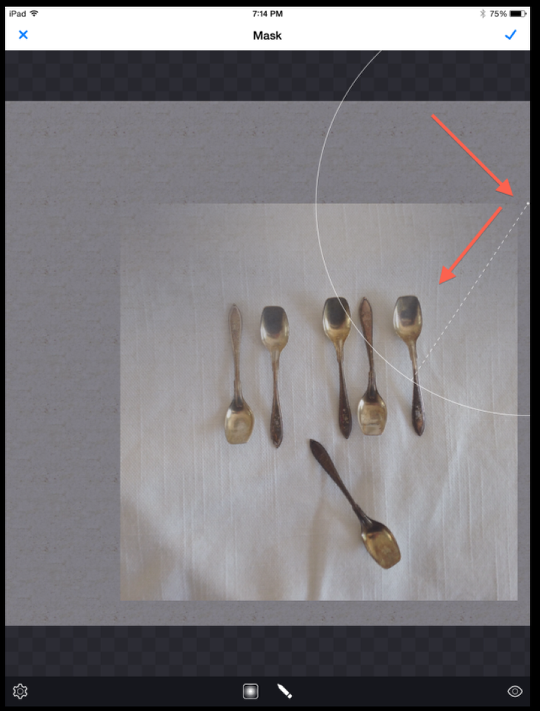
Then, moving corner to corner, I did likewise.
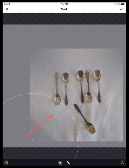
And here…
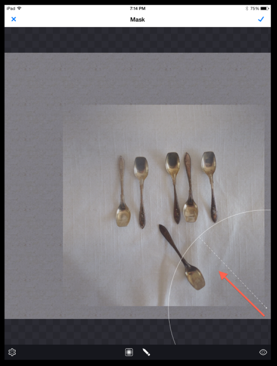
And here to finish the corners.
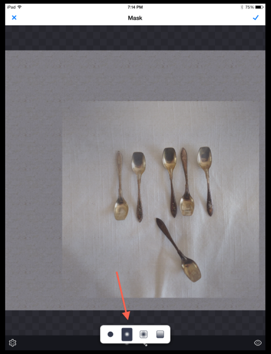
Not satisfied with just this, I decided to use the gradient brush to paint around the rest of the image.
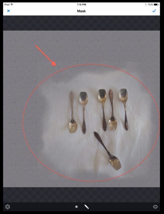
I did this until I achieved a sense of the spoons floating on the background.
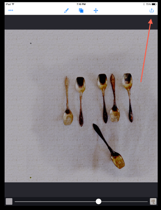
Coming out of “Mask” mode, you can see the effect I was after. With this done, it was time to “Flatten” these two layers so I could continue building my image.
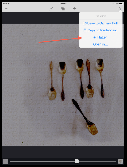
I clicked on “Flatten” which the app did and at the same time, made this my new Background layer.
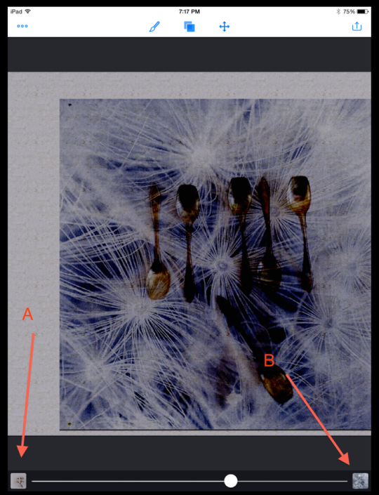
With my first layers in “Background” (A), I pulled in a macro image of dandelions as my new “Foreground” layer (B).
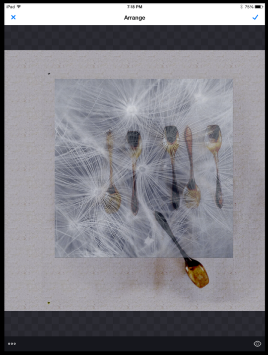
Using “Arrange” I moved this layer to about center of the background leaving a bit of the lower spoon hanging out. (This proved to be a good decision!)
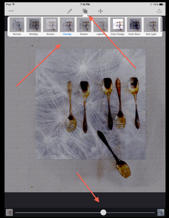
This time I used “Overlay” when I went into “Blend” mode…and adjusted the opacity as indicated.
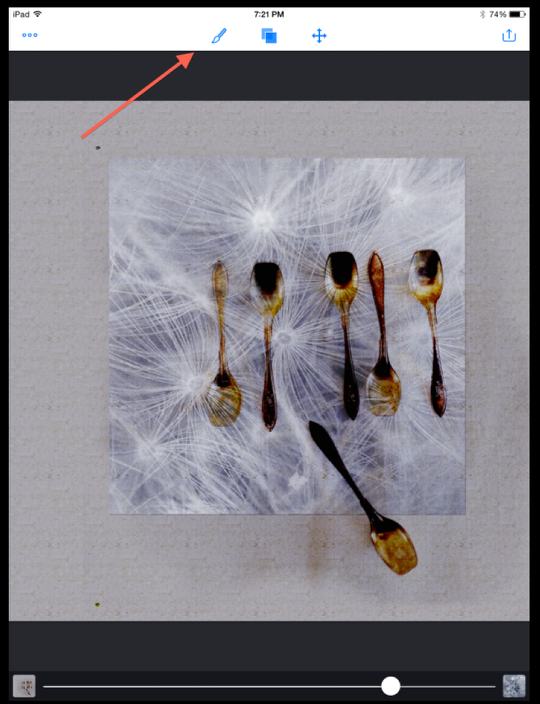
Wanting to brush out the edges a bit, I opened the “Mask” mode again.
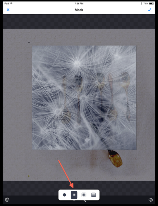
Using the gradient brush mode, I painted around the edges….
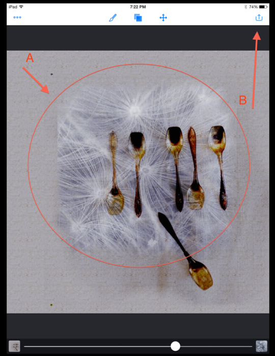
…like this! Time to flatten these layers so I could add my third and final image.
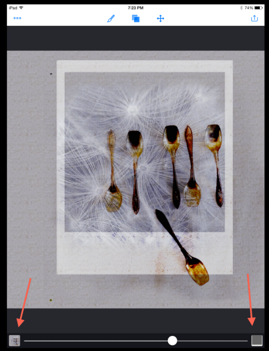
There seems to be a “fad” at the moment of creating faux Polaroid images, so I decided to bring in a Polaroid frame element I had in my stock files to see how it would work with this project. As soon as I pulled this image in as my Foreground, I knew what I had to do!
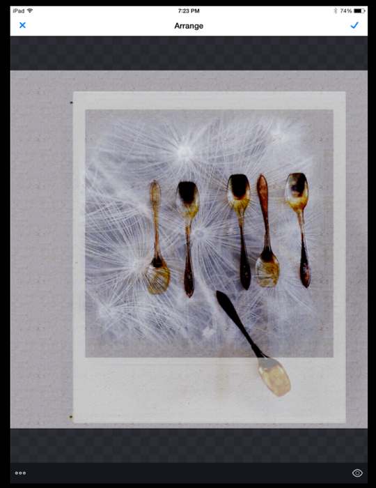
In “Arrange”, I positioned the faux frame so that while the five spoons where more or less centered, the lower spoon was “out” of the frame.
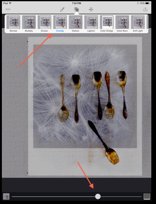
Going to “Blend”, I once again used “Overlay” adjusted for opacity as shown.
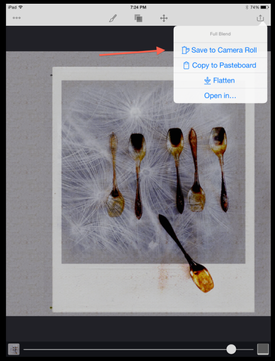
Being quite pleased with how this image came out, I decided to stop and save!
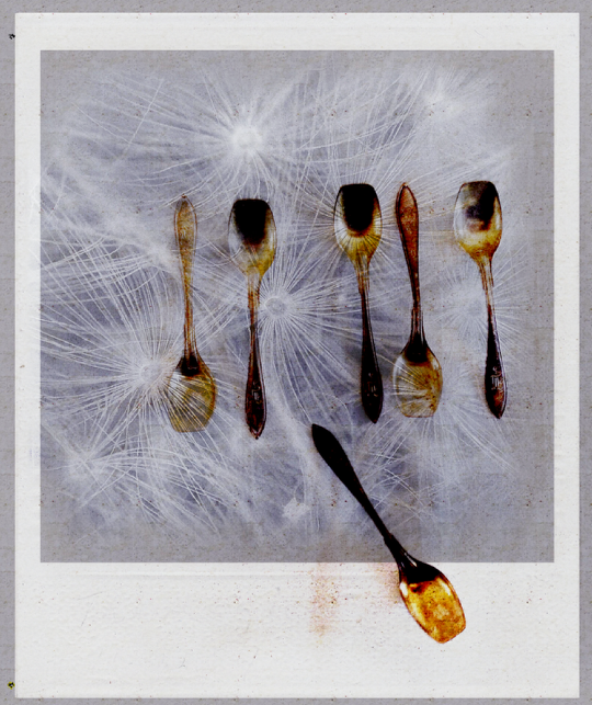
Only one problem…I needed to cut my image from the rest of the background. So I reopened the image in PS Express and used its crop function to do so. Simple as that!
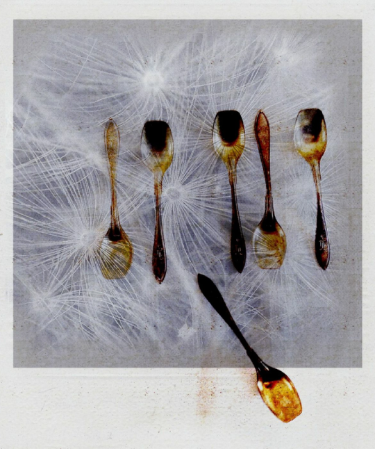
Here’s the final image. I do hope you like it as much as I do!!
If you are not already a user of Image Blender, I do encourage you to give it a try. Have some fun putting different images together…you never know what can come about!!
