iOS Photography Tutorial – ‘Tune in and Drop out: Eliminating a plain black or white background’ by Jerry Jobe
We’re delighted to publish Jerry Jobe’s latest technical tutorial here today. This week Jerry explains the intricacies of creating composites with your iOS photo editing device, don’t miss this…(foreword by Joanne Carter).
“Sooner or later, we all want to create a composite. We want to add one image to another to create something new. Chances are that you only want to add part of one image to another, and we’ve discussed many ways to mask out a background, so that you’re only adding a portion of the top image. There’s masking in iColorama, Superimpose, LayerPic and Background Eraser (among those we’ve covered) and Photoshop Touch, Filterstorm, Leonardo and Handy Photo (among those we haven’t).
But masking can be a tedious process; zooming in and brushing out a background is one of my least favorite tasks. So today we’re going to address a special situation that allows for several quick and easy solutions for dropping out a background.
I came up with the idea for this tutorial while experimenting with a wonderful image of gulls from Carol Smith. I first took it through Distressed FX, then decided to take a look at the frames in Photo Toaster, an app which was recently updated. That resulted in the image below.

I like the frame, but don’t care for the fact that the frame color is limited to white or black. I wondered what it would look like with a painted background: one I had created earlier.
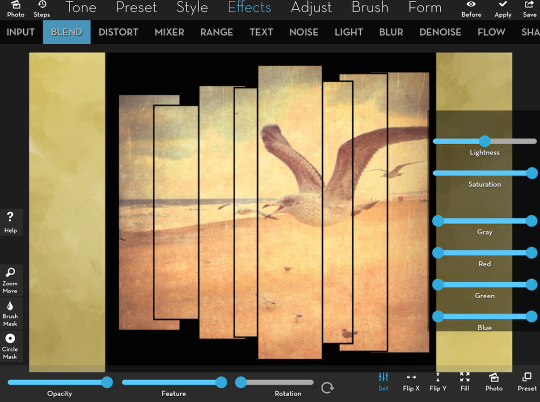
There’s a feature in the full desktop Photoshop called Blendif, and that is the first method that occurred to me. iColorama has a version of that method in its Blend settings. I brought the background into iColorama and went to the Effects>Blend menu choice. At the bottom I tapped Photo to load the gulls with frame.
When I tapped the settings, I saw a series of sliders. What I want to accomplish is to drop out the black in the top photo, while leaving the lighter portion. The Gray slider has controls at both ends. As you move the one on the left to the middle, the darkest portions of the image are masked out; as you move the right one to the middle, the lightest are dropped out. In the screenshot below I have yet to adjust that slider.
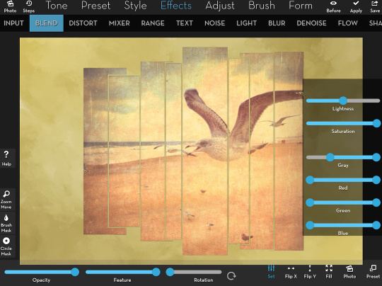
Just a slight movement of the slider drops out the blacks, as seen below.

If you look very closely, though, you’ll see there is still a slight black edge around the boxes. Because the gulls image has no real blacks in it, we can continue to move the slider farther to get rid of the black edge, and that will not start to mask out any of the bulls or beach.
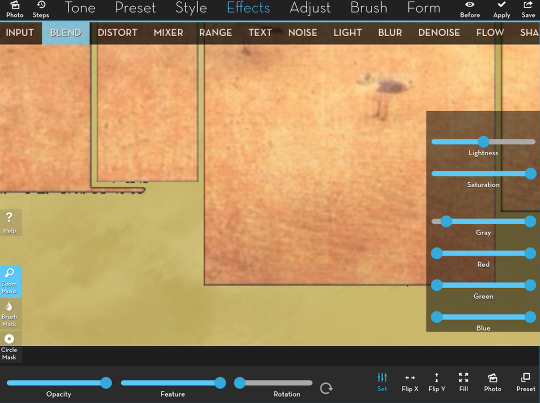
This method is not perfect; individual pixels along the edge may have some bleed-through, making them not entirely black or white. Below you’ll see some detail of the “jaggeds” – pixels that are not entirely black that do not drop out until you move the slider value higher.
Of course, this method works with white backgrounds as well. iColorama, by default, starts its painting functions on a white background. Below I painted the gull image on a white canvas, then used the Blendif function to place it over another canvas. Look closely at the edges, especially along the bottom, and you will see that you get a lighter edge where the paint has blended into the white background, making it darker than the white and lighter than the paint. If I tried to eliminate that light edge entirely, I would take out lighter areas of the painted portion as well.

Let’s move on to Superimpose. It doesn’t have a Blendif mode, but it does have a Magic Wand with a Threshold setting that works in somewhat the same manner. Below I’ve loaded my background and my gulls image. I chose the Masking icon on the bottom, and tapped and held the Magic Wand icon on the right to show you the settings for the tool.
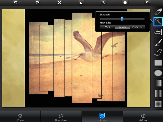
Then I tapped on the black in the Foreground image, and it drops away.
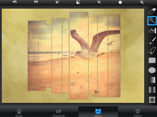
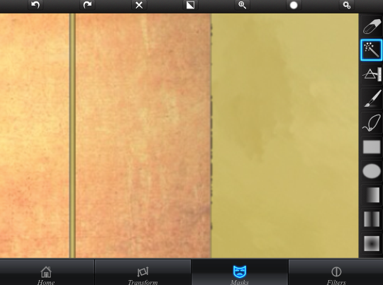
We still have a case of the “jaggeds”, though, which can be adjusted using the Threshold slider on the Magic Wand tool. Just Undo the mask, adjust the Threshold, and tap on the black again.
The makers of Superimpose have a fully-featured layer editing app called Leonardo. There’s an advantage to using a full layering app when compositing that I’d like to show you. I’ve loaded the two layers below, then (as in Superimpose), chosen the masking function on the left and the Magic Wand on the right. Settings, once again, are accessed by tapping and holding the tool icon or by tapping the “sliders” icon at the bottom of the screen.
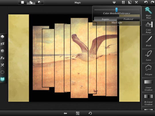
Below I’ve tapped the black portion of the top layer to drop it out. There are some “jaggeds”, as you’ll see if you look closely.
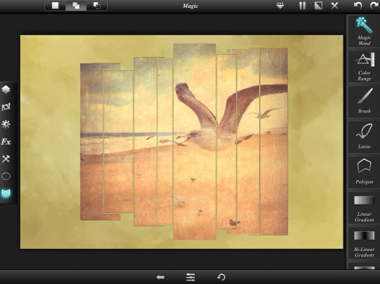
By using a layering app like Leonardo, you can then do some wonderful things to the top layer, like add a drop shadow. This isn’t possible with a single-layer app like iColorama. I’ve chosen Fx on the left , and Drop Shadow on the right.
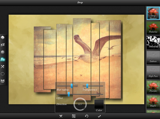
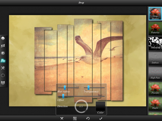
Notice, though, in the above image, how the shadow is nice and soft on the bottom, but has a hard edge on the right side. That’s because the shadow is cut off by the original edge of the layer (which can no longer be seen). Effects will not extend beyond the edge of the layer. So in the image below, I adjusted the Offset and the Blur Radius to pull the shadow closer so it wouldn’t extend beyond the edge.
So far, we’ve been working with an image that has a very distinct line between what we want to keep and what we don’t. How well do these techniques serve us when the added image encompasses all the tones from dark to light? Below is an image I created in Embers on a black background. How well will that work, when it is really impossible to mask accurately?

We first go back to iColorama, and see if the Blendif feature works. I load the background, go to Effects>Blend, and load the foreground.
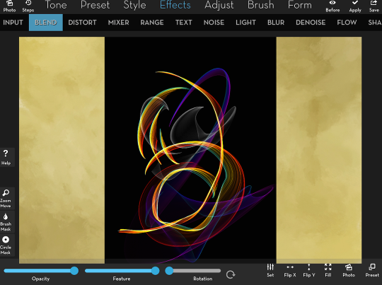
I go to the Blend settings and start to move the Gray slider. Because Blendif goes after the darkest parts of the image, it isn’t long before we start losing the dark blues, while keeping some of the lighter grays. It really is quite a mess.
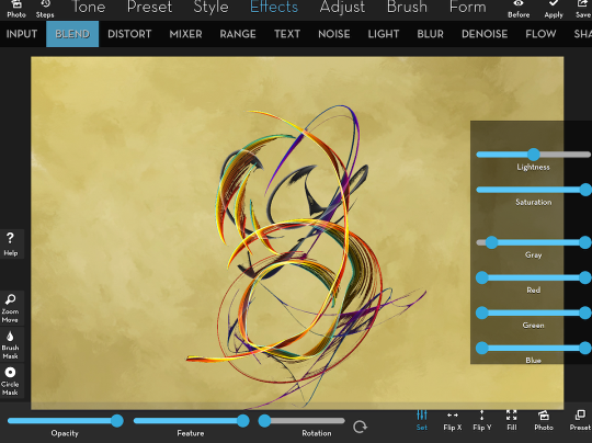
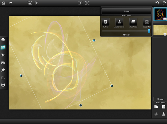
One solution is to change the blend mode. In order to drop out the blacks and keep the lighter tones, the blend modes we need to use are in the Screen family. Here I’ve changed the blend mode to Screen, and the blacks definitely dropped out.
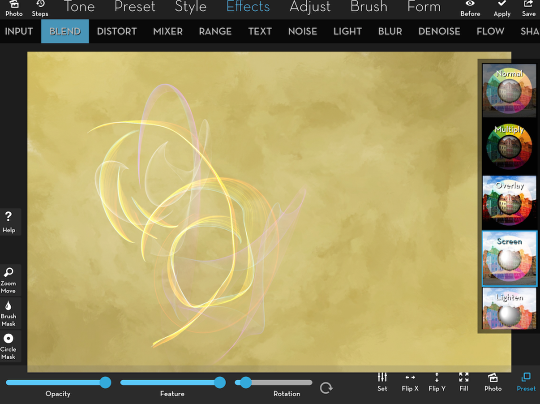
The figure is awfully light, though. Add mode definitely strengthens it.
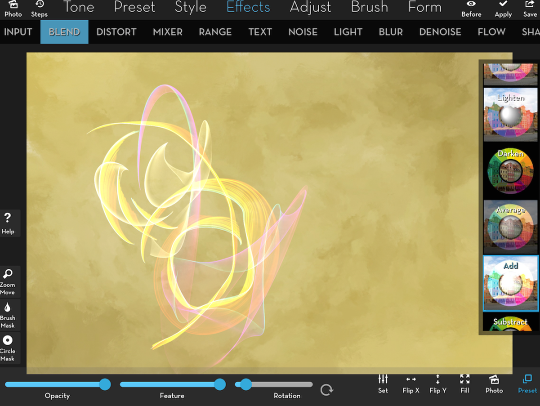
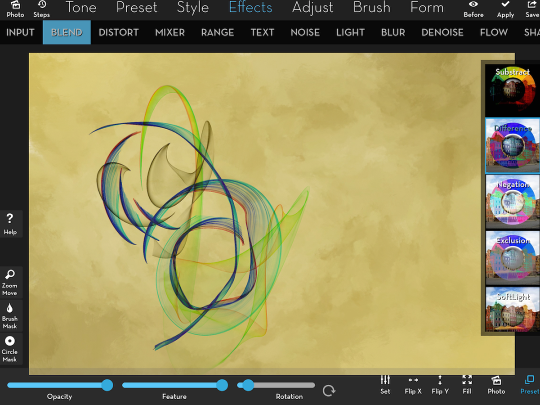
You might want to explore other blend modes as well. In this particular case, where the color of the figure itself is not paramount, a Difference blend mode drops out the black and strengthens the figure – but changes the color.
Now let’s go back to Leonardo. Once again, we can use the blend mode to drop out the black. As I look at the layer characteristics, I see it starts out in Normal Mode.
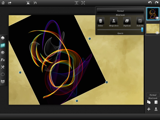
Tapping the mode button allows me to change it to Screen.
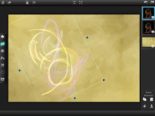
Another advantage of a layering program is that I can strengthen the effect by duplicating the layer. Here I duplicated the Screen layer and lowered the opacity of the top layer by 50%, giving me an “effect-and-a-half”.
What about masking using the Magic Wand? Will that work in this instance? Below I’ve tapped on Mask to the left and Magic Wand on the right.
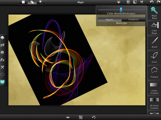
Tapping on the black took out the black on the outside, but left it in the middle. Why is that? It’s because the Magic Wand works on contiguous, or touching, colors. I would have to tap on the interior part of the figures with the wand, and might end up eliminating a color I want to keep.
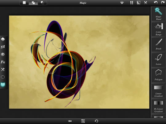
The next option down, ColorRange, is non-contiguous. It has the same controls, but affects the color you tap throughout the entire image.
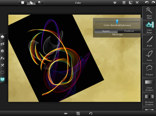
Here’s the result, which is closer to what we want. Let’s see if we can improve it by changing the settings for ColorRange.
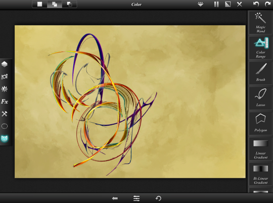
Below I’ve changed the Threshold to lower it, meaning that I want to keep some of the darker colors. I only want to mask out those colors that are closest to the black I choose. I also changed the mask type to feathered, to get a smoother transition. That’s a nice result.
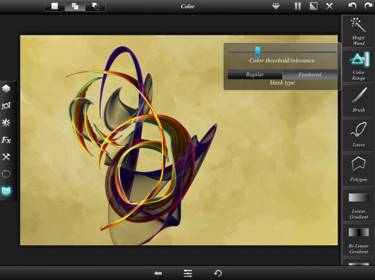
I decided to see what a drop shadow would do in this instance. But, as you’ll see below, I still get the sharp edge to the shadow because the shadow overlaps the edge of the layer.
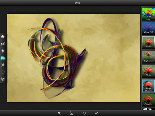
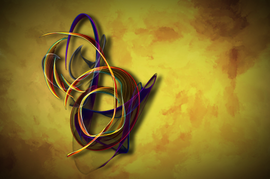
I decided to extend the canvas of the layer holding the figure in Filterstorm. By surrounding the figure with more black, the shadow would have to extend pretty far beyond the figure to be cut off by the edge of the layer. I retraced my steps with this new top layer, and added clarity and a vignette to the bottom layer. I ended up with the image below, which is very pretty, in my eyes.
Many apps give you white or black frames or backgrounds, with no option to change them. Don’t be satisfied with those limitations! Drop out those drab backgrounds and make them your own! I hope these quick techniques, using just a couple of sliders, will open up new vistas for you. Enjoy!


3 Comments
Dan
Nice tutorial Jerry. I was unaware of those adjustments in icolorama. I’ll have to give it a try. Have you tried masking in union app yet? It has a slider with the magic wand tool that changes the amount that is masked. Works well sometimes.
Jerry
Yes, there are many apps that will do the same thing; my tutorial was meant to cover different techniques and was unable to exhaust all the different apps that use them. For example, Union and LayerPic use the same magic wand technique as Superimpose, and Photoshop Touch includes the ability to add a drop shadow like Leonardo.
Roxi
This is more than amazing. I didn’t realize you could do blend if in iColorama. Thanks for such a detailed tutorial. I’ve been looking for an app that will do drop shadows with needing a mask to make it possible and stumbled on this. So I’m still searching.