iOS Photography Tutorial – ‘Matter – expanding your artwork’ – by Jerry Jobe
We are delighted to publish this incredibly comprehensive and well planned technical tutorial with the new iOS Photography App Matter. Jerry Jobe has once again written a very clear tutorial that we are sure you will all enjoy. Over to you Jerry (foreword by Joanne Carter).
Matter retails for $1.99/£1.49 and you can download it here.
“Ben Guerrette and the folks at Pixite have been producing some wonderful geometric-based apps over the past couple of years, and I’ve produced tutorials for them: DecoSketch, Tangent, LoryStripes and Fragment. Now they’ve got a new app that adds depth to those geometric shapes, and it’s called Matter.
Matter adds shapes to your photos that can be rotated in 3-D space; that cast shadows; that can be turned into videos where the shapes spin, bob and pulse. It’s a fascinating app, well-built like other Pixite apps, and can be a lot of fun to use. Let’s get started!
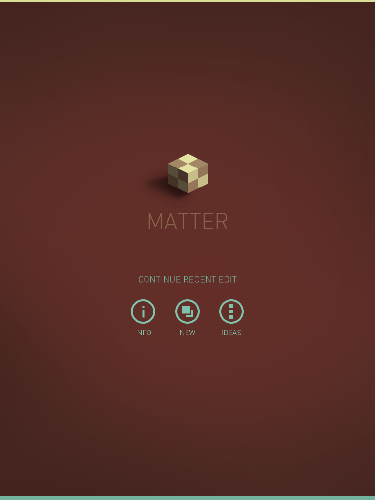
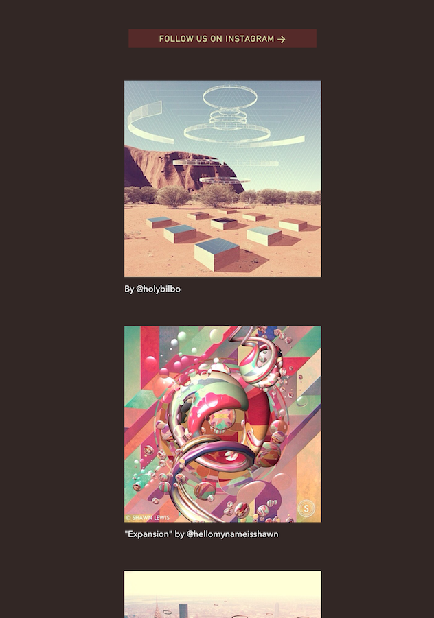
The opening screen allows you to Continue a recent edit, get information, start a new edit, or peruse the latest photos added to Instagram by Pixite under the name matter_app”.
The Info button will lead you to credits. You have to swipe left twice to get to the help screen.
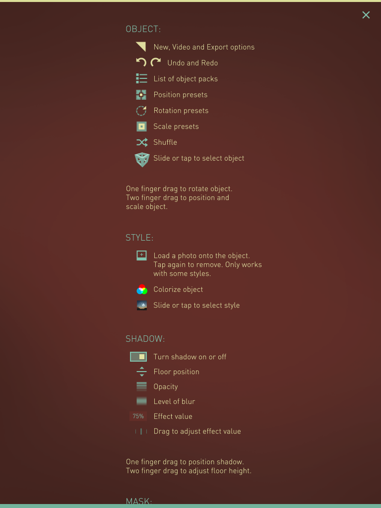
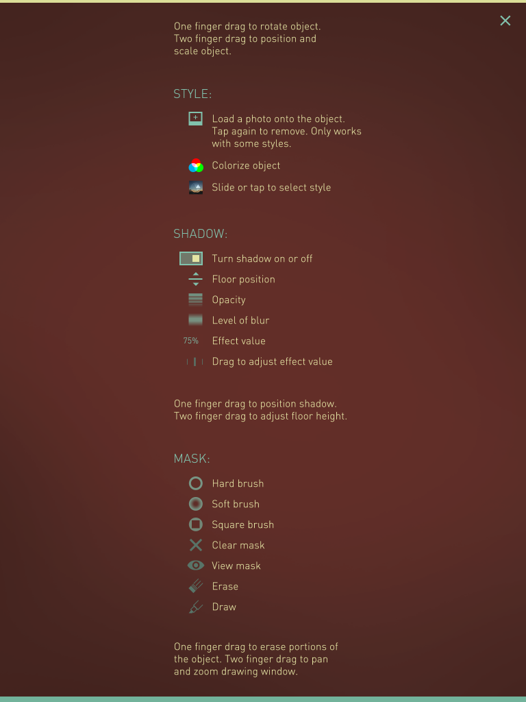
The help screen, as with all Pixite apps, is a quick reminder of what the buttons are used for. We’ll get a little more in depth here in this tutorial.
You have to swipe up to see all the info on the help screen.
Below you’ll see the “Ideas” screen. These are curated by Pixite, and added here from images and videos uploaded to Instagram with the #matterapp hashtag.
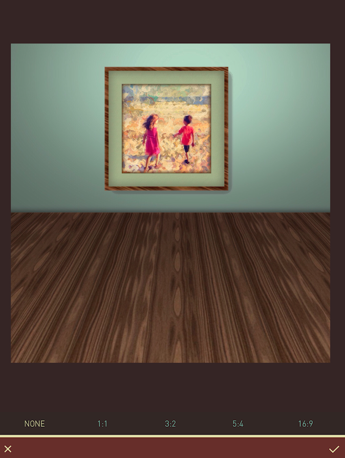
I, of course, will be starting a new project. Matter allows you to capture an image with the built-in camera, but I’ve leaded an image I built in iColorama with a little help from FrontView. I wanted to make a room for my 3-D object to be placed within. Matter allows you to crop the image before working on it; I hit the checkmark at the bottom right to accept the image without cropping.
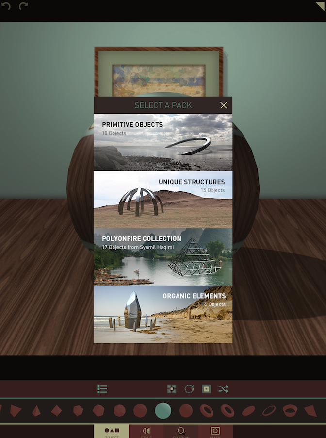
Matter currently has 54 different 3-D objects to choose from, divided into four packs. This “pack menu” can be accessed at any time by first tapping Object on the bottom row, then the (dot dash) List icon at the left of the third row from the bottom.
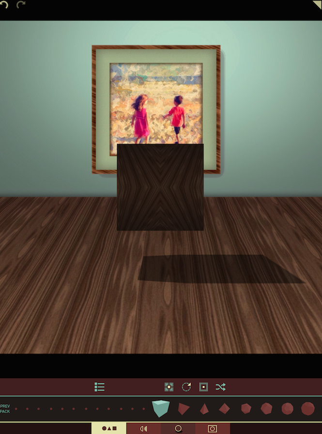
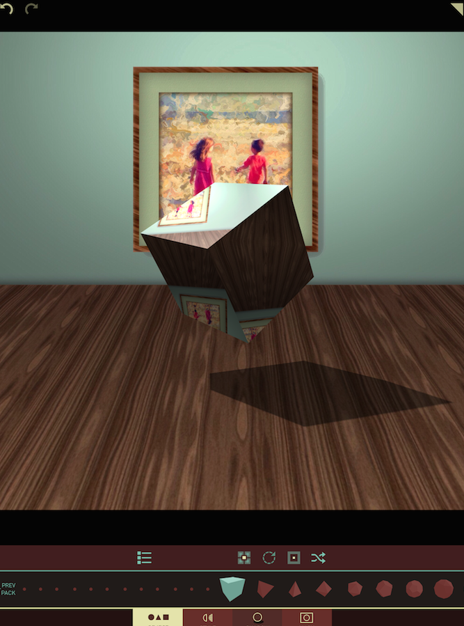
I chose “Primitive objects” as my pack, and the first object within that pack, a basic cube. It’s set up in its default position and size.
A single-finger drag on the object will rotate it in 3-D space. Below I’ve rotated the object to show three sides of the cube. Notice how the shadow changes also to reflect the rotation.
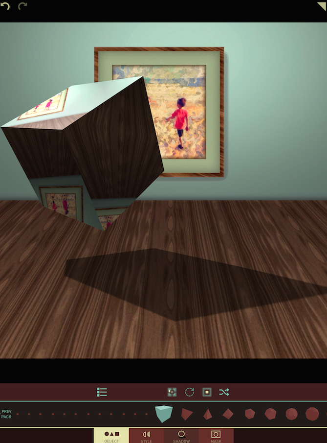
There are four more buttons, other than the List button, on the third row from the bottom when you are in Object mode. The first three of those are Position, Rotation and Size. Tapping any of these will set your object at a pre-defined position, rotation and siaze on the screen. You can also use a single-finger drag for rotation, a double-finger drag for position, and a double-finger pinch for size to customize the settings. Below I’ve tapped the Position button several times to move the cube.
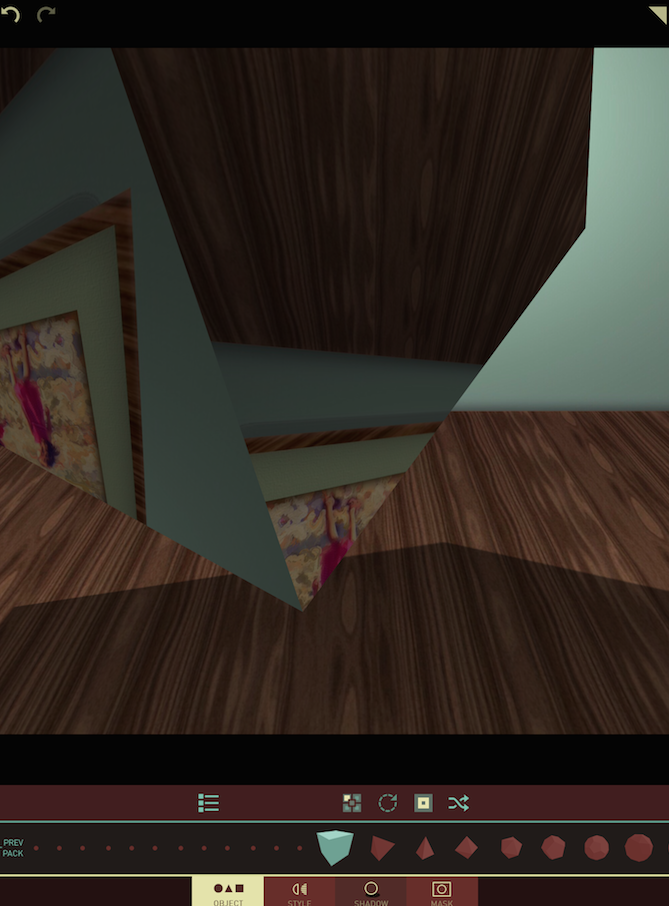
And in the next image I tapped the Size button, which results in an enormous object.
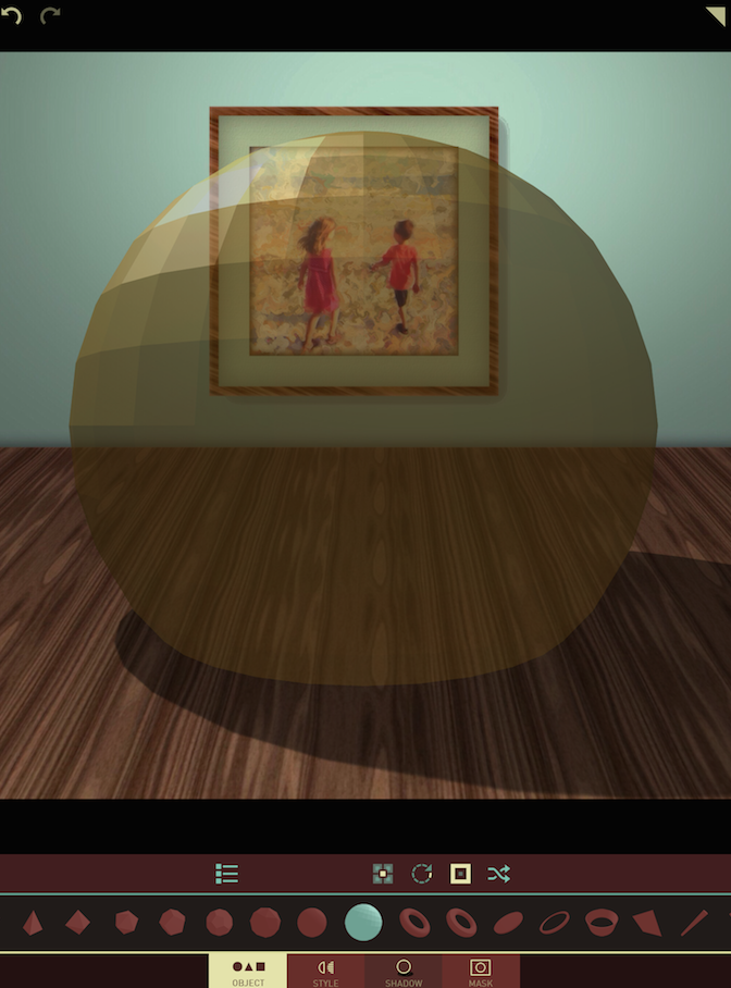
The last button is the Shuffle button. Beware, because this shuffle is not limited to Position, Rotation and Size. It also shuffles the Object, the Style, and the Shadow. One tap of the Shuffle button resulted in the yellow transparent geodesic sphere shown below. (Note: The Object is only shuffled within the current pack; if you are using Primitive Objects, like I am, it will not choose an object from the Unique Structures pack.)
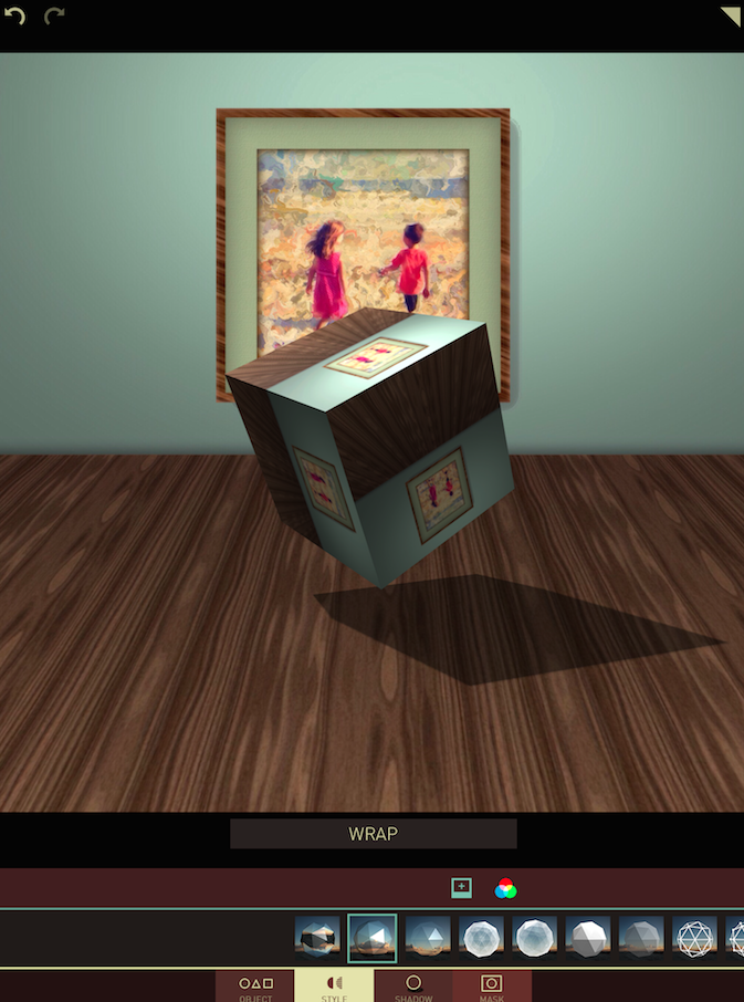
After choosing and positioning your object, the next decision has to do with Style. There are 11 different styles to choose from in Matter. The default is Reflect, which turns the sides of the object into mirrors, reflecting the background image. Below I’ve chosen the second Style, Wrap, which also reflects, but reflects the whole background in each side.
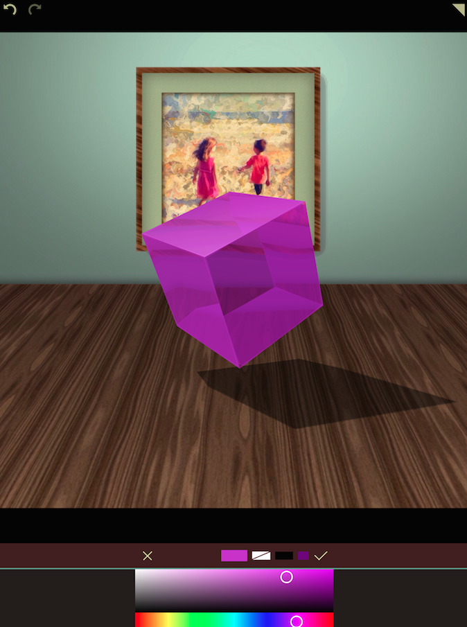
Once you’ve chosen the Style in the second row from the bottom, you can tap the color wheel in the third row to tint your object. In the next image I’ve changed the style to a frosted cube using the Refract 3 Style and chosen a purple tint for the cube.
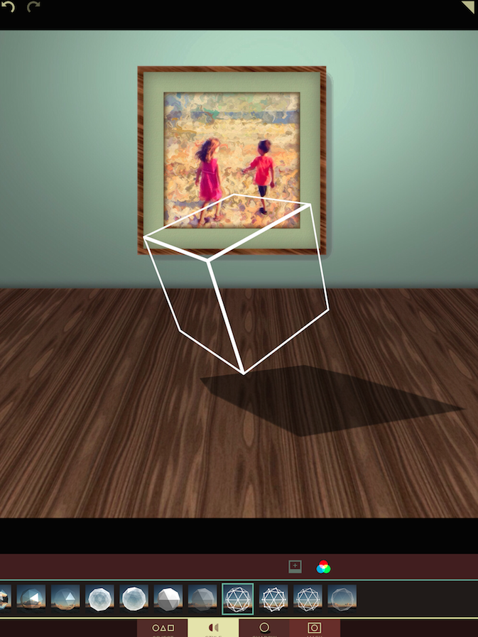
There are also wireframe Styles to make your objects just a shell of what they were. (Oh, puns, how I do love thee!)
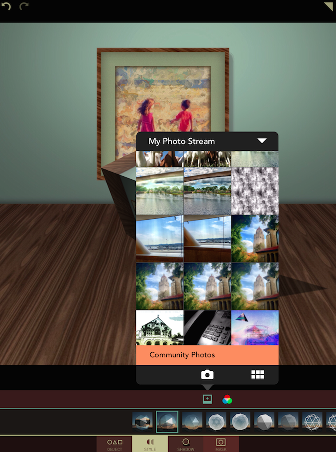
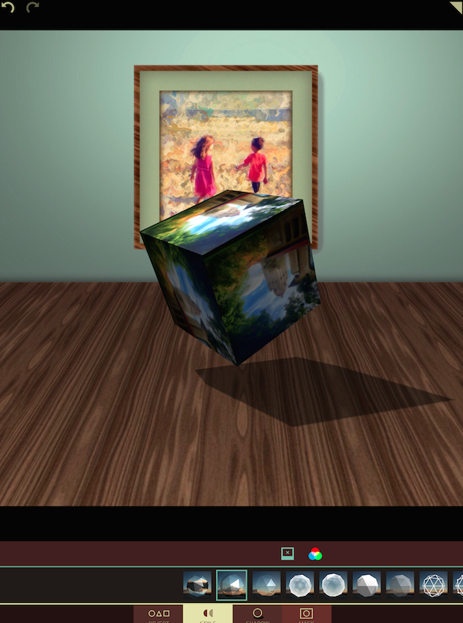
The Reflect and Wrap styles are not limited to reflecting the background image. They can also reflect an image not seen, by tapping the square icon with the plus sign within. That takes you to your photo library to choose another image.
Below I chose a painting to be wrapped onto the cube. If you look closely at the square icon, you’ll notice that it no longer contains a +, but instead contains an X. This allows you to delete the added photo and instead go back to the reflection of the background.
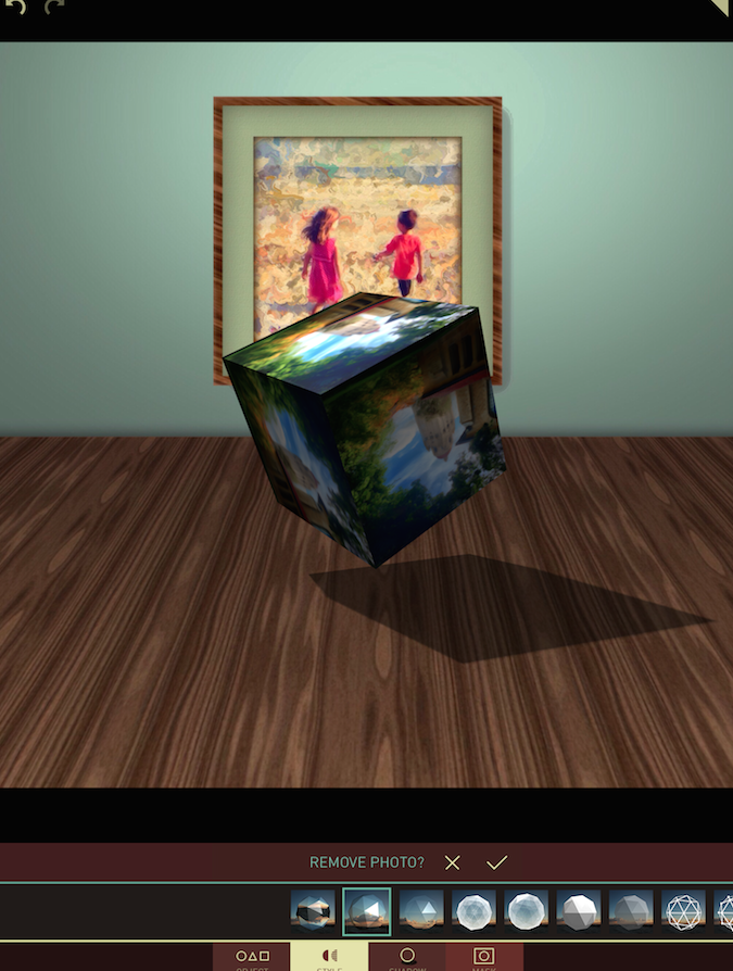
Removing the photo has to be confirmed with that third row from the bottom, as shown below.
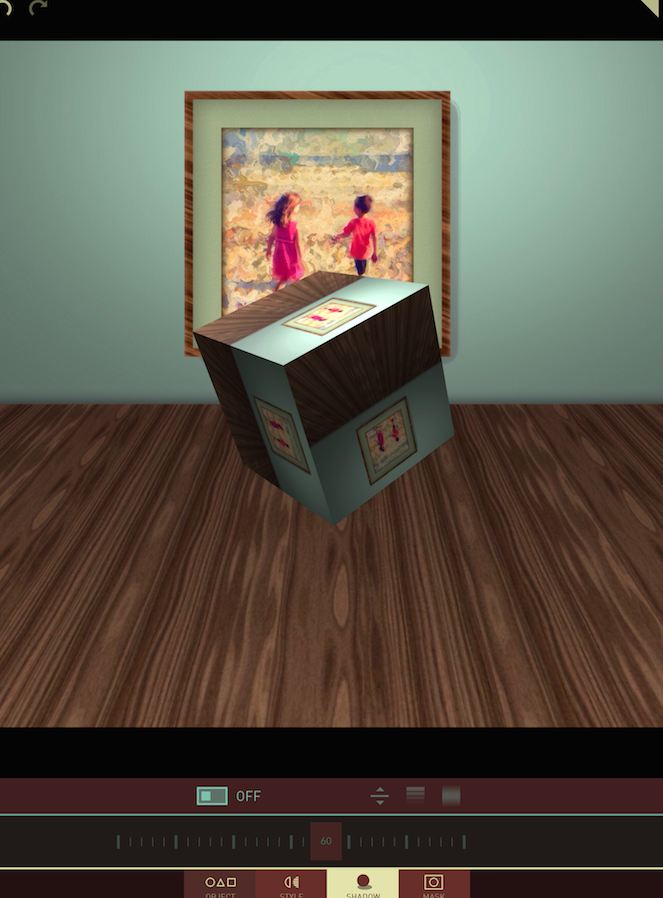
The next adjustment, after Object and Style, is to the Shadow (and lighting). The first control is a switch that allows you to turn off the shadow, as I’ve done below.
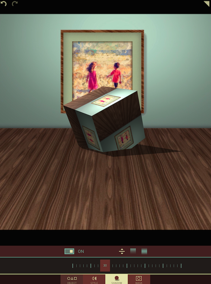
The next control is to the shadow floor. As you move the slider to a lower value (30 in the screenshot below), the “floor” of the shadow overtakes the object itself. That cuts off part of the object. When you have a real “floor” in the background image, it makes it look as though the cube is near the “back wall” and buried in the “floor”.
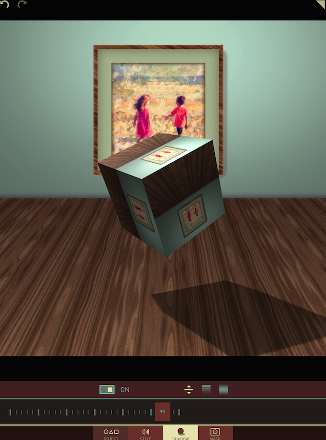
If I increase the shadow floor setting (90 below), then it seems that the object has been raised relative to the “floor” and moved outward from the “back wall”.
The next setting for the shadow is Opacity. Below it is at its default setting of 70.
Opacity falls off pretty quickly. Below you can barely see the shadow even though the setting is 30.
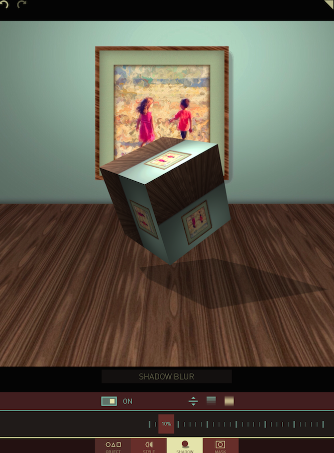
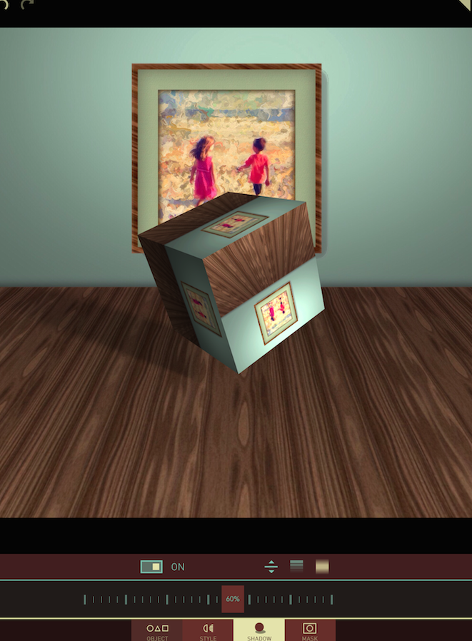
The final setting is Blur. The default setting of 10% results in a sharply defined shadow.
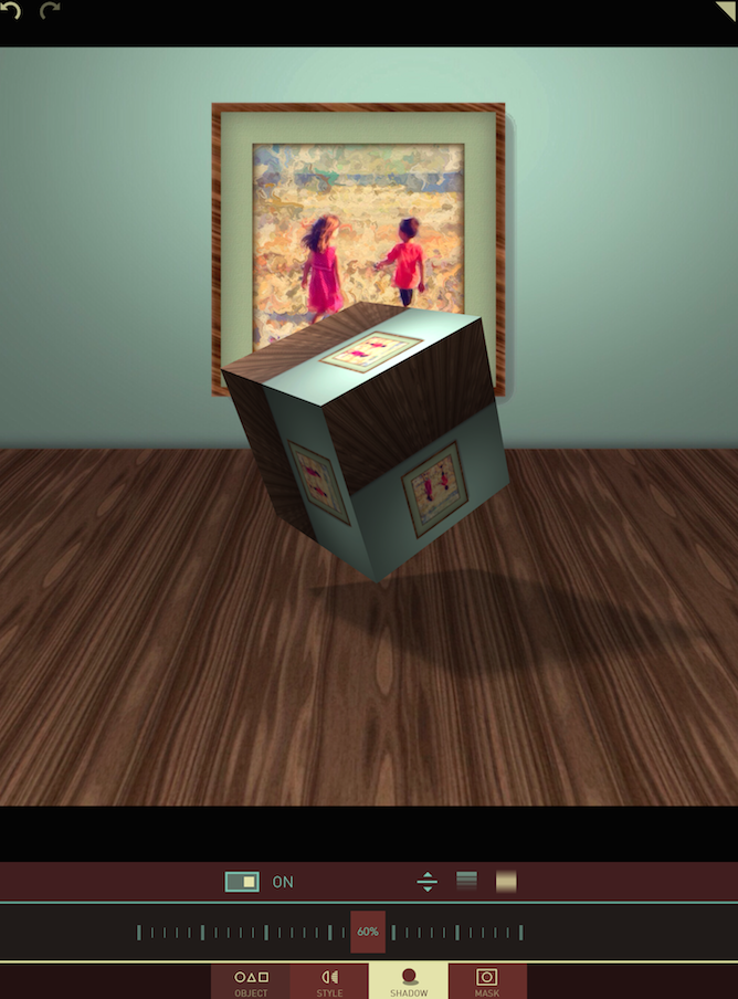
Here at 60% a realistic blur changes the lighting from harsh to soft.
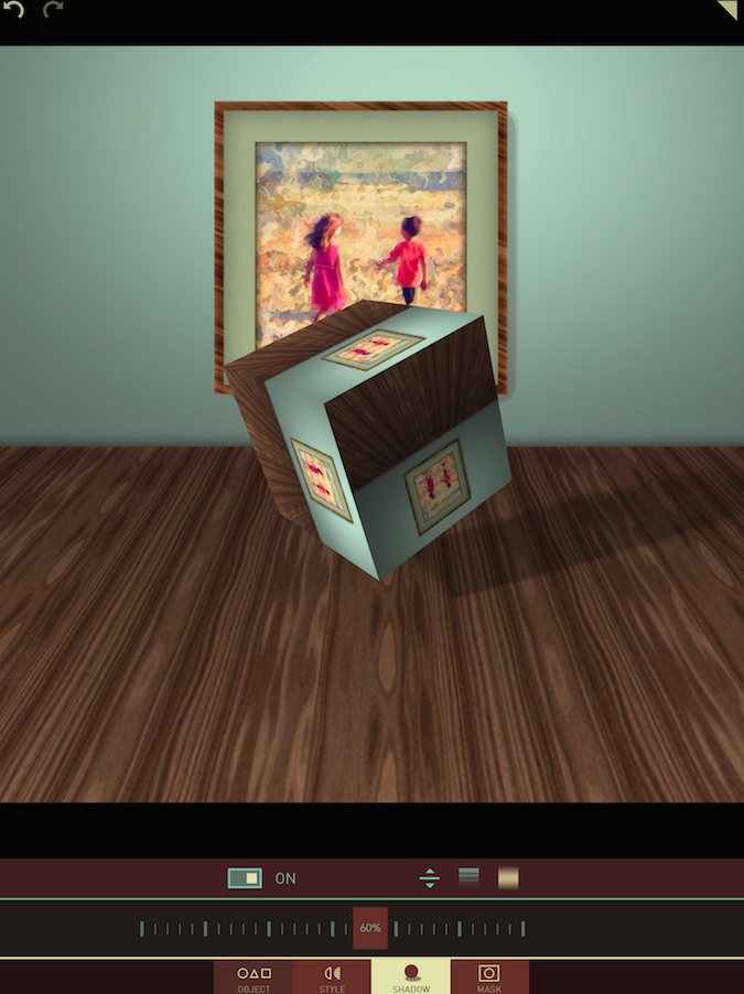
It is also possible to move the shadow (and lighting) around the object with a single-finger drag. When I move the shadow around, the lighting on the object changes to reflect the source of the light that would throw such a shadow.
This can result in a non-realistic shadow. In the image below the picture on the back wall casts a shadow to the right, while the cube casts a shadow to the left. This is possible in an interior scene, since there can be several lighting sources. Outside in sunlight, however, this would look wrong.
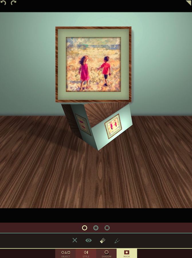
The last feature is Masking. As shown below, you can choose from a hard-edged, soft-edged, or square brush for masking. The X clears the mask; the Eye shows the mask; the Eraser removes the object; and the Marker restores the object. In Masking mode, a double-finger pinch allows you to zoom in on the image and move around, to allow for more accurate masking.
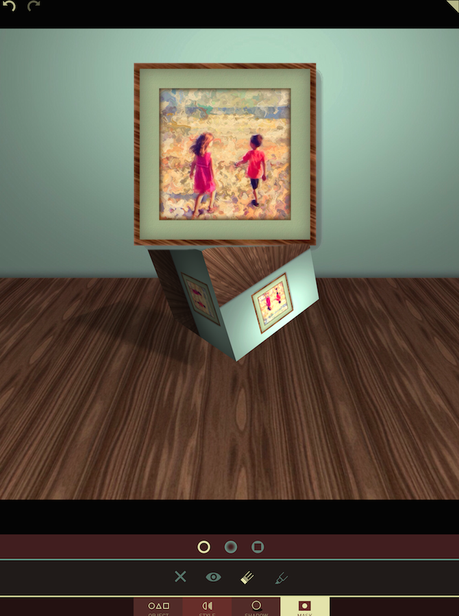
In the image above, you can see that erasing the object does not affect the shadow; the full cube is shown in the shadow! Therefore, if you want the shadow to reflect the masked object, you will have to erase the shadow as well. I’ve done that below.
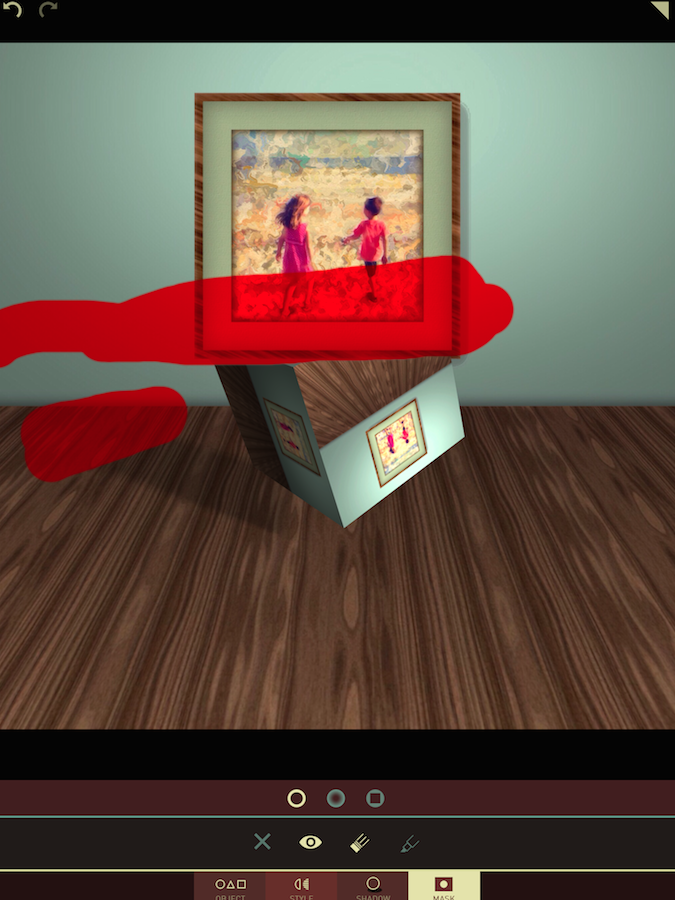
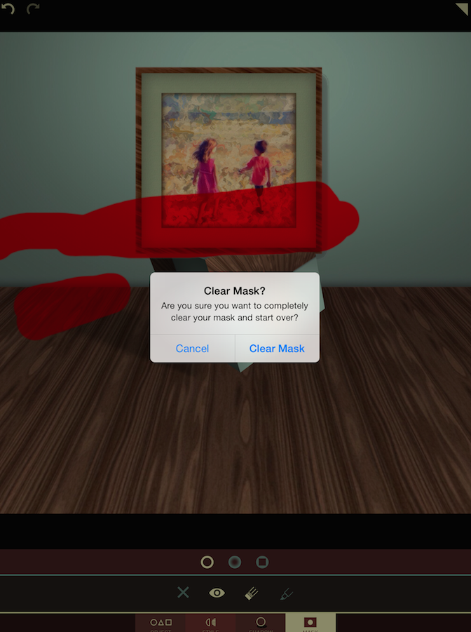
The Eye icon places a red overlay on the image to show what areas you’ve masked out.
Tapping the X icon to delete the mask results in a confirmation dialog box.
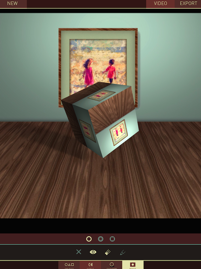
Tapping the triangle in the upper right of the screen takes you to Save options. The top menu changes to show your options. You can start a New session without saving, or you can either Export the still image or create a Video.
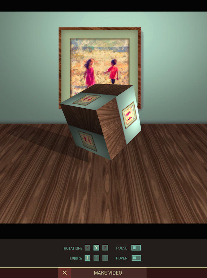
Below is the video creation screen. You can decide if your object will rotate in the X, Y or Z axes (or any two or all three), and you can set the speed for that rotation. There are two switches – Pulse will make it seems as though your object has a heartbeat, zooming in and out on the object, while Hover will make your object float, moving up and dow as it rotates.
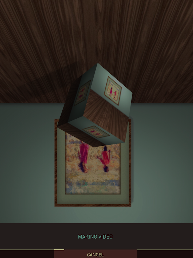
When you changed the settings as you like, tap Make Video at the bottom and your video will be saved to your Camera Roll. (I don’t remember the image actually being turned over while the video was made. It may be an artifact of the screen capture. It did not affect the image or video.
This is the video I created. Hover was turned on for this video.
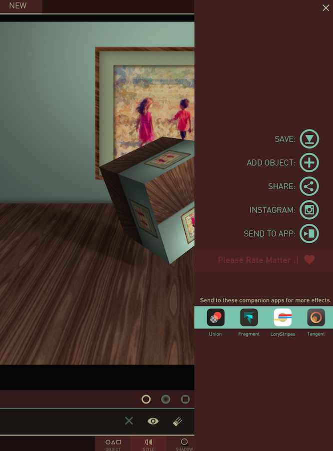
Export allows you to save the image, Share it to social media, send it to other apps (including Union, Fragment, LoryStripes or Tangent – the Pixite apps shown at the bottom) or add another object.
If you decide to add another object, all adjustments will be made to the new object; old objects are now “set in stone”. This means that if you create a video, only the new object will move.
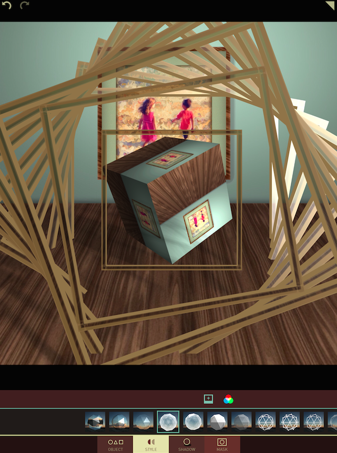
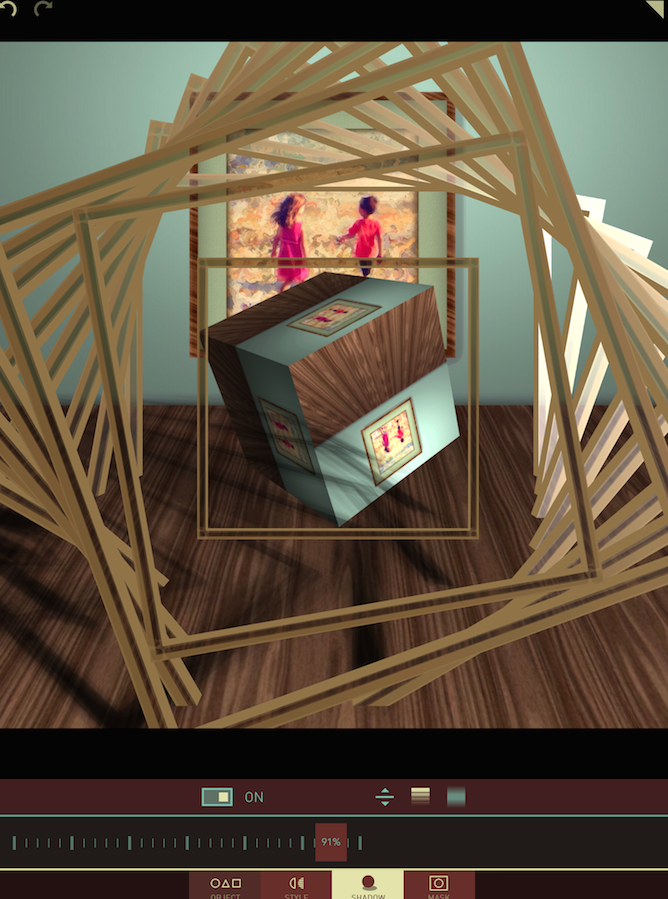
You also need to realize that the shadow for the new object will treat the first object as part of the background. Notice in the image below how the shadow for the spiraling squares looks off because the cube is treated as part of the flat background rather than as another 3-D object.
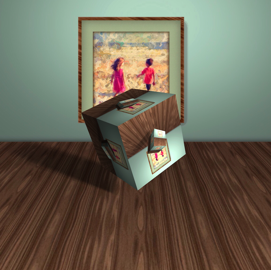
Also be aware that your new object will reflect the old object. I took advantage of this in my finished image by letting my second object be the same cube, in the same position. The second cube includes the first cube, making for a nice multiple mirror effect.
There’s nothing that says you can’t take your results through other apps. Below I’ve taken a landscape from Epcot through Matter, then Glaze.
Here’s a video created before I took it through Glaze.
Here’s another video with an Epcot landscape, but the object reflects another image of my daughter.
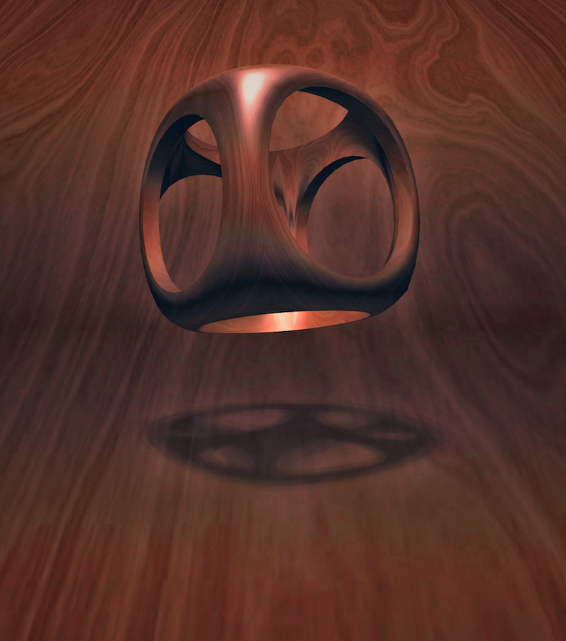
This “wooden” hollowed out cube reflects the background, but you can use a texture as your “other image” and get the same effect.
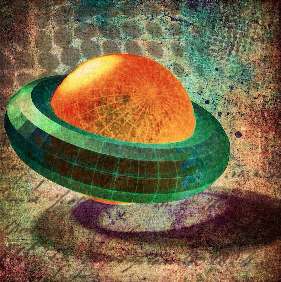
In the following image, passed through many apps after Matter, I masked the second image (the “donut’) to make it look as though it surrounded the first (the orange “sphere”).
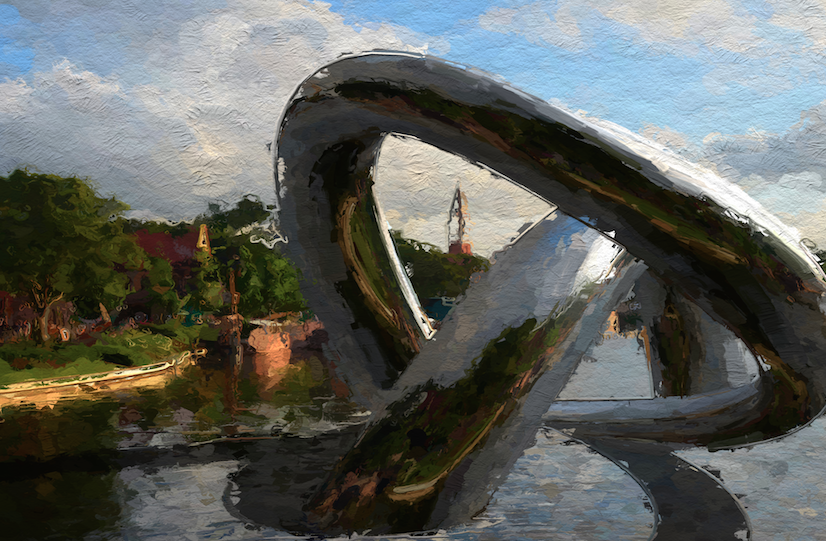
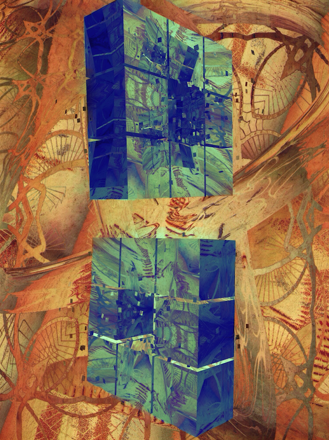
In my final image. I used Matter several times. The first object (the swirl used in the first Epcot image above) reflected the yellow painted background created in DecoSketch and Glaze. Then it was distorted in iColorama. Then I brought it back into Matter to add the two exploding cubes, then back into iColorama to change the color and contrast of the cubes. When did I stop? When I needed to go ahead and write this article – I could have gone ahead and modified it more and more.
Matter is yet another winner from Pixite. It adds a surreal touch to your images, and allows you to create avant-garde videos from drab scenes. Enjoy!




4 Comments
Carlos
Thanks for the tutorial Jerry.
Jiri
Be aware that the Matter app will drop into a lower resolution mode after some time when it runs out of the memory. After several modifications, or doing some videos in between, like using different objects and parameters the output resolution of the picture suddenly drops, e.g. from 2448×2448 to 2048×2048. If the picture is a rectangle (e.g. 3264×2176 after the crop) it becomes 2048×1365. I was able to make about 11 pictures in the original resolution on my iPhone5s and then the resolution dropped down.
I have emailed the developers and apparently they will work on some solution.
Enrique
Great tutorial Jerry. Thanks for sharing your expertise, makes using Matter ( and for that matter…the other apps..iColorama) a joy!
Guenter Schmitt
Hi Jerry,
Thanks for the great tutorial concerning the Matter APP.
I want to recreate the space that has been created with iColorama and Front View. That is exactly my problem.
You wrote: ..” I wanted to make a room for my 3-D object to be placed within. Matter allows you to crop the image before working on it…” That you have done with icolorama with little help from Front View.
I do not know how I can make such a space as an image.
Do I have to create it within iColorama or there is such a thing done.
For what you still need FrontView to generate the space image.
Can you give me a tip on how I can create such a space. Then I could continue to operate as described in the tutorial.
Thanks for your help.
Best regards
Guenter