iOS Photography App Tutorial ‘Water Battle Part 1: Color Lake
We’re delighted to publish this fabulous new technical tutorial with the creative app Color Lake. Jerry Jobe has once again created a comprehensive and fully immersing tutorial, we are sure you will find it very useful.
Color Lake retails for $1.99/£1.49 and you can download it here. It has just been updated today and we have codes to giveaway for this app too, follow this link. Over to you Jerry (foreword by Joanne Carter).
Back when my daughter (now a sophomore in college) was young, I wanted to share her interests. For a long time, that meant being immersed in everything Pokemon. So you’ll excuse me when I admit that when I decided to have two water apps square off against each other, I imagined it as Blastoise vs. Gyarados. Use Hyper Beam!
But enough with the obscure pop culture references. I was going to have our two contenders, Color Lake and Flood, face off in a single, no-holds-barred mega-article, but that became much too large. So I’m going to cover them separately, starting with ColorLake.
Color Lake by Ababeel was the first of these two apps that I acquired. Both make your image look as though waters have crept in and inundated your setting. Both have their advantages and disadvantages, which makes them ideal for the face-off format.
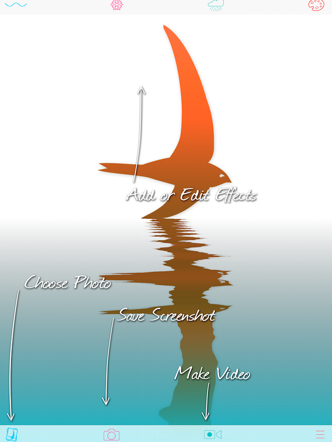
Color Lake loads with a help screen, that tells you where to find effects, choose your photo, and make a snapshot or a video. The reason that you “save a screenshot” rather than “save an image” is that the water in Color Lake is constantly moving. In order to get your perfect image, you have to time the screenshot exactly as you save. This is a bit of a drawback, in my eyes, but nothing that can’t be overcome.
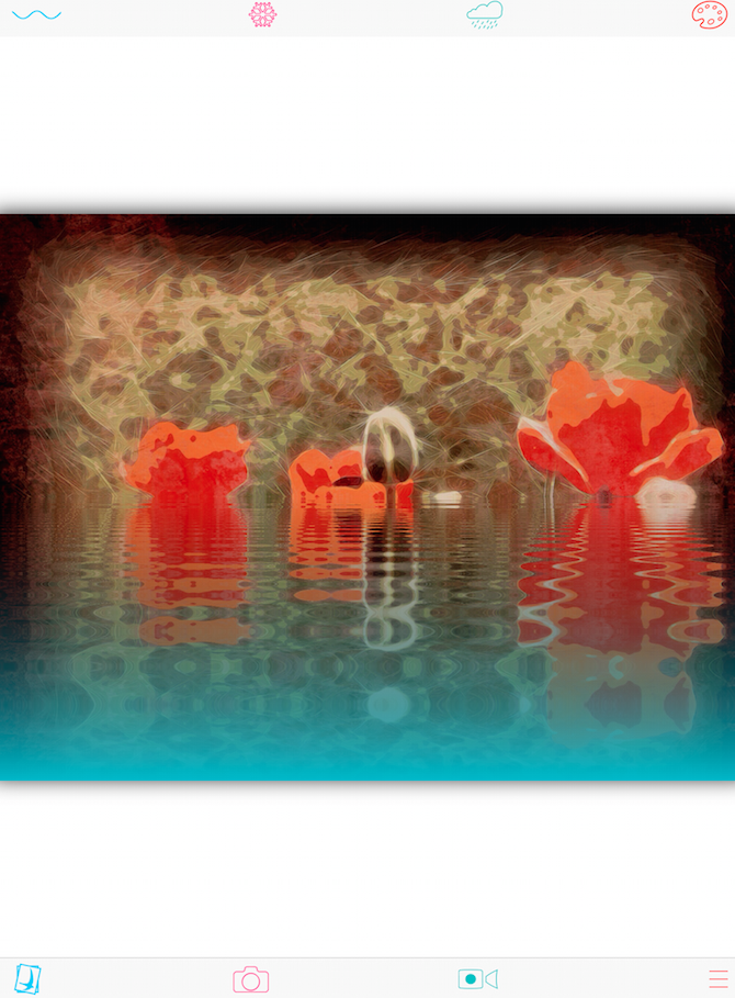
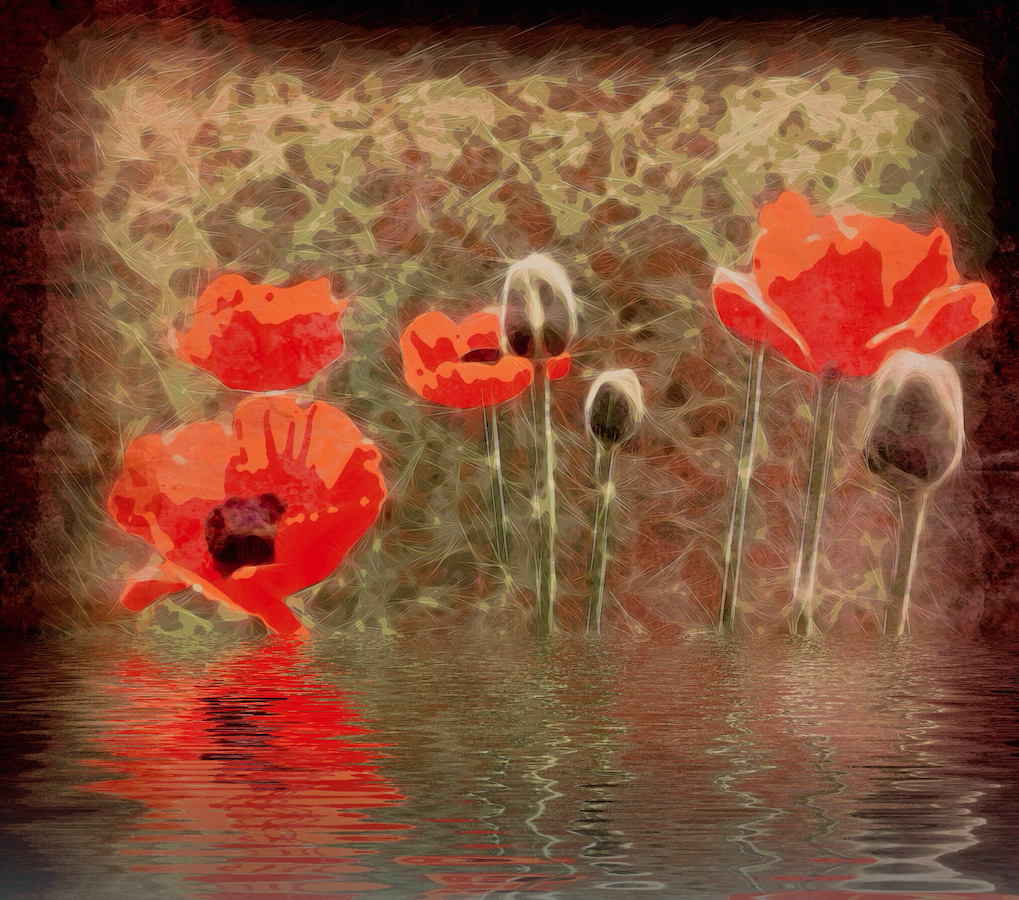
Here I’ve loaded a painterly image of some flowers I created from a photo by Carolyn Hall Young. I loaded it by tapping the “bird in square” icon at the lower left. The image is loaded with a default setting for the water that puts the waterline dead center of the image.
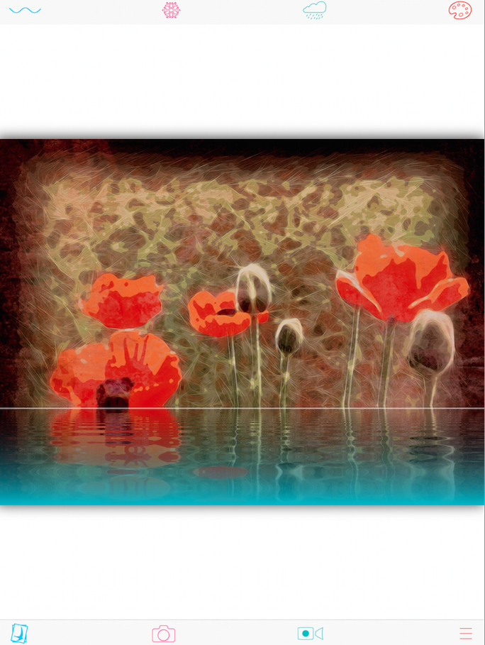
You can drag that waterline up and down in your image. As you drag, the line becomes visible as seen below.
Once you’ve set the waterline, you can adjust the waves themselves by tapping the Wave icon at the upper left. When you do so, a dialog box pops up and the top menu bar changes, as shown below.
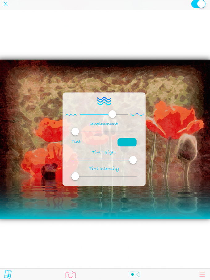
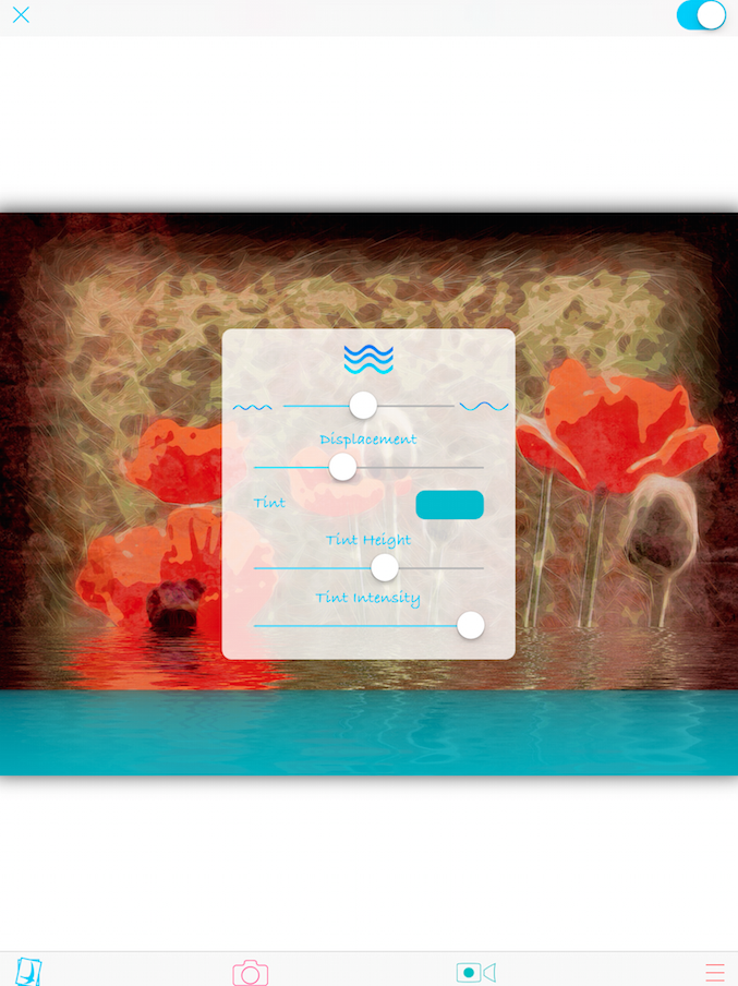
The top slider in the dialog box controls the number of waves – many waves to the left, fewer to the right. The second slider controls displacement, or how much the reflection is moved from side to side by the wave. You can also think of this as the height of the wave, since a reflection is displaced more when the wave is higher. The final three controls are over the tint, or color, of the water.
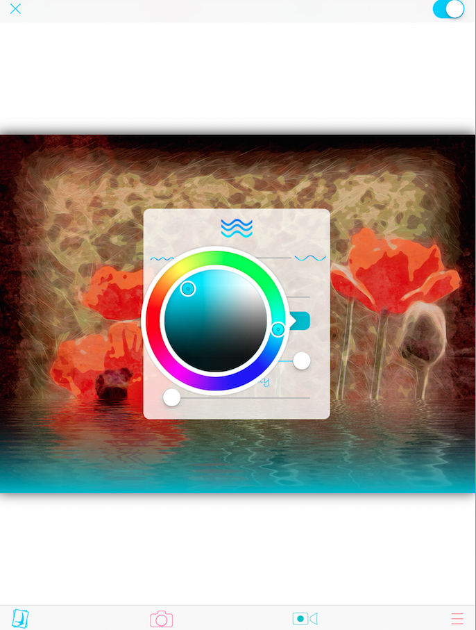
You can change the tint by tapping the thumbnail. A color wheel pops up to allow you to change the hue, saturation, and luminance of the tint. Tapping again on the thumbnail hides the wheel.
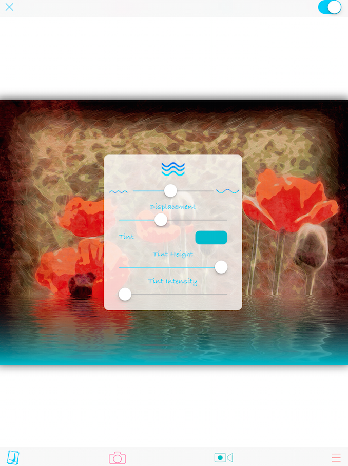
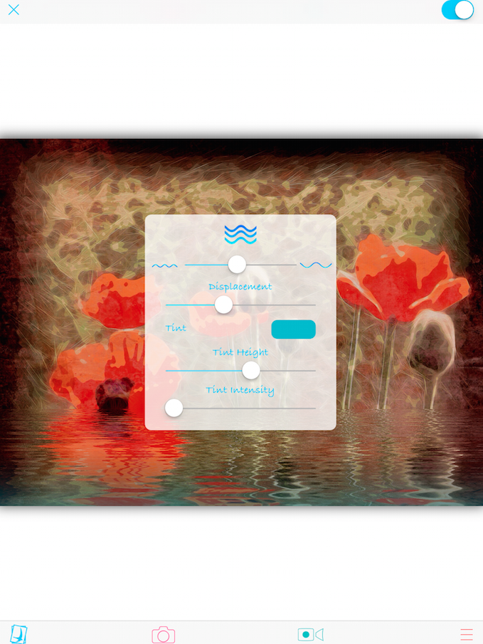
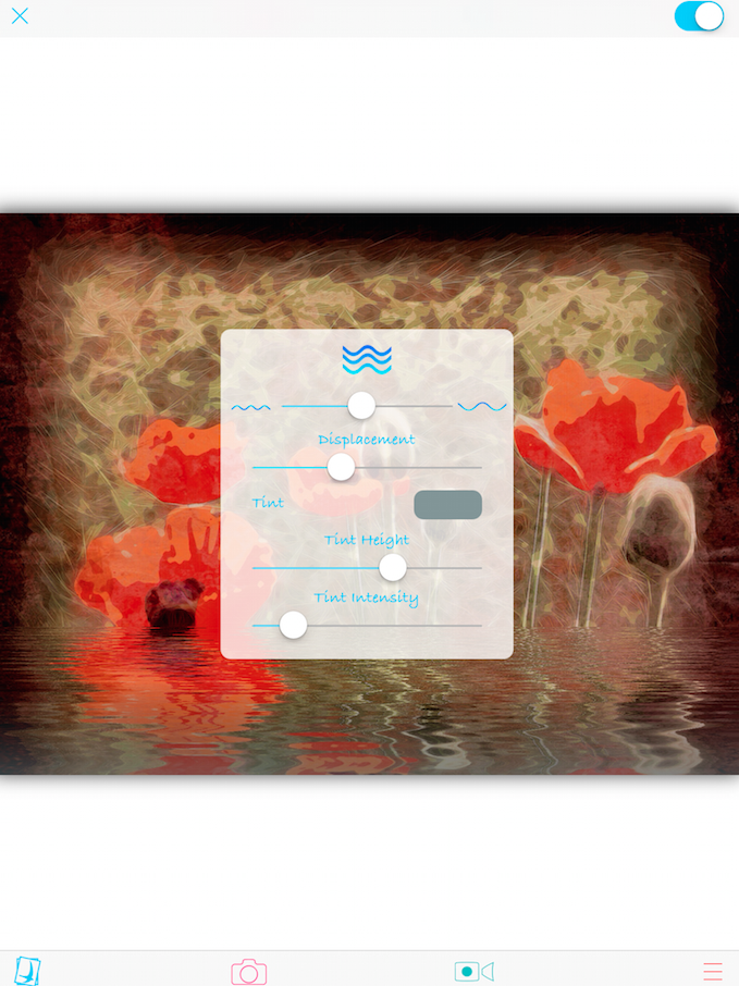
Tint Height is at maximum by default, coloring all the water. As you lower Tint Height, as shown below, only the water closest to the viewer is tinted, and the water closest to the background is a true reflection of the color of the background.
Tint Intensity controls how much tint is imparted to the water. When you turn it all the way up, the water reflects less of the background and more of the tint, If you use a light color, as shown below, then the water will look as though it is lit from below. Using a high Tint Intensity can really make the image look surreal and unrealistic.
Below I’ve changed the tint color to a gray, and you can see that now the tint just works to darken the water.
To commit the changes, press the X at the upper left. (The X is not “revert changes”, it acts as a “back” command to get to the main screen. There is no “revert changes” or “undo”; you have to manually reset the sliders to return to an earlier “look”.)
There are two ways to see the image without the current effects – tap the wave icon in the dialog box or tap the switch at the upper right. This will show you the original photo in this case, without any waves!
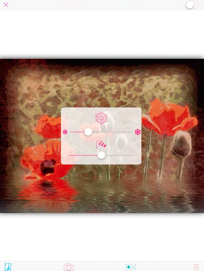
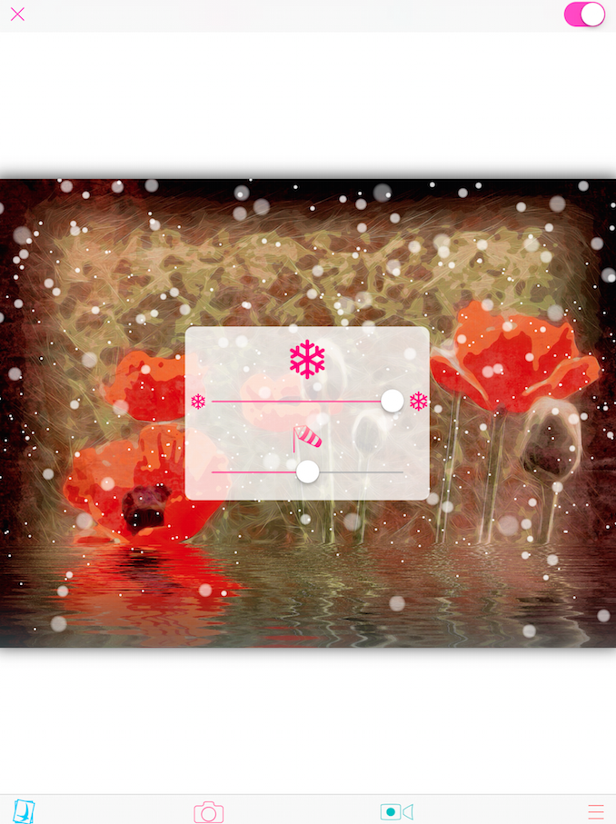
The next setting from the main screen – the snowflake – allows you to add snow to your image. Since the default is no snow, you have to move one of the sliders in the Snow dialog box to see the effect. Below you’ll see the Snow dialog box before moving either slider.
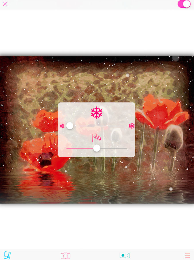
The top slider controls the size of the snowflakes. If you move it all the way to the left, you have smaller snowflakes, as seen below.
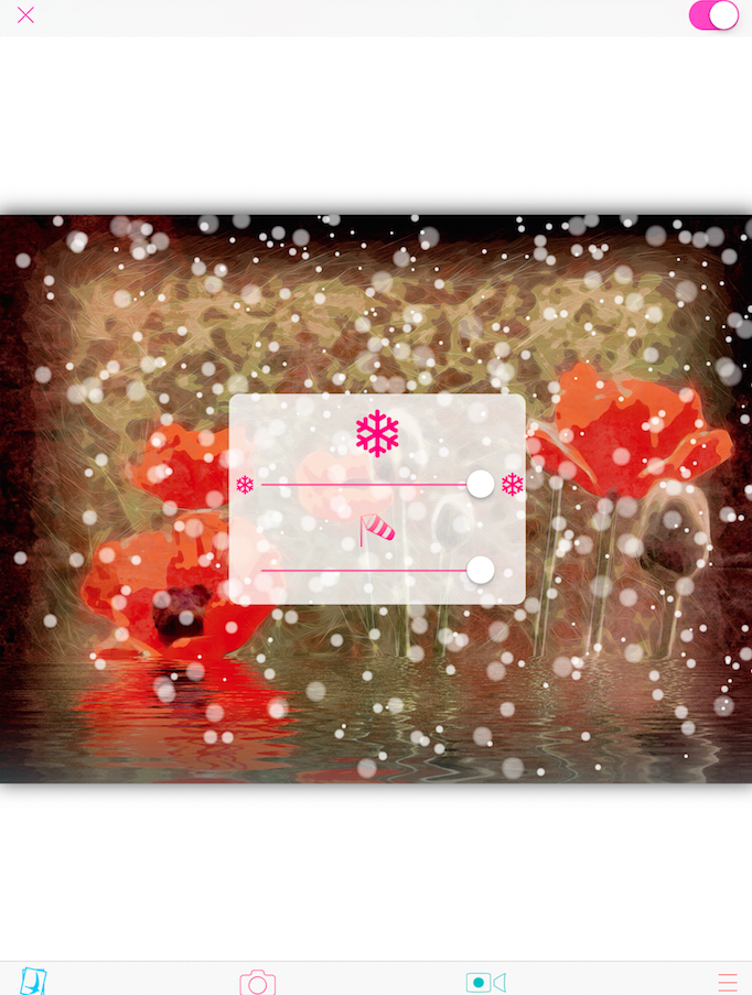
All the way to the right, and you get larger snowflakes that seem to move faster.
The bottom slider is wind direction. When working with a still image, wind direction for snow is a hard idea to convey. If you look at the lower left of the image, you’ll see fewer snowflakes because the wind is blowing from the left. But remember, water, snow and rain in Color Lake is constantly moving; a still image is a screenshot of the constant motion.
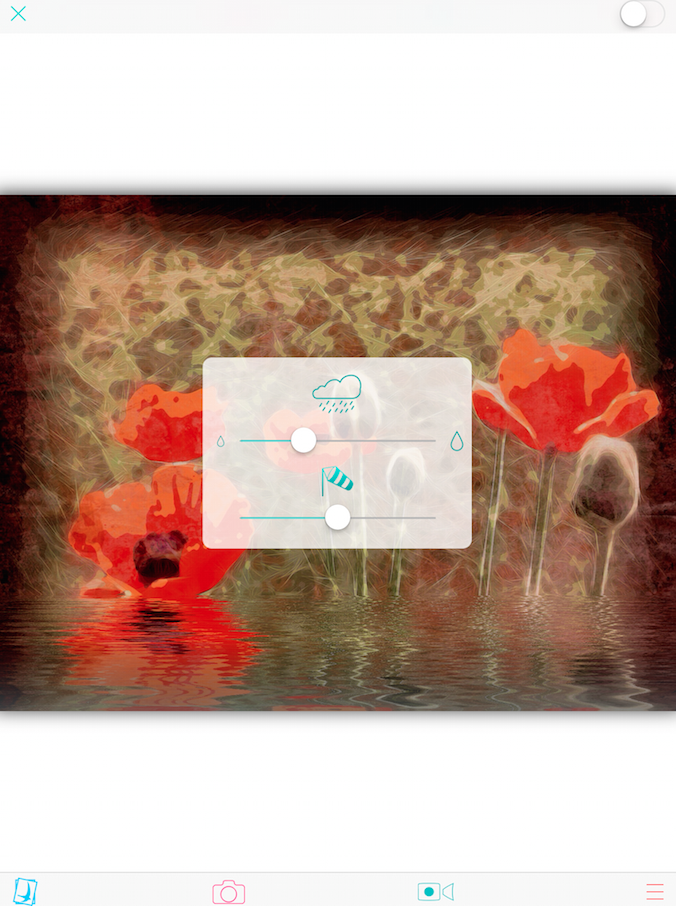
Below I’ve tapped the snow icon on the dialog box, turning off the snow prior to tapping the X and returning to the main workspace. This is how you turn your unwanted snow off.
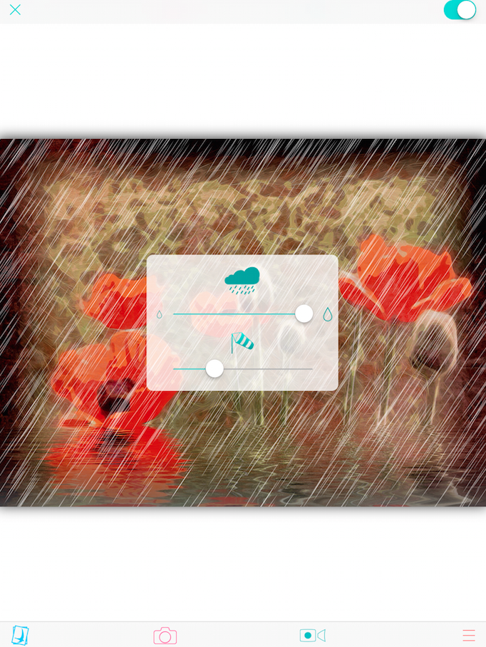
The next setting is Rain, which works just like Snow. When you enter, the rain is not seen until you move one of the sliders.
The speed of the rain is constant (and pretty fast). You change the size of the drops and wind direction with the sliders in the Rain dialog box. You turn off the rain by tapping the cloud in the Rain dialog box.
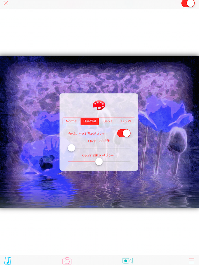
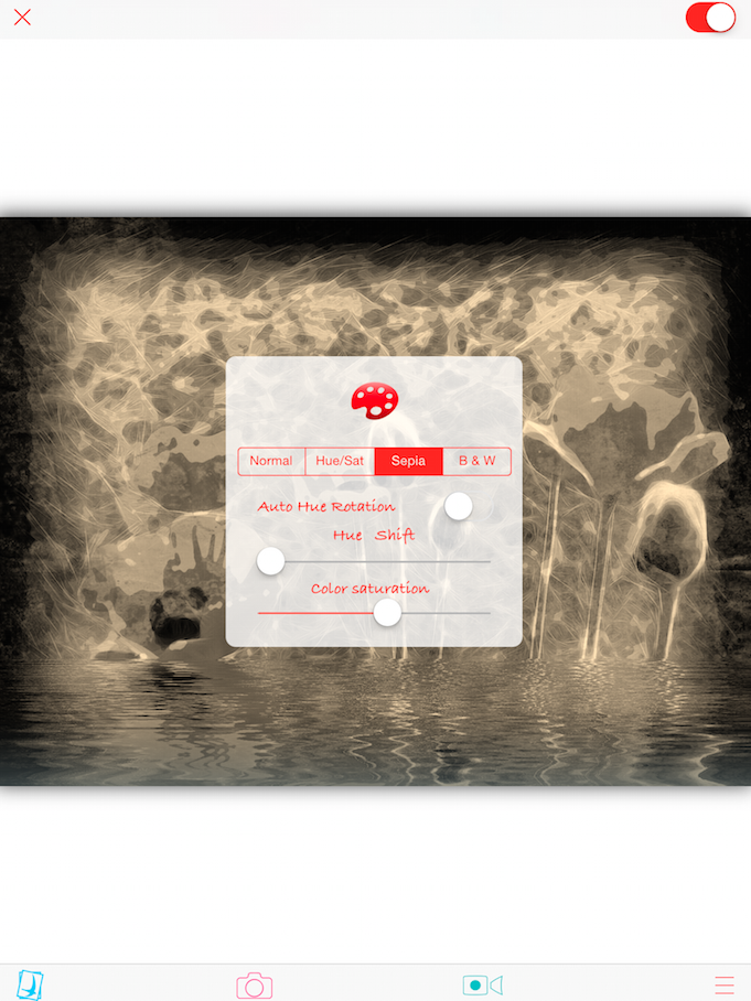
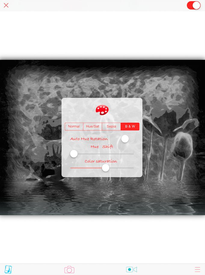
The final setting on the main screen, the one that looks like a painter’s palette, is for changes to the background image. There are four buttons: Normal (original image), Hue/Sat, Sepia, and B&W. When adjusting Hue and Saturation, there is a switch available called Auto Hue Rotation. This can be used to have the image change colors at the same time as the waves are moving and the snow or rain is falling. It can get pretty trippy. You can also change the color directly by using the Hue Shift slider while the Auto Hue switch is off.
Below is the Sepia setting.
And then there’s the B&W setting. Remember these settings only change the background. If your water is tinted, then that tint will show. Below the water is tinted gray (darkened), so the tint is not obvious when I switched to Sepia or B&W.
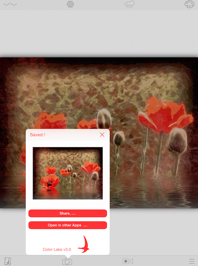
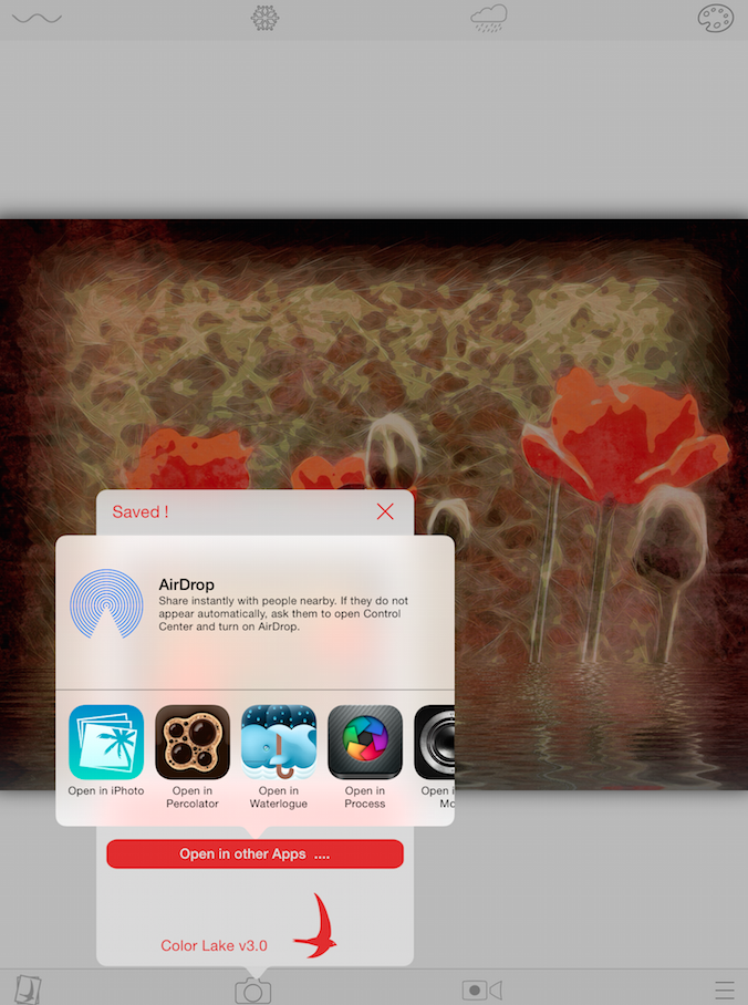
Along the bottom of the main workspace are four icons: Get Photo, Save Screenshot, Make Video, and Settings. Tapping the Save Screenshot button will bring up the box seen below. At the top of the box you can see that Color Lake has already “Saved!” the image to the Camera Roll. In addition, you can Share the image or Open the image in another app.
Both Share and Open in another app use the standard iOS dialogs. Below you’ll see the “Open in another app” dialog.
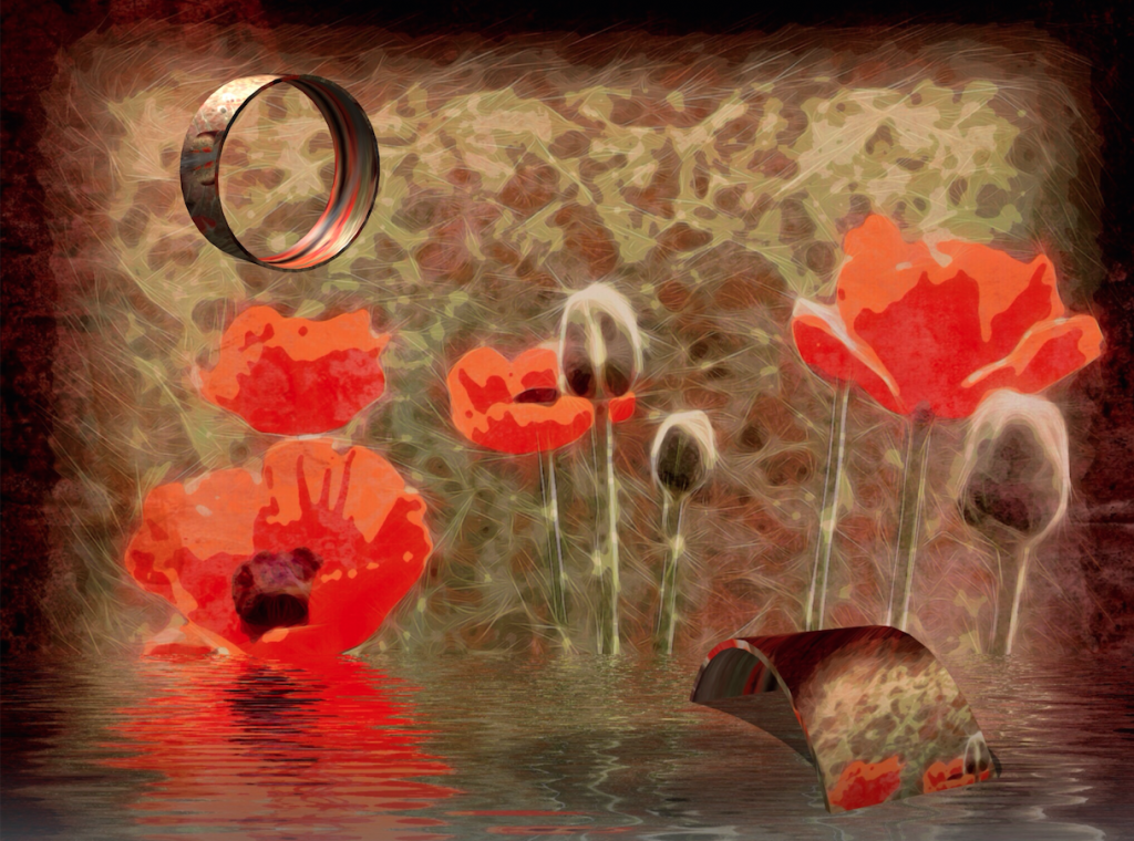
I decided to open the resulting image in Matter (last week’s tutorial) and add a couple of rings. One I set up to be partly submerged in the water while the other is floating in the air.
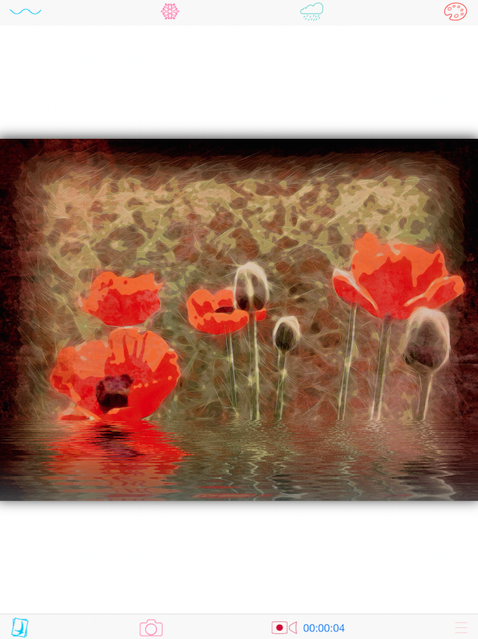
If, instead of Saving the screenshot, I tap the “Make Video” button, then a video starts recording and a running time is kept next to the button. The video is a little choppy, even on my iPad 4. I don’t find a lot of value in the video, and therefore could do without the constantly moving (but jumpy) water, snow, rain and/or hue shift.
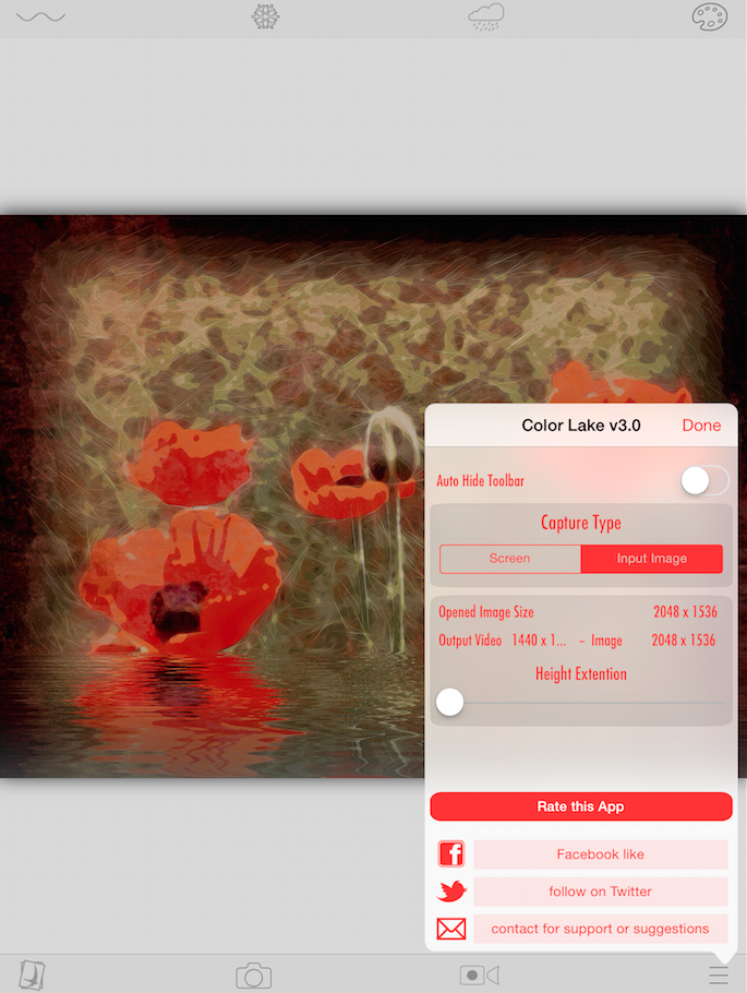
The Settings contain a few valuable options. Auto Hide Toolbar would only be valuable when editing images that take up the entire screen; I leave it off.
Capture Type allows you to save at either screen resolution or the resolution of the background image. If I import an image that’s smaller than screen resolution, then I don’t want Color Lake doing any upsizing – that’s not what it’s for. If I import a larger image, then I don’t want Color Lake losing that higher resolution. That’s why I use the Input Image Capture Type.
Now, what if I want to have the waterline near the bottom of my background image, yet want more water? I can accomplish that with the Height Extension slider. Unfortunately, the slider is not real-time; you have to exit Settings for the extension to take effect. Below, I’ve moved the slider, yet the total image is still the same size.
When I change the Height Extension slider and hit Done, then the additional canvas and water is added. However, the waterline is placed back at the middle of the total space, as shown below, and has to be reset to the correct place manually.
Below is the saved image with the added canvas.
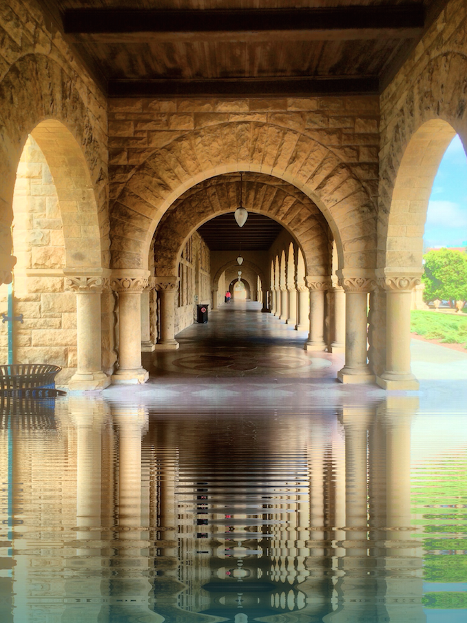
To sum up our first entry in the Water Battle, Color Lake has the advantage spelled out in the name: the ability to tint the water to make it look as though it were a blue ocean, a green pond, or a lake of blood (for those of you inclined toward the gruesome). It also has the advantage of being able to extend the canvas to add more water.
Disadvantages center around the focus on video (while delivering a jumpy video): a still image has to be captured on the fly from the moving elements. That can be done when the water is moving, but the snow and rain elements are more pleasing while moving than they are when frozen in time.
Next time, we’ll take a look at Flood and declare a winner in the head-to-head matchup. Until then, enjoy!
Less than 12 hours after this article had “gone to press”, a new release of Color Lake was made available in the App Store. Fortunately, there were no huge user interface changes. The app works the same way. Some improvements have been made to the video options, which negates my complaints about the jumpiness of the video. It now works smoothly. Just thought you should know!





One Comment
Carlos
Thanks Jerry!