iPad Photography App Tutorial Pixelmator Part 2: Create Image, Layer Basics and Adjust Color by Jerry Jobe
We are delighted to publish Part 2 (of 5) of a wonderful series of tutorials covering the brand new Pixelmator app for iPad. If you missed Part 1, please go here. This time Jerry goes a little deeper, discussing layering and more. We’re quite sure you will find this tutorial invaluable (foreword by Joanne Carter).
Pixelmator for iPad retails for $4.99/£2.99 and you can download it here
“In Part 1 of the Pixelmator series of articles, the basics were covered: opening a file, adding layers, dealing with the gallery, saving a merged version of the layered image. Of course, that merely scratches the surface of what Pixelmator can do. In this entry, I’ll be talking about layering extensively. Layering is the main benefit of full-featured editors like Pixelmator, Photoshop Touch, Leonardo, Laminar Pro and others. Layering allows you to combine images, textures, text and other objects while giving you the ability to edit each object individually. Also, you can return to each object and re-edit; you’re not forced to commit an edit before the whole is finished.
The quickest way to produce a layered file is through the use of templates that are packaged within Pixelmator. These templates are accessed through the Create Image function. Templates are stock images with various shapes, test objects or textures added in layers on top of the stock images.
Below you’ll see a screenshot of my gallery, and there’s a big white square with a + which is the button to create an image. Create Image can also be accessed by tapping the + in the upper left corner and selecting Create Image from the drop-down list”.
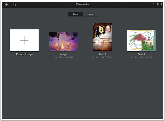
There are various categories of templates. The Blank templates are for use in painting on a blank canvas (covered in a future installment of the series). Additionally, there are Collage, Frame, Card, Poster, Photography, and Vintage templates.
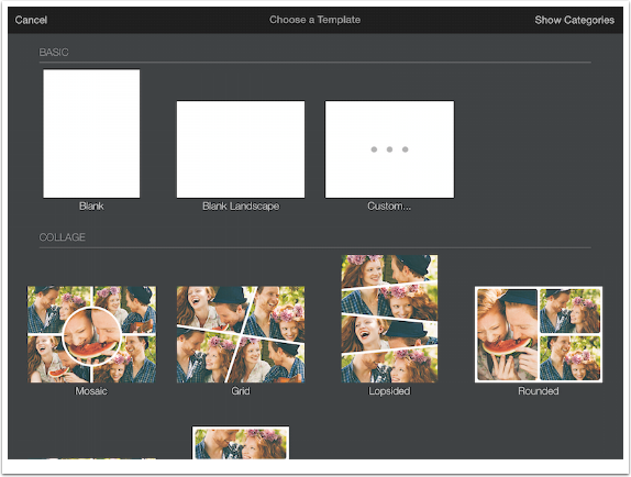
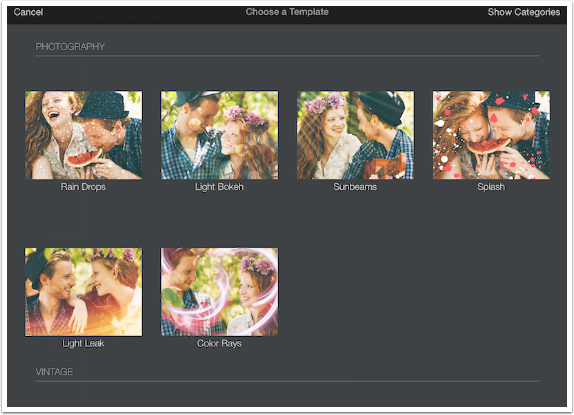
The templates are not stored in Pixelmator. When one is selected, like Sunbeams under the Photography collection, the template is downloaded. This results in saved storage space, but creates a lag while the template is downloaded.
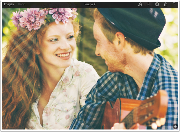
Below you’ll see the loaded template, with the stock image. Before we see what layers are involved, there’s something you should take into consideration: the size of the template. In this case, I want to load a rather large image as the base image to replace the stock photo, so I want to make sure I won’t be losing all those pixels from the large photo.
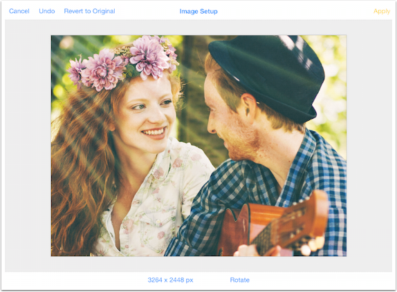
I go to Settings>Image Setup, and find that the size is 1360×1020 – a medium resolution, but much smaller than the photo I’m using. So I want to resize the template to make it larger. I tap on the size indicator (bottom left) to enter a new value.

I enter a value of 2500 for the smaller side (height) and leave the Constrain Proportions button on; it ends up with the dimensions 3264 x 2448. (I don’t know why it refused to give me the exact dimensions I asked for.) Then I tapped Apply at the upper right.
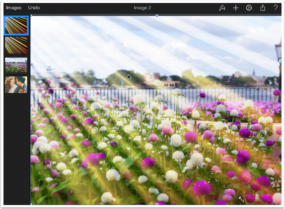
By dragging right from the upper left side of the workspace, I bring up the Layers list. There are four layers: the stock photo at the bottom and three layers on top of it. The first is a white layer, reduced in opacity until all it does is lighten the image slightly. The top two are sunbeam textures, using blend modes that drop out the black between the beams. The stock image is currently active, and you can tell that by the blue outline in the Layer list.
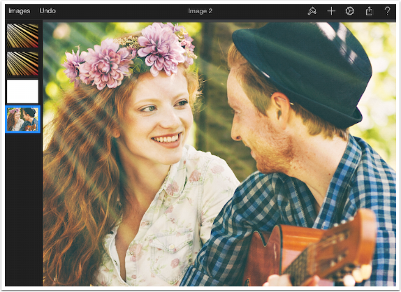
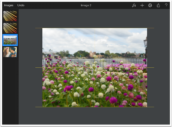
With the stock photo active, any layer I add will be placed right above it. When I tapped the + sign at the upper right to add my image, I was told that for images of this size, the upper limit for number of layers is four. I decide to eliminate the white layer, since I definitely won’t need it. I double tap the white layer, and select Delete from the drop-down menu that appears. Then I re-select the bottom layer and add my image, some white and purple blooms. (After adding this image, it will save space to delete the stock image as the lowest layer. I do not do that during the course of this lesson, so you’ll see it throughout. I did delete it later on.)
I have to resize it slightly to fill the image, and I do that by using the handles that appear over the layer. A two-fingered pinch just resizes the entire image within the workspace, so it is necessary to use the handles to resize the layer. As I move the layer from side to side, guide lines appear to inform me whether it is centered correctly. (Guide lines are turned on in the Settings menu; see Part 1.)
Layers that are imported as part of the template are locked, and you cannot change the opacity, blend mode or rotation until they are unlocked. Double tapping a locked layer will result in a drop-down menu with only one option: unlock.
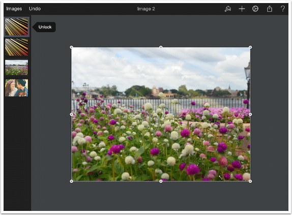
Once it is unlocked, a double-tap will bring up a much more comprehensive menu: Cut, Copy, Paste, Delete, Hide, Duplicate and Style. Style will control the Opacity and Blend Mode of the layer, as well as some other things.
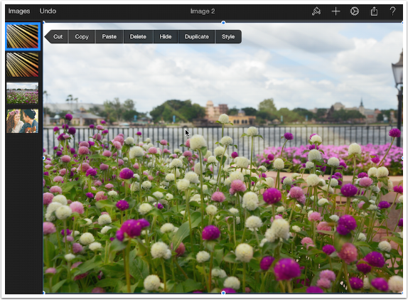
This top layer of the template is in Overlay blend mode at 14% opacity.
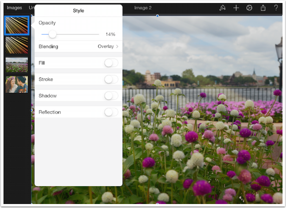
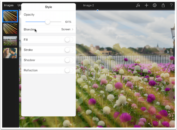
I increase the opacity to 34%.
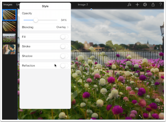
If I tap the Blend option, a list of possible blend modes appears.
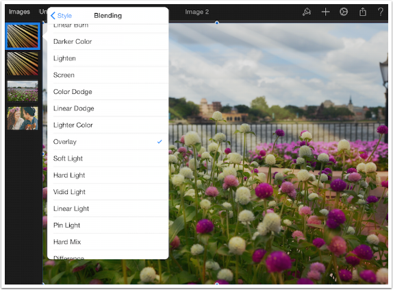
Tapping Screen changes the mode from Overlay to Screen.
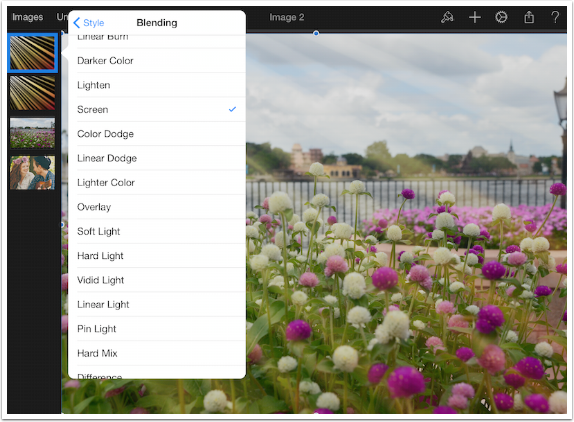
I can make the layer really over-the-top obvious by increasing the opacity further.
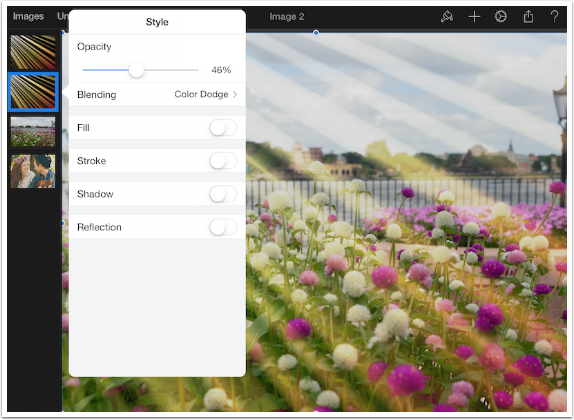
The underlying Sunbeam layer is in Color Dodge mode, and I’ve increased the opacity to make it obvious below.
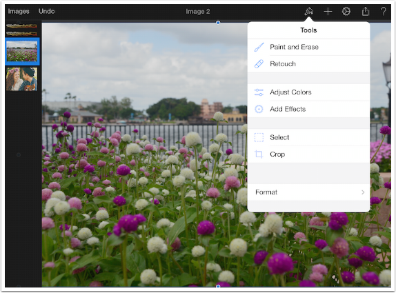
The real problem with my image, though, is not the strength or blend mode of the sunbeams; it’s that my underlying image is drab. As you might expect, Pixelmator hass tools to help you fix your image; they are accessed by tapping the Paint Brush, then Adjust Color.
Also, in order to have a better idea of how the adjustments affect the flower image, I don’t need to be distracted by the sunbeams. In the screenshot below, I’ve tapped the Hide button on the drop-down menu for both of the Sunbeam layers. Hidden layers become thin in the Layers list, and reappear if you tap Show in the drop-down menu for the hidden layer.
When Adjust Colors is selected, the image workspace shrinks down to accommodate the options menu on the right. At the top of the menu is a list of presets. These presets are various combinations of the controls below. For example, the B&W preset moves the Saturation slider all the way to the left.
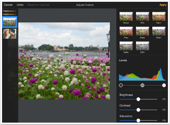
Below I’ve chosen the Rosy preset, and it affected Levels, Brightness and Saturation, as well as some controls that are further down the menu and so currently unseen. To clear the settings for the preset and go into full manual mode for your adjustment, just tap the Revert to Original indicator at the top.
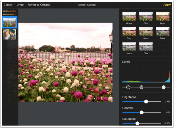
The first manual control is Levels. Levels deserves an entire conversation, as does Curves. The Levels adjustment is the single slider with three buttons below the graph (histogram). The histogram indicates the amount of pixels in the image that fall into a particular tonal range. All the way at the left of the graph is the black pixels, and all the way to the right are the white ones. By moving the button on the slider that is on the right, darker pixels are made pure white. This can create the advantage of brightening the image and increasing the contrast, as shown below; but it can also result in loss of details in the highlights, caused by making pixels that are slightly gray pure white. This is called clipping, and both blacks and whites can be clipped noticeably by injudicious use of the levels adjustments.
The middle button adjusts the brightness in between the two endpoints. This can also be done with the Brightness control.
Levels is more useful when there are no pure whites or black in the image. Levels will then allow you to get pure blacks and whites without clipping, by moving the end sliders under the endpoints of the histogram (the lightest and darkest parts of the image).
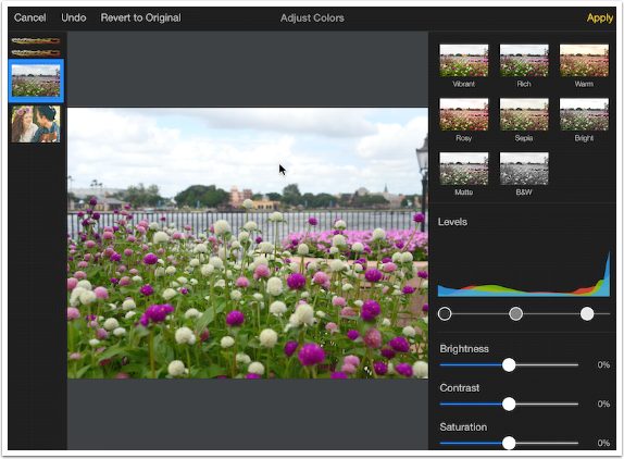
Brightness, Contrast and Saturation sliders are self-explanatory. The sliders are real-time, so you can see the changes as you move the sliders.
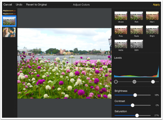
By scrolling down on the menu on the right (sliding your finger up), you access the other controls for Adjust Color: Color Balance, White Balance and Curves. Color Balance is an “eyeball-approximation” method of correcting color in your image; if you think it’s too blue, move the slider away from Blue towards yellow.
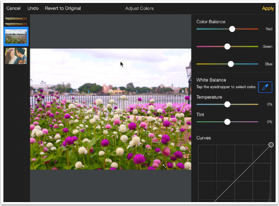
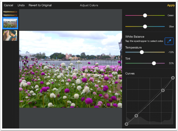
White Balance is a more accurate method of getting the correct color. To use white balance, tap the eyedropper and then move the box with the crosshairs around the screen until the crosshairs lie over a part of the image that is as close to a neutral gray as you can find. (White balance will not work if you place the crosshairs over a pure white or black pixel.) The Temperature and Tint sliders will adjust to make that pixel a true gray. In our example, the flower (which should be fairly close to white) needs more blue and magenta, as it was too yellow and green.
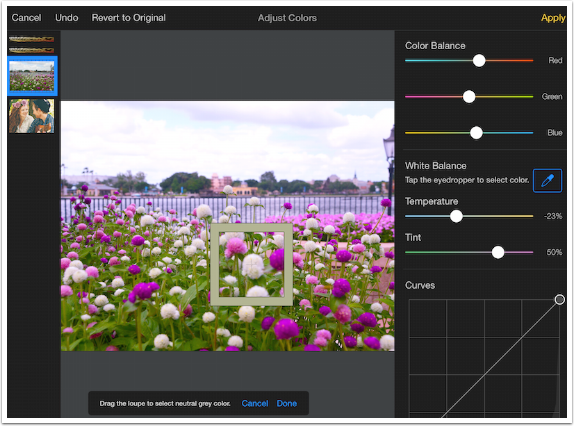
Of course, adjustments made to other sliders, such as Levels and Color Balance, will affect the White Balance. Below I’ve tapped Revert to Original to clear the previous changes, then used the eyedropper again. It results in different settings.
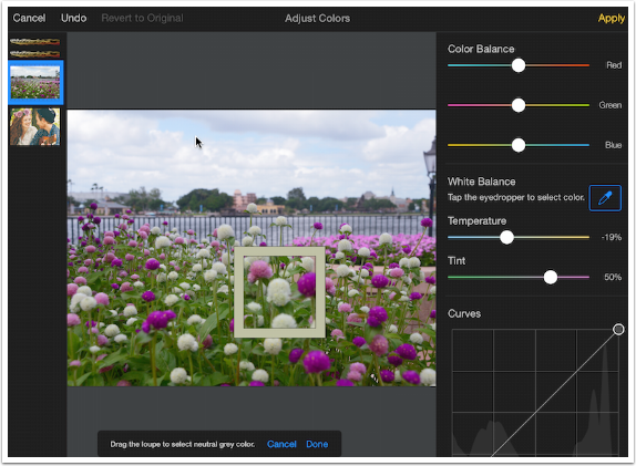
The final setting in Adjust Color is Curves. Whole books have been written on Curves, and the adjustment is capable of very delicate fine-tuning. We can’t go over everything with Curves, but I will give you a very short primer. Once again, you see a histogram under a box. There’s a diagonal line, with the bottom left indicating the black pixels, and the upper right the white. The curve between those two points is adjusted by moving points on the curve. The endpoints are always present, but you can add more points by tapping anywhere along the curve.
Below I’ve added two points along the curve. I pulled the leftmost added point downward slightly to make those dark pixels darker. I pulled the rightmost point upward slightly to make the light pixels lighter. The resulting curve is slightly S-shaped, and an S-shaped curve is most commonly used to increase contrast in the midtone range. The flatter portions between the added points and the end points result in lower contrast in those pixels.
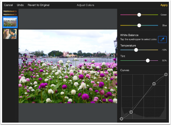
By moving the rightmost added point lower than its starting point, the entire image is darkened.
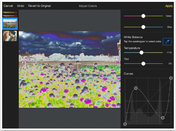
You can get some very odd results by distorting the curve into different shapes, as seen below. You can even fully invert the image by moving the black endpoint up to the top and the white endpoint down to the bottom.
In full implementation, Curves can be used for color correction. That is because in full Curves implementation, the Red, Blue and Green Curves can be independently manipulated. Pixelmator only allows the Luminosity, or Brightness, curve to be adjusted.
Below I added yet another point in the middle to hold the brightness steady in the middle of the tonal range. It was getting too dark when the rightmost added point was moved down to create more contrast in the sky. That concludes my changes, and I hit Apply to exit Adjust Colors.
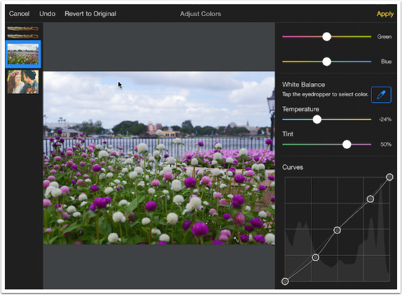
Now that I’ve adjusted my base image, making it a little less drab, it’s time to show the Sunbeam layers again. I double-tap the hidden layer and tap Show in the resulting drop-down menu.
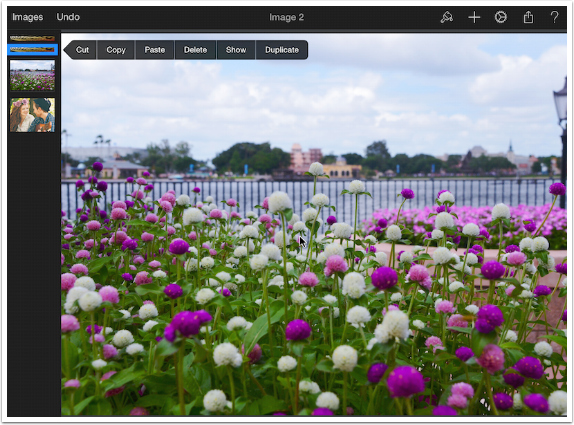
And here they are. They’re still too strong, but the advantage of having layers is that I can go back and change the opacity of each of them before committing to a final image.
Wow! We’ve been through a lot today – creating images, manipulating layers, and making changes to layers with Adjust Colors. We’ve also had extended discussions on Levels and Curves that will serve you well in making those adjustments in other apps. In Part 3, we’ll take a look at other kinds of layers that can be added, and tips in making selections. Until then, enjoy!



2 Comments
Dan Cooksey
Good stuff. Looking forward to future posts.
Carolyn Hall Young
Thanks, Jerry!