ProCamera for iPhone – Tutorial – Getting To Grips With It
Several weeks ago, I wrote an article for TheAppWhisperer about the then brand new ProCamera for iPad app (see here if you missed that). Ms. Carter has asked me to take a look at the iPhone version. So I did! Now…if you are a long-term user of ProCamera, you probably won’t learn much from this article…but if you are looking for a versatile all-in-one app, then read on!
If you haven’t purchased ProCamera for iPhone yet, you can do so here. It retails for $2.99/£1.99.
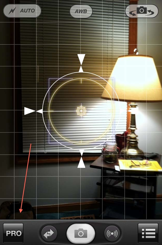
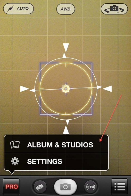
First off, I wanted to see what the camera side of this app was all about. The opening screen is very similar to the one in the iPad version…although it doesn’t have the floating tool bar available on the iPad. Let’s take a look at what some of these buttons do for us! I’ve started with the “Pro” button in the lower left corner.
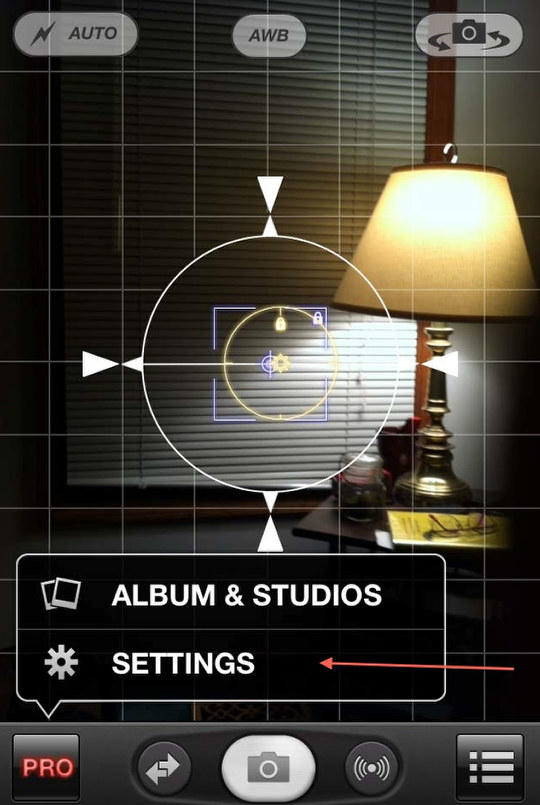
Clicking on this opens a pop-up that gives access to your photo albums and the apps “post-processing” functions…which I’ll look at later. For now, let’s go to the “Settings” screens.
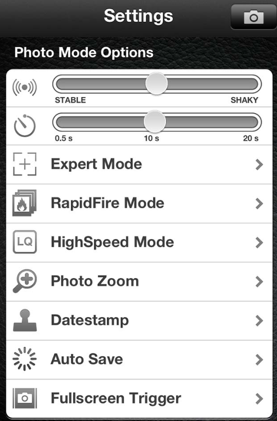
You’ll be impressed (or overwhelmed!) by all the controls presented to you for this app. At the top of this scrolling screen are adjustment bars for the stabilizer and self-timer, Expert Mode that allows for controllable focus and exposure points, shooting modes, etc. What the iPhone version has that the iPad doesn’t is a “fullscreen trigger” function. I’ll let you decide if this is good or bad. (I usually don’t use it…)
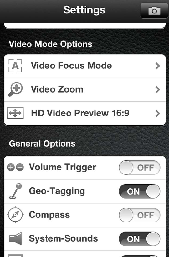
Scrolling down…you’ll find video mode options as well as some general options that you can use to personalize how you use ProCamera. (I won’t be going into the video aspects of the app this time.)
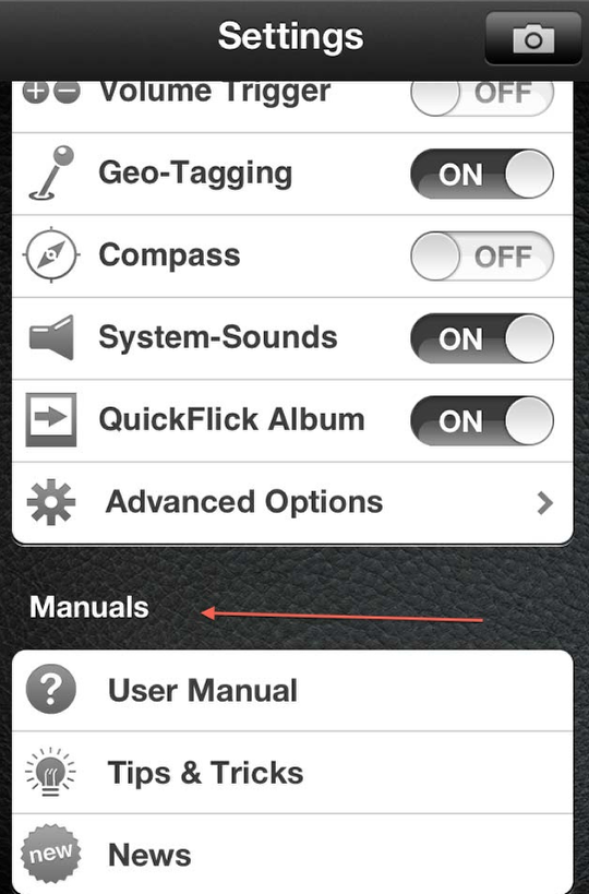
Finally, there’s access to the User Manual. Do take a look at this before you start using ProCamera…and even if you have been using it. I tend not to read the manuals until much later….a habit I need to break! Probably would save me a lot of time and aggravation!
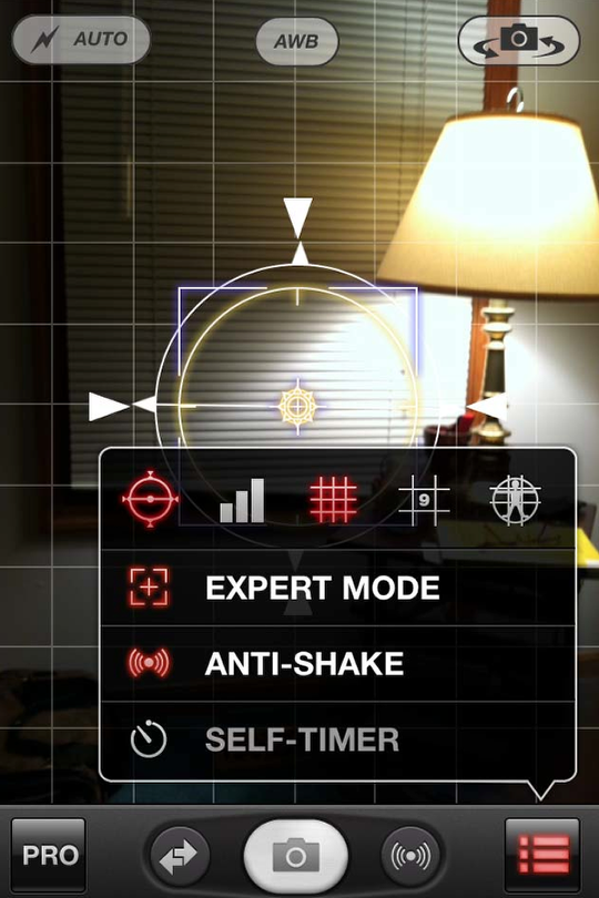
Okay. Time to move to a different button! Clicking on the one on the bottom right brings up this selection panel. Here you can pick which grid you’d like on your camera screen. An interesting feature here is the exposure “meter” activated by clicking on the three bar icon. This will give not only the shutter speed and ISO of a given image but also it’s histogram. (Not something the iPad version has!)
Below all of this is where you can activate the Expert Mode, Anti-shake stabilizer or Self-Timer. (Default is the Anti-Shake function.)
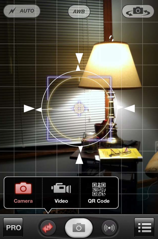
Clicking on the double red arrows to the left of the shutter trigger opens the camera or QR Code options. (ProCamera doesn’t create QR codes but reads them! Useful if you don’t already have a QR app.)
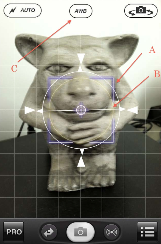
Meet Herbie! He’s my constant computer companion…keeping an eye on my system for me…and reluctant model at times. I’m going to use him to do a quick demo of ProCamera’s Expert Mode. In this mode you can touch and drag the focus point (A) and exposure point (B)…and lock these down by double tapping …to anywhere on your image. The AWB (automatic white balance) feature is also turned on in Expert Mode.
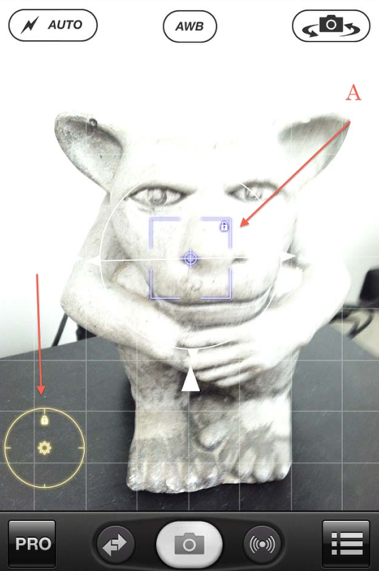
In this screenshot, I moved the exposure point (B) to the black surface Herbie sits on…dramatically washing-out the image. I kept the focus point (A) the same. Need-less-to-say, he wasn’t happy with this one!
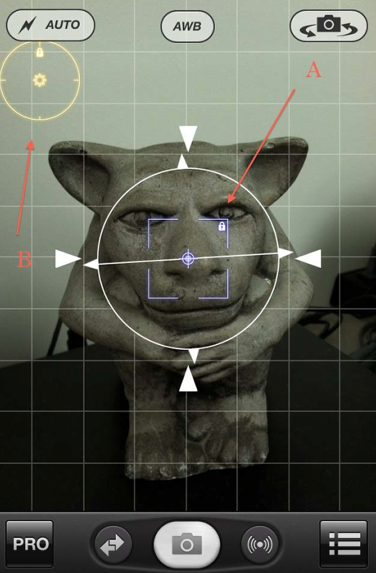
And in this one, I moved the exposure point (B) to the wall behind him causing the image to darken. Again, I kept the focus point where it was.
A quick comment about the focus point…you’ll have to play with that one on your own. Sorry about that…but I didn’t want this article to get too long! Perhaps this is material for my next ProCamera article!
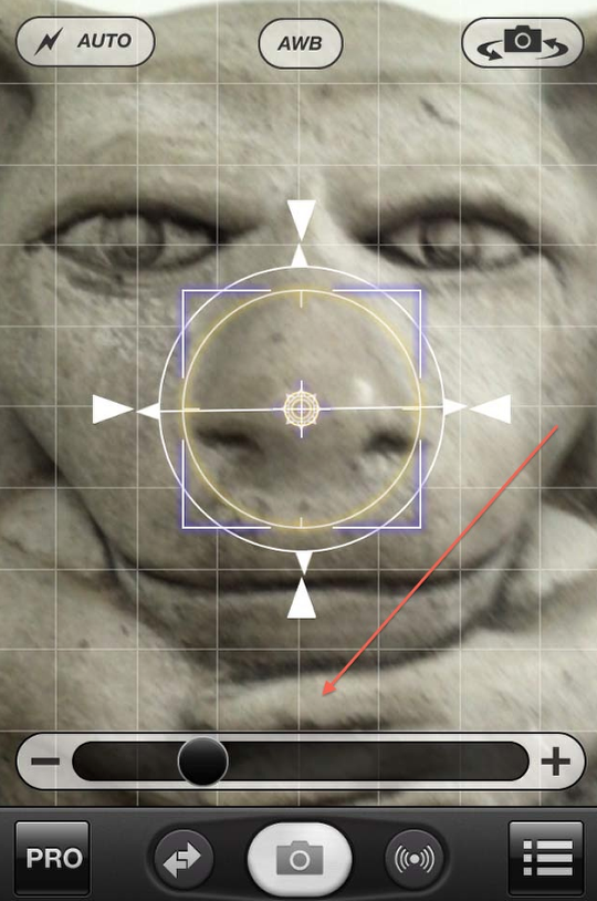
Oh yeah…almost forgot! ProCamera does have a digital zoom that works by swiping the screen to activate the zoom slider bar. Herbie was ready for his close-up! (Need to be careful how you swipe ‘cause ProCamera has a new feature that allows you to also swipe the screen to the right on the camera screen which takes you to your Albums. It’s all in the touch…
There are a lot more camera settings/functions that I haven’t discussed…I only touched on a couple. Do make sure you look over their tutorial if you have any questions about the various bells and whistles available to you in ProCamera.
Right now I’d like to move onto the three different “post-production” studios that come with this app. (Interestingly enough, these aren’t available in the iPad version!) To get to these you can do one of two things. Use the finger swipe to the right that will take you to your Albums or click on the “Pro” button…and then on “Album & Studios”.
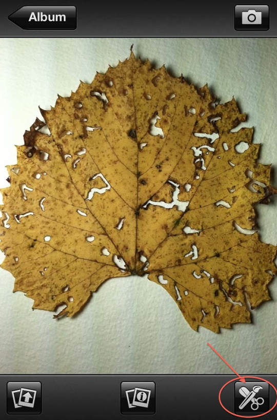
I went to my Camera Roll and selected this shot of a leaf that I had done earlier. I then clicked on the icon in the lower right corner to activate the “Studio” screen.
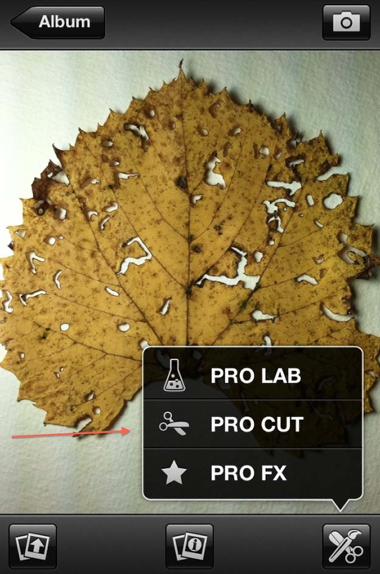
You have three options to choose from: Pro Lab where you can adjust such things like contrast, brightness, etc.; Pro Cut where you can crop and or flip your image; and Pro FX where there are a number of great filters to work with.
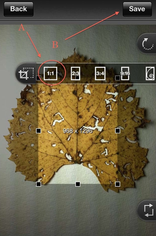
I decided to do some cropping first, so I clicked on Pro Cut and came to this screen. You can control the size of the crop using the selection points on the screen or by clicking on the top tab (A) which presents you with different fixed ratios to work with. Although I have the 1:1 box circled, I decided in the end to go free form. Once I was done with my selection, I clicked the “Save” button (B) to activate the crop.
Now…here’s something to keep in mind. ProCamera’s effects are not progressive…meaning that each time you click on Save, you are saving to your Camera Roll. Basically, ProCamera thinks you are done! It does keep your last image active so you can build on it…but in the end, you will have versions of your image in progress saved to your camera roll. This is both good and bad. As always, I’ll let you decide.
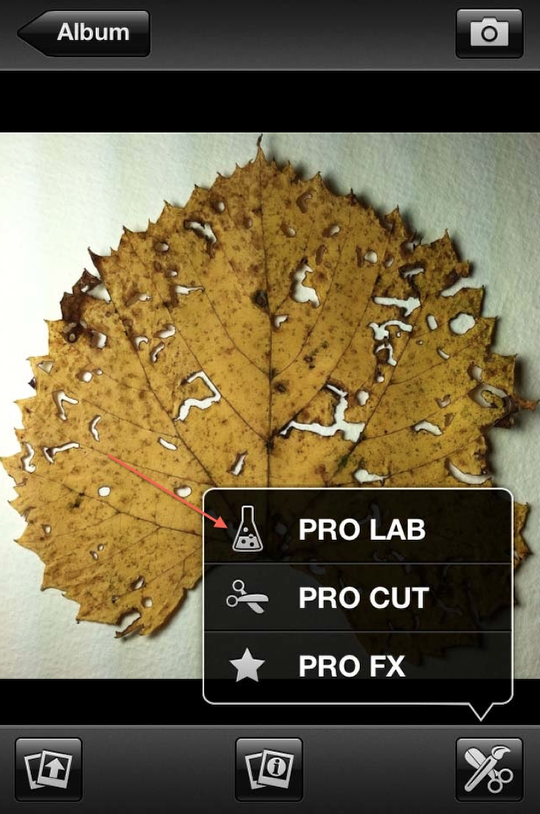
In any case, I next went to the “Pro Lab” to do some clean up adjustments to my cropped image.
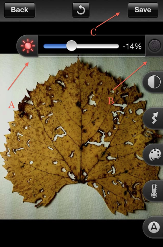
After considering the various adjustment options, I finally decided to only work with the brightness a bit, as shown in this screen shot. The other options are, from top to bottom, brightness (as shown), contrast, exposure, color saturation, and color temperature. The “A” tab gives you auto contrast and auto color tools. (To deactivate a tab you are using, click on the button (B) to the right of the bar.) Finished, I clicked on “Save”.
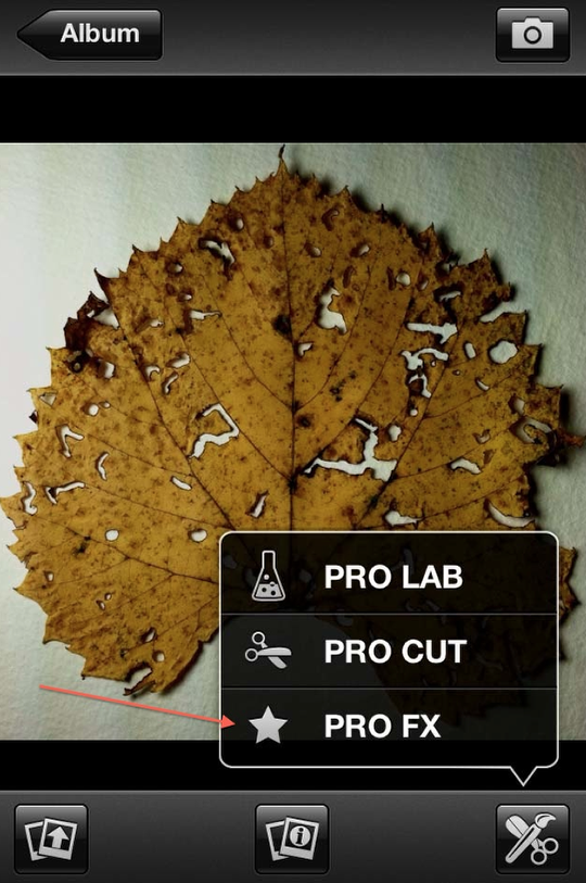
Here’s the fun part…using the filters in “Pro FX” !
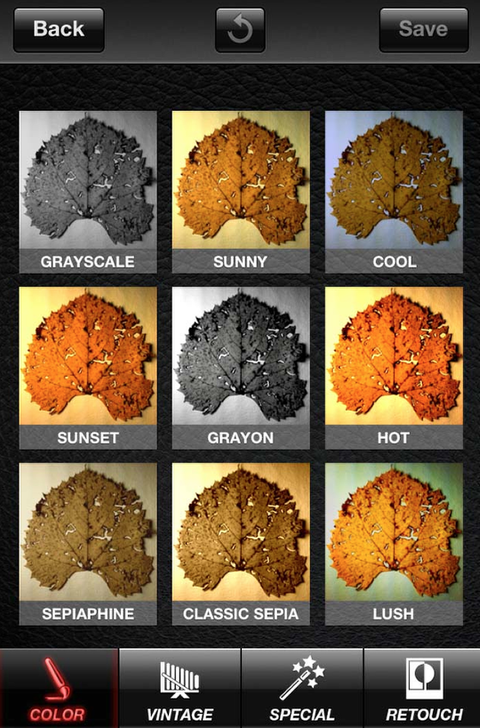
There are four different categories of filters to choose. (Unfortunately, you can’t control the intensity of each filter…it is what it is!) This screen shows you those in the “Color” category.
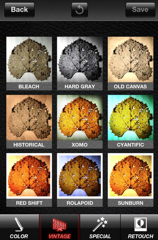
Here is the “Vintage” category….
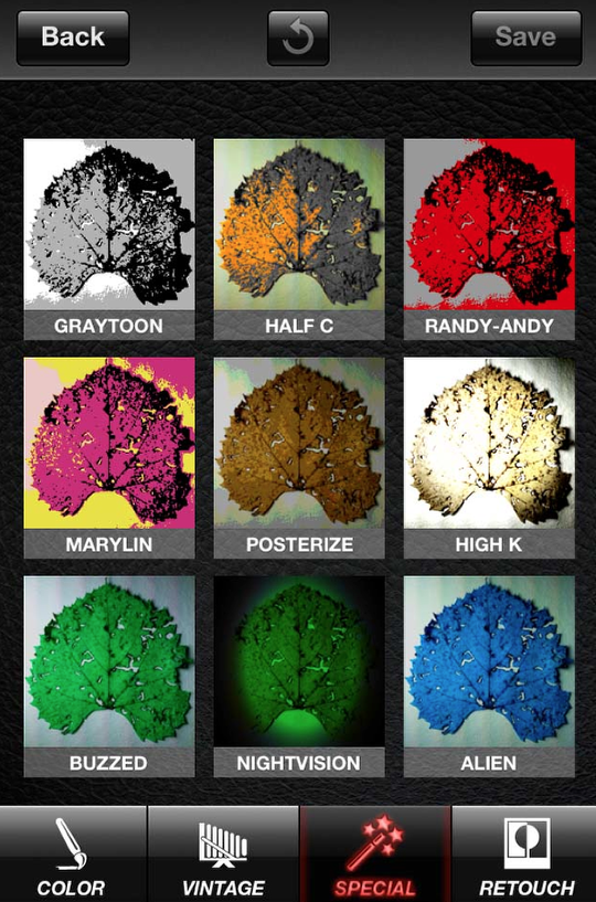
The “Special” category….
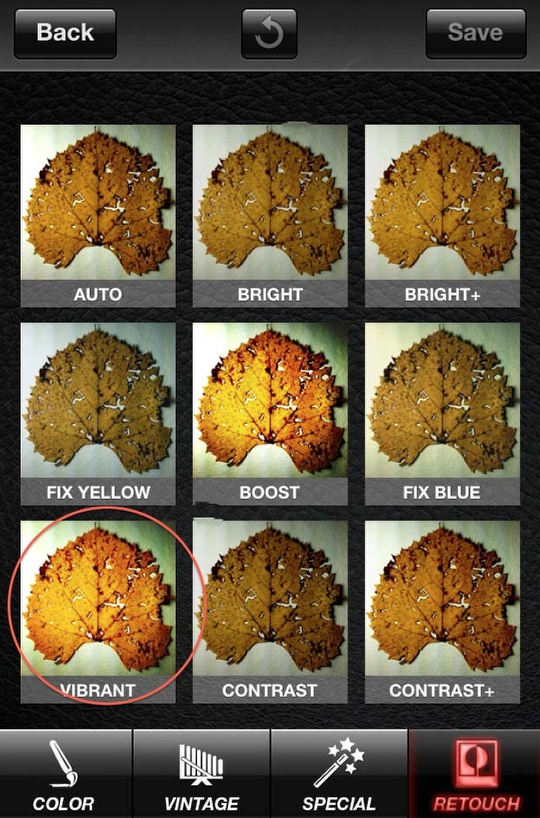
And the “Retouch” category! For some reason the “Vibrant” filter spoke to me, so I clicked on it, which applied this filter and brought up this screen…
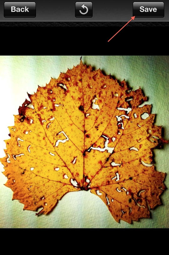
…that gives you a full screen preview. If you like what you see, click on “Save”.
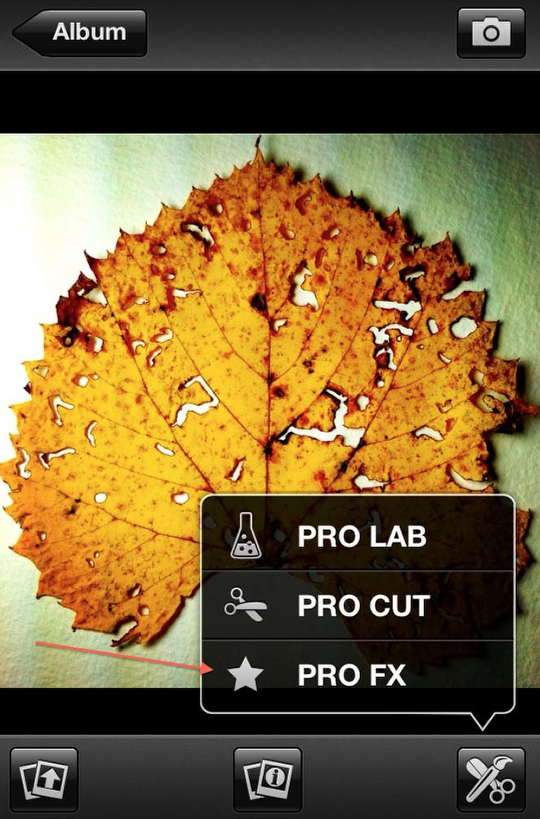
Not content with just one filter…I never am…I went back to “Pro FX”!
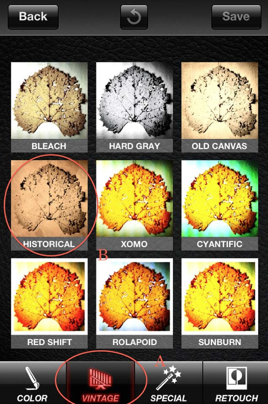
This time I decided on “Historical” (B) in the Vintage category (A). As before, a preview screen came up showing what I had so far…which I liked, so I clicked on “Save”.
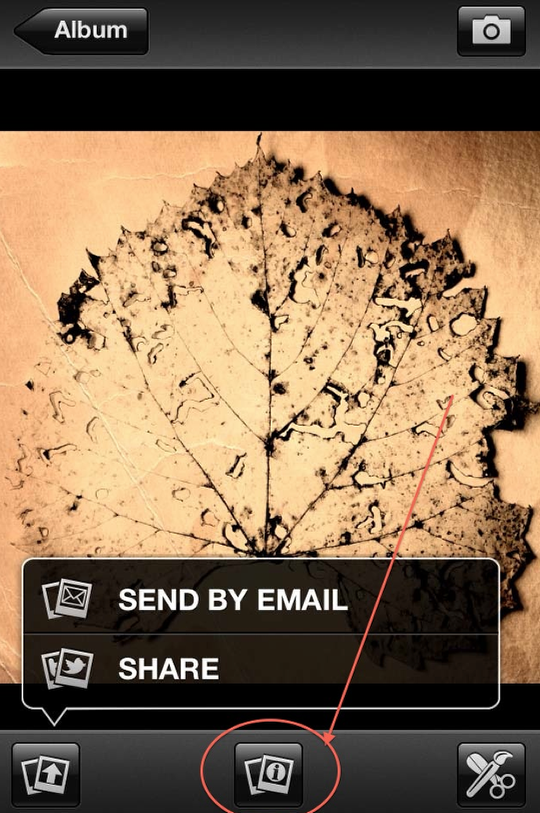
In this screen shot, you can see my final image behind the pop-up panel. I wanted to show you this one feature before ending…and that’s the information screen that’s accessed by clicking on the center icon.
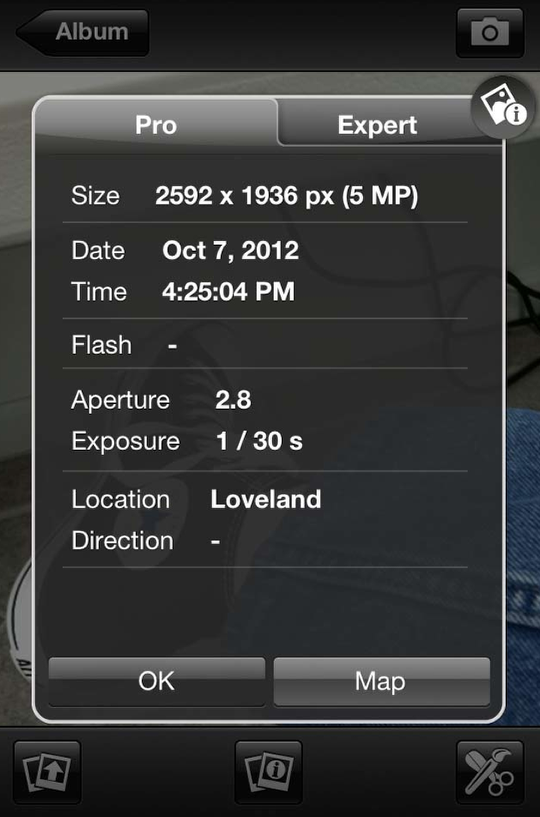
In this screen you can find out all sorts of things about your photo…some more useful than others. What I was hoping for when I first looked at this was a listing of all the steps I had taken to create an image…but that’s not included. (There’s only one app that I know of that provides that info. I wish others did as well!)

Here it is….my final image. Simple, but elegant…don’t you think!
As always, thank you so much for taking time to read my tutorial. I hope you found it both informative and enjoyable. Please don’t be shy about leaving comments or asking questions…that way I know you’ve been here!


13 Comments
Geri
David, Thanks for the tut. I didn’t realize they had added editing features to ProCamera! What is the app you mentioned that lists all the steps?? Just curious
David
Geri ~ glad my tutorial was of help!! The editing features are only in the iPhone version at the moment…hopefully they’ll add these to the iPad version as well. Now…I find I have to backpedal a bit about that app! Once upon a time, Jazz had a screen that showed you everything you did…and you could save this as a “style”. It appears that they have changed that! You can still save the steps you did as a “style” but they’ve changed the format it’s shown to you. There are other apps like Filterstorm that will show you the “history” ala Photoshop of what you did…but not in any detail.
Dilshad
Wonderful!!! thank you so much!
Dilshad
Wonderful!!! This is so helpful!!
Mar
The inclusion of a live histogram is fantastic; it shows in red if the highlights or shadows have been clipped. Love it. Its also a brilliant photo browser, because you can zoom in on your photos by about 400%.
David
And thank you, Dilshad!! Twice!!
David
Mar ~ good point! I’m not one to pay much attention to that sort of thing while I shooting…particularly with my iPhone…but the attention of a histogram is a bonus for those, like you, who like using it!
Dee
Your tutorial was very helpful. I found a link to it on the ProCamera blog. Thanks especially for walking me through the filters. Now maybe I’ll be inspired to be more creative myself.
David
You’re welcome, Dee. Glad it was helpful. ProCamera has a link to it on their blog? Wow! I’d didn’t know that!!!
Dee
Written by Misho, who I see AppWhisperer just brought him on as a columnist. Good move. I’m new to mobile photography and have found his writings extremely helpful.
David
The AppWhisperer is the place to come for great tutorials, that’s for sure!!
Marilyn Gallas
Thanks so much for this post. I stumbled upon “App Whisperer” through Geri Centonze’s blog. I’m brand new to iPhonography and a bit overwhelmed with all the apps. Consequently I have only two apps…..Snapseed and ProCamera. I’m just learning what all ProCamera can do and your article adds significantly.
David
Marilyn ~ Glad this was helpful to you. An app like ProCamera has so much depth to it that it does take awhile to master. Only two apps? I only had two apps once…then I became addicted…now I won’t say how many I have!!!